
This season’s MLB All-Star Game will take place next Tuesday in Philadelphia. By the night’s end, one player will have been selected as the game’s MVP and will therefore win the Ted Williams MVP Award, which is a glass bat.
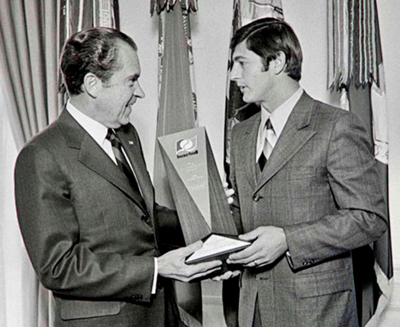
But when I was growing up in the 1970s, the All-Star MVP won something called the Commissioner’s Award (not to be confused with the Commissioner’s Trophy, which is presented to the World Series championship team). Red Sox outfielder Carl Yastrzemski won it in 1970 and later showed it to Richard Nixon at the White House (see above).
It’s hard to see clearly in that photo, but the Commissioner’s Award had an unusual logo. You can get a better look at it in this shot of Pirates outfielder Dave Parker, who was the All-Star MVP in 1979:
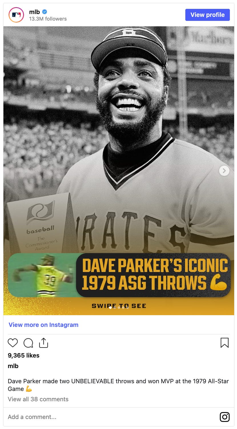
I remember being fascinated by that logo as a kid, because it didn’t seem to appear anywhere else except on that trophy. Also, I was intrigued by the word “baseball” being rendered in all-lowercase lettering (a topic we’ve recently explored here on Uni Watch).
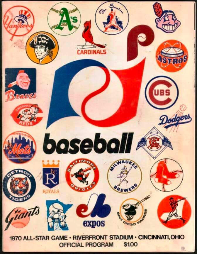
I didn’t know it at the time, but that logo had debuted at the 1970 All-Star Game, where it was featured not just on Yaz’s MVP trophy but also on the program cover:
The program included a note about the logo, which the mighty Fleer Sticker Project showcased back in 2015:
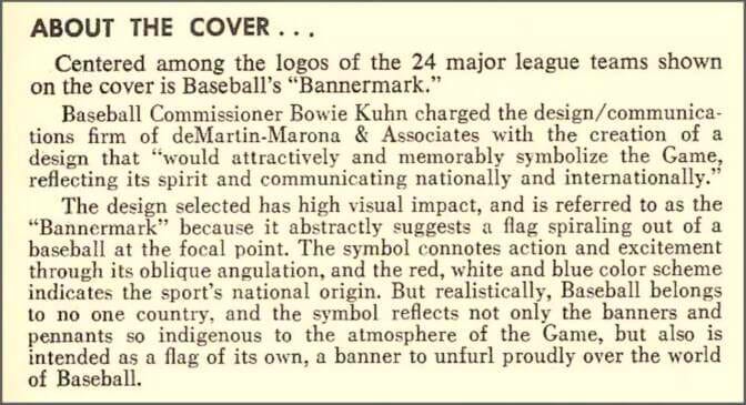
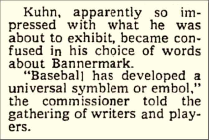
So there you go — the bannermark! The New York Times reported that the design was unveiled at a luncheon the day before the All-Star Game, where then-commish Bowie Kuhn invoked an amusing spoonerism while trying to say “symbol or emblem”:
Ah, Bowie Kuhn. That takes me back.
Let’s take a closer look at this symblem — er, symbol:
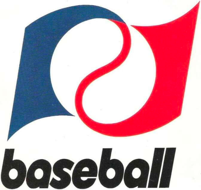
Not really such a great design. I’m particularly irked at how the “laces” on the baseball are red, which ruins the symmetry of the design. Shouldn’t the top part of the laces be blue, leading to a gradient in the center that resolves as red at the bottom?
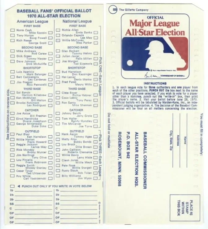
The bannermark unveiling wasn’t the only notable thing about the 1970 All-Star Game. That year marked the first time since 1957 years that fans had been permitted to vote on the starting rosters. (Commissioner Ford Frick had eliminated fan voting after Reds fans stuffed the ballot box in ’57.) So you’d think the bannermark would appear on the ballots, right? Wrong. The 1970 ballots instead featured the silhouetted-batter mark, which had debuted the previous year as MLB’s centennial logo:
Perhaps that isn’t so surprising, because the bannermark never achieved full public-facing traction and was used mostly behind the scenes, as MLB designer/historian Todd Radom explained in a Fleer Sticker Project comment:
The “bannermark” — also called the “Commissioner’s Mark” — was used on MLB letterheads, media guides, awards, and ceremonially distributed trinkets such as cufflinks and tie bars, as well as in-house communication during the Bowie Kuhn years. It was eliminated when Peter Ueberroth took over in 1984.
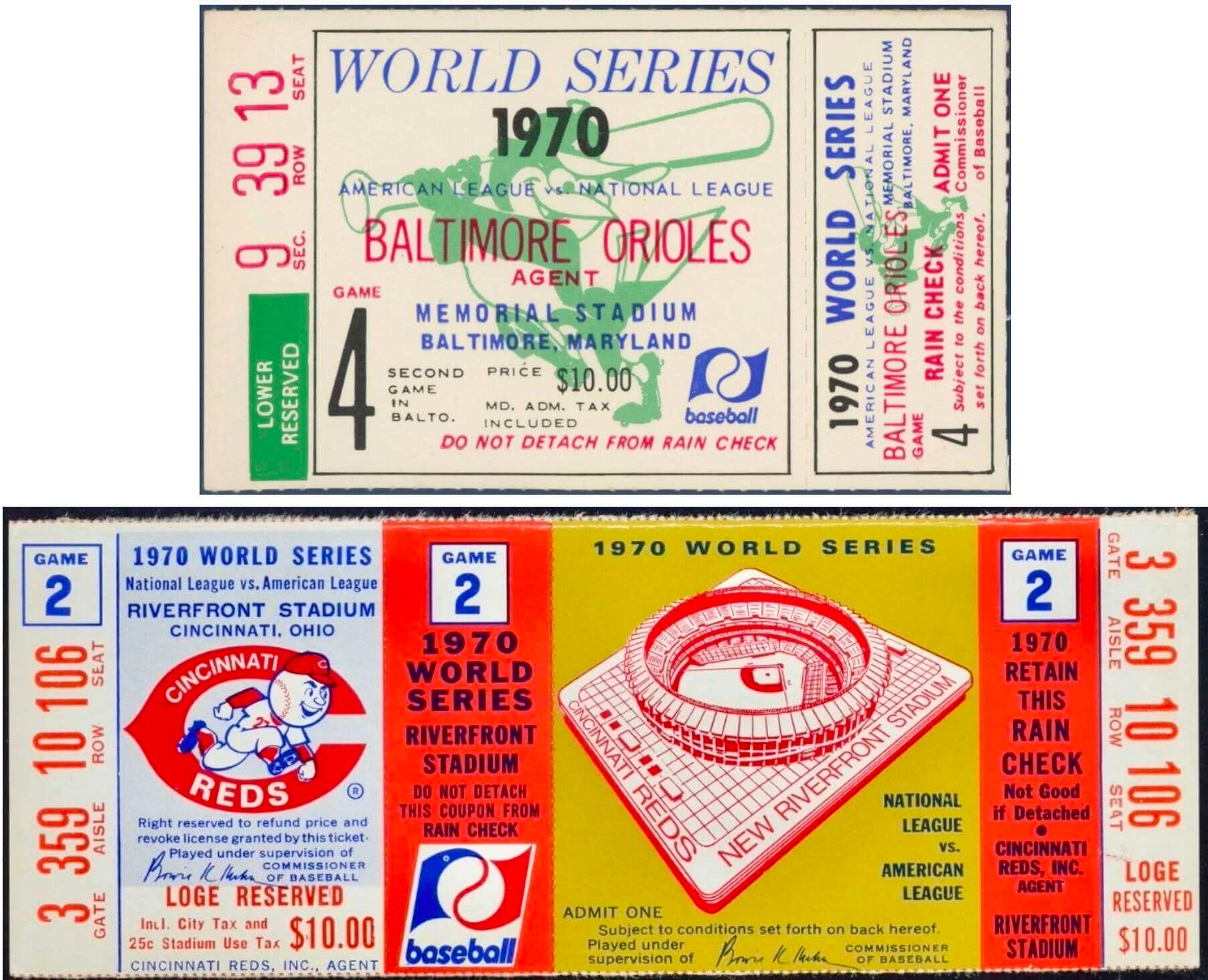
But the bannermark did have pride of place from 1970 through 1976 on World Series tickets (except, for some reason, on the Reds’ 1972 tix). Here’s a year-by-year look at the tickets from each of those seasons:
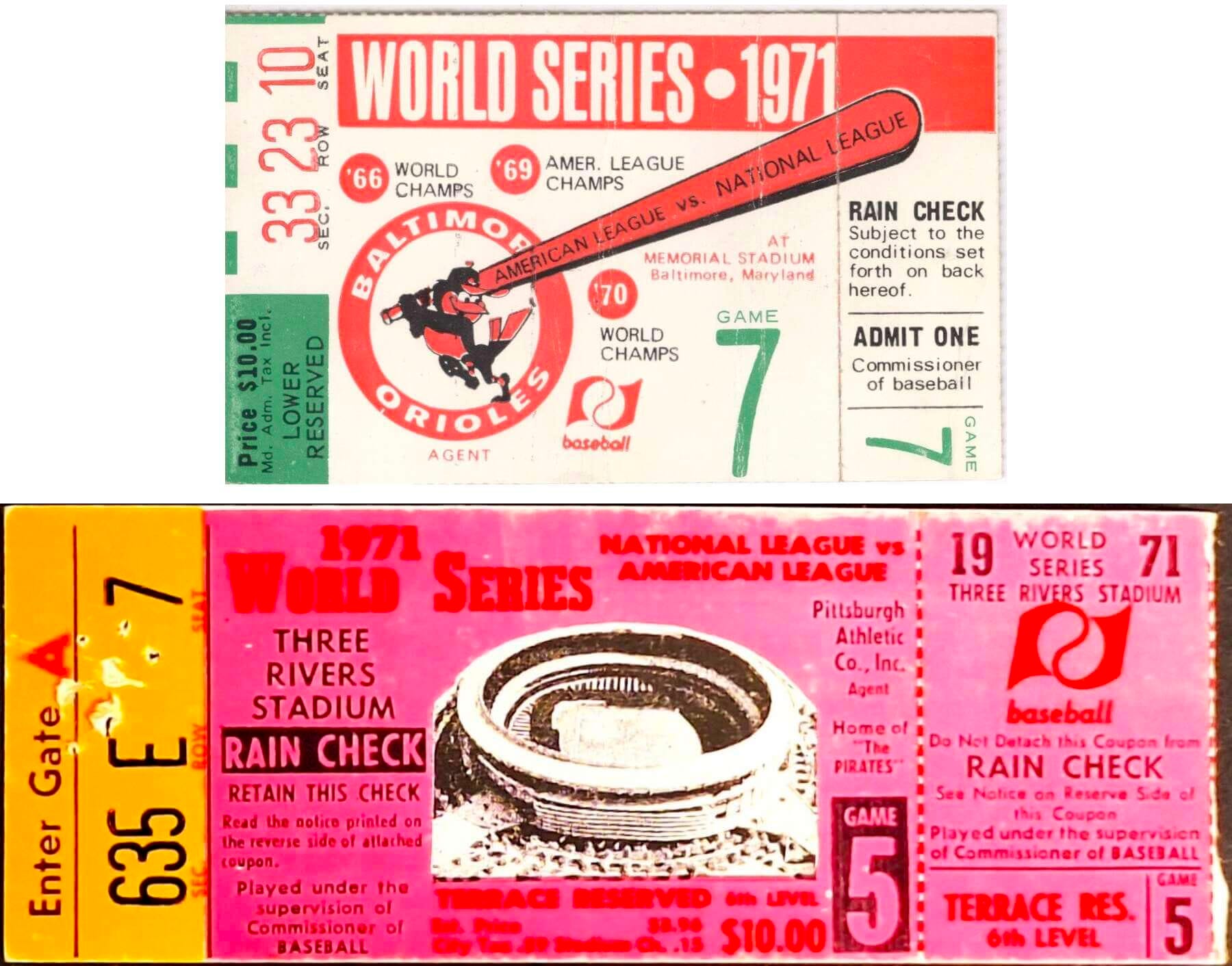
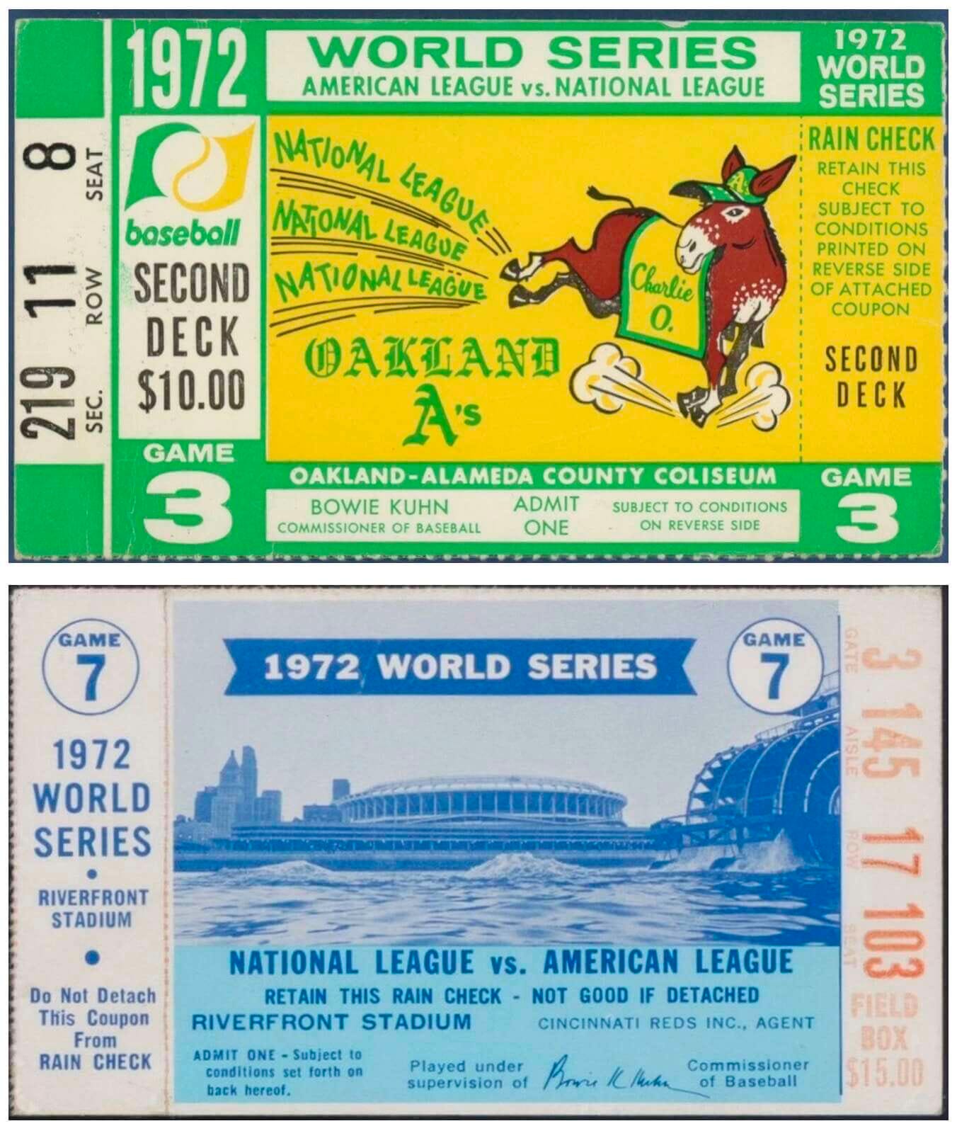
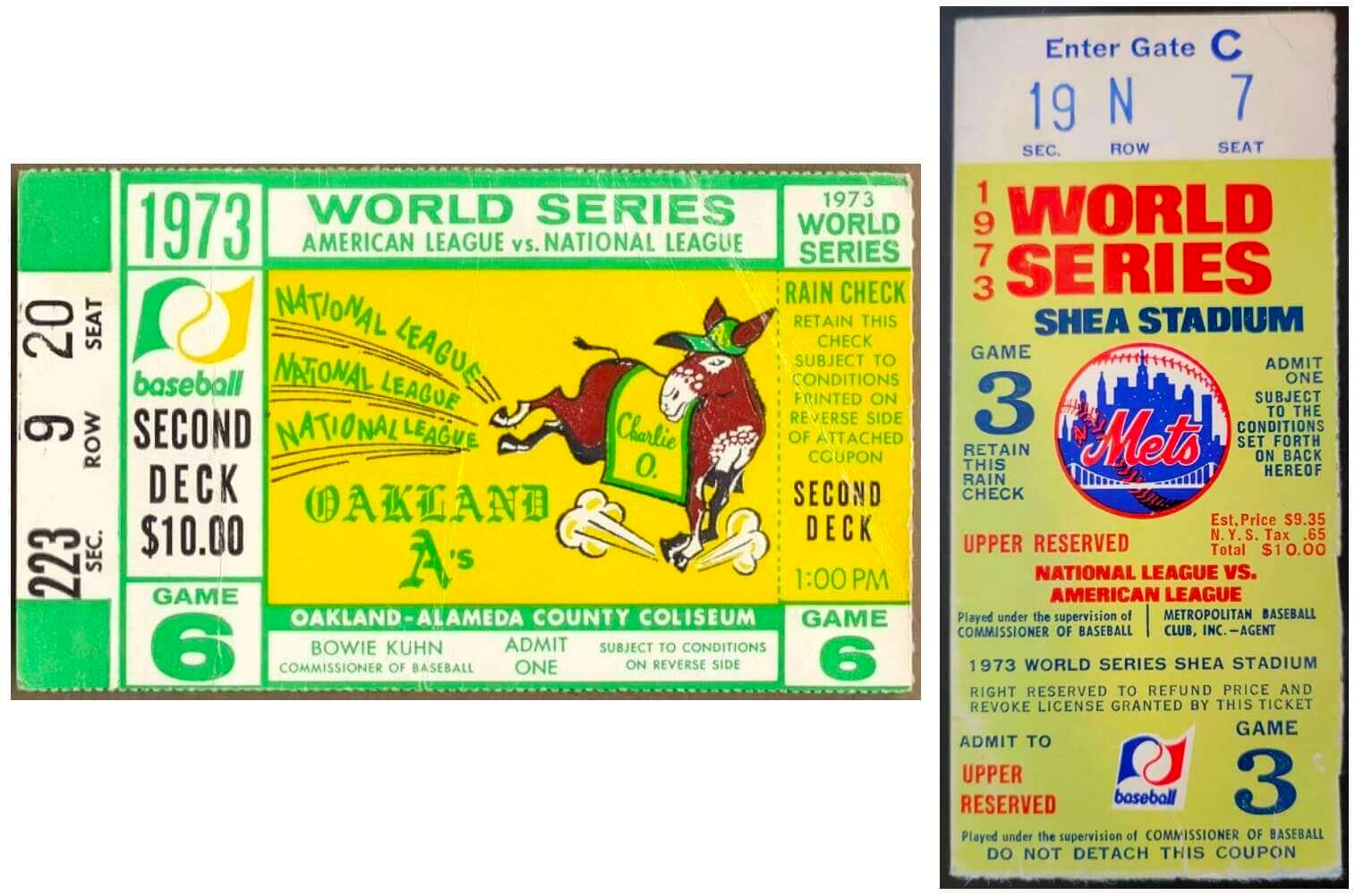
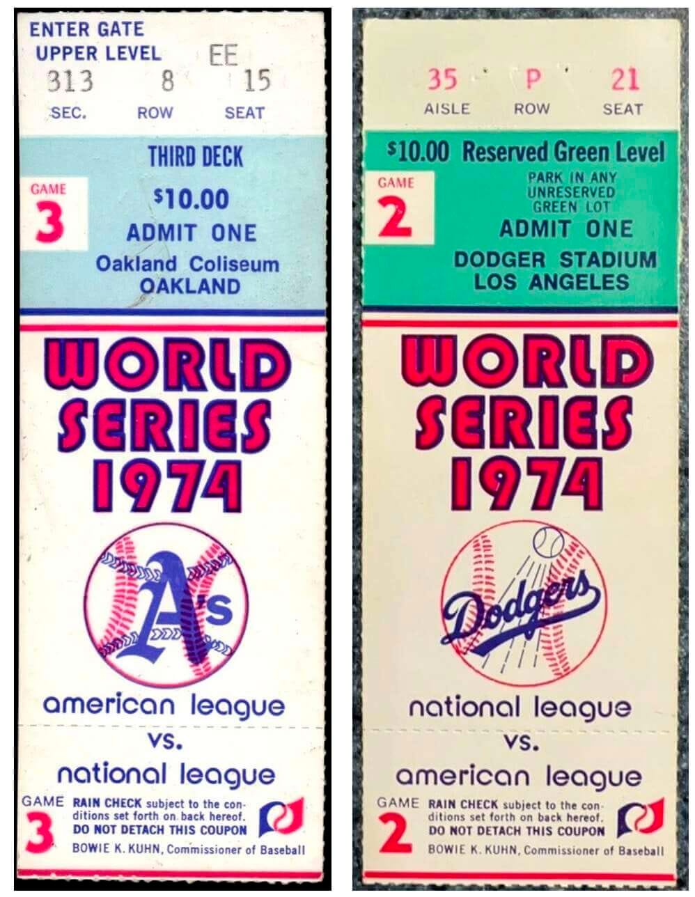
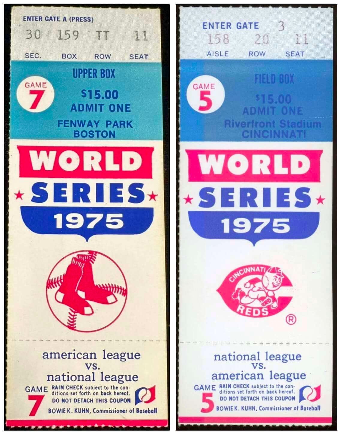
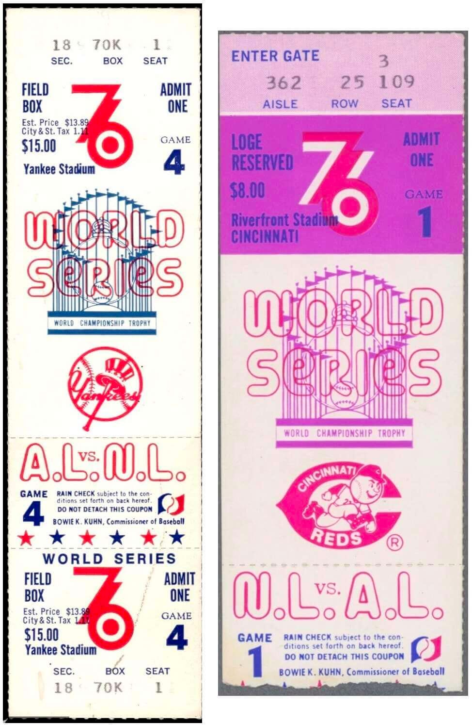
The design firm that created the bannermark, deMartin-Marona & Associates, was active from the 1960s through the ’90s. They mostly handled a lot of corporate branding (including the 1968 revision of the Morton Salt girl), but their portfolio included at least one other notable sports-related credit: They designed the uniforms, logos, and visual system that the Phillies introduced in 1970, the same year that the bannermark debuted:
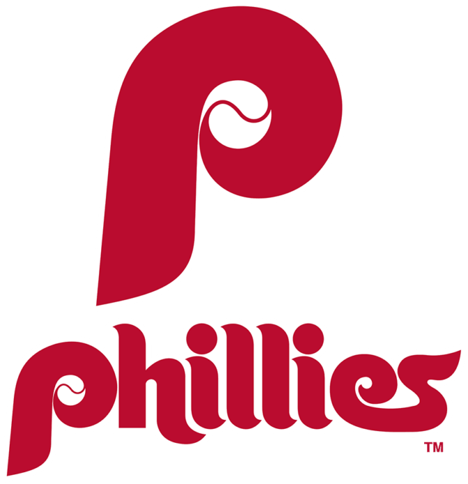
Hmmm, an all-lowercase wordmark with a stylized baseball as its focal point — seem familiar? It’s just like the bannermark! deMartin-Marona & Associates got a lot of mileage out of that approach in 1970. But unlike the Phils’ 1970s look, which is still remembered fondly, the bannermark is just an obscure footnote in MLB’s visual history.
Comments
Nothing yet. Say the first thing.
Sign in to join the conversation.