
This is the free version of an in-depth article published last week for paying subscribers only. As a free article, please share as it should appeal to most football fans, even if I retain slightly more focus on Liverpool.
As ever, all commenting is for paying TTT subscribers only.
Key takeaway:
The results suggest that the financial gap between the Haves and Have-Nots has closed massively in recent seasons, having first exploded in 2003 and lasted two decades; and that the league is now as competitive as it’s ever been in the ‘modern’ era.
Thanks for reading The Tomkins Times - Main Hub! This post is public so feel free to share it.
The Premier League from 2003-2015 is likely to have contained the most expensive teams in the entire history of the sport in England, when adjusted for inflation; but FFP and PSR have reversed the financial gulfs in the game in this country; and now we’re into the Squad Cost Ratio era.
Dr Ian Graham’s book “How To Win The Premier League” includes the following acknowledgment of my work:
“I am not the first to point out the surprisingly large proportion of failed transfers. Paul Tomkins’ book ‘Pay As You Play’ [2010] looked at transfer fee inflation in the Premier League. A few years later, he revisited the work in his blog, The Tomkins Times, and compared transfer fees to ‘success’. His method for measuring success was more complicated than ours [at Liverpool], with the benchmark depending on a weighted mixture of transfer fee paid, inflation, transfer fee received and number of games started. Tomkins’ conclusion was that only 40% of transfers succeed. This is a lower success rate than my simple starts-based measure but is in the same ballpark.”
So I’ve been covering this issue for a while now, and believe that our Transfer Price Index (co-created with Graeme Riley for TTT) was the first to model football inflation.
In this article I will revisit my work on this subject, that began 16 years ago, with the latest figures and analysis, and some new ways at looking at the data.
Individual player costs, adjusted for inflation, was just one part of the work.
Just since 2024, squad costs and £XIs – the £XI being a term I coined for the average transfer cost of all Premier League XIs a club fields in a league season, adjusted to current day football money – there’s been a massive narrowing, as the richest clubs are no longer able to massively outspend the smaller clubs.
(Note: we focused on the XI, and not the subs who came on as well, as that was far too much to work out back in 2010 when going all the way back to 1992. Now you could probably do a version by percentage of minutes played. We also focused only on the league, to keep it manageable.)
This ties in with how equitable the league seems in terms of league positions since 2024, and how English football ended the season with 11 of the top 18-ranked sides in Europe based on the Elo Club Index. It ties in with how 11 of the top 30 most valuable clubs in the world are in England; and removing the six US teams, that makes 11 of the most valuable 24 in Europe. That includes Brighton & Hove Albion, to show how things have changed.
In this article, I will use data, graphs and scatterplots to show how much ‘fairer’ the competitive balance has been since 2024, and how it now is much closer to the pre-Roman Abramovich ‘blew the bloody doors off’ era.
Everything is relative, as everything is in 2026 money.
At the time of writing, five of the Big Six have squads that cost over £1bn in 2026 money (and that doesn’t include Arsenal at just under £1bn, but does include Spurs, albeit various clubs are yet to offload all unwanted players); but how even smaller clubs have c.£500m squads.
The usual pattern is for around 50% of that investment to make it into the starting XIs over the course of a campaign, due to injuries, form, rotation and players being frozen out, or loaned out.
If a squad is roughly 25 players, then there will a few free youth or Bosman players in there, lowering the costs; a few overpriced players in there too. The best players or the most expensive players will obviously be more likely to start games; but not always these. There is always a balancing out that, over a bigger sample size, correlates spending and success.
And from a squad of 25, only around 40% can play. Even if it’s a different XI every week, 60% of the players will not be starting. A settled XI may mean good players don’t get to start many games.
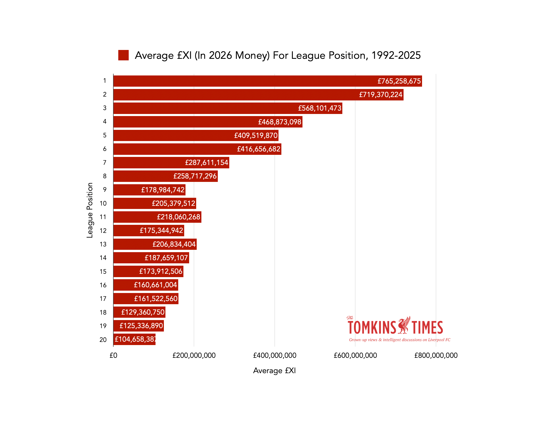
However, in any given season, lots can go wrong; so you can never say that what you spend will marry up with where you finish in any given campaign. But over time, the team most likely to win the title is the team with the highest £XI, and the team most likely to finish 2nd has the second-highest, and so on, down the relegation places.
However, there is a bit of a weird imbalance in mid-table; the trend is less strong there.
But of course, mid-table is where teams can both underachieve and overachieve. See last season, with Chelsea finishing 10th with an expensive £XI, and Bournemouth finishing 6th, with a far less expensive £XI; while Brentford and Brighton also finished above Chelsea.
Obviously this does not cover wages, but one of the original aims of the Transfer Price Index was to show that, in contrast to what was noted in the seminal book ‘Soccernomics’, there is a actually huge correlation between transfer fees and success of a team if you include inflation, and don’t just look at what was spent in any given summer; whilst it also provides more up-to-date data. (I later co-authored an academic study on the matter, and also, provided assistance to an EU study on transfer spending.)
The £XI is different as it’s up to date, and not a year behind. It shows who actually played, and that has a greater correlation than just how much the squad cost.
It’s far from perfect, and modern transfer fees can be opaque, confusing, and include all kinds of incentives and agents’ fees. (Erling Haaland’s transfer fee could be listed as almost twice as much if including the additional payments made to secure the deal.)
But ever since Graeme Riley and I co-created the Transfer Price Index in 2010, it has generally showed the link between transfer fees and success.
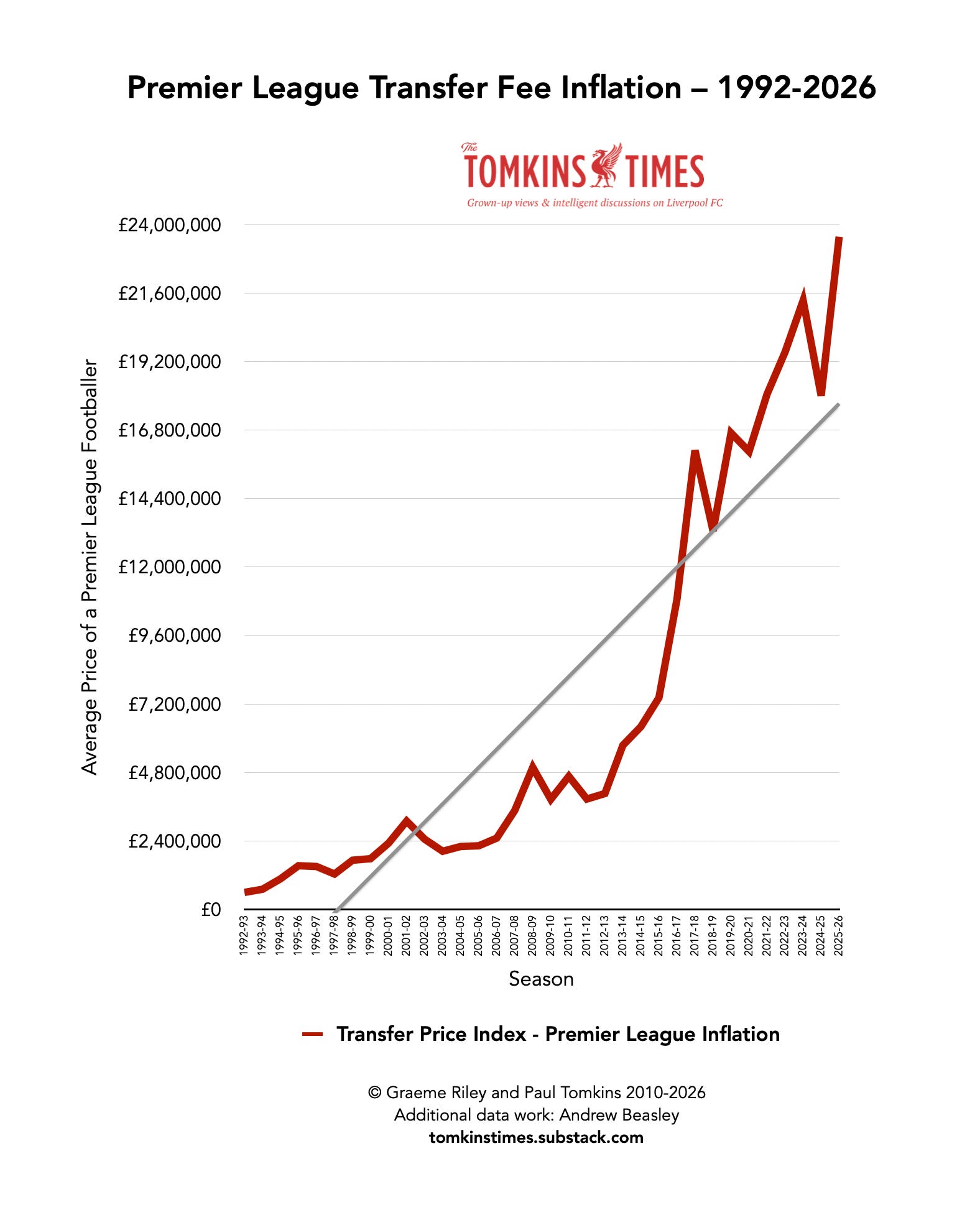
As a quick reminder to how it’s calculated, the Transfer Price Index takes every single player signed for a fee in a season, and works out the average price for a player that year. The average price generally rises, and often sharply (usually in line with increases in TV deals); but sometimes falls.
All fees are relative, so the more that’s spent on a player compared to that season’s average, the more expensive he will remain when inflation is applied.
However, one reason for the financial fairness of the current day is that, post-2011, teams had to be more careful with their money, and spend more on squad players rather than massive marquee signings.
It was too risky to spend the equivalent of £200m-£300m on single players after then, but that is where the upper fees were heading had that not been radically slowed.
Here’s the inflation graph:
(We always worked on the maximum fee possible, and used reliable sources. Andrew Beasley diligently helped update the database in recent years, and I’m now using Transfermarkt for the 2026-27 signings. There will always be discrepancies in transfer fees. In the old days I got tired of arguing on Twitter with people saying someone cost £22.2m, and not the £22.1m I’d stated.)
At the time of writing (early August 2026), the average price for a Premier League player, based on this summer’s business so far, is pushing up towards £30m, from 2025-26’s c.£24m.
So, c.£30m is now the going rate for an average footballer; or, at least, the average going rate for a footballer.
If you want analysis of the exact accounting figures, then Swiss Ramble remains the definitive source, and here’s his analysis of Liverpool’s latest accounts (2024-25).
While Pep Guardiola had a massive budget to work with, and City fell away when that budget fell, it’s still clear that he changed English football a decade ago. But, losing energy and maybe going a bit stale, in addition to City losing so many players and going through their own rebuild, he’s gone now.
So has Jürgen Klopp, who, points-wise, was arguably the modern game’s biggest overachiever at the top-end of the table; remember, the higher up the table, the less scope there is to improve a team by 40 points. And the league has grown stronger in mid-table since Klopp’s Imperial Phase.
To show how perfect Liverpool’s recruitment and management was, 99, 97 and 92 are all more than any other club has achieved with a similar expenditure.
These are the top eight points tallies in the Premier League era, and the corresponding £XI.
100 – 2017-18, Man City (1st) £1.1billion
99 – 2019-20, Liverpool (1st) £662m
98 – 2018-19, Man City (1st) £1.05billion
97 – 2018-19, Liverpool (2nd) £685m
95 – 2004-05, Chelsea (1st) £1.1billion
93 – 2021-22, Man City (1st) £892m
93 – 2016-17, Chelsea (1st) £857m
92 – 2021-22, Liverpool (2nd) £627m
All of which adds to the notion that the Fair Play era is back.
(Even if some teams have yet to be punished for their financial chicanery.)
If the Premier League has felt more interesting in the last couple of years – in terms of competitive balance, if not beautiful football – it’s due to the end of the Unfair Play Era, which began in 2003, when Roman Abramovich bought Chelsea.
That still remains the biggest seismic shift in English football’s financial landscape.
At one point, Chelsea’s £XI was three times that of Liverpool.
Man City then swooped in with investment, spending big pre-FFP, and continuing to do so, but slowing a fair bit (publicly, at least) in the coming years. (The 115-130 charges are still not resolved.)
This is the £XI graph with 2003-2024 blanked out; a whopping 21 years.
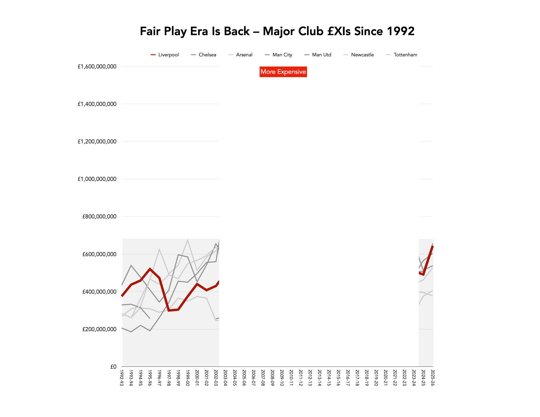
In 2010, when co-authoring ‘Pay As You Play’ (a book full of good information, but not necessarily a good book, looking back, as with hindsight I didn’t always bring the information together in the best possible way), I noted the alarming spikes in the graphs, and it continued until 2023-24, albeit the radical spending had peaked pre-pandemic.
We are now back to almost the exact kind of competitive balance seen prior to 2003, but it took two decades to get the gap back to something that is not Unfair Play.
While Man City still finished 2nd under Pep Guardiola in 2025-26, Man City’s dominance ended when their spending cratered and the older world-class players left or retired, one by one.
Similarly, since Chelsea stopped being by far and away the most expensive side English football has ever seen, with the dip starting in 2012-13, they have won just two league titles, and had several extremely poor seasons. Their spending since 2023 seems more chaotic, with too much churn.
The far smaller range of £XIs is reflected in England now having 10 of the top 17-ranked teams on the European Club Elo Index, as the league has got stronger from lower to upper mid-table.
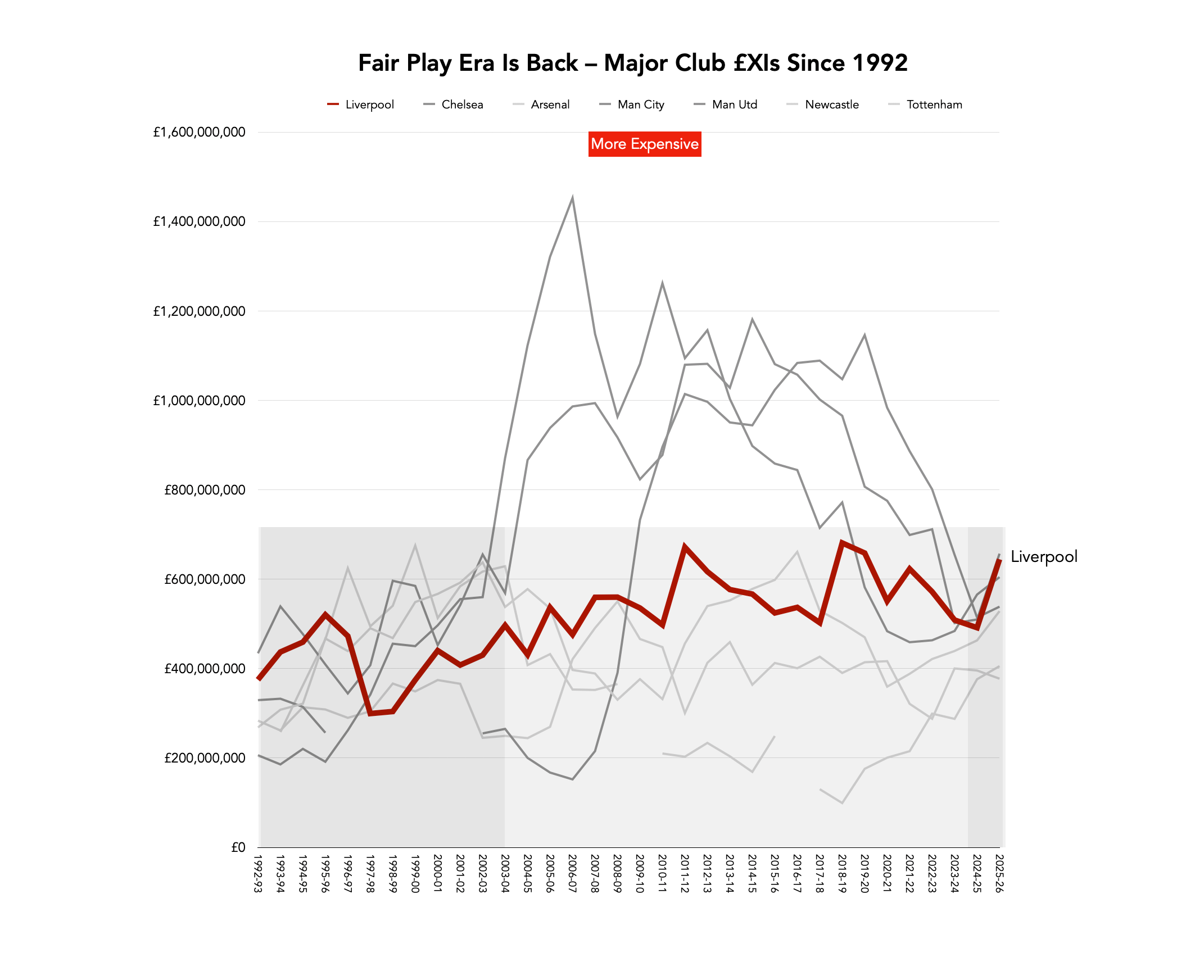
And of course, transfer fees are no guarantee of individual success. The £XI also reflects the impacts of injuries, in that if a lot of key players are missing, the £XI will be cheaper; and the £XI provides greater correlation than the overall inflation-adjusted squad costs.
One difference with the cheaper 1990s sides was the number of homegrown players in the £XIs of Manchester United and Liverpool, in particular, with period when roughly half the team was homegrown (but which left more money to spend on marquee signings).
It’s now rare for clubs to have more than a couple of academy graduates in the team, as a way to keep costs down; and also, these tend to start from much lower wage bases, as well as having no transfer cost.
As the Premier League has filled up with better players from all over the world, and got ever-faster and more physical, in addition to the rise in quality, younger players simply cannot bridge the gap; and those who can often end up injured, due to having not finished growing, and breaking down. You get exceptions, but they are pretty rare.
But often, having free homegrown players just frees up more money, if you have it, to spend greater amounts on the players you do buy; rarely does any club keep its powder dry for long, and indeed, many clubs spend everything they have, and more.
The three ‘mountains’ of Mount Everest, K2 and Kangchenjunga, all in grey on the graph, are Chelsea, Manchester United (2nd) and Manchester City (3rd), in that order of peak height. Each spends times as the highest, which, unlike the actual mountains, means the others fell away.
These three can be seen separately below, compared to the more middling £XI (by comparison only with those three clubs!) of Liverpool.
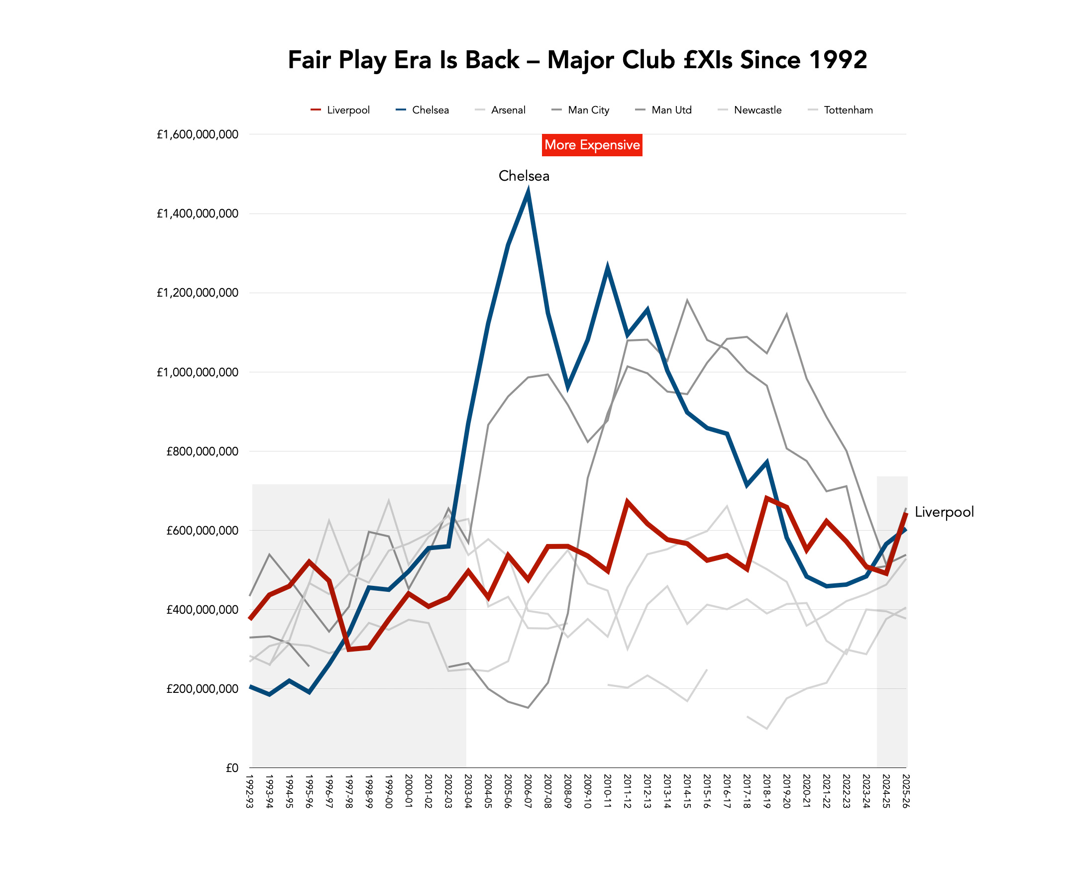
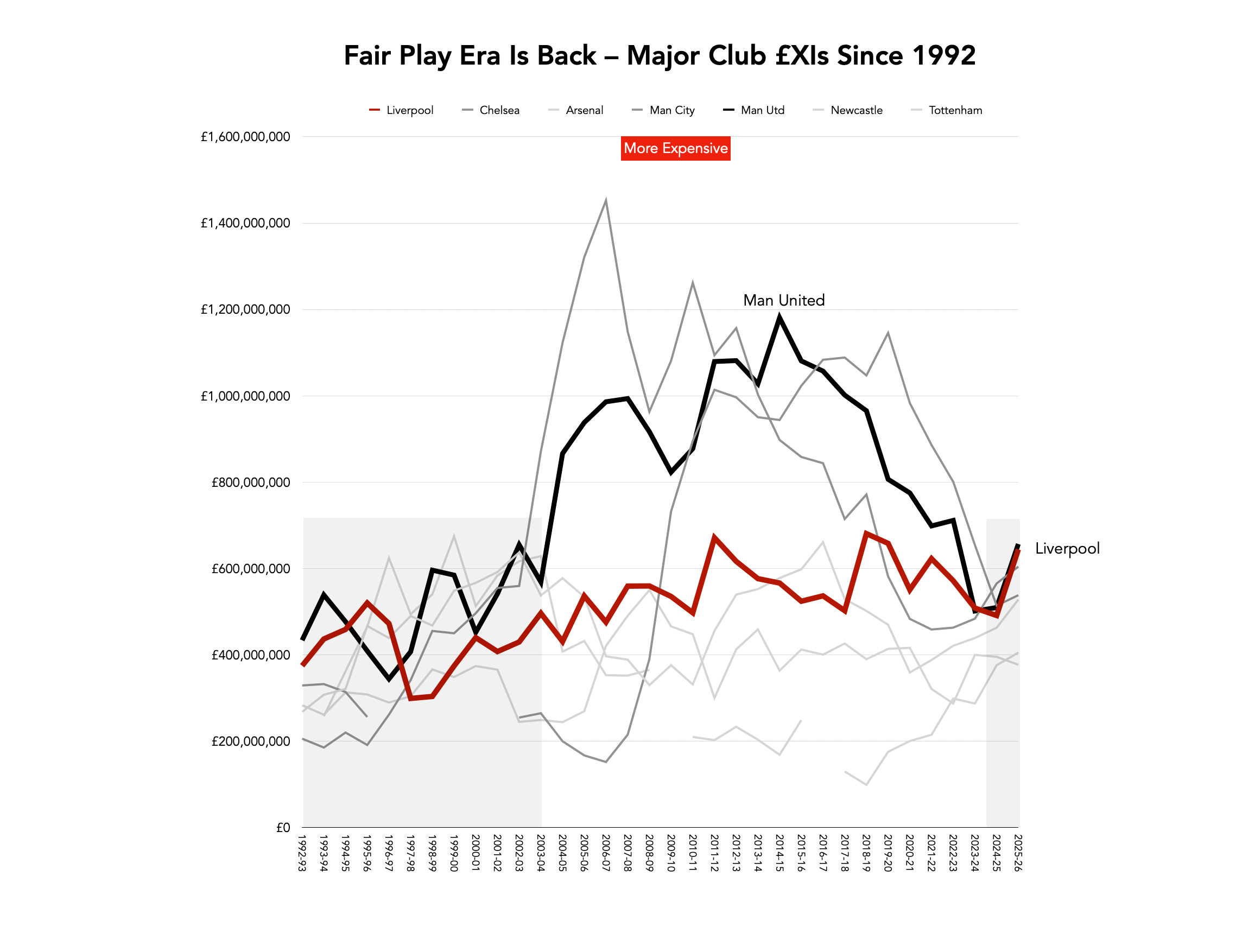
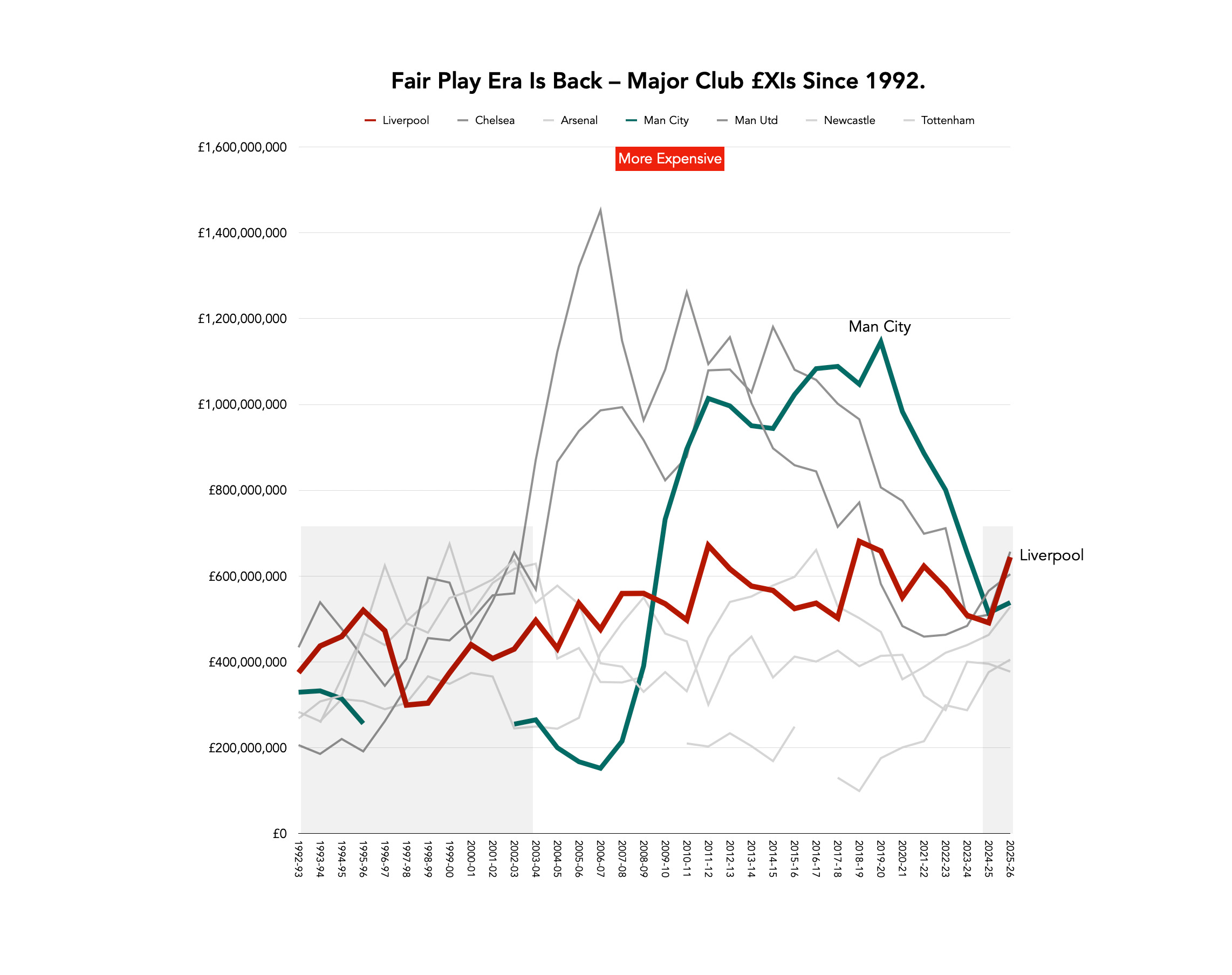
But you can see each individual peak, by 2026, ending up as more Ben Nevis than Mount Everest. All have pretty steep declines, once their super-expensive players aged out and moved on.
It ended up that only Man United had a costlier £XI than Liverpool in 2025-26, but Liverpool had the unquantifiable impact of the death of Diogo Jota, as well as a squad overhaul, whilst experiencing the common dip for league champions who are not used to winning it every year (as my recent research showed). Man United had their own (less drastic) overhaul, and change of manager that appeared to give them the kind of bounce you’d expect.
Chelsea’s £XI cost almost as much as Liverpool’s, yet they finished 10th, whilst Arsenal won the title with the 5th-highest £XI, but in a season where the financial gulfs had narrowed.
Had Man City had the leeway to buy three £100m+ players in 2025, as they’d done in the past (adjusted for inflation), then they might have regained the title, if those players had settled quickly (which itself is another issue).
That they didn’t have the financial power to do that anymore was good for the game; less good for City.
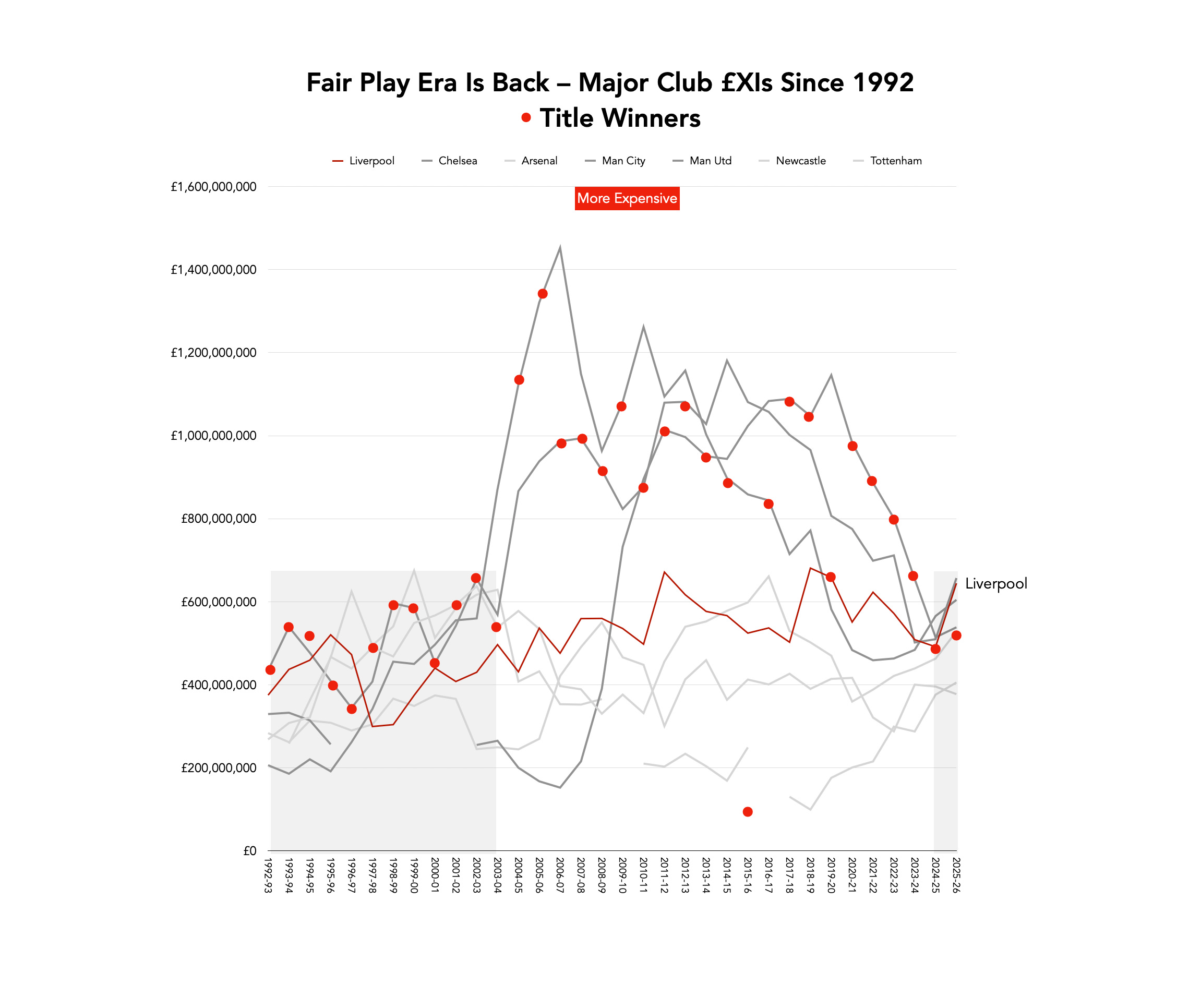
If you plot the titles as red squares on this graph, this is what you get; with the top graph including the lines for the clubs, and the one below designed to just plot the titles.
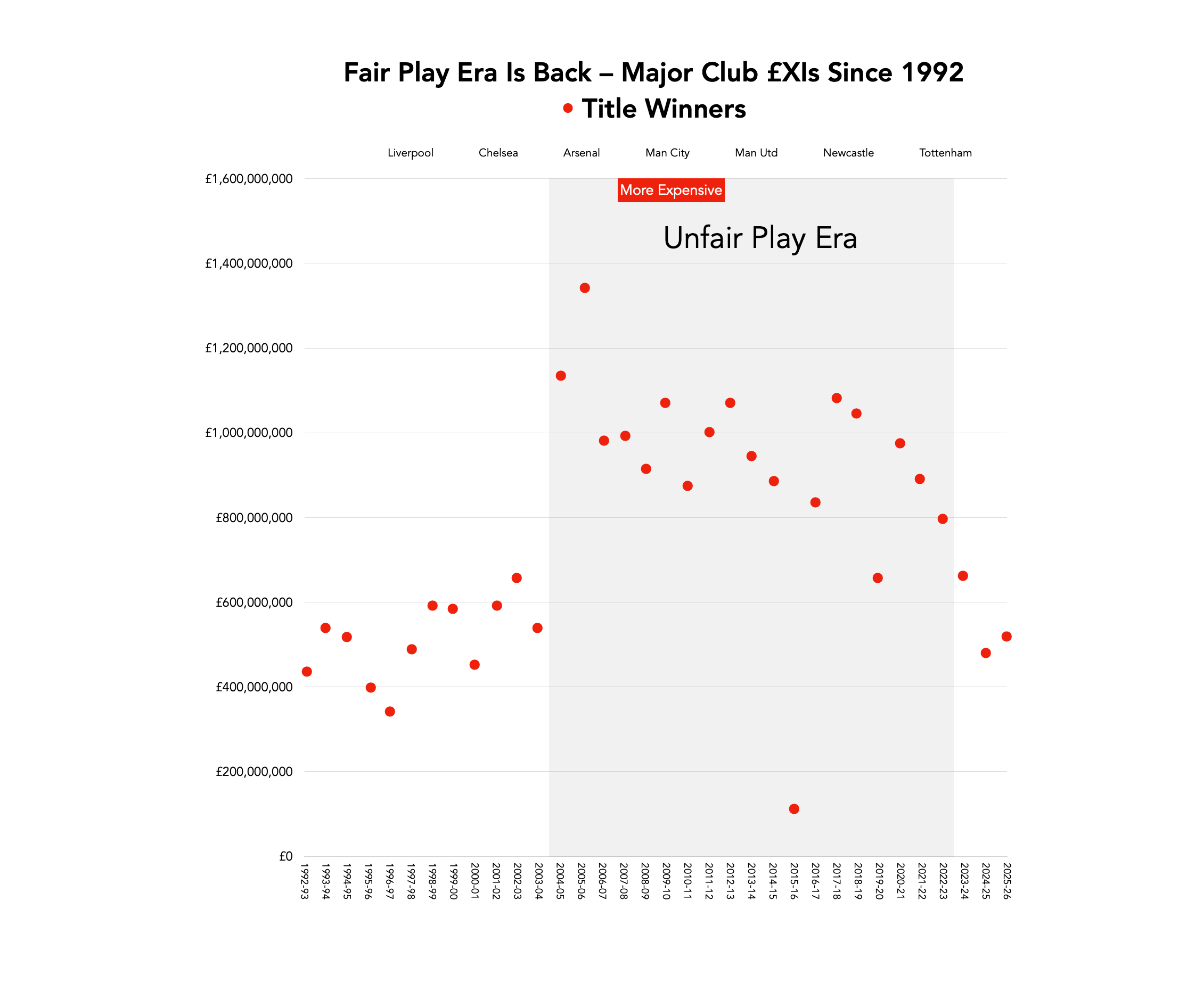
As with everything, ever, Leicester in 2016 makes no sense; but that’s why it was a 5,000-1 shot, and nothing remotely similar has happened since.
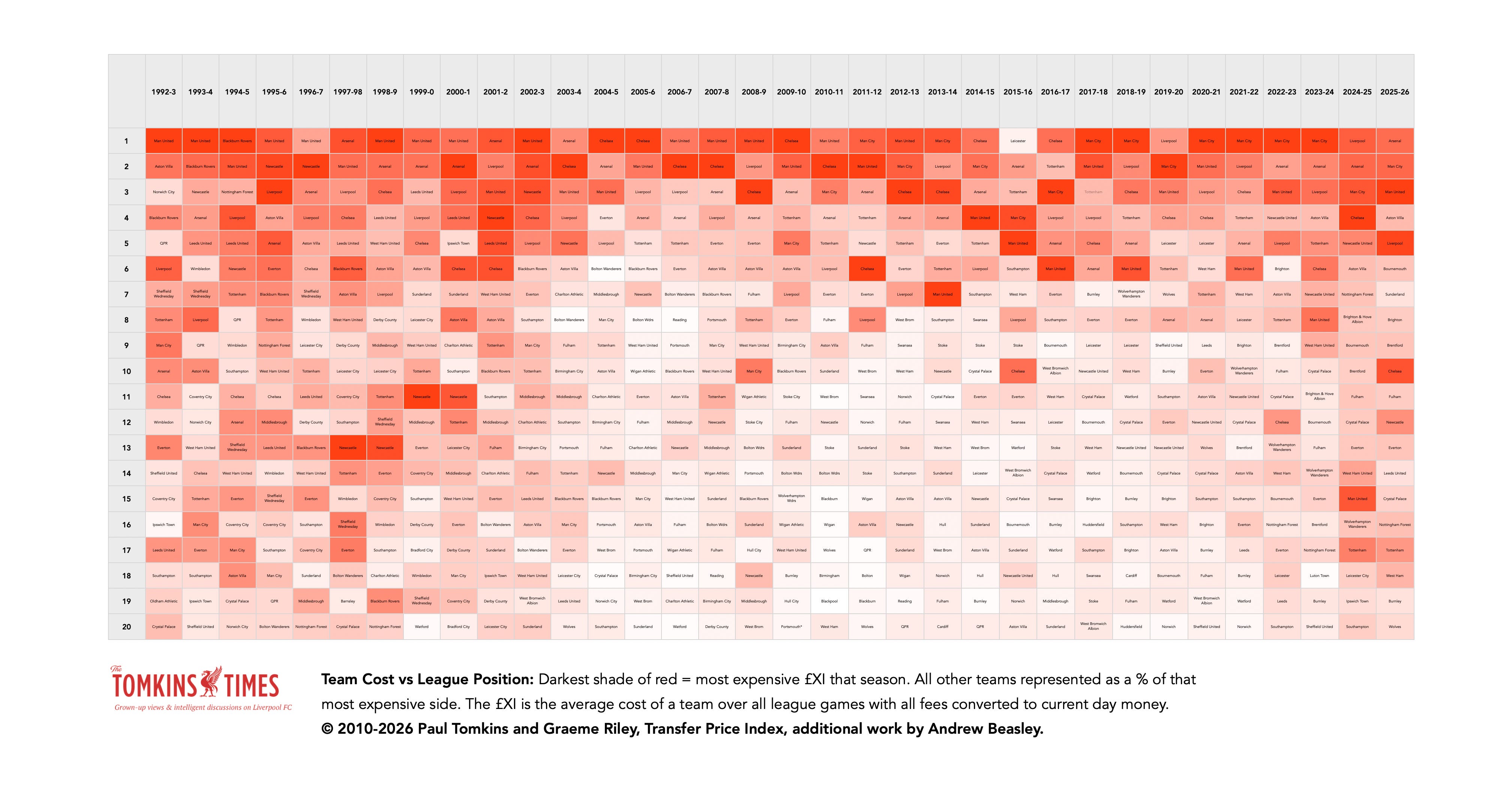
I first created this heatmap in 2010, and as well as being in the book ‘Pay As You Play’ it was reproduced in a major national newspaper.
This was a way of showing how, by 2010, most teams were operating on a fraction of the budget of the richest team; each team is shaded as a % tint of the 100% red of the costliest £XI.
So this is now updated, and correct up to 2026. Things actually got more extreme after 2010, and stayed that way for a long time.
I produced a version without the team names on too (below), to just show the patterns without the distracting black text that slightly dilutes the tonal impact.
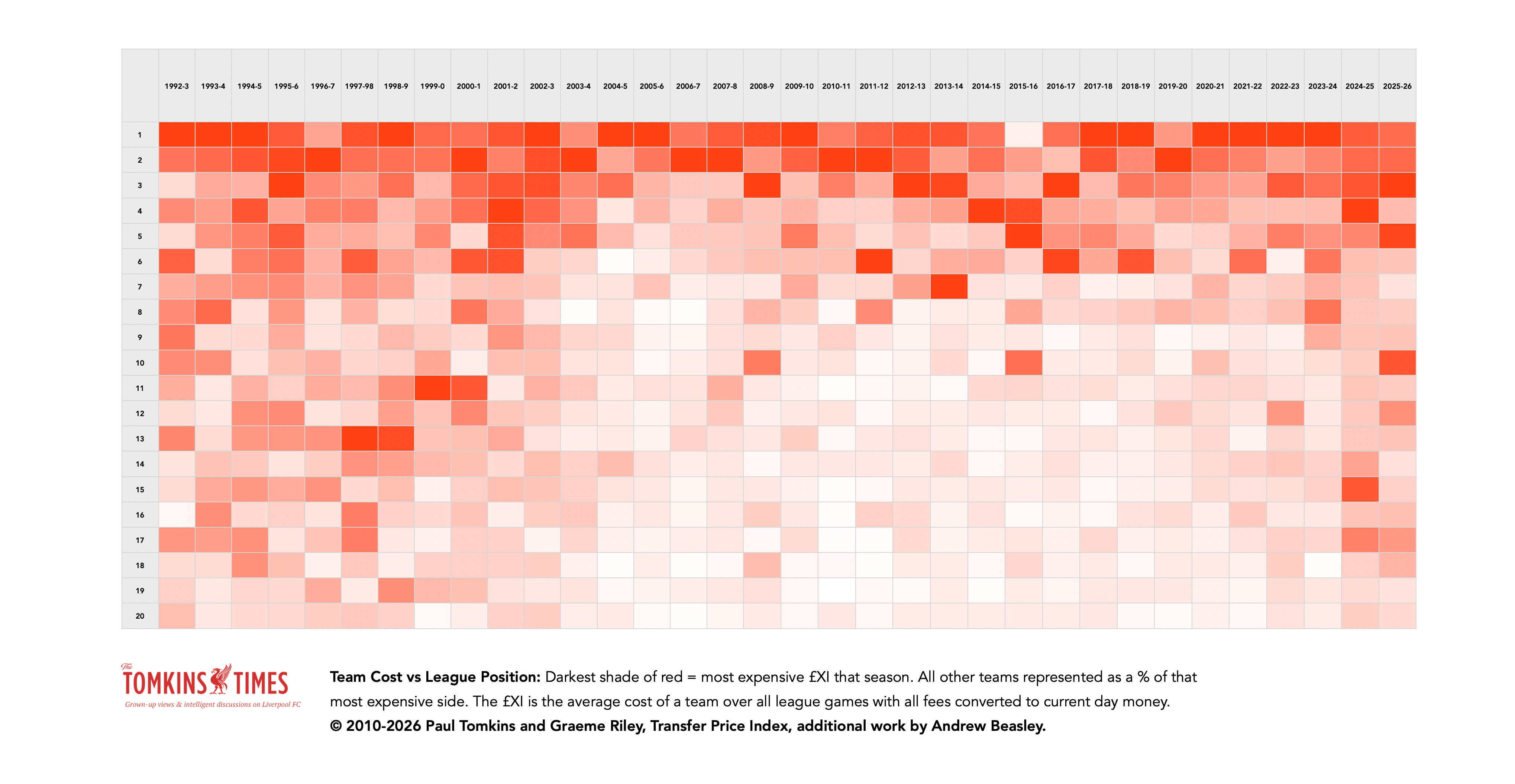
You can also see via this heatmap that 2024 marked an end to the massive gap between the richest and poorest, and how more costlier sides were slipping down the table, and doing so below the hitherto outlying ‘worst’ of 10th for Man City in 2009 and Chelsea in 2015.
Note also that, as it’s all relative, none of the teams are as ‘pale’ as in the past, with Luton the last such side, at just 2% the budget of Man City; while teams like Huddersfield and Norwich would be 3% or 4% the most expensive side.
Now the shade for Burnley is 17%, with the change due to promoted teams (and nearly-relegated teams) spending more money, and the significant lowering of the most expensive £XIs.
Leicester, at just 8% the cost of the most expensive side that season, stand out in the top three, let alone as title-winners. Again, zero sense; and Claudio Ranieri was sacked two-thirds of the way through the next season.
Based on r2 analysis, there’s a 53% relationship between spending and league position – when not grouped into bands. An r2 analysis is stronger when more of the data points are closer to the trendline – which in this case is a pretty strong 45º rise in line with more spending making it onto the pitch equalling more points.
Obviously there will always be lots of underachievers and lots of overachievers, who fall well below or well above the norm; but the trendline still shows that the the more you spend, the higher your points tally, on average.
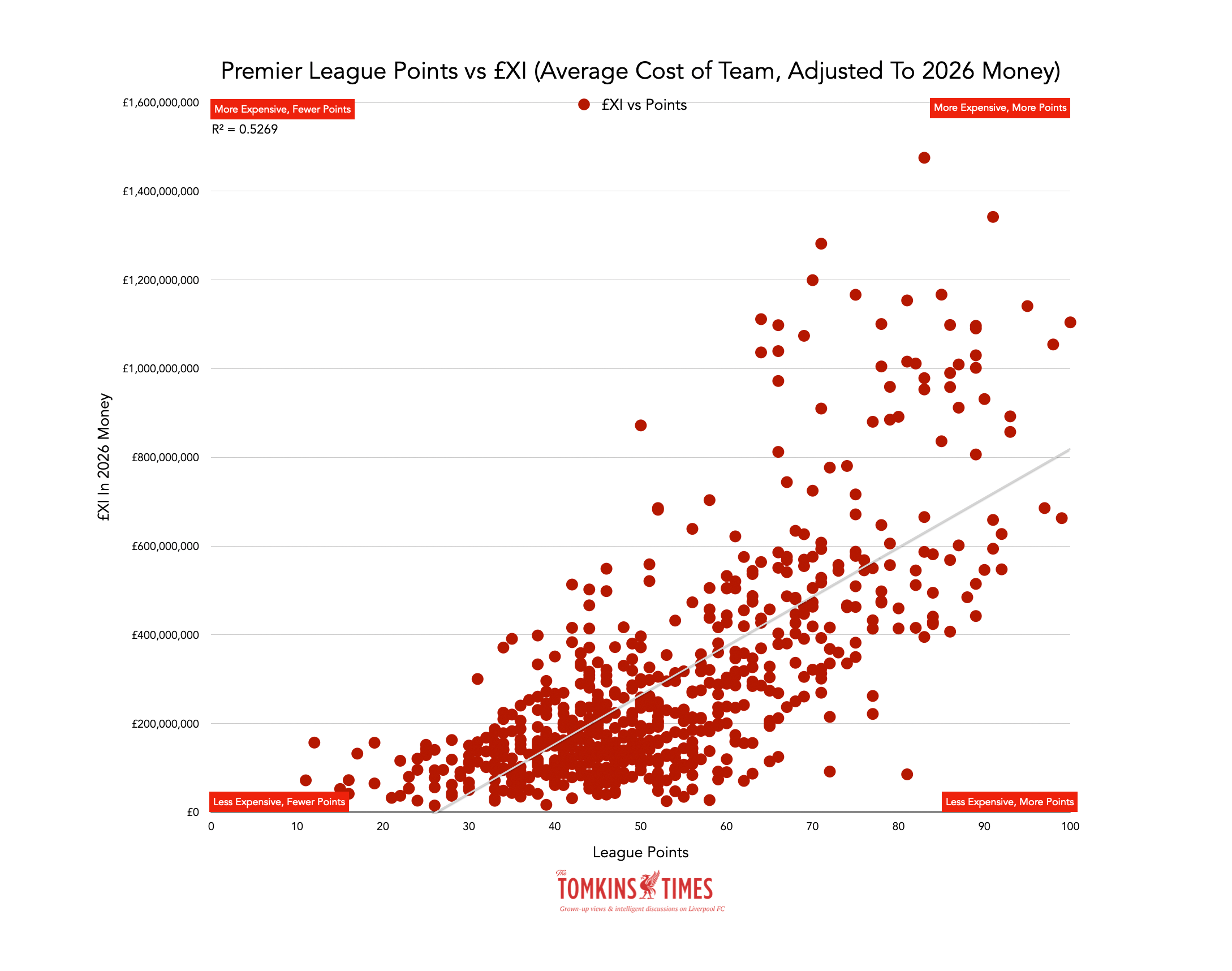
I googled the strength of the correlation and the result came back as: “General Benchmarks: According to conventions by ResearchGate and Cohen’s guidelines, 0.53 generally falls into a moderate to substantial effect size.”
You can also see that the left-hand side of the scatterplot is mostly empty above the £200m-mark.
No team with an £XI of more than £800m garnered fewer than 50 points, so if nothing else, spending close to a billion on players who make it onto the pitch guarantees the lack of a relegation fight.
Meanwhile, a £1billion £XI guarantees you 60 points on the evidence so far.
Which is obviously not what anyone with a £1bn team is hoping for, but again shows the insurance, and no mega-team can mega-flop in a dangerous way.
On the same scatterplot I’ve added some of the team names.
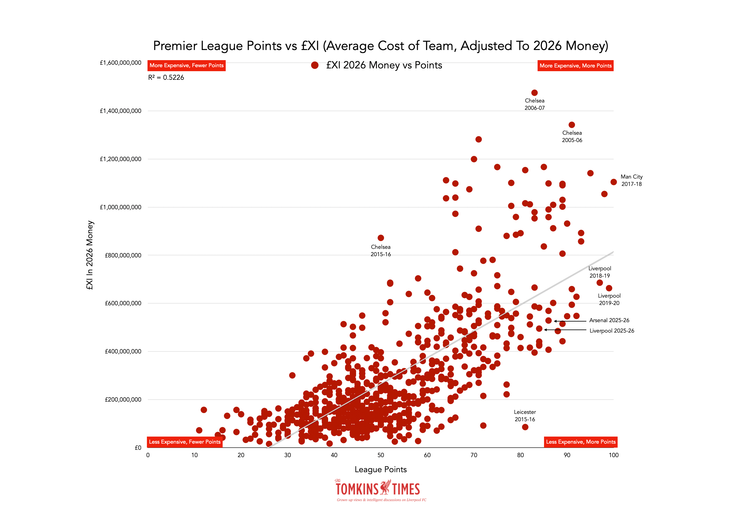
Because of individual seasons of under- or over-achievement, the model’s r2 says 53% correlation.
However, when averaging out every league position between 1992 and 2025 (but updated to 2026 money), and how much the £XI cost, there’s a 90% correlation between how costly the team is and where it finishes. The averages ‘even out’ all the outliers.
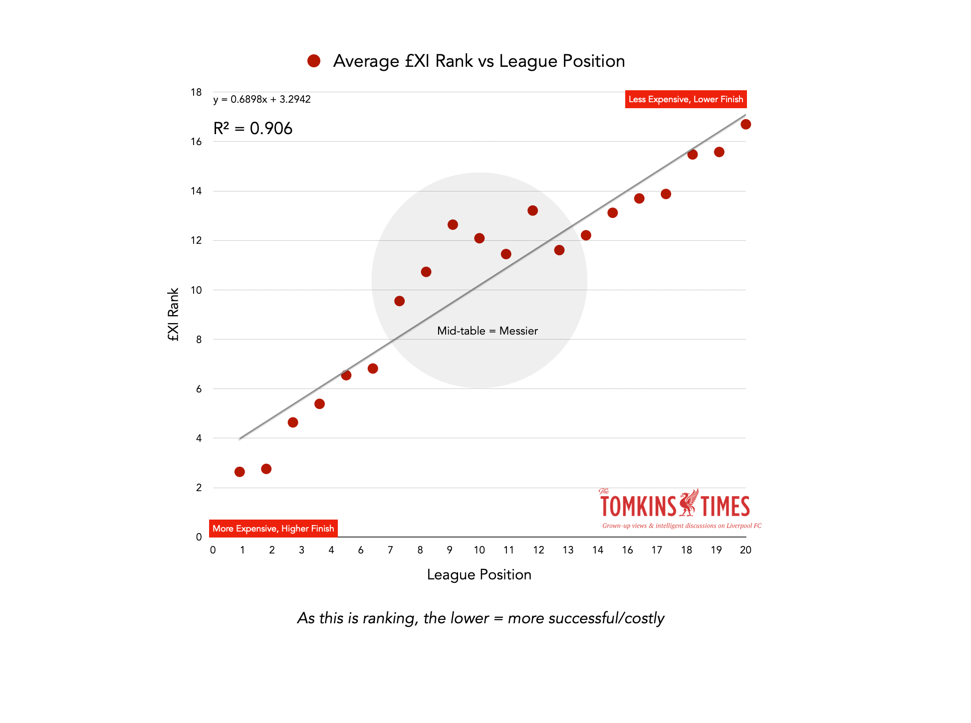
When taking away ‘mid-table’ – positions 7-12 – the r2 value rises to 0.993, or 99.3% correlation.
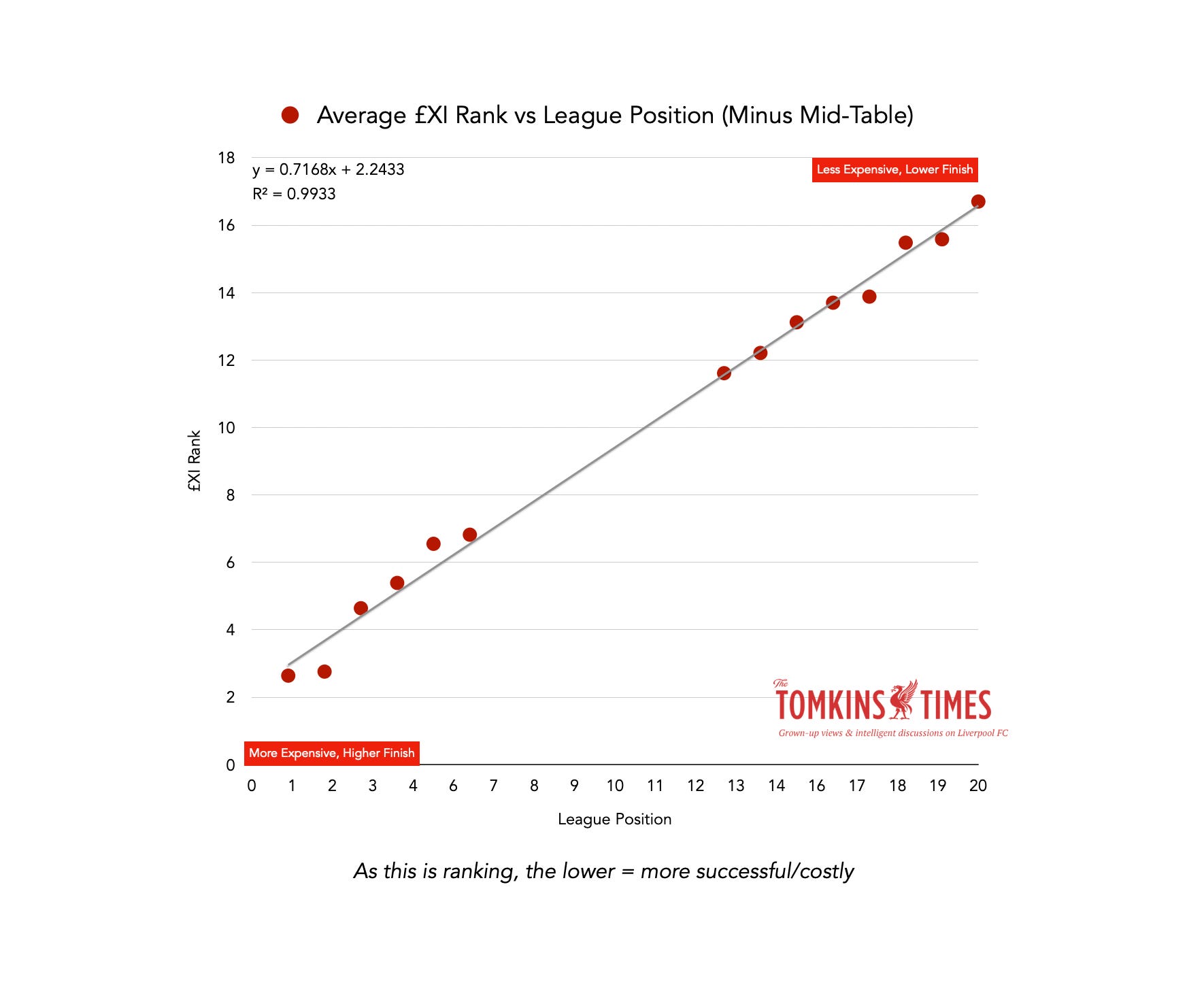
(Mid-table is perhaps, logically, the only part of the table where teams can both overachieve and underachieve. As top spenders you cannot easily overachieve by much, and at the bottom on spending you cannot easily underachieve by much.)
While there is a correlation between squad cost, the relationship is stronger when looking at who made it onto the pitch.
Between positions 1st and 9th, only 6th bucks the trend of not being lower than the previous higher position (and 1st, as there’s nothing above 1st; above us only sky).
All these trends will vary from season to season in terms of how close they follow the model, but these are 34-year averages.
It’s a bit like saying that, on average across the 55 Olympics, the fastest sprinter will win the 100m – but that in any individual Olympics, he or she might not win the gold.
If Usain Bolt, at his peak, snapped a hammy after 20 yards, he won’t have been champion; and in football, there are far more moving parts to rely on. Anything can go wrong; but on average, the best will win out.
And so in football, the costliest team in any given seasons averages 1st place in the rankings when combined with the other 33, but the costliest may finish 3rd, as Man United did in 2026.
Liverpool
Liverpool’s £XI was competitive in the 1990s, even with so many ‘free’ homegrown players, but relatively speaking, fell away badly in the 2000s, once Chelsea upped the ante.
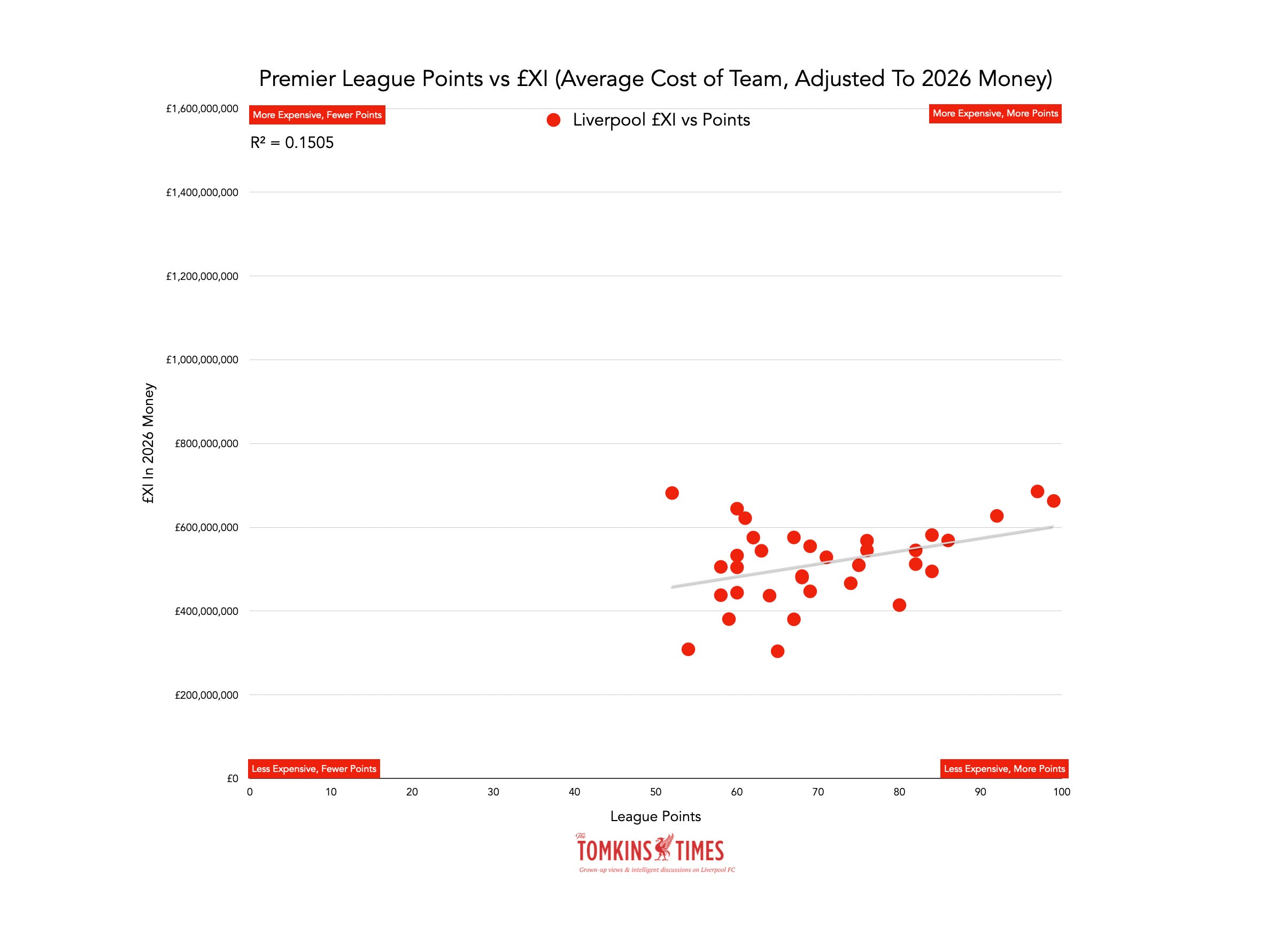
Over time it hasn’t changed dramatically, and has yet to ever pass the £700m mark in 2026 money, when the peak for other clubs has been close to £1.5billion.
Due to some expensive underachievement and some less expensive overachievement, the model’s r2 suggests that it only explains 15% of the Reds’ points tallies. Liverpool tend to have good and bad seasons irrespective of what the team costs, but Jürgen Klopp’s two best seasons were with expensive teams by the Reds’ standards.
Chelsea
The model’s r2 suggests 50% of Chelsea’s points tallies are down to spending, albeit the more recent underachievement makes it a bit of a mess. A lot of the failure to correlate is due to seven seasons where the points tallies were well below (to the left) of their average line based on the cost of the £XI.
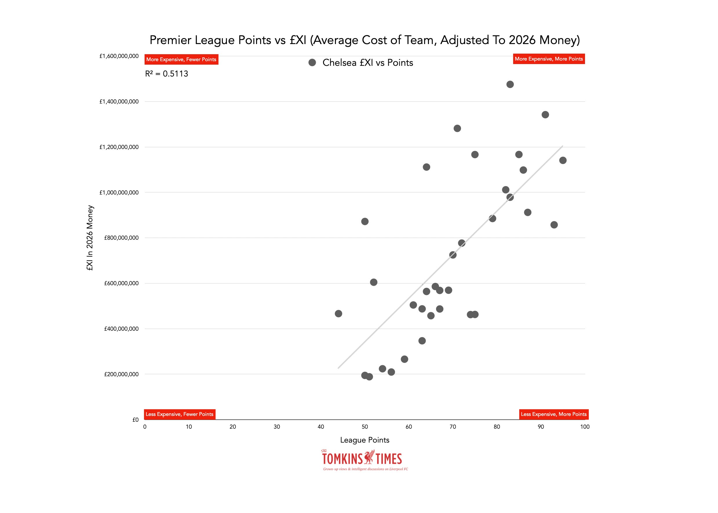
You can probably tell which was pre-2003 Chelsea and post-2003 Chelsea based on the scatter. They still have the three most-costly £XIs ever, with one of those being 2010-11, the year before they won their first Champions League title (albeit the £XI is league games only, but it shows their financial power even up to 2012).
Man City
For City, it’s super-clear when they got rich; a cluster of smaller, pre-investment seasons at the bottom, and everything since above £500m and 60 points.
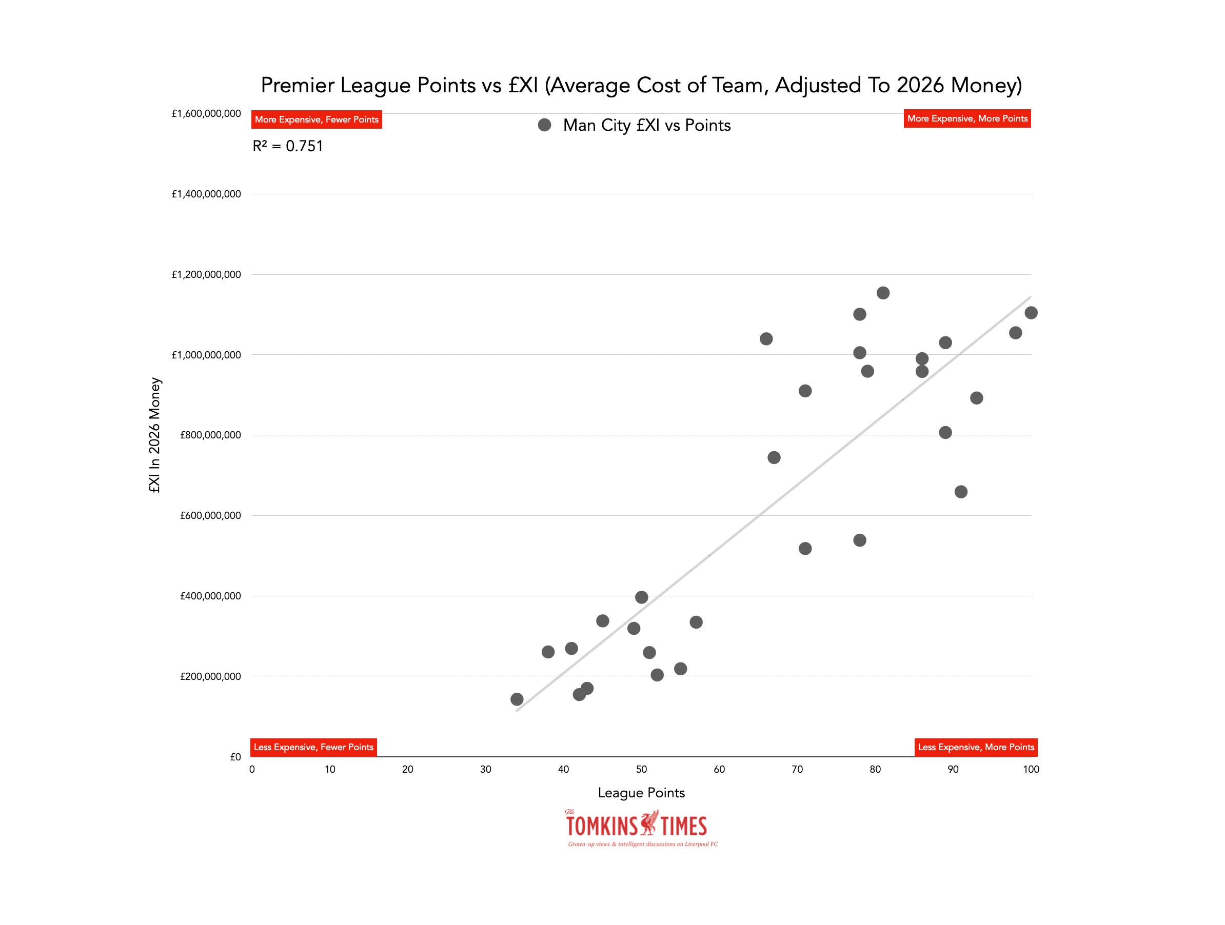
As such, the model suggests it is 75% reflective of spending, according to r2.
In other words, City weren’t much good before they got rich; then, when they got rich, they got good, and have mostly stayed very good, if not always excellent. When their £XI was at its highest they were at their best. As their spending has been slowed, the team has been less impressive, even if still comfortably in the top four.
But even good teams will have below-par seasons, and the model will never be 100% with such little data. No matter what your team costs, things can still go wrong, or go right, with luck always a huge factor in sport. The better teams and sportspeople can mitigate luck by just being so damned good; but they remain human, and fallible.
Man United
For Man United, there seems to be literally zero correlation between spending and success, as that relationship was scuppered after 2013.
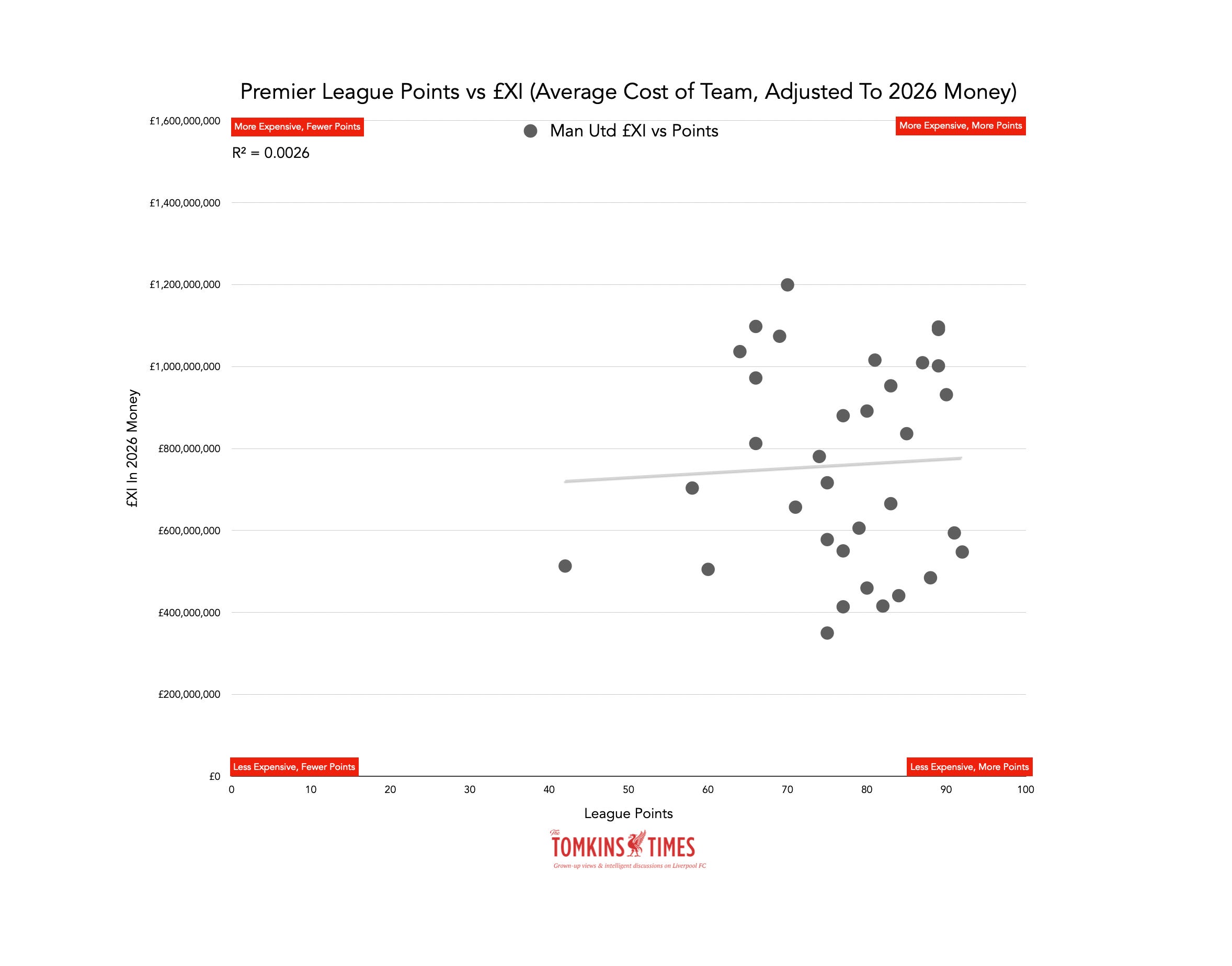
Ferguson had success with very expensive teams for the time, but also some less expensive teams (due to the class of ’92, etc.). Since then, United have generally spent a lot of money for not very many Premier League points.
In 2025-26 they were top of the £XI pile again, but finished 3rd with just 71 points; an improvement on the near-relegation form with a c.£500m team a year earlier.
Arsenal
Arsenal’s £XIs and points tallies are similar to Liverpool’s, in terms of a lower clustering (17% relationship).
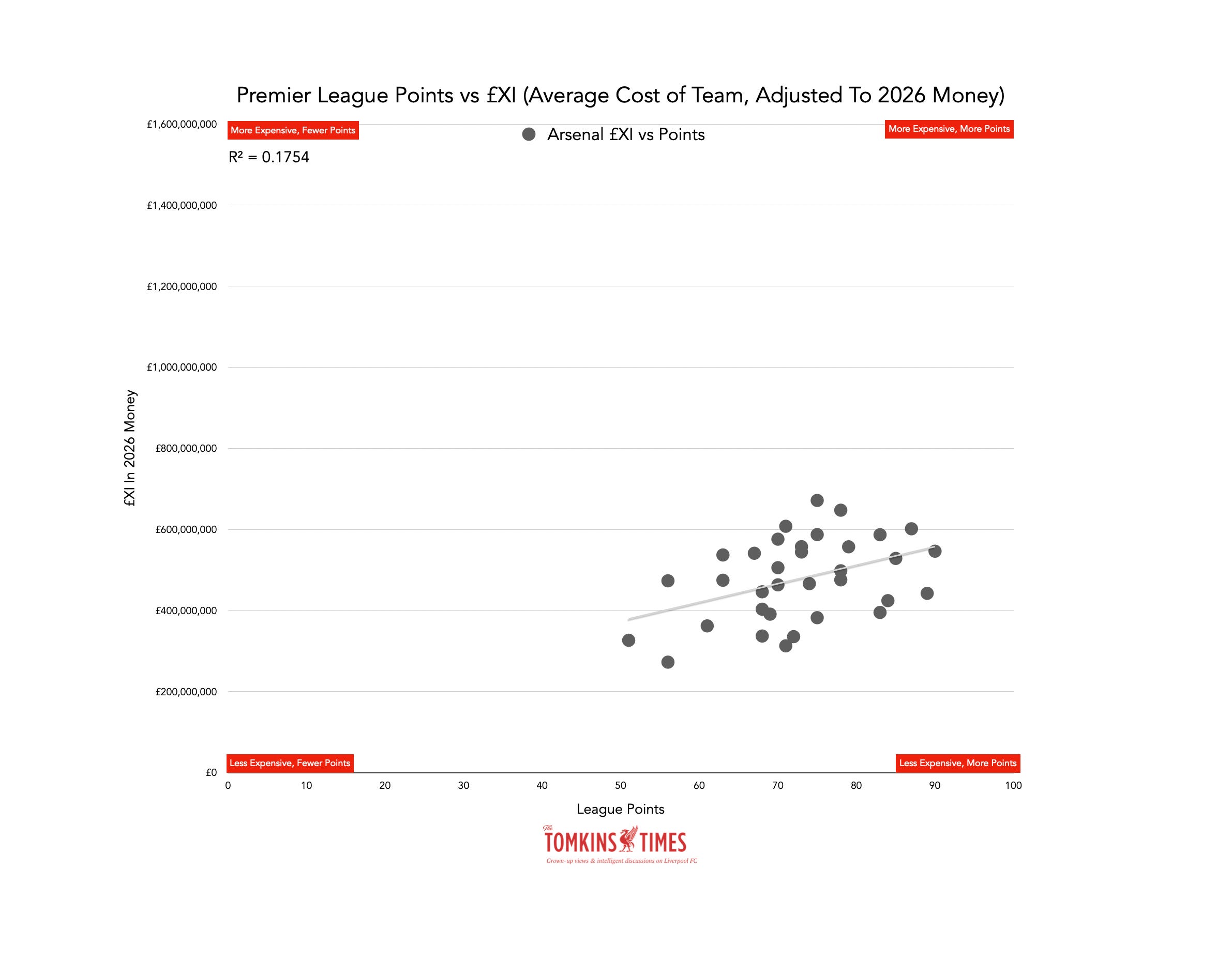
Liverpool’s and Arsenal’s graphs represent what steady, non financially-doped team-building looks like. Both clubs may have bought expensive players, but in isolation rather than right across the whole squad.
Liverpool vs Chelsea
If you compare Liverpool and Chelsea, you can see how much greater the London club’s £XIs have been since the mid-2000s.
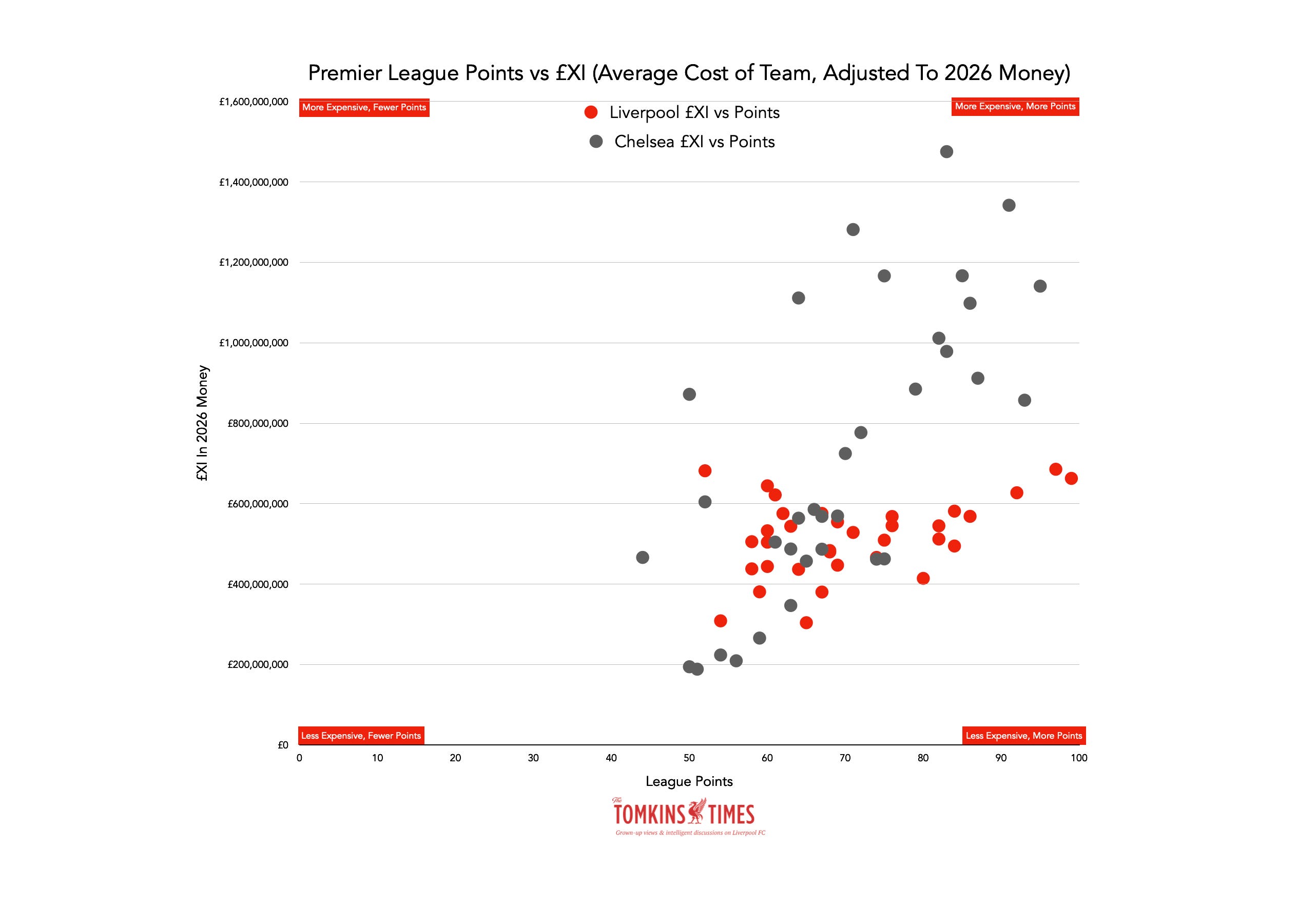
To date, 16 Chelsea £XIs have cost more than the costliest Liverpool £XI. But their starting point was to have four lower than Liverpool.
As with all the Big Six, the gaps have closed, and the summer of 2026 seems to suggest that while some clubs may spend big, it won’t be enough to have them really pull away from the rest in terms of squad cost and £XI.
Liverpool vs Man City
City’s £XI has not been more expensive than Liverpool’s to the same extent, but it’s still 14 seasons with a more costly £XI – a run of consecutive seasons that ended in 2025-26.
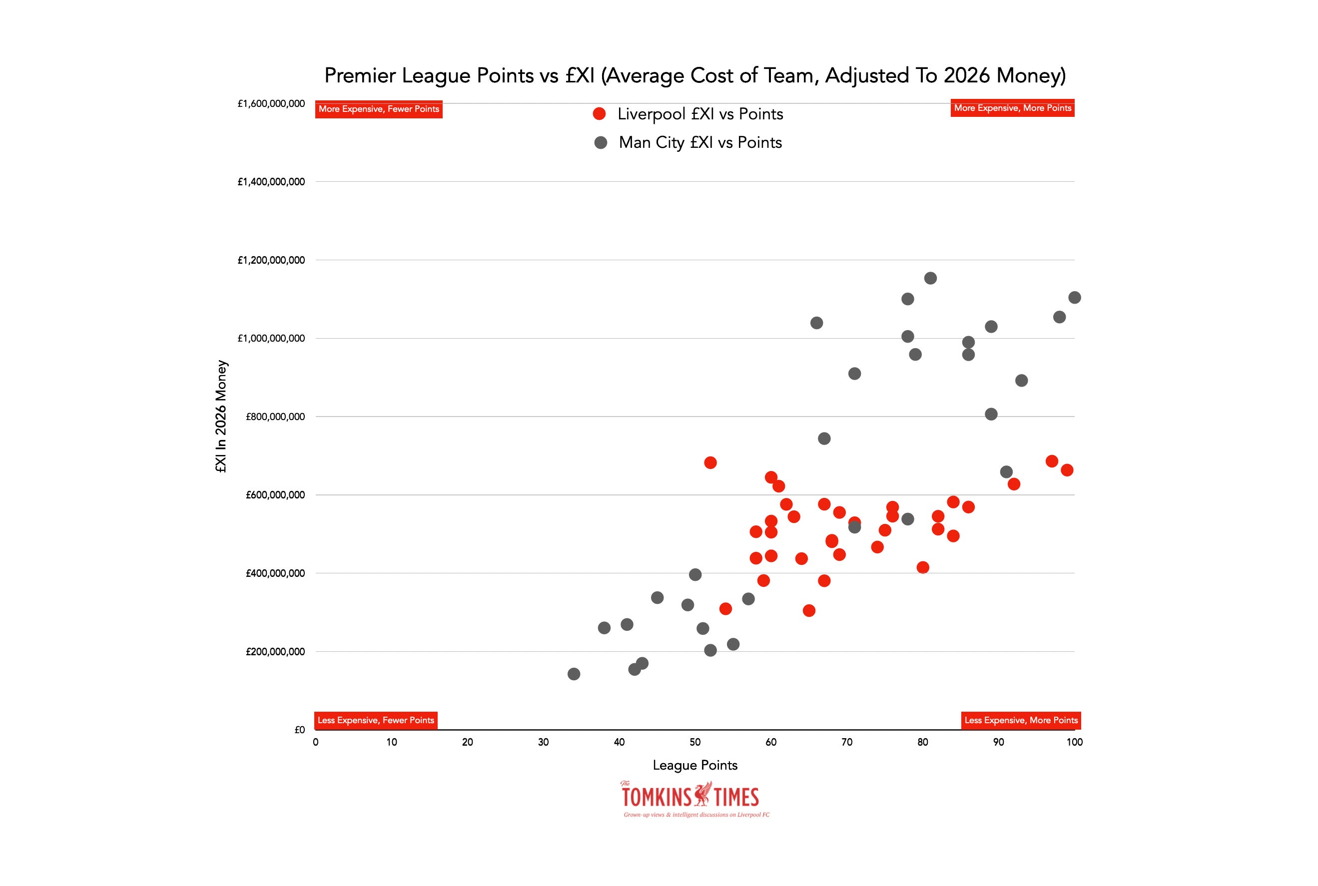
Again, like Chelsea, you can see their low-cost, low-points seasons at the foot of the graph, and City weren’t even in the Premier League every season.
Clearly the title winners will be to the right of the scatter, given that that’s where it gets up towards 100 points.
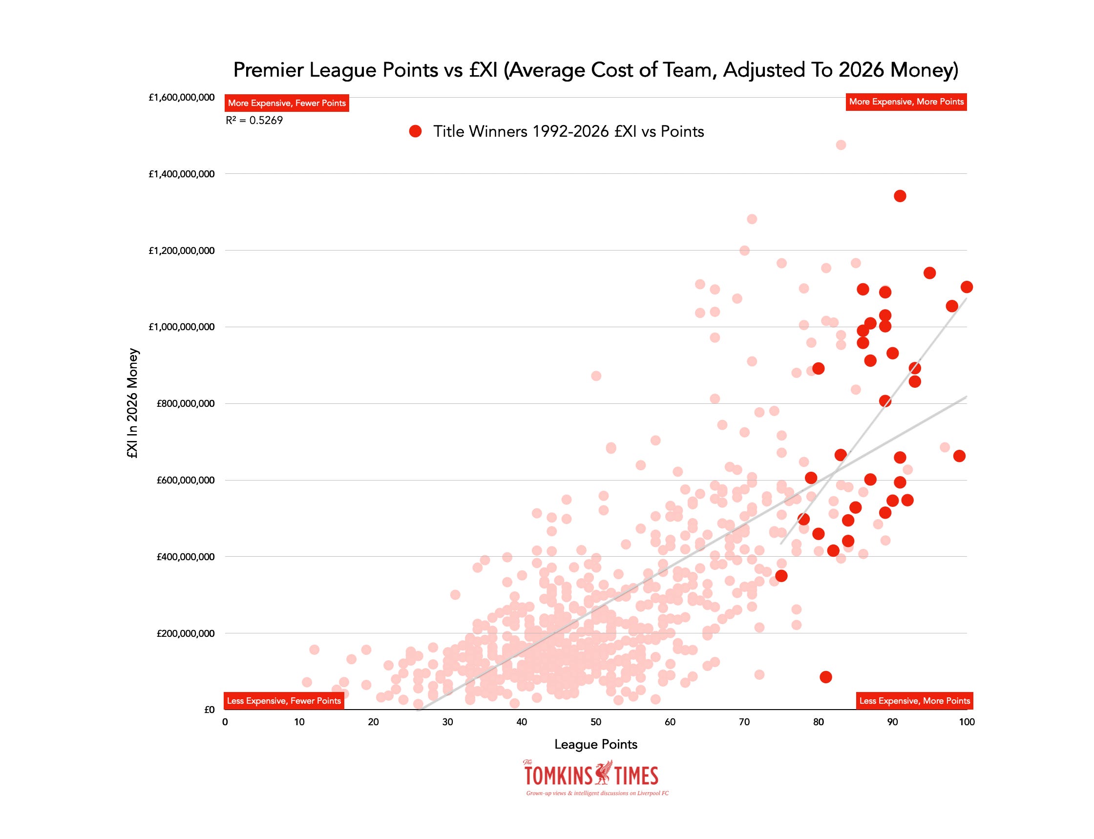
You can see that only two of the 34 champions since 1992 have had an £XI under £400m (as ever, adjusted for football inflation).
Let’s look at the winners since 2004-05:
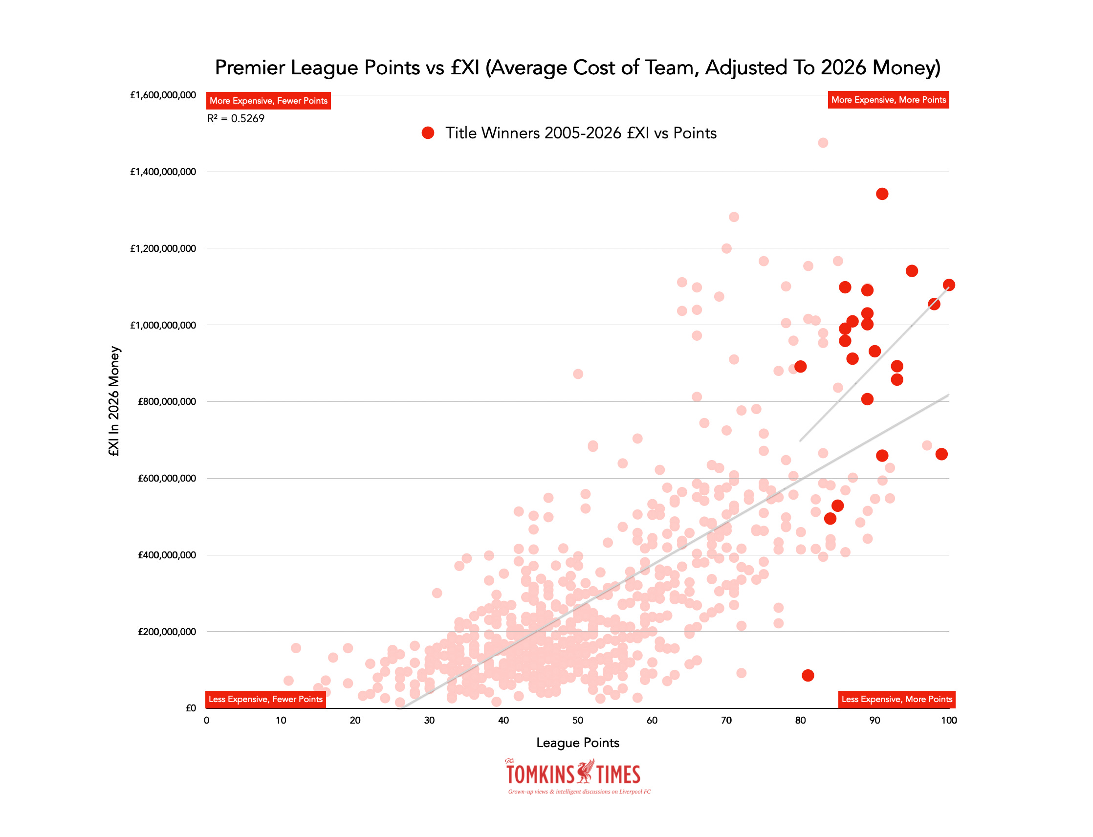
Looking since 2004, you can see that now there are only three of the 22 title-winners below £600m (and just five below £800m), and two of those have been in the last two years.
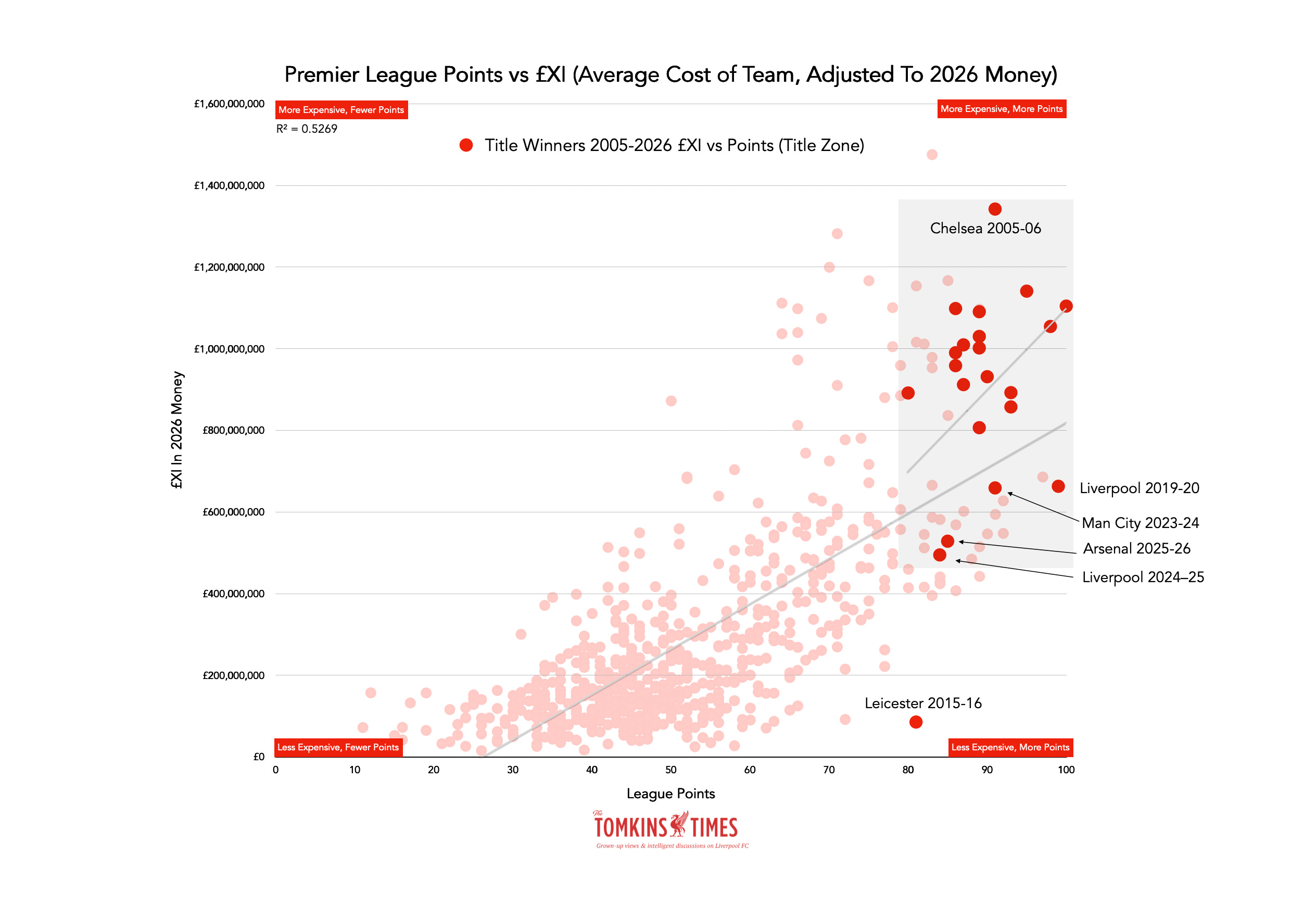
‘The Title Zone’ for the last 22 seasons now starts at a minimum of around £500m, if you exclude Leicester. (Always exclude Leicester. As their success remains utterly illogical, if glorious.)
It seems likely to me that the 2026-27 champions will be more expensive than Arsenal and Liverpool’s recent £XIs, and more expensive than the #1 last season, Man United.
Big clubs are adding big signings, but what might not get noticed, also losing historical big signings; so Man City are spending over £100m on Elliot Anderson, but have lost the £100m+ John Stones for free (not that he contributed to much of 2025-26’s £XI.)
However, it feels like the £XIs should still creep up a bit, barring lots of injuries. As things stand, the average cost of a Premier League football is set to rise, yet again.
If key players stay fit, Arsenal are likely to increase their £XI this season, as are Man City and Man United; albeit their older expensive defenders, Harry Maguire and Luke Shaw, at over £100m each in 2026 money, may age out.
Liverpool’s £XI increased last season, but not as much as it would have had Alexander Isak been fit for more than a few games; plus, there was the issue of a squad rebuild, with time the other factor – it’s not just money. (And that’s before the grief of losing Diogo Jota.)
Liverpool’s own two expensive ‘defensive’ players are Virgil van Dijk and Alisson, both over £100m in 2026 prices. Each should feature in the best XI in 2026-27, but each is in the final year of his contract. Those two players alone often tend to account for about a third of Liverpool’s £XI, but that could change if the rest of the Reds’ costlier players start.
Whilst Liverpool did it twice last summer, other clubs are spending around £120m on single players, with Elliot Anderson and Morgan Rogers moving to Man City and Chelsea respectively. At the time of writing, Liverpool could be doing so again with Bradley Barcola.
It seems unlikely that any £XI will be even close to £1billion, when Chelsea were at around £1.5billion for a while two decades ago. While Chelsea still spend big, they also have to sell a lot as well; and other clubs can compete better, including those used to being mid-table.
Spurs are an interesting one to watch, but I’ll analyse all the likely £XIs just before the season starts, and again if necessary when the transfer window closes.
You can see all 34 Liverpool £XIs here since 1992, set against the background of all other £XIs. Clearly the cost is above the majority of teams, as are the points tallies, but the £XI has yet to break the £700m barrier in 2026 money.
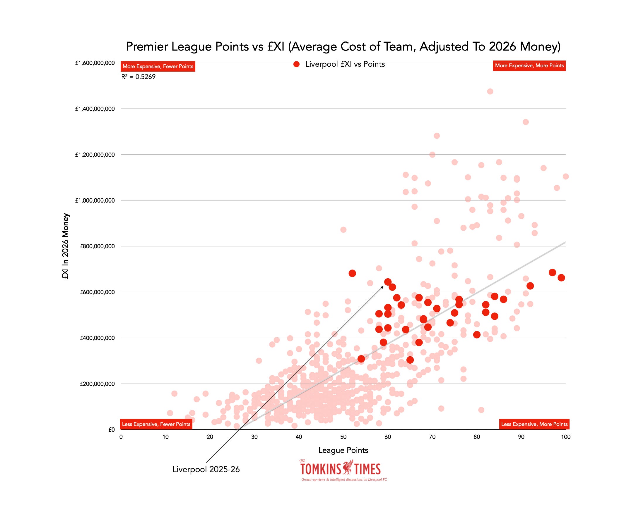
Liverpool had only had four £XIs costlier than in 2025-26, but obviously the issues that arose were not something you can account for with money.
Another way to see how teams are closer together or spending is the scatter where last season’s 20 teams are highlighted.
In this scatterplot you can see how there are no big £XI outliers, nor any scraping the bottom.
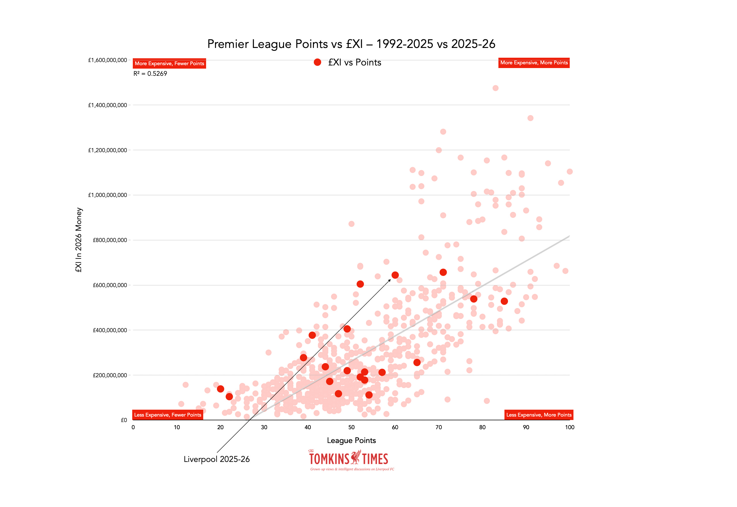
However, five clubs had vaguely similar £XIs, starting with Chelsea on 50 points, then Liverpool on 59, then Man United, Man City and finally Arsenal, as champions, with 86.
For Liverpool fans, it’s worth looking at the £XIs for the top six in the past 20 years, to show how Andoni Iraola’s Bournemouth fared.
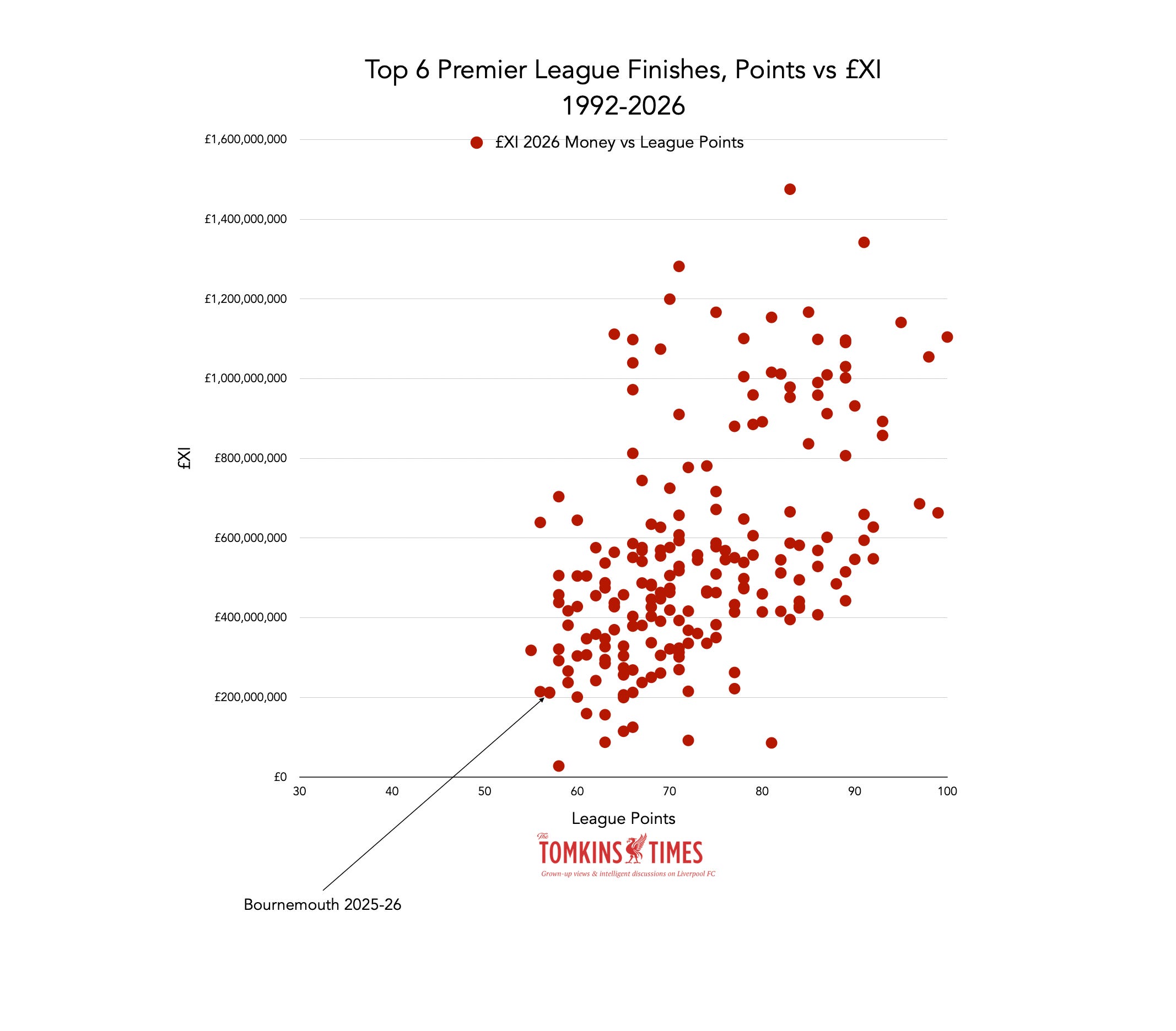
In a very compressed and ultra-competitive league, 57 is actually the fewest points to finish in the top six in the past two decades, but only four teams have been cheaper since 2006 when edging out some of the Big Six .
Prior to then, in the most equitable era, it was easier to fly to the top with less spending. Now, even though it’s an equitable era again, the superclubs still tend to dominate most of the top six space most years.
It remains an excellent achievement by the Cherries, given the quality of the league as a whole in 2025-2026, and so 57 points is actually better than getting 65 points in a league where there were 12-14 poor-to-rubbish teams who could be easily beaten.
So, that’s it for this piece. I hope it all makes sense. As ever, money is not everything; but it explains a lot of success over time; less so in any one specific season.
In another article I will look at five-year trends in spending and performance. I’ll also look at the latest squad costs when adjusted for inflation, and estimate the likely £XI tallies for the season ahead, once a few more transfers have been completed.
Thanks for reading The Tomkins Times - Main Hub! This post is public so feel free to share it.
Comments
Nothing yet. Say the first thing.
Sign in to join the conversation.