
There is nothing we love more at TG than space planning. Few things are more satisfying than walking into a home and instantly realizing that it’s not the house that’s failing the family - it’s the layout. And sometimes, one strategic shift (simple in theory, less simple on the GC’s estimate) can completely transform not just how a space looks, but how life happens inside it.
Enter this adorable townhouse in Chappaqua, NY, with our adorable client and her adorable boys.
This project felt especially personal because we’ve known her forever - truly forever, back when we were design babies ourselves. She works in marketing within the design industry, and I think we first met sometime around 2011. After unexpectedly losing her husband, she decided it was time for a fresh start and a new home for herself and her young sons. We were incredibly honored when she called us to help shape this next chapter.
She had us weigh in on this house before she even made an offer. Before falling for finishes or furniture placement, she wanted to know the bigger question: Could this home actually become what she needed it to be? And from day one, the mandate was crystal clear. She kept saying she wanted the townhouse to feel like a jewel box (which she said in her perfectly adorable Southern accent) - layered, charming, intimate, and full of personality. We immediately understood the assignment.
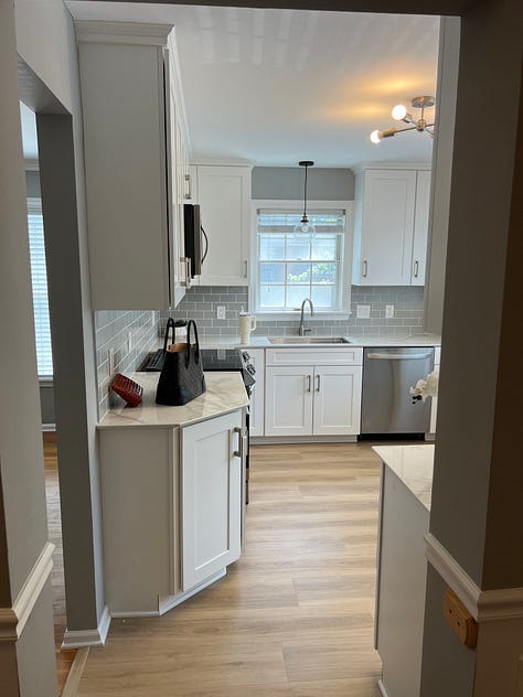
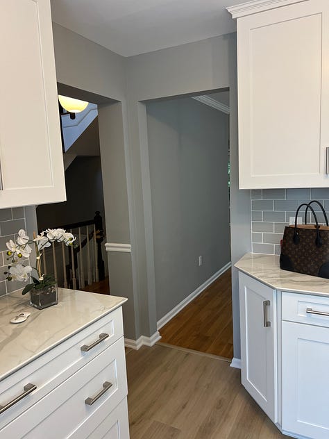
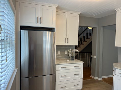
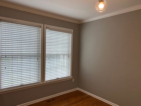
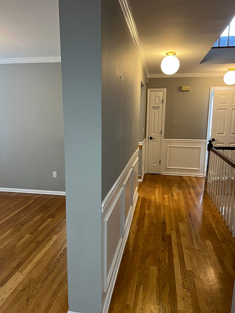
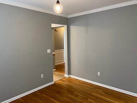
Initially, she told us the kitchen simply needed a facelift and an extra run of cabinetry under the window. It wasn’t bad, exactly. Just painfully builder grade. But the second we walked through the house, we knew the issue ran deeper than finishes. While we are famously pro-enclosed rooms and anti–wide-open-floor-plan at TG, that tiny enclosed kitchen was starving the house of flow and light. And worse, it made you feel claustrophobic in the kitchen, which is supposed to be the hub of the home. Still, knocking down the wall between the kitchen and the combined living/dining area wasn’t the answer either. That would have left us with one giant room - and giant rooms do not say jewel box.
Then there was the mystery of the awkward partition wall between the staircase/hallway and the living space. It just… stopped. No trim. No header. No architectural reason for existing whatsoever. The kind of thing that makes you tilt your head and wonder if someone simply gave up halfway through.
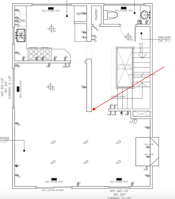
Because space planning is our love language, we developed three layout options. Each one solved the same core issues: absorb that strange floating wall into something intentional, enlarge the kitchen, and, most importantly, combine the kitchen and dining spaces. Creating one hardworking family hub meant carving out room for real life: homework spread across the table, puzzles in progress for days, boys hanging around while mom cooks, all the little moments that actually happen in a house.
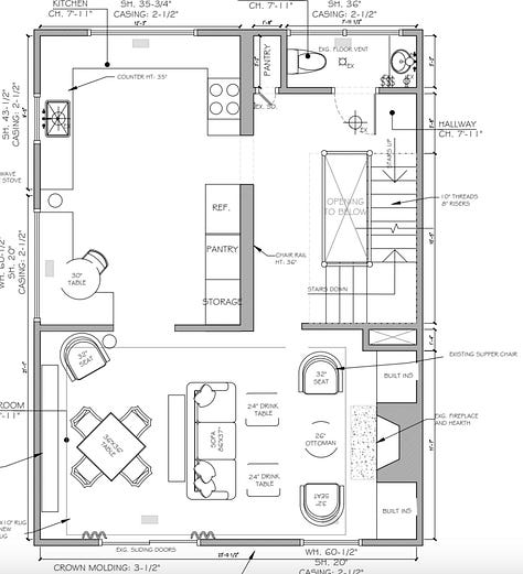
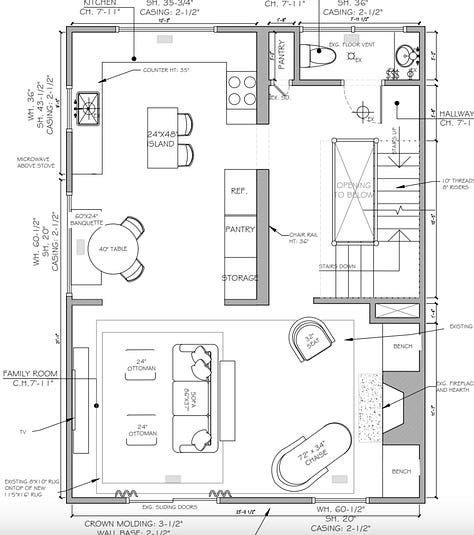
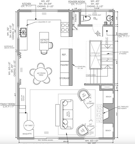
All three layouts were strong contenders, but we ultimately landed on Option One - the one with the sweet corner banquette. It tucks perfectly into the corner and instantly creates that cozy, gathered feeling we were after. The run of tall cabinetry opposite it - with a paneled refrigerator and concealed storage - almost reads like its own room. It softens the utilitarian side of a kitchen and makes that area feel far more layered and furniture-like. We even managed to sneak in a petite island for extra prep space and storage.
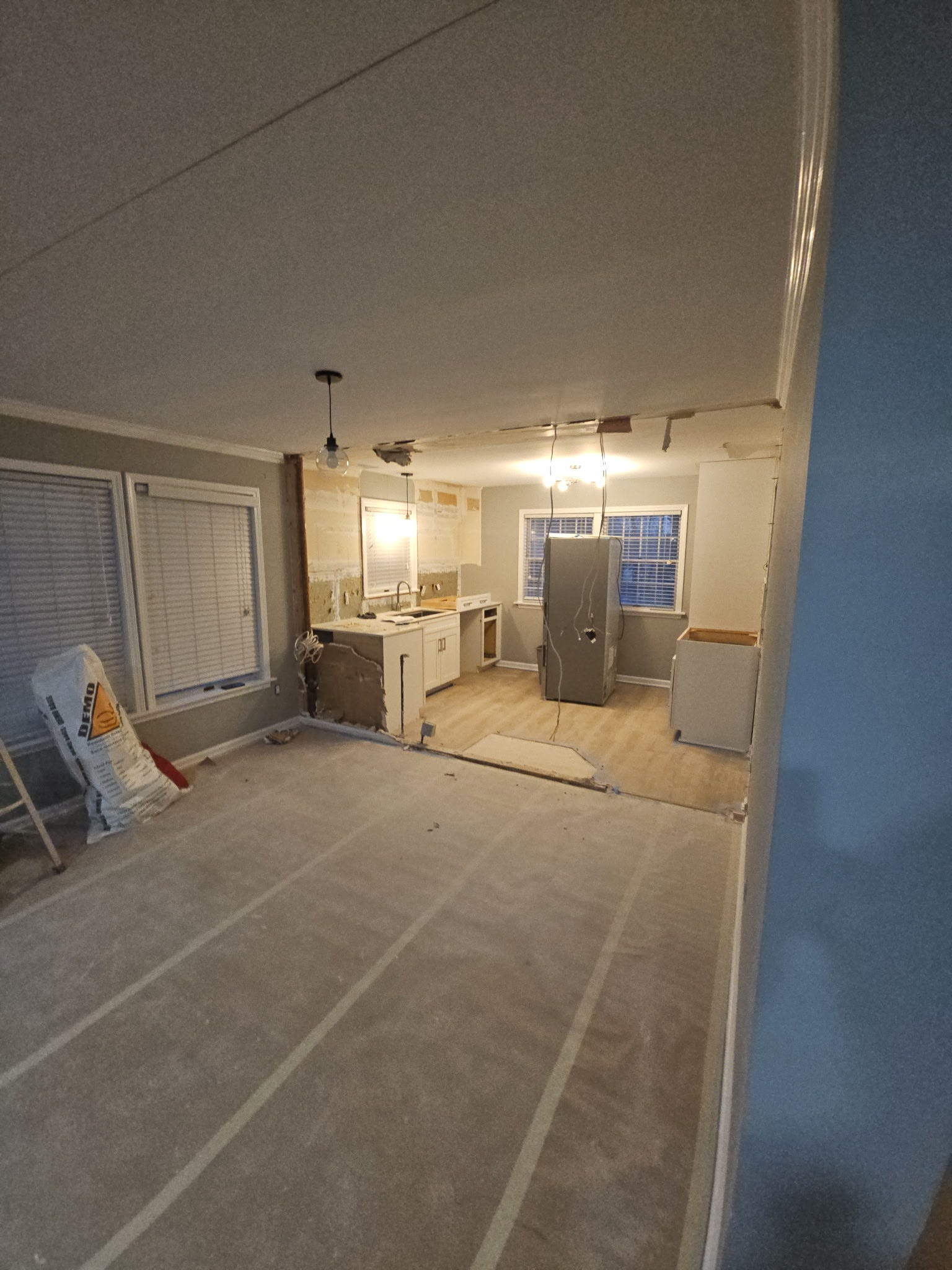
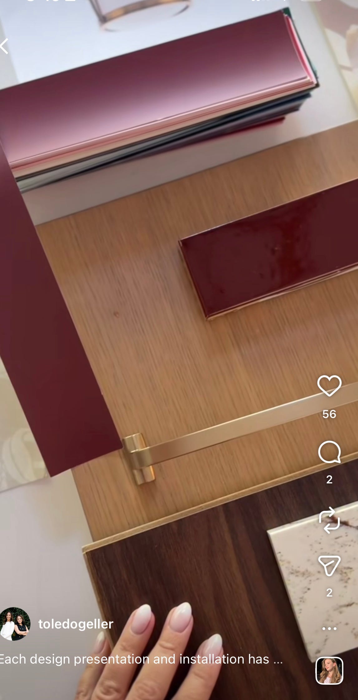
And just wait until you see the kitchen color. Oxblood red. A first for us... and we are absolutely smitten.
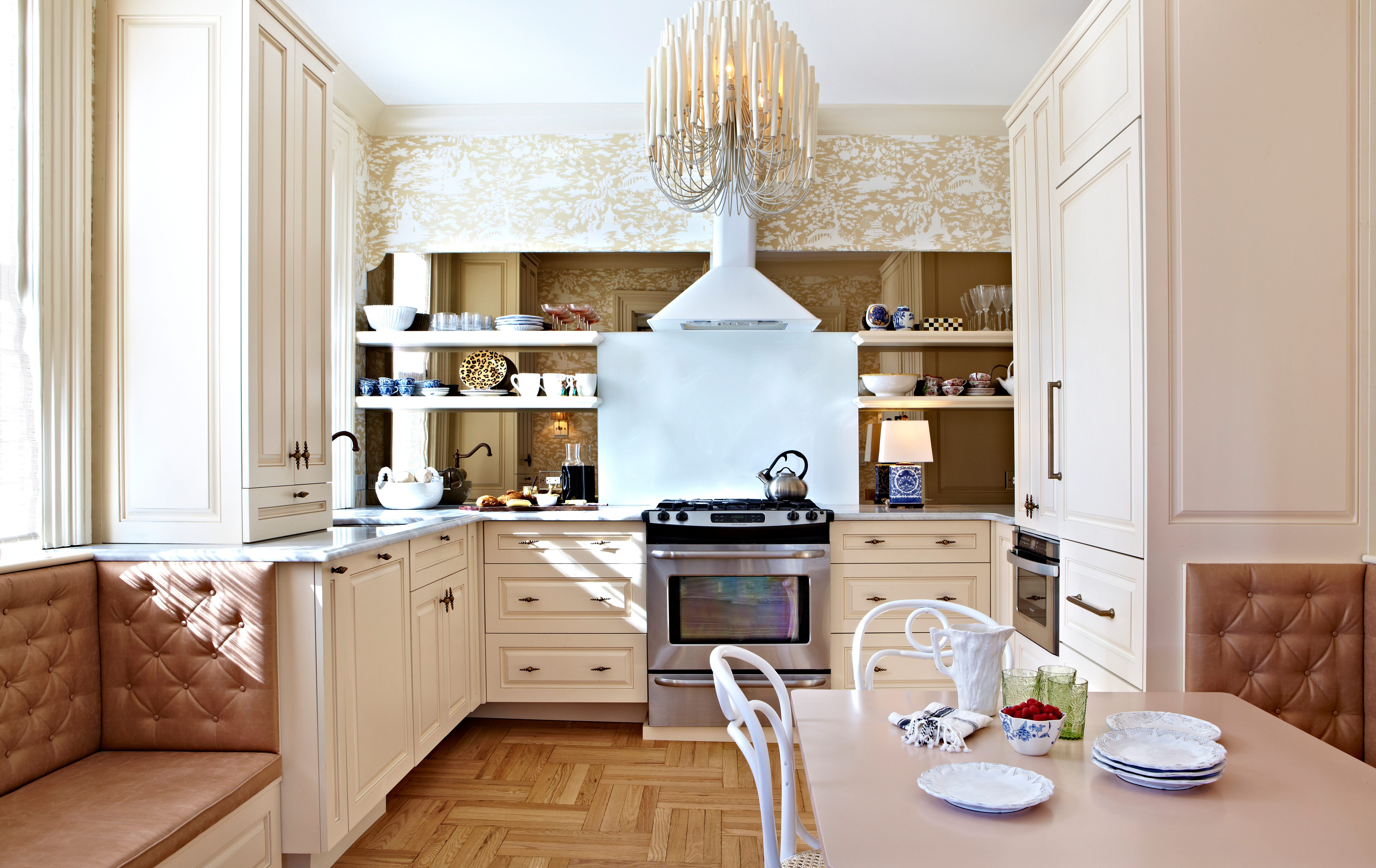
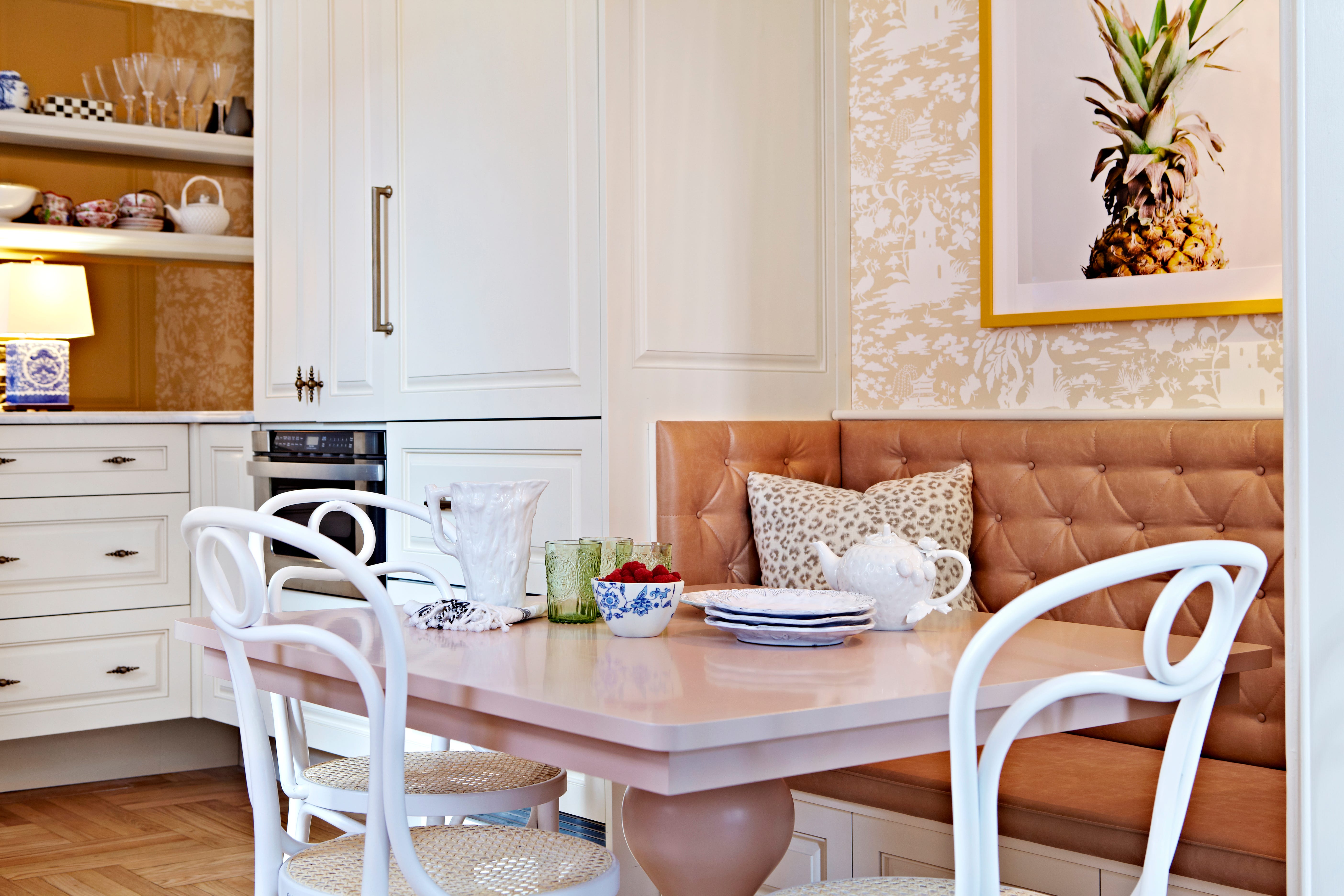
P.S. This layout gave us serious déjà vu because it totally reminds us of my old townhouse. My previous home in Hoboken underwent a major renovation that included bringing the kitchen up from the garden level to the parlor floor and combining it with the living space. The footprint was tight, so every inch had to earn its keep. We wrapped cabinetry around nearly every wall and tucked the sweetest little banquette into the corner - then added a matching banquette across from it because apparently I cannot resist a little symmetry (or a good spot to peek out the window and watch neighbors).
Maybe there’s something about townhouses that calls for this kind of layout. Cozy corners, layered spaces, rooms that multitask a little harder. Perhaps this is just the townhouse formula.
We genuinely believe space planning is the most underrated part of interior design. Paint colors can be changed. Furniture can be replaced. But getting the layout right changes how a family lives in a home every single day.
If you’re staring at a floor plan, awkward corner, or room that just isn’t working, send it our way. Those are our favorite puzzles.
If You Enjoyed This, You Might Also Like:
Why That Beautiful Room Never Gets Used: The most common reason rooms fail and how thoughtful planning can fix it.
Basements: The Most Underrated Square Footage in The House: Finished, unfinished, or somewhere in between.
The Bathroom That Used Ten Marble Slabs: The space-planning decisions that made every inch work harder.
No posts
Comments
Nothing yet. Say the first thing.
Sign in to join the conversation.