
For the better part of the last decade, frontend development was dominated by a framework-centric paradigm that treated the browser as a mere runtime for complex JavaScript pipelines. We abstracted the document structure into monolithic bundles, often at the cost of the very platform we were building upon. As we move through 2026, however, we are witnessing a “Great Simplification.”
The industry is shifting back toward an “HTML-First” architecture. This movement is a pragmatic response to the technical debt, visual fragility, and massive performance overhead caused by treating HTML as a compiled byproduct. For the modern developer, the goal is no longer to simulate a document through a virtual DOM, but to leverage the powerful, evergreen standards built directly into the browser. This is more than a trend; it is an architectural directive to favour the Principle of Least Power, using the simplest, most declarative technology before resorting to imperative code.
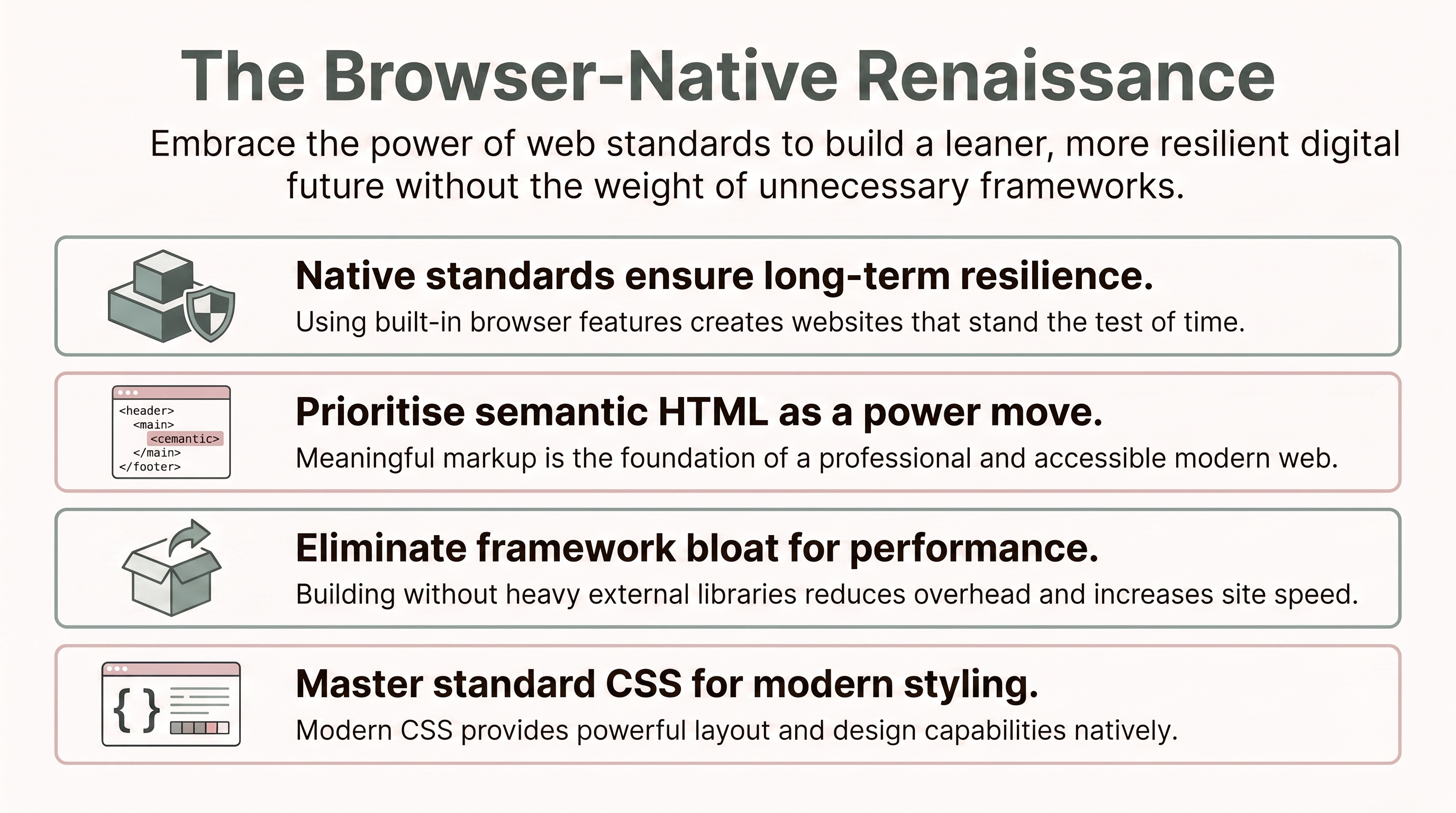
Building a resilient web starts by moving away from “div soup”, the practice of nesting generic containers so deeply that document meaning is lost. Semantic elements like <header>, <main>, <nav>, <aside>, and <footer> are not mere labels; they are a structural hinting system that allows browser engines to optimise style recalculations and partition rendering tasks across multiple threads.
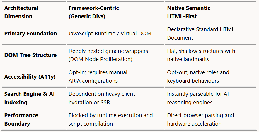
Semantic HTML serves as a “machine-readable API.” In an era where Generative AI and LLM-driven scrapers navigate the web, using tags like <article>, <time>, and <figure> ensures your content is interpreted accurately without the need for expensive JS execution. As noted in the 2026 technical report Architectural Shift Toward Semantic HTML-First Web Development:
“Modern workflows frequently generate bloated Document Object Model (DOM) trees characterized by deeply nested generic containers, colloquially known as ‘div soup’” (Technical Report, 2026).
See my previous article: Modern CSS Architecture: CSS CUBE Methodology and Best Practices
To scale styling without selector bloat, architects are adopting CUBE CSS (Composition, Utility, Block, Exception). This methodology embraces the cascade rather than fighting it, reducing the cognitive load of large-scale CSS.
Composition: Handles macro layouts and “skeletons.” It uses parent-level rules (like the
.flow> * + * utility (see the “lobotomized owl” below) to manage spacing between elements without styling children directly.Utility: Single-responsibility classes for design tokens (colours, typography, spacing). These keep the stylesheet DRY and highly reusable.
Block: Skeletal components like cards or buttons. Unlike BEM, these remain minimal (ideally under 80-100 lines) as the global layers do most of the heavy lifting.
Exception: Manages state variations.
CUBE CSS mandates using HTML data attributes (e.g., [data-state="open"]) for exceptions instead of modifier classes. This is an architect-level move: it uses the DOM itself as the state machine. Data attributes bridge HTML, CSS, and JS more effectively, ensuring that the “truth” of an element’s state is accessible to all three layers simultaneously.
Modern CSS allows us to embrace “Intrinsic Layout”. (see another of my previous articles: The Breakpoint is Dead: How to Build Modern, Fluid Websites That Just Work)
The Stack: This primitive manages vertical rhythm via the “lobotomized owl” selector (
* + *). It injects margins only between adjacent siblings, providing a zero-specificity rule that can be easily overridden when necessary.The Sidebar: This relies on the “Flexbox switch” logic (sometimes called the "Holy Albatross" trick). By combining
flex-grow: 999on the primary content with aflex-basis(the “breakpoint” width), you create a layout that sits side-by-side when space allows but wraps to 100% width instantly when space is restricted.
These primitives rely on browser algorithms to determine dimensions. As architect Andy Bell famously phrased it, we should “be the browser’s mentor, not its micromanager.”
A Table of Contents (TOC) illustrates how semantic precision solves complex UI problems. Nicholas C. Zakas (2022) emphasises that a TOC is a list of relationships where:
“The order matters and shouldn’t get lost in the markup” (Zakas, 2022).
To build a professional, accessible TOC:
Use
<ol>: An ordered list is semantically superior to a<ul>for a TOC because the sequence of chapters is essential content.The WebKit Quirk: Many browsers, particularly WebKit, remove list semantics when
list-style: noneis applied. To prevent screen readers from losing the list structure, you must explicitly applyrole="list"to the element.Relative Spacing: Use the
chunit for indentation (e.g.,padding-inline-start: 2ch). Becausechis relative to the width of the “0” character, your layout remains resilient even if the user changes their font size or typeface.Dot Leaders: Decorative leaders should be in a separate element with
aria-hidden="true"to prevent screen readers from announcing “dot-dot-dot” for every line.Tabular Alignment: Apply
font-variant-numeric: tabular-numsto page numbers. This ensures that a “1” occupies the same width as an “8,” preventing the “zigzag” alignment common in variable-width fonts.
We can solve “wrapper rot” (the injection of non-semantic containers for layout purposes) using the display: contents property. This instructs the browser to ignore the container’s box model while promoting its children to participate directly in a parent grid or flex layout. This keeps the DOM tree shallow and performant.
For encapsulated behaviour, Native Custom Elements (Web Components) offer a standard lifecycle without the weight of third-party runtimes. The connectedCallback fires precisely when an element enters the DOM, allowing for “atomic” lifecycle management. This approach is more sustainable; by stripping void element self-closing slashes and reducing raw file size, we reduce the energy consumed during transmission and parsing.
In 2026, the web platform is powerful enough that “simulating” components with heavy JS is often a regression. Beyond performance, there is a mounting environmental cost to framework bloat. Every redundant DOM node and every unnecessary CPU cycle consumed by script compilation contributes to a site’s energy footprint.
My advice is simple: invest in the evergreen. Frameworks are ephemeral, but the standards of the web are enduring. By mastering semantic HTML and intrinsic CSS, you aren’t just writing better code; you are building a faster, more accessible, and more sustainable future.
In a world of shifting dependencies, how much more resilient would your career be if you mastered the standards that actually power the browser?
Thank you for reading… :D
Comments
Nothing yet. Say the first thing.
Sign in to join the conversation.