
The paperback edition of Tidy Up Your Life is out NOW!
This is Part 4 of a 4-part series about our cottage. In this part, I’ll share the bigger real estate questions Emily and I have been asking ourselves lately and the projects we’re planning next. If you are new to the series, here’s Part 1: An apartment in NYC and a cottage in the Pocono Mountains?, Part 2: Why We Bought That Cottage, and Part 3: The Cottage Numbers Everyone Wants to Know.
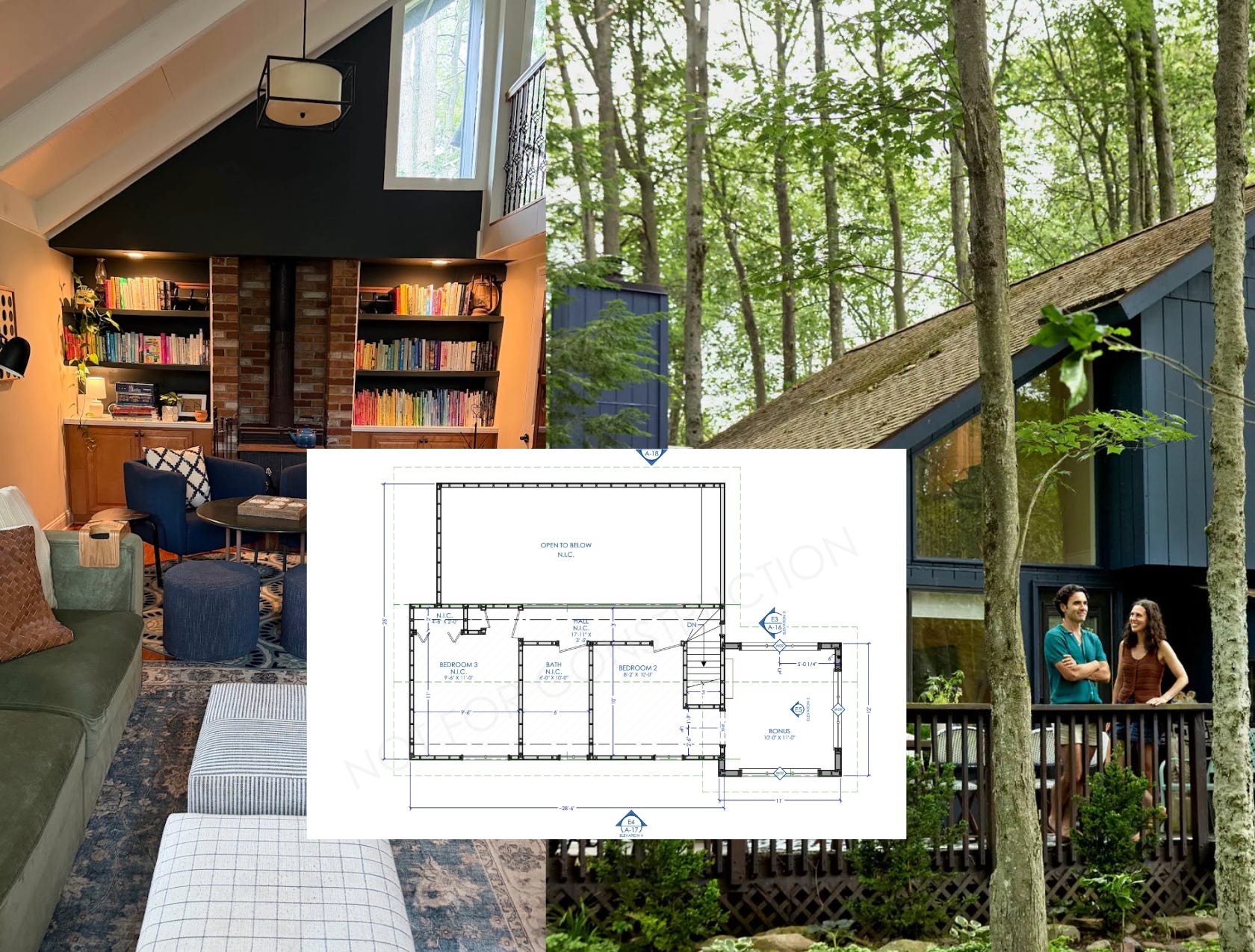
Over the years, we’ve enjoyed pouring our time, energy, and sweat equity into our cottage. Looking back at the original listing photos and comparing them with what it looks like today is pretty remarkable. We started with what was essentially a beautifully renovated blank, bland canvas and, little by little, turned it into a home with warmth, charm, and character. Check out the before and after photo below!
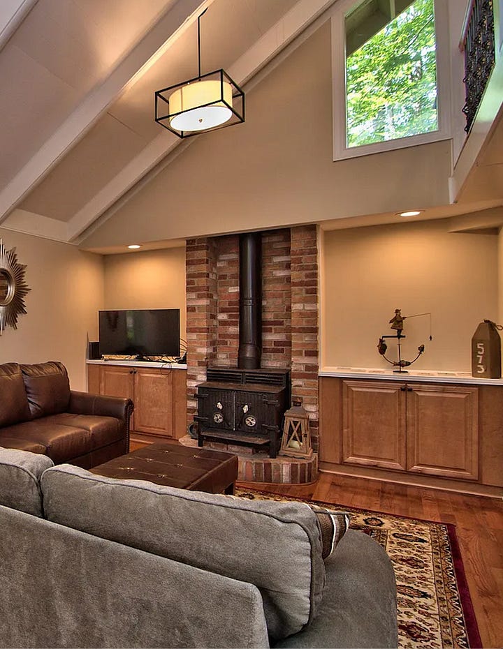
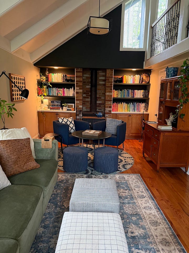
From the beginning, we were drawn to a cozy English-country-cottage aesthetic. That meant layering fabrics and patterns, embracing collected pieces, and thinking intentionally about color.
We wanted the color palette to include shades that were naturally occurring to the landscape surrounding the cottage: deep greens, cool blues, warm whites, and soft tans inspired by the forests, lakes, and changing seasons outside our windows.

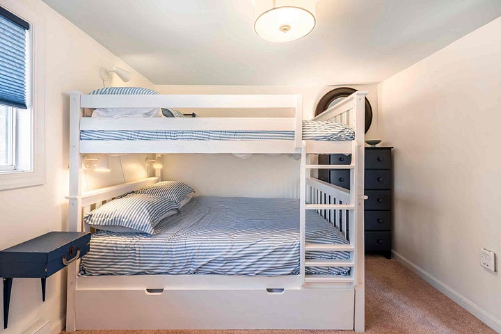


We also wanted the interior to feel vibrant in the long winter months when everything feels dark and brown outside. We also knew we would eventually rent the cottage on Airbnb, so we wanted the home to feel broadly welcoming. If you want to learn more about our very early cottage design projects, you can check them out HERE!
Blue became the anchor color throughout the house. It’s calming, timeless, and, perhaps not coincidentally, one of the most universally loved colors. Surveys consistently find that roughly one-third of adults in the United States and many European countries identify blue as their favorite color, making it one of the most appealing color choices for a shared space. The psychology of color is fascinating.
A few summers ago, we even painted the exterior of the cottage blue. It was a dramatic change from the original tan siding and immediately made the house feel brighter, happier, and more inviting. It’s another dramatic before and after!
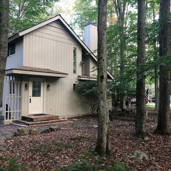
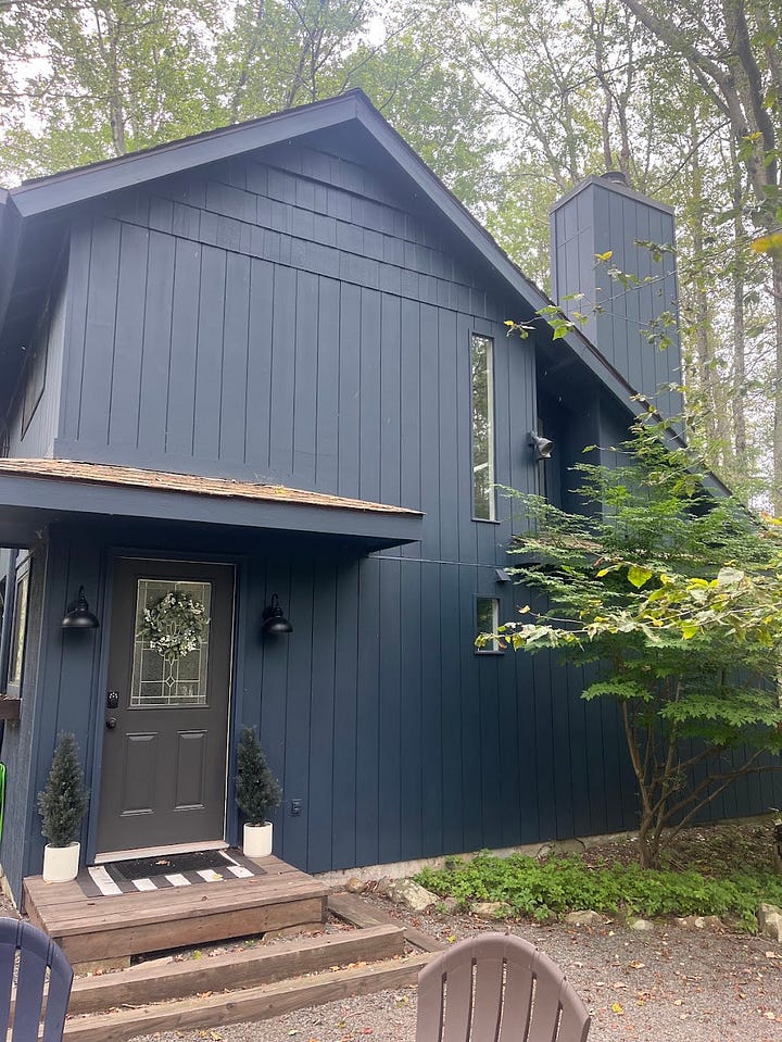
Those smaller projects have given us the confidence and inspiration to think a bit bigger in terms of our cottage’s future and how we’d like to see the space continue to evolve. It’s time to share the bigger real estate questions Emily and I have been asking ourselves lately and the projects we’re planning next.
Remember: The paperback edition of Tidy Up Your Life is out NOW!
Simply enter your order details HERE to claim your free subscription.
Comments
Nothing yet. Say the first thing.
Sign in to join the conversation.