
When I tell people I’m an exhibition designer at the Guggenheim, I usually get the same reaction: curiosity, followed by a question. The most common one? “Is that a humble way of saying you’re a curator?”
My answer: “Oooof, no. You know those pedestals in the museum? Yeah, I design those.”
At that point, I see the sparkle fade. Designing pedestals doesn’t exactly sound glamorous. Consider this my long overdue rebuttal because exhibition design is, in fact, a decidedly sexy profession.

In case it wasn’t clear: exhibition design is a different field than curation. As exhibition designers, we work closely with the curators and artists, but play a completely different role. Where curators decide what the world sees, exhibition designers decide how the world sees it.
Exhibition designers create the landscape on which art and objects live. We choreograph the visitor’s journey: the way you move through a space, the moment a painting stops you in your tracks, the bench that appears exactly when your feet give out. We act as the bridge between the curators and other departments such as fabrication, art handling, and visitor experience, while keeping hang heights, accessibility standards, and the overall emotional arc of the show in mind.
Think about the last exhibition you visited. How did you enter? How did you move through the space? Was there a wall that felt like it was built for that one painting? What color were the walls? And how did that color affect the art? These are the kinds of decisions visitors often don’t consciously notice, but feel. These are the decisions that transform the exhibition from simply looking at objects on walls into a memorable, immersive experience.
To put it simply, we build the stage, then disappear before the curtain rises.
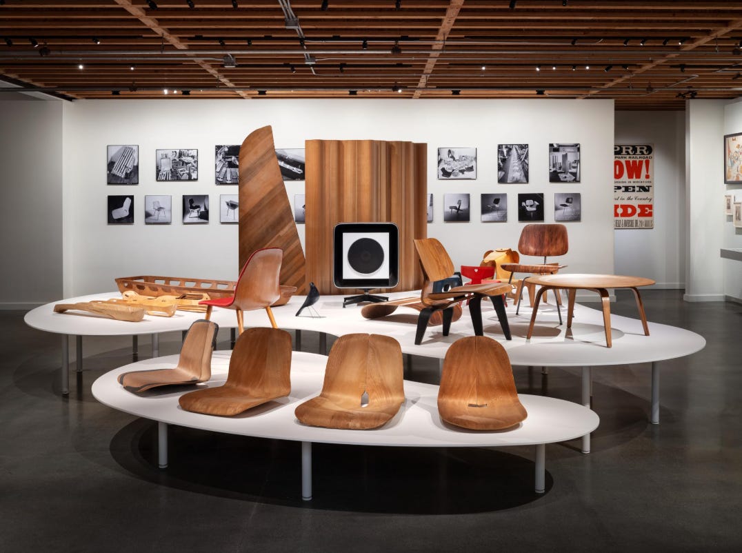
Before joining the Guggenheim, I worked at a small design firm creating exhibitions for furniture brands including the Eames Institute and MillerKnoll. In those contexts, the exhibition design was less about being invisible and more about amplifying a brand’s identity.
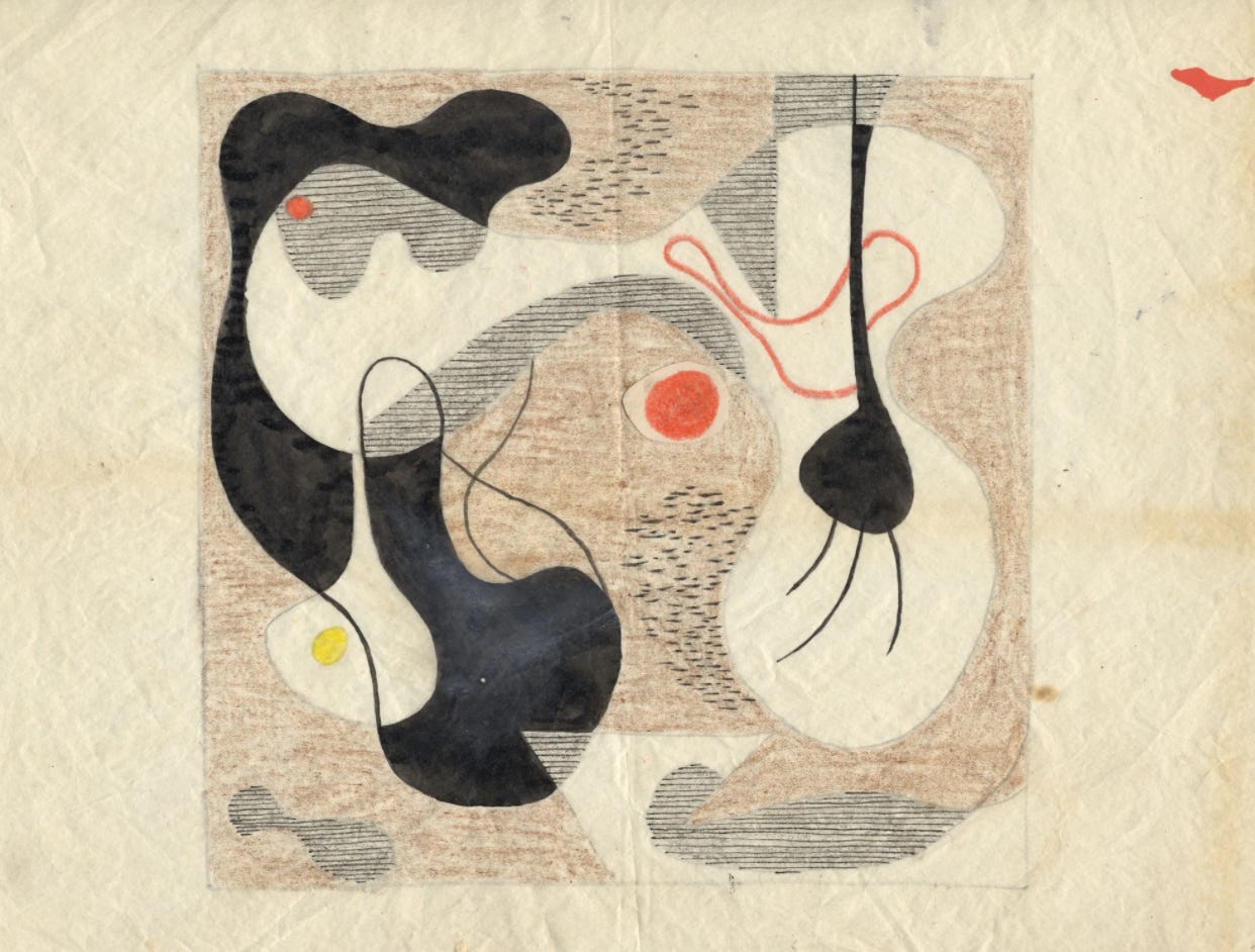
At the Eames Institute of Infinite Curiosities, we developed “Ray’s Table” as the centerpiece of the show: a free-form structure drawn directly from Ray Eames’ playful, iconic sketches. It wasn’t just a surface to hold objects. The table didn’t just hold objects but extended the spirit of their work and highlighted the joy and experimentation embedded in their practice.
Historical museums offer yet another approach; with fewer showstopping visuals to anchor a room, exhibition design often takes on more of a teaching role. Visitors are guided through dense, layered storylines in a way that feels accessible and engaging rather than exhausting. The Benjamin Franklin Institute in Philadelphia is a great example. A few years ago, my boyfriend and I ducked inside during a rainstorm and ended up having an unexpectedly wonderful time. Although the museum is very much geared toward children, we still say “Huzzah!” to each other to this day—borrowed from one of the games we played there.

There’s also a long history of architects working in exhibition design. The overlap makes sense: both disciplines involve shaping environments, guiding movement, and thinking in three dimensions (I also came from an architectural background).
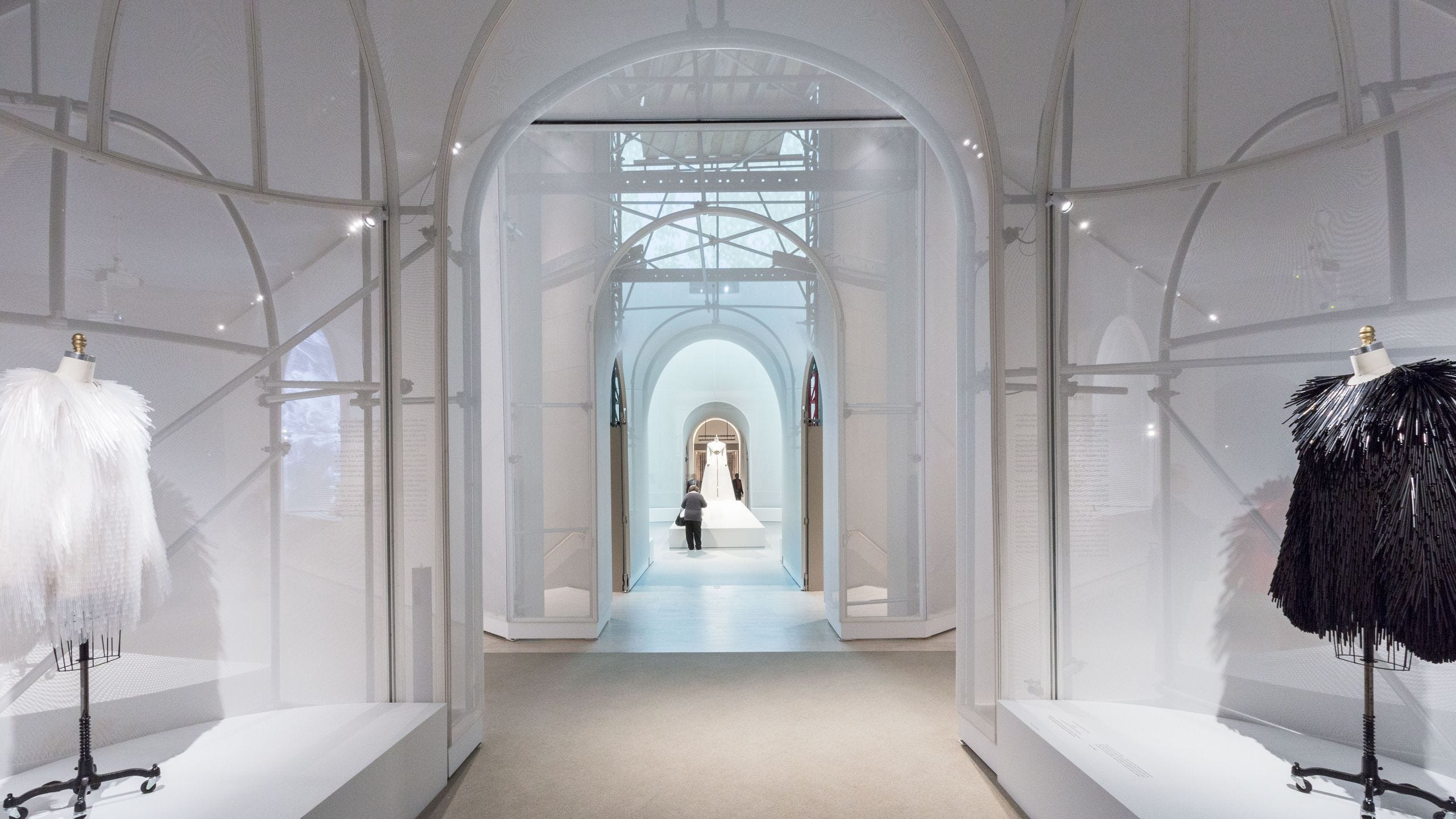
These exhibitions often take a more visible, immersive approach. The space itself becomes part of the conversation. Take Manus x Machina, designed by OMA for the Metropolitan Museum of Art. The exhibition referenced the museum’s classical architecture in form while introducing a futuristic atmosphere. The environment didn’t compete with the objects—it deepened the central tension of the show: the relationship between handcraft and machine production.
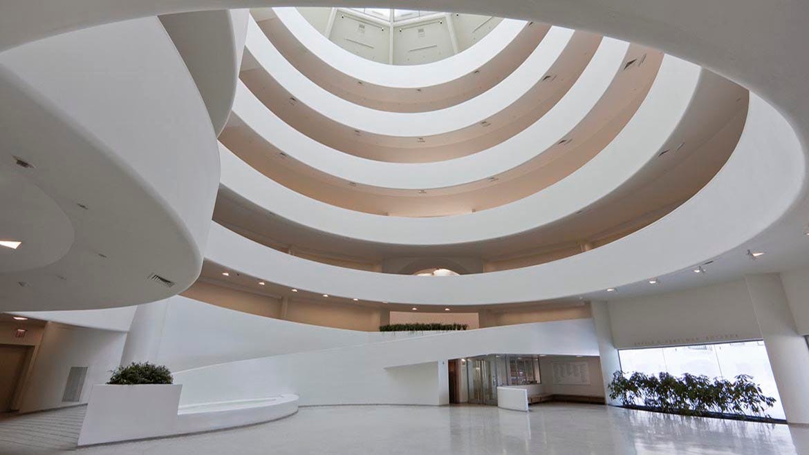
Each museum and exhibition is different: different art, different audiences, different cultural stakes, different walls. Exhibition design has to rise to meet all of it. At the Guggenheim, the stakes are particularly high, because… well.. our floors are famously and our walls are curved. There’s no such thing as a straightforward hang. Every decision requires a little more ingenuity, a little more intention, and honestly? A lot more fun.
Exhibition design is such a fun and fascinating field, and I’m thrilled that so many of you are curious about it. I’m still early in my career, and I feel like a kid in a candy shop every time I learn something new about the exhibition world.
Most days after work, I come home and talk my mom’s or my boyfriend’s ear off about whatever fascinating thing I learned that day. It occurred to me that Substack might be a better place for all of that enthusiasm—and hopefully more enjoyable for everyone involved.
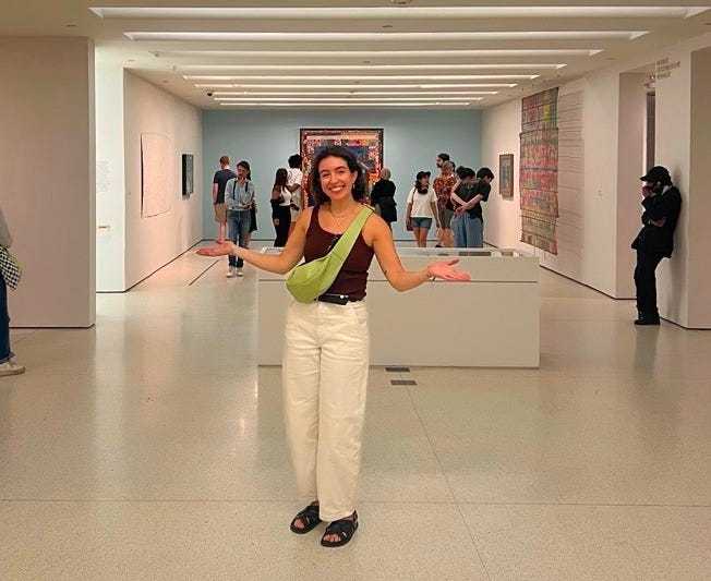
I have so many stories, ideas, and behind-the-scenes details I can’t wait to share.
Thank you so much for being here.
- Alya
No posts
Comments
Nothing yet. Say the first thing.
Sign in to join the conversation.