

“Designers do great work, but they don’t know how to communicate it. I get all these screens in a Figma file, and I’m like, where’s your annotations? You can’t go to a VP and show them this stuff.” — Senior Director of Product Design
That’s what a Director of Product Design told me the other day, and it’s not an uncommon sentiment.
The era of self-explanatory visuals is over. A well-designed screen used to be enough to carry a product review. It doesn’t anymore.
The fix is one of the smallest, most transferable skills you can build as a senior designer: a simple three-part frame for annotating your own work. Decision, hypothesis, outcome.
Redesigns used to be drastic enough to speak for themselves. When the before screen was from the 1990s and the after was modern, you could see it at a glance.
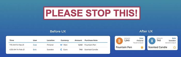
I’m not the only one that feels this way
People said things like “design modernized the site,” and even though much of the design work was invisible (Information Architecture, typography, decision-making), the overall story read decently. Design made things modern, sleek, and intuitive.
Those comparisons are much harder now. The difference between “before” and “after” might not just be invisible to non-designers. The difference between your design and AI might be imperceptible (to non-designers).
A PM used Google Stitch to turn Miro sketches into a design that looked real. It looked finished, but when you start looking at it, it’s not quite right and broken in places. But it raised this worry for the team, because decision-makers might think otherwise. — Head of Design, Legal Tech
Visual comparisons of screens, especially between your work and AI, aren’t always going to tell the story. You have to say it.
Nowhere does this hit harder than in how you present research.
User research doesn’t photograph well.
The most common thing you see in a readout deck is a zoomed-out FigJam board with two hundred stickies on it. Proof that something happened.
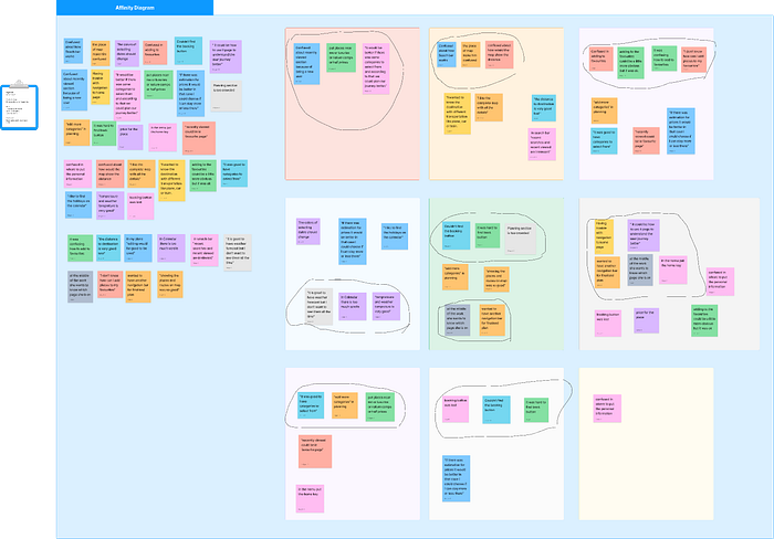
Can you tell what happened here?
But when you actually look, all a VP learns is that you checked the box. You ran the workshop. You built the persona. You conducted the competitive audit and generated 100 Post-it notes.
That’s not what they’re sitting in the meeting for. It used to be enough to show you could run a workshop. It isn’t anymore. They want to know what came out of the workshop that helped the business.
The same logic runs through the design section of your deck. A screen that shows you can push pixels is not an argument for the decision you’re presenting. If you want a VP to understand more than “you came up with something,” you need words next to the screens. Words that do the argument the screens can’t.
When you hear “annotate your work,” you probably picture the same thing everyone does: callouts on a screen. An arrow pointing at a chip that says “filters by date range.” A label on a CTA that says “primary, mobile.” Short, specific, attached to a pixel.
That kind of callout is useful. But it’s the wrong emphasis for a presentation.
What the people in the room (and those reading the deck after the meeting) are trying to follow are the decisions around the artifact. The copy on the slide that tells them why this screen exists, what you chose against, and what happened because of the choice.
A good review slide is a screen, something pointing at it, and something framing it. The callouts are the smallest part.
The structure that holds up across product reviews, stakeholder updates, and the screenshot you paste into Slack has three parts. I think of them as a decision, a hypothesis, and an outcome. Each one lives in a different place on the slide, and the geometry matters.
Decisions get annotated directly onto the artifact. A line, an arrow, a callout pointing at the specific UI element, and naming the choice.
It can take two specific forms:
The problem. Calling out a problematic UI element and what goes wrong with it. This is what you use when you’re pitching a design recommendation in a presentation. For example: “5/5 users couldn’t figure out how this selector worked.”
The decision. Highlighting the choice you made that led to positive outcomes. This is what you use when you’re walking someone through work you’ve already shipped. For example: “I re-did our selector layout because of these difficulties.”
Someone skimming your slide should be able to reconstruct what you decided just from reading your arrows.
Hypothesis lives in the slide itself, usually near the top.
Simply put, this is the bet you made on how user behavior would change, based on your decision. If your decision is about redoing the selector layout, your hypothesis might be: “We expected to see less drop-off on the Product Details page, because users weren’t getting stuck on the selectors.”
It doesn’t attach to a single pixel because it’s about the whole bet, not one element of the screen.
Outcome lives at the bottom of the slide or in a results strip. A number when you have one. A specific qualitative shift when you don’t.
“Mobile completion rose from 38% to 54% over six weeks. We saw a shift in customer complaints, especially regarding wrong sizing.”
Treat it as the close of the argument, not an afterthought.
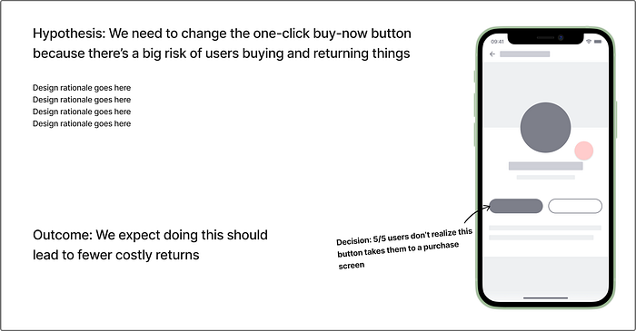
Sample of Hypothesis, Decision, Outcome
Decision on the artifact means the reader can reconstruct your thinking element by element. Hypothesis at the top means they know what you were trying to do before they see whether it worked. Outcome at the bottom means the slide lands.
Cover the screens with your hand. Can a VP who wasn’t in the room still follow what you decided, what you expected, and what happened? The arrows should still point at something meaningful, even if they’re pointing at air. The hypothesis should still read. The outcome should still land.
If yes, your writing is carrying its weight, and your screens are supporting it. If not, your screens are doing the presentation’s job, and your writing is decoration. This is exactly the position the director at the top of this piece was complaining about.
This is how you surface the invisible work you do as a designer.
Rather than trying to craft the perfect image that spells out everything visually, adding annotations (and arguments) is how you get your team to see your strategic judgment, and how your decisions keep traveling in the rooms you’re not in.
Kai Wong is a Design Storytelling Coach and author of the Data and Design Newsletter. He helps designers tell the story of why their work matters to businesses, to get buy-in for their ideas, and advance their careers.
No posts
Comments
Nothing yet. Say the first thing.
Sign in to join the conversation.