
Hey there! You’ve built a model. It’s trained, it’s running, and now you need to know if it’s any good. You open up your notebook and see accuracy: 94%. Sounds great, right?
Not necessarily. And if you’ve been doing this work for a while, you already know why.
The truth is that accuracy is often the wrong metric to optimize for, but it’s the default one that everyone reaches for because it’s simple and intuitive.
The problem starts when you realize that your model needs to work in the real world, where the costs of different types of mistakes aren’t equal, and where your dataset probably isn’t perfectly balanced.
Let’s talk about what happens with imbalanced datasets. Say you’re building a fraud detection system for an e-commerce platform. You have 10,000 transactions, and 150 of them (1.5%) are fraudulent.
Here’s a model that’s technically impressive:
Total Transactions: 10,000
Actually Fraudulent: 150
Actually Normal: 9,850
Model predicts: “Everything is normal”
The confusion matrix looks like this:

That’s an A+ grade. But the model catches exactly zero fraud. It’s completely useless, yet accuracy makes it look fantastic.
This isn’t a theoretical problem. In medical diagnosis, spam detection, fraud prevention, and most real-world classification tasks, you’re dealing with imbalanced classes. The visualization in the accompanying figure shows how a completely useless model (one that predicts only the majority class) can achieve 90%, 95%, or even 99.9% accuracy depending on class imbalance.
And even when classes are balanced, accuracy treats all errors the same way. But missing a cancer diagnosis is not equivalent to a false alarm that leads to an extra test.
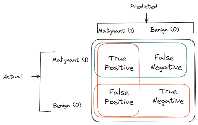
Everything starts with the confusion matrix. For a binary classifier:

From these four numbers, we derive all our metrics.
Precision answers: “When my model predicts positive, how often is it right?”
Precision = TP / (TP + FP)
Example: Your fraud model flags 100 transactions as fraudulent. Investigation reveals that 75 were actually fraud, and 25 were false alarms.
Precision = 75 / (75 + 25) = 0.75 or 75%
Recall (also called Sensitivity or True Positive Rate) answers: “Of all actual positives, how many did I catch?”
Recall = TP / (TP + FN)
Example: There were actually 200 fraudulent transactions. Your model caught 75 of them and missed 125.
Recall = 75 / (75 + 125) = 0.375 or 37.5%
📘 If you’re a Data Analyst preparing for interviews…
We’ve interviewed at Meta, Google, DoorDash, and Poshmark, and after running hundreds of interviews ourselves, we realized the strongest candidates nail business thinking, technical execution, and clear communication.
That’s why we created Ace Your Data Analyst Interview - a complete playbook with:
✅ 150+ real interview questions & frameworks
✅ SQL, Python, Excel, Data Viz & Statistics
✅ Case studies, take-homes & behavioral guidance
If you want clarity, confidence, and a roadmap to your dream data role:
These metrics let you see the trade-off between being cautious and being comprehensive. High precision means when you say something is positive, you’re probably right. High recall means you’re not missing many positives. You almost never get both at once.
Consider a breast cancer screening model evaluated on 1,000 patients:
100 patients have cancer (10% prevalence)
900 patients are healthy
Model A (Conservative):
Catches 60 cancer cases (TP = 60)
Misses 40 cancer cases (FN = 40)
Correctly identifies 850 healthy patients (TN = 850)
False alarms for 50 healthy patients (FP = 50)
Precision = 60 / (60 + 50) = 54.5%
Recall = 60 / (60 + 40) = 60%
Accuracy = (60 + 850) / 1000 = 91%
Model B (Aggressive):
Catches 90 cancer cases (TP = 90)
Misses 10 cancer cases (FN = 10)
Correctly identifies 700 healthy patients (TN = 700)
False alarms for 200 healthy patients (FP = 200)
Precision = 90 / (90 + 200) = 31%
Recall = 90 / (90 + 10) = 90%
Accuracy = (90 + 700) / 1000 = 79%
Model B has lower accuracy and much lower precision, but it catches 90% of cancers instead of 60%. For a screening test where false positives just trigger more testing, that’s probably the right choice. The additional 30 caught cancers are worth the extra 150 false alarms.
The F1 score is the harmonic mean of precision and recall:
F1 = 2 × (Precision × Recall) / (Precision + Recall)
For Model A above:
F1 = 2 × (0.545 × 0.60) / (0.545 + 0.60) = 0.571
For Model B:
F1 = 2 × (0.31 × 0.90) / (0.31 + 0.90) = 0.46
The harmonic mean penalizes extreme imbalances. It’s useful when you want a single number that balances both concerns, but it weights precision and recall equally. That’s fine for some problems and completely wrong for others.
There’s also F-beta, which lets you weight recall β times more important than precision:
F_β = (1 + β²) × (Precision × Recall) / (β² × Precision + Recall)
If false negatives are twice as costly as false positives, use β = 2.
ROC (Receiver Operating Characteristic) curves plot True Positive Rate against False Positive Rate across all possible classification thresholds.
True Positive Rate (TPR) = Recall = TP / (TP + FN)
False Positive Rate (FPR) = FP / (FP + TN)
AUC (Area Under the Curve) summarizes this into a single number between 0 and 1:
AUC = 1.0: Perfect classifier
AUC = 0.5: Random classifier (no better than coin flip)
AUC < 0.5: Worse than random (you inverted your predictions)
Practical Example: You’re comparing three spam detection models on 10,000 emails (1,000 spam, 9,000 legitimate):
Model A: AUC = 0.92
Model B: AUC = 0.85
Model C: AUC = 0.78
Model A separates spam from legitimate email better across all thresholds. But ROC-AUC doesn’t tell you what threshold to use in production. The accompanying visualization shows how different models compare on ROC curves.
For imbalanced datasets, Precision-Recall curves are often more informative than ROC curves. They plot Precision against Recall.
Why it matters: With 10,000 emails, where 100 are spam:
Scenario: Model catches 80 spam (TP = 80) with 50 false positives (FP = 50)
ROC metrics:
TPR = 80/100 = 0.80
FPR = 50/9900 = 0.005
Looks great! Only 0.5% false positive rate.
PR metrics:
Precision = 80/(80+50) = 0.615
Recall = 80/100 = 0.80
More realistic view: Only 61.5% of flagged emails are actually spam.
The ROC curve is dominated by the 9,900 true negatives and makes the model look better than it performs. The PR curve focuses on positive predictions and is more honest about performance on the minority class.
Start by asking what matters for your specific problem. Not what metrics are popular or what you’ve used before, but what the actual consequences are.
Spam Filtering:
False Positive (legitimate email marked spam): User misses important message
False Negative (spam gets through): Minor annoyance
Optimize for: Precision (you want high confidence when marking as spam)
Typical threshold: Higher than 0.5, maybe 0.7-0.8
Cancer Screening:
False Positive: Extra tests, patient anxiety, costs $500
False Negative: Missed cancer, potentially fatal, lawsuit risk
Optimize for: Recall (catch as many cases as possible)
Typical threshold: Lower than 0.5, maybe 0.2-0.3
Credit Card Fraud:
False Positive: Declined card, angry customer, $5 support call
False Negative: Actual fraud, you lose $2,000 on average
Optimize for: Custom cost function (FN is 400x more expensive)
Threshold: Calculate based on expected costs (see visualization)
Let’s work through the fraud detection example with real numbers. You process 1 million transactions monthly:
10,000 are fraudulent (1%)
False Positive cost: $5 (customer support call)
False Negative cost: $500 (average fraud loss)
At threshold 0.5:
TP = 6,000, FP = 20,000, FN = 4,000
Total Cost = (20,000 × $5) + (4,000 × $500)
          = $100,000 + $2,000,000
          = $2,100,000 per month
At threshold 0.3:
TP = 8,500, FP = 40,000, FN = 1,500
Total Cost = (40,000 × $5) + (1,500 × $500)
          = $200,000 + $750,000
          = $950,000 per month
By lowering the threshold, you save over $1 million monthly despite quadrupling false positives. The visualization shows how to find the optimal threshold by plotting total cost across all thresholds.
Use Accuracy when:
Classes are balanced (roughly 40-60% split)
All errors have equal cost
You need a simple, interpretable metric
Example: Predicting if an image contains a cat or a dog (balanced dataset)
Use Precision when:
False positives are costly
You want high confidence in positive predictions
It’s okay to miss some positives
Example: Email spam filtering, drug safety alerts
Use Recall when:
False negatives are costly
You need to catch as many positives as possible
False positives are manageable
Example: Disease screening, fraud detection, first pass
Use F1 Score when:
You need a single metric
Precision and recall are equally important
Classes are imbalanced
Example: Document classification, sentiment analysis
Use ROC-AUC when:
Evaluating overall model quality
Comparing models independent of the threshold
Classes are roughly balanced
Example: Model selection during development
Use PR-AUC when:
Evaluating on imbalanced data
Focusing on positive class performance
Comparing models for minority class detection
Example: Rare disease prediction, anomaly detection
As shown earlier, you can get 98.5% accuracy by predicting everything as the majority class. The visualization demonstrates this clearly: as class imbalance increases, even a completely useless model achieves high accuracy.
Fix: Use precision, recall, F1, or AUC instead.
F1 treats precision and recall equally. If catching cancer is 100x more important than false alarms, F1 is the wrong metric.
Example: Two cancer models with equal F1 = 0.80:
Model A: Precision = 0.73, Recall = 0.88 (catches 88% of cancers)
Model B: Precision = 0.88, Recall = 0.73 (catches only 73% of cancers)
F1 says they’re equal, but Model A is clearly better for this use case.
Fix: Use a weighted F-score or create a custom cost function.
Your model achieves 70% precision on a problem where 50% of cases are positive. Sounds okay, right?
Compare to a problem where only 1% of cases are positive. Random guessing would give you 1% precision. Getting 70% is a massive 70x improvement.
Context matters. Always compare to the baseline (usually the proportion of positive class).
Most people accept the default 0.5 threshold. But as shown in the threshold visualization, precision and recall change dramatically as you adjust the threshold.
A model might have:
At threshold 0.5: Precision = 60%, Recall = 70%
At threshold 0.7: Precision = 80%, Recall = 45%
At threshold 0.3: Precision = 40%, Recall = 90%
You have one model but three very different operating points. Pick the one that matches your business needs.
Your stakeholder asks: “How good is the model?” You say: “F1 is 0.75.”
They ask: “What does that mean for our business?”
You realize you should have also reported:
How many frauds we’ll catch (recall)
How many false alarms we’ll generate (precision)
Expected costs and savings
Number of transactions requiring manual review
Fix: Report multiple metrics that tell the complete story. Better yet, translate metrics into business outcomes.
START HERE
    ↓
Is data balanced (30-70% positive)?
    ↓
    YES → Are all errors equally costly?
        ↓
        YES → Use ACCURACY or F1
        NO → Go to cost analysis
    ↓
    NO → NEVER use accuracy
        → Are you comparing models?
            ↓
            YES → Use PR-AUC (or ROC-AUC if not too imbalanced)
            NO → What’s more costly?
                ↓
                FP → Optimize PRECISION
                FN → Optimize RECALL
                Both → Use F1 or custom cost function
Key Takeaways:
Accuracy is only appropriate for balanced datasets with equal error costs
For imbalanced data, use precision, recall, F1, or AUC metrics
Always consider the actual business cost of false positives vs false negatives
Don’t accept 0.5 as your threshold without analyzing alternatives
Report multiple metrics and translate them to business outcomes
Compare your metrics to baseline performance (usually the positive class proportion)
The final thing to remember is that these metrics describe your model’s behavior, but they don’t tell you whether the model is good enough to deploy. That’s a business decision that depends on the value created and the costs incurred. A model with 60% recall might be useless or game-changing depending on the context.
Start with understanding what matters for your problem, then pick the metrics that illuminate whether you’re succeeding at what actually matters. The math is straightforward once you know what you’re trying to optimize for.
Btw, If you’re job searching, my friend built something genuinely useful.
Dataford has interview guides for 4,000+ companies, updated weekly. Not just a list of generic questions. You get role-specific prep (Data Scientist, ML Engineer, PM, and 40+ other roles), real culture ratings broken down by career growth, work-life balance, and compensation, and the actual questions each company asks.
Worth bookmarking before your next interview: https://dataford.io/interview-guides
Best of luck for everything!
- Sai Bysani, a fellow Hustler!
Keep grinding, keep growing,
The Data Hustle.
No posts
Comments
Nothing yet. Say the first thing.
Sign in to join the conversation.