
An end-to-end project you can run today, built the way a real team would, all the way to revenue saved.
Every company pours money into winning new customers. Very few can tell you which of their current customers are about to walk out the door, until after they have already gone.
That is the gap a churn model fills, and it is one of the best projects you can put in a portfolio, because every subscription business on earth needs it. Today we build one from scratch. We will pull the data from Snowflake like a real team does, use AI in the spots where it actually helps, and finish somewhere most tutorials never reach: a number your VP of Marketing will care about, and proof the whole thing worked.
We are using the Telco Customer Churn dataset. Small, realistic, runs on any laptop.
Download it here: https://www.kaggle.com/datasets/blastchar/telco-customer-churn
7,043 customers, 21 columns, one row each. The columns that matter most: tenure (months as a customer), Contract (month-to-month, one year, two year), MonthlyCharges and TotalCharges, the services they use (InternetService, OnlineSecurity, TechSupport, StreamingTV), PaymentMethod, and Churn (Yes / No), which is what we predict.
About 27% of these customers churned. So a model that predicts “nobody leaves” for everyone is right 73% of the time and completely useless. Accuracy is a trap here. We care about recall (of the customers who actually left, how many did we catch) and precision (of the ones we flagged, how many really left). A retention team works down a ranked list until the budget runs out, so what they want is the true leavers near the top. Hold that picture.
In industry you do not model off a CSV on your desktop. The data lives in a warehouse, and you pull what you need. Let us do the same and load Telco into Snowflake once, then read from it.
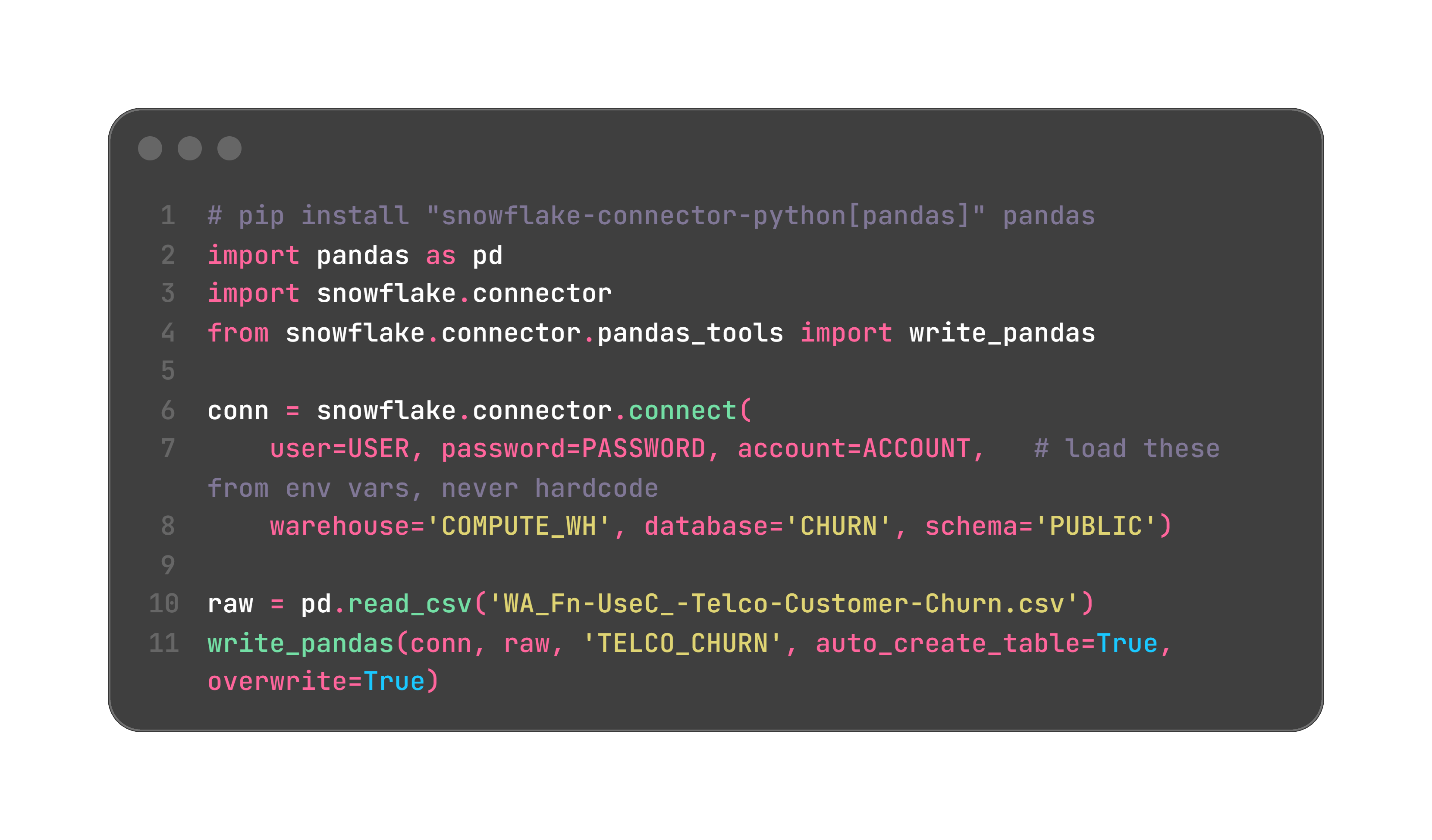
The industry habit worth copying: do your heavy filtering and joins in SQL, and pull a clean, smaller table into Python. Push the work to the warehouse.
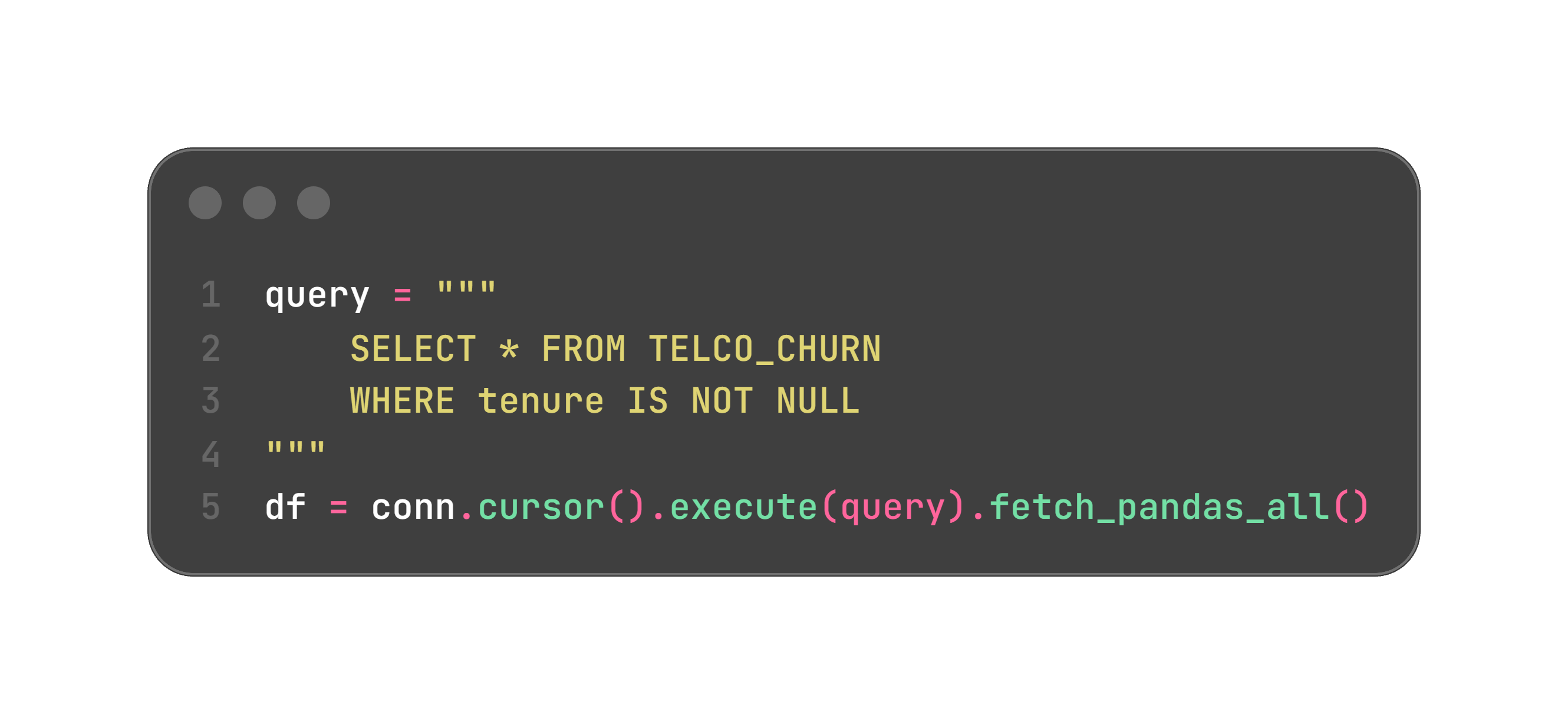
One real gotcha: Snowflake upshifts column names to uppercase, so rename them back to match the rest of this tutorial, or quote them on the way in.
AI move: paste your table schema and ask your assistant to write this connector plus a .env template. Credential boilerplate is exactly the kind of tedious, well-known code it gets right.
No Snowflake? Skip to Step 2 and read straight from the CSV with pd.read_csv. Everything after this is identical.
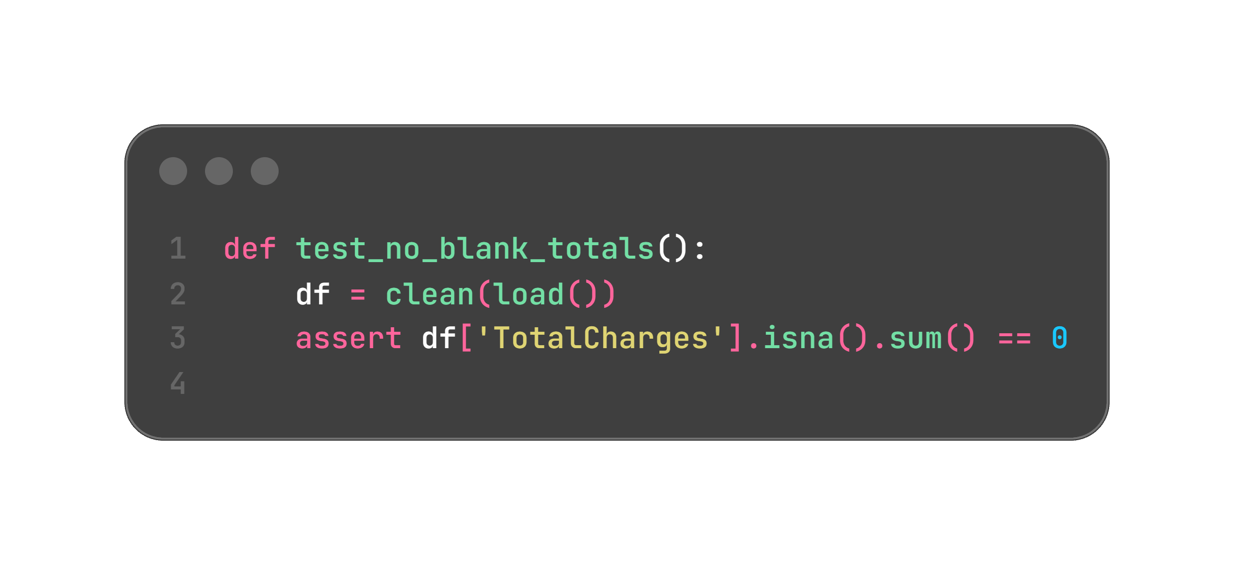
Every real dataset has one, and this one hides in plain sight. TotalCharges looks numeric but loads as text, because brand-new customers (tenure of 0) have a blank there. Miss it and your model breaks silently.
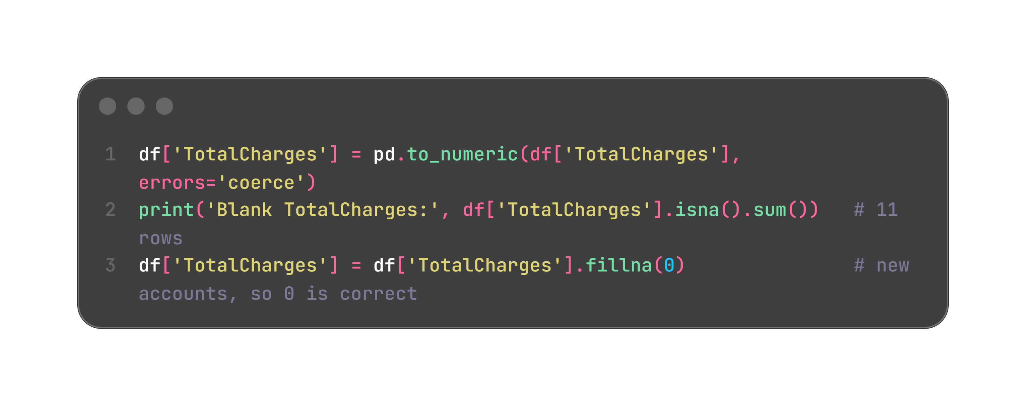
In an interview, “I found 11 blank totals, traced them to new accounts, and set them to zero” shows you actually looked at your data.
AI move: ask it to list every column whose dtype looks wrong for its contents. It flags these faster than you will.
Look before you model. You want to walk into a meeting able to name what is leaking customers.
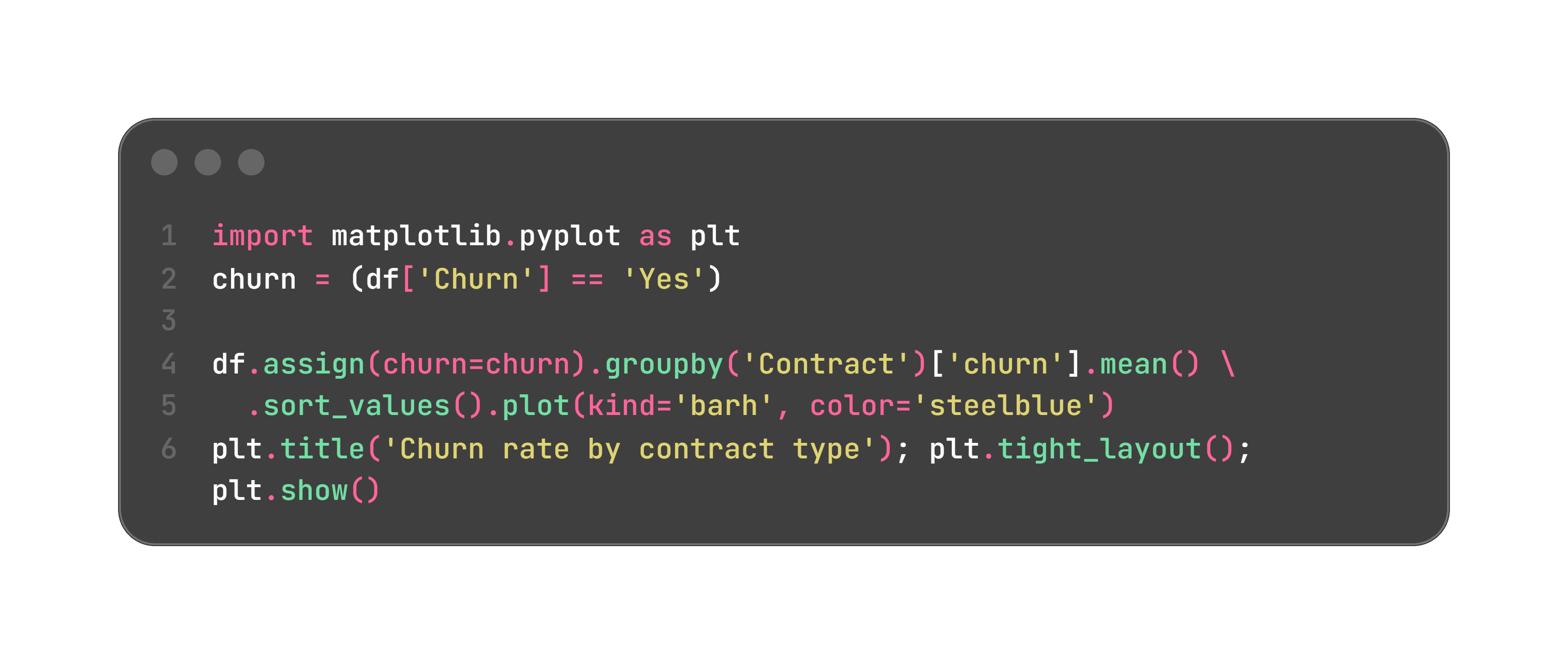
Do the same for tenure and monthly charges. You will find the story every subscription business knows: new customers on flexible month-to-month plans leave most, and loyalty grows with time.
AI move: describe your columns and ask which handful of charts are worth making first. Treat the answer as a starting list, not the final word.
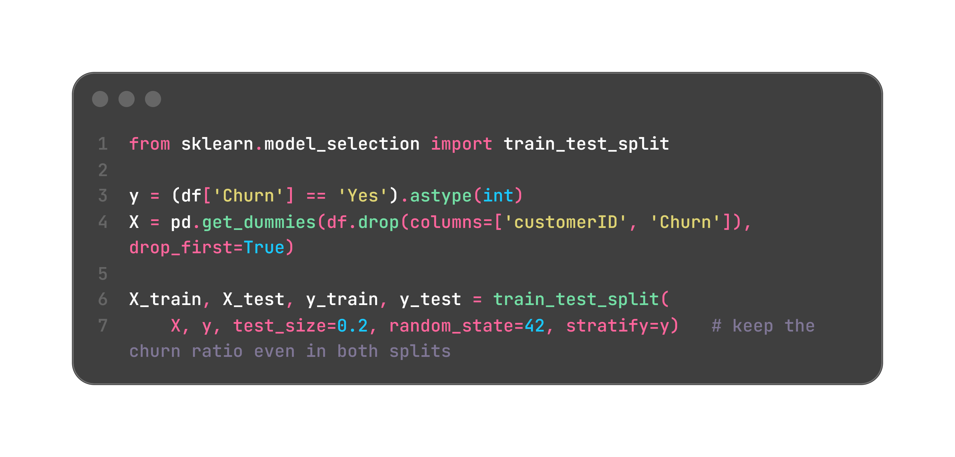
AI move: have it write the encoding plus a check that your training columns and your scoring columns match. Mismatched columns are the single most common reason a churn model that worked in a notebook fails in production.
Start simple and explainable, then see if a heavier model earns its place. If it cannot clearly beat the simple one, keep the simple one.
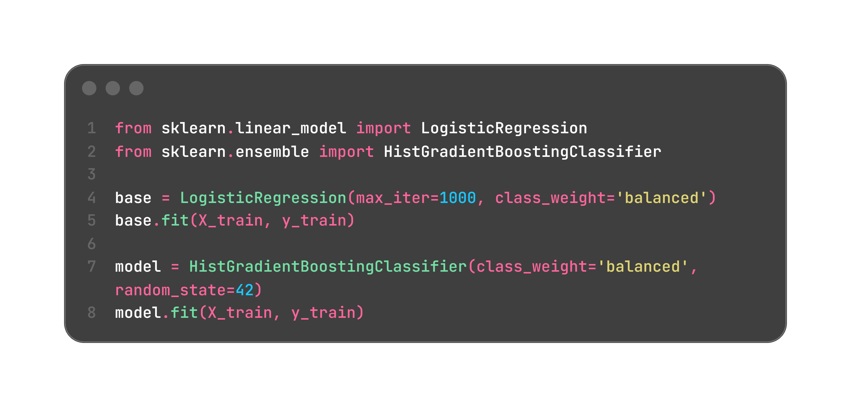
class_weight='balanced' makes both take the smaller churn group seriously. At work, teams often use XGBoost or LightGBM in this slot for a bit more lift.
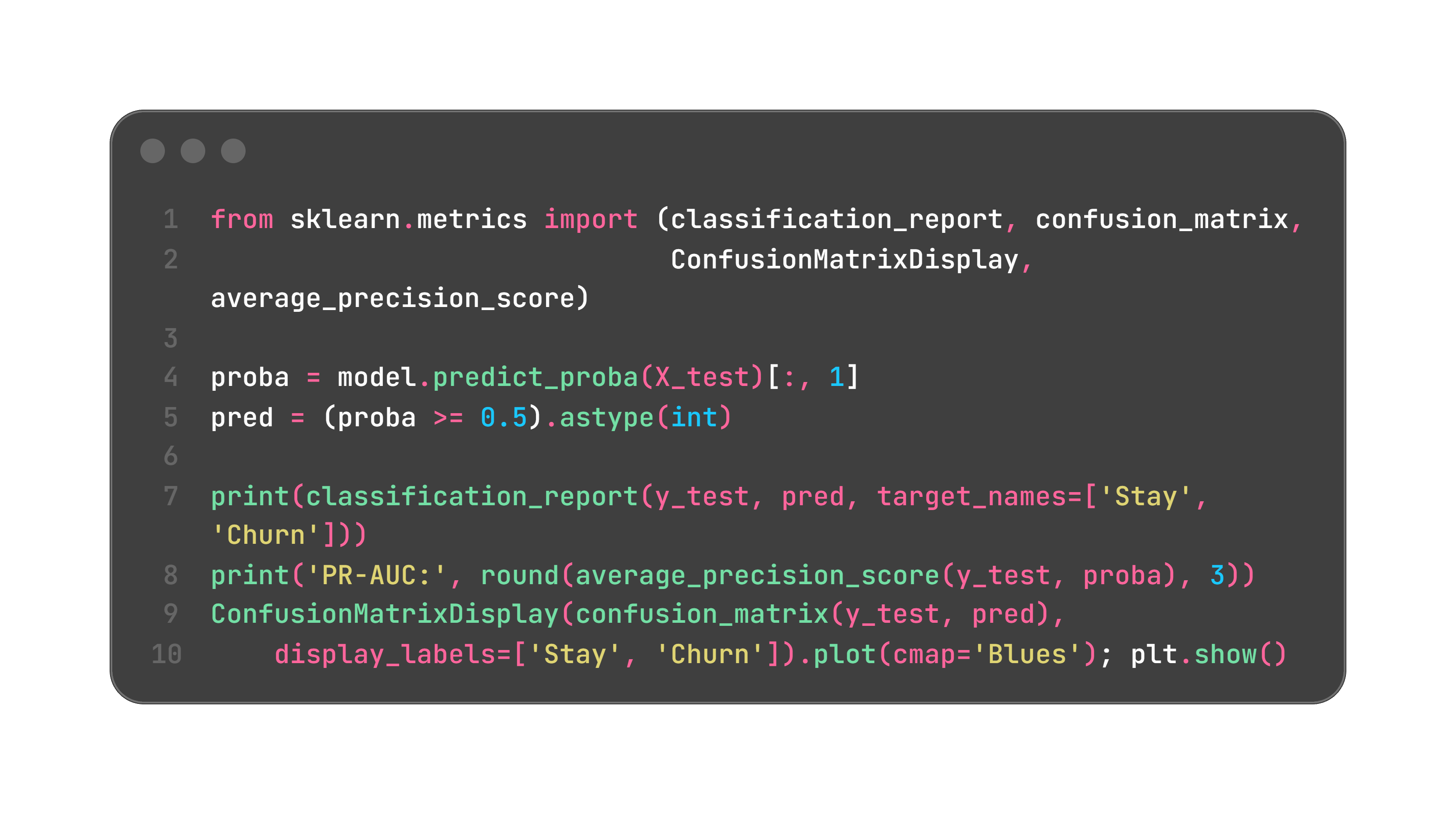
Read the churn row, not the overall accuracy. PR-AUC is the single number to compare your two models on, because it rewards putting real leavers near the top.
Now a step almost everyone skips, and it matters because Step 8 turns these probabilities into dollars. Those probabilities have to be honest: when the model says 30%, roughly 30 out of 100 such customers should actually churn. Check it, and fix it if needed.
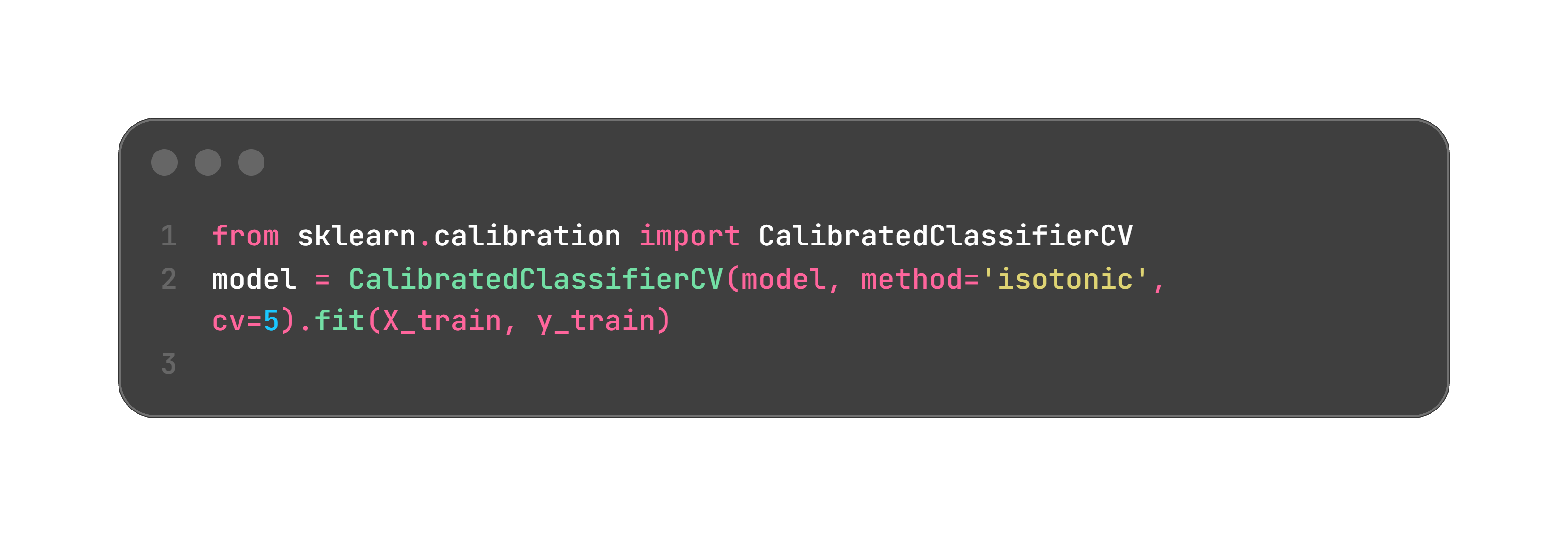
A model can rank customers perfectly and still have badly skewed probabilities. Uncalibrated scores wreck the business math even when the ranking is fine.
AI move: paste a confusing classification report and ask it to explain each number in terms of your specific business, not textbook definitions.
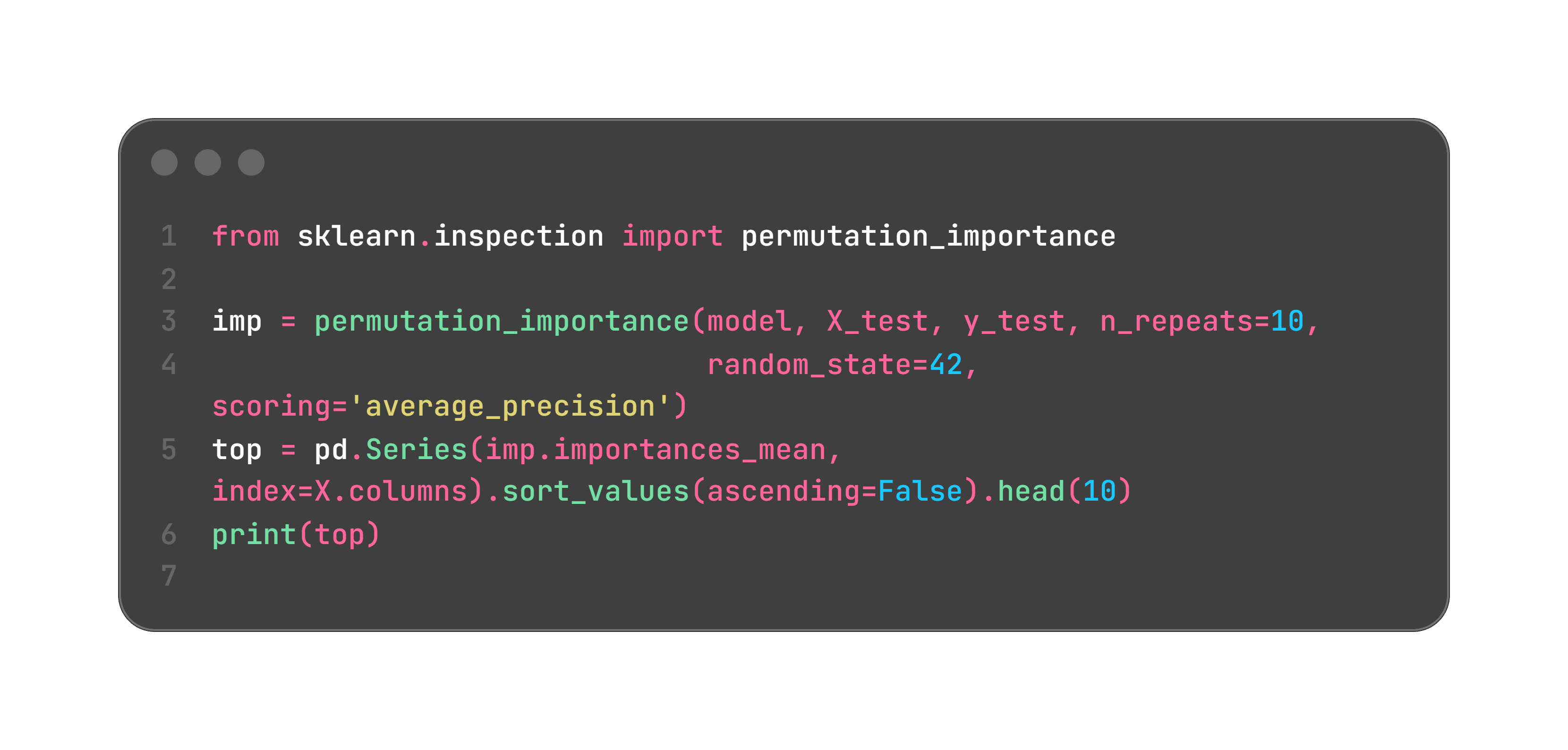
Permutation importance asks: if I scramble this column, how much worse does the model get? It works for any model and is harder to fool than built-in importances. This is what goes on a slide.
A churn score is useless until someone acts on it. Convert it into a call list using three numbers your team already knows.
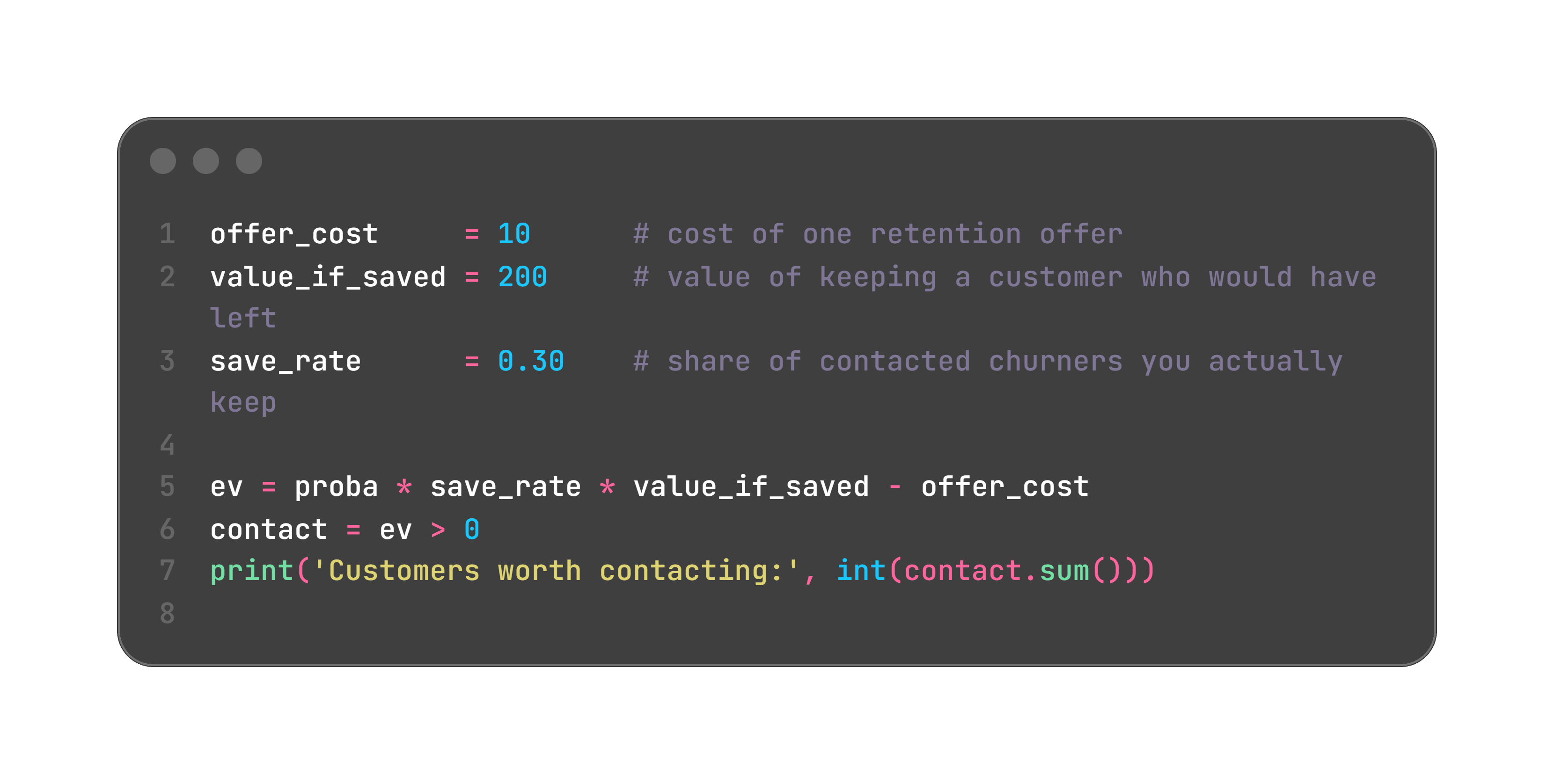
With these numbers, reaching out pays off once a customer’s churn risk clears 16.7% (that is offer_cost / (save_rate * value_if_saved)). Everyone above the line goes on the list. Change the offer cost or the customer value and the line moves itself.
Here is the hard truth. A VP does not buy “PR-AUC of 0.66.” They do not know what recall is, and they should not have to. They buy revenue, cost, and risk. Your job is to translate.
Say the model flags 1,500 customers above the threshold this month, and from your evaluation about 40% of them truly would have churned. Then:
Campaign cost: 1,500 offers at $10 each = $15,000
Customers actually saved: 40% who would churn, times a 30% save rate = 180 customers
Revenue protected: 180 at $200 = $36,000
Net this month: $21,000, or roughly $250,000 a year
That is the sentence that gets budget: “For fifteen thousand dollars of outreach we can protect about thirty-six thousand in revenue this month, and here is the exact list of who to call and why.” Notice not one metric name appears in it. Keep the recall and PR-AUC in the appendix for the analysts. Lead with money, customers, and cost. (Numbers here are illustrative. Plug in your real ones.)
Predicting churn is not the same as reducing it. So do not contact everyone the model flags. Randomly hold back a control group, maybe 20% of the flagged list, and give them no offer. A month later, compare the churn rate of the customers you contacted against the control. The gap is the real lift your model and campaign produced together, in customers and dollars.
This is the difference between “we built a model” and “we ran it, held out a control, and cut churn in the treated group by four points.” That second sentence is what renews your budget, and it turns this into an A/B test story you can tell in any interview.
A model in a notebook helps nobody next month. You do not need anything fancy. You need it to run and be easy to fix.
Break it into files, one job each:
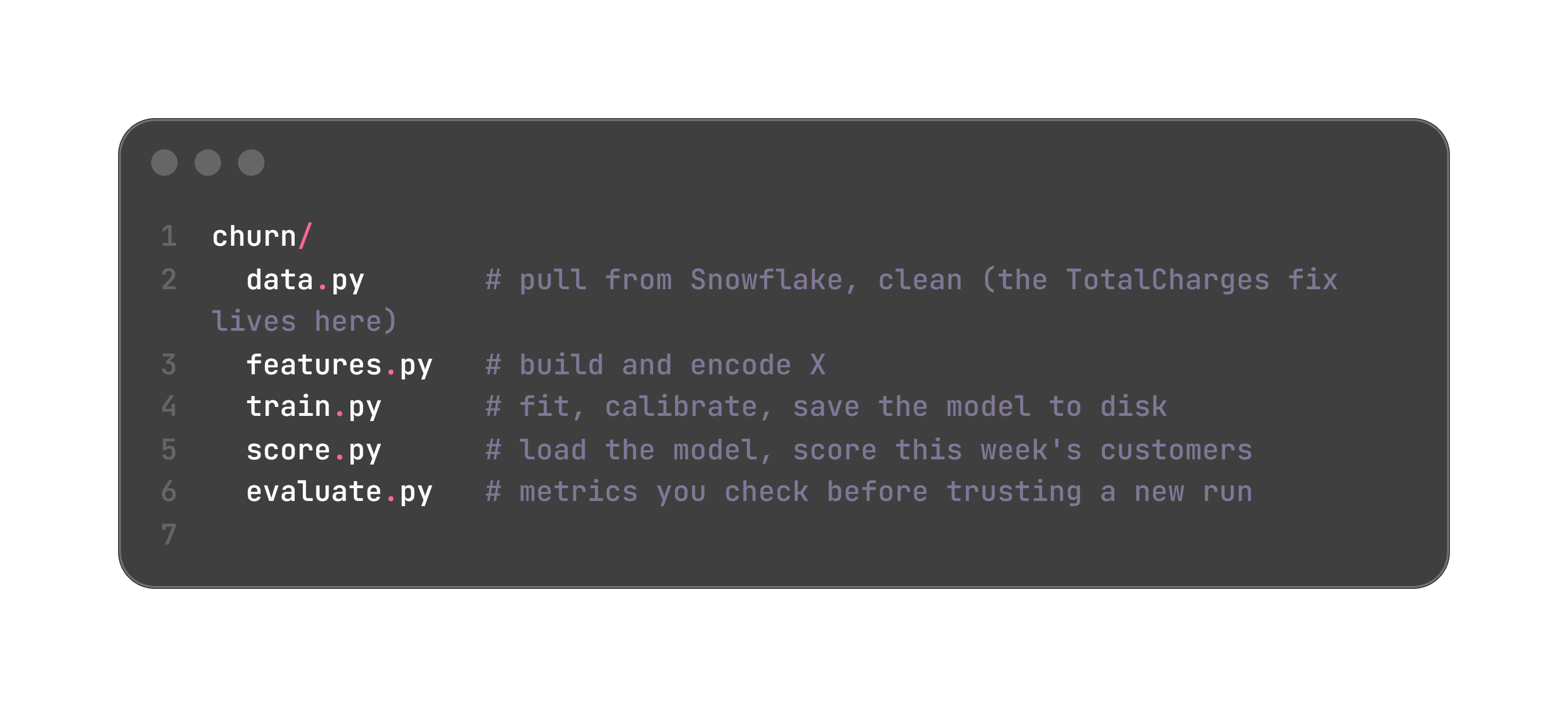
Write a test or two, for sleep, not show. The ones that guard the data catch the failures that hide:
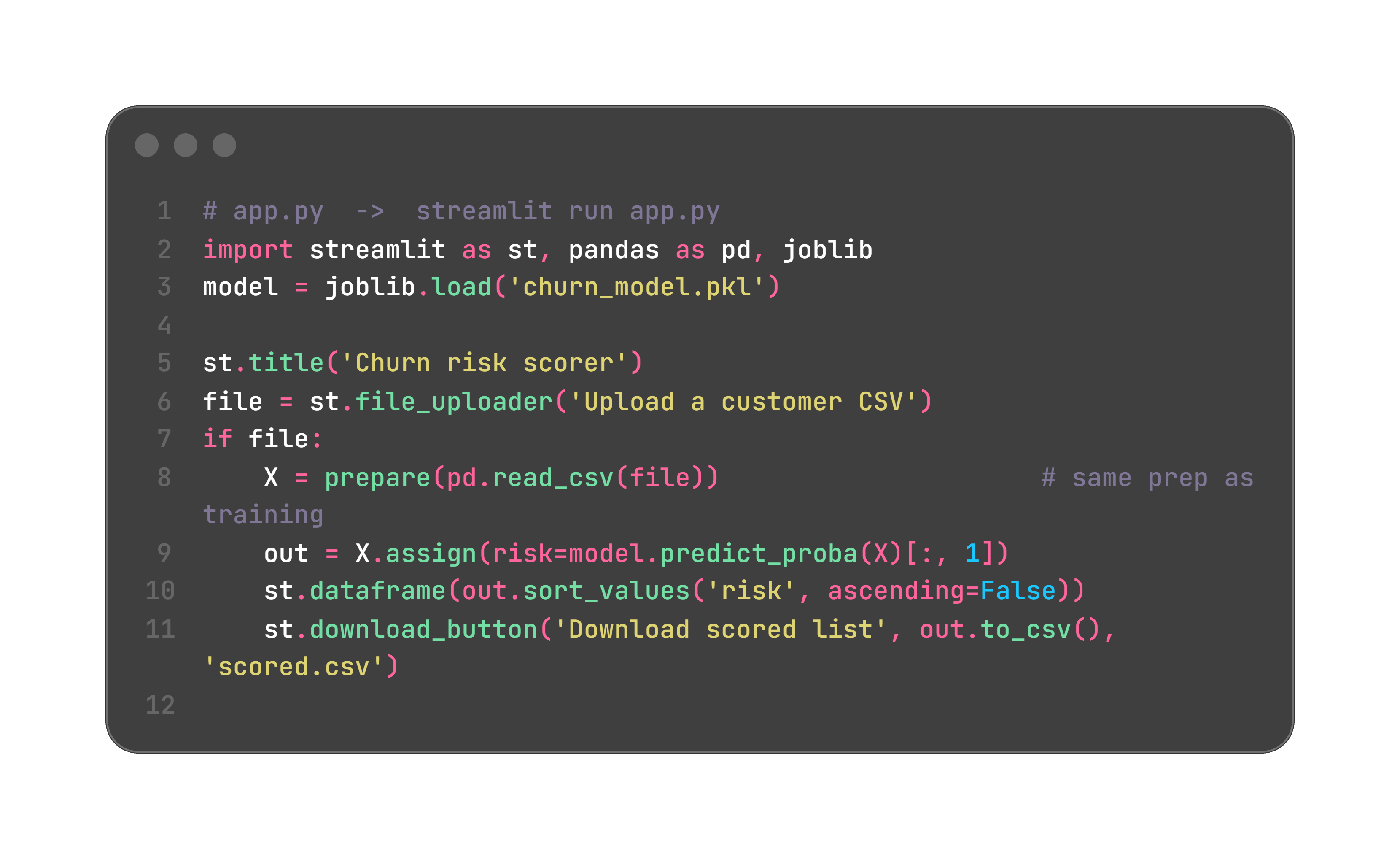
Then give it a front door. Two options, and the choice is about who the user is.
A dashboard your retention team clicks, with Streamlit:
Or an endpoint another system calls, with FastAPI:
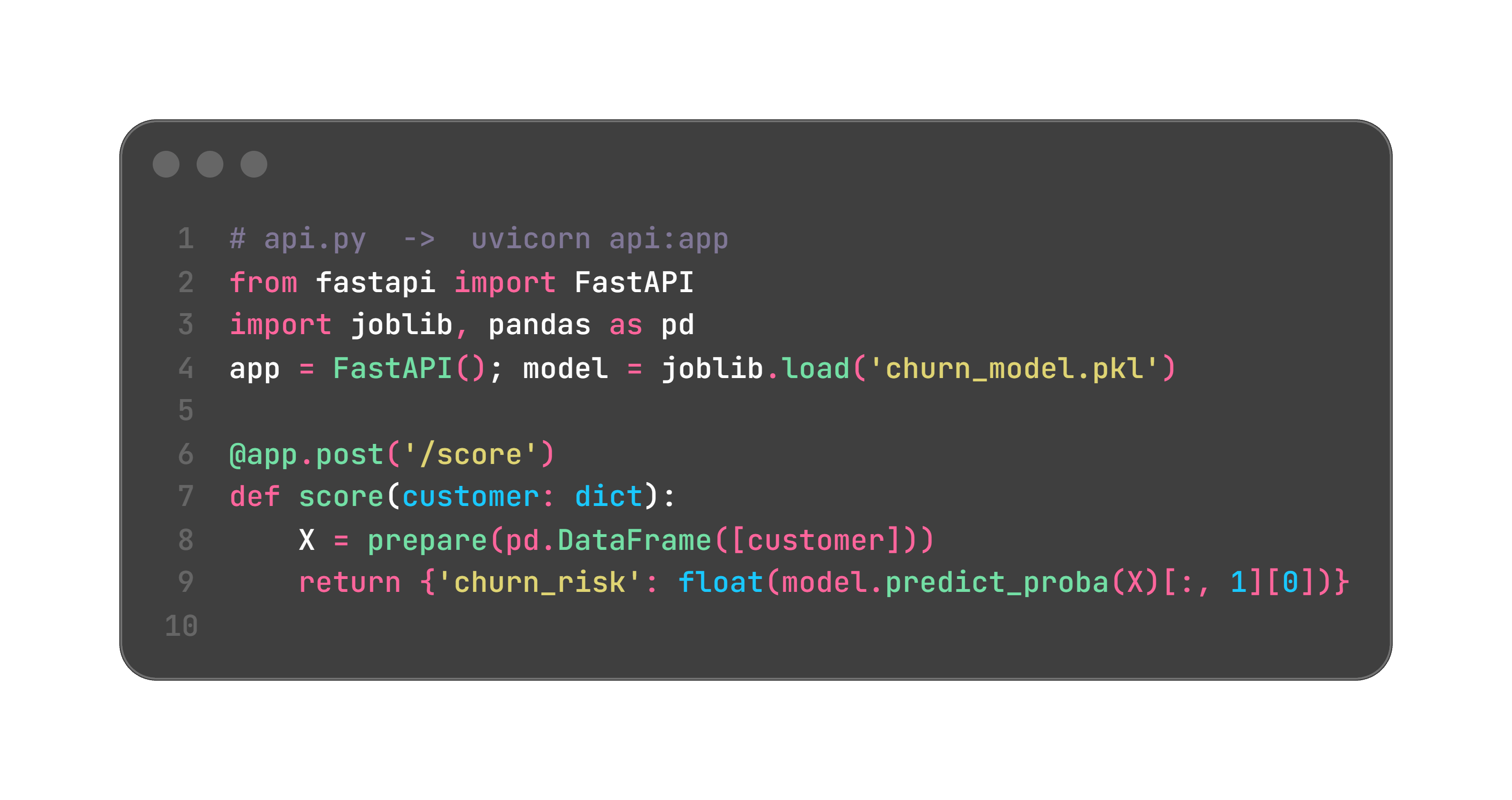
Streamlit when a human needs to see and act. FastAPI when a system needs an answer. Run whichever on a weekly schedule, log every prediction so you can measure how right you were, and retrain when new data drifts from what you trained on.
AI move: hand it your notebook and ask it to split it into these files. Mechanical refactors like this are where it saves you the most time.
Let it do the how: the connector boilerplate, the encoding checks, the refactor, the first draft of your writeup. Do not let it own the what or the why. It should not pick your churn definition, your metric, or that 16.7% threshold, because those need business context it does not have. And do not trust it to catch a data leak. Ask it to “just build a churn model” and it will happily use a column it should not, hand you a perfect score, and never say a word.
Simple vs strong model: logistic regression is easy to explain, boosting usually ranks better but is harder to reason about. Match it to your audience.
Recall vs precision: catch more leavers, or waste less outreach. Your retention budget picks the point, not a default of 0.5.
Calibrated vs not: a model can rank well and still lie about probabilities. If you are turning scores into dollars, calibration is not optional.
Batch vs real-time: weekly batch is plenty for churn. Real-time scoring adds cost for almost no gain here.
Streamlit vs FastAPI: a screen for people, an endpoint for systems.
More features vs upkeep: every feature is one more thing that can break, drift, or leak. Add them on purpose.
Overview — 7,000 telecom customers, goal is to flag who will churn so the team can act first.
Approach — pulled from Snowflake, fixed the TotalCharges trap, explored churn by contract and tenure, trained a logistic baseline against a calibrated boosting model, evaluated on recall and PR-AUC, converted scores into a cost-aware call list, and measured real lift with a holdout.
Findings — about 1 in 4 churned, month-to-month contracts and short tenure were the strongest signals, and at the numbers above the campaign nets roughly $21k a month. Fill in your real scores.
Limitations — one snapshot in time, the retention economics are estimates to refine with the team, and the model needs retraining as behavior shifts.
The thing that makes this stand out is not the algorithm. Every step has a reason you can say out loud, and it ends with a decision and proof, not a chart.
Best of luck for everything!
- Sai Bysani, a fellow Hustler!
Keep grinding, keep growing,
The Data Hustle.
No posts
Comments
Nothing yet. Say the first thing.
Sign in to join the conversation.