
Anthropic shares details of how Claude’s text watermark works
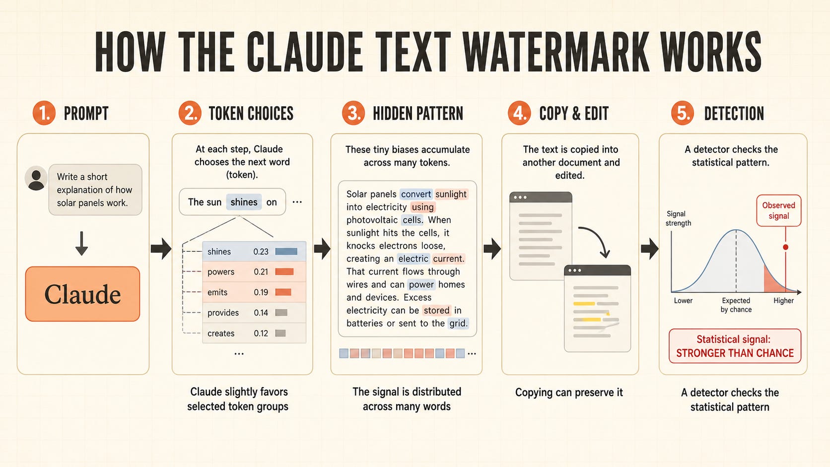
Large language models like Claude work by generating one word at a time. Each time the model decides on the next word, it chooses among a list of potential candidates, ultimately selecting the most sensible or likely based on the preceding text. Take the sentence “The weather today was cold and…”. The next word is very unlikely to be “sugary.” But it is quite likely to be “overcast” or “grey.” Under most circumstances, it doesn’t matter much to the reader which of these latter two words the model ultimately chooses—the meaning of the sentence is largely the same either way. In cases like this, the choice is settled by a random number.
Watermarking uses low-stakes choices like these—which occur many times over a piece of generated text—to leave a pattern in Claude’s responses. That pattern is undetectable to the reader, but is detectable to anyone who has a key that encodes it. When watermarking is used, choices are still made at random, but the source of the randomness is different. Instead of using an arbitrary random number generator to pick the next word, watermarking uses the key and a few words that come before to settle what word the model should pick. That is, the words that Claude picks are still random, but now, one can check the sequence of words and see if it’s consistent with the choices Claude would make if it was using the key. If it is, one can assign a probability that the text was generated by Claude.
You Don’t Have a Design System – what design systems don’t solve for building consistent experiences
Atomic design gave us a useful hierarchy a decade ago: atoms compose into molecules, molecules into organisms, organisms into templates and pages. The useful claim, chemistry aside, is that a system needs the larger patterns too, not just the components inside them.
But look at where most of us spend our energy on the daily, and it’s easy to see why. A button is a tractable problem. It has states, variants, a token for every value, and a Storybook page where you can see all of it at once. You can finish a button, and finishing things is very satisfying. You can even tweet a picture of a fancy looking button and get ~1k likes from the design community.
Those larger patterns resist all of that. A settings page isn’t a component with props. It’s a set of judgment calls: what belongs together, and how hard it should be to change something. You can’t always list those out exhaustively, and it’s a hard problem to solve definitively. So they often remain as precedent, transmitted by pointing at an existing screen and saying “just like that one.”
Beautiful UI for AI-native interfaces.
How design systems talk to machines
A study of the current state of the art in how design systems implement and distribute agentic tooling for DS contribution and consumption.
The hierarchy of competence
Hardik Pandya summarizes 9-step hierarchy of traits that highly competent people exhibit (Execution, Efficiency, Collaboration, Visibility, Anticipation, Ownership, Foresight, Prioritization, Direction).
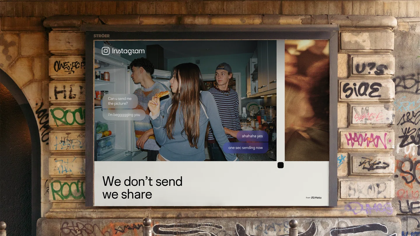
“Instagram has evolved”: the process and craft behind Instagram’s first major refresh in over ten years
It’s Nice That sits down with creative director Christy Silva and director of brand design Cynthia Pratomo to discover the inspiration behind Instagram’s latest brand system, and an exciting new wordmark.
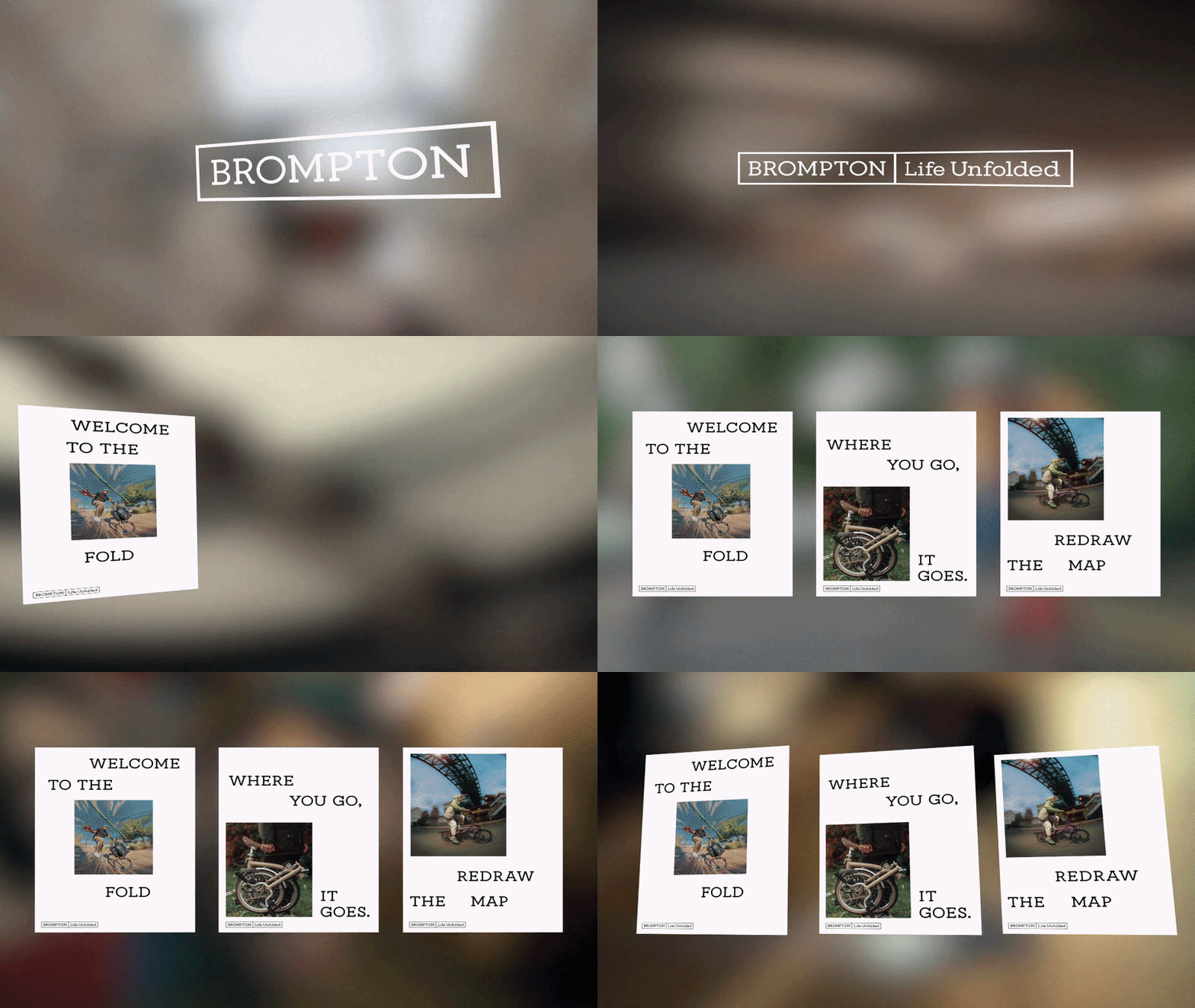
Studio Blackburn’s global branding system for Brompton, introducing custom slab typography and logo grids.
London agency Studio Blackburn led the full brand update for Brompton, the world famous folding bike maker. The brand expanded across Europe and Asia. Its previous image suffered from mixed style use. The new branding establishes a clean plan centered around a custom font named Brompton Slab. Laser-cut aluminum stencil plates connect the brand look directly to the company workshop floor. Rich cobalt blue pairs with raw metal surfaces. This balances shop roots with crisp global appeal. This structured approach gives the brand clear weight and strong visual focus.
No posts
Comments
Nothing yet. Say the first thing.
Sign in to join the conversation.