
This is a playbook for smart brands. Each chapter is shaped by years of experience in branding, sharing how to build brands that are human, intentional, and culturally relevant.
If you’re stuck overthinking branding — or waiting for more budget, more people, or more polish — this is for you. Clarity over complexity. And yes, you can save time, money, and resources along the way.
After a series of practical chapters on growth, content, and launch systems, this chapter moves back into art direction: the visual and emotional layer where a brand becomes felt, not only understood.
Because something interesting is happening.
After years of polished templates, smooth digital identities, over-optimized content, and now AI-generated visuals that can produce almost anything in seconds, the handmade is starting to feel valuable again.
Not handmade as a rustic aesthetic. Not handmade as nostalgia for its own sake. And definitely not handmade as a shortcut for “authentic”. But handmade as a signal of presence and attention. Of someone making a choice with their eyes, hands, taste, and patience.
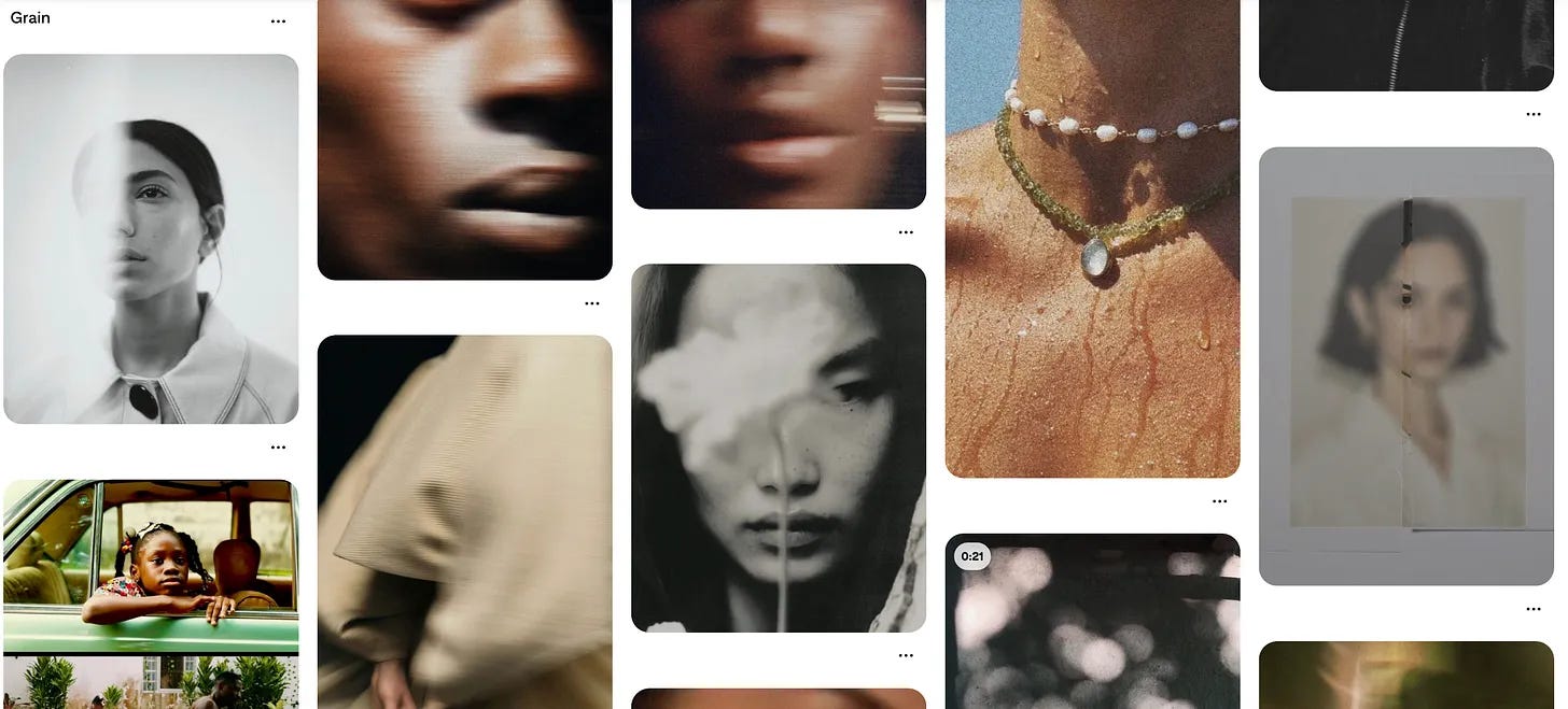
You can feel it in the return of handwriting, grain, scanned textures, printed matter, imperfect compositions, physical objects, real interiors, drawn marks, and layouts that do not seem built only to please a grid. You see it in restaurant menus that look touched by a person, in fashion campaigns that foreground craft, in beauty brands leaning into ritual and materiality, in newsletters and zines borrowing from print culture, and in small brands using texture because the flat, frictionless, perfectly balanced visual world has started to feel a little too easy.
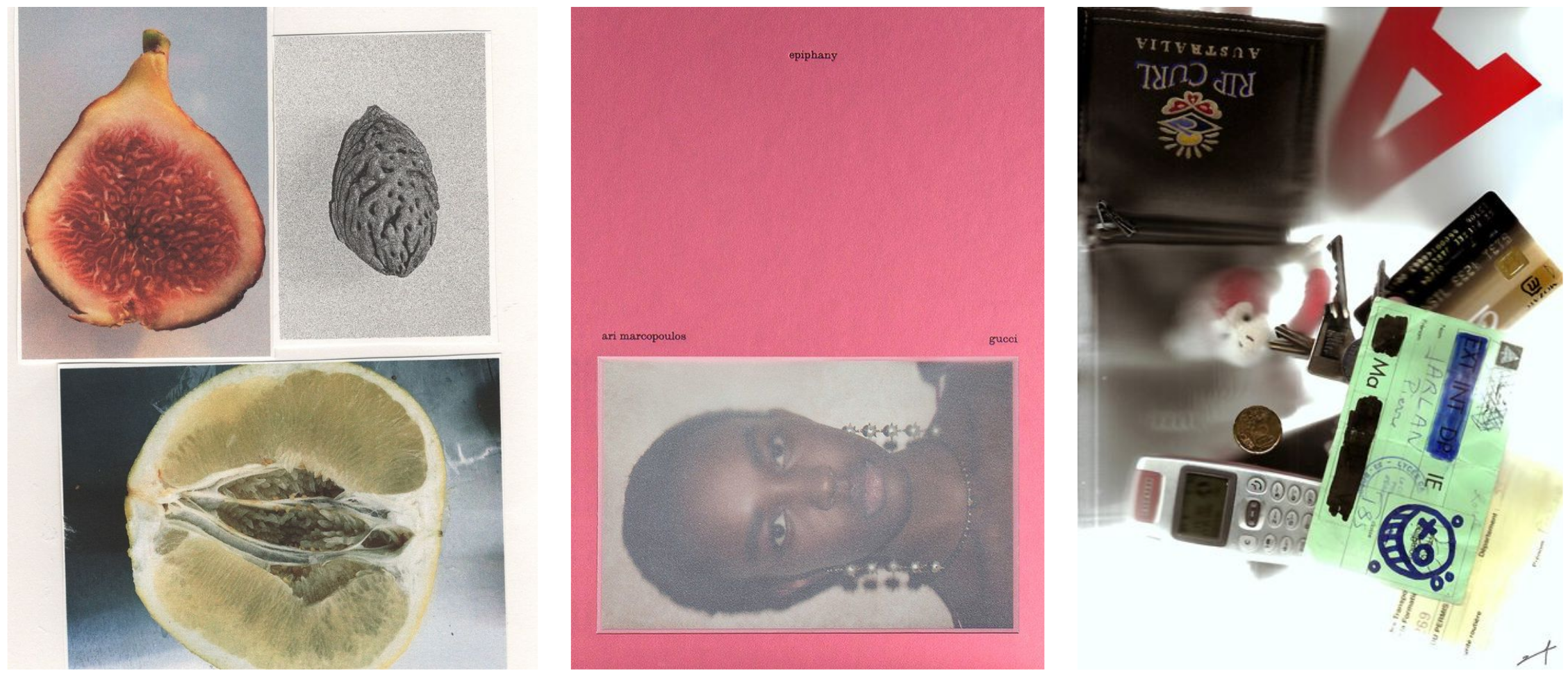
The handmade brand is not about rejecting technology. Most brands will still use digital tools. Many will use AI somewhere in the process. The point is not to pretend we are going backwards. The point is that when everything can be generated, polished, scaled, and replicated, the signs of human involvement begin to carry more meaning.
A slightly uneven line. A real table. A handwritten note. A grainy photograph. A folded card. A visible brushstroke. A material you can almost imagine touching.
These things now do something strategically useful.
They slow the eye down.
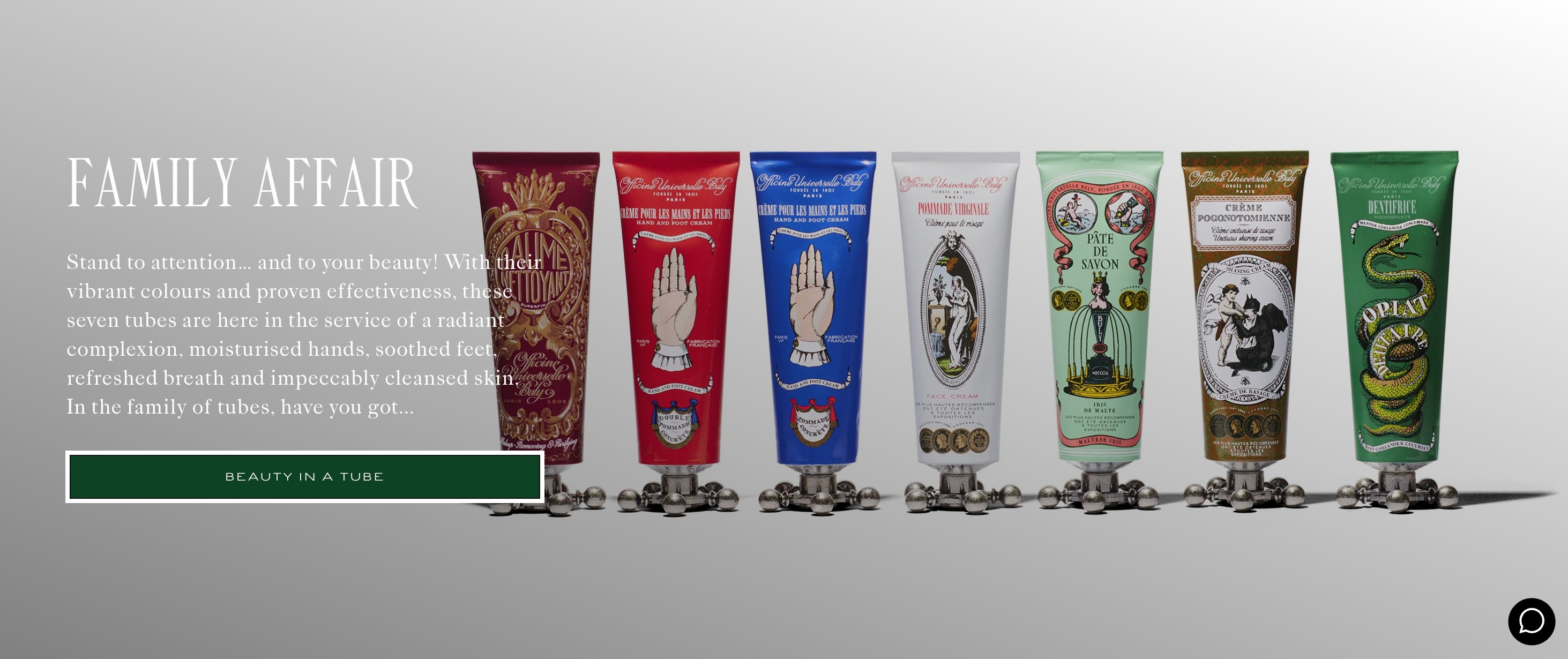
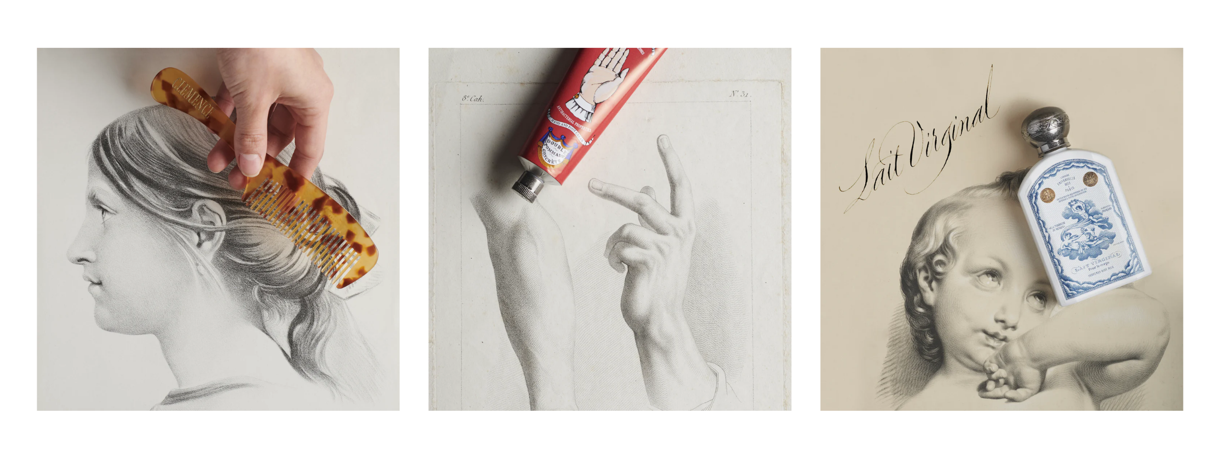
Officine Universelle Buly is a useful example because the brand turns the act of gifting into a physical ritual. Its packaging includes printed paper that reproduces an old newspaper, marbled gift pouches, embossed initials, ribbons, and handwritten calligraphy on selected products. The product is not only bought; it is wrapped, named, marked, and almost ceremonially prepared. That is handmade art direction working as experience, not decoration.
For a long time, digital-first branding moved toward smoothness.
Clean sans-serifs. Soft gradients. Rounded buttons. Minimal icons. Modular layouts. Friendly illustrations. Neat systems. Perfect spacing. Perfect lighting. Perfect skin. Perfect mockups. Perfect language that said all the right things without leaving much behind.
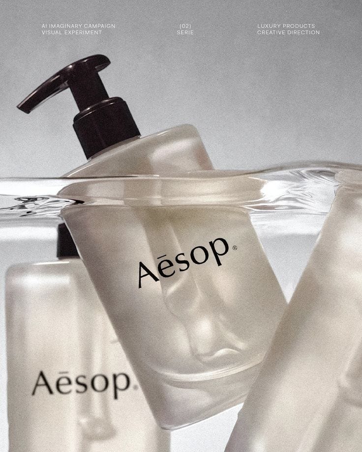
There was a reason for this. Digital brands needed to feel simple, scalable, trustworthy, and easy to use. Clean design became a way to reduce friction, especially for tech, finance, wellness, beauty, education, and almost every category trying to make itself feel accessible online.
But when too many brands use the same language of ease, ease becomes invisible.
A perfectly polished brand can start to feel strangely empty. It may look professional, but it does not always feel particular. It may communicate trust, but not memory. It may be beautifully designed, but hard to place. And now, with AI making polished imagery even easier to produce, the visual surface that once signaled care can also start to signal convenience.
This is the tension behind the return of handmade art direction.
People are not suddenly tired of beauty. They are tired of sameness pretending to be beauty.
People are tired of images that look finished but not felt. They are tired of visual worlds that seem technically correct, but emotionally absent.
The handmade gives the brand a little friction again.
Not friction as difficulty, but friction as texture. Something for the eye to hold onto. Something that suggests a person was there.
Handmade details work because they suggest time.
Someone drew this. Someone arranged this. Someone printed this. Someone wrote this down. Someone chose this object, this corner, this fold, this shadow, this strange little imperfection that a template might have cleaned away.
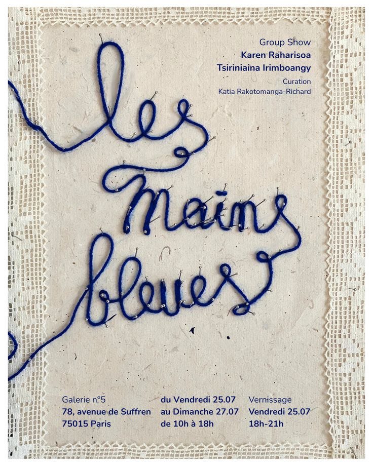
That suggestion of time matters because attention has become one of the most expensive materials a brand can use. We are used to fast images now. Fast content, fast campaigns, fast identities, fast websites, fast captions, fast launches. The handmade disrupts that speed because it carries evidence of slowness.
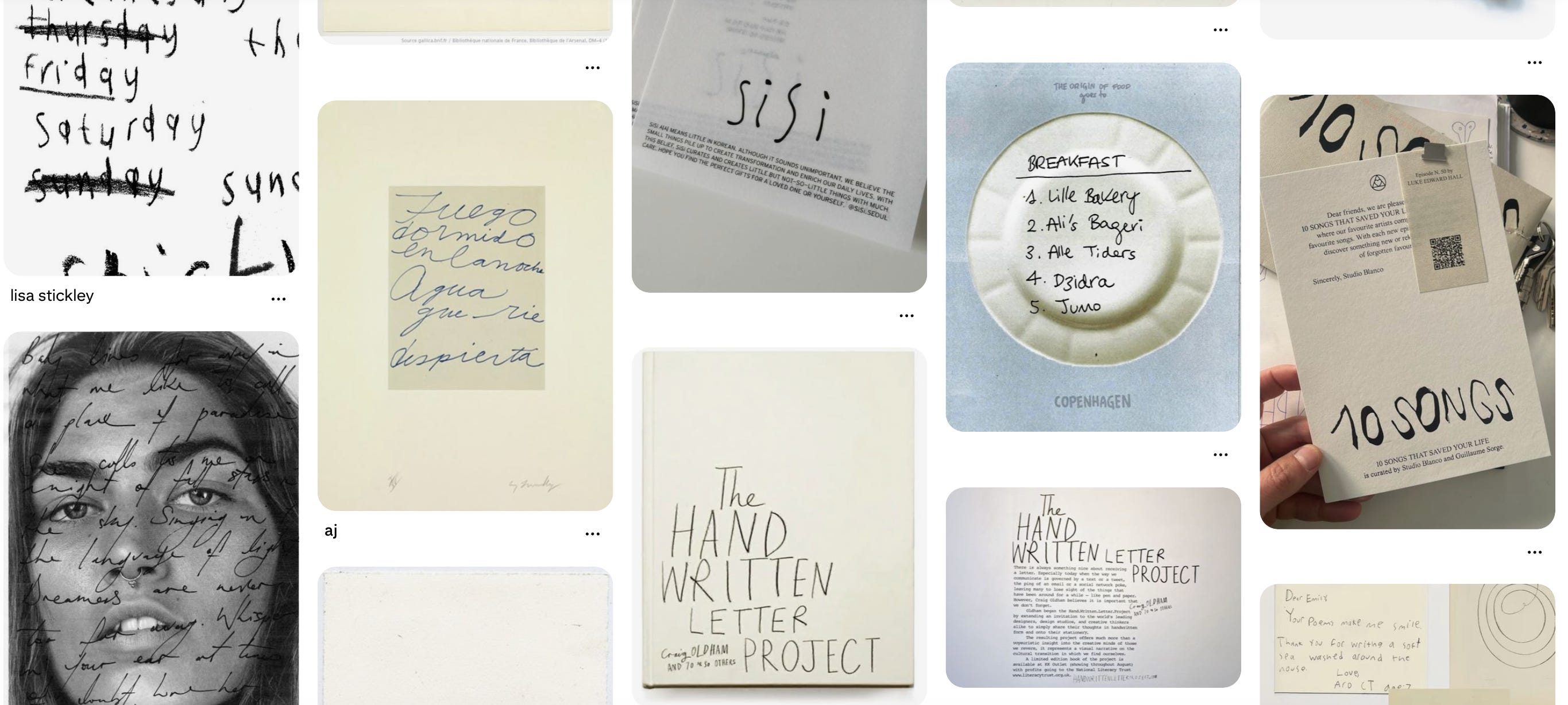
A handwritten menu feels different from a digital menu because you can sense the hand behind it. A campaign shot on film, or made to feel close to physical print, creates another kind of intimacy than a perfect render. A product photographed on a real surface, with objects that feel chosen rather than generated, can make the brand world feel more inhabited.
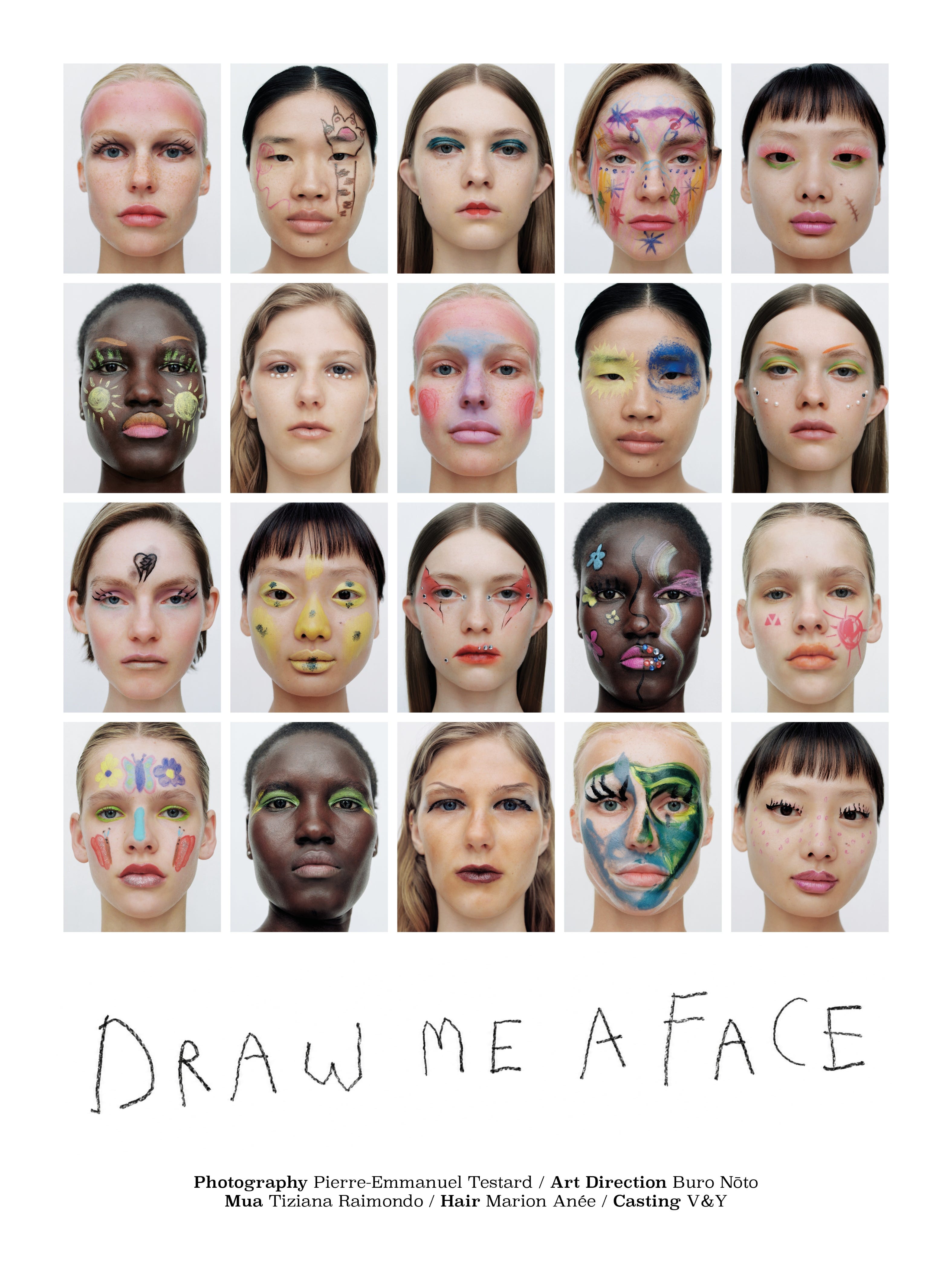
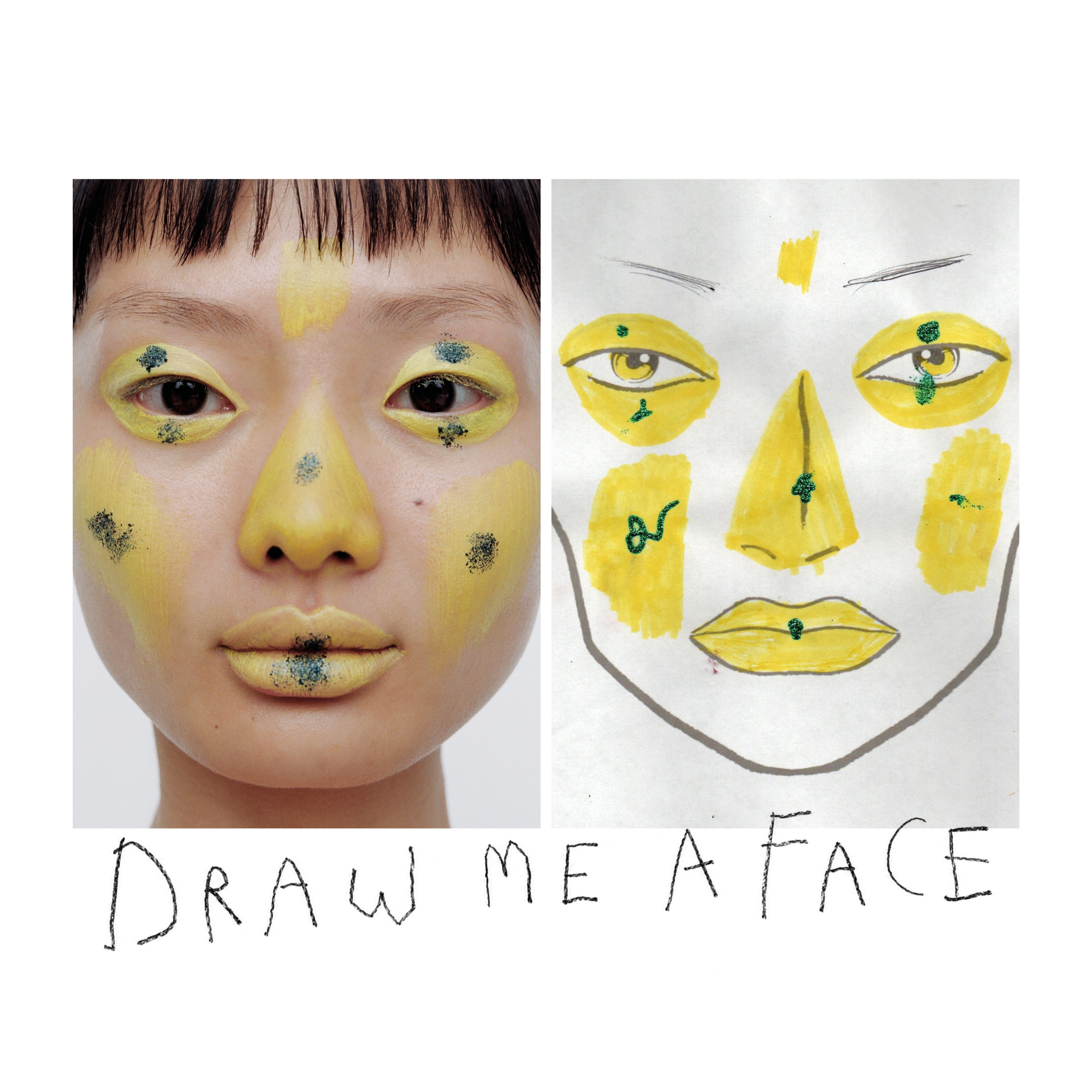
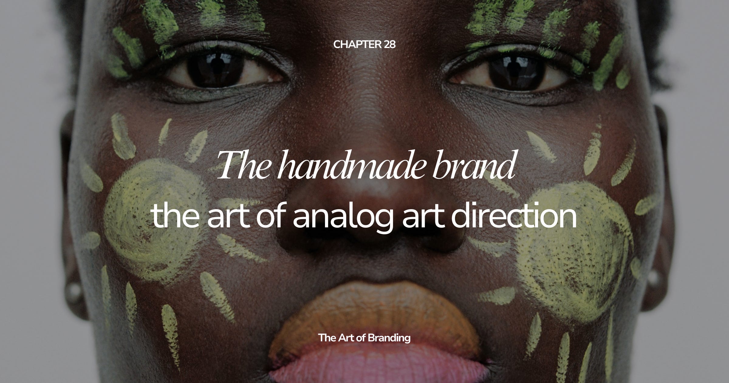
A beautiful example of this shift is Draw Me A Face, a project by Pierre-Emmanuel Testard and Tiziana Raimondo that turns children’s unfiltered imagination into makeup art. What makes it feel so relevant to the handmade brand is the way it resists the polished logic of beauty imagery. Instead of starting from perfection, symmetry, or a finished campaign idea, the project begins with instinct: a child’s drawing, a strange line, an unexpected face, a visual language that has not yet learned how to behave. The result feels alive because you can sense the human hand twice — first in the child’s imagination, then in the translation into makeup. It shows why handmade cues are becoming valuable again: they bring back surprise, irregularity, and the feeling that something was made through attention rather than automation.
This does not mean handmade cues are automatically better. A hand-drawn logo can be weak. A messy layout can be lazy. Grain can become a filter. Imperfection can become a style trick.
But when it is connected to the brand’s meaning, the handmade can become a powerful code.
For a food brand, it can signal appetite, locality, generosity, and care.
For a fashion brand, it can signal craft, taste, and a world beyond the product.
For a beauty brand, it can signal ritual, intimacy, skin, touch, and materiality.
For a cultural brand, it can signal point of view, independence, and editorial depth.
For a service brand, it can signal thinking, process, and the human mind behind the work.
The handmade says: this was not only produced. It was considered.
There is a trap here.
As soon as an aesthetic becomes desirable, brands start copying the surface. Suddenly everything has rough paper, irregular type, grain overlays, casual handwriting, blurry photography, behind-the-scenes objects, and an “imperfect” layout that somehow looks exactly like every other imperfect layout.
This is how the handmade becomes another template.
The question is not: how do we make the brand look more handmade?
The better question is: where does the brand genuinely have human touch?
That is where the art direction should begin.
If the brand is built around care, the handmade might show up in notes, rituals, soft materials, real-life use, and slower visual pacing. If the brand is built around expertise, the handmade might show up in annotations, sketches, frameworks, margin notes, process images, and the visible thinking behind the final result. If the brand is built around hospitality, the handmade might show up in menus, table settings, objects, handwritten details, imperfect light, and the rhythm of being welcomed.
The handmade should not be a costume placed over a brand that has nothing human to say.
It should reveal where the brand is already alive.
One of the reasons handmade art direction feels interesting now is that objects are returning to the center of visual culture.
For years, many brands existed mostly as flat digital surfaces: logos, websites, social posts, templates, mockups, UI, packaging renders. But the more digital our visual environment becomes, the more meaningful physical objects can feel.
A crumpled receipt. A matchbox. A handwritten card. A ceramic cup. A paper bag. A candle. A marked-up notebook. A slightly worn chair. A plate, a pen, a ribbon, a postcard, a fabric swatch, a tray, a flower, a key, a book left open.
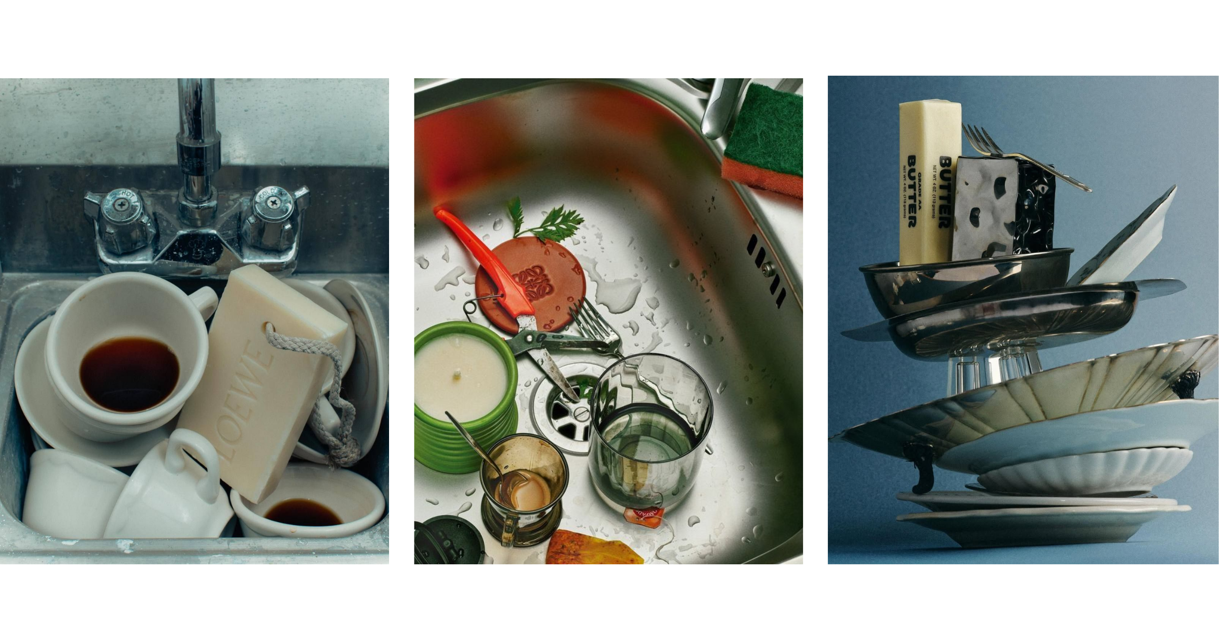
These are not just props. They are carriers of mood.
Objects help the audience understand the world of the brand without needing everything explained. They create atmosphere, scale, and intimacy. They make the brand feel like it belongs somewhere, not just that it exists online.
This is why still-life art direction, tablescapes, product rituals, and object-led imagery are becoming so useful for brands. A product photographed alone can communicate what it is. A product placed inside a world can communicate how it wants to be lived with.
The object says: this brand has a life around it.
For founders and creatives, this matters because many brands are too focused on the asset and not focused enough on the world. The logo is not the whole story. The product is not the whole story. The website is not the whole story. The brand becomes memorable through the surrounding signals: the objects, the environments, the gestures, the repeated details that make the world feel specific.
A handmade brand pays attention to these signals.
A handmade brand does not only live in graphic design. It often becomes most convincing in space.
A store, studio, restaurant, hotel room, market stall, pop-up, workshop table, bathroom counter, event dinner, or packaging moment can do more for the brand than a month of content if the experience is memorable enough.
Physical spaces hold details that digital channels flatten. Sound, smell, light, weight, temperature, pace, distance, service, touch. These are brand signals too. They shape how people remember the brand, even if they never describe them in those terms.
This is why many brands are investing in spatial cues again. Not always through expensive stores, but through smaller moments of physical presence: a beautifully packed order, a postcard, a printed guide, a pop-up table, a handwritten sign, a real object photographed well, an event where the table setting communicates the brand before anyone gives a speech.
The handmade brand understands that identity is not only what people see on a screen.
It is what they encounter.
For small brands, this can be encouraging. You may not have a flagship store or a production budget. But you can still design moments of presence. The way a guide is delivered. The way a proposal looks. The way a package opens. The way a thank-you note is written. The way your process is shown. The way your materials are photographed. The way your community feels invited into the work.
Small details become powerful when they repeat.
The return of handmade art direction is not an invitation to make everything messy. It is an invitation to make things feel more present.
That requires judgment.
A brand should not add roughness just because polish feels overdone. It should understand what kind of human presence belongs to its world. Some brands need softness. Some need tension. Some need ritual. Some need evidence of process. Some need warmth. Some need strangeness. Some need craft. Some need restraint. Some need a little imperfection to stop the whole thing from becoming too clean to remember.
If you are exploring this direction, start with a few questions:
Where does human touch already exist in the brand?
What parts of the process are worth showing?
Which materials belong to the brand world?
What objects could carry meaning?
Where would handwriting feel natural rather than forced?
What kind of texture supports the brand’s mood?
Which physical moments could become more intentional?
What should stay polished, because not everything needs to look handmade?
The last question matters. Handmade art direction works best when it has contrast. If everything is rough, nothing feels deliberate. If every asset tries to look personal, the brand can lose authority. If every detail is imperfect, imperfection becomes the system, and the system begins to feel predictable.
The strongest brands know where to show the hand and where to keep control.
What makes the handmade valuable is not the aesthetic itself. It is what the aesthetic implies.
Attention.
Someone noticed the detail. Someone cared enough to make the object feel specific. Someone chose the paper, the line, the photograph, the surface, the spacing, the note, the light, the strange little thing that did not need to be there but somehow makes the whole brand feel more alive.
This is why handmade cues can be so emotionally powerful. They make the brand feel less automatic. Less frictionless. Less like it was produced by a system that could produce a hundred variations by morning.
They suggest that someone was present.
Presence is difficult to fake because it is not only visual. It has to show up in the way the brand behaves. A handwritten note means little if the service feels careless. A grainy campaign means little if the product experience is generic. A beautiful printed card means little if the brand has nothing specific to say.
The handmade has to connect to the way the brand actually moves through the world.
That is where it becomes more than style.
It becomes trust.
The future of art direction will not be a simple return to the past. Brands are not going to abandon digital tools, templates, automation, AI, or scale. The interesting work will happen in the tension between the two: digital speed and human slowness, system and gesture, polish and texture, efficiency and attention.
The brands that use this well will not be the ones pretending technology does not exist. They will be the ones that understand what technology cannot easily replace.
A sense of taste.
A specific eye.
A lived reference.
A material decision.
An imperfect mark that feels right.
A room that has atmosphere.
A product shown in a way that makes you imagine touching it.
A sentence that sounds like someone actually thought before writing it.
The handmade brand is not valuable because it looks less perfect.
It is valuable because it feels more present.
And in a culture full of images that look finished before they feel meaningful, presence may become one of the strongest art direction codes a brand can have.
After looking at the emotional and visual side of presence, the next chapter will return to the commercial layer: what happens when someone is interested, but the brand still makes it too hard to act.
We’ll look at how to make your brand easier to buy from through offer clarity, proof, calls to action, landing pages, pricing communication, and the small decisions that help people move from “this is interesting” to “this is for me.”
No posts
Comments
Nothing yet. Say the first thing.
Sign in to join the conversation.