
👋 Get weekly insights, tools, and templates to help you build and scale design systems. More: Design Tokens Mastery Course / YouTube / My Linkedin
I am not affiliated with any of the suggested tools
You spend 2 hours setting up beautiful variants in Figma. Primary, secondary, ghost. Small, medium, large. Default, hover, disabled.
Then a developer asks: “What are the props for this component?”
You explain everything again. In a meeting, in a Notion doc, or in Slack messages. The developer writes the component with slightly different naming. Now “Primary” in Figma becomes type: 'main' in code.
The translation layer between design and code breaks down within weeks.
Here’s the thing: your Figma variants already ARE your props. They just need to speak the same language as your code. When you set this up correctly, your Figma button with variants “Primary, Secondary, Ghost” automatically becomes a React component with variant: 'primary' | 'secondary' | 'ghost', which automatically becomes interactive controls that anyone can toggle.
No manual documentation. No translation meetings. No drift.
Figma variant properties = Component props: When you name variants correctly, AI generates matching TypeScript types automatically
The naming alignment is everything: “Primary” in Figma should become
'primary'in code, not'main'or'type1'Storybook controls generate from types: Clean union types mean clean dropdown controls, no configuration needed
Prompts: Copy-paste prompts for every step of this workflow
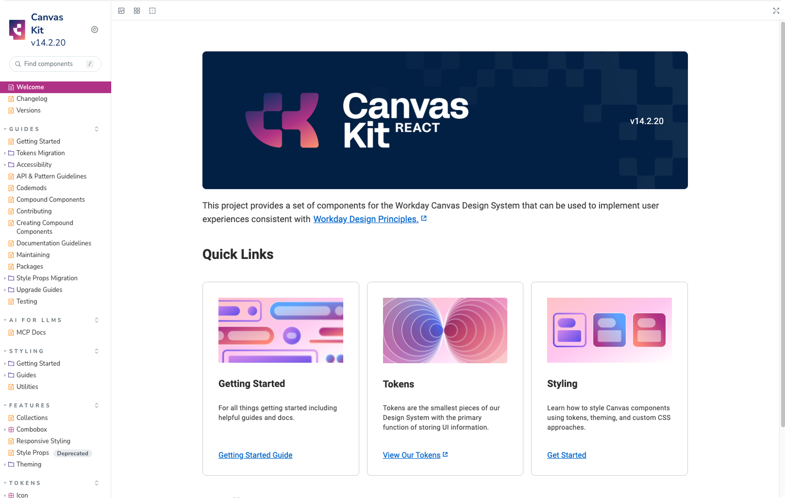
Storybook is a free, open-source tool that lets you browse and test your components in isolation, outside of your app. Think of it as an interactive catalog of every component in your design system.
Why is it so useful:
You can click through every variant without spinning up the full product
Controls panel lets you toggle props (size, variant, disabled) in real time
Auto-generated documentation pulls from the code, so it never goes stale
Shareable URL means you can send a link to anyone for review
When your Figma naming matches the code, Storybook generates all of this automatically from your TypeScript types.
Before you touch any tools, understand this flow:
FIGMA                      CODE                        STORYBOOK
───────────────────────────────────────────────────────────────────
Variant property     →     Component prop       →     Control panel
"Variant: Primary"         variant: 'primary'         [Dropdown: Primary ▼]
"Size: Medium"             size: 'md'                 [Dropdown: Medium ▼]
"Disabled: True"           isDisabled: boolean        [Checkbox: ☑]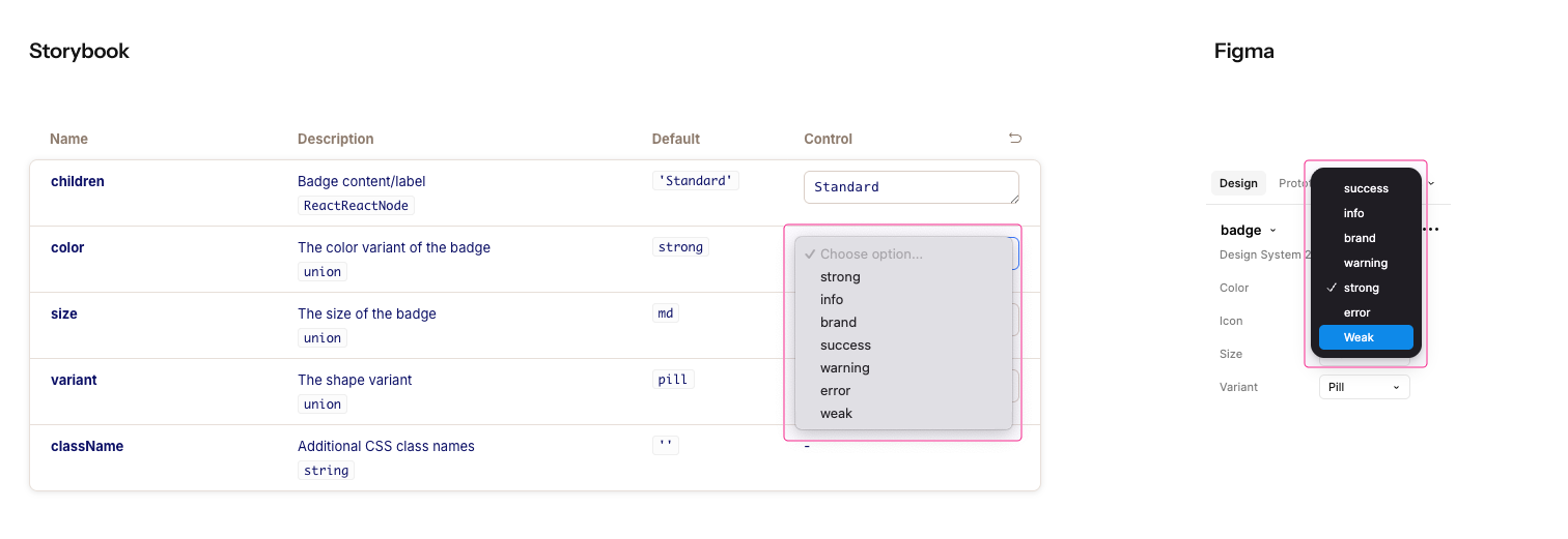
You set up Figma → AI generates the code → Storybook creates the controls.
When this chain works, everything stays in sync. When it breaks (usually because Figma naming doesn’t match code conventions), you get drift.
Let’s go step by step.
In your React/Next.js project, run:
npx storybook@latest initThis creates a .storybook folder with configuration. Start it with:
npm run storybookYou’ll see a local server at http://localhost:6006 with example stories.
Chromatic publishes your Storybook online, so your entire team can browse components in a browser. Free for open source, generous free tier for everyone else.
I use this option, so I can also share the work with others.
→ Sign up at chromatic.com (GitHub login works)
→ Create a new project and get your project token
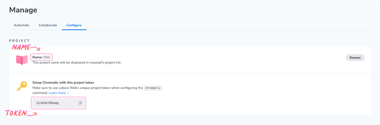
→ Install and publish Chromatic:
npm install chromatic --save-dev
npx chromatic --project-token=YOUR_TOKEN
You’ll get a public URL to share. Chromatic also catches visual regressions when you push changes.
This is the most important step. AI tools read your Figma file directly: your variant properties, layer names, and design tokens. If these are messy, the generated code will be messy.
Your Figma variant property names become your prop names.
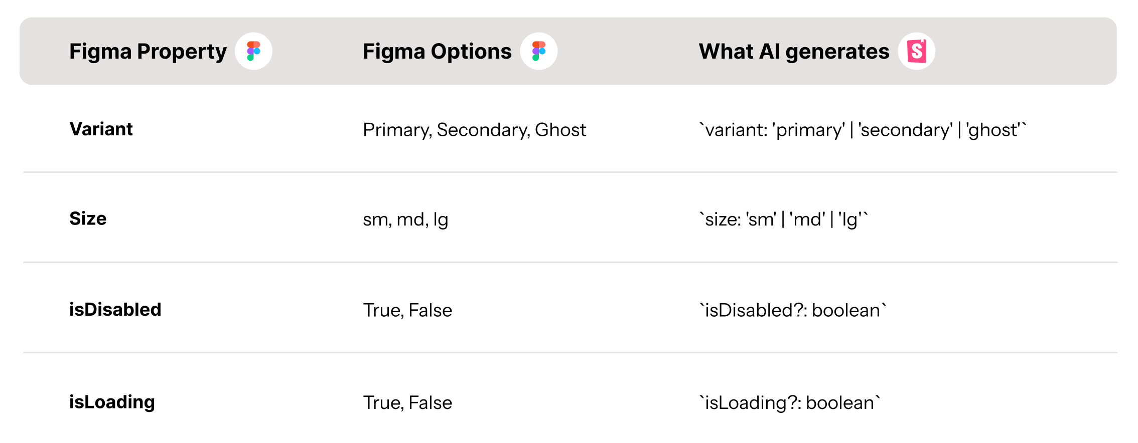
Name your Figma variants with code-friendly values (lowercase, no spaces, consistent format), and AI generates cleaner code.
Checklist before you generate
Open your component in Figma and verify:
Consistent naming: All variants use the same format (sm/md/lg, not sm/Medium/LG)
Code-friendly values: No spaces, lowercase preferred (primary, not “Primary Button Style”)
Boolean properties for on/off states: isDisabled, isLoading, hasIcon (not “State: Disabled”)
Meaningful layer names: “Leading Icon”, “Label”, “Trailing Icon” (not “Frame 47”, “Vector”, “Text”)
Select your component set in Figma and add a description. AI reads this and uses it for context:
Button component for user actions.
Props:
- variant: primary | secondary | ghost | danger (default: primary)
- size: sm | md | lg (default: md)
- isDisabled: boolean (default: false)
- isLoading: boolean (default: false)
Usage: Use primary for main actions, secondary for alternative actions,
ghost for tertiary actions, danger for destructive actions.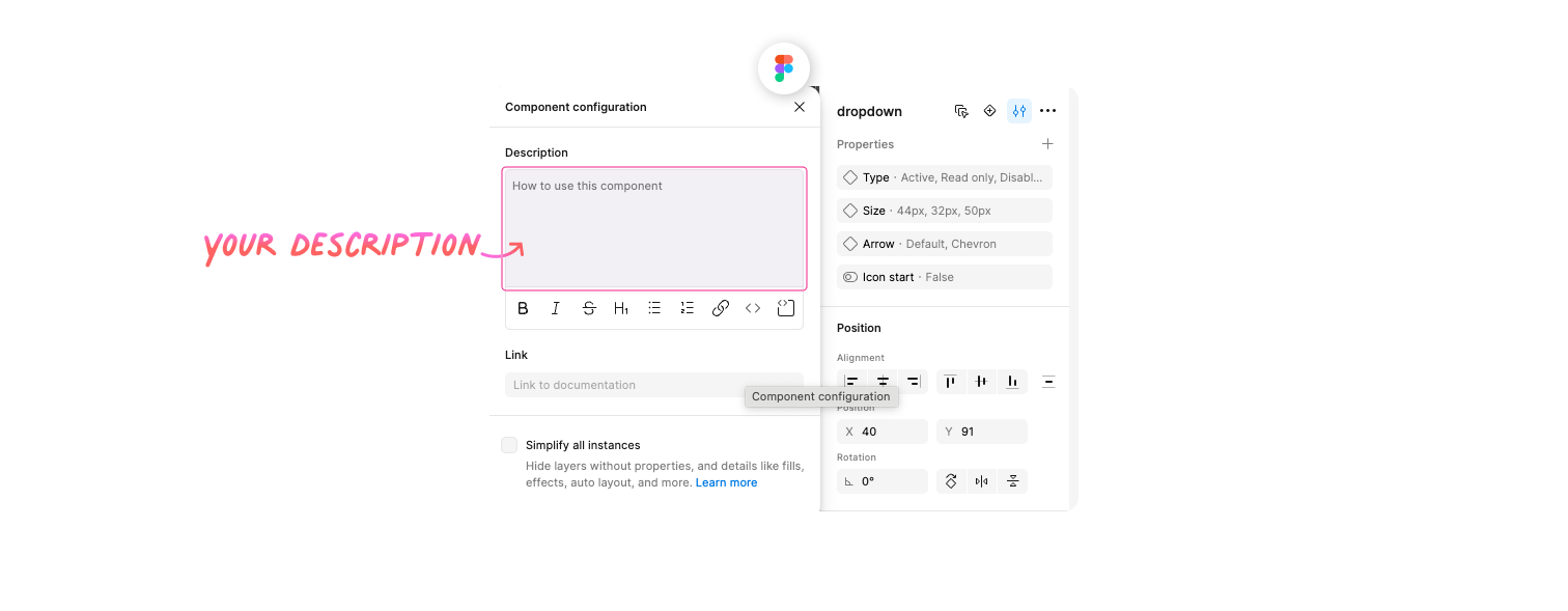
You need an AI tool that can read your Figma and generate code. Here are your recommended options:
Claude Code reads Figma files directly through the Figma MCP server. One-time setup. Claude Code can be used as an extension in any IDE or in your terminal.
Or, you can use Cursor.
Cursor is an AI-powered code editor (IDE) with built-in chat. It also supports MCP servers, so you connect Figma the same way. You can switch between AI models (Claude Opus 4.6, GPT-5.2, Gemini, etc.) to compare outputs.
This is the core of the workflow. The first builds your component, the second pushes it to Storybook.
Select your component in Figma, then paste this:
Get the design context for the selected Figma component.
Generate a React component with TypeScript that:
1. Has props matching the Figma variant properties exactly
   (use the same names and values, lowercased)
2. Uses TypeScript union types for all variants
   (e.g., 'primary' | 'secondary', never just string)
3. Uses boolean props for on/off states
   (e.g., isDisabled?: boolean)
4. Adds JSDoc comments for every prop explaining:
   - What it does
   - Available options
   - Default value
5. Follows the patterns in our existing components at src/components/
Show me the generated TypeScript interface first so I can verify
the prop names and values match my Figma setup before you write
the full component.
More detailed guide and tricks about generating components with AI here →
export interface ButtonProps {
  /** The visual style of the button */
  variant?: 'primary' | 'secondary' | 'ghost' | 'danger';
  /** The size of the button */
  size?: 'sm' | 'md' | 'lg';
  /** Whether the button is disabled */
  isDisabled?: boolean;
  /** Whether to show loading state */
  isLoading?: boolean;
  /** Button content */
  children: React.ReactNode;
}
Check that the prop names and values match your Figma exactly. If AI-generated type instead of variant, or small instead of sm, tell it:
The prop names don't match my Figma. Change "type" to "variant"
and "small/medium/large" to "sm/md/lg".
Once your component looks good, paste this:
Look at the component you just created.
Generate Storybook stories that:
1. Use CSF 3.0 format with Meta and StoryObj types
2. Include the 'autodocs' tag for automatic documentation
3. Create one story for each variant
4. Create one story showing all sizes side by side
5. Create stories for every boolean state (disabled, loading, etc.)
6. Add an "AllVariants" story that renders every variant
   in a grid so I can compare them at a glance
7. Add edge case stories:
   - Long text label (50+ characters)
   - With leading and trailing icons
   - Inside a form context
8. Add a play function to the default story that:
   - Clicks the component
   - Verifies the click handler fires
   - Tests keyboard navigation (tab + enter)
Put the stories next to the component file.
Then run Storybook so I can see the result.
Open http://localhost:6006 (or whatever local address you have) You’ll see:
Live component preview you can interact with
Controls panel with dropdowns for variant and size, checkboxes for isDisabled and isLoading
Auto-generated docs with your JSDoc comments as prop descriptions
AllVariants story showing every combination in a grid
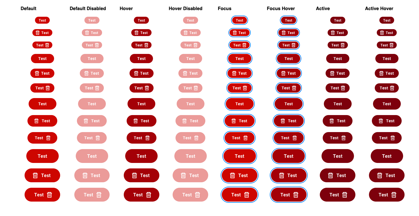
You didn't configure any controls. Storybook figured it out from your types. That's the whole point of getting the naming right in Figma.
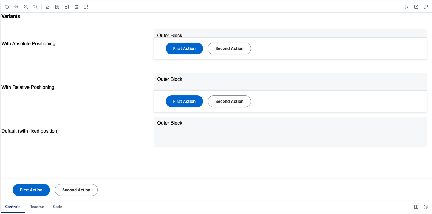
Check the example story here →
Two issues come up most often:
Controls don’t match your Figma variants
This happens when AI uses different names than your Figma. Tell it exactly what to fix:
Update the component types to match my Figma naming exactly:
- variant: primary | secondary | ghost | danger
- size: sm | md | lg
Types are too loose
If AI typed a prop as string instead of specific values, tighten it:
The size prop is typed as `string` but it should only accept
specific values. Change it to a union type: 'sm' | 'md' | 'lg'
The props connection between Figma and Storybook creates a single source of truth.
When your Figma variants, code props, and Storybook controls all use the same language:
Designers review components without asking “what did the developer call this?”
Developers implement without asking “what does the designer mean by Type 2?”
Documentation stays accurate because it generates from the code
AI updates everything when you change the Figma source
The biggest design system problems aren’t technical. They’re communication problems. Naming alignment solves a surprising number of them.
See how top companies document their components:
🔗 Shopify Polaris: Accessibility auditing, viewport testing, theme switching
🔗 GitHub Primer: Clean organization, great props documentation
🔗 IBM Carbon: Comprehensive component library with detailed usage guidelines
🔗 BBC iPlayer: Rebuilt their entire UI library in Storybook after a component audit
🔗 Monday.com Vibe: Beautiful welcome page, clear navigation
🔗 Audi UI React: Brand imagery meets component documentation
🔗 Grommet (HPE): Extensive theming examples
🔗 WordPress Gutenberg: Block editor components, accessibility focus
🔗 JetBrains Ring UI: Developer tools components, dark mode support
Browse more at the Storybook Showcase.
Enjoy exploring 🙌
— If you enjoyed this post, please tap the Like button below 💛 This helps me see what you want to read. Thank you.
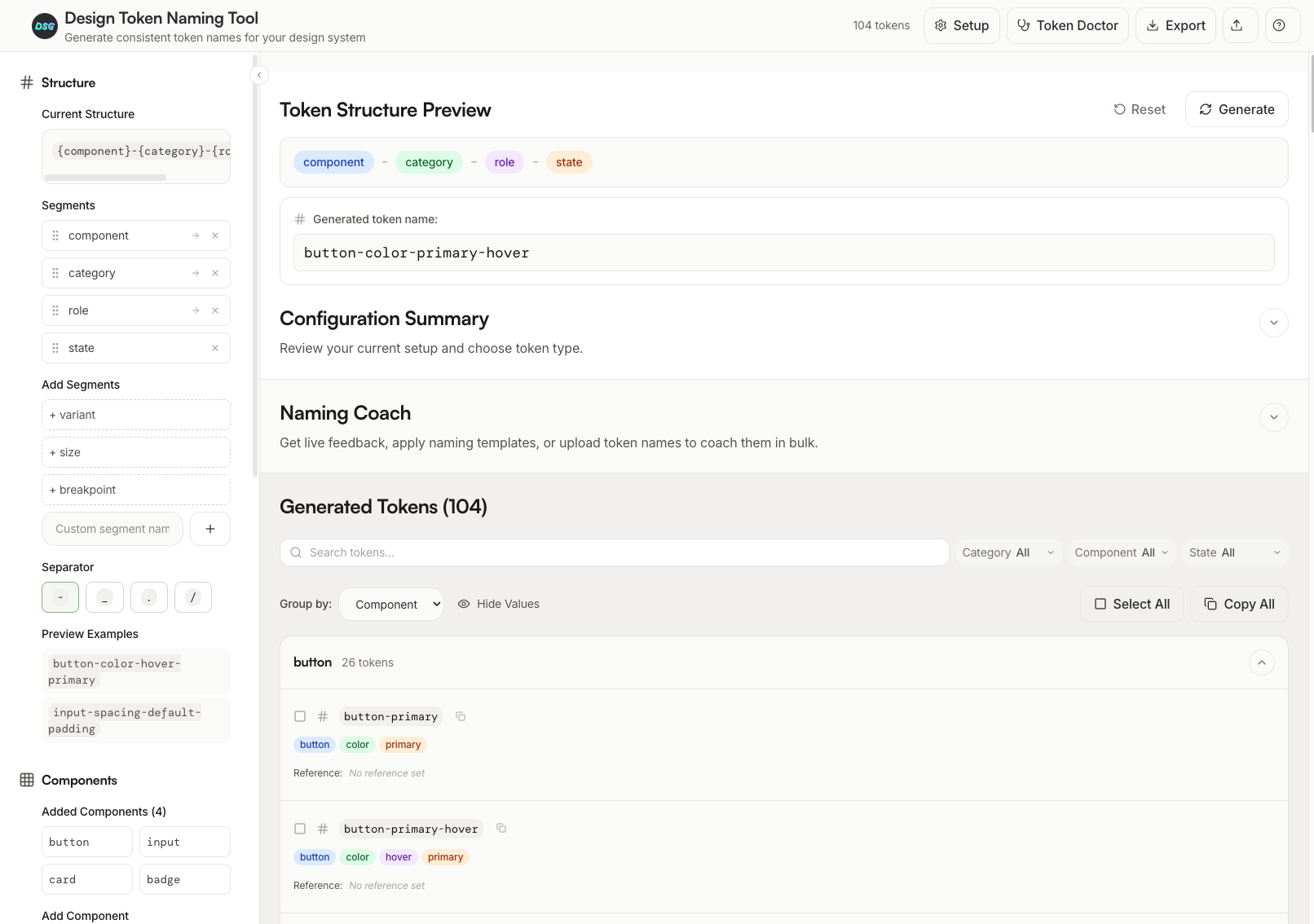
I built a free, interactive tool to help designers and developers improve their naming of design tokens. And maybe, build their own token systems along the way. 🙃
Whether you're just getting started with tokens or trying to get your team on the same page, this might help.
Here's what you'll find:
6 interactive lessons that walk you through what design tokens actually are, how they work, and how to name them well (about 15 mins total)
Token BUILDER to configure your own naming structure with components, categories, states, and roles
Primitive vs Semantic modes, so you can switch between simple scale-based tokens or full semantic naming
Live preview that shows your token names as you build them
Export-ready, so you can copy or download your tokens and start using it
Figma Variables ready format
Advanced filtering and sorting
Add values manually or put placeholders in a second
The whole point is to let you quickly switch naming conventions and test what works for your project.
Feedback for improvements is always welcome. 🫶
Winden Tokens
A Figma plugin for managing design tokens (variables) with a spreadsheet-style interface. Quickly create, edit, and organize your design system variables.
🔗 Link (GitHub) 🔗 Figma plugin
Comments
Nothing yet. Say the first thing.
Sign in to join the conversation.