
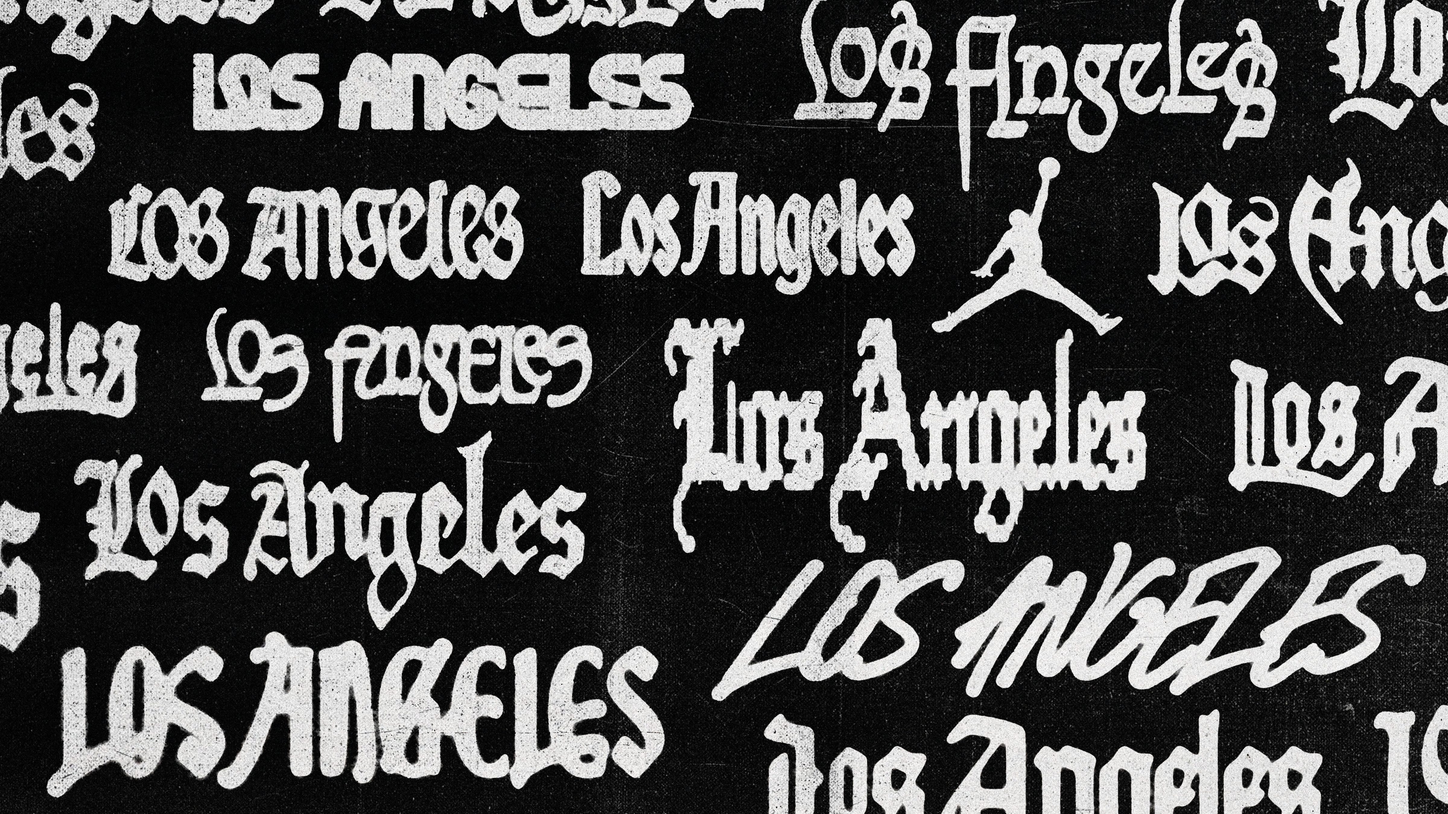
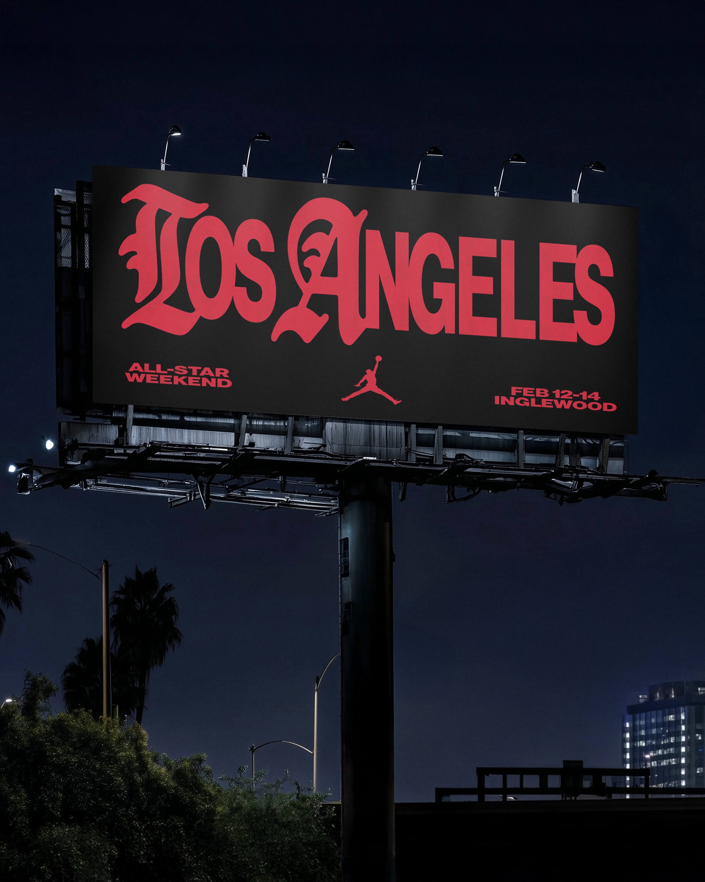
Los Angeles resists easy description. It always has. So when Jordan asked us to design a series of wordmarks for the 2026 NBA All-Star Weekend — one for the city itself, and several more for the surrounding neighborhoods woven into the activation — the brief’s central ask, “neighborhood flavor and an authentic LA feel,” immediately opened into something harder to hold. Authenticity, here, is not a single thing. It never really is with this city.
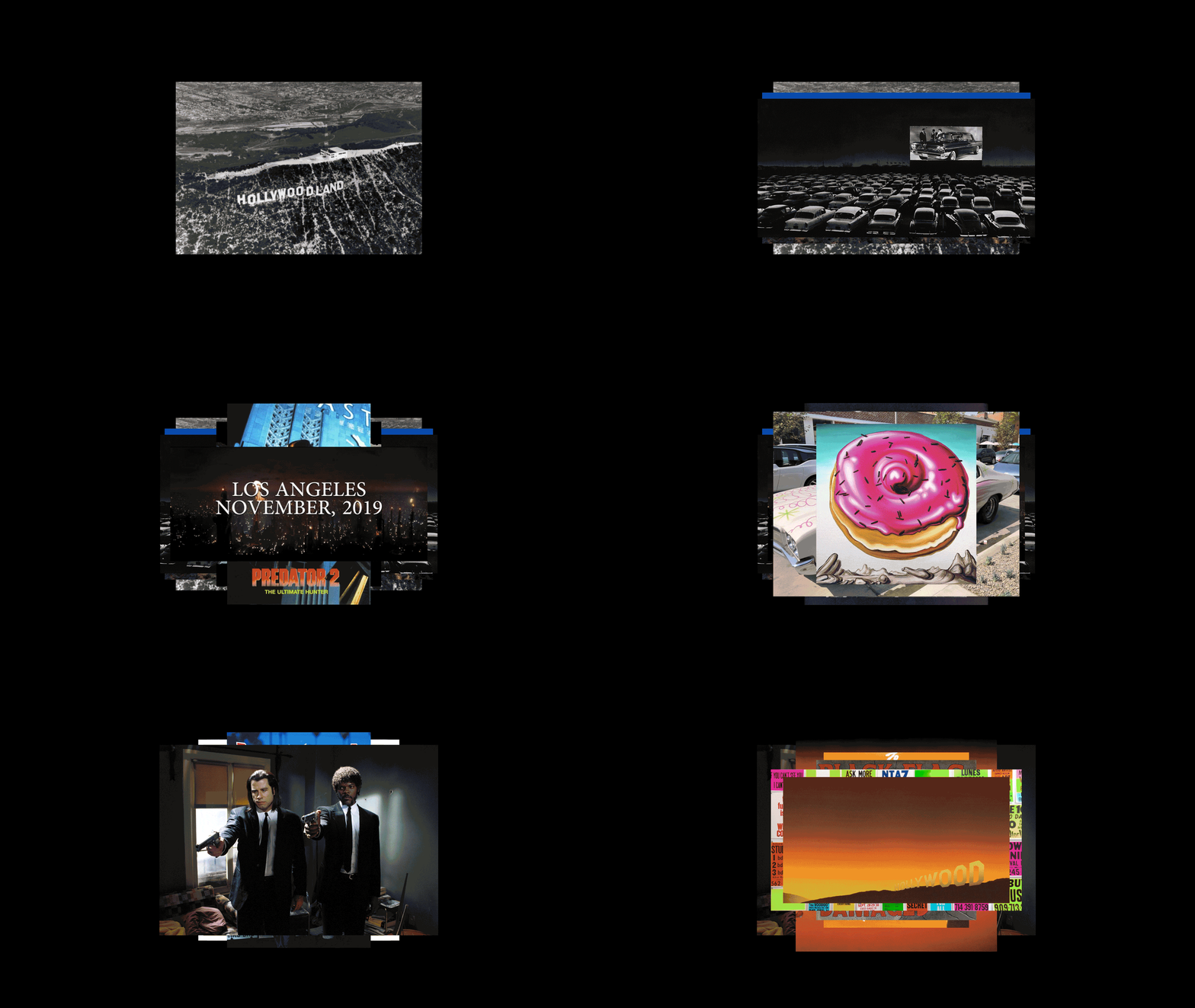
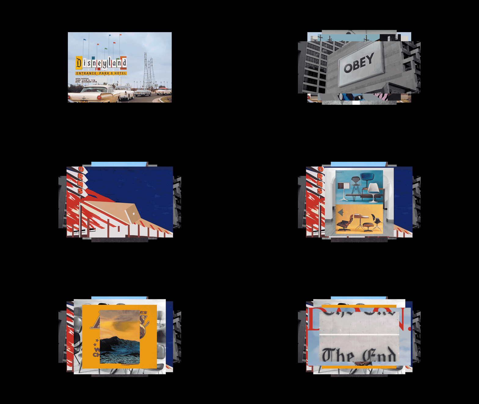
Los Angeles is a place of dense cultural fabric — many connected neighborhoods with their own histories, typographies, and visual languages. The city is littered with hand-painted signs, various merchant’s store lettering, as well as numerous murals fading into stucco. When we began sketching concepts, the goal became not just to capture what LA looks like, but also what it feels like — the many moods, tones and atmospheres. This is a city shaped as much by imagination as by geography, a sort of theater of dreams. We found that the city exists in two forms: the physical, and the fantasy. The former is lived in. The latter is felt.
Typography has always been part of how Los Angeles tells its own story — sometimes quietly, and at other times quite loudly, but always persistently, and across many decades. It shows up in the hand-lettered credits of a film title, in the logo on a Showtime-era Lakers jersey, in the cover art of a West Coast rap album — making the city feel like a place you already knew before you’d ever been. These weren’t references we consulted from a distance. They’re part of the visual fabric that anyone who grew up here, or grew up loving this city from somewhere else, has already absorbed. Our job was to pull those threads without flattening them.
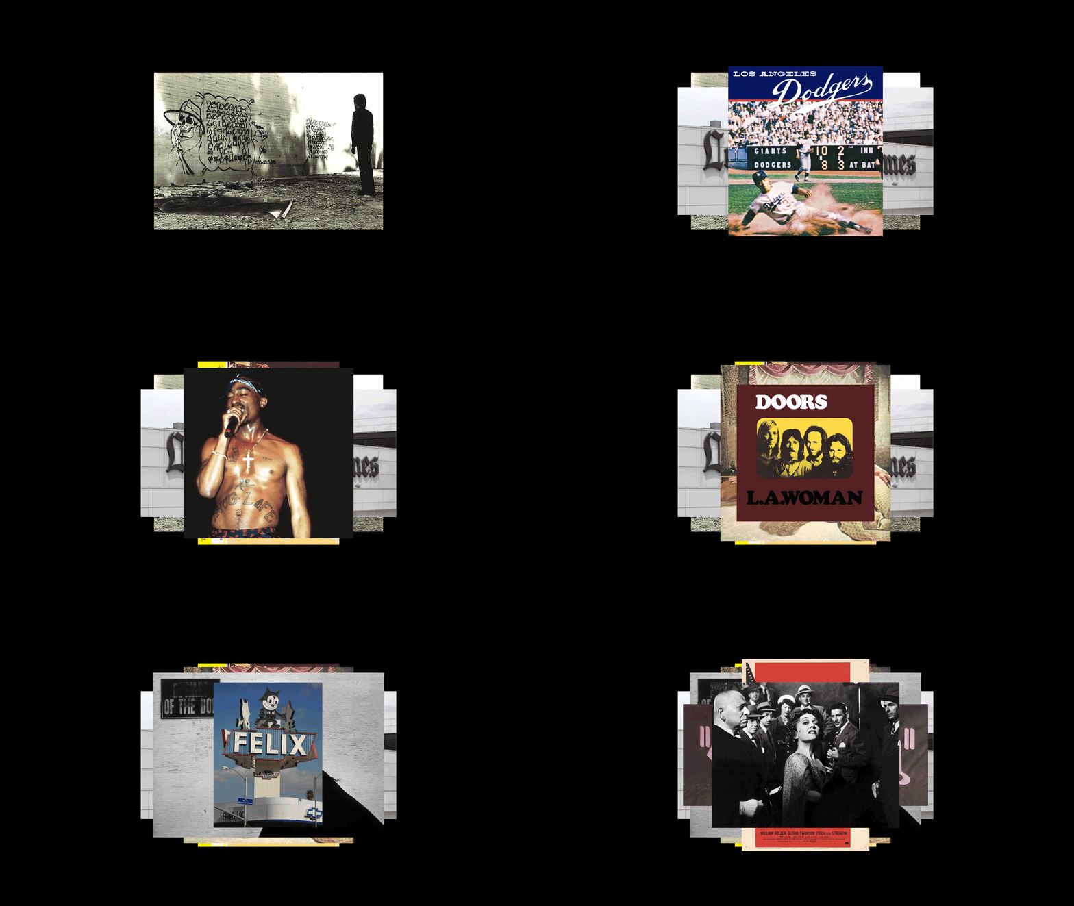
One direction kept surfacing no matter where we looked: blackletter. We won’t pretend we didn’t notice the irony of landing on one of the city’s most overused typographic tropes. But there’s a reason it’s overworked... It showed up on album covers from an array of genres, in the masthead of the Los Angeles Times, in historic signage weathered into walls across the city. But its deepest roots in LA run through Chicano and lowrider culture, where blackletter has been a core typographic voice for decades — appearing on tattoos, car clubs, airbrush art, and neighborhood signage as a way to assert presence, pride, and continuity with heritage. That lineage never really went away. It evolved through streetwear, skate culture, and music, got absorbed into album art and brand identity, and kept resurfacing, maybe because it carries something that purely digital letterforms often don’t: a sense of labor, of something drawn rather than set. In a city built by independent makers and subcultures, that quality reads as personal rather than corporate.
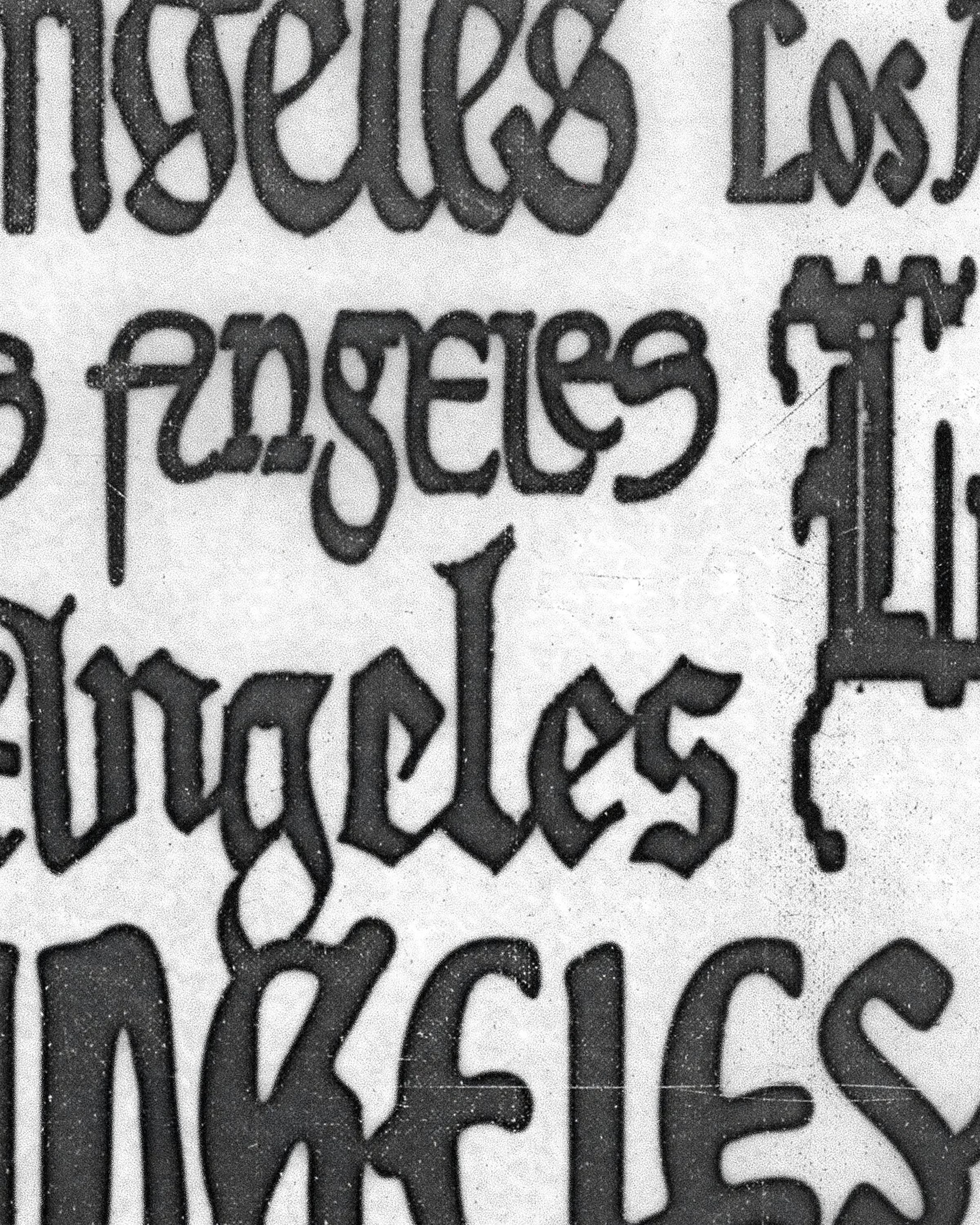
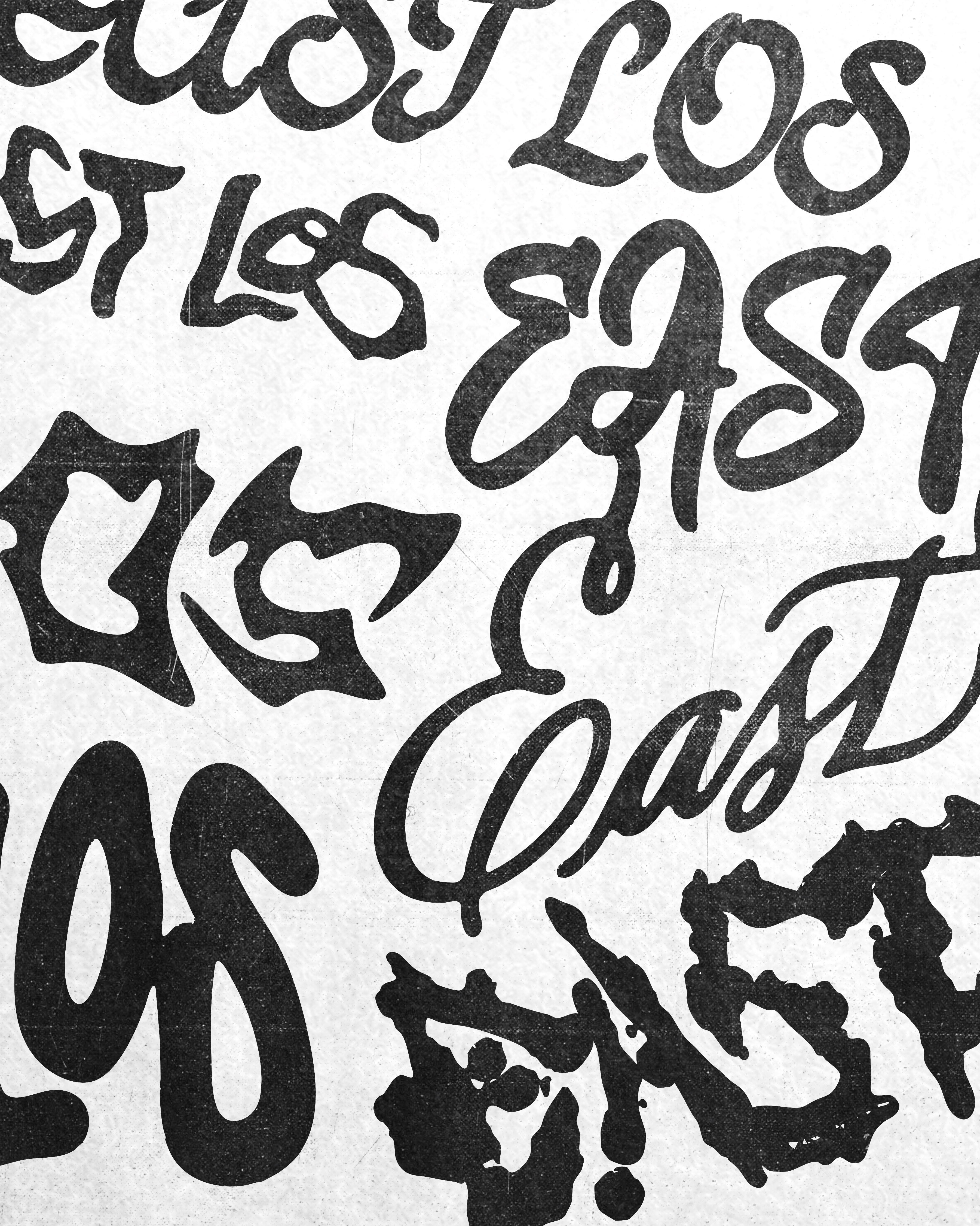
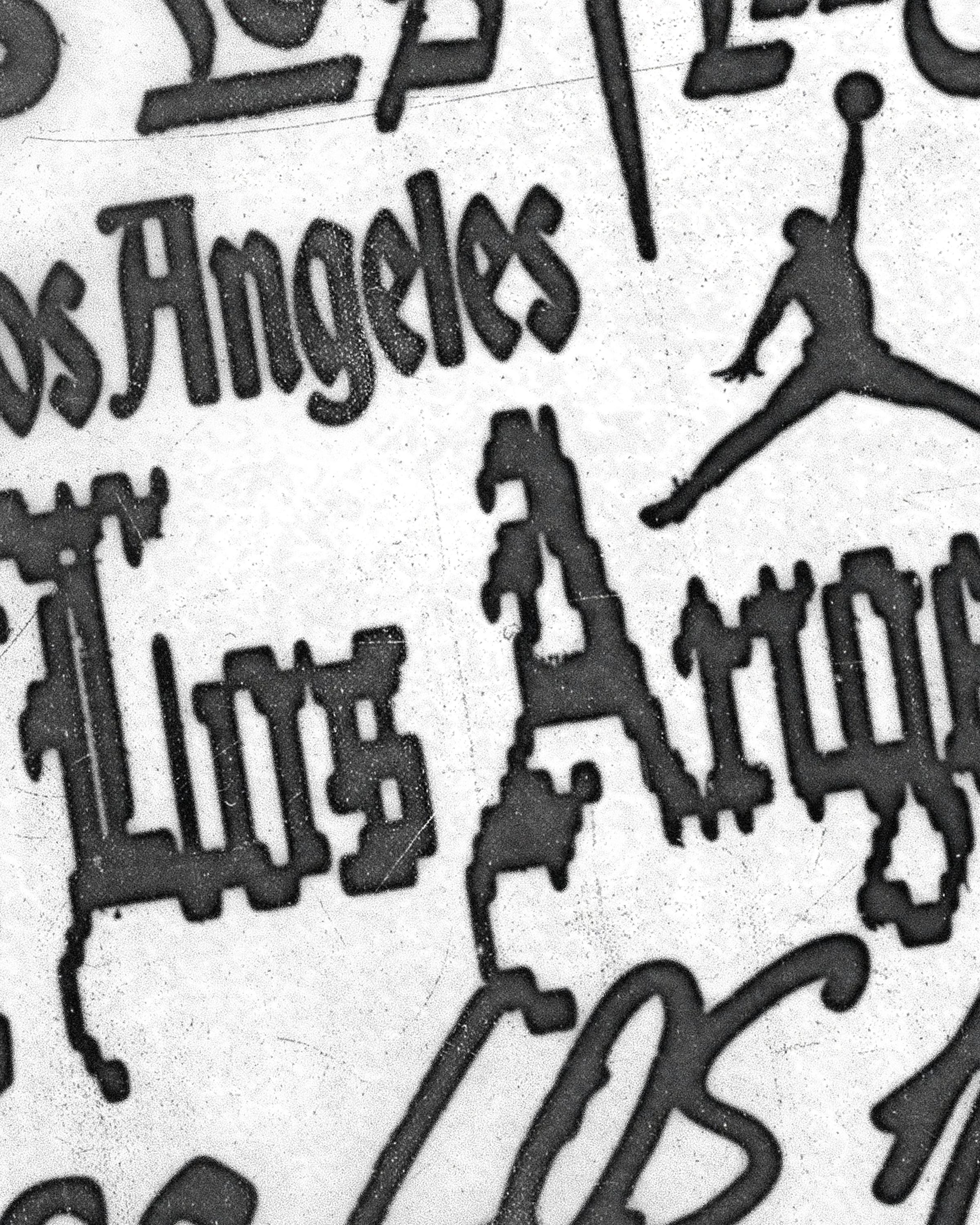
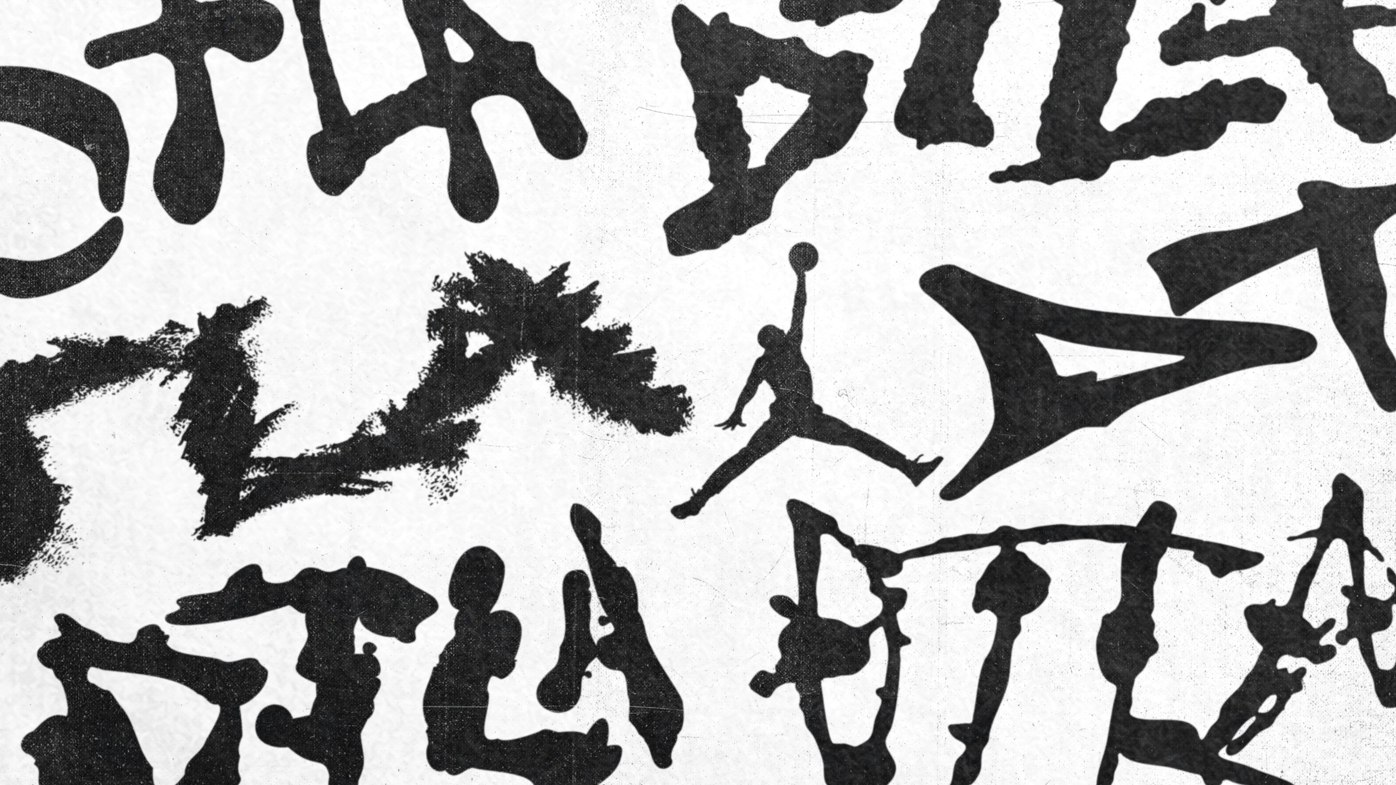
It was persistent enough that ignoring it felt dishonest. So we leaned in, not to reproduce it, but to see what happened if we pushed it somewhere that felt new. The “L” and the “A” became the site of that experiment. We stretched them, softened them, reworked them until the letterforms stopped quoting blackletter and started feeling like something else entirely — familiar in origin, but distinctly their own. Those two characters were then set against Jordan’s house font, itself already stretched and distorted, and something clicked. The tension between the two created the novelty. Neither element alone would have gotten there.
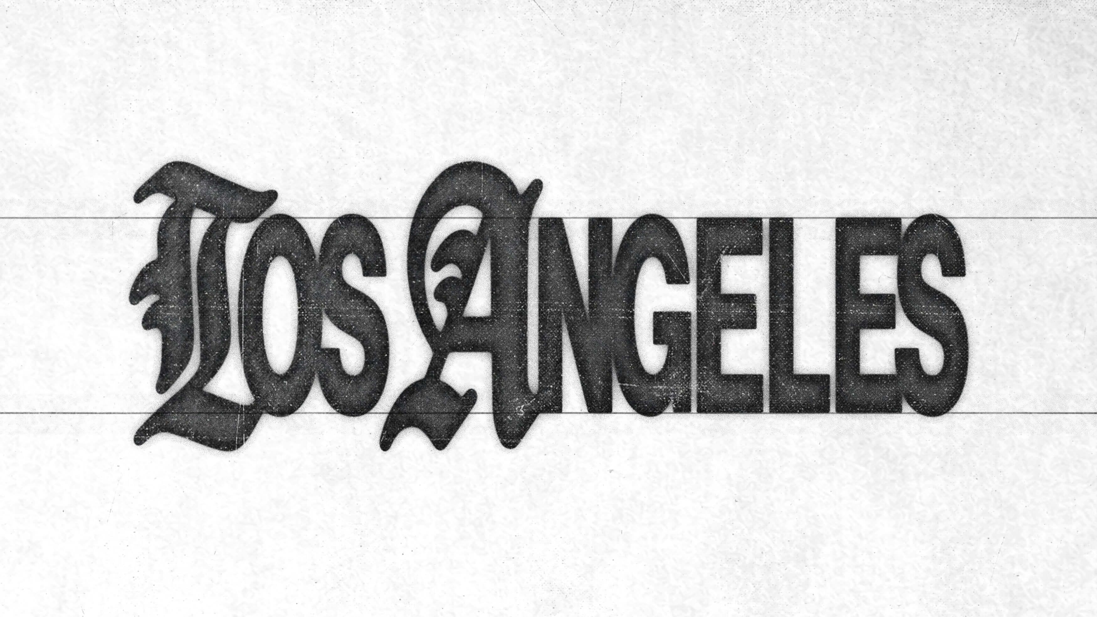
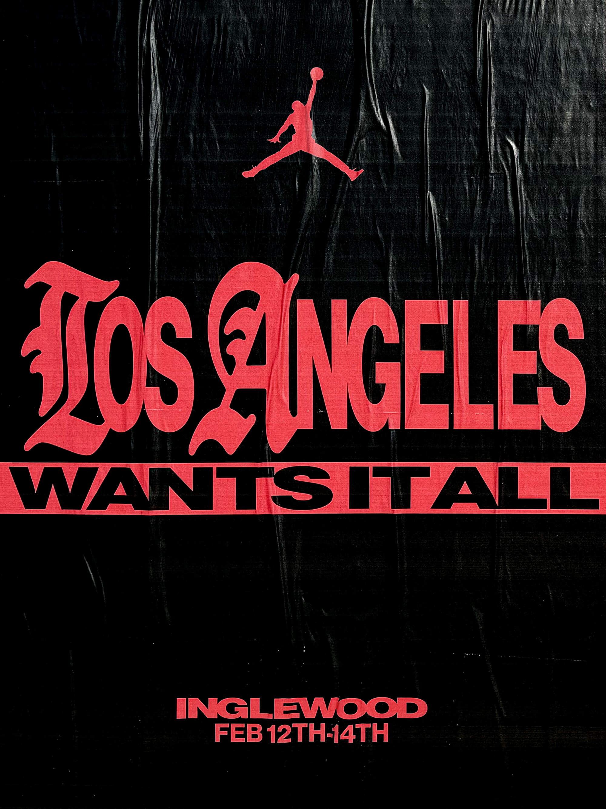
Not every direction was meant to become a final mark. These sketches operate somewhere between observation and interpretation — pulling from the city’s vernacular while testing the limits of its shape-shifting image. Some of these studies lean into nostalgia, while others distort or abstract some alternate reality. A few feel familiar while others intentionally don’t. But each one is a way of asking the same question: What does Los Angeles look like when you try to write it down?
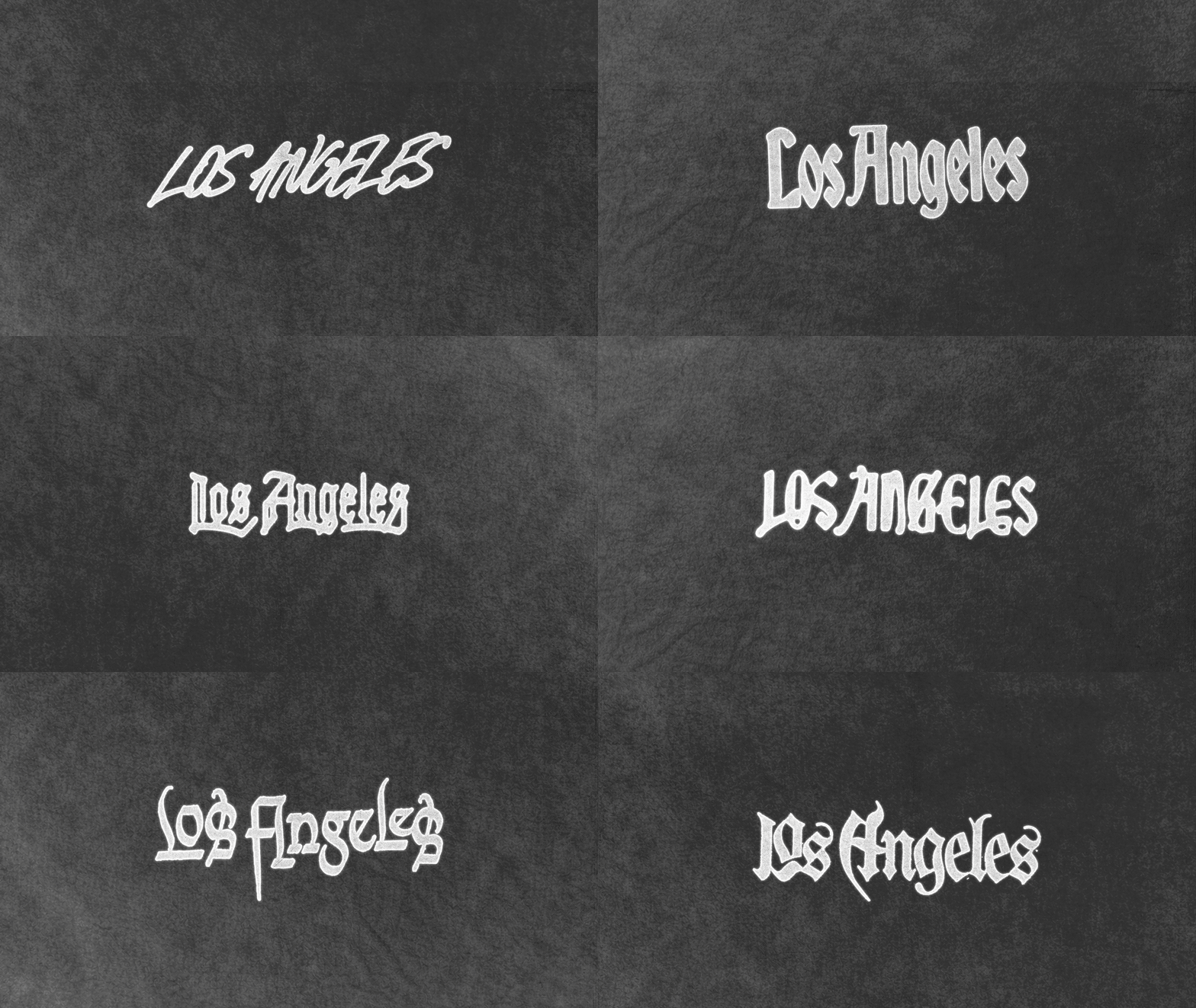
The fact remains — Los Angeles resists a singular identity. It’s a layering of neighborhoods, histories, and cultural exports — constantly shifting, constantly being redefined. Designing a typography for the city meant navigating that complexity. Somewhere between documentation and invention, this body of work isn’t a conclusion — it’s really only a small fragment. One small study within a much larger visual language. One that continues to evolve across the city, every day.
To view the finished case study of this work click here.
No posts
Comments
Nothing yet. Say the first thing.
Sign in to join the conversation.