
A gentle walkthrough where we build our take on Obsidian's callout component in Svelte.
I use Obsidian for a lot of my writing and note gathering when I’m working on a course. I wouldn’t mind using Obsidian Publish for hosting my notes and—as of this writing—I do have a paid account, but given that I want a high-level of customization and the ability to include code along with my content, I need a bit more control over how the content is hosted than Obsidian Publish is willing to give me.
We’re Doing This Live
I’m in the middle of working on a course on building out a component library in Storybook, so I figured, this was a good excuse to document my thinking around building out a component. I’m coming into this relatively cold and this piece documents my thinking as I went about implementing the component that you’re reading right now.
I want to be able to use Obsidian’s Callout components, but they’re not a standard feature of Markdown. So, I need to build out my own Callout component to render them properly.
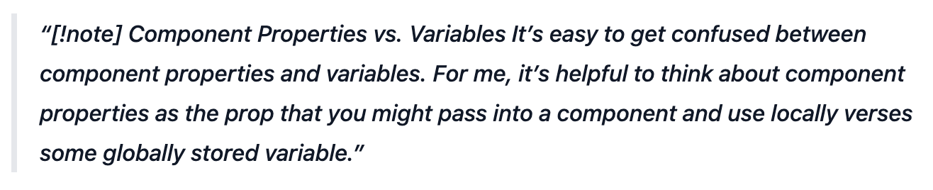
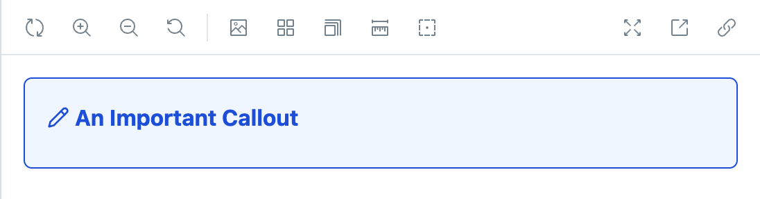
This is what they look like right now as I embark on this journey.
Looking at the documentation, it looks like we have a few variations. There are a number of different types of callouts (e.g. note, tip, warning, question, etc.), callouts can have an optional title, callouts can have an optional body, and they can be foldable like an accordion component.
As far as variations are concerned, Obsidian supports the following:
| Variation | Aliases | Color |
|---|---|---|
| abstract | summary, tldr | green |
| bug | red | |
| danger | error | red |
| example | purple | |
| failure | fail, missing | red |
| info | blue | |
| note | blue | |
| question | faq, help | orange |
| quote | cite | grey |
| success | check, done | green |
| tip | hint, important | green |
| todo | blue | |
| warning | caution, attention | orange |
With all of that in mind, Here is some pseudo-code of what I’d like the interface for my component to look like.
That could just as easily be Svelte or React—and that’s one of the cool things about building out a design system, a shocking amount of is framework agnostic.
Creating a Type for Callout Variations
First up we want to take that table of all of the variation and make a type that comprises of the union of all of them.
Determining the Component Properites
Then when it comes to our component, we can assume that the body of the callout will be the <slot /> of the Svelte component. This is similar to children if you’re more familiar with React.
One caveat here is that Storybook doesn’t have great support for <slot />. In React, we can get around this by using the children prop, but that’s not something that exists in Svelte.
I’m basically left with two and a half options:
- Don’t use a
<slot />and opt for adescriptionorbodyprop instead. This will let me use Storybook’s Component Story Format with not additional work. - Use the
renderproperty and pass in a function that renders my component instead of using the object notation. - Support both. If not slot is present, use the
descriptionproperty.
Normally, I wouldn’t feel super great about letting Storybook determine the API for my component, but since this component is most likely to be used in the process of compiling Markdown, I don’t really mind passing a long string to description. That said, I think I’m going for the third option.
My initial component structure is going to look something like this:
Obsidian uses Lucide for icons and that was already what I was using on this site. I took a look at the default callout and saw that it was using the Pencil icon. One of the things that I’m immediately thinking about is the fact that I’m not sure that I want to have to load every single icon if the component is only used once or only in a few variations. I could choose to load them dynamically, but I’m not totally sure if I want to do that just yet.
Here is a picture of what it looks like at this point.
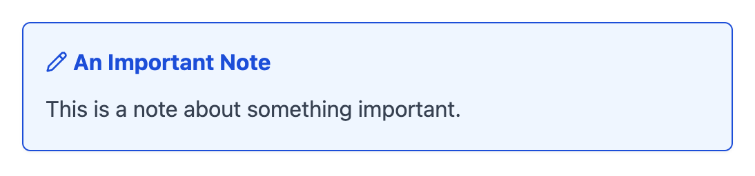
Now, this is obviously incomplete. It doesn’t support any of the variations listed above, the colors and icon are hard-coded, and it’s not foldable.
I’m using the prose class from @tailwindcss/typography because callout can support nested markdown, but I’m not totally sure how I feel about that just yet. And, I reserve the right to change my mind.
Writing the First Story
Since this callout is going to have lots of different variations, I want to create stories for each of the given permutations. Let’s start with a story that captures out default state.
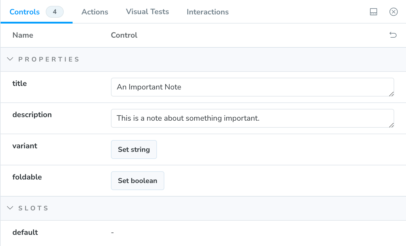
One of the first things that jumps out at me is that right now, I’d have to type the name of the variant in by hand if I wanted to change it in a given story. I’d love to make it a list that I could select from, but right now, I only have access to that list as a type.
A trick that I commonly use here is to create a constant value and then derive the type from that. Let me show you what that looks like.
Using as const tells TypeScript that this array is never going to change. Without the as const, the variations array would have a type of string[], but as a constant, TypeScript knows exactly what values to expect in there. As a result, ColorVaration has the exact same union type as it did before.
I can now update my story as follows:
You’ll notice that I am now able to access the callout variations as an array and still use it as a type in the component. As a result, we now have the option to switch between all of the different variations of the callout.
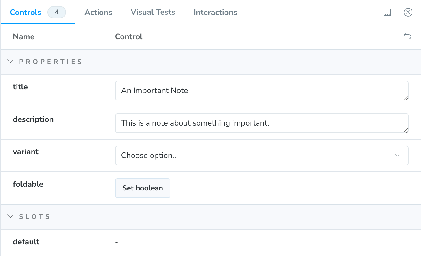
That said, it doesn’t do anything yet.
Supporting Callout Variations
Our next task is to be able to set the correct color and icon for each callout type. Before endeavoring on this adventure, I already took the time to look up the color associated with each variation, but I’ll need to decide which I icon I want to use for each. Given that Obsidian and I are both using Lucide for our icons, I think I’ll just follow their lead.
| Variation | Icon |
|---|---|
| abstract | clipboard-list |
| bug | bug |
| danger | zap |
| example | list |
| failure | x |
| info | info |
| note | pencil |
| question | help-circle |
| quote | quote |
| success | check |
| tip | flame |
| todo | check-circle-2 |
| warning | alert-triangle |
Earlier, I opined on how I wasn’t sure I wanted to have to import all of these. But, I am going to start by doing that and then refactor later. But, first let’s worry about the colors.
Adjusting the Color Based on the Callout Variation
Not only do I have over a dozen variations, but some of those variations have aliases, which adds an additional level of complexity. My first thought it to create some kind of object that will give me the correct color.
Resolving Aliases
First of all, I don’t ever want to think about these aliases again. So, I’m going to write a little function to quickly resolve them whatever variation they alias to.
With that solved, I can do something similar with the core variations and the colors. I chose to write this all in variations.ts because I don’t want to junk up my component definition with all of this business logic and I want to leave my self the option to be able to easily grab these functions and pull them into some unit tests without needing to worry about the rest of the component. You can make an arguement that this should be in it’s own file and I don’t know that you’ll get a lot of pushback from me.
Now, let’s wire all of this into our component in. I could use something like tailwind-merge to combine my classes, but right now I know that there won’t be any conflicts with the existing classes since I’m only using this for colors.
Immediately, I’m able to head over to my Storybook and toggle between the variants. But, I think I want to make a set of stories so that I can run visual tests against them. Let’s update our story as follows:
In addition to make a whole bunch of stories, I went ahead and move some of the default arguments to the meta for the component. Now we need to get to the icons.
Getting the Icon for the Callout Variation
My first thought is to do something similar to what we did the the colors. Although, this time I’ll need to pull in a whole bunch of components.
Let’s import all of our icons and some types to help us work with them.
Next, we’ll define a list a dictionary that associates our variations to our icons.
Finally, we’ll pull that logic into our component. I’m using svelte:component to dynamically render the correct icon component.
Supporting a Default Title
Obsidian’s callouts will let you omit a title and use the name of the variation as the title. All of the variations are one word; so really, we just need a simple function to capitalize the variation name. I haven’t explicitly dealt with the fact that Obsidian’s variations are case-insensitive and my current implementation is very case sensitive. But, I’m going to at least prepare for that in my capitalize function.
And now, we can set a default value for our title based on the variant.
And now, I think I’ll remove the title as a default argument in the stories.
We’ll also add an additional story that does set the title.
Supporting the Optional Description
If we just don’t pass in a description slot, then it doesn’t look too bad, but there is some additional space. Let’s set up a story and then update our component so that it doesn’t have the little bit of extra space.
We’ll only render that additional div with the description if there is either a description or some content in the <slot />.
Now, it looks like we want it to—with no additional space at the bottom.
Making the Callout Foldable
Do I really care about foldable callouts? I don’t, but as long as I’ve gotten this far, I might as well add support for foldable components.
Looking at Obsidian’s implementation, they’re just taking Lucide’s chevron-down component and rotating it -90 degrees when the callout is collapsed. I don’t need to reinvent the wheel here. Let’s start with a simple story so that we have something to look at.
If I look at Obsidian’s implementation, anywhere on the title will open or close the foldable callout, but clicking on the body does not fold the callout back up. My first tempotation was to try to get clever with a hidden checkbox and then show or hide the content with CSS based on the state of the checkbox, but I think I’ll leverage Svelte instead. (I reserve the right to revisit this decision in the future.)
I’m going to use a number of techniques.
- I’m going to use a hidden checkbox and Tailwind’s
peerutility to style the chevron and get it pointing in the right direction. - I’m going to make the entire clickable region the label in order to trigger the checkbox.
- I’m going to bind that checkbox and add it to the logic where I show or hide the description section.
This is what I wrote for my first draft.
I think that this is mostly accessible, but I’ll set up some accessibility audits in a future piece and we’ll find out together. I also want to test to make sure that I don’t break the mechanics of folding the callout. But, that’s also a future endeavor. For right now, I have a component that I’m pretty happy with.
Last modified on .
Comments
Nothing yet. Say the first thing.
Sign in to join the conversation.