


Serif typefaces include projection in the end of the strokes of its letter-forms.

The thin parts are on the diagonal axis.
In the stem and head curve, they have bracketed serifs.
Wedge-shaped serifs.
The contrast is minimal.
Angled head serifs.
Examples: Garamond, Adobe Jensen.

Vertical strokes.
Pronounced contrast.
Vertical stress.
Oblique and bracketed serifs.
Examples: Perpetua, Baskervile, Cambria.

Narrow and unbracketed (hairline) serifs.
Dramatic contrast between strokes.
Vertical orientation of weight axes. Vertical strokes are thick.
Examples: Didot, Bodoni.
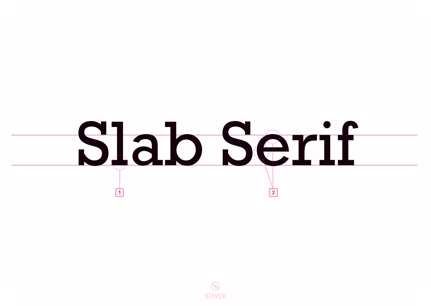
Little or no bracketing. Heavy serifs.
No contrast in stroke weights.
Examples: Rockwell, American Typewriter, Memphis, Museo Slab.

Emulation of lapidary inscriptions.
Triangular serif shapes.
Examples: Albertus, Cartier Book, Newtext.
Sans-serif typefaces do not include any projections at the end of the strokes of its letter-forms.

A spurred uppercase “G”.
Minimal contrast on the strokes.
A double-story lowercase “g”.
Examples: Franklin Gothic, News Gothic.

Enhanced Legibility.
Plain.
Similar to other Grotesque sans-serifs.
Examples: Helvetica, Arial, Univers.

Based on simple geometric shapes.
Have round "O".
No contrast between strokes.
Examples: Futura, Avenir.

Created to be more legible.
More weight contrast than other sans-serifs.
Calligraphic influence.
Examples: Verdana, Lucida Grande, Gill Sans.
Script typefaces are based on the fluid strokes of handwriting and range from formal to casual.

Have flourishes and loops.
Connected letterforms.
Examples: Bickam Script, Snell Roundhand, Kuenstler Script.

Brush like appearance.
Letterforms are connected, but not always.
Powerful strokes.
Examples: Brush Script, Mahogany Script.

Hand-lettered calligraphy emulation.
High contrast.
Examples: Vivaldi, Ballerino, Mistral.

Formal appearance.
Handwritten calligraphy foundation.
Strong contrast.
Examples: Monmouth, Engravers Old English, Goudy Text.

Mimic modern handwriting.
Casual appearance.
Examples:Pacifico, Cedarville Cursive, Blog Script.

Non-proportional typefaces. Every letter is using the same amount of horizontal space. There are serif and sans-serif typefaces.
Examples: Consolas, iA Writer Mono, Courier New, Victor Mono.

Big variety in appearance. Mainly suitable for titles and headlines.
Examples: Monoton, Broadway, Cooper Black, Curlz.
Comments
Nothing yet. Say the first thing.
Sign in to join the conversation.