
In this postletter I introduce my favorite of all of the economic data coming out of America’s official agencies: the data documenting personal income per capita. Since the 2024 presidential election I’ve wanted to analyze the election using these data, and a new round of social-media chatter about the Biden economy has pushed me to actually start.
The triggers for the latest chatter seem to be an unexpectedly high December CPI-inflation estimate from the Bureau of Labor Statistics, and Politico’s new article “Voters Were Right About the Economy. The Data Was Wrong.”, by Eugene Ludwig (“chair of the Ludwig Institute for Shared Economic Prosperity”). Ludwig’s article, selectively picking statistics to build a case against the economy under Biden, sparked debate among leftists, center-left posters, and Democratic partisans on Bluesky and X/Twitter.
This debate produced not just direct critiques of the article, but an efflorescence of sarcastic derision of “the emoji left”, wisecracking about how Karl Marx said “numbers are cringe”,1 an accusation that unspecified people were denying tradeoffs, sneering that “most American socialists […] have no plan and terrible analysis” alongside an insistence that things “did” get better for working people (from a self-described socialist), a claim that “[t]hings got better; people voted for Trump”, whining that “the generic definition of” “the economy” (what generic definition?!) was “changed […] after it appeared that Biden oversaw a good one”, and at least one person ostentatiously signaling how fed up they were with people arguing online about the economy.
What’s going on here is the 3rd year of the “vibecession” argument: why did consumer sentiment seem to come unmoored from “standard macroeconomic variables” in the pandemic? Was the public “completely misinformed” if not “insane”, bamboozled by “vibes” into thinking that a low-unemployment economy with rising hourly wages was bad? In the wake of the 2024 presidential election, these empirical questions have taken on a partisan cast: was the Biden economy actually great, and voters simply too disconnected from reality to recognize it?
The person who’s answered these questions most starkly in the affirmative may be Will Stancil, a “Minnesota policy wonk” who was “posting his way to power and influence” before losing the Democratic primary for Minnesota House of Representatives District 61A.
A week after the 2024 presidential election, Stancil alleged that “the Biden economy was incredibly strong”, pointing out that it was “nonsense” to decide that the economy was “bad” just because “we lost an election”. 6 weeks later he repeated his assessment of the economy being “incredibly strong”, and also accused “the left” of being “unwilling” “to acknowledge that Biden governed as a progressive”, “doing extraordinary, generational damage to their own ideas”.
Most recently, Stancil’s zeroed in on comparing the economy in the year 2023, the present, and the pandemic period to the economy in 2019.


; the second blueskeet is "Something changed structurally, seemingly in late 2020 or early 2021. What was it?"; the third blueskeet answers the question with "It's social media", followed by a link to a Brookings Institute piece and an embedded screenshot snippet of the piece.")
The “vibecession” debate and Will Stancil’s challenge boil down to the following key question.
Is there any meaningful economic variable that was doing well in 2019 and became worse around 2021, such that consumers and voters could justifiably regard the Biden-Harris economy as bad?
My answer to this challenge is yes: that variable is growth in real disposable personal income per capita.
That’s a bit of a mouthful, so I’ll break it down. Personal income is income that goes to individual residents of the US (as opposed to, say, flowing out of the US to foreign stockholders). Disposable personal income is the personal income residents have left to spend freely after the government takes its cut in taxes (and gives out transfers like Social Security payments). Real disposable personal income is that post-taxes-and-transfers income adjusted for inflation. Real disposable personal income per capita is the average inflation-adjusted post-taxes-and-transfers income per US resident.
The US Bureau of Economic Analysis publishes time series of real disposable personal income per capita for the whole US. They’re available for each calendar year back to 1929, each complete quarter back to the first quarter of 1947, and each complete month back to January 1959 (except for last month). Calculating the month-on-month, quarter-on-quarter, or year-on-year changes in these time series gives the growth in income over time.
Political scientists have a history of using income growth to model how votes for President split between the incumbent party and the other major party. (From this point I’ll just write “income” instead of “quarterly real disposable income per capita”.) A 2012 paper by Douglas A Hibbs, attempting to forecast Barack Obama’s reelection prospects using growth in income, called it “the broadest single aggregate measure of changes in the electorate’s economic well-being”, and one of the only two variables that “systematically affect[…] postwar aggregate votes for president”. (The other variable was deaths of US soldiers in wars overseas.) Christopher H Achens and Larry Bartels, in chapter 6 of their 2016 book Democracy for Realists: Why Elections Do Not Produce Responsive Government, reviewed earlier literature, cited Hibbs, and correlated a Hibbs-based measure of income growth with votes for the party holding the presidency.
I follow them in using the same growth measure, to demonstrate that I’m not cherry-picking a weird or idiosyncratic metric.
To set the scene, here are the Bureau’s income numbers, followed by the quarter-on-quarter percentage growth in those numbers.
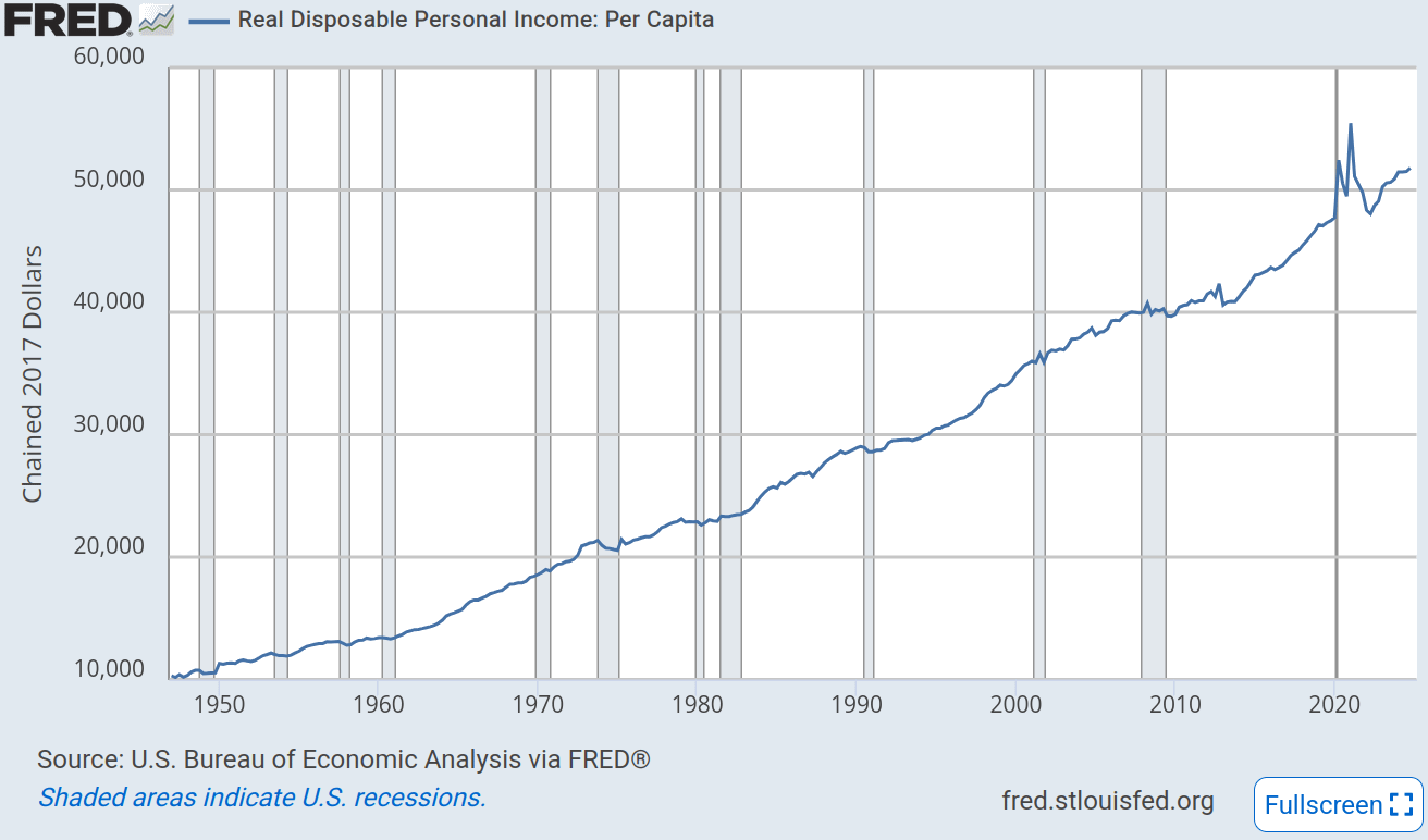
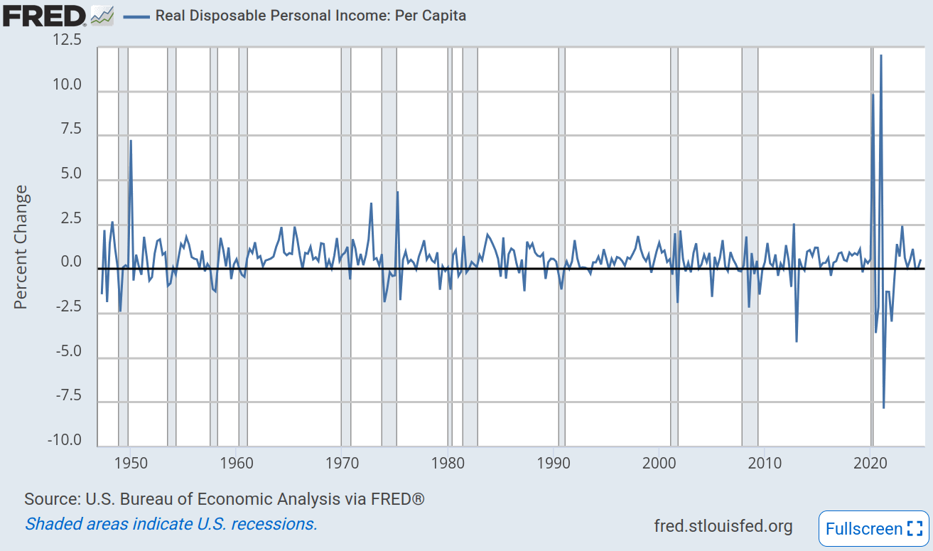
The first graph shows (annualized) income rising exponentially from about $10k per year in 1947 to about $52k per year in 2024. In recessions income stands still or even goes backward, although the policy response to the COVID-19 recession made income spike in Q2 of 2020 and, importantly, in Q1 of 2021.
The second graph shows quarter-on-quarter growth in income hovering around 0.5%, though with significant volatility. The most extreme volatility came in the first year and a half of the pandemic, when there was the biggest quarter-on-quarter increase in income (12.1% in Q1 of 2021) followed by the biggest quarter-on-quarter fall in income (7.8% in Q2 of 2021), after which income continued falling until Q3 of 2022.
The outlines of my argument now start to take shape. The ad hoc pandemic welfare state thrown together in 2020 boosted income to new highs as Joe Biden took office. Under Biden, that welfare state was dismantled, depressing income and purchasing power even before Russia drove up oil and wheat prices by invading Ukraine. Income resumed growing in mid-2022, but that won over only voters willing to forget the peak income of Biden’s inaugural quarter (and the 5 quarters of shrinking incomes right after it). By contrast, income growth was consistent under Trump until the pandemic; from 2017 through 2019, growth was between 0.3% and 1.2% every quarter, with the sole exception of Q2 of 2019.
The punchline: pocketbook voters who cared about consistent income growth throughout a president’s term would have preferred Trump’s economy over Biden’s.
I now do this calculation more rigorously, using the formula from Hibbs’s paper to calculate moving weighted2 averages of growth in quarterly income. The chart shows the 15-quarter moving average of income growth over time, with red circles picking out the average growth in the quarter of every election from 1952 through 2024.
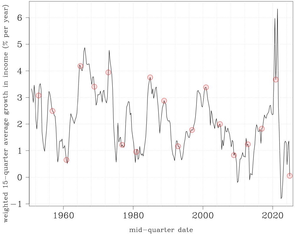
Astoundingly — and I truly did not expect this result until I plotted the chart — the Biden administration going into the 2024 election oversaw worse pre-election growth in income than every one of the 18 administrations before it. That last red circle in the bottom right of the chart is just barely above zero. (0.05% per year, to be precise. The next-worst growth average was the Eisenhower administration’s 0.65% per year.) The income growth of 2022–2024 barely offset the 2021–2022 dip; overall, income did not grow under the Biden administration. In this light, it’s a wonder that Harris came as close to winning as she did!
I zoom in on the last 20 years, plotting each quarter as a cross. This gives a better view of the Trump and Biden administrations while retaining some historical context.
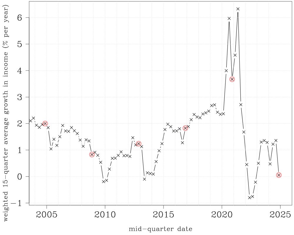
Average income growth was plainly better in 2017–2019 than in any quarter after Q3 of 2021. Stancil’s claim of “similar fundamentals” in 2019 and 2023 was false; the 15-quarter average of income growth was a respectable 2%–3% per year in 2019, but below 1.4% per year throughout 2023. Stancil’s claim that “the economic condition of Americans is historically very strong, and certainly comparable to 2019” was false; the latest average, for Q4 of 2024, is virtually nil, comparable to the trough of the Great Recession. And Stancil’s inference that “social media” “changed structurally, seemingly in late 2020 or early 2021” is gratuitous speculation; what changed was the erection and then dismantling of the pandemic-era social safety net, which deranged American’s incomes. Rising hourly wages and falling unemployment were simply insufficient to fix that.
The subpar Biden economy was not a phantasm of TikTok-hypnotized voters and ungrateful, data-hating leftists. One can reasonably debate which macroeconomic statistics should be used to decide whether “the economy” is “good” (or “incredibly strong”, in Stancil-speak), and by selecting the right economic statistics one can argue that the Biden economy was secretly fantastic. But the intuitive economic statistic that political scientists use to assess “the electorate’s economic well-being” — income — shows the Biden economy souring by the 2024 presidential election, and is sufficient to explain Harris’s loss all by itself.
While I’m cocking an eyebrow at Ryan Cooper, I’ll change the subject for a moment to note my skepticism of his suggestion that Pete Hegseth and Donald Trump tearing out the heart of NATO would provoke Europe west of Russia to enter “a new age of nuclear proliferation”.
Discounting Russia, Europe already has two nuclear powers, the UK and France, both of which have been founding members of NATO since 1949, and both of which detonated their first nuclear weapons years after that (in 1952 and 1960 respectively). NATO membership correlates positively with European nuclear proliferation, not negatively.
More generally, I don’t see that European countries have much to gain from sinking resources into developing and stockpiling nuclear weapons. No, not even Russia; it can bluster about its nukes to try to discourage other countries from defending Ukraine, but I don’t see that many other countries take that bluster very seriously. Granted, it would take more than a footnote for me to interrogate and flesh out this intuition of mine.
Hibbs’s formula has one parameter, a “lag weight” called “λ” that’s between zero and one. λ represents how evenly voters weight income growth over a president’s term: λ = 1 means voters give every quarter equal importance; λ = 0 means voters consider only the election quarter’s income growth; values between zero and one mean that voters put some weight on income growth before the election quarter, but less weight on quarters further back in time. One can try to estimate λ with a statistical model relating past income growth to past vote shares, but to ward off any accusation that I’m cherry-picking λ’s value to get the answer I want, I just use the value Hibbs presented all the way back in his 2012 paper: λ = 0.9.
No posts
Comments
Nothing yet. Say the first thing.
Sign in to join the conversation.