
When I hear presentation design, at least for me, I think of something that is kind of boring or tedious. I also think it has a bad PR team. Of course, there is the worst version of it: a boss asking you to move a picture one click to the right at 1 a.m. before a big meeting the next morning. But like most things, there is a dark side and a light side.
We all have to build decks, and whole industries are built on presentations to sell ideas. At some point in life, everyone ends up arranging thoughts across a sequence of 16:9 slides to share ideas with other people and hopefully win them over.
I think there is a romance to a good presentation, almost a film-like quality. A strong presentation does not just explain something, it unfolds. In my experience, a good one can sell an idea within the first few spreads, sometimes before anything is even said out loud. These are a few things I have learned after building what feels like millions of pitch presentations, along with a few layouts I mocked up to illustrate the points.

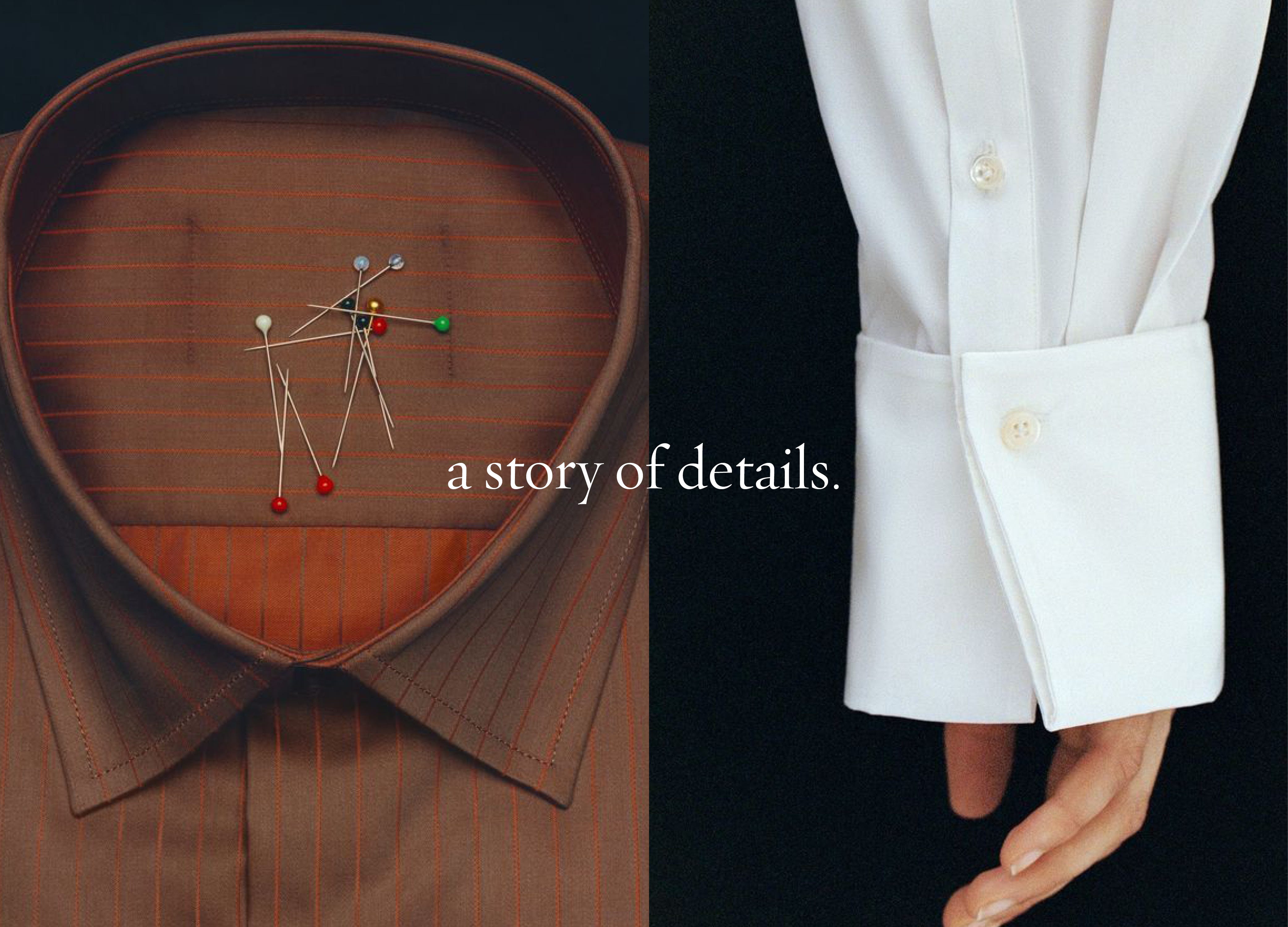

Each page sets up the next, especially at the beginning of a pitch. Some slides exist to create tension, some to slow things down, and some to land the point. When the pacing is right, the person viewing is hanging on each layout, waiting for what comes next.
An outline is essential for me. It is always very rough, just boiling things down to what is most important and making sure that is the focus. I usually think of the first three to five slides as the story of the presentation. They are the preview to the movie. After that, I get into more detail. You have to reel in the fish before you catch it.
Comments
Nothing yet. Say the first thing.
Sign in to join the conversation.