
Now that you might have YOUNG WORLD in your possession or at least seen it somewhere, the design takes center stage. It looks nothing like any other book out there, because that was the intent behind it — and yet at the same time, it takes the best possible design team to bring intention to life.
We had Carol Ly at Random House, who managed the interior layout; Jun Sekiya, who coordinated the flow of all the visuals; Tim Terhune at Random House, who spearheaded physical production; Michael Blank and Alexander Lu who handled the most complex visual illustrations.
But it was Matt Roeser, famed book cover designer and all around mad-scientist, who was my collaborator from the beginning on figuring out the look for YOUNG WORLD.
Here is my interview with him, looking back on how all of it came to be.
…
SOMAN
So when I came pitching this book — were you like, what the F?
MATT
You originally approached me and said, “I have this idea that’s sort of crazy.” But I’m used to you having crazy ideas and sharing them with me. In this case, though, you wanted me to collaborate with you on the first hundred pages of a speculative book.
You knew the book would be a long one — and it would have images and interstitials between chapters. That was it, though. What you wanted us to do was figure out the general language for the design throughout the book.
I will say: it didn’t seem as daunting as what it ended up becoming. I had an inkling of what you wanted, which seemed crazy and cool, but nowhere near as epic in scope as the final product. I just didn’t have the expectation of how big you were thinking.
SOMAN
I think you’re partially misremembering, because you are directly responsible for a lot of how crazy it became. When I first pitched it to you, I told you: I want a hot pink cover and lots of art inside. And then you were the one who said — if you want a hot pink cover, then you should use a neon Pantone for it… and if you do that, then you might as well have that neon hot pink throughout the whole inside of the book.
You got me hooked on the idea of two colors for the whole book. (Most books are printed in one color: black). I didn’t even know that was a thing!
MATT
Yeah, that’s true. In retrospective, you had your idea and then I through the nuke-colored Molotov through the window.
Here’s the thing. When I was at Candlewick Press, as a designer, I would often suggest big ideas and a lot of times, it was coming from a place of ignorance, not knowing that something was wildly expensive or that it was unfeasible with the number of copies we were printing.
I did know that normally, when you see two-color printing, it’s for short middle-grade books. And here you wanted a 500-page behemoth, so I kind of sensed we were in for some trouble. It was going to be expensive. But I also knew that we had a runaway train, where we both loved the idea so much that it became the gauntlet — if a publisher wasn’t willing to do two colors and a neon Pantone, then you wouldn’t go with them.
SOMAN
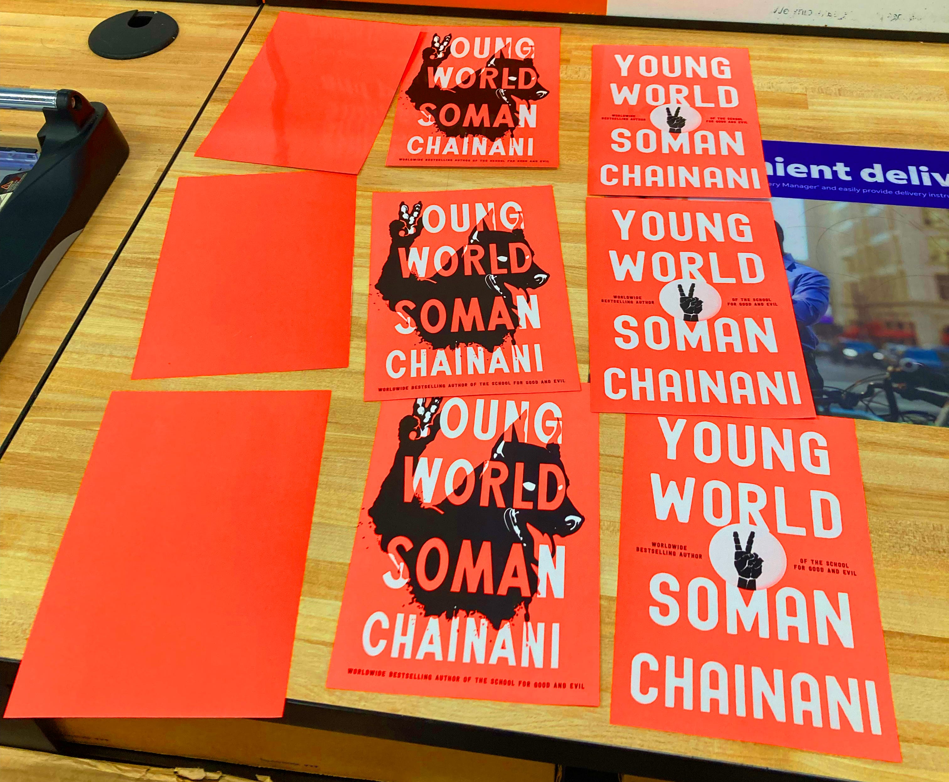
We spent three months working on the proposal, which was the first 50 pages of the book, with the illustrations and neon Pantone. We were so dead set on the color that you told me to get sample swatches of the nuke Pantone printed, so I could bring them to the meeting and make the publisher understand the importance of the color.
MATT
Yeah. We used a printer called John. P. Pow in Boston. I don’t think they were used to printing out big sheets of empty color. But we had to have it to make the point. Because like you’ve said — digitally, it just doesn’t show up.
And you needed to show them that color. That color is everything. It blinds your damn eyeballs out in such a big way that it’s just part of the book package. It’s how you sell it.
SOMAN
Let’s go back to the design because there’s over 150 visual illustrations. There were three designers. There was you, Michael and Alex. I would say Michael did the most complex illustration ones because he is a true “artiste.”
MATT
He can draw anything you ask for. Whereas I can make documents, posters — anything that would exist in real life. I come from my advertising design background. It’s like I can make, like real things. And Michael can just work abstractly to illustrate anything. Alex is just awesome, too. He would come in and manage anything that me or Michael couldn’t quite do.
SOMAN
Alex was the Wild Card. We’d hand him things and be like —
MATT
“Here, Alex. Figure this out.”
SOMAN
Exactly. Which was the if you had to pick the most difficult visual to work on, the one that gave you the hardest time?
MATT
Definitely the page with all the threat files.
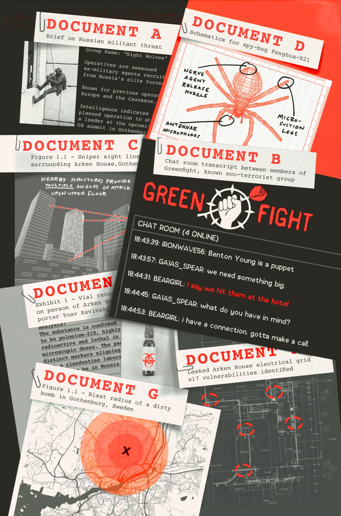
I had nightmares about it. It had like seven different potential assassination plots, referenced in files, and in a complex collage. There was a lot going on in each of those images, plus having to interlock them into an overarching page design. Technically, it was the most difficult.
Actually, I’m flipping through the book right now… Sometimes there was a challenge just finding the right image. Like for the headline about the Indian assassination in the Washington Times, I couldn’t think of the right image. But then saw a flag that would give us this beautiful pop of nuke in the center, and I knew it was the one.
Often, that was the guide. Where would the splash of neon nuke be? How will the neon interact with the imagery? For instance, the spread about Toto the polar bear was all about how to use neon color effectively. You couldn’t make the polar bear fluorescent orange, obviously. So where was I going to use it? That’s when I realized I could use the nuke as its own neon highlighter to underline key bits of information.
SOMAN
Did you have a favorite image? The one you’re proudest of?
MATT
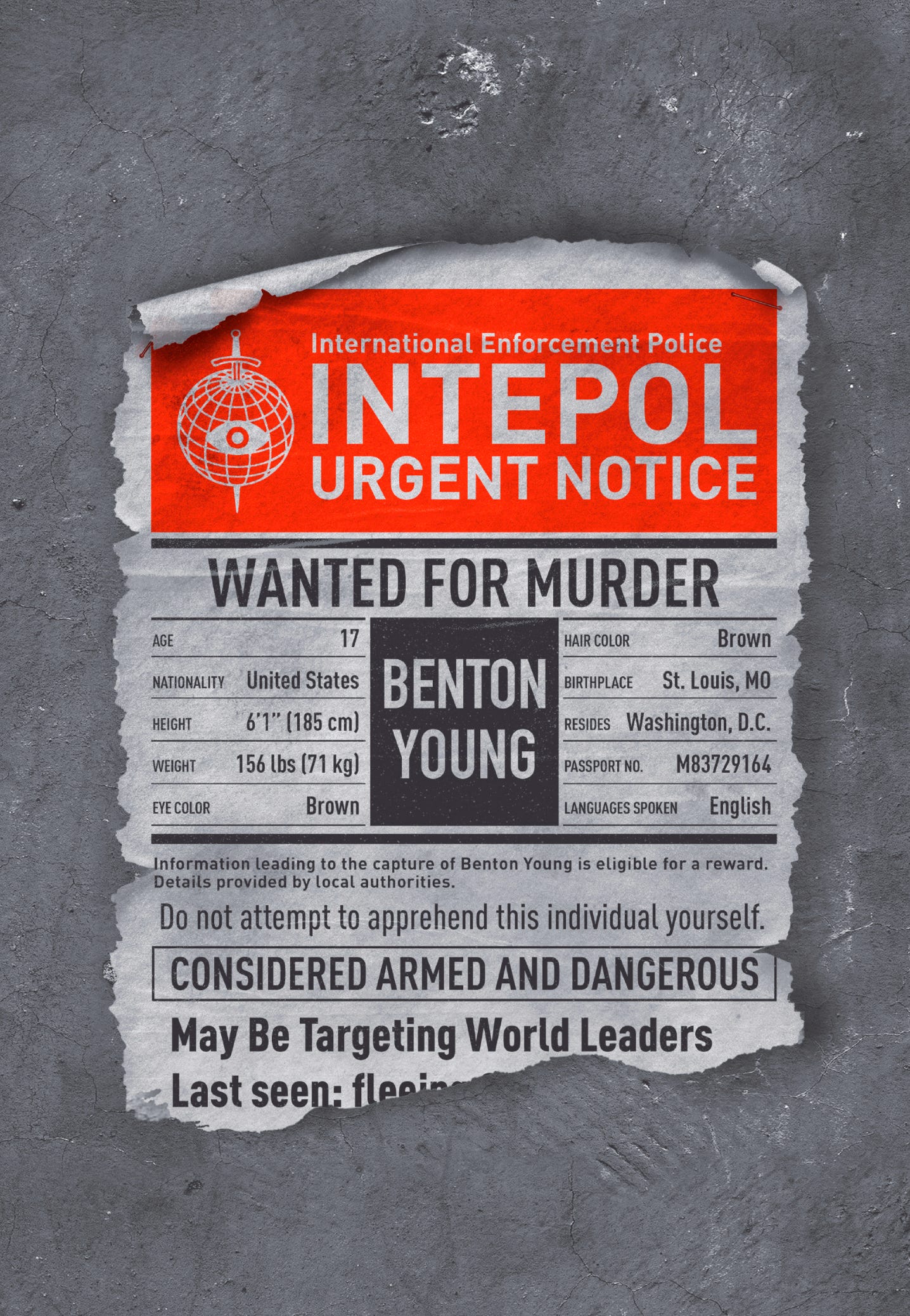
I really do like the Meet Toto one. Also, the Nuke Cola ad because it was one of the very first ones we finished. The Interpol murder poster as well, because that was the first one I did. It’s what set the tone for the book and got us moving.
SOMAN
That one had to be perfect. It’s the first page of the book. I really pushed and pushed on that one so every pixel was exactly right.
MATT
In that one image is the DNA. 95% real world authentic… 5% heightened. The style was set with that first page.
SOMAN
Let’s go way back. How did you get to this point in your career where you were the go-to for a book design this ambitious?
MATT
For about eight years I worked in advertising, branding and marketing in Saint Louis, a company called Atomicdust. And we basically did everything from developing marketing and branding and messaging for a client to then getting that out across every type of media, from websites and brochures and trade show booths.
So I have a background experience of launching a brand in all that entails. I got burnt out after about seven years because a lot of times, the fun clients don’t have any money. And the money clients are involved with remittance and healthcare billing… How many times could I do a website with a smiling nurse? It wasn’t as fun as working on a cool new restaurant in town that could be more of a design showcase — but they also had no money to pay us.
So I started to think about what would be a fun challenge going forward, and I knew I love to read and love design, so I started wondering how does one get into the world of book cover design. That felt like the dream job. So in my spare time, I kept a Tumblr where I made my own book covers for books that I really liked and posted them. They started getting attention. That’s what led to people reaching out to hire me for my first gigs.
I went onto work at Candlewick for 12 years. Now I’m full-time freelance, both to have more control over my workload but also work on my own books and illustration projects. So now I spend three days a week working on bill-paying stuff and two days a week on my own work.
SOMAN
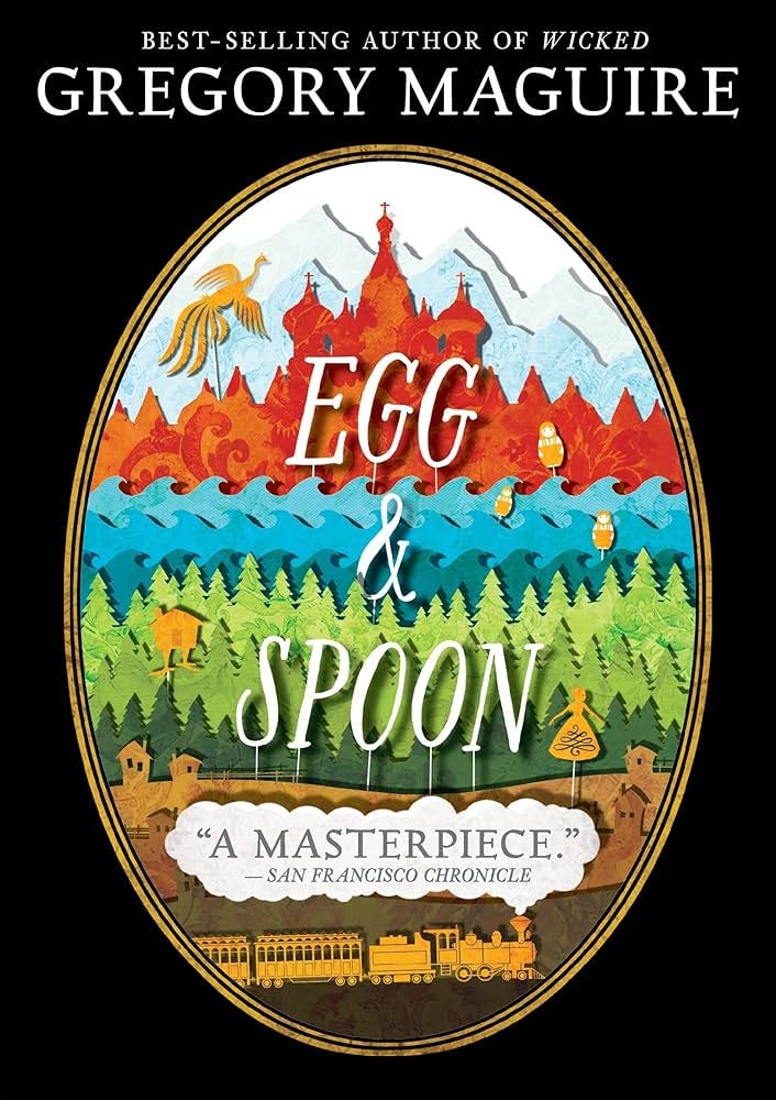
And we met while you were working at Candlewick. You’d designed a book cover for Gregory Maguire, the author of Wicked. And he and I were on a panel at Boston Book Festival, your hometown.
MATT
Yes, the book was called Egg and Spoon. I think the panel was just you, Gregory and Cassandra Clare, if I remember. You guys were quite the group.
SOMAN
It was in a giant church, if I remember correctly. Gregory sang opera for some reason. And Cassie Clare opened by saying she’d fallen out of an Uber that day because the driver had opened the door, not realizing she’d fallen asleep against the window. A very memorable panel, actually.
MATT
That’s what I remember too. And I’d gone to meet Gregory, since I’d done his book cover and wanted to support him. I came to the Green Room… and then you and I got introduced.
SOMAN
I remember this very vividly.
MATT
Then I stood in your line to get a book signed. And we were friends from that moment on.
SOMAN
I came to you over the years for so many freelance assignments. Every book I started, I’d hire you just to sketch out some potential cover designs, so I could understand visually how I’d bring the book to market. Actually, YOUNG WORLD was the first case where the publisher hired you onto the project officially too. They wanted you to do the cover. And we both decided to just be as unhinged as possible.
MATT
Which, as a designer… that’s what I love.
SOMAN
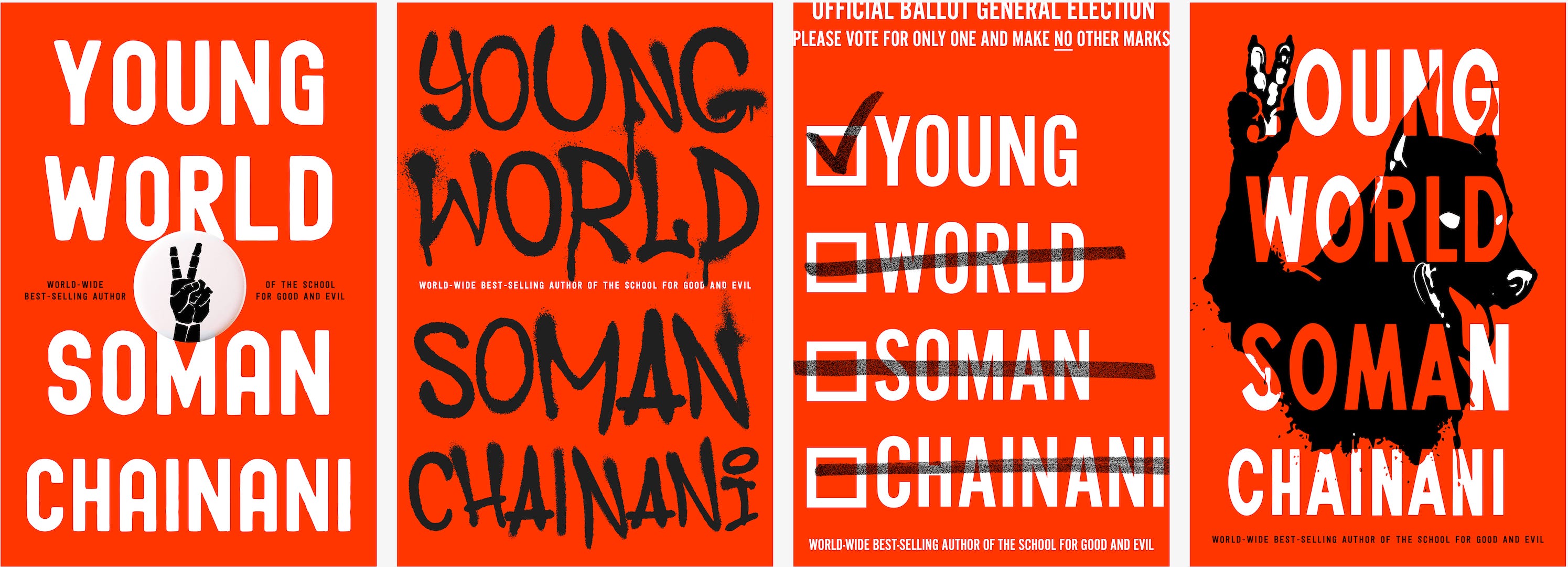
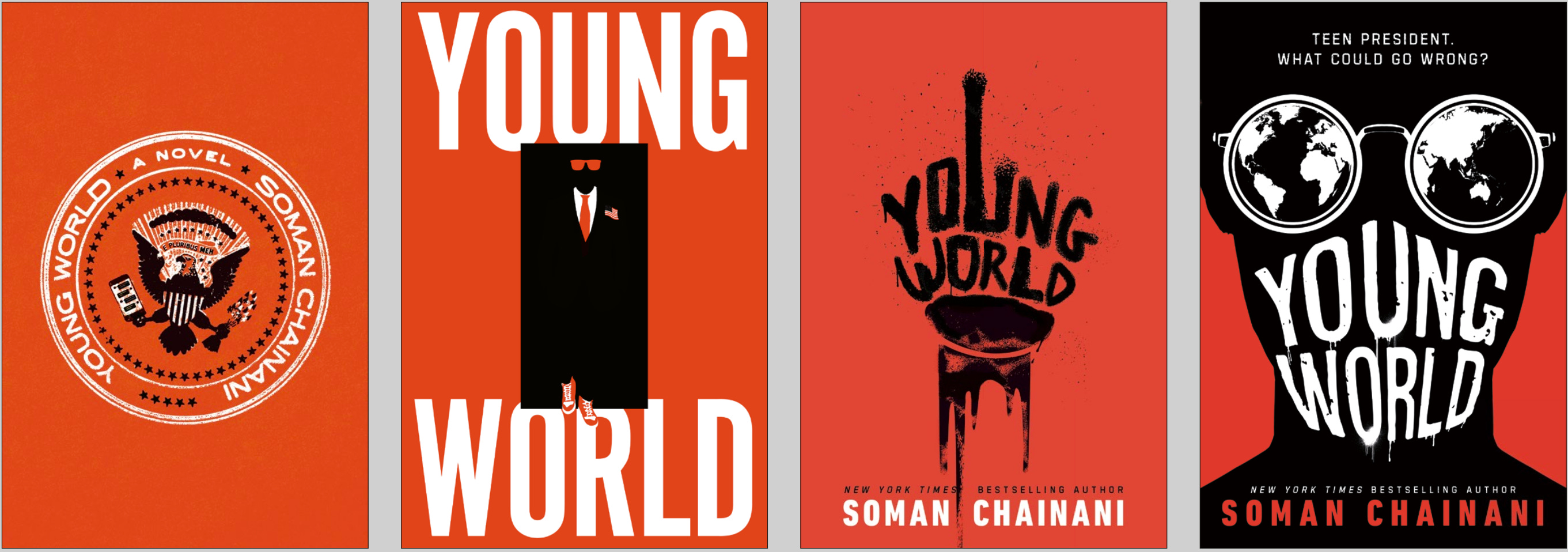
I wasn’t sure we’d ever get one of your covers approved, but that was beside the point. I think the idea was to set expectations that the YOUNG WORLD cover was going to be unusual. So talk us through some of the concepts you had from the start.
MATT
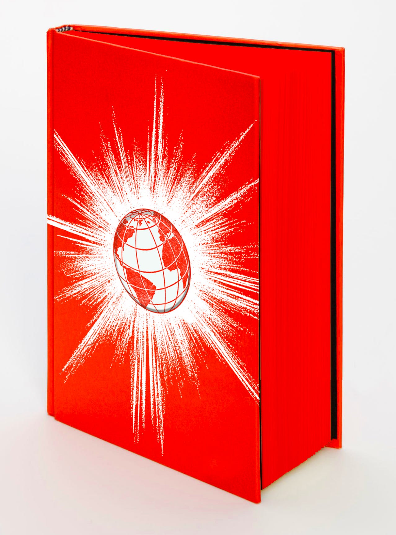
We wanted it to be a neon glowing brick that everyone would just carry around. Something that would make people go: what the hell is that? A literally glowing book.
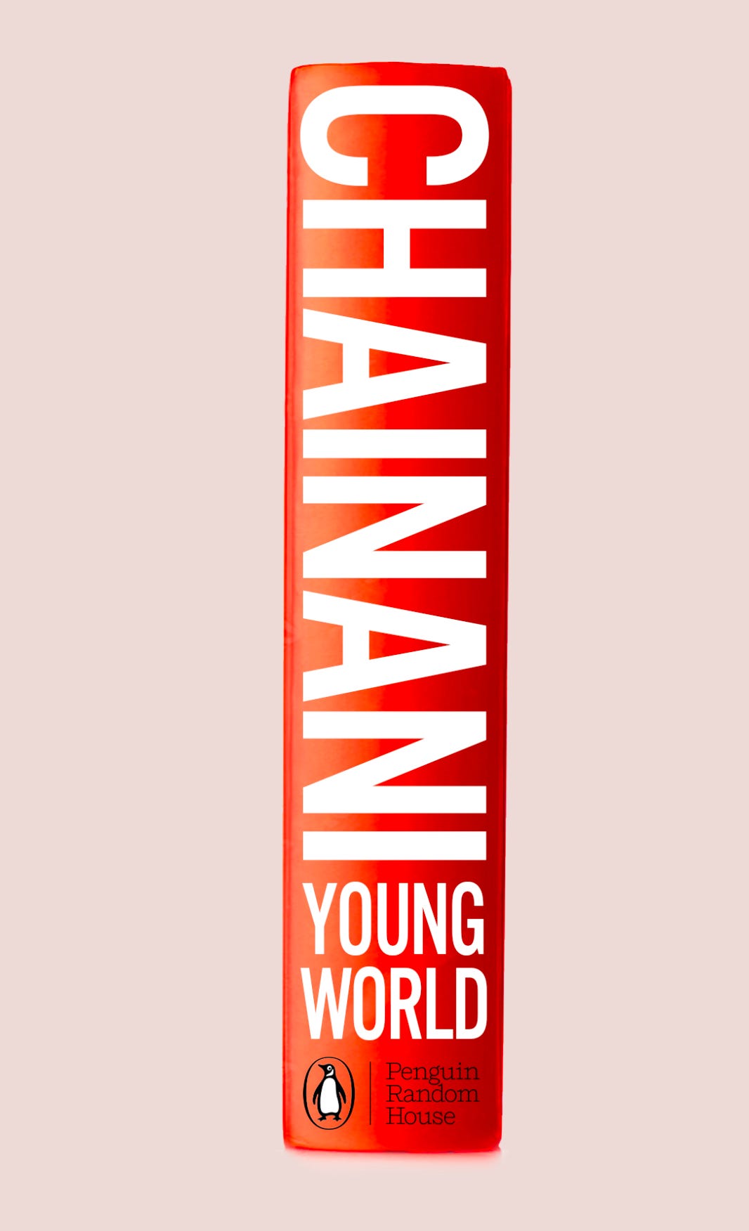
I knew it needed to be dramatically neon and it also needed neon edges. Also, no book jacket. It had to be a physically neon book.
I tried to really push the envelope here. Could we do no title on the front and just a title on the edge? Or a title on the spine only? What if there was just a title and no author?
We started with the idea of an exploding globe and a die-cut hole in the middle of the cover… So that when you opened it, you would see that exploding world on the endsheets.
Didn’t we also talk about just having no title and the exploding globe and then your name huge on the spine?
SOMAN
The narcissist in me loved that idea.
MATT
It would make the book feel so mysterious.
SOMAN
Random House disagreed, ha. They also didn’t like the exploding earth because it felt too sci-fi to them.
MATT
Alien invasion.
SOMAN
Which as soon as they said it, I agreed with. Then you tried a snarky emoji on the globe.
MATT
With sunglasses. That didn’t fly either.
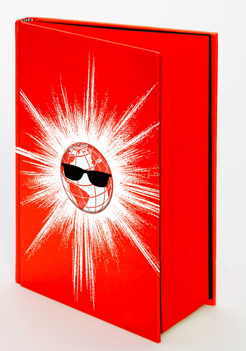
But the point we were making, that eventually got through, is that this is different from every other book. We wanted a book that every bookstore would put face-out.
SOMAN
You had so many great ideas that helped inform the final.
MATT
Yeah, I played with spray paint and graffiti and upside-down images. I had an upside down presidential seal. I never came up with the upside down Capitol though…
SOMAN
That was Spencer Fuller at Face Out Studios. You’d moved onto to other projects and Spencer was able to just lock down a combo of all the elements we’re discussing. As soon as we saw it, we knew we had it. Though there was pushback at first… The publisher thought an upside down White House was better.
MATT
White House is too much of a rectangle. I feel like the Capitol has that point at the top, so upside down, it’s pointy and edgy and dangerous.
SOMAN
It’s like a top waiting to spin.
MATT
It also looks like a weapon upside down. But the thing I like best about the final cover is it does not look like any YA book before or since, and doesn’t even look YA. It looks like a book for absolutely everyone. An adult wouldn’t say — oh that’s for kids.
SOMAN
My last question for you: how do you feel about the book now that it’s out there in the world? And would you do more YOUNG WORLDs if I come knocking?
MATT
Oh, we already have color ideas for the next one. It can’t be the same color. It needs a whole new vision… something totally different…
See? I’m already on board. And now we have a visual language to work from. It can be even more ambitious. There’s no way there’s just one of these. This has to be a world.
SOMAN
Oh, man… You’re making me tired.
MATT
Get cracking!
No posts
Comments
Nothing yet. Say the first thing.
Sign in to join the conversation.