
Instagram’s New Logo Is a Compromise Nobody Asked For
Tech’s minimalist era is ending. What’s replacing it looks so much worse.
Sign up for the Slatest to get the most insightful analysis, criticism, and advice out there, delivered to your inbox daily.
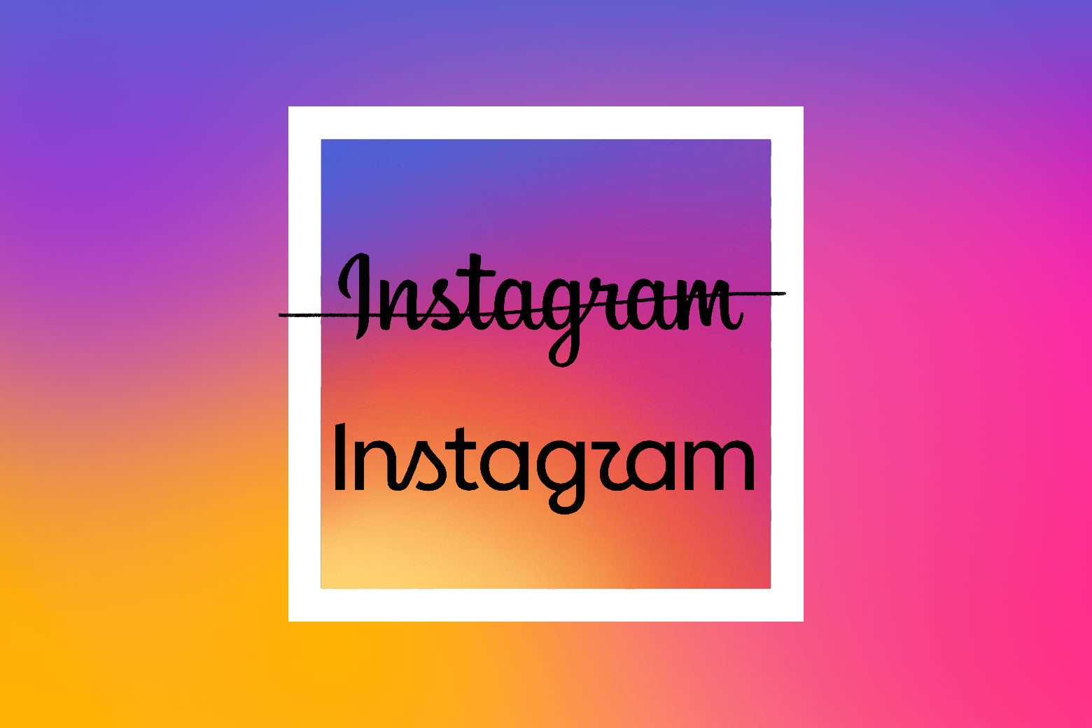
Instagram did something bold and brave this week: It unveiled a new wordmark for the first time, stepping away from its signature cursive to a new and strange part-modern, part-script font. It took one look for people to start dogging the company out for its unreadability. It does, unfortunately, look like it says Instagzam.
“The wordmark at the top of the app hasn’t changed in 10 years, so it was time for a refresh,” Instagram head Adam Mosseri wrote in his announcement. “Cleaner and more modern, with references to the original and the simplicity and craft that’s always made it Instagram.”
The new wordmark, which is displayed across the banner of every user’s feed, is now predominantly in a sans serif font, with only a remaining cursive S and the controversial cursive R left over from its all-script predecessor. The design feels like Substack and Goodreads and Hinge—apps that sit at the intersection of wanting to be LinkedIn-bro tech companies but also wanting to let you know that they, culturally, are meant for a group of performative men who carry around an unopened copy of The Bell Jar in their farmers market tote bag. This new wordmark smells like Le Labo’s Santal 33.
There’s been a lot of that going around, to be fair. As tech has grown as an overwhelming force in our lives, the visual design cornerstones associated with it—arial font, minimalist branding, bright colors and clean lines—have become the norm. In the rush for everyone to claim tech-company status, we lost a lot of good shading in many iconic logos: Warner Bros., Pringles, Burger King all went with ultra-minimal redesigns, as if anyone would see Pringles as a forward-thinking tech company and not the perfect contraption to get sour cream–and–onion dust all over your hands. But it raises a new problem: If everything is flat and sleek and simple, it all looks the same once again.
The modern age of minimalist millennial-gray rental units and plain box-build apartments has been getting dragged all over the internet, as people complain about the fact that we used to really make things like iron doorknobs and intricate crown molding for the love of the game. At the same time, we’ve begun to see more nascent tech companies attempt to differentiate themselves from the masses of the flatpack 2010s Silicon Valley startup design, whether it’s the controversial iOS Liquid Glass design or the gradients that Google added into its Workspace app icons. Growing venture capital–backed consumer brands, like Blank Street Coffee and dentist office Tend, traded in neons for pastel greens. A.I. companies are all, for whatever reason, really obsessed with serif fonts, as if adding some kind of literary touch to their branding will distract from the fact that the base function of their product is to literally remove a human somewhere from the process (neither a compliment nor shade, just the fact of the matter). A lot of people have pointed out that their logos all look like buttholes, too, but that’s not what we’re focusing on today.
If that Katy Perry–feminism era of tech design is now pedestrian, gauche, and untrustworthy, then this new era of airbrushed dimension, semi-scholarly font, and rounded edges is chic and forward-thinking, considerate of the humans but reaching into the future.
Of course, it was destined for the jokes about the new wordmark to happen. It is tradition for consumers to hate on new brand designs upon arrival: Spotify’s Elphabean temporary disco-ball logo for the app’s 20th anniversary, Kia’s equally inscrutable font change, when Airbnb unveiled its new logo and people online said it looked like genitals, and of course that time when Cracker Barrel tried to roll out an Apple Store-esque logo and a very large segment of this country’s population including the president staged a massive public tantrum about it that ultimately resulted in the CEO stepping down a year later. Even other brands were reaming Instagram for the change. KitKat made fun of them, ChatGPT made fun of them, Canva made fun of them. Wendy’s was, naturally, involved. It is in our nature to see something new and spit it out like we are 2 years old and PepsiCo has offered us a spoonful of broccoli. I get it. I still refuse to call Twitter by its new stripper name.
The point of these splashy redesigns is always to tie back to something more intrinsic to the company, though. In Instagram’s case, the brand also rolled out a new “brand system,” including new fonts, icons, and formats for posts. This rollout also comes at the same time Meta CEO Mark Zuckerberg sits on trial over child safety concerns, specifically on Instagram, which could spell huge changes to the app in the near future. It’s unclear what led to this exact timing, but this would certainly zip in nicely with the changes that might happen because of the child safety trial, and offer a small, fresh visual change in front of the more foundational ones that may happen soon.
So in a weird way, the new wordmark is kind of the perfect compromise. The new typeface really does fit the moment, a time when anything in full cursive is kind of washed and outdated, and soon, no one will be able to read it anyway. So why not take one foot out? Younger users probably struggle to read the cursive parts, older people on the platform also probably struggle to not post bird’s-eye selfie angles of themselves by a lake, and now there’s a slight bit of awkwardness for everyone involved when scrolling. That’s beautiful. In just a few years, you won’t even know what that script gibberish says. But we’ll always know what we have now: Instagzam.
Comments
Nothing yet. Say the first thing.
Sign in to join the conversation.