
Table of Contents:
By now, I hope you're proudly embracing your inner type nerd! You've explored the beauty and variety of typography, learned essential rules, and practiced applying them in both creative and practical ways.
Next up: type crimes 🔍
We’ll be looking at common design mistakes—can you spot them before they strike? 👀
But first, check out this fun video that shows how type can be used as an image:
🎥
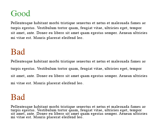
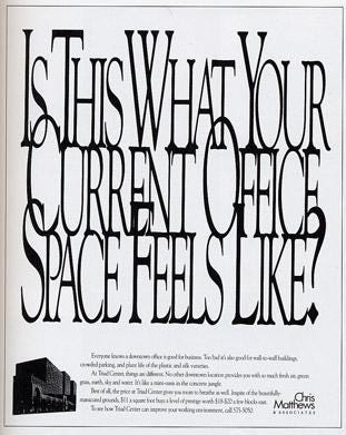
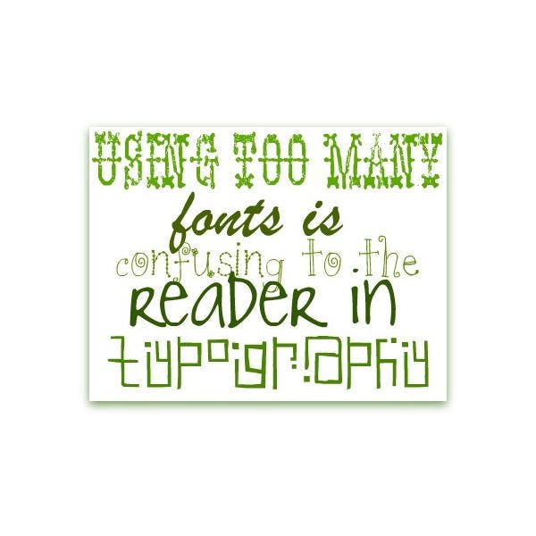
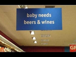
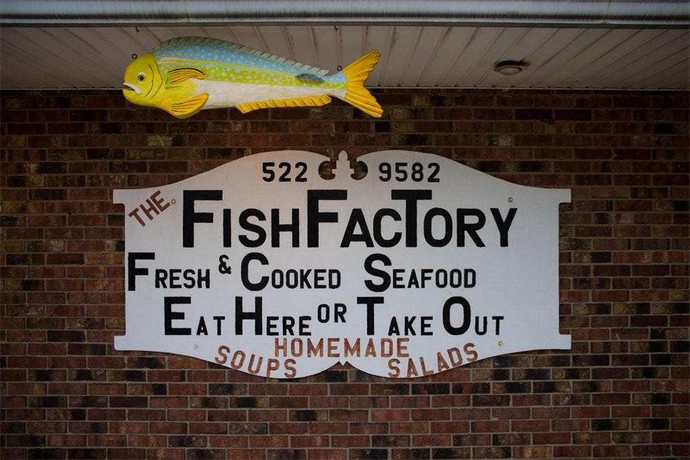
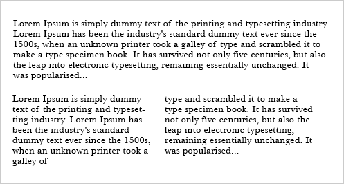
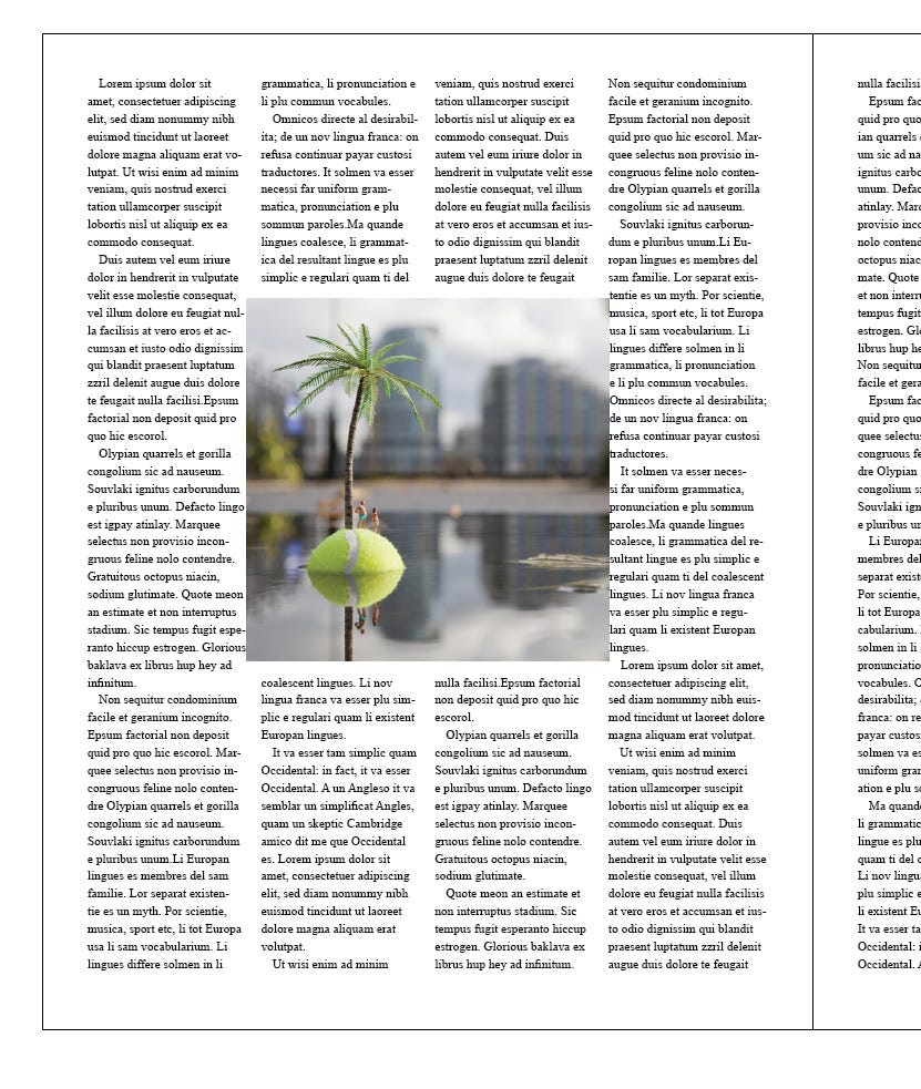
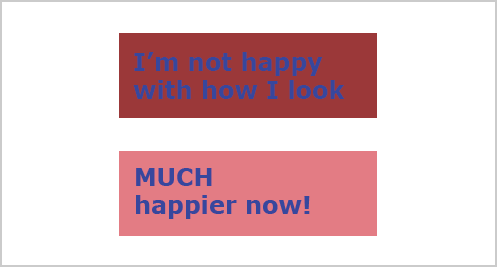
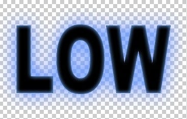
Dark text on dark background (no contrast)
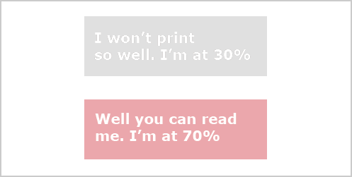
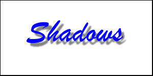
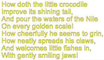
Light text over light background (no contrast)
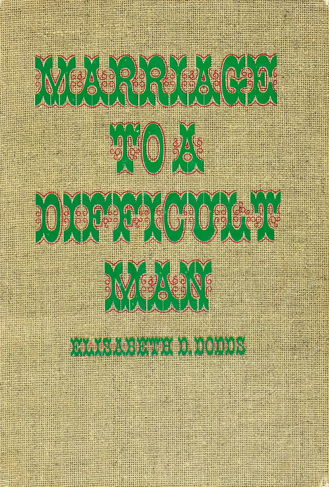
Text over a multi-colored background
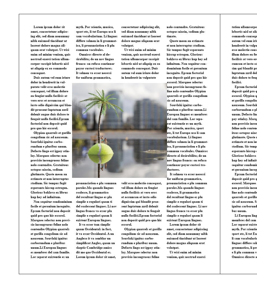
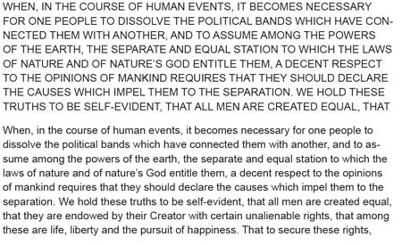
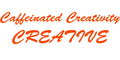
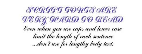
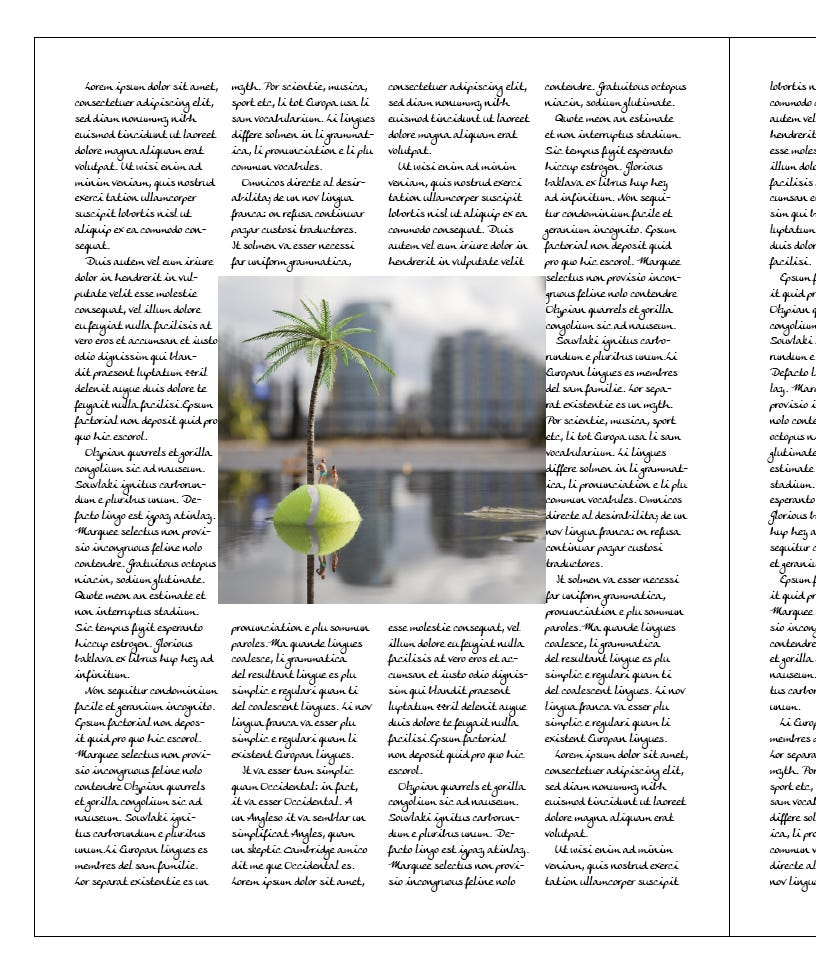
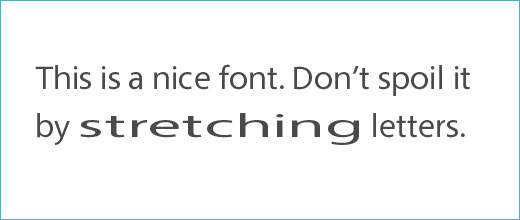
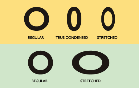
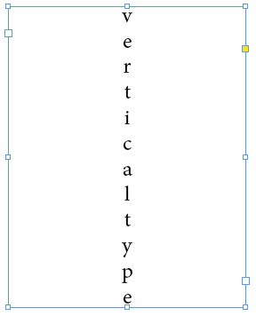
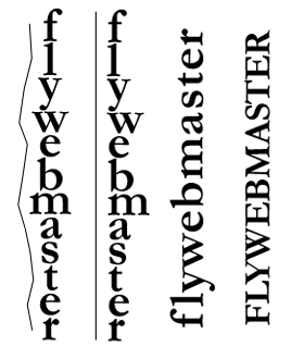
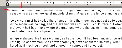
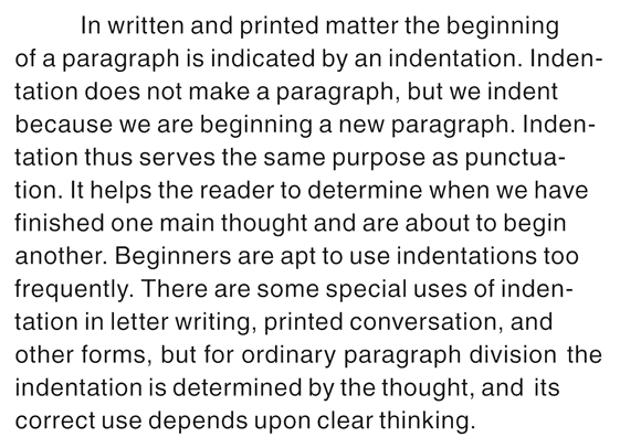
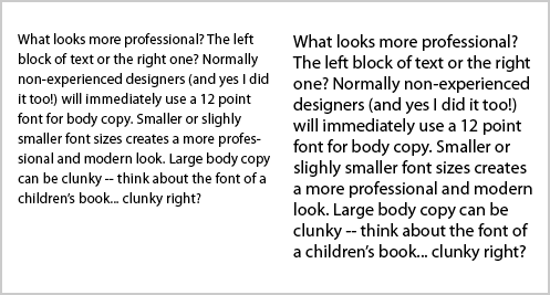
Should only be 2 em spaces (em = the x-height, or about the width of a lowercase "m")


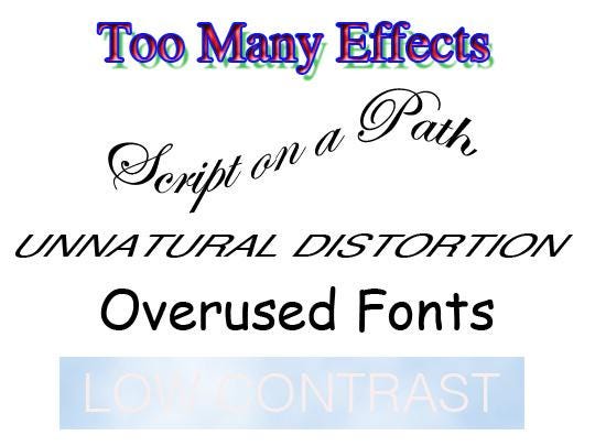
👀 Got your phone? Good — because this week, you're on the lookout for bad typography in its natural habitat.
Your mission:
📸 Snap photos of cringe-worthy fonts, chaotic kerning, or layout disasters you spot out in the world — signs, menus, posters, you name it.
💬 Upload them to the chat and let your fellow Substackers weigh in on the “type crimes” you've uncovered.
Let the font-shaming begin! 😆🧯🔎
Comments
Nothing yet. Say the first thing.
Sign in to join the conversation.