
Table of Contents:
The term “typesetting” dates back to the early days of printmaking, when individual letter blocks had to be physically set into frames according to the layout of each project. While we now use computers instead of metal type, the term lives on—referring to the choices a designer makes with fonts, spacing, and type tool settings.
Next up, you’ll learn some essential rules and guidelines to help you make thoughtful, effective typesetting decisions. You’ll also practice applying them in a few creative projects.
To kick things off, enjoy this short video—it gives just a glimpse of the enormous range of fonts out there, from A to Z. It’s easy to see why a few rules can go a long way!
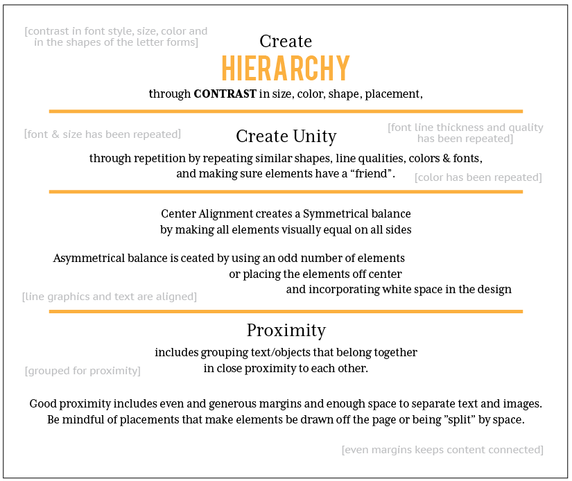
Designing personal invitations is a fascinating area to explore. Invitations can be created for digital or print, and their style can range from traditional to trendy—often shaped by the location, occasion, or people involved. Regardless of the format or style, one thing remains essential: clear communication. The effectiveness of an invitation depends heavily on its hierarchy and organization, which are guided by strong typographic choices and solid design principles.
There are many type techniques that help organize content and guide the reader through an invitation. These techniques work hand in hand with the four basic principles of design: Contrast, Repetition, Alignment, and Proximity—also known as C.R.A.P.
Contrast
Leads the reader’s eye by creating visual hierarchy. It helps direct attention to the most important information first.Repetition
Brings consistency and unity to the design, reinforcing both the look and message.Alignment
Creates structure and balance, giving your design a polished, intentional feel.Proximity
Groups related content together to make logical sense. Good proximity includes generous margins and enough white space to separate different sections clearly.
Critique is one of the most valuable tools in your design journey. You’ll encounter it often—in school and in the professional world. Designers rarely create something in isolation; feedback and revision are part of the process.
To be useful, critiques need to be specific and constructive. Saying "I like that" is kind, but not very helpful. Instead, aim for feedback like:
“This works well because…”
“I think it might be stronger if…because…”
Keep in mind: design isn’t math. There’s rarely one single correct solution. As designers Kate Lawless and Shannon Crabill put it,
“Design isn’t math. There are … only subjective opinions that may differ from one designer to another.”
(Lawless & Crabill, 2015)
Ultimately, as the designer, it’s your job to weigh the feedback and make the final call.
Lawless, K., & Crabill, S. (2015, March 27). How to give and receive a good design critique. Retrieved May 8, 2016, from AIGA.org
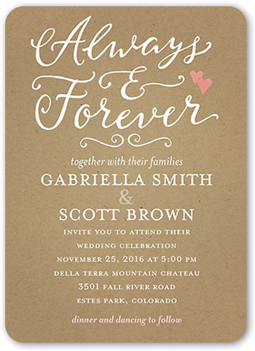
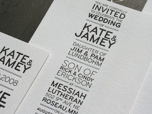
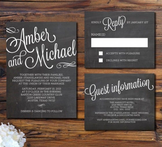
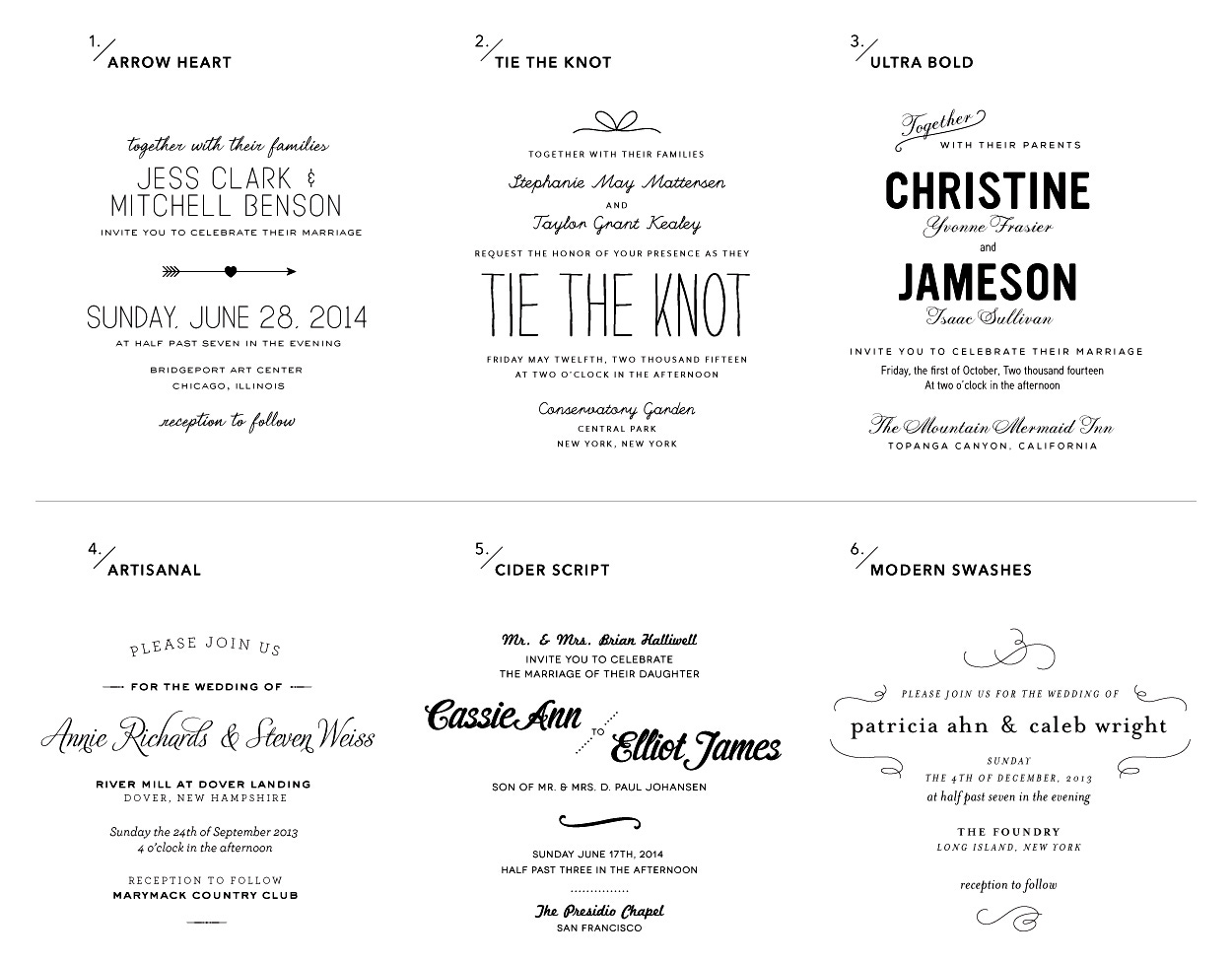
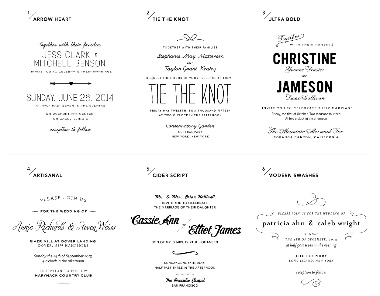
This week, you’ll step into the role of a designer who has been approached by a couple to create a text-focused wedding invitation—no photos, just beautiful type and layout.
But instead of designing just yet, you’ll begin like any good designer: with research and evaluation.
📌 Note: You are not designing an invitation yet—this assignment is focused on research, critique, and design thinking.
Design Research Questions
Imagine you're interviewing the couple. Besides needing the names, date, and location, what two questions would you ask to help guide your design decisions?
(Examples might relate to theme, tone, culture, colors, etc.)Your Imagined Answers
Provide your own made-up answers to those two questions. These should reflect what you envision for the couple and their event.Two Examples of Invitations
Find two text-based wedding invitation designs online that could serve as inspiration. Embed or link to the images (see your course’s instructions for how to do this).Evaluation & Critique
For each design:What aspects work well? (Consider font choices, hierarchy, spacing, tone, layout, etc.)
What aspects could be improved?
What would you change to better suit your client’s imagined needs? (Think about typography, layout, emphasis, or color palette.)
This assignment builds your ability to analyze design, ask the right questions, and visualize solutions before you ever open your design software. It’s a key part of the creative process.
Comments
Nothing yet. Say the first thing.
Sign in to join the conversation.