
Good morning. Hope you’re surviving the heat! The week as been a tad warm hasn’t it. I am not complaining, not one bit, but sleeping is tricky isn’t it. The hot flushes on top of hot flushes FML. Global warming is all my fault. I am a ROASTING menopausal woman. Those polar ice caps melting? Pretty sure I am to blame. HA
ANWYAY!
This week we are talking paint colours. Where do you even start. SO much choice, so many ways to spend your money and often a lot of fear about getting it wrong.
I have a couple of ideas up my sleeve, that might help. Faced with alll the colours and alll the colour cards you can pick up in B&Q or Homebase etc, the choice is vast and overwhelming. So much so you are in danger of A) doing nothing, or B) gathering samples and painting patches of your walls and leaving it at that, because it’s just impossible to choose. Hands up?
First of all - Do not even look at the Dulux (or any) paint station. You know the one. It contains thousands of colours on colour cards, each with tiny rectangles of colours with multiple, almost identical shades of the same colour on each one. I look at it, suddenly go paint blind and immediately lose the will to live (or paint anything) Faced with that level of choice I’d rather move house as it would be quicker.
Do not collect any cards with multiple shades of the same colour. DON’T do it. Don’t even look it in the eye. Pass the area quickly with your back to it. The sheer amount of choice is dangerous territory. All those colour cards start with the same letter. P. P for PROCRASTINATION. Unless you know PRESICELY what shade you are after, bypass bypass.
Narrow your choice down to a couple of brands you like. My favourites are Fenwick & Tilbrook, and Farrow & Ball (before any F&B haters roll their eyes - please bear with, as I have conducted research and share my findings later in this post)
ORDER THE PAINT DECK/S. It’s the best investment I have made as I use them all the time and it means less blumming test pots all over the place and test pots are not cheap. A professional paint deck means you get a decent sized swatch and it is MUCH easier to pick what goes with what. No more bending a colour card with a tiny rectangle over, to see if it goes with another tiny rectangle further along the card. Impossible.
It’s also a real flex because you won’t lose them and can whip them out any any moment should the mood strike. Unlike the free ones that you might find in the drawer where you keep the take way menus…after a rummage. Or the bin.
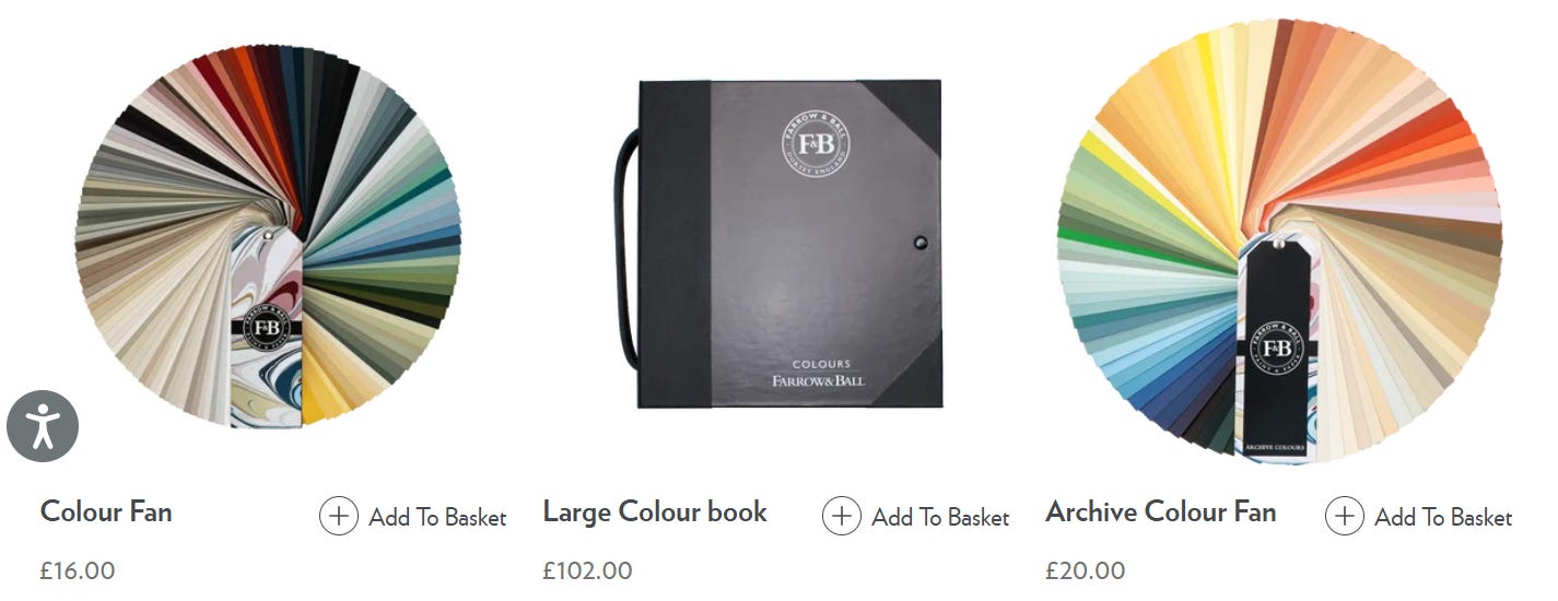
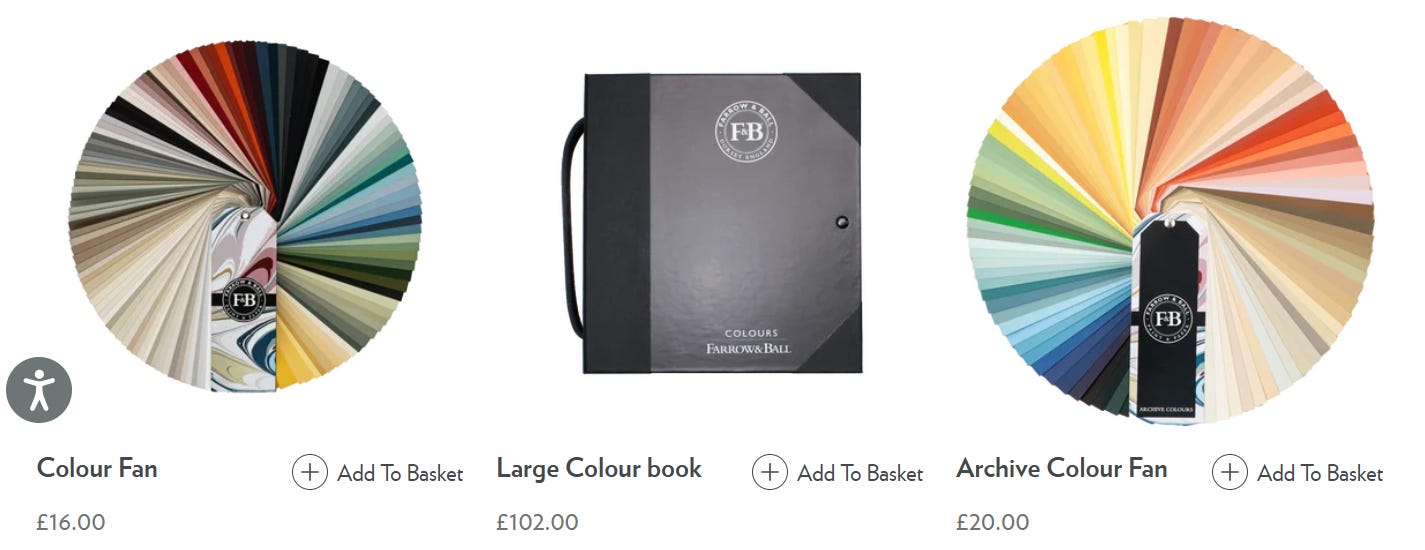
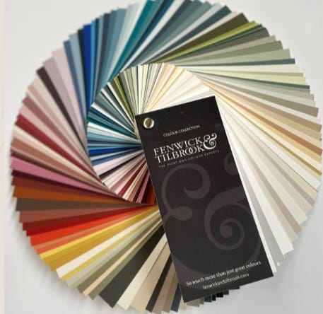
And the Fenwick & Tilbrook Deck, here
Most brands have these decks, so pick a couple of your favourites and don’t look at any others.
Once you have your brands nailed down, stick to one brand in the same room. Choosing colours from within the same collection makes things easier. The shades will have been created to sit beautifully next to one another. The undertones will naturally work too, which means pairing walls, woodwork and ceiling, much easier. It also makes it almost impossible to get wrong.
MOOD BOARD. I don’t mean a fancy one, just a place to put colours next to each other alongside images of other items in your room or pieces you want to buy, so you can check it all looks good together. Pick a colour you like and go from there. If you have found fabrics, furniture etc, pick colours to harmonise. There is always a starting point from which everything else grows to form a scheme.
I make my mood boards online and I have mentioned this before but I can’t get on with Canva. I am probably one of the only people on the planet who hates it, but if you are also one of ‘us’ HERE is a link to the easiest way I found to very quickly create a mood board with zero faff. And I promise it will help you decide on your scheme.
There is nothing more dangerous than randomly picking a colour with no forward plan and hoping it all works. I mean, obvs there are more dangerous things. Sharks are more dangerous (but they’d be raging if they had to pick a paint colour)
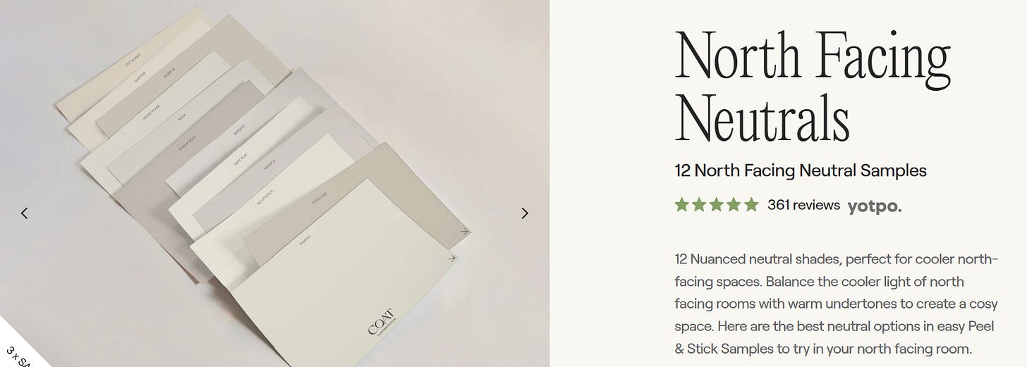
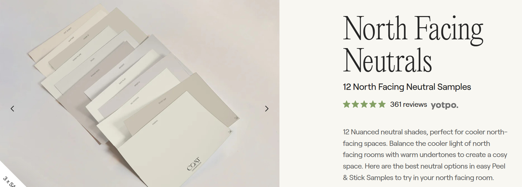
A quick note on an alternative - I have never used COAT paint - but I noticed they do Sample packs of peel and stick test swatches Find them here. It’s a great marketing tactic but equally, it helps you narrow it down to a smaller colour palette, which is key for helping you choosing a shade. Less choice = more likely to be able to actually make a decision.
HOW I USE AI
Faced with a room that you are struggling to imagine, or even a room that hasn’t been built yet - say if you find yourself planning decor mid extension, use AI. AI is your friend and can really help you imagine a space.
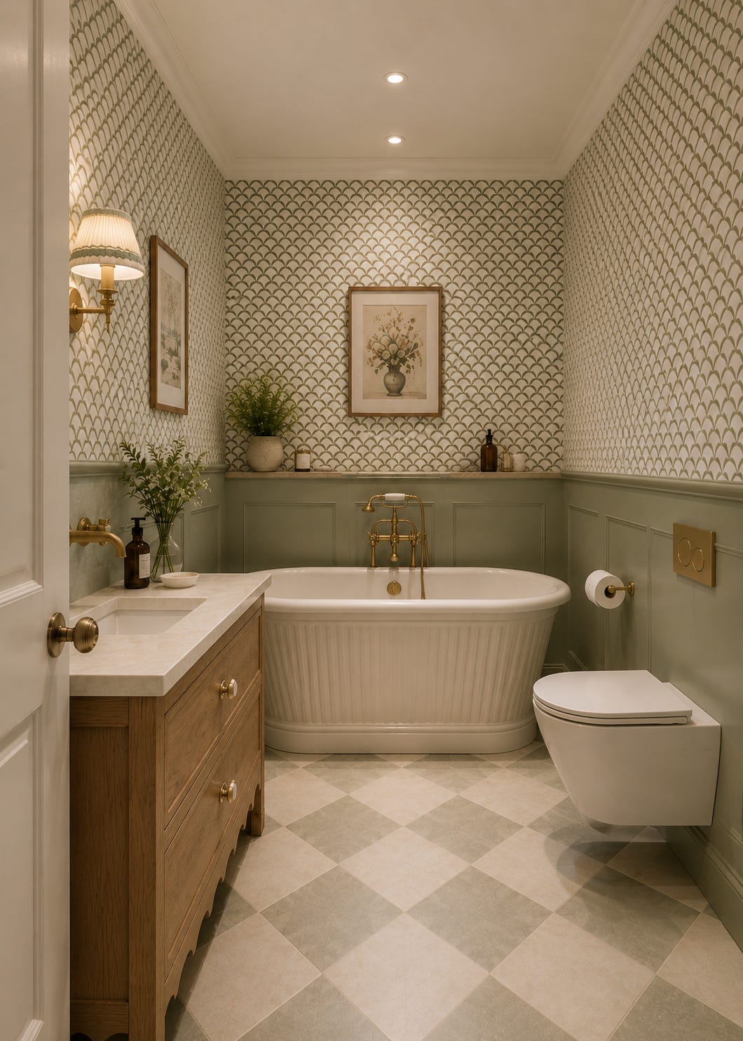
I asked AI to create a bathroom - I gave all the info such as size, shape, where doors would be and my design ideas and specifically no window as I was helping someone imagine their own bathroom which would be windowless and AI delivered (and now I want this bathroom haha) and it massively helped the vision for this space. REALLY handy if you are struggling even imagining colours together and how things could look.
We have a bathroom with no window and I wrote about the transformation from room of utter doom, to a windowless room of GORGEOUSNESS
HERE in case you need some ideas
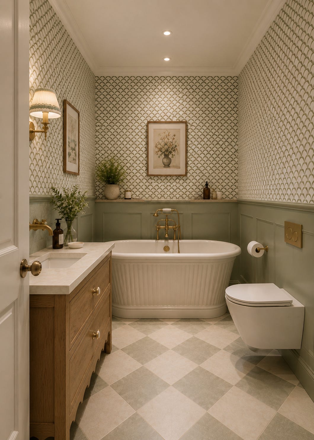
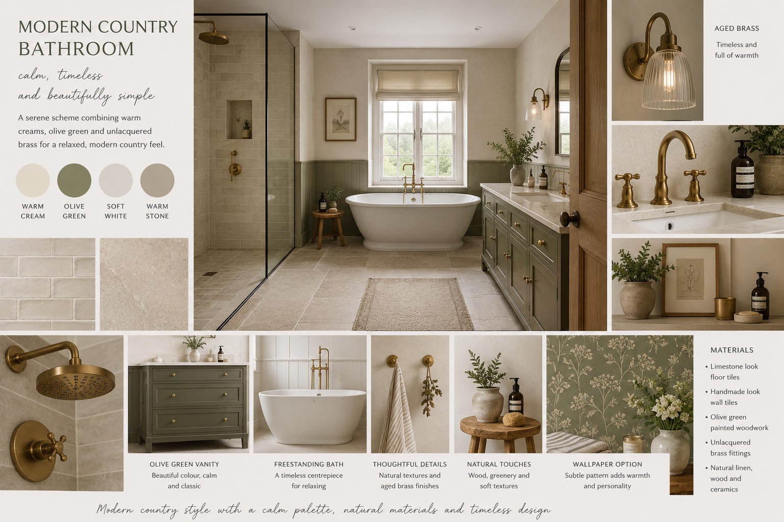
AI made this - (ChatGPT) Ideas in an instant and a spring board in to your own real life design. Because sometimes you just need to see a picture when you can’t find the right inspo on Pinterest or in a magazine.
Now, I admit I am a bit rogue because I never think too deeply about the final colour choices. There is nothing more debilitating than being stuck choosing between 8 shades of white. I refuse to be that debilitated. And I know for a fact that there is more than one perfect colour for your scheme. I usually trust the deck, the mood board and just go for it. One of the good things about sticking to only a couple of paint brands is that, over time, you become your own colour expert because you use the paints and can see what works, what you love and equally, what doesn’t. Experiencing the colours and learning from them.
We have all come a long way since ‘daffodil white’ and are now braver than ‘magnolia’ .
I will say that I have been a massive fan of their paint. Until I wasn’t. It changed and then I whole heartedly agreed with the nay sayers - it was awful. And then they invented DEAD FLAT which can be used anywhere - walls, wood work, radiators, all of it. And it is EXCELLENT once again.
We live in Cornwall and our local supply shop is small. It holds most whites but there is more chance than not, that when I dive in hoping to find the all colours to choose from, invariably they are just not available. And I am ALWAYS in a ‘need it yesterday’ situation. I am nowhere near organised enough to order in plenty of time. Gav will suddenly say ‘RIGHT get the colour, we will paint today’ And I will send myself on emergency despatch to the Crown Decorating Centre.
Many people get their posh paint colour, colour matched, which saves lots of money. I was always dubious paint matching - surely it’s not the same as the real deal?
I wanted F&B ‘Whirly Bird’ for a bedroom. Its a gorgeous shade of green. ‘SURPRISE’ not stocked at our decorating centre and would be a couple of days if I ordered it. SO, I had it mixed. They used the magic numbers to mix ‘the exact shade’ and off I went. Duly painted the walls and hated it. The absolute paint snob in me, convinced it wasn’t as nice as the ‘real’ colour. SO much so that we stopped painting and ordered the real Whirly Bird from F&B. Waited days. (‘It’ll be worth it’ I said) It arrived. We started again, (Gav was losing the will to live by this point) and reader, it was the exact same colour as the one we had mixed. *IDENTICAL. FFS.
* worth noting though, posh paint such as Farrow & Ball, has a distinctive depth because of the pigments and finishes. While some people are perfectly happy with colour matched alternatives, some prefer the real thing. It largely depends on your own preference, budget (and how much of a hurry you are in!) And, according to the lady in charge of the mixing machine, some matches turn out better than others. But I CAN say that Whirly Bird was blooming identical. Eye rolls at self.
Ceilings don’t have to be white. Nor do radiators or woodwork.
We have zero white ceilings in our house. We take the wall colour up and over the ceiling which means no cutting in and a lovely cohesive room. If you want white ceilings of COURSE - paint them white, but don’t forget they are the 5th wall and the colour of them needs to be decided rather than presumed.
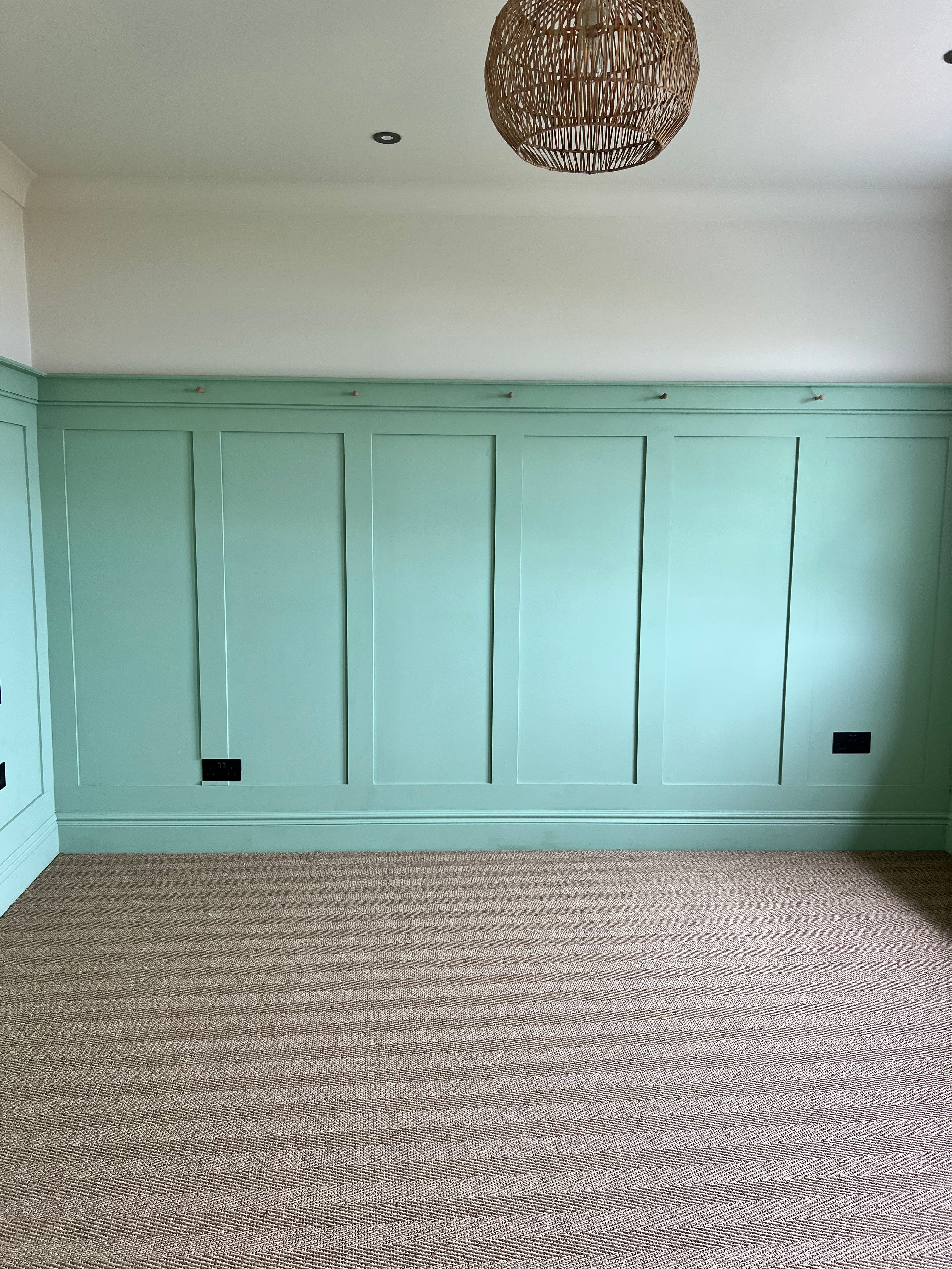
Starting with that damn green that almost caused a divorce.
F&B Whirly Bird on the panelling, and Dimity on the upper walls and over the ceiling.
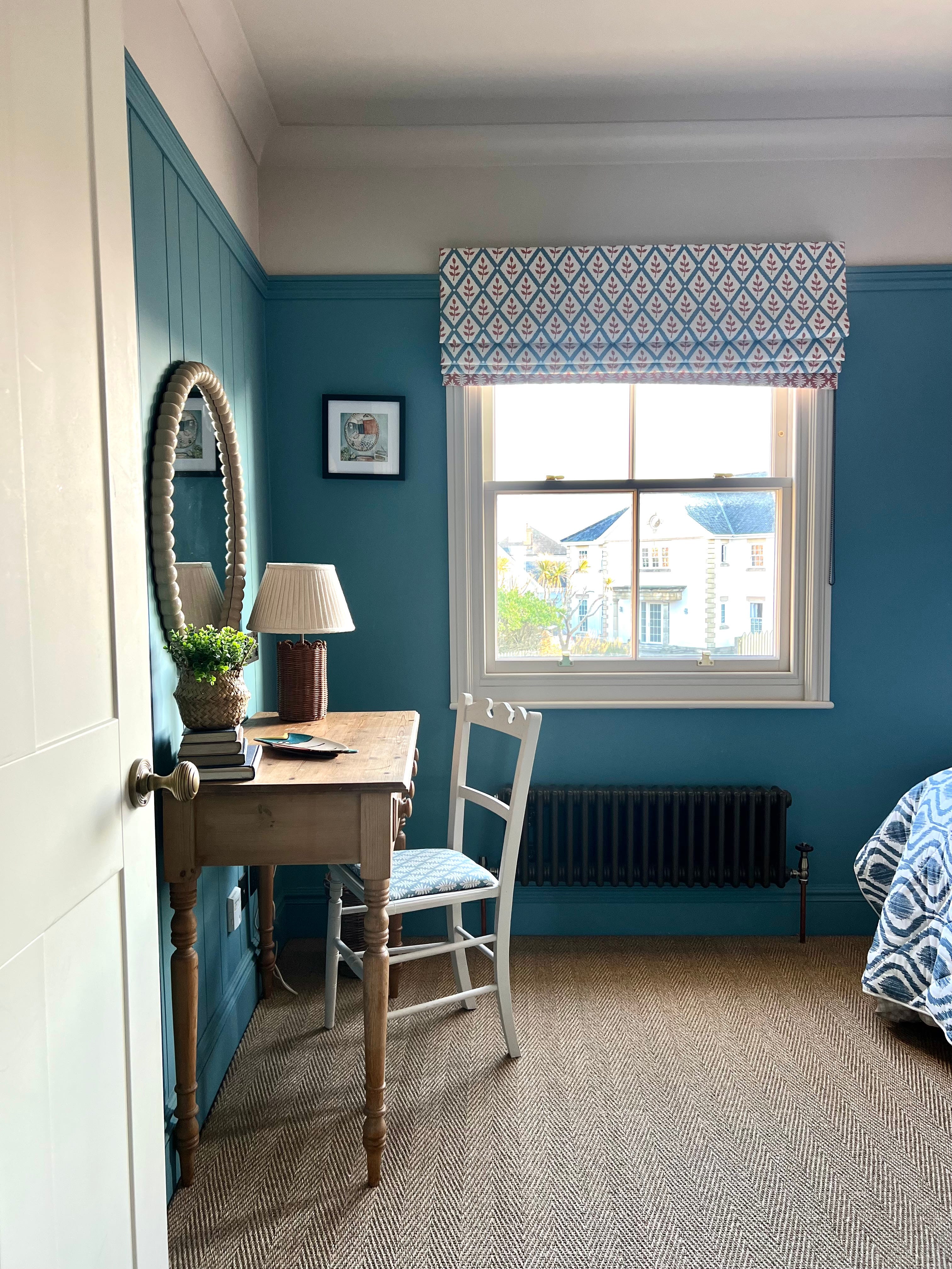
F&B Stone Blue Dead Flat on the panelling, and Stir About Dead Flat on the upper walls and over the ceiling. Stir About is my GO-TO neutral. A porridgey cloak - it looks really dark compared to white, but with no white around, it looks like a white.
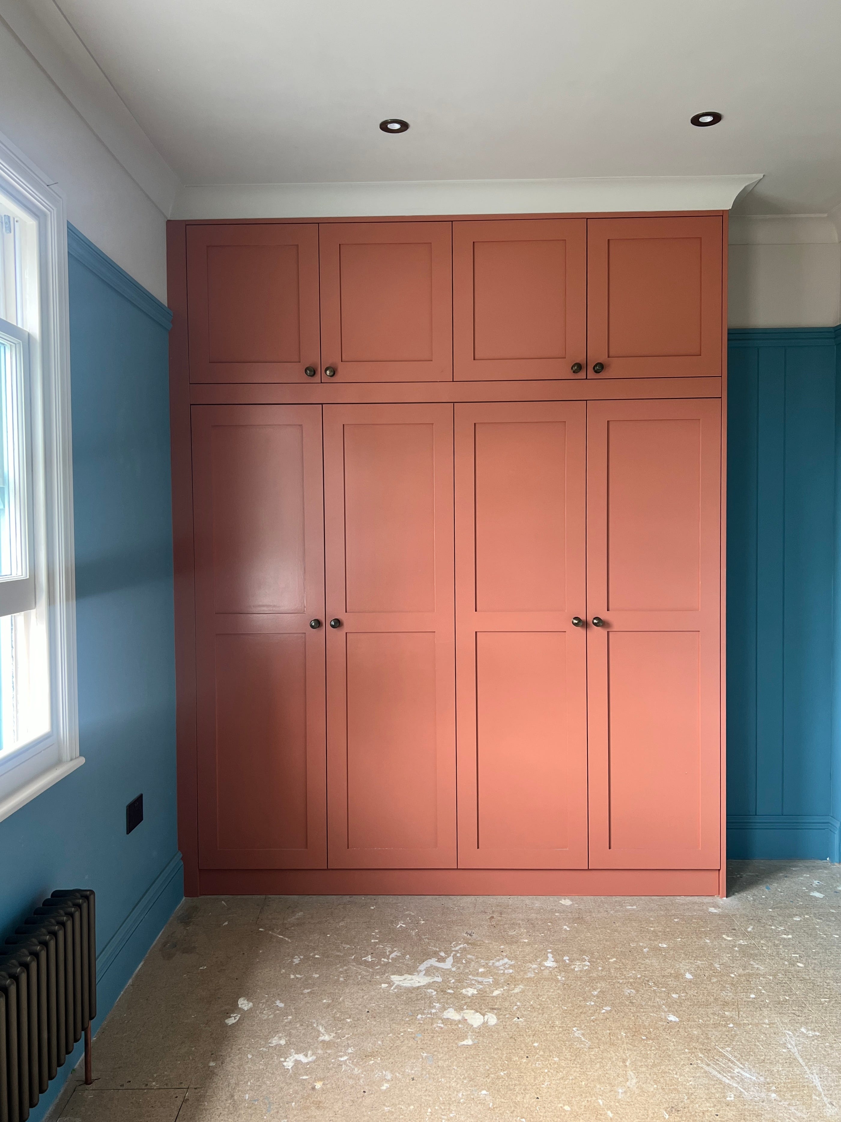
Pre carpet - but Stone Blue Dead Flat on the walls and Stir About on upper walls and ceiling. Wardrobes Red Earth - in water based eggshell
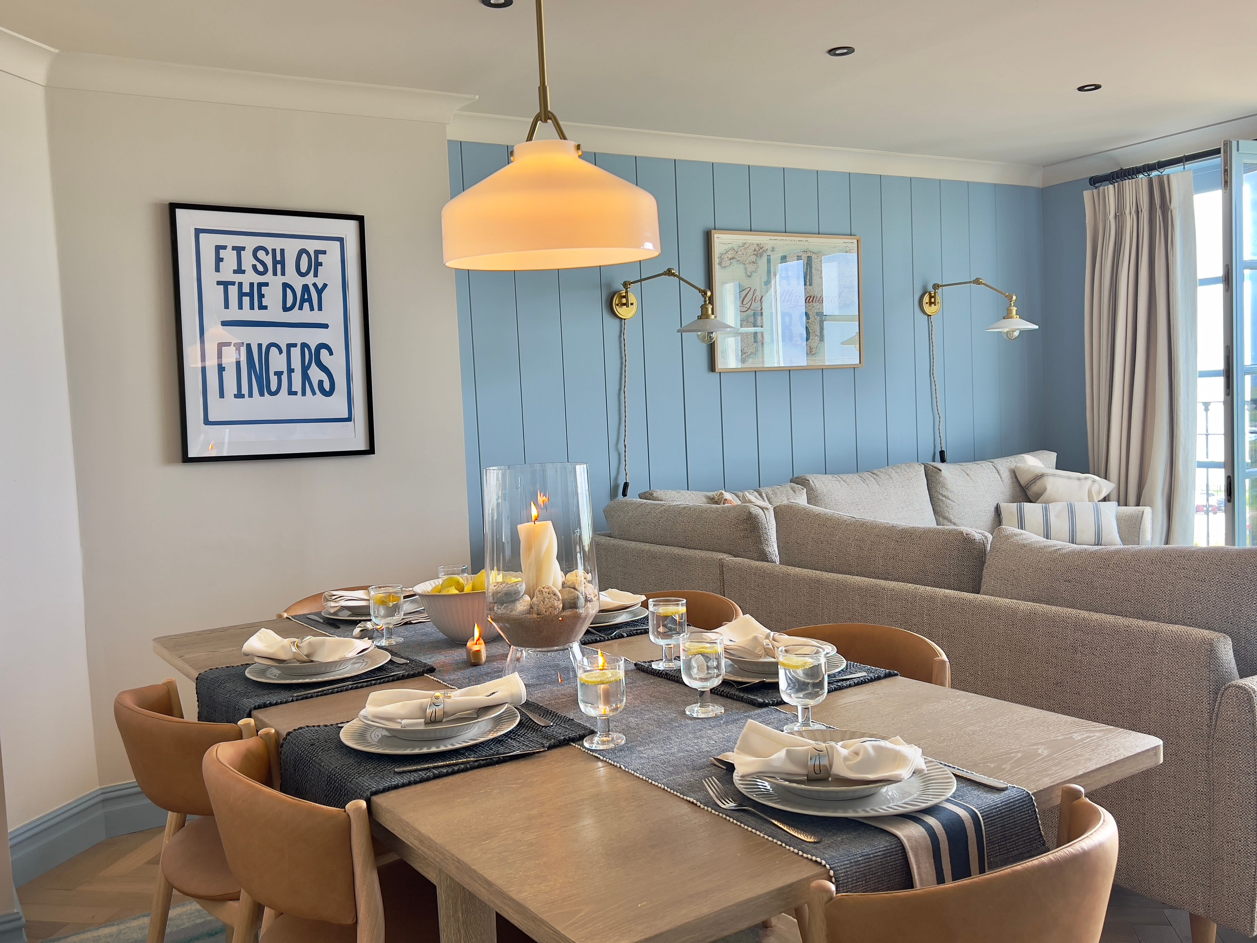
Panelling, woodwork and skirting - F&B Kittiwake in water based eggshell. Walls and ceiling F&B Stir About Dead Flat
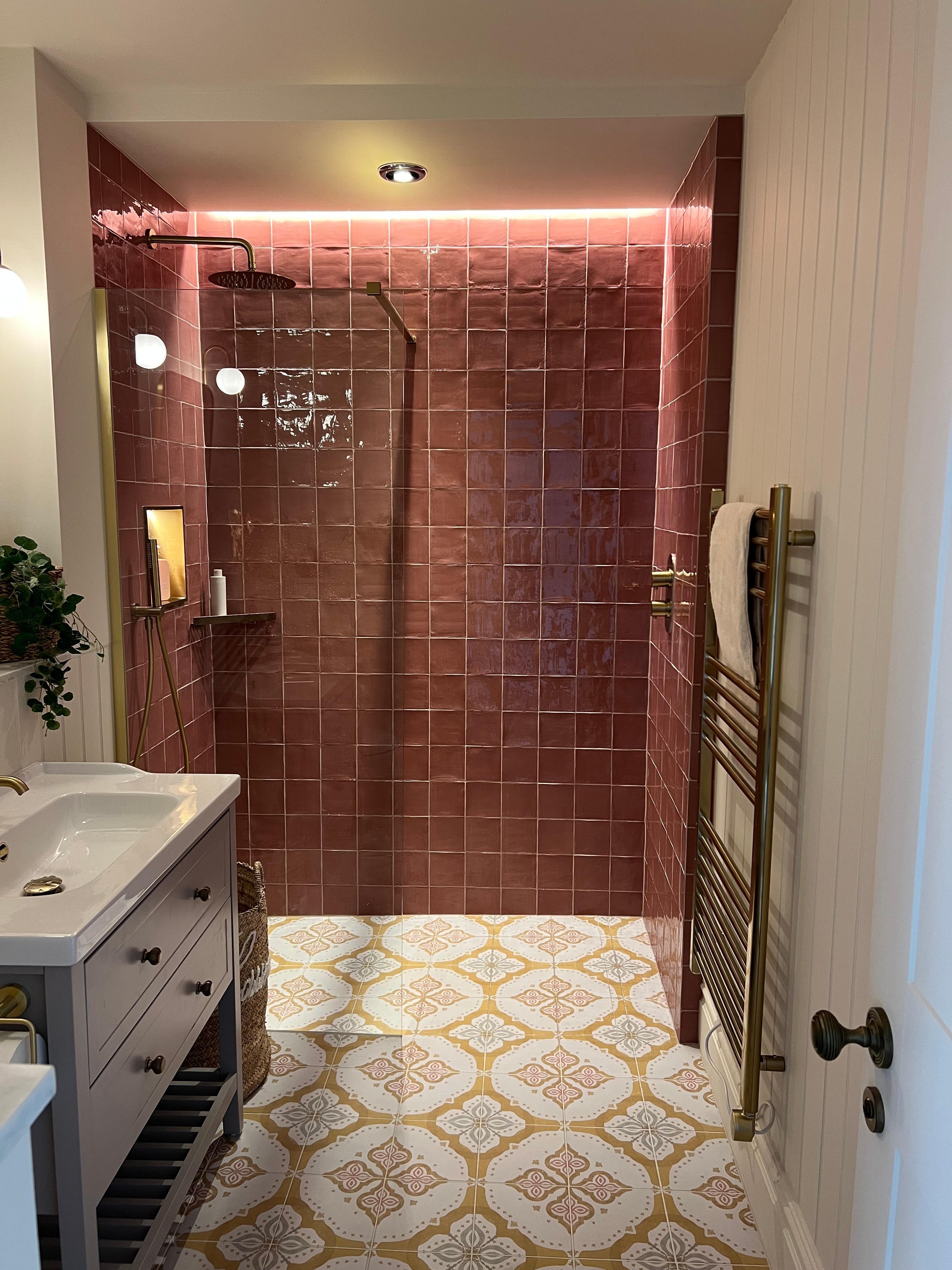
Dimity -every where Dead Flat - it’s ok but with hindsight I’d go eggshell in a bathroom because it’s more wipeable.
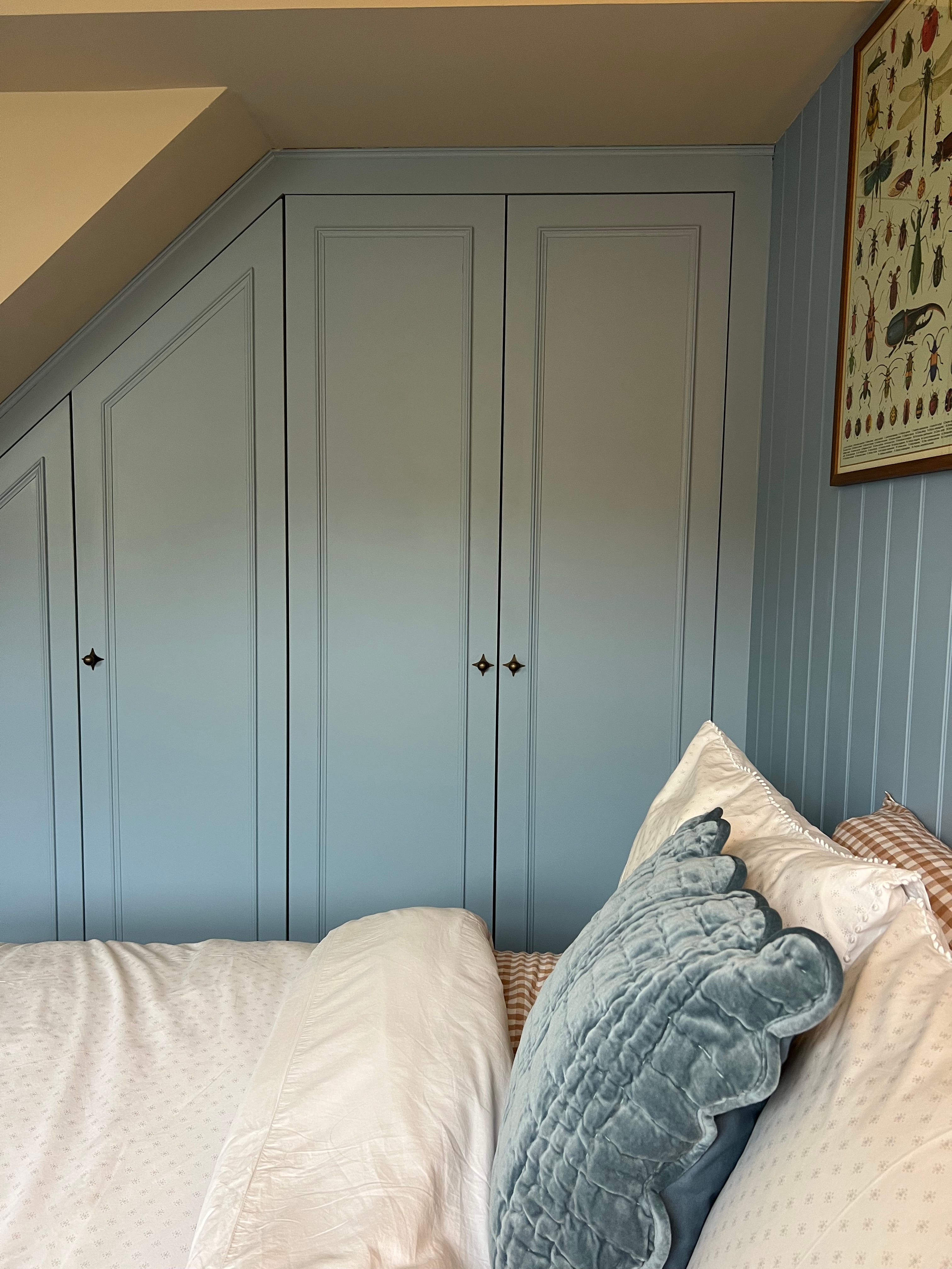
Blue - Lulworth Blue water based eggshell - a F&B mix up from Crown decorating centre. V happy with it. Everywhere else Stir About Dead Flat.
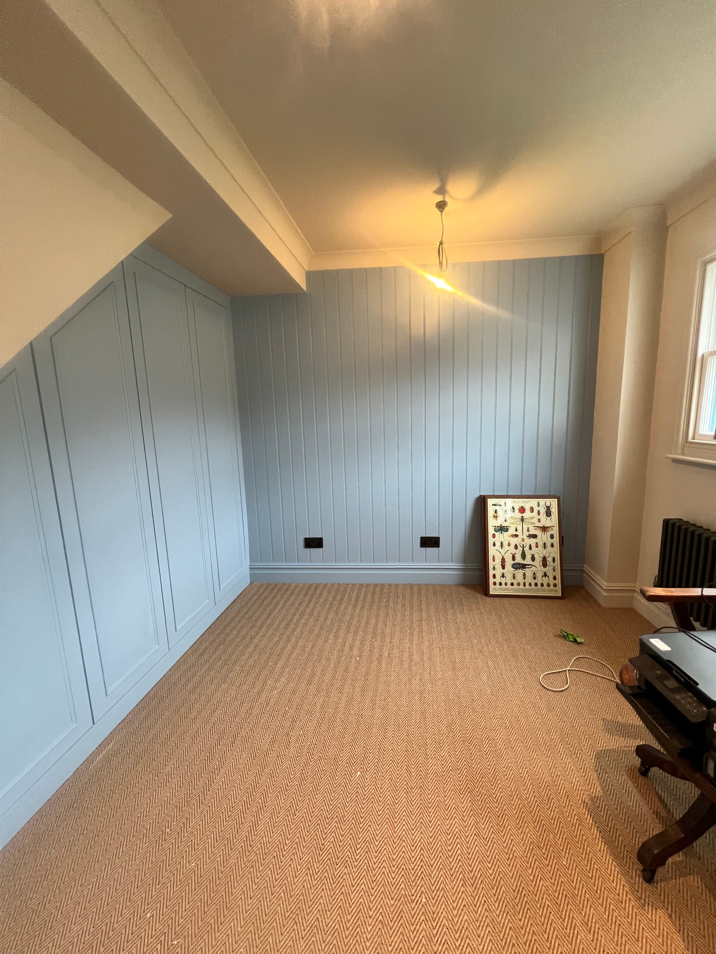
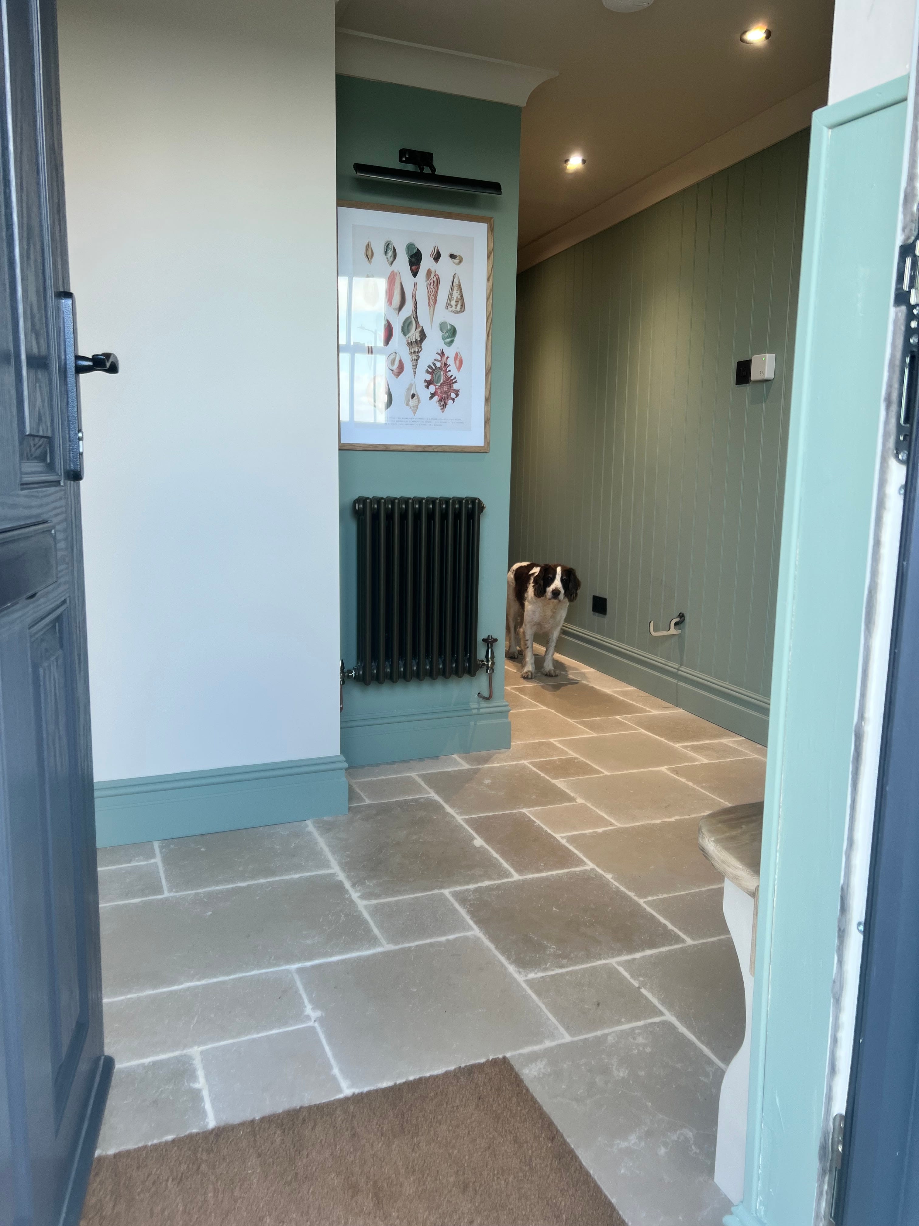
Woodwork and panelling ‘Oceans’ by Fenwick & Tilbrook - other walls and ceiling ‘Timeless’ Fenwick & Tilbrook
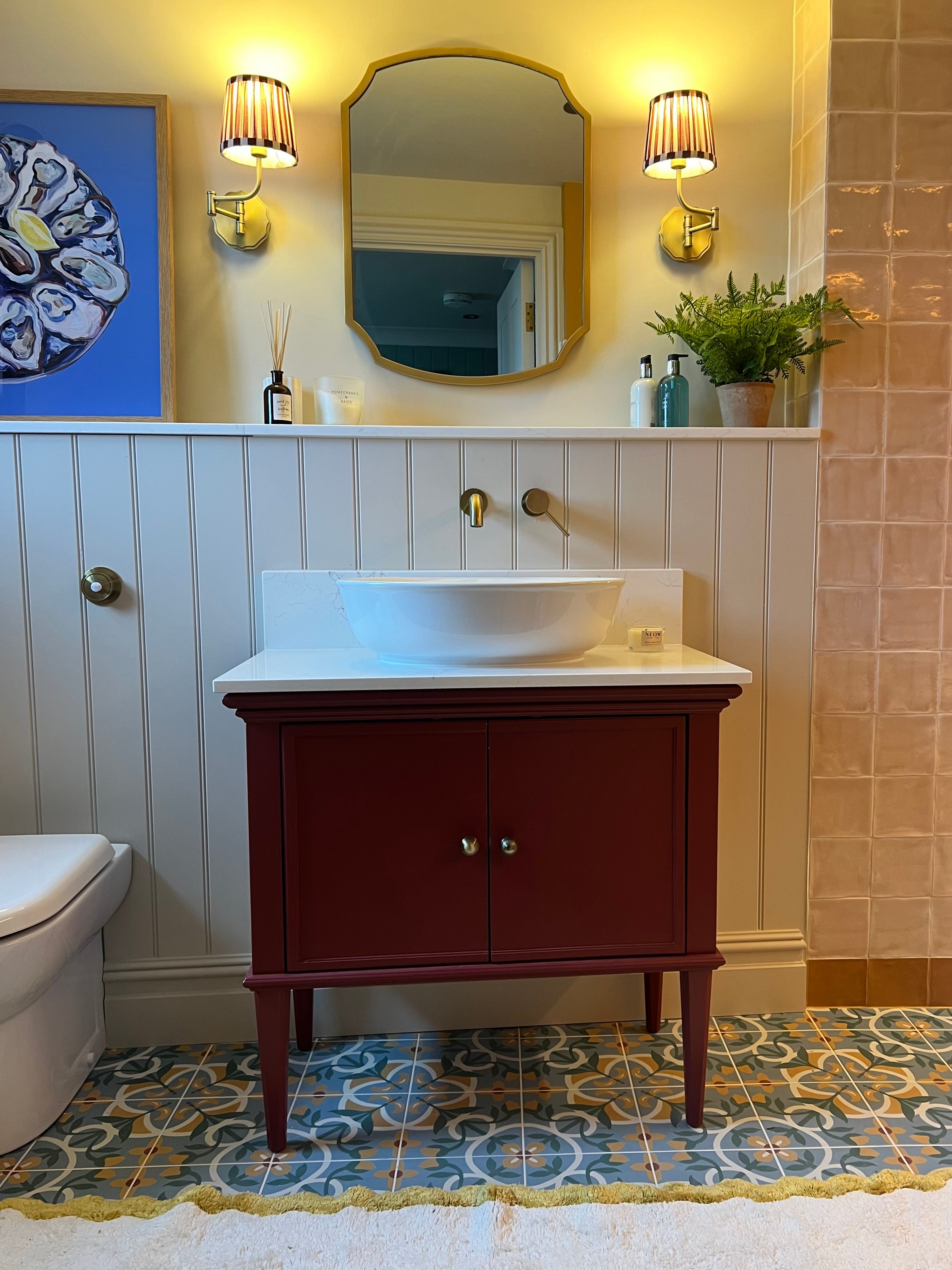
Walls and panelling ‘Stir About’ F&B Dead Flat. Vanity Unit ‘Eating Room Red’ Water based eggshell.
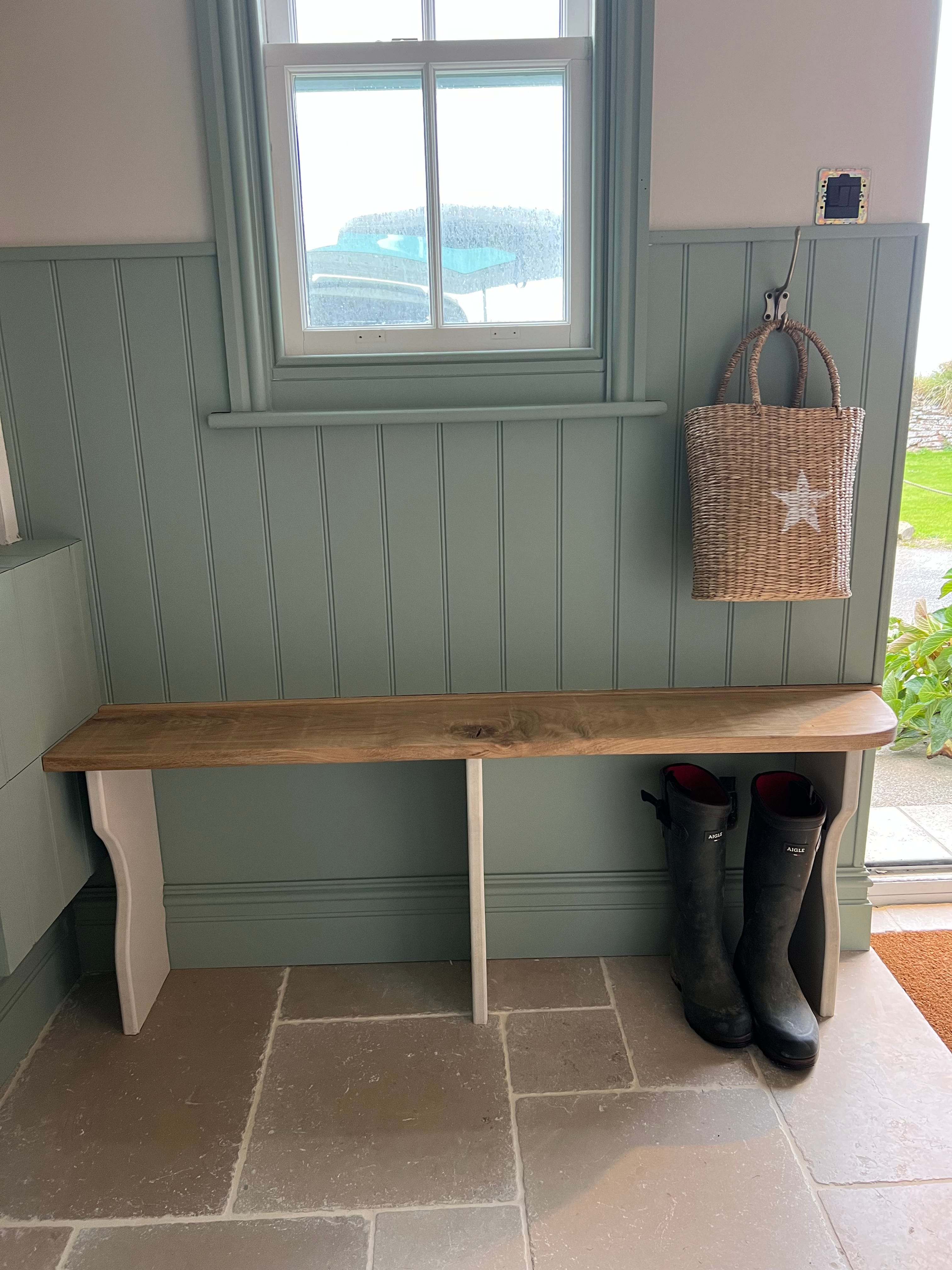
Fenwick & Tilbrook - Oceans and Timeless
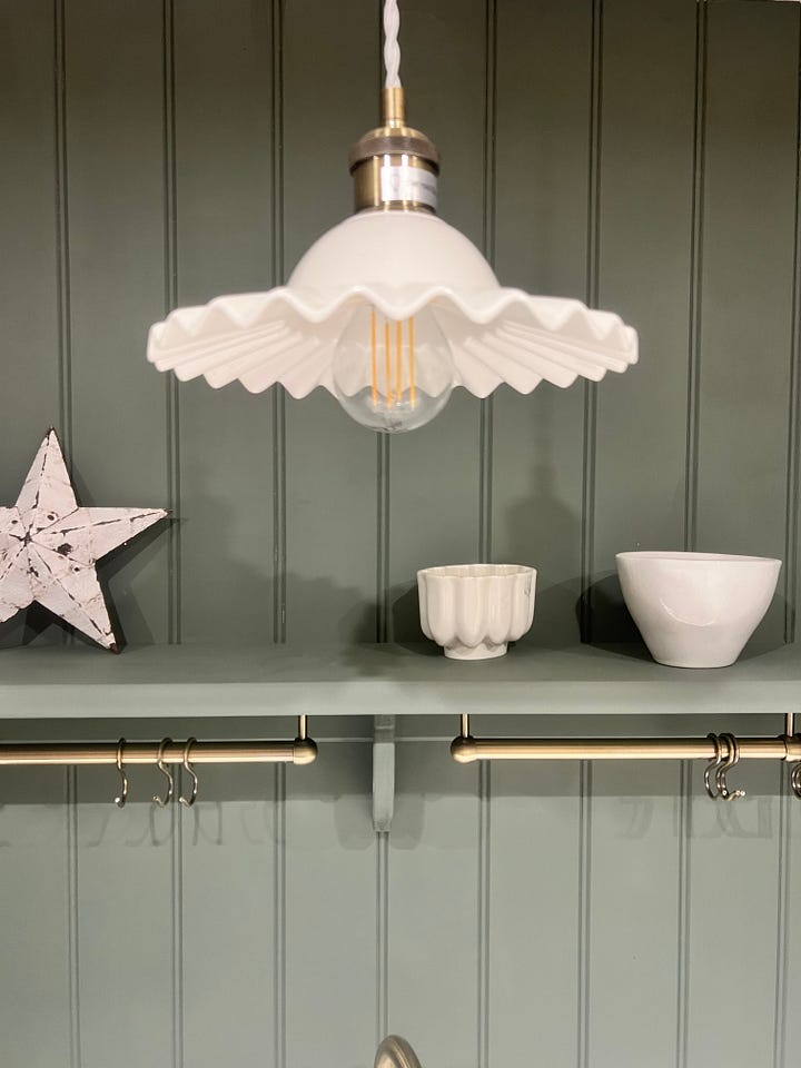
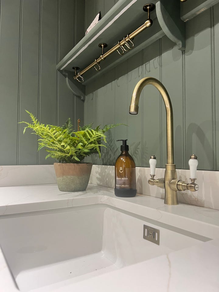
F&B - Green Smoke water based eggshell.
Don’t be scared!
Stir About is my favourite neutral because it looks lovely in any light, and isn’t ‘yellow’ or ‘grey’. It never feels dark - BUT, next to white ,it is UNRECOGNISEABLE, and could very well put you off seeing this, but if you look at all of my photos where it features, you’d never believe it is the same colour as this ….
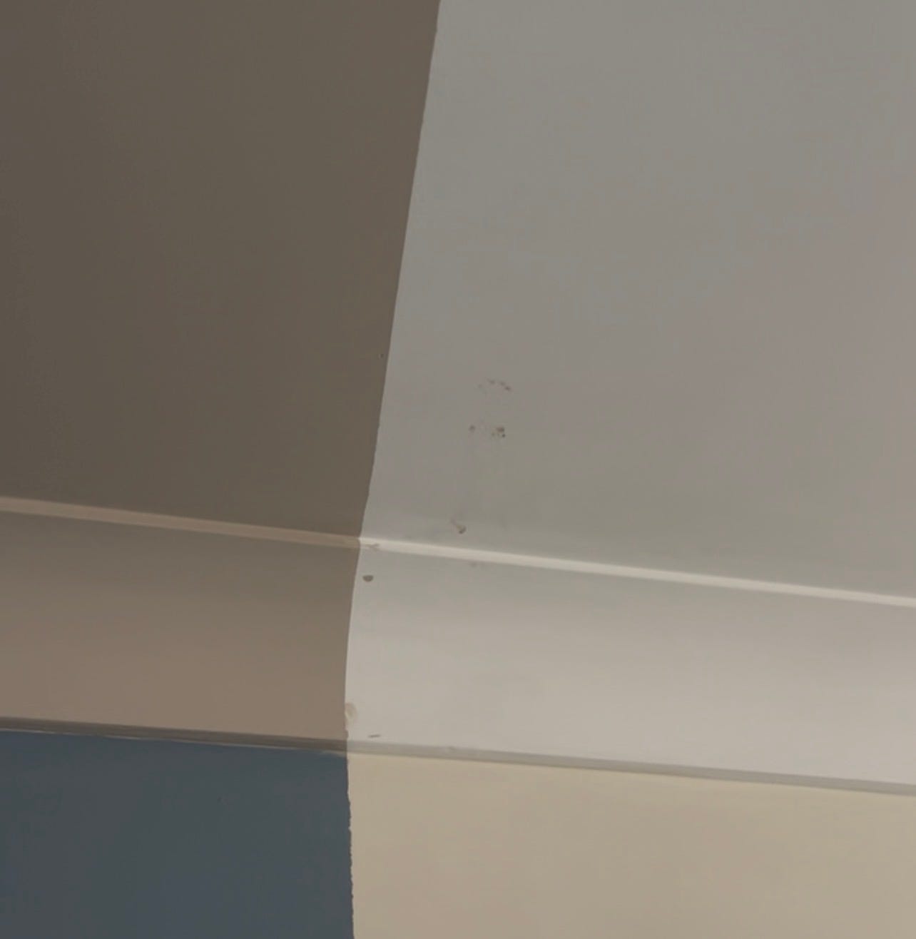
Stir About is the top left of the 4 colours here.
Get it away from white or a yellow cream and it looks totally different and not dark AT ALL.
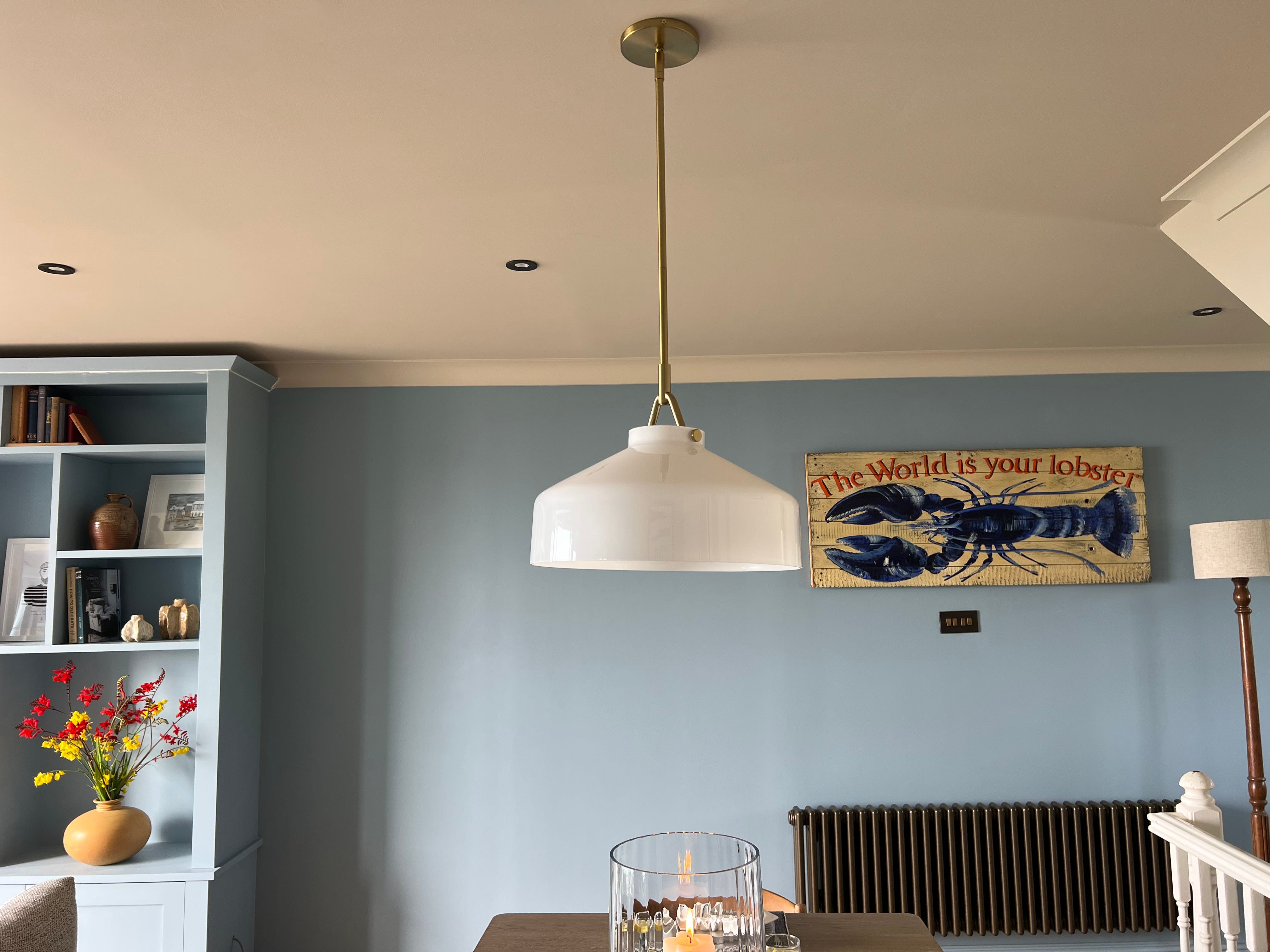
ANY colour can look terrifyingly dark when it’s put next to white. If you have a white ceiling and are cutting in next to it, it will feel especially terrifying. Personally, I think that this is why we can spend forever worrying about which ‘white’ to buy. Lose the bright pure white and the problem disappears.
And there we have it- hopefully this might help you choose a colour without suffering overwhelm. None of this is an exact science - this is just how I do it. It’s worked for me so far. Take the nuggets you need from this post and you will find your own stride and way of doing things.
Go & buy a professional paint chart deck/fan and revel in how much easier it’s all just become and think how much you’ll save in test pots.
I’ll be back next week - it’s about time we had a Cornwall post isn’t it? I’ll see what I can do
Have a lovely Sunday and a peaceful week
Love
Sally x
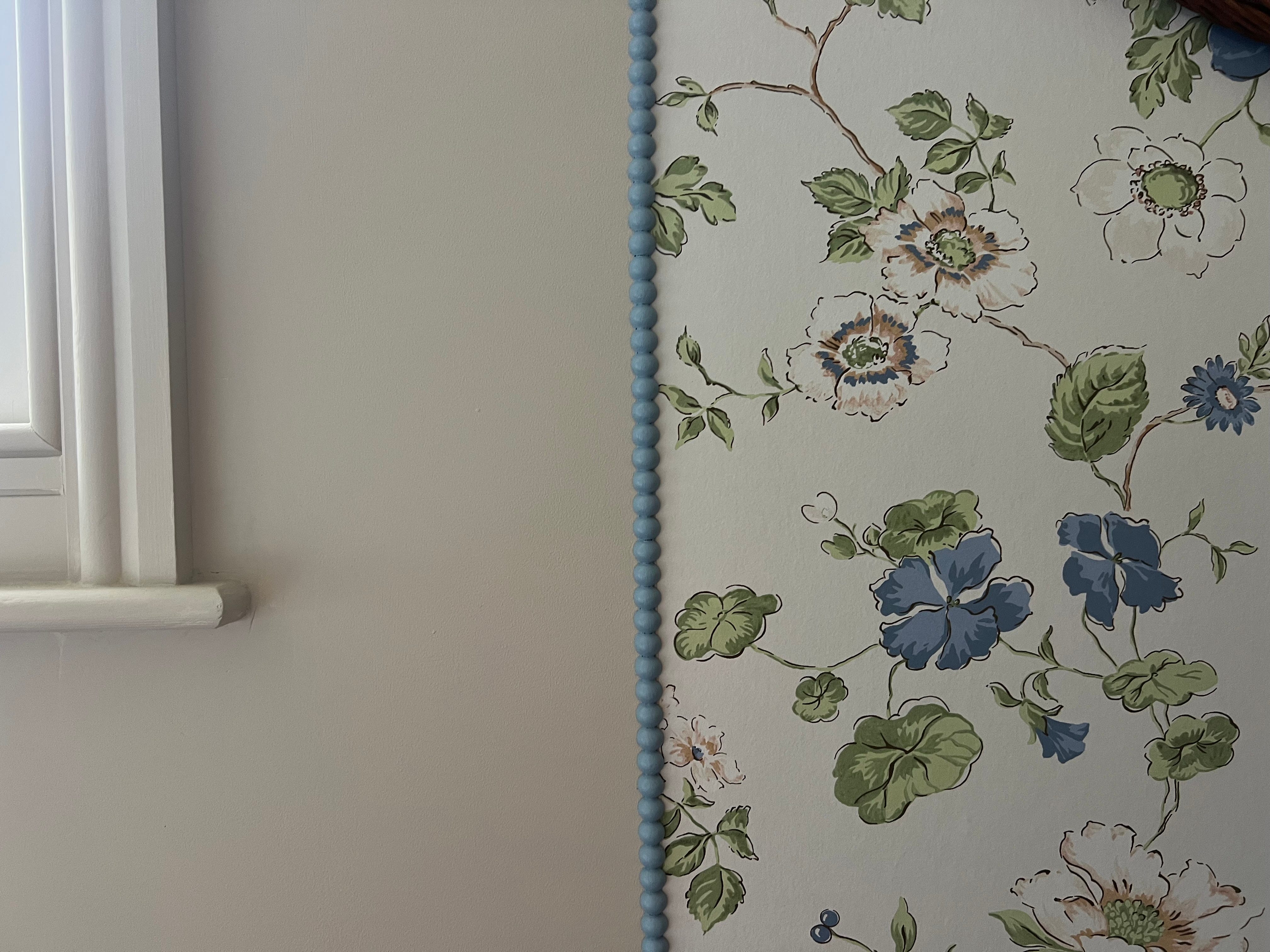
One last pic - THAT beading in Lulworth Blue, next to Stir About (the internet continues to be raging about a stranger they will never meet, in a house they will never visit, that has half a wall of wallpaper in a room that isn’t finished yet. Face Book is crosser than anywhere else and it is bonkers!)
Thanks ever so much for subscribing :) xx
No posts
Comments
Nothing yet. Say the first thing.
Sign in to join the conversation.