The <progress> element is a lesser known but broadly available HTML element.
We can easily visualize progress with a value and max property:
<progress value="50" max="100"></progress>Default style
All browsers ship a default style which can be overridden by settings the accent-color CSS property on the element itself or any parent.
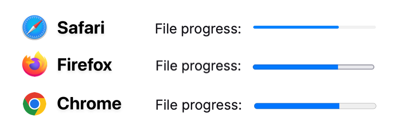
The accent-color only alters the active portion of the element (blue above) and adding any other CSS property like background-color will reset the default styling like height and border-radius.
Pseudo Elements
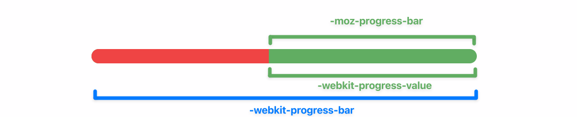
The Progress Element is made of various pseudo elements which can be styled individually. The following HTML structure is the representation of Safaris and Firefox' DOM structure.
<progress>
  <pseudo -webkit-progress-inner-element>
    <pseudo -webkit-progress-bar>
      <pseudo -webkit-progress-value style="width: 50%"></pseudo>
    </pseudo>
  </pseudo>
</progress>
<progress>
  <pseudo -moz-progress-bar style="width: 50%"></pseudo>
</progress>
To add more confusion to the topic, Chrome & Safari's -webkit-progress-value is equivalent to Firefox' -moz-progress-bar .
Background Color
To style the background part...
Target the element itself
&(for Firefox)Target
-webkit-progress-bar(for Chrome & Safari)
To style the bar that represents the amount of progress that has been made...
Target
-moz-progress-bar(for Firefox)Target
-webkit-progress-value(for Chrome & Safari)
progress {
  /* The background part of the progress bar */
  &,
  &::-webkit-progress-bar {
    @apply bg-green-300;
  }
  /* The bar that represents the amount of progress that has been made */
  &::-moz-progress-bar,
  &::-webkit-progress-value {
    @apply bg-red-500;
  }
}
Rounding
Adding border-radius also has some caviats. Firefox will easily round the whole progress element if a border-radius is applied to the element itself.
Chrome & Safari will not add rounding unless the progress element itself has an overflow: hidden property set.
progress {
  @apply rounded-full overflow-hidden;
}
Text Color
You can also add text to progress elements by simply creating elements inside it.
<progress>
  <div>
    50%
  </div>
</progress>
Altering the text color of those elements isn't as straight forward as adding a color CSS property to the progress element. In fact that's the only variant that won't work.
For styling text inside progress elements, target the child element or the progress' parent element.
progress div {
  @apply text-white;
}
Tailwind
Translating our knowledge to Tailwind classes using CSS self & pseudo selectors we get the following element. Using a bg-green-300 for the background and bg-red-500 for the progress made.
<progress value="50"
          max="100"
          class="rounded-full overflow-hidden
                 bg-green-500
                 [&::-webkit-progress-bar]:bg-green-300
                 [&::-webkit-progress-value]:bg-red-500
                 [&::-moz-progress-bar]:bg-red-500"
>
  <div class="text-white">
    50%
  </div>
</progress>
Comments
Nothing yet. Say the first thing.
Sign in to join the conversation.