
We must know some color management because many parts of 3D works by switching color spaces and such, even if you don’t know it’s happening. If you do know what’s happening, you avoid surprising bugs and you can demand a higher salary at a studio—because you may well be the only one there who knows this shit.
I’ll try to keep it simple. Let’s go.
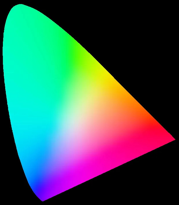
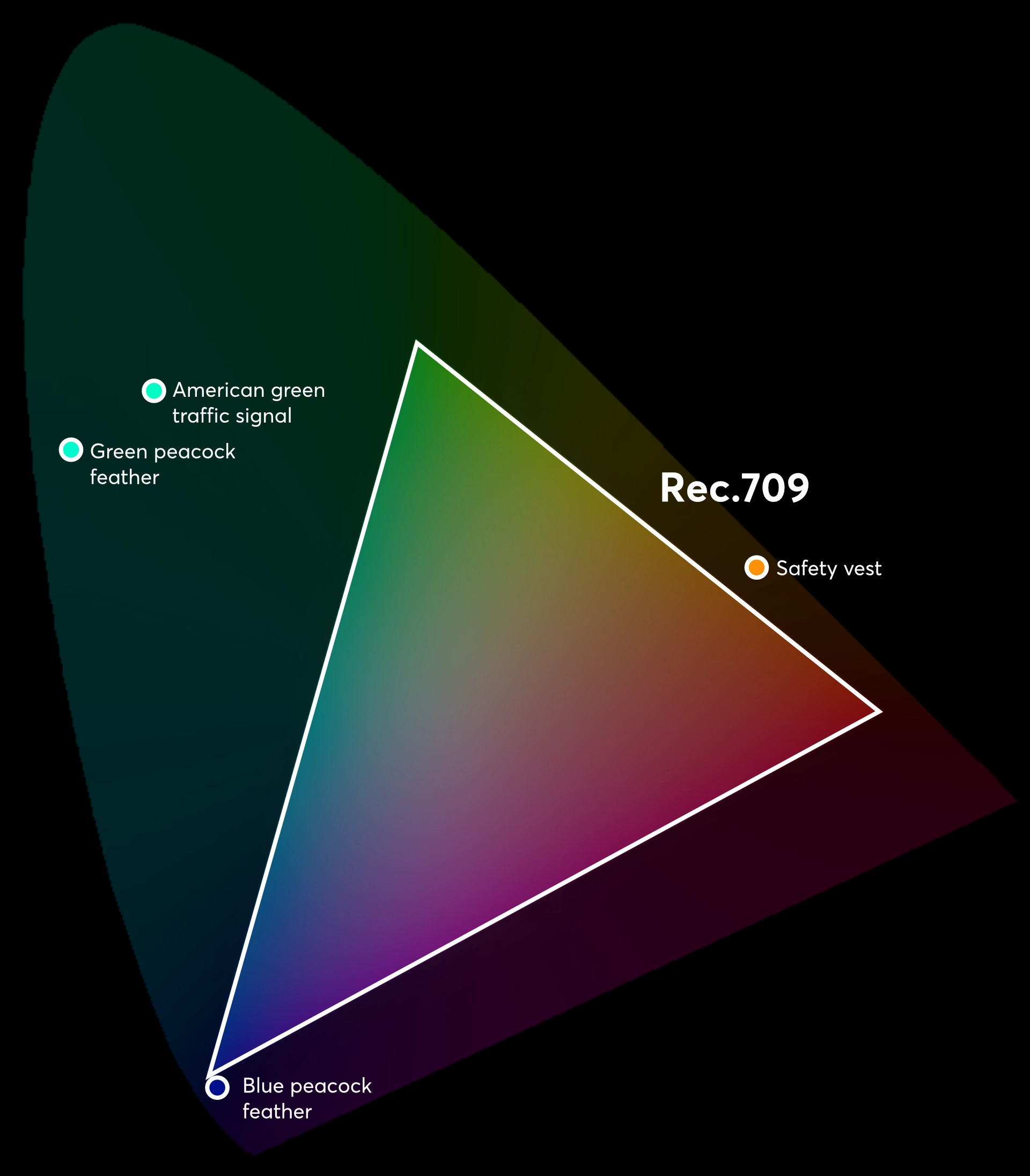
This weird graph contains all the colors your magnificent glittering human eye can see. But you rarely see those powerful, intense colors near the edges of the graph. Colorful objects don’t go that far. So when we store an image, we cut those away to save space. The shape we cut out is called a gamut. It's a triangle drawn between a red, a green, and a blue value.
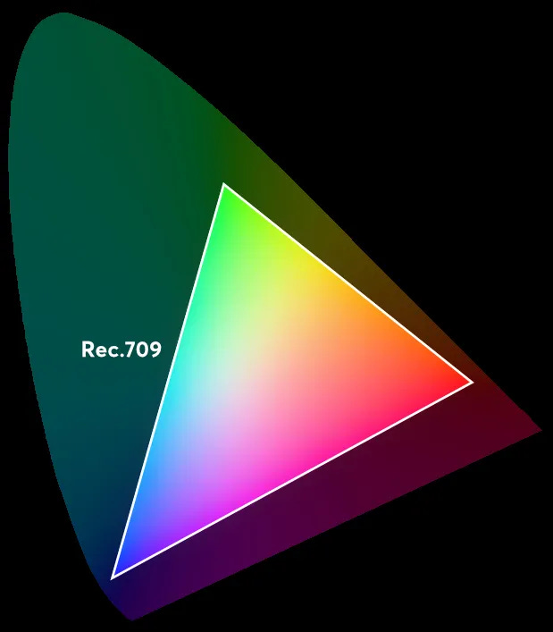
The triangle in this picture is the rec.709 gamut. When you store a picture in Rec.709, that image can’t contain any colors outside of that triangle. Rec is short for recommendation, and boy was the recommendation received. This is the gamut used by almost all screens you see.
If I store a single orange pixel in Rec.709, that file may read something like this:
Pixel 1 {
Red: 1.0
Green: 0.5
Blue: 0.0
}
When my monitor reads that file, it moves all the way to red and quarter way to green, which shows orange. (It’s not half way to green, because full red plus full green would be yellow. So we move half the way to yellow.)
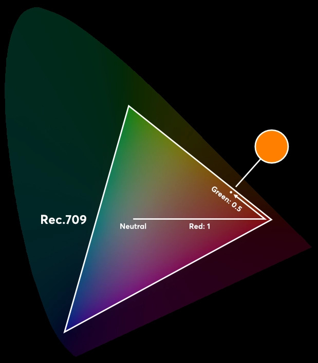
But here’s the rub. Screens are not the only thing that use color. There are cameras and software as well. And often they use different gamuts, which is where the trouble begins.
For example, my camera stores images in a gamut called V-gamut. If you move all the way to red and a quarter way to green in V-gamut, you end up somewhere else. With the same data, the color is different.
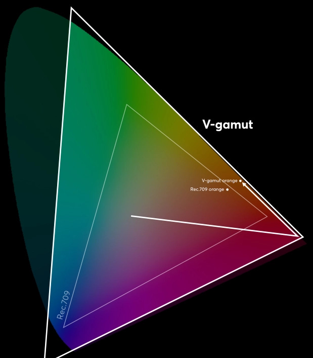
That’s why our software needs to know the color space of every image. If it doesn’t, the colors end up in the wrong place. You tell Blender the color space with this dropdown:
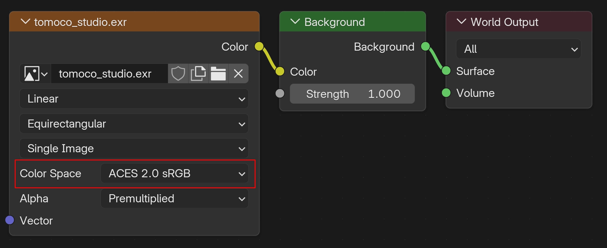
When you select an input color space, Blender converts it into its own internal working color space, which is a kind of temporary color space where all images are the same. By default, Blender’s working color space is rec.709, but you can change that in the Color management panel.
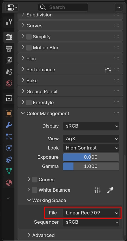
So with the above example of an HDRI in the ACES 2.0 sRGB color space, Blender would look where all the colors fall on the big blob graph, figure out where that would be in Rec.709, and convert them. This is color management. It is knowing what color space the source is in, what the destination is in, and converting (which happens automatically.)
But sometimes it’s not so easy. If the image comes in with a bigger gamut than Blender’s Rec.709, then Blender has to find a close color inside the Rec.709 gamut. The colors clip in the same way that brightness can clip if a camera is over-exposed.
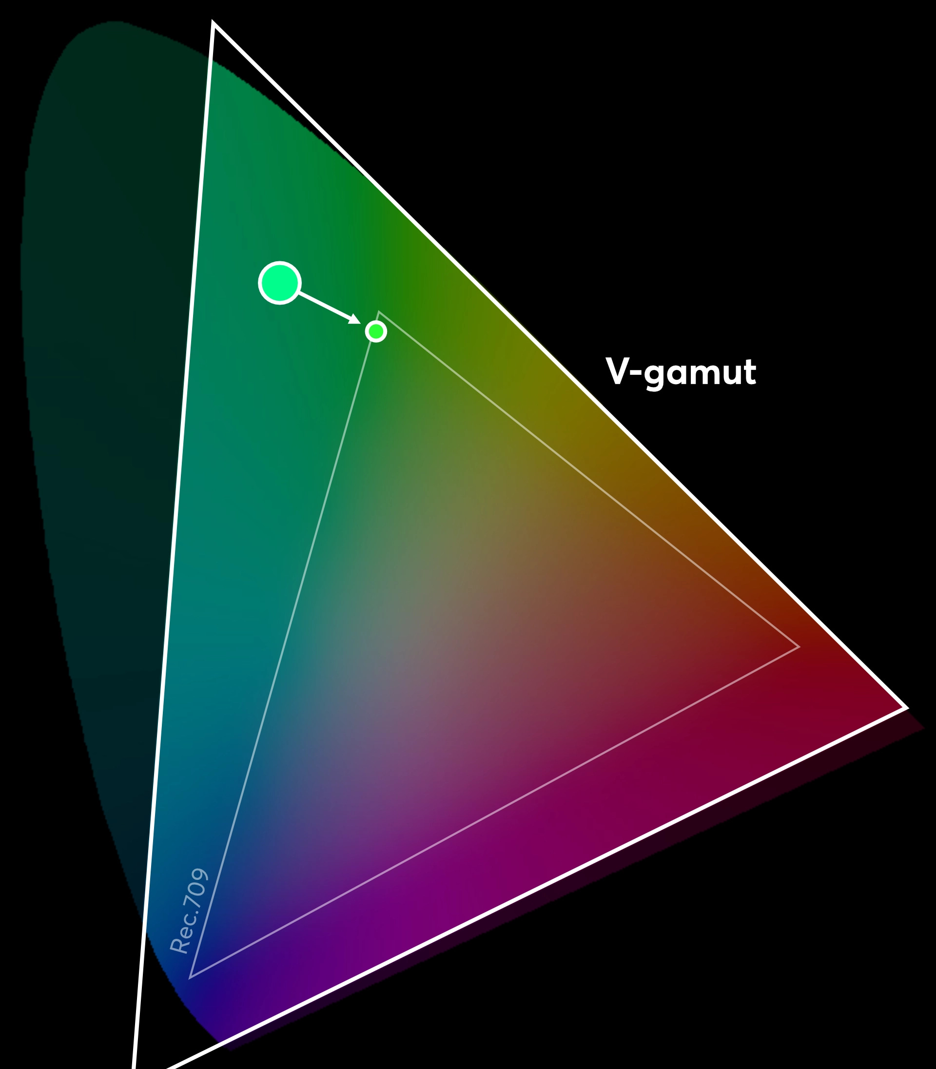
How big of a problem is this? Luckily, not very big. Almost all objects fall within the rec.709 gamut. It’s hard to make a paint that can’t be shown with Rec.709. But you can get problems with emissive colors (like neon or lasers,) and some special surfaces.
This is why some people change their Blender working color space to Rec.2020 or ACES. These are much bigger gamuts. Why are they not default? I think it’s because you can’t trust amateur artists. When you open the color picker and you want a red object, you might push it to full red. In Rec.709, that’s pretty close to real red dye. In Rec.2020, that’s a pure red laser. So if you make the switch to Rec.2020, remember that you must pick slightly less saturated colors for regular objects.
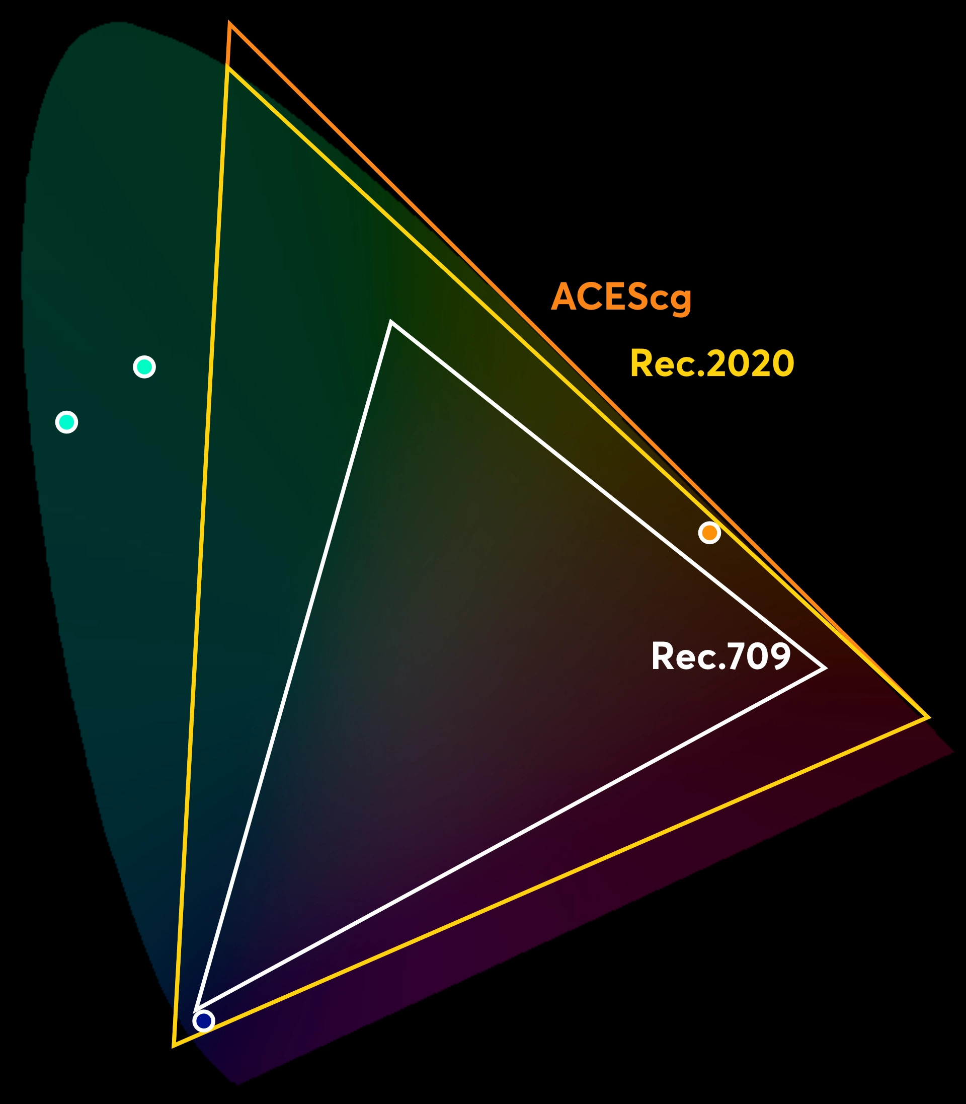
“But ACES is slightly bigger. Why should I use Rec.2020?” Well, it has to do with generation loss.
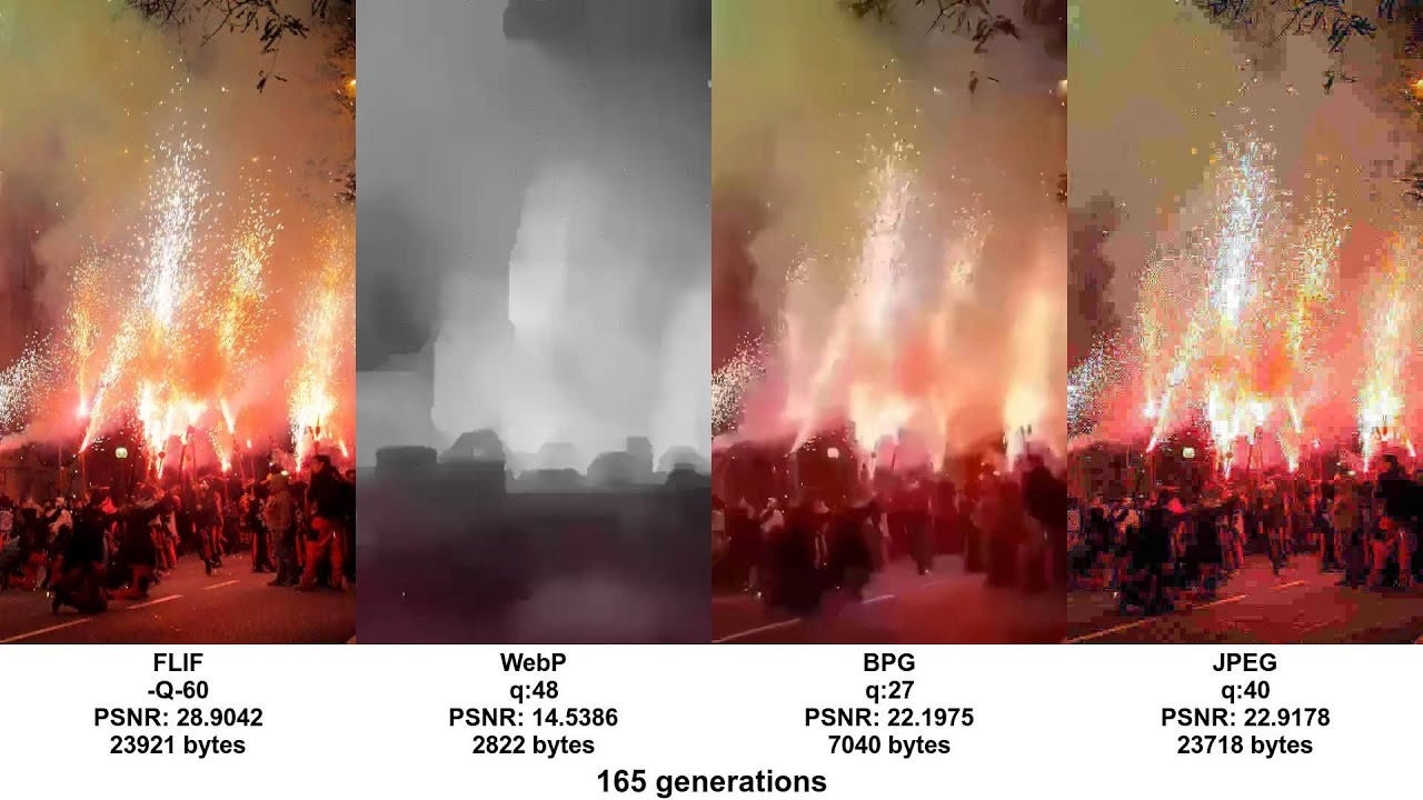
Have you seen these? Saving the same image over and over 165 times to see it absolutely wrecked by the end. This happens when we convert between gamuts too. Every time you convert, a color might not find an exact match, so it shifts a little bit. It’s not huge, but it’s a good practice to reduce the number of conversions.
Ideally, we want the same gamut all the way through our pipeline, for every image, all the time. This is why ACES was created. It is meant as a standard to use across your entire pipeline. But I find that ACES isn’t supported in all my software. Rec.2020 is much more widely supported, so I use that instead.
Remember that my Camera stores images in V-gamut. V-gamut is not in Blender’s dropdown, so I can’t import footage into Blender with the right colors. I have to first convert it to a gamut Blender knows. So I usually open it in DaVinci Resolve and convert it to Rec.2020 using a convert color space effect. It will look totally wrong (way too high contrast,) but that’s just because my monitor expects a different type of image. It looks correct again when I open it in Blender and set the input color space to Linear Rec.2020.
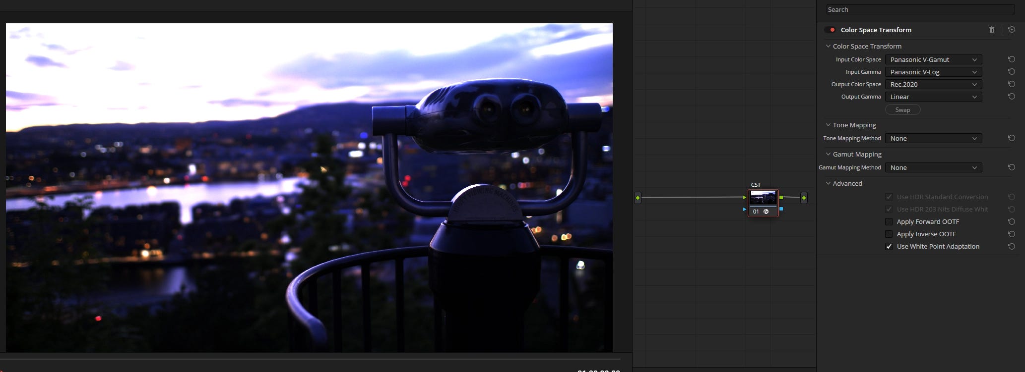
I keep saying gamut when the labels in Blender and Resolve say Color Space. What gives? Well, the gamut is not the only thing we need to worry about when converting. There is also the transfer function and the white point. Together, the gamut, transfer function, and white point make up the color space.
(In the above image, there are dropdowns for color space and gamma. That’s Resolve’s terms for gamut and transfer function. I know, it’s a mess.)
For almost everything all the time in the digital world, the white point is the same. In Resolve’s Color Space Transform, keep white point adaptation on and you’ll never run into problems. That leaves us with only the transfer function, and then you’ll be a master of color spaces.
Say I shine a flashlight at a wall and you want to take a picture of the gradient from bright to black. That gradient has infinite points. But a picture can’t store infinite points, so your camera picks a point at every 10% interval and stores those. Call them nodes. The number of nodes is your bit-depth. If you’ve ever wondered why 16-bit is better than 8-bit, this is why. With more bits you get more bands, and smoother gradients.
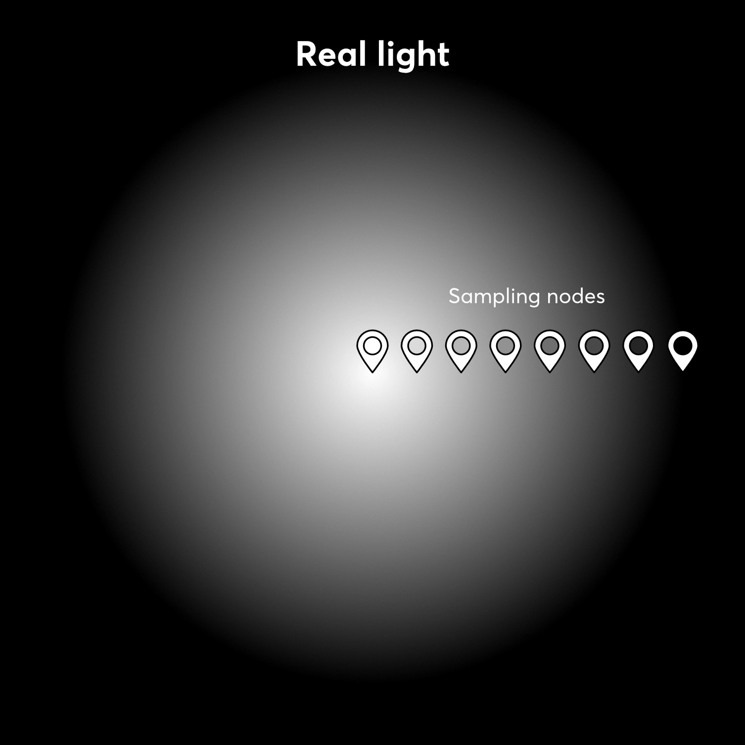
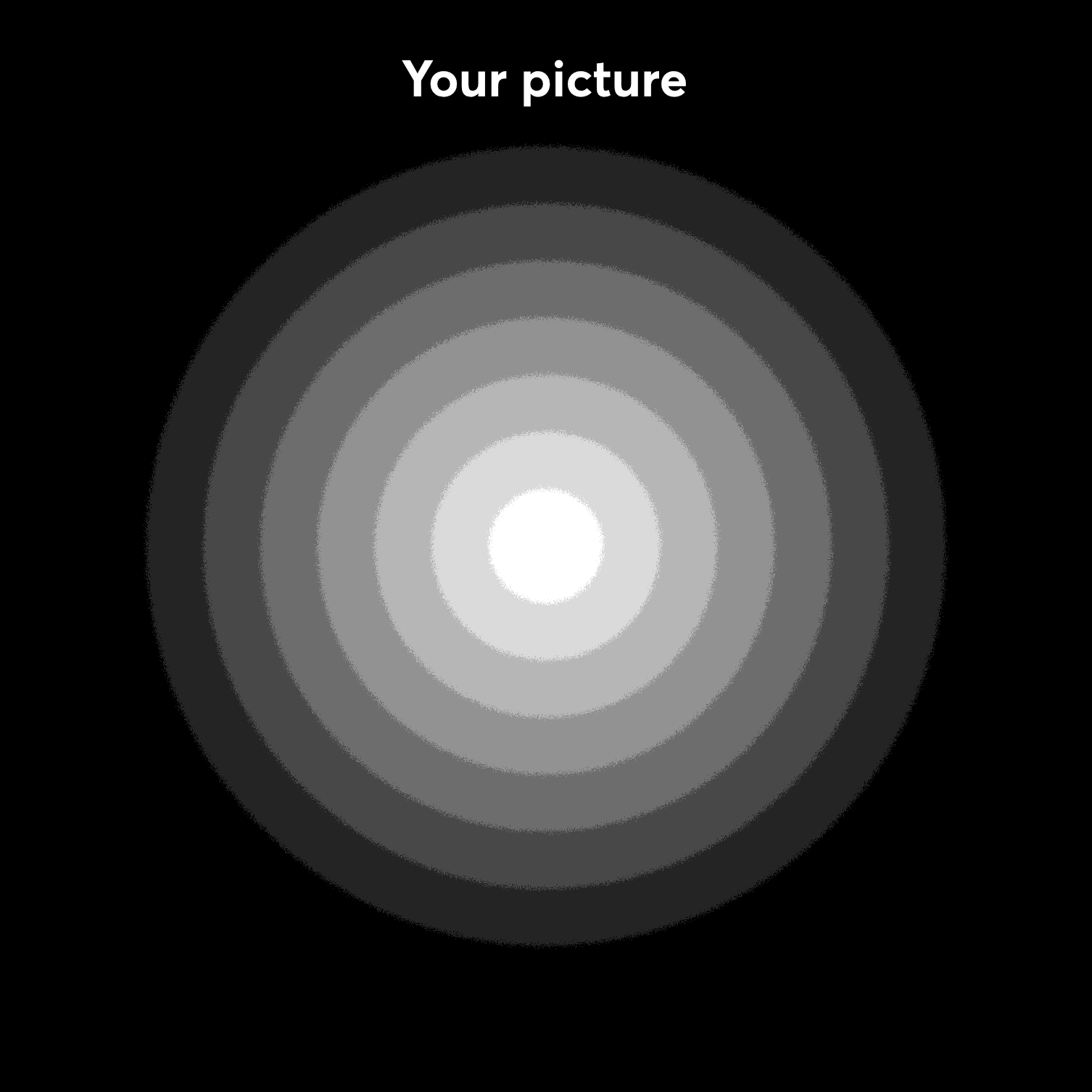
When storing an image, it is common to shift those nodes upwards and bunch them up more in the bright areas of the picture. That’s because your eyes can distinguish nuances of bright better than nuances of dark. So we allocate more data to the bright parts.
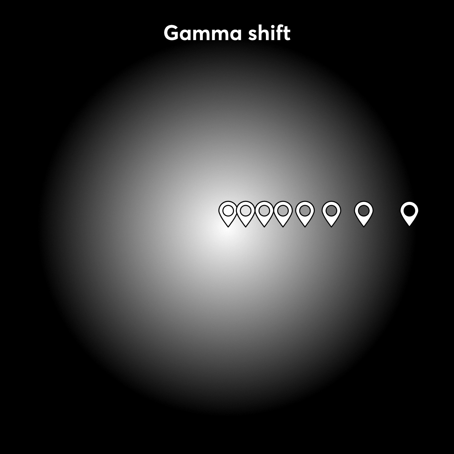
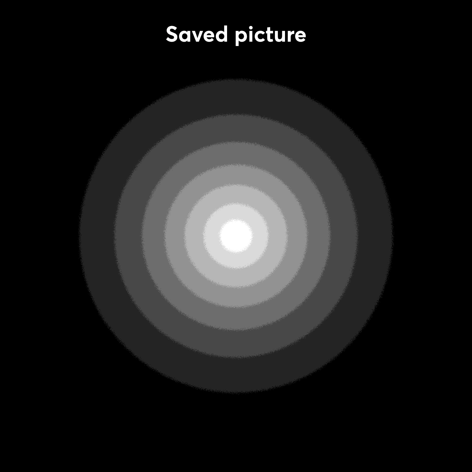
One easy way of doing this in practice is to add a gamma adjustment to the picture. That darkens the mid-tones, so that what previously covered the top 25% of the dynamic range now covers the top 50%. Then you store this slightly darker image with a tag saying “gamma shifted by 2.2” so that whatever software opens the image knows to adjust it back before showing it. (We’ll get to how)
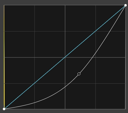
For a long time, this is exactly what most RGB color spaces did. That’s why DaVinci Resolve’s label says gamma. But a better word is transfer function because modern adjustments like this are not simple gamma adjustments. They’re more complex functions that each create unique curves. And different curves are useful for different things.
In computer graphics, there are three main types of curves that we care about:
Display, linear, and log
Let’s take them each in turn.
The display transfer function is whatever transfer function your screen or projector or whatever expects. Typically it’s Gamma 2.2. So when you save a deliverable that’s meant to be displayed, you pick Gamma 2.2.
In Blender, you get Gamma 2.2 when you save in the color spaces labeled with sRGB.
Linear is an unchanged straight line curve. We want our working transfer function (in the working color space) to be in linear, because that makes the math easier. When one light overlaps with another light, you just add them together and that’s the new intensity. This is only correct to do when your working transfer function is linear. You should therefore composite in linear. Blender’s working color space is always in linear.
Some images should be stored as linear—images that don’t represent visual color, like normal maps and roughness maps. That’s why you set those to non-color when you import them in a shader.
To save a linear image from Blender, choose either a color space that says linear or non-color.
A log transfer function is used to store a big dynamic range within a zero-to-one range. Most video cameras will have an option to save images in log. If you scroll up to my DaVinci Resolve screenshot, you see that I set the input gamma to Panasonic V-log, which is the specific log function my camera uses. Very often you will work with log footage.
You can also export Filmic Log or AgX Log from Blender, but you hardly ever want to.
So in short, footage comes in as log, you work in linear, and you export in display gamma 2.2. (Most of the time for most projects yada yada.) I try to keep most of my working files in linear Rec.2020 because it’s a big gamut with a linear transfer function that is widely supported.
I’ll run you through my standard color workflow.
If I’m working with real footage, I import that into DaVinci Resolve. In the color tab, I use a Color Space Transform to go from the camera’s color space to linear Rec.2020. I turn off tone mapping and OOTFs. I export that as an EXR sequence with DWAB compression.
In Blender, I import that footage and set the input color space to linear Rec.2020. If needed, I also set my working color space to Rec.2020. Any pictures I add from the web are set to sRGB, unless they are data textures (like normal and roughness maps,) which I set to non-color.
While I work, I set my color management to display as either AgX or Filmic with medium to high contrast. This is an aesthetic decision.
When I render, I either
Save as 16-bit EXR files with DWAB compression at 60% quality. They are saved in the color space linear Rec. 2020.
or
Save as JPEG with 90% quality with color management set to follow scene. Follow scene will use whatever color space you’ve set to use in the viewport. This is if I don’t plan to composite anything, and I’m rendering the final image.
If I rendered EXR: In DaVinci Resolve, I open the render in either the color tab or the Fusion tab (depending on whether I’m going to composite or not.) When I’m done compositing and color grading, I do one of two things:
Add a Color Space Transform node going from linear Rec.2020 to Rec.709 Gamma 2.2, tone mapping set to luminance mapping with custom max input all the way up and Apply forward OOTF on.
or
Add an OCIO colorspace node and navigate to Blender’s install directory, where Blender’s OCIO file is. Then from the dropdown I pick the same view I used in Blender (AgX or Filmic.) This guarantees the exact same colors as I saw in Blender. I prefer this way.
Those are both ways of transforming a linear image to a display image. There’s no one right way to do it. These are just two. It’s an aesthetic choice.
Then I render out an mp4 with the color space tag set to Rec.709 with gamma 2.2.
And let out a big breath.
No posts
Comments
Nothing yet. Say the first thing.
Sign in to join the conversation.