
Thank you for subscribing to my posts. If you’re not yet a paying supporter, please consider becoming one. That’ll allow you to DM me with questions and comments. Your contribution will help cover the cost of the data I use in my posts, which I fund out of my own pocket. Thanks so much for your support and feedback!
I’ve devoted recent posts to mounting dysfunction in government debt markets across advanced economies. Yesterday’s post looked at yield curves across the G10 and found that the steepness at the long end of Japan’s curve points to rising stress and suggests a low-level debt crisis is already underway. This is also why intervention can’t hope to stabilize the Yen. By artificially capping yields, Japan avoids its debt service blowing out, but this just shifts what would be a debt crisis to the currency. Depreciation pressure on the Yen is just a symptom of too much debt.
One pushback I got to yesterday’s piece is that Japan can’t possibly be in a debt crisis because its stock market is going up so much. That’s an excellent point and I begin to address the specifics of Japan in today’s post. The traditional debt and currency crisis in the G10 is very similar to what happens in emerging markets. Countries typically have exchange rate pegs and run unsustainably expansionary policies. This results in big and widening current account deficits, which require foreign capital inflows, i.e. foreign lending, to pay for all the imports that booming domestic demand is sucking in. Some random shock comes along, which leads to a “sudden stop” in foreign inflows. What follows are large devaluations, rapid adjustments in the current account and recession. Japan’s initial conditions are very different from all this, which means the debt crisis that’s building in Japan also looks very different.
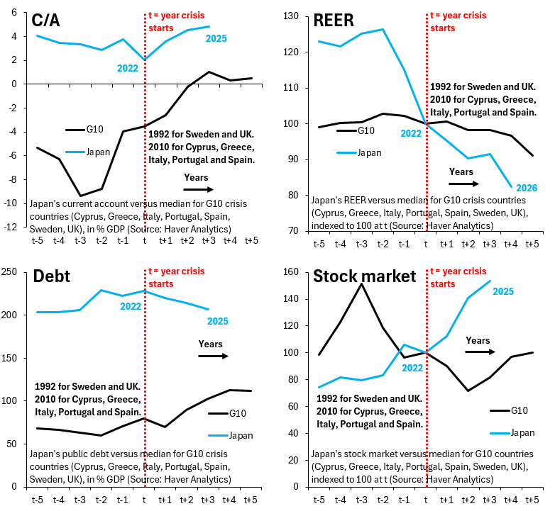
The four charts above look at the current account balance (top left), the real effective exchange rate (top right), gross government debt (bottom left) and the stock market (bottom right). Each of these charts is in event time with t denoting the year in which the crisis starts. The blue line is Japan, while the black line is the median across past G10 crises, which is Cyprus, Greece, Italy, Portugal and Spain (where the crisis begins in 2010) plus Sweden and the UK (where the crisis starts in 1992). I’ve set the start of the crisis in Japan to be in 2022, which is when the Yen started falling in earnest as the world’s central banks hiked interest rates while the Bank of Japan was prevented from doing so by the high level of public debt.
Unlike previous crises, Japan has a steady current account surplus, yet the Yen is falling much more sharply. Public debt in Japan is a lot higher than in past episodes, but the stock market is doing better than in other crises. What does all this mean?
Japan’s history of current account surpluses means past crises are a poor template. The fact that Japan is a big creditor to the rest of the world (it’s a net lender to other countries as a counterpart to its current account surpluses) means much of its debt is held domestically. This means the kind of “sudden stop” that wreaks havoc in past G10 episodes can’t happen and gives the government more discretion to cap yields. That’s bad for the Yen, but it’s good for equities, which domestic households increasingly see as a refuge from currency debasement. The fact that Japan’s stock market is going up therefore doesn’t negate that a debt crisis is unfolding. It’s just another symptom of the underlying debt overhang given Japan’s unique initial conditions.
No posts
Comments
Nothing yet. Say the first thing.
Sign in to join the conversation.