
December has been a quiet month at the studio. At the point where I start thinking about putting this diary entry together I go through my photo catalogue to remind me of what went on during the month. December’s total was just 30 photos.
6 of these are record shots of my artwork on the wall from our recent exhibition
8 are of my grandson at Christmas
4 were taken out on my dog-walking routes, trees and scenes all photographed previously
there are 4 macro shots of typewriter text on top of paint, one of those ‘let’s see if this could be interesting’ exercises on which the jury is still out (although I did make a Christmas card out of one of them)
5 are for my ‘shallow tin’ project as part of the year-long Revolve experiment which culminates next July
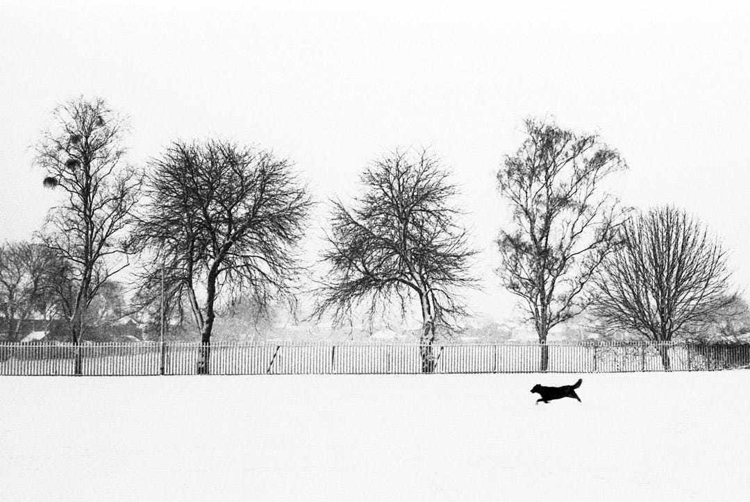
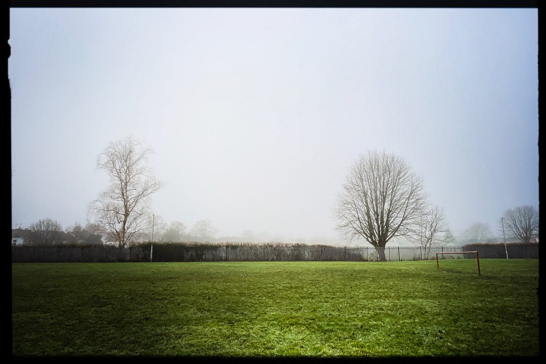
…leaving 3 shots which could be classed as taken with some sort of intent, if you’re keeping up with the maths. Exhibit A was taken in response to this shot of trees in the snow with the dog running in the foreground. Having recently come across the snow picture again I thought an up to date comparison shot might be interesting but that wasn’t to be.
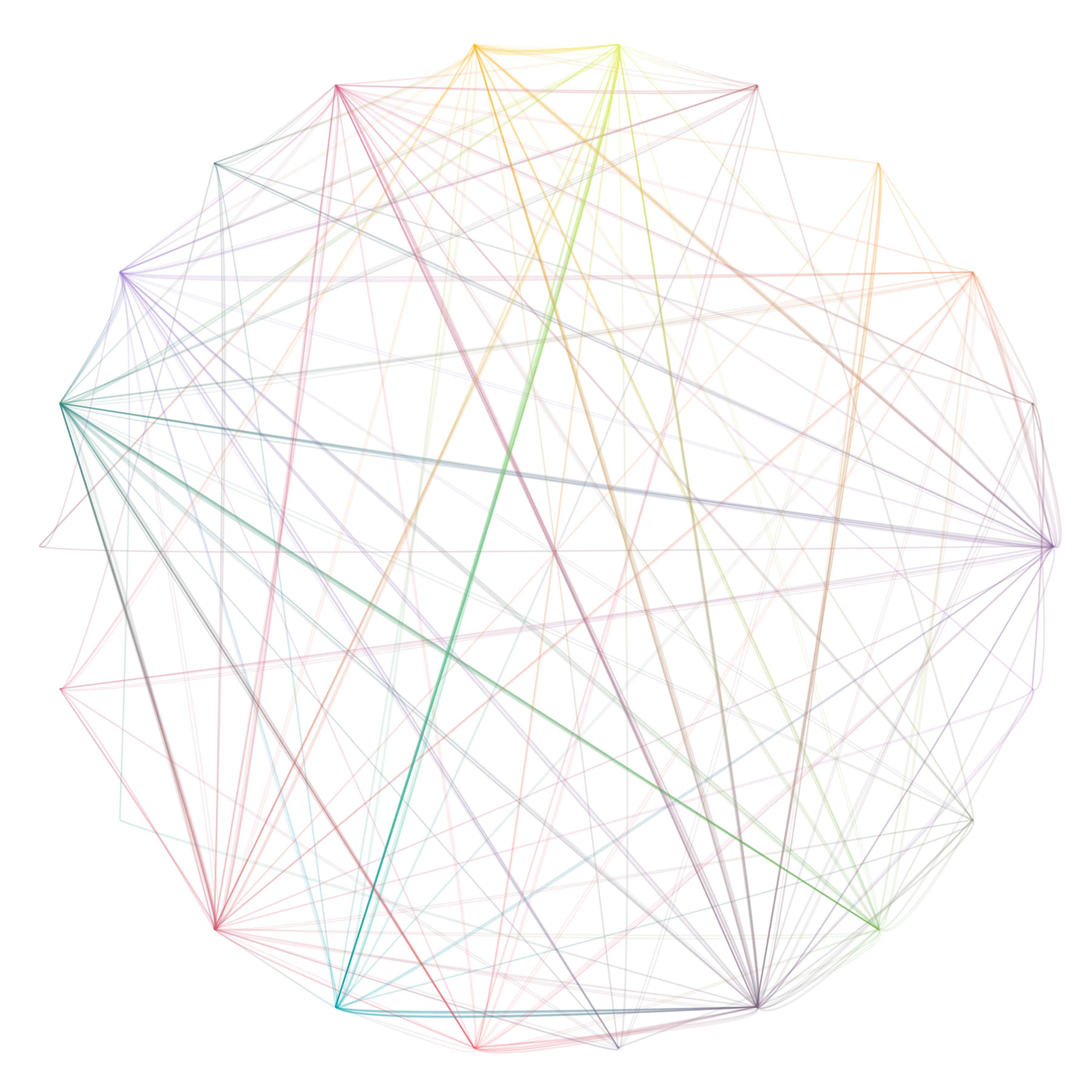
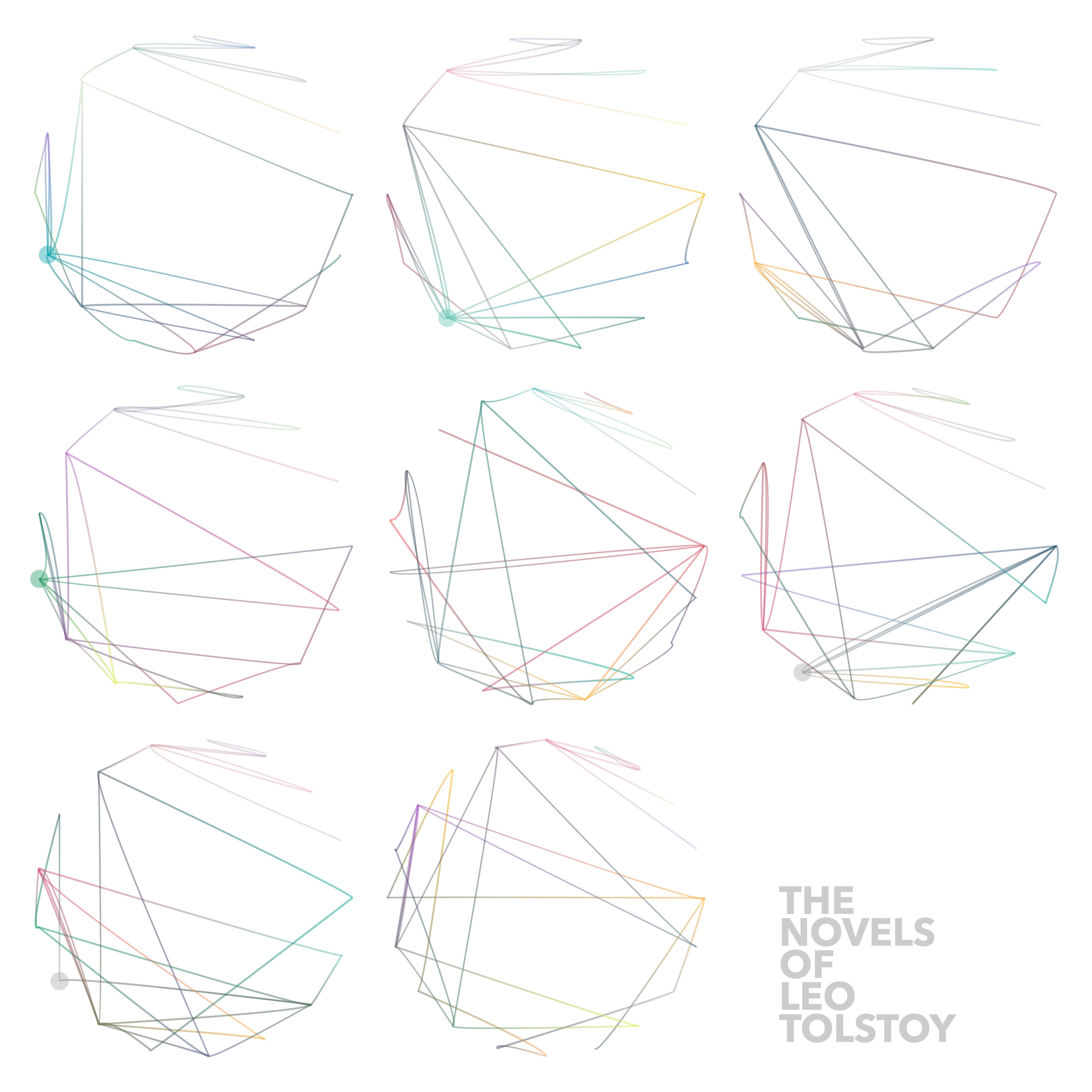
The two remaining shots were of some printed work in progress on a new coding project which I’ve been playing with since the start of the month. During our recent Collective exhibition I was introduced to another artist who makes maths based images using binary alphabets and multiplication circles. We are talking about collaborating on a project in the future but in the meantime I was inspired to try adapting the code that I wrote to translate headlines into coloured blocks to make an image which draws a path between points around a circle representing the letters in the text. Probably easier to visualise than explain.




And that’s another month over. Happy New Year!
Comments
Nothing yet. Say the first thing.
Sign in to join the conversation.