
There are too many fonts, so much so that I usually choose the Braille Institute’s Atkinson Hyperlegible for everything from my browser’s sans-serif default, to Obsidian notes, to my personal blog.
I few weeks ago, I started writing LaTeX papers and Atkinson Hyperlegible looked awful! So, I scoured the deepest cavities of Reddit (using Perplexity of course; fuck u/spez), and finally found XCharter, a beautiful, minimal serif font.
“What other fonts am I missing out on?”
Yes, people do get FOMO from unused fonts. I thought I’d leave a note for myself and anyone else with decision paralysis who always chooses fonts like Poppins, Inter, or Rubik for design work or Arial and Calibri for documents.
Modern Font Stacks
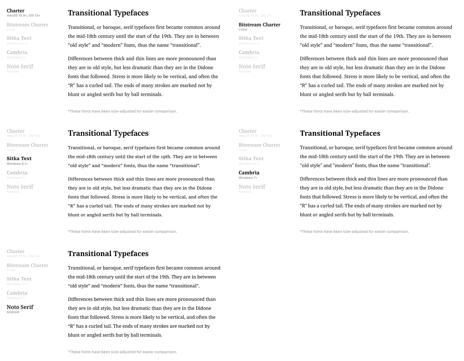
Dan Klammer’s passion project wonderfully summarizes 15 fonts’ weights, article views, characters, and CSS snippets, and renderings!
Comments
Nothing yet. Say the first thing.
Sign in to join the conversation.