
💜 Your Users Are Feeling Machines That Think (by Alex Dziewulska)
💜 How it could look different, and what to expect after being hired (by Jakub Sirocki)
💪 Interesting opportunities to work in product management
🍪 Product Bites - small portions of product knowledge
🔥 MLA week#53
Join Premium to get access to all content.
It will take you almost an hour to read this issue. Lots of content (or meat)! (For vegans - lots of tofu!).
Grab a notebook 📰 and your favorite beverage 🍵☕.
I spent the last two weeks teaching product to people who don’t think in product. One of the biggest companies in Poland, deep into a transformation, doing the thing every keynote promises and almost no company survives.
Talking product to product people is easy. Same language, same reflexes, same way of seeing a problem before anyone’s named it. I move fast in that room.
Put me in front of people whose whole careers were built inside project culture, and the floor tilts.
Not because the concepts are hard. They’re not. Outcomes over output. Continuous discovery. Empowered teams. I can explain any of it in twenty minutes and they’ll understand it — they’re smart, that was never the bottleneck.
The concepts are the easy part. The concepts are always the easy part.
What’s hard is everything they sit on top of. Finding common ground with someone whose entire career rewarded the opposite instinct. Translating from a world that pays you for delivering exactly what was asked into one that pays you for asking whether it should be built at all. Fighting resistance that never once says the word “no.” Finding a reason — a real one, theirs and not mine — to want any of this.
And under all of it, the thing no roadmap has a column for: mindset. Trust. Ownership. The willingness to be wrong out loud, in front of people who outrank you.
That’s the actual work. And it’s the work my whole industry has quietly agreed not to charge for.
Let me be honest about my own trade, because I’m in it.
People pay me to walk in and move things. Reporting lines, decision rights, who sits where, who answers to whom. I rearrange the furniture of how work flows, and I’m good at it, and it matters. But it’s the easy half. It’s the half that fits on an invoice.
Budget. Headcount. Process. Org charts. A gorgeous Product Operating Model with swimlanes and a maturity curve — a coloring book for the board, something to present and feel transformed. You can hire, fire, fund, and redraw the boxes until your hand cramps. And still fail. Because every bit of that is structure, and structure sells precisely because you can see it, count it, and call it done the second the slide gets approved.
The other layer doesn’t sell. Nobody cuts a PO for trust. There’s no statement of work for ownership. You cannot ship intellectual honesty by Friday and bill for it Monday.
So we sell the part we can deliver, and stay politely quiet about the part that decides whether the rest of it lives through the year.
When a transformation dies, the postmortem always rhymes. Not enough budget. Wrong people. Bad process. It’s never true. It died because the culture couldn’t hold it.
But “culture” is a word people hide behind. Too big to argue with, too soft to fix. So let me cut it open.
Three things carry the weight. Everything else is what leaks out when they’re gone.
Trust. Without it, empowerment is a poster on the wall. Micromanagement strangles it on contact, and you watch every decision climb three levels for a signature while the org chart swears those teams are autonomous. They’re not stupid. They’ve just learned nobody will catch them if they fall.
Ownership. Without it, nothing belongs to anyone. Silos quietly reassert themselves — not out of malice, out of gravity. When no one owns the outcome, everyone retreats to owning their function. The matrix wins. The product loses. Again.
Intellectual honesty. Without it, the organization stops being able to learn. Discovery becomes a ritual that only ever confirms what leadership already decided. The data gets gathered, then ignored the instant it says something inconvenient.
Now watch what those three grow when you starve them.
No courage — no real bets, no hard truths spoken — because courage is just trust and honesty holding up under load. No iteration — perfectionism freezes everything — because iteration needs permission to ship something imperfect, and that permission lives downstream of a trust nobody extended. No room to fail — experiments become theater — because the moment failure stops being safe, every experiment turns into a performance of a certainty nobody in the room actually has.
Six symptoms. Three causes.
Miss that and you’ll spend the entire transformation treating the rash. Running a courage workshop for people who were never handed one reason to trust the room they’re sitting in. Hoping a values offsite installs something no offsite has ever once installed.
Here’s the part that landed in that room and won’t leave me alone.
We talk about resistance to change like it’s a defect. A bug in the people. A thing to “overcome,” preferably with a comms plan and a stakeholder map.
It isn’t a defect. Resistance is the sanest thing in the building.
Look at who’s actually sitting there. A project manager who spent a career being rewarded for hitting the date, hitting the scope, delivering precisely what the spec demanded. They were good at it. The organization told them — in raises, in praise, year after year — that this was the job and they were winning it.
Then I walk in and say: outcomes, not output. Stop measuring whether you delivered what was asked. Start measuring whether it mattered.
Hear it the way they hear it. I’ve just told a competent person that the game they mastered is over, and I’ve declined to explain the rules of the new one or how anyone keeps score. We’re apes who read a room for threat before we’ve finished the sentence, and they smell it instantly: the ground I know is being taken, and nobody has shown me where the footing is safe now.
Of course they resist. Resistance is what a smart animal does when you move the ground and call it progress.
This is the non-negotiable nobody prints on a slide. Not “you need buy-in” — everyone says buy-in, it costs nothing to say. I mean the expensive version: every single person you’re asking to change has to be shown what’s in it for them. Not the company. Them. And you have to mean it — real value at the individual level and real value at the org level, both true at once — or you don’t have a transformation. You have a compliance exercise. And compliance is something people are very, very good at waiting out.
Show someone the new world isn’t a threat — show them, by name, exactly how they win in it — and most of the resistance you braced for never walks through the door.
Which brings me to the question that cracks the whole thing open.
Does every team have to become a product team on day one?
The textbook says yes. Empowered, outcome-obsessed, customer-facing teams, all of them, all at once. It looks flawless in a keynote. It also describes no company that has ever drawn breath.
The honest answer is no. And it isn’t a compromise. It’s topology.
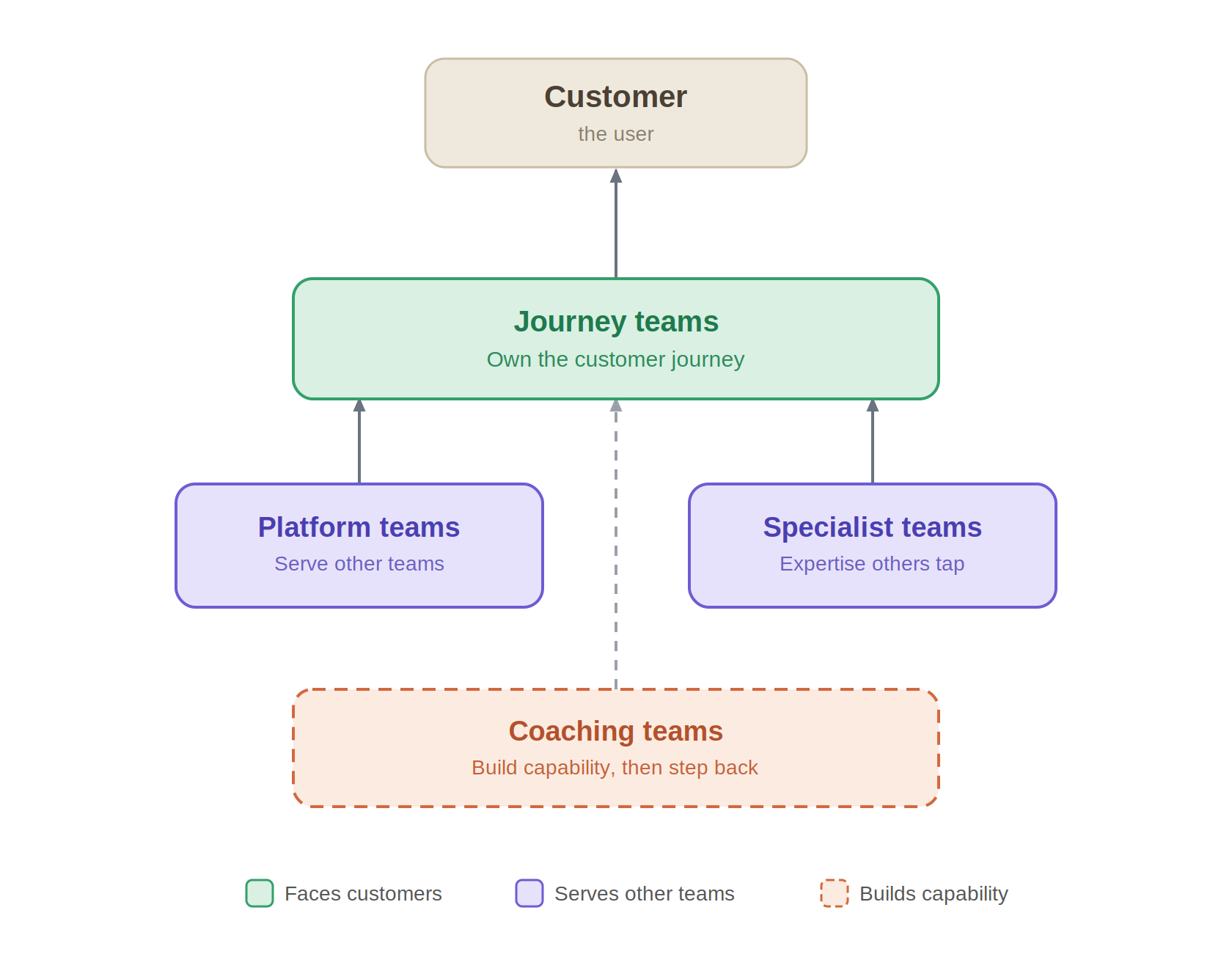
Walk into a real org mid-transformation and you find at least four different relationships to the work.
Some teams face the user and own a slice of the journey end to end. These are the ones people mean when they say “product team” — the sharp edge, where outcomes actually get decided.
Some teams serve other teams. Platforms. Their user isn’t the customer, it’s everyone downstream of them. You don’t want a platform team facing the end user — that’s the wrong shape entirely. But you do want them treating that platform like a product, with the internal teams as their demanding, ungrateful, indispensable customers.
Some are specialists. Deep expertise the rest reach for when they hit the edge of their own. Not everything has to live in every team — concentrated competence is a feature, not a silo, right up until someone decides to gatekeep it.
And some teams exist to make themselves unnecessary. They build the capability, and then they leave.
That last one is the whole answer to “day one.”
The dashed box on the chart is the time axis hiding inside the structure. No organization wakes up a product organization on a Monday. It grows the thing — team by team, person by person — through people whose entire job is to transfer the mindset and then get out of the way. Different teams reach it at different speeds. Some were never meant to reach it the same way at all.
So what’s actually universal?
Not the form. The form is supposed to vary — who faces the user, who serves the teams, who holds the rare knowledge, who builds and steps back. What’s universal is the living tissue under every one of those boxes. Trust. Ownership. Intellectual honesty. The values travel to every team on that chart. The operating model does not have to, and never did.
This is the distinction the dogma flattens — and the flattening is why transformations choke. “Share the mindset” gets mistranslated into “take the identical shape,” and now a platform team is graded on customer outcomes it can’t even see, and a specialist team is scolded for not owning a journey it was never built to touch. You took correct topology and called it resistance. You manufactured the exact dysfunction you were hired to cure.
Shared values, varied form. That isn’t transformation-lite. It’s the only kind that survives contact with a real company.
This is why the immaculate operating model fails the moment it touches the floor.
It isn’t wrong. It’s a photo of a healthy body. And you cannot make a sick organization well by showing it a picture of health and asking it to match.
I don’t care about the utopia version — the maturity curve, the target state, the org that behaves like the textbook because the textbook never had to make payroll. I care about the Tuesday. The Tuesday when a team lead has to choose between looking decisive and admitting the discovery just killed a plan everyone’s already attached to. The standup where somebody could say “I think we’re building the wrong thing” — and has to calculate, in real time, in front of their boss, whether that sentence is survivable.
Transformation lives or dies right there. Not in the operating model. In whether the person in that exact moment has trust to spend, ownership to act on, and enough honesty in the room to say the inconvenient thing and still have a job at five.
You cannot install that.
You can’t reorg your way to trust. You can’t put ownership in a RACI chart. You can’t book intellectual honesty for Q3. It grows, or it doesn’t, in the conditions you build or fail to build.
And the first condition — the one underneath every other one — is showing each person, by name, why this new world is worth the risk you’re asking them to take.
Start there. Or don’t start.
P.S.
The part I actually love in this work never shows up on a maturity curve.
It’s a moment I don’t get to schedule. Weeks after a training, in a meeting I’m not even in, somebody who spent their whole career inside scope and specs stops their own team and says:
“Wait, guys — let’s build the skateboard first, before we scope everything.”
Nobody installed that. No slide produced it. The mindset took — in someone who started the year resisting it — and now they’re the one defending it to the room.
The coaching team can step back. The substrate is holding.

There’s a conference happening 270 kilometers from my desk in September, and most of the product people I know in Poland still book flights to London or Lisbon to see the same speakers. I want to fix that.
WaysConf is in Kraków on 16–17 September, with a separate workshop day on the 15th. Marty Cagan and Brad Frost are keynoting. Debbie Levitt and Petra Wille are running workshops. Then it goes deep on working practitioners rather than circuit speakers — staff designers from Meta and Shopify, research leadership from Wise, a Principal AI Designer from Intercom, product leaders from Kraken and IKEA.
Here’s my one piece of unsolicited advice, and it’s the contrarian one: do not build your two days around the keynotes. You can watch Cagan on YouTube tonight, in your pajamas, for free. What you cannot get on YouTube is the case study about what actually broke, the roundtable where people who run research orgs argue about maturity, or the speaker who contradicts the one you heard ninety minutes earlier. Conferences that only platform one worldview are just expensive newsletters read aloud. WaysConf isn’t that. The speakers counter-argue each other, and that’s the point.
The theme this year is “Building What Matters” — good decisions under real constraints, in an AI-accelerated, ship-faster world. I spend most of my time on the gap between what the AI-product discourse claims is happening to teams and what is actually happening to teams. A room full of practitioners presenting real case studies, in our region, is exactly where that gap gets argued out by people living it rather than people monetizing the narrative about it.
And the unglamorous part: if you run a small studio or sit on a Polish team budget, a Kraków train ticket and a conference pass is a different financial event than flying a team to San Francisco. Same caliber of speaker, fraction of the friction. The room is people you’ll keep running into for the rest of your career, mostly within a few hours of where you already work.
So go. Block the 16th and 17th, decide whether the workshop day is worth the extra ticket, and spend your time in the case-study rooms and the hallway — not the front row of every keynote.
The keynotes will be on the internet by October. The conversations won’t.
WaysConf 2026 · 16–17 September (workshops 15 Sept) · EXPO Kraków + online · waysconf.com

Web Summer Camp 2025 — and Alex will be there
Web Summer Camp is a three-day, hands-on event for Europe’s web professionals — workshops, small group sessions, and real conversations, taking place July 3–5 in Opatija, Croatia. Not the kind of conference where you collect slides and forget about it by Monday. The kind where you actually work through problems with people who build digital products for a living.
This year they added an AI track — not because everyone else is doing it, but because they wanted to do it right. There’s also a dedicated Founders program and tracks for JavaScript, PHP, UX, and product.
Alex will be joining as a speaker. If you’re heading to Opatija this summer — or considering it — this is where to find her in person.
More about the conference: [LINK]
Ready to grab a ticket? [TICKETS]
Do you need support with recruitment, career change, or building your career? Schedule a free coffee chat to talk things over :)
Product Lead - Alten
Product Manager - Asana
Senior Product Manager - InPost
Product Manager - Flying Bisons
Senior Product Manager - Vonage
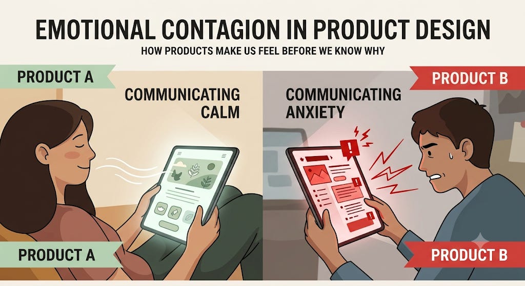
There is something that happens in the first few seconds of using a well-designed product that is difficult to articulate but immediately recognizable. A feeling of calm, or clarity, or invitation. Before any feature has been evaluated, before any task has been attempted, a mood has already been set. The product communicated something — not through its functionality, but through its texture. And that communication shaped everything that followed.
This is not metaphor. It is a documented psychological mechanism with a precise name, a body of empirical research behind it, and direct implications for how product teams design the emotional register of what they build.
Two task management tools solve the same problem with comparable feature sets. Users who test both describe one as “focused” and “calm.” They describe the other as “cluttered” and “stressful.” A head-to-head feature comparison shows no meaningful difference. The satisfaction gap is real and persistent. In follow-up interviews, users struggle to explain it. “It just feels different,” is the most common formulation.
The difference is emotional contagion. The calm product communicates calm — through its spacing, its color temperature, its typographic choices, its interaction patterns, its microcopy — in ways that users absorb automatically and unconsciously, before any rational evaluation begins. The cluttered product communicates anxiety in the same way. Neither team necessarily designed the emotional register deliberately. Both products have one.
Emotional contagion is the phenomenon by which emotional states spread from one person — or one environment — to another, automatically and largely below the threshold of conscious awareness.
The concept was formally developed by psychologists Elaine Hatfield, John Cacioppo, and Richard Rapson, whose landmark 1993 paper in Current Directions in Psychological Science defined it as “the tendency to automatically mimic and synchronize expressions, vocalizations, postures, and movements with those of another person and, consequently, to converge emotionally.” Their subsequent book of the same name documented the mechanism across dozens of contexts: faces, voices, physical spaces, written communication.
The mechanism operates in two ways. The first is automatic mimicry: when people perceive an emotional signal — a facial expression, a tone of voice, a posture — they unconsciously replicate it, and through the feedback of that replication, they begin to feel the corresponding emotion. The second is more cognitive: people observe emotional cues, interpret them consciously, and update their own emotional state accordingly. In practice, both mechanisms operate simultaneously, with the automatic pathway often faster and more influential.
Research by Sigal Barsade published in Administrative Science Quarterly in 2002 extended these findings to group contexts, demonstrating that emotional contagion shapes group decision quality, cooperation, and conflict. A 2020 paper by Goldenberg and Gross in Trends in Cognitive Sciences documented digital emotional contagion specifically — the transmission of emotional states through digital content, interfaces, and communication — establishing that the mechanism is not limited to face-to-face contexts. Products are environments. Emotional contagion operates in them.
Every design decision in a product emits an emotional signal. Whitespace communicates calm or emptiness depending on how it is used. Color temperature communicates energy or restraint. Typography communicates authority or approachability. Interaction patterns communicate control or unpredictability. Microcopy communicates care or indifference. These signals are not consciously evaluated by users. They are absorbed through the automatic contagion pathway — and they shape the emotional state in which the user encounters every subsequent element of the product.
The product team that does not think deliberately about emotional register is not producing a neutral product. It is producing one with an undesigned emotional register — which may or may not serve the context in which users encounter it.
Emotional contagion in product design is not simply about positive versus negative emotions. It is about fit between the emotional register of the product and the emotional context of its use. A product used during high-stress moments — health decisions, financial management, crisis response — may benefit from a calm, stable emotional register that reduces ambient anxiety. A product used during creative exploration or entertainment may benefit from an energetic or playful register that amplifies the user’s existing mood. A product that communicates anxiety in a health context, or boredom in an entertainment context, has failed at emotional fit regardless of its functional quality.
Headspace’s design philosophy is a direct application of this principle. The product is used by people who are already anxious — that is frequently the reason they open it. Every design decision is oriented toward communicating calm before the user has done anything: the color palette, the illustration style, the sound design, the pace of animations, the gentleness of the microcopy. The emotional contagion is deliberate. The product needs to change the user’s emotional state before the content can be effective. The design is the first intervention.
Research on emotional contagion consistently finds that negative emotional signals spread faster and have stronger effects than positive ones — a product of the brain’s threat-detection prioritization. In product design, this means that a single anxiety-provoking element — an error message that implies user failure, an urgent notification design, a checkout flow that communicates scarcity through high-pressure copy — can override the calming effect of all other design decisions. The emotional register of a product is not the average of its signals. It is disproportionately determined by its most negative signals.
This asymmetry has direct implications for design prioritization. Removing anxiety-producing elements is more emotionally impactful than adding calming ones. A product that eliminates its most stressful interaction patterns will feel substantially calmer even if nothing else changes — because the negative signals that were driving the aggregate emotional register have been removed.
Written language is one of the most powerful contagion vectors in product design because it operates through both automatic and cognitive pathways simultaneously. Microcopy — button labels, error messages, empty states, onboarding prompts, notification copy — communicates an emotional tone that users absorb without consciously evaluating. Copy that uses language of urgency, scarcity, or implied failure generates anxiety. Copy that uses language of agency, clarity, and care generates trust. The specific words chosen for a single error message can shift the emotional experience of an entire workflow.
Headspace’s design team has described their approach to emotional register as a design constraint that precedes all other decisions: the product must communicate calm before it communicates anything else. This constraint shaped their color palette selection (desaturated, warm), their illustration style (rounded, non-threatening forms), their animation pace (slower than digital convention), their notification copy (gentle, non-pressuring), and their onboarding flow (low commitment, no urgency). None of these decisions would have followed from functional requirements alone. They followed from a deliberate theory of emotional contagion: if the product communicates calm, the user will become calmer, and the product’s core function — meditation — will be more accessible. The emotional design is not decoration. It is the mechanism by which the product works.
Linear’s design philosophy operates through a different but equally deliberate application of emotional contagion. The tool communicates competence and control through its visual density, its keyboard-first interaction model, its restrained color usage, and its precise, functional microcopy. Users describe using Linear as feeling “in control” and “efficient” before they have taken any action. These feelings are not produced by features. They are produced by the emotional register the design communicates — one of deliberate craft and precision that induces in the user a sense of their own competence. The contagion works in the direction of the product’s positioning: a tool for serious engineers working seriously.
Calm’s approach to notification design illustrates the asymmetry principle in practice. The company made a deliberate decision early in its development to eliminate the emotional anxiety typically produced by wellness app notifications — the streak warnings, the guilt-inducing reminders, the scarcity framing around limited-time content. Research has documented the negative emotional contagion of anxiety-based notifications: they produce the opposite of their intended effect, increasing stress rather than motivating return. Calm’s notifications are explicitly non-pressuring: “Take a moment for yourself” rather than “Don’t break your streak.” This design decision produces a measurably different emotional response at the moment of notification receipt, which shapes the emotional state in which users open the app. Calm has reported that their notification design approach is correlated with higher session quality metrics, consistent with the contagion theory: users who arrive in a positive emotional state engage more deeply with content designed to improve that state.
Emotional contagion matters for product teams because it operates before, during, and after every feature interaction — and because most product teams do not design it deliberately. The emotional register of most products is an emergent property of thousands of individual design decisions made without a unified emotional framework. The result is an emotional signal that is incoherent, inconsistent, and often misaligned with the context in which the product is used.
Research on the relationship between emotional experience and product outcomes is consistent: users who experience positive emotional states during product use report higher satisfaction, show higher return rates, and are more forgiving of functional failures. Users who experience anxiety or frustration show higher churn rates and lower willingness to invest in learning the product. Emotional contagion is not a secondary effect of good design — it is a primary driver of the behavioral outcomes that product teams measure.
The Facebook emotional contagion experiment, published in PNAS in 2014, demonstrated the mechanism at scale: by manipulating the emotional valence of content shown to users in their news feeds, researchers produced measurable changes in the emotional valence of those users’ own posts. The manipulation worked because emotional contagion is real and powerful. The experiment was ethically controversial. The mechanism it demonstrated was not in question.
Map the emotional register of the current product before designing a new one. Before making any design decisions, characterize the emotional signal the product currently emits. Walk through the product as a new user would, and name the emotion each major touchpoint communicates — not what you intended it to communicate, but what it actually emits. The gap between intention and emission is the starting point for deliberate emotional design.
Define an emotional design brief alongside the functional design brief. Every significant design project should include an explicit statement of the emotional register being aimed for — not just the features being built. What should the user feel at the beginning of an onboarding flow? What should they feel after their first successful task completion? What should they feel when they encounter an error? These are design questions with design answers. They should be answered deliberately, not left to emerge from functional decisions.
Apply the negativity asymmetry principle to prioritization. In any list of emotional design improvements, prioritize the removal of anxiety-producing elements over the addition of calming ones. The most anxiety-provoking interaction in the product is reducing the emotional quality of the entire experience more than any positive element is raising it. Find it and remove it first.
Audit microcopy for emotional register explicitly. Copy review processes typically evaluate clarity and accuracy. Add emotional register as an explicit review criterion: what emotion does this copy communicate? Is that the emotion that serves the user in this context? Button labels, error messages, empty states, and notification copy are high-leverage emotional contagion vectors. Reviewing them through an emotional lens, not just a functional one, is a low-cost intervention with significant impact.
Hatfield, Cacioppo, and Rapson’s foundational work established that emotional contagion is not a soft phenomenon or a cultural preference. It is a biological mechanism, operating through the same neural pathways as sensory perception, at speeds that precede conscious evaluation. Environments emit emotional signals. People absorb them. Products are environments.
The implication for product design is direct: the emotional register of what we build is not a style choice or a finishing touch. It is a fundamental design dimension that shapes user experience before any feature is encountered, during every interaction, and in memory afterward. Teams that design the emotional register deliberately — that define the feeling they want to produce and make design decisions in service of that feeling — build products that users describe as “calm,” “focused,” “trustworthy,” or “energizing” without being able to say exactly why.
The users who cannot articulate why they prefer one product to another are not being vague. They are accurately reporting an emotional experience produced by contagion. The product communicated something to them. They felt it. They stayed.
Design the feeling before you design the function. The feeling arrives first.

Every product fails its users. Not occasionally, not under unusual conditions — regularly, predictably, and in ways that are entirely foreseeable. Forms reject valid inputs. Sessions expire mid-task. Integrations break. Files fail to upload. Payments don’t go through. The question is not whether the product will fail. It is what the product says when it does.
Most products say very little. Or they say it in a language designed for the engineers who built the system rather than the people who use it. “Error 422.” “Unprocessable entity.” “Something went wrong.” These are not communications. They are failures to communicate — and they convert a moment of product failure into a moment of relationship failure, compounding one bad experience with another.
The teams that understand error states differently — that treat them not as edge cases to be minimized but as relationship moments to be designed — produce products that users describe as unusually trustworthy, even when they fail. Especially when they fail.
A developer is integrating a payment API at eleven o’clock on a Wednesday night, under deadline. The API returns an error. One version of the error message reads: “invalid_request_error.” Another reads: “Your API key appears to be a test key. You’re sending this request to the live endpoint. Switch to your live key or use the test endpoint at api.stripe.com/v1.” The developer fixes the problem in thirty seconds. The first version sends them to documentation, then to Stack Overflow, then to a Slack channel, then to sleep unsatisfied.
Same error. Completely different experience. The difference is not the error itself — it is the quality of the communication in the moment of failure. One team designed the error state. The other left it as a system output.
The error message is a product decision. It is also, in that moment, the entire product.
Error states are distinct from every other product touchpoint in one critical way: the user arrives in them involuntarily, already frustrated, and with their trust in the product already reduced. Every other interaction the user has with the product is entered willingly, from a baseline of at least neutral trust. Error states are entered against the user’s intent, from a baseline of negative emotion.
This context makes error states both more difficult and more valuable to design well. More difficult because the user’s cognitive and emotional capacity for processing information is reduced by frustration. More valuable because the quality of recovery from a failure shapes users’ overall perception of the product more strongly than equivalent experiences during successful interactions. Research in service recovery — the study of how customers respond to service failures — consistently shows that a well-handled failure generates higher trust and loyalty than an equivalent interaction that never failed in the first place. Users who never experience a problem never learn how the product treats them when things go wrong. Users who experience a well-handled problem do.
This is sometimes called the service recovery paradox, and it operates in digital product contexts as reliably as in service industries. The error state, handled well, is a trust-building opportunity that the success path cannot replicate.
Every error message has three distinct jobs, and most error messages fail at all three. The first job is acknowledgment: communicating clearly that something went wrong and that the product knows it. Generic messages like “something went wrong” technically acknowledge an error but do so in a way that communicates indifference — the product noticed but does not care enough to say what. The second job is explanation: communicating what went wrong in terms the user can understand and act on. This requires translating system language into user language — not “422 unprocessable entity” but “the date you entered doesn’t match our records.” The third job is recovery: communicating what the user can do next to resolve the problem or accomplish their original goal through an alternative path. Most error states fail at the third job by providing no clear next action, leaving users to figure out recovery on their own.
The three jobs require different types of information and different communication decisions. They also require different emotional tones. Acknowledgment should be honest and calm. Explanation should be specific and non-blaming. Recovery should be direct and empowering. An error message that achieves all three in two to three sentences is a substantial design accomplishment.
One of the most consequential design decisions in error state communication is how blame is distributed. System-generated errors typically use passive constructions that are ambiguous about causation: “the request failed,” “the file could not be uploaded,” “your payment was declined.” These constructions are often experienced by users as blaming them, even when the failure was the system’s. Research on error message language consistently shows that passive and ambiguous constructions generate more frustration than clear, active constructions that locate responsibility accurately.
When the error is the user’s — incorrect input, missing required field, format violation — the message should acknowledge this gently, without shaming, and provide specific remediation. When the error is the system’s — server failure, integration outage, processing error — the message should own it explicitly: “we’re experiencing a problem” rather than “the request failed.” The difference in user trust response to these two approaches is substantial and measurable.
Error states are unusually revealing brand moments because they expose how the product treats users when the product needs something from them — their patience, their understanding, their willingness to try again. A product that communicates warmth, competence, and care during an error state is communicating something about its values that success states cannot demonstrate. A product that communicates indifference or frustration during an error state is communicating something that success states cannot undo.
Slack’s error state copy — which has used humor, warmth, and absurdist imagery to communicate server outages and loading failures — is an often-cited example of brand expression through error states. Whether Slack’s specific approach is appropriate for every product context (it is not) is less important than the principle it demonstrates: the error state is a voice opportunity, not just a technical output.
Error states occur in conditions of reduced cognitive capacity. Users who are frustrated, rushed, or confused have less bandwidth for processing information than users in calm, successful states. Error messages that would be perfectly legible in a success state may be effectively incomprehensible in an error state — too long, too technical, too much to parse under cognitive load. The legibility constraint argues for error messages that are shorter, simpler, and more direct than the equivalent communication would need to be in a success context. The information density that serves documentation does not serve the user who needs to recover from an error at nine o’clock in the morning with three other things happening.
Stripe’s error handling philosophy in its API and dashboard products is the most studied example of deliberate error state design in the developer tools category. Stripe error messages include specific error codes that can be looked up in documentation, plain-language descriptions of what went wrong, and — critically — specific guidance on what to do next. The company’s design team has described treating error messages as a category of product writing that receives the same investment as marketing copy or onboarding content: not a technical output, but a communication designed for a person in a specific emotional and cognitive context. The result is a developer experience in which errors, while still frustrating, rarely leave the developer without a clear path to resolution. Stripe’s reputation for developer experience is inseparable from its error handling quality.
GitHub’s approach to form validation illustrates the inline, real-time error design pattern that has become the standard for high-quality form UX. Rather than waiting for form submission to surface errors, GitHub validates inputs as they are completed — checking username availability, password strength, and email format — and provides specific, friendly feedback in real time. Crucially, GitHub’s validation copy is written to be encouraging rather than corrective: “That username is available” alongside “Looks like that username is taken — here are some alternatives” creates a tone of collaboration rather than evaluation. The error state becomes a guidance state: the product is helping the user succeed, not flagging their failure.
Figma’s handling of file conflicts and version history errors demonstrates error state design in a high-stakes context where user frustration is at its peak. When a file conflict occurs — two edits made to the same element in a collaborative session — Figma surfaces the conflict clearly, shows the user both versions, and provides a simple mechanism for resolving it. The error state contains everything the user needs to understand what happened and to fix it, without requiring them to leave the product or consult documentation. The design reflects a theory about the user’s emotional state in that moment: they are alarmed, they need to understand what is at risk, and they need a clear path to resolution. All three needs are addressed before any other interface element competes for their attention.
Error states matter for product teams because they are among the highest-leverage design surfaces in any product — and among the most consistently underinvested. Research on usability consistently identifies error states as the interaction category most likely to cause abandonment, most likely to generate support tickets, and most likely to shape overall product perception negatively. A product with excellent error state design can significantly reduce support volume, increase completion rates on complex flows, and improve NPS scores — all from work that most design processes allocate minimal time to.
Error states also matter because they accumulate in organizational memory. A user who encounters three confusing error messages in a single session does not remember each one independently. They remember a product that was confusing when they needed help. That memory shapes their subsequent engagement, their willingness to recommend, and their resilience when the next error occurs.
The service recovery paradox suggests that the inverse is also true: users who encounter a well-handled error remember a product that helped them when they needed it. The emotional trace of a good error recovery is more positive than the emotional trace of an interaction that never required recovery. Products that handle failure well earn a category of trust that products without failures cannot access.
Audit the most frequent error states in the product before designing any new feature. Pull support ticket volume, identify the error types that generate the most contacts, and review the current error message for each one. In almost every product, the ten most common error states are inadequately designed — too technical, too vague, or too unhelpful on recovery. Improving these ten error messages will reduce support volume, improve completion rates, and change users’ emotional experience of failure faster than any new feature.
Write error messages for the user’s emotional state, not the system’s technical state. The first question to ask when writing an error message is: what is the user feeling at this moment? The answer should shape the tone, the length, the level of technical detail, and the clarity of the next step. A user who has just had a payment declined is anxious. A user who has entered an invalid date is mildly confused. A user whose account has been locked is alarmed. Each of these users needs a different communication at a different emotional register.
Include recovery in every error message by policy. Every error message should answer three questions: what happened, why it happened (if attributable), and what the user can do now. The third question is the most important and the most commonly omitted. A policy that requires every error message to include a clear next action will transform error state quality more efficiently than any style guide.
Test error states with users in emotional conditions that approximate real use. Error state usability testing that recruits calm, attentive participants in structured sessions systematically underestimates the legibility problems that occur when real users encounter errors while frustrated, rushed, or confused. Testing error states with participants who are under mild time pressure — or who have just experienced a frustrating prior task — will surface legibility and clarity problems that calm-session testing misses.
A product’s error states reveal its theory of the user. Products that treat users as capable adults who need accurate information to solve their own problems write error messages that are specific, honest, and action-oriented. Products that treat users as problems to be managed write error messages that protect the system from blame and provide the minimum information required for legal adequacy. The difference is visible in a single sentence: “Something went wrong” versus “Your session expired because you were inactive for 30 minutes. Sign back in to continue where you left off.”
These are different theories of the user’s capacity and different theories of the product’s responsibility. The second theory produces better products, higher trust, and lower support costs. It also requires that the design team care enough about the moment of failure to invest in it — to write, test, and refine communication for the moment when the product has let someone down.
That investment is not glamorous. It does not appear in product launches or press releases. It does not generate screenshots worth sharing. It generates something more durable: the experience of feeling helped when you needed it most.
Users remember how products treated them when things went wrong. Design for that memory.

There is a simple diagnostic for the quality of any product decision: does the person making it experience its consequences? If an engineer writes code they will never run, a designer creates flows they will never navigate, or a PM sets priorities they will never encounter as a user, the feedback loop between decision and consequence is broken. And broken feedback loops, across time and scale, produce broken products.
This is not a novel observation. It has a name — skin in the game — and a literature that stretches from ancient Babylonian law through Nassim Taleb’s 2018 book of the same name. In product development, it has a specific and practical form: the discipline of building products that you yourself use, in the way your users use them, with the same stakes.
In February 1980, Mike Scott, then president of Apple, sent a memo to the entire company. It read: “Effective immediately, no more typewriters are to be purchased, leased, or maintained. We believe the typewriter is obsolete. Let’s prove it inside before we try to convince our customers.”
Apple’s word processing software was not yet ready for production use. The memo was uncomfortable. Employees who depended on typewriters for serious work were being asked to use something worse. That discomfort was the point. The only way to know whether the product was actually ready — whether it could genuinely replace what it claimed to replace — was to depend on it. Not test it. Depend on it.
The products Apple subsequently shipped in that category were shaped by that dependence. The feedback was not from a research study or a usability session. It was from daily friction, daily frustration, and daily moments of discovery. It was from people who had skin in the game.
The practice of companies using their own products internally — in the way customers would use them — is called dogfooding, a term that entered the technology industry’s vocabulary through Microsoft in the late 1980s.
The term traces to a 1976 Alpo dog food advertisement in which actor Lorne Greene claimed to feed the product to his own dogs, implying quality confident enough for personal use. Jim Harris, Microsoft’s first head of OEM sales, adapted the phrase as a litmus test for product readiness: “Will the dogs eat the dog food?” — meaning, would the product’s creators willingly choose it over alternatives if they had to live with the consequences?
The practice was institutionalized at Microsoft following a 1988 email from executive Paul Maritz titled “Eating our own dog food,” challenging teams to run Microsoft’s networking software on their own servers rather than the Unix systems they were using. Brian Valentine, a testing manager, set up an internal server named dogfood and mandated the switch. Microsoft’s subsequent gains against Novell in the networking market were attributed partly to the quality improvements that internal dependence forced.
The mechanism is straightforward and the logic is ancient. Hammurabi’s Code required builders to live in the houses they built — if the house collapsed and killed the owner, the builder was put to death. The Babylonians understood that accountability requires consequence, and consequence requires exposure. You build differently when you live in what you build.
Dogfooding is frequently confused with internal testing, but the two are structurally different. Testing is evaluating a product against a specification to find defects. Using is depending on a product to accomplish real goals, with real consequences for failure. The difference matters because the category of problems each reveals is different.
Testing reveals functional defects: bugs, broken flows, failed validations. Using reveals experiential defects: the feature that works correctly but feels wrong, the flow that completes successfully but takes twice as long as it should, the notification that is technically accurate but arrives at a moment that destroys focus. These experiential defects are invisible to QA and to usability testing conducted in structured sessions. They are only visible to people who depend on the product daily and feel the accumulated friction of imperfect design choices over time.
The PM who uses their own product to do their own work generates a qualitatively different category of insight than the PM who reviews their own product in a prepared demo. The first is in contact with the product as it actually is. The second is in contact with the product as it was prepared to be seen.
Dogfooding has a documented failure mode that its advocates often understate: the team is not the user. Engineers who dogfood a developer tool share the cognitive profile of the product’s target users. A team of non-technical professionals dogfooding a consumer product does not. The feedback they generate reflects their own needs, their own workflows, and their own tolerance for friction — none of which may match the target user’s.
This is the competence problem in dogfooding: internal users often know the product too well, have workarounds for known issues, and lack the fresh perspective of someone encountering the product for the first time. They are also motivated differently — by professional obligation rather than genuine need — and their usage patterns may not reflect real-world user behavior.
The teams that use dogfooding most effectively treat it as one input among several, not as a substitute for user research. It answers the question “does this work for us” but not the question “does this work for the people we’re building for.” Both questions matter. Only external research answers the second.
The most important function of dogfooding is not the feedback it generates — it is the accountability it creates. When product teams use what they build, imperfections have consequences for the people who could fix them. The friction of a slow loading state is not abstract when you experience it fifteen times a day. The confusion of an error message is not a design discussion when it costs you twenty minutes of your own time.
This accountability mechanism changes the quality calculus of shipping decisions. A team that will never use what it ships can be satisfied with “good enough for users.” A team that will use what it ships applies a different standard: good enough for me, now, under real conditions.
Basecamp’s development team has used Basecamp as their primary project management tool since the product’s earliest versions. Jason Fried and David Heinemeier Hansson have described this practice as foundational to the product’s design discipline: every feature that ships must earn its place not only in a customer value calculation but in the team’s own workflow. Features that add complexity to the tool make the team’s own work more complex. Features that introduce friction slow down the team’s own communication. The feedback loop is not mediated by research or analytics — it is direct and immediate. Fried has noted that this constraint has been as responsible for what Basecamp has not built as for what it has: the team’s own experience of the product limits the accumulation of features that would be accepted on the basis of customer requests but rejected on the basis of daily use.
Linear’s engineering team uses Linear to build Linear. This self-referential dependence — building a project management tool with the project management tool — is not a gimmick. It means that every performance issue, every UX friction point, and every workflow limitation is encountered daily by the people who can and must fix it. Linear’s reputation for speed — both as a product attribute and as a development pace — is partly a product of this feedback loop. Slow load times are not an abstract metric for the Linear team. They are a daily frustration. The team’s motivation to fix performance is internal and immediate, not external and delayed.
Stripe’s developer documentation team maintains a policy of reading every piece of documentation they produce from the perspective of a developer integrating Stripe for the first time — using the actual integration process, not a simplified version, to validate that the documentation is complete and accurate. This practice has been cited as a primary driver of Stripe’s documentation quality, which is consistently cited by developers as the best in its category. The team that dogfoods their own documentation cannot sustain gaps that a team reviewing documentation from the author’s perspective would miss.
Skin in the game matters for product teams because it provides a category of feedback that no research methodology can fully substitute for: the feedback of accumulated, consequential, daily use by people with the knowledge, access, and motivation to act on what they find.
Research studies produce snapshots of user behavior in defined contexts. Support tickets surface the most acute failures. NPS scores capture aggregate satisfaction. None of these provides what daily use provides: the continuous, longitudinal experience of living with the product’s decisions and feeling their cumulative effect.
The PM who has used their own product to manage their own projects for six months has a model of the product that a PM relying on research does not. They know which flows are technically correct but practically frustrating. They know which features are used in ways the team did not anticipate. They know what it feels like to encounter the product’s limitations under real conditions, not in a prepared demonstration.
This knowledge changes what gets prioritized and what gets delayed. It creates a bias toward the changes that improve daily experience over the changes that improve reported satisfaction. These are correlated but not identical, and the gap between them is where the most important product improvements often live.
Use your own product for your own work before you use it for any other purpose. The PM who manages their roadmap in their own product, the designer who files their design critiques in their own feedback tool, and the engineer who tracks their own bugs in their own issue tracker are generating continuous, honest feedback that no other process can replicate. If this seems impractical — if the product is not yet good enough to use seriously — that impracticality is itself diagnostic.
Mandate usage at the leadership level. Dogfooding programs that are voluntary generate voluntary feedback — from the most engaged and most positive internal users, which is a biased sample. Programs that are mandatory, starting with leadership, generate the feedback that comes from reluctant use under real conditions. The most valuable dogfooding feedback is often from the person who would have preferred to use something else and used the internal product only because they were required to.
Distinguish between dogfooding for quality and dogfooding for desirability. Dogfooding reliably surfaces functional and experiential quality problems — things that are broken, slow, or confusing. It does not reliably surface desirability problems — whether the product solves the right problem for the right user. The team that confuses the two will produce a high-quality product that nobody outside the team wants to use. Pair internal use with external user research to answer both questions.
Create a systematic channel for dogfooding observations. Informal dogfooding — using the product without a structured way to capture what you notice — generates observations that are forgotten before they can be acted on. A simple, low-friction channel for logging friction points encountered during internal use — a shared document, a dedicated Slack channel, a weekly async standup question — converts individual observations into an organized backlog of real-experience insights.
Extend dogfooding to the products your product depends on. The team that uses the integrations, APIs, and third-party tools their product connects to will understand what their users experience when those connections fail. The PM who has personally tried to connect their product to a competing tool understands the switching cost. The engineer who has debugged an integration failure from the user’s side understands the error state quality problem. Extending skin in the game to the edges of the product’s ecosystem produces insight that internal-only dogfooding cannot.
Nassim Taleb’s formulation of skin in the game is ultimately about epistemic integrity: the claim that you know what you’re doing is more credible when you bear the consequences of being wrong. For product teams, the parallel is precise. The claim that you understand your users’ experience is more credible when you live it. The claim that the product is ready is more credible when you depend on it.
This does not mean that building for yourself and building for your users are the same thing. They are not, and confusing them is one of the most common and costly errors in product development. The Apple memo understood this: “Let’s prove it inside before we try to convince our customers” — meaning internal use is a necessary condition, not a sufficient one. You must be able to use it yourself. That is not the same as building what you would use.
The products that get built best are built by people who use them enough to feel their failures, who care enough about those failures to fix them, and who are honest enough to distinguish what works for them from what works for the people they are building for.
Build it. Use it. Feel where it fails. Fix what you find.
Then ask your users what you missed.
The Minimum Lovable Action (MLA) is a tiny, actionable step you can take this week to move your product team forward—no overhauls, no waiting for perfect conditions. Fix a bug, tweak a survey, or act on one piece of feedback.
Why it matters? Culture isn’t built overnight. It’s the sum of consistent, small actions. MLA creates momentum—one small win at a time—and turns those wins into lasting change. Small actions, big impact
There is a pattern in how most product managers write updates. It starts with context — how we got here, what the data showed, what the team tried, what the constraints were. It builds through a sequence of findings. And somewhere near the end, often apologetically, it arrives at a recommendation. The reader has to wait through everything you learned to find out what you think they should do about it.
This feels thorough. It’s actually a burden.
Barbara Minto noticed this pattern while working at McKinsey in the 1960s. She was reading the firm’s client documents and found the same problem everywhere: smart people building to their conclusions instead of leading with them. The structure made sense to the writer — it followed the sequence of their thinking — but it created unnecessary work for the reader, who had to hold a growing pile of information in their head before learning what to do with it. Minto’s solution was to invert the pyramid. <cite index=”8-1”>Start with the answer. Support it with key arguments. Back each argument with evidence.</cite> Her framework — now known as the Pyramid Principle — became the communication standard at McKinsey and spread from there to most major consulting firms, investment banks, and executive teams worldwide.
The reason it works is structural, not stylistic. <cite index=”2-1”>Because the conclusion is presented upfront and supported with structured arguments and data, stakeholders can quickly assess, challenge, and act on recommendations.</cite> When your recommendation appears at the end of a long update, a busy stakeholder who stops reading halfway through has no idea what you’re asking them to do. When it appears in the first sentence, every subsequent line serves to support or explain a decision they can already see. The conversation is more focused, the feedback is more specific, and the time to a decision is shorter.
For product managers, this matters in every direction. Updates to leadership that bury the ask. Slack messages that require three paragraphs of context before revealing the question. PRD rationales that walk through the research before stating what was decided. Roadmap justifications that present the analysis before the recommendation. Each of these is a small tax on the people who need to process your communication — and over time, that tax changes how people relate to what you write. They start skimming. They start waiting for someone to summarize the summary. They start assuming that if it was important, you’d have said it first.
This MLA is one rewrite. One update. Enough to feel the difference.
Step 1: Find one update you’ve written or are about to write
It could be a weekly stakeholder email, a Slack message requesting a decision, a section of a PRD, a status update to leadership, or a message you’ve been drafting and delaying because you’re not sure how to frame it. The format doesn’t matter. What matters is that it’s real — something that will actually be sent or shared.
Step 2: Read it and identify where your main point appears
Most people find it somewhere in the second half — often the last paragraph, sometimes the last sentence. Some updates don’t have a clear main point at all: they present information and leave the reader to draw the conclusion themselves.
Write down, in one sentence, what you actually want the reader to know or do after reading this message. If you can’t write that sentence, the update isn’t ready to be restructured yet — figuring out what you’re actually saying is the first step.
Step 3: Restructure using the SCQ + Pyramid format
The Pyramid Principle works best when combined with a brief orientation frame — what Minto called Situation, Complication, Question — followed immediately by your answer.
The structure looks like this:
Situation (one sentence): The shared context both you and the reader already agree on. Not analysis — just the starting point. “We’re three weeks from the Q3 launch.”
Complication (one sentence): What has changed or what tension has emerged. “User testing last week surfaced a critical issue with the onboarding flow.”
Question (implied or explicit): What does this mean we need to decide or do? This is usually implicit — the complication raises it naturally.
Answer / Recommendation (one sentence, immediately): Your main point. “I recommend we delay the launch by two weeks to address the onboarding issue before it reaches production.”
Supporting arguments (two to three): The reasons why. Each one should stand on its own.
Evidence (as needed): The data, research, or examples that back each argument.
The critical move is placing the recommendation immediately after the complication — not after the supporting arguments. <cite index=”7-1”>The Minto Pyramid inverts the way most people communicate. Instead of building up to your conclusion, you start with it.</cite>
Step 4: Rewrite the update using this structure
Don’t edit the original — start fresh. Write the situation, the complication, the recommendation, and then the two or three arguments that support it. Cut anything that doesn’t support the recommendation directly.
Notice what gets cut. Material that felt essential when you were building to a conclusion often turns out to be context that only mattered as scaffolding for your own thinking — not information the reader actually needs.
Step 5: Read both versions side by side
Ask yourself: if a stakeholder read only the first three sentences of each version, which one would leave them better informed? Which one would prompt more specific feedback? Which one would be easier to forward to someone else?
The answer is almost always the restructured version. But the comparison matters — it makes the difference concrete rather than theoretical.
Step 6: Send it — and notice what comes back
The response to a Pyramid-structured message tends to be different from the response to a bottom-up one. Feedback is more specific because the reader knew what they were evaluating from the first sentence. Decisions come faster because the ask was clear before the reasoning. Follow-up questions target the arguments rather than trying to reconstruct what you were actually recommending.
That difference, noticed once, tends to change how you write everything after it.
For you: The discipline of writing your recommendation first forces a clarity that bottom-up writing lets you avoid. When you can’t defer the conclusion to the end, you have to commit to it at the beginning — which means you have to actually know what you think before you start writing. That’s harder than it sounds, and it’s exactly the kind of thinking that sharpens product judgment over time. PMs who write this way consistently are perceived as more decisive, more strategic, and easier to work with — not because they changed their thinking, but because they stopped making stakeholders excavate it.
For your team: When a PM’s written communication is consistently structured around a clear recommendation, the team’s decision-making rhythm changes. Less time is spent in meetings clarifying what the update was asking for. Less energy is spent on status updates that don’t connect to action. People know how to respond because they know what response is being asked for. <cite index=”2-1”>Using this approach increases decision speed and stakeholder alignment</cite> — not by removing debate, but by making the object of debate immediately visible.
For your organization: Most organizational communication inefficiency isn’t caused by a lack of information. It’s caused by information that’s organized around the writer’s process rather than the reader’s needs. <cite index=”4-1”>Distilling findings into a small number of clear recommendations increases the likelihood of stakeholder buy-in and effective decision-making.</cite> A team where this is the default communication pattern moves faster through alignment, spends less time in clarification loops, and makes decisions based on what was actually recommended rather than what someone inferred from a long update.
Find the update. Write the recommendation first. Send it.
Then notice what the response looks like compared to what you’d normally get.
Doing this challenge? Share what you found on LinkedIn or X and tag it #MLAChallenge. The sentence you moved from the bottom to the top is usually the one worth naming out loud.
Some time ago I wrote about why product recruitment is broken. Today is about what could replace it. This piece is not a list of tips, it is one observation that I will develop from several angles. The way you recruit says the same thing as the way you sell your product. The way you look for a job says the same thing as the way you will acquire customers. It is the same muscle. If you treat the other side as a partner, you get partnership, and if you treat them as a resource, you get a resource, in both directions. And that is why recruitment should be a two-sided discovery.
Imagine a client comes to you and says “build me a product.” They do not say what problem we are solving, they do not say who the users are, they do not say what the budget is. They pay for the project before you see the brief. Everyone in product knows how that ends: badly. Recruitment without these questions is exactly the same thing. The company buys the candidate, the candidate buys the company, neither side has seen the brief.
First you invest days in a recruitment task without knowing how the company works, who decides, what they expect, and only afterwards, if the task passes, do you get a conversation where you can ask about any of it. That is the wrong order, because a recruitment task, if it has to exist at all, should be the last step in the process, not the first filter, and it should be scoped so it does not take the candidate days of work. First a conversation about whether there is any sense in going further, then a possible task, short and grounded in the company’s reality. If you treat the employer as a client, and you should, then recruitment is a shared discovery. Both sides should leave the process with a clear picture of what they are agreeing to, not one with full knowledge and the other with hope that it will be fine.
There are five questions that should come up in recruitment before the candidate invests days in any task. Not the polite “do you have any questions” at the end of the interview, but concretely and early. First, what does onboarding look like: what will I be doing in the first week, who will bring me in, when will I get my first project, no generalities about great culture. Second, how do you make product decisions, who has the final say, how much autonomy this role actually has, no platitudes about flat structure. Third, what access will I have to data and users, because if you say “data-driven,” show me what you have: analytics, research, contact with users.
Fourth, what does the first project look like, with context and history, or is it just “figure out the backlog,” because that says more about the company than any question about culture. And fifth, what do you expect after ninety days, because if the company cannot answer, that means they do not know what they are looking for. If the answers are generalities, you have your information, possibly more useful than anything in the job posting.
For the record, I usually do ask these questions. And here is the catch. Most candidates do not ask, because they do not know they can, or do not want to step out of line. On the other side, most companies answer as if they had painted the grass green. You ask about autonomy, you hear “great, you’ll be able to make decisions,” and after you join it turns out you can make decisions only about completely insignificant things, while the important ones are off the table. You ask about decisions based on data, you hear “we are data-driven,” and after you join it turns out no one outside the board has access to analytics, and the board looks at the numbers once a quarter. You ask about ninety days, and here is a number from my own career: out of all the places where I worked, only two had those ninety days laid out properly, the rest were improvisations. I have my own method: I get the answer to these questions, and then I check through other channels whether the answer matches reality. There is still the question of what to do with that, because you can ask the five questions, get positive answers, realise it is not true, and sign anyway, because you have to pay the mortgage and you have to live off something. That has to be said out loud too, so no one thinks I am selling five questions as a solution. This is a beginning, not an end.
If you are the company doing the hiring, go back to those five questions and check whether you can answer them concretely, not with generalities. If you cannot, you do not have a recruitment problem, you have an organisational problem: you open a role without knowing what you are looking for, you hire someone without knowing what they should do, and after ninety days you say the new person did not work out. The numbers show how much this costs: a position stays open on average 68.5 days, the cost of an unfilled position can reach $25,000 per month, then ninety days of onboarding, and if it does not fit after that, the company has lost more than five months plus the cost of a bad hire estimated at 2.5 times annual salary, which means team burnout, cascade turnover and lost projects. And answering five questions before signing would have been enough. This is not the candidate’s problem, this is a business problem of the company.
A concrete example, from the perspective of someone I know well. A friend of mine was hired as a Product Manager at a large corporation. The job posting and the interviews talked about solving customer problems, about discovery, about working with data, about building a product that delivers value. After he joined, it turned out the company was not looking for someone who solves customer problems. They were looking for someone who would manage the backlog, someone who would learn the product in two weeks, someone who would make decisions at a level no one had defined, someone who would talk to customers about things he did not yet know, and someone who would make sure the decision maker did not have to deal with trivia. He tried to do what he had signed up for. After a few weeks he was told to focus on the backlog. Then he started looking around: he looked at other people in the same role at that company and saw they were all doing exactly what he was doing. When he talked to them about what a Product Manager should actually be doing, they had no idea what he was talking about.
Only then did he understand what the company really wanted from him. He was supposed to be a dedicated person for one organisation that the company was rolling its enterprise product out to. He was not supposed to develop the product in the long term. He was supposed to deliver one specific implementation for one specific client. That is not a description of a Product Manager. That is a description of a Project Manager with technical knowledge. Two different professions under one name. The company simply worked that way, and nothing in that respect was going to change. He resigned before the end of his probation period, because he saw no room to work differently. But the job posting said Product Manager, so that role existed on the market.
Questions are one thing, evaluating the candidate is another. The current system requires CV, portfolio, cover letter, recruitment task, presentation, whiteboard challenge, together it takes weeks, and still does not predict who will be a good employee. It would be better to do the opposite and check thinking instead of execution. Here are three formats that work better.
A pitch deck about one project, instead of a portfolio with ten case studies. The candidate puts together one document describing the problem, the decisions, the trade-offs, the mistakes, and the business outcome, spends a few hours on it instead of weeks, and the hiring manager reads it in fifteen minutes and learns more than they would from an hour spent on a portfolio. The format works identically for a designer and a PM, because both are answering the same questions about product thinking, not about pixels.
A product audit of the company. The company shares a piece of its own product and asks what you would change and why, and the candidate answers with a Loom, a document, or a screenshot, without designing anything. From the company’s perspective you do not even need a special platform: a single field in the application form, where the candidate describes what they would change, is enough. An hour for both sides, it checks analytical thinking rather than execution, and it requires courage from the company to expose its own weaknesses, which in itself tells the candidate a lot about the culture they would be joining. With one reservation: the audit should be early in the process, not at the end, because if a candidate goes through every stage, does the audit at the end and gets rejected, that means you were not actually checking the thing that matters to you.
Problem framing, the fastest of the three. One problem in one sentence, for example “70 percent of users abandon the cart, what do you do?” The candidate does not design a solution, they write down what questions they would ask before starting anything. This is how it differs from an audit: an audit is evaluating something that already exists, problem framing is showing how you think before anything is built. Fifteen to thirty minutes of work, a few minutes to evaluate, and it separates those who jump into execution from those who scope the problem first.
These are three out of a larger set of formats I consider sensible. Others worth using include a fragment of a real file, a pair design session, a Loom walkthrough, a decision log, and async written Q&A. Each of them tests something different, each of them respects both sides’ time, and which one you pick depends on what you actually want to know about the candidate. They all share one thing in common: they ask about thinking, not pixels, they work the same way for a designer and for a PM, and they give information to both sides, not only to the company. A process like this, from the first contact with the candidate to the offer, fits within two or three weeks from the candidate’s perspective and requires no more than three people from the company: the hiring manager, one person from the team, and optionally a third for a pair design session or an audit. For the company that means a position does not need to stay open for an average of 68.5 days as it does today, because you make the decision faster and with better information.
You cannot write about fixing the system from only one side, because candidates also fuel the wheel. Spray and pray, that is, mass sending of careless applications, is understandable, because with a callback rate of just a few percent the candidate often has to send over a hundred applications, but there is a difference between a hundred thought-through ones and a hundred sent at every posting with the word “designer” in the title. The second hurts you, because you waste time on processes that have no chance, and it hurts others too, because the company drowns in irrelevant CVs and builds even more filters, which then frustrate the candidates who do take care, and the wheel keeps turning.
An inflated portfolio is the second problem, and here the situation is more complicated than it looks. A case study looks great, but the candidate was one of ten people on the project and did ten percent of what they show, and on top of that it often happens that the organisation they worked at did not measure the things the hiring manager is now asking for: conversion, retention, revenue. And it does not even end there. Let us assume the candidate worked honestly for three years at one company and has one strong, long project: they hear “only one product.” They add older items from previous jobs: they hear “that is too old, it does not count anymore.” Five paths to choose from: insert someone else’s metrics, make them up, leave the field empty, show the one long project, or add the old ones. Each ends with rejection or with a lie. It is hard to blame candidates for choosing the lie, because statistically it gives them the best chance of making it through.
In design, nothing is done alone, so the question is not “did you do this by yourself,” but “what was your unique contribution,” and if you do not have metrics because the company did not collect them, say so. At the same time we have to admit honestly that saying so reduces your chance of being hired, because the hiring manager prefers a candidate with numbers, even invented ones, over a candidate without numbers, and that is why so many candidates lie. If I am still recommending honesty, I am doing so with full awareness that the system does not reward it on the first filter. But there is one thing you cannot build with lying: trust that survives the first ninety days. That is what the game is really about.
A second confession, longer. Several years ago a large B2C company reached out to me themselves after I had sent in my application. I told them at the time, plainly, that I would not do a recruitment task because I thought it made no sense and because I respected my own time. A year later I reached out to them and asked, on my own, whether I could try again. The question came back: what has changed, that you will do the task now? I gave them the honest answer: what changed is that it is harder to find a job now. And I did it. I did not get the job anyway, because my portfolio did not land, and the whiteboard challenge went badly: the task was to come up with something, but the brief had so many gaps that one question led to another, in the “what if this, what if that” style, and in the end I ran out of time to untangle any of it. Today I can say that the task was poorly designed, and that the whiteboard format in general discriminates against people for whom thinking and talking out loud at the same time does not come easily. But none of that changes the fact that the first version of me had principles, the second one gave them up, and the market noticed and even asked why.
And the thing I found hardest to write. I do not send follow-ups after interviews. I criticise the system and at the same time I keep it going. I feel I am being treated unfairly by a company that does not respond for weeks and ghosts me, so I do not send a thank-you, the company does not get a signal that I am interested, perhaps interprets that as lack of motivation, and the wheel keeps turning. I am a bit of a hypocrite here. A follow-up will not change the outcome of a recruitment if you are not the right fit, an email cannot fix that, but it is one of the few moments when you have influence over what the other side thinks of you, and one of the few ways to break the cycle in which everyone keeps reacting defensively. I know I should. The system does not encourage it, but that is not an excuse.
Let us assume that the process worked, the candidate got an offer, signed it, and is starting now, and now they verify everything they heard during recruitment. This applies equally to every role in product, that is, to a PM, a Product Designer, a UX Designer, a Researcher, and a Product Owner. From the company you should expect business context from the first week, not just “here is Jira, here is Figma,” access to data and users if they talked about “data-driven,” clarity on who makes decisions and how, a real project with context instead of “figure it out,” and someone who will bring you into the culture, not as part of a formal mentoring programme, just a person who will tell you how things really work here.
You also have work to do. For the first thirty days, listen and map how things actually work, not how they said it works during recruitment. Talk cross-functionally to people outside your function, identify the gap between the offer and the reality, not to complain, but to know what game you are playing. Show how you think before you start doing anything, because a PM who writes a roadmap on day one, and a designer who starts a redesign on day one, lose trust faster than they build it. Product is a team sport regardless of role, so the first ninety days are time for trust, not revolution. After ninety days, answer yourself honestly whether the promises from recruitment held up. If they did, great, and if they did not, you have information, and what you do with that information is your call, but it is better to know after three months than after a year.
There is one more part that has to be said separately. Have the courage to ask. You told me I am supposed to make data-driven decisions, but I do not have access to data. You told me I have autonomy, but I cannot make any important decision. Some companies will read questions like that as being a pain, as being a difficult employee. And here is the paradox: those same companies write in their job postings that they are looking for critical people who ask questions and push back, and when they get them, they have a problem with it. Asking questions, pushing back on decisions, wanting to do something well, that is not being difficult. That is being someone who cares. The rest depends on whether the company sees it or not.
And that is the heart of it. The questions from recruitment are a preview of what you verify in those ninety days. If the company answered concretely, the ninety days are a test of truth. If they could not answer, the ninety days are when you find out on your own what no one told you.
A while ago I was at a product conference. One of the people responsible for product at one of the companies in our industry was giving a talk. They proudly said that their company is introducing a comprehensive product process based on artificial intelligence, and that the conclusions about how the product should work come from hallway tests. The room went silent. No one asked whether that is a method. No one pointed out that this is not how you do research in product. No one said that the product in question has, among its users, exactly the reputation it has, meaning it does not work as it should and does not deliver what it promises. And yet silence.
I was also silent. I could have laughed it off, I could have asked a question, I could have done anything. I did nothing, because I still think of myself in terms of a cog, a person without authority, someone who is not supposed to speak up when there are people in the room more important than I am. I work somewhere in the machine, I am not the boss of anything, I am not a keynote. I am the guy whose job is to make sure the product makes money, not the one who sets a direction. That is my own piece of the same problem I am writing about throughout this article.
What does that have to do with recruitment? Everything. Because it is the same muscle that is not being used. The same lack of reflection on how we make decisions. The same shortcuts: hallway test instead of research, CV in fifteen seconds instead of a conversation about thinking, “looks nice” instead of “does it actually work.” The same silence around the fact that it does not actually work. And the same internal economics that whispers to each person individually: do not get involved, do not stand out, you are not the one who is supposed to do this. And if every person in the room thinks like that, no wonder the room is silent. If product leaders publicly boast that they do not do product properly and no one responds to that, no wonder they do not hire properly and no one responds to that either.
I am coming back to where I started. The first interaction with a potential employee is your onboarding flow, and if that flow does not work, the question is what else of yours does not work. The way you recruit and the way you look for work are not two different disciplines. The same way of thinking about the other side, the same respect or lack of it, the same readiness to reflect or lack of it. Communication, presentation, persuasion, treating someone as a partner instead of as a resource. Selling yourself and selling your product are the same thing, both ways.
For a while now I have been writing about what does not work in recruitment and what could look different. What I have written is based on my own experience with applications, on conversations with designers and PMs at various points in their careers held during mentoring and workshops, on observations from conferences and from private meetings over coffee. This is one side of the table, even if I have tried to make it as full as I can. It is easy to write about problems, easy even to propose solutions, harder to look the other side in the eye, and harder still to set an example with your own work. That is why I am planning two things.
First, a conversation with someone who recruits professionally for product roles, because I want to hear the other side: what they see from their seat at the table, where the company’s brief collides with what lands in their inbox, what they actually look at in a CV and portfolio, where they themselves see the absurdities of the system they work in, what they would change if they could. Not to settle any scores, just so that the text you are reading is not the voice of only one side.
The second thing will be a case study of one of the hardest projects in my career, written as a story, not as a dry process description with pretty screenshots. I will show how the discovery actually looked, what decisions I made and why, what went wrong, what worked, and what real impact it had, and the whole thing will be split into a few parts. It is meant to be an example of the kind of material on which I think a candidate should be evaluated: not a portfolio with polished screens, not a recruitment task disconnected from reality, but a full story of one project with all its context. Because if I wrote that the current artifacts do not work, then I owe you a look at an artifact that does. And I am doing it for a second reason too. In earlier articles I wrote about how our industry paints the grass green, how it shows nothing but smooth screens and happy paths. I want to show the opposite. Not every project looks ideal, not every decision turned out to be right, plenty of things I could have done differently and I only know that with hindsight. I hope that someone who feels that their own work does not always look like the case studies on LinkedIn will see in this permission to show theirs honestly. And yes, I know that writing these words is also my attempt to move the thing I am writing about. I do not know whether it will change anything. I do know that without trying, it certainly will not.
I can hand you the age, the job title, the goals, the “frustrations,” and the smiling stock-photo face of your user. I can give you their commute, their favourite productivity app, and a pull quote in a serif font. None of it will tell you the one thing you actually need to know: whether they’ll choose your product when the moment comes to choose.
Because a persona answers who. And the decision you’re about to make — ship this, cut that, charge this much, put the button here — rides entirely on how they decide. Those are not the same question. They were never the same question. We spent a decade answering the first one and quietly pretending it was the second.
This is not a complaint about doing user research. It’s a complaint about the artifact we let stand in for the user once the research was done. The persona was supposed to be a compression of human behaviour. It became a horoscope with a headshot.
Let me make the case for throwing it out — and for what goes in its place.
Here’s the inconvenient part, because it would be easy to make this a story about lazy
Comments
Nothing yet. Say the first thing.
Sign in to join the conversation.