
This is part three of our series on how to evaluate the designs of public spaces. If you missed part two, you can check it out here!
What to expect in this article:
Start With Experiences, Not Objects: How to look past pretty pictures and evaluate real-life usability.
Three Common Rendering Red Flags: Birds-eye bias, overexposure, and inflexible design.
Don’t Forget Operations: Why management and maintenance matter as much as aesthetics.
Case Study: East Phillips Park: Applying the method to a proposed park design.
What’s Next: Submit a rendering for critique in our final installment.
Send us your site plans!
For Part 4 of this series, we want to assess a site plan from one of your communities. Please submit documents and any background to max@musicantgroup.com by April 1 to be considered for inclusion.
Now that we’ve covered how so many of our public and shared spaces fail because they lack much of anything to do, and how to evaluate an existing space, we’ll examine how to assess and improve site plans while they are being designed (i.e., when big changes are still possible).
Of course, as we’ve addressed in the past, ideally you can implement changes incrementally, testing ideas out and adjusting for successes and failures as you observe them happening over time. But, making big changes during a capital event is still our default process. So whether you are a government planner managing a project, a developer, or a community member, you’re going to find yourself needing to evaluate design concepts.
However, this is often not possible, so your next best option is to try and spot red flags in renderings and prevent them from becoming reality before it’s too late.
It’s easy to get drawn in by the aesthetic appeal of a design: the beautiful lighting and landscaping, smooth geometric shapes of the physical objects, and happy illustrated people within renderings all telegraph that this is a depiction of a perfect place. The architect is using evocative language to describe what you are seeing: “moments,” “materiality,” “placemaking,” “community.”
But while you can draw crowds of smiling people in a rendering, you can’t force people to visit a place in real life if that place isn’t interesting or useful to be in.
Just as we did for an existing space, ask yourself: What can someone actually do here on a random Tuesday? How many reasons can you come up with for someone to come to this place? How long would one realistically want to stay there?
This is where the Project for Public Spaces’ concept of the “Power of 10” can be a helpful tool. Can you identify 10 or more distinct things (not 10 features, but 10 activities) people could do in this space?
An open lawn is a feature, but what can people do on an open lawn before getting bored, if there’s nothing there but grass? We can imagine it filled with people, play, picnics, and games. But people won’t use that lawn unless:
It’s in a very dense city where people don’t have their own lawns.
It’s not surrounded by active uses like playgrounds, food service, businesses, schools, etc.
There’s not some provision of shade.
If you struggle to come up with 10 real, repeatable, everyday activities for a public space (and its surroundings), it’s a red flag that it will generate far less use, and thus community or commercial value, than what is hoped for.
The more frequent the experience, the more valuable it is. Designing primarily for the once-a-year festival often produces a space that feels empty the other 364 days. Consider the weather and time of day, since uses (and usability) of a space will change depending on whether it’s nighttime or daytime, rainy or sunny.
Ask the designer or project manager to walk you through mock experiences to reveal improvements: how would I enjoy this space in the winter? How would a mom with two kids get here? What is the path and location for a food truck to enter?
And, if possible, emulate the example of Christopher Alexander and still try to go walk the site itself, especially if it’s an empty lot full of nothing but dirt. Alexander was able to collaboratively design spaces and get real-time feedback by using by using stakes to map out where things ought to go on a site. Doing this lets you physically experience the space and imagine what you want to happen there as you’re walking through it, working in three dimensions with all five of your senses. You’ll get more insight and be able to solve problems collaboratively, and you’ll be able to translate those stakes into a site plan easily.
Three other common problems with site plans and renderings that are helpful to watch for are birds-eye views, improper amounts of enclosure, and a lack of flexibility.
Computer aided design (and before that, drafting) is first done from a bird’s eye view. The appeal of seeing the entire space in one sheet is undeniably appealing. But no one experiences the space this way and the vantage point is a gateway to spaces that are inconvenient and incoherent on the ground.
When reviewing a site plan, mentally lower yourself to eye level and ask:
What will this feel like when I’m walking through it?
Do paths follow natural desire lines between uses?
Are there awkward right angles or acute turns?
Do destinations connect intuitively?
Angular geometry that satisfies the eye from above often frustrates the body on the ground, because human movement is curved, diagonal, and opportunistic. If it looks better from above than it feels at eye level, that’s worth questioning.
One of the most common rendering problems is overexposure: wide-open plazas, expansive lawns, long sightlines, minimal edges and the like. While this may look beautiful in photographs, for users it will feel psychologically uncomfortable (as we pointed out in our previous post with the Bloomington Central Station Park example).
The most beloved spaces rarely feel vast and empty. They feel articulated and layered. If everything in the rendering is flat and open, you may be looking at an aesthetic preference overriding human comfort.
The classic saying: if you are a hammer, everything looks like a nail. If you are an architect, every problem needs a permanent fixed feature as its solution. This can be well intended, as developers, planners and architects are not typically involved in operations. They want to try to make things work as best they can with the tools they have.
But overly relying on fixed features is both expensive and ineffective. Anything that doesn’t end up working very well is almost impossible to change.
In response, for instance, push to install seating that can be moved around; storage space that can accommodate different types of games and other low-budget, fun items; or venue space that can accommodate a variety of programming (e.g., a modest stage that can host local musicians, stand-up comedians, and the like, versus an expensive amphitheater that requires a large crowd to fill).
Movable elements in particular allow users themselves to create incremental change. They generate feedback loops without requiring another multi-million-dollar capital campaign in order to change, if it turns out the users don’t like the space as it’s initially laid out. The goal shouldn’t be to predict the future perfectly, but rather to leave room for growth and modification.
Also, push for a post-construction contingency guided by the end-users if possible. There are inevitably going to be things you’ll learn only after the ribbon cutting. Again, it would be ideal to incrementally develop over time, but if you can’t, then try to reserve even a small amount of money outside of operational funds to make revisions after the first year. It’ll be a high return on investment, because you’ll be capitalizing on real opportunities rather than hypotheticals.
Renderings tend to focus exclusively on physical features, but places succeed or fail just as much on operations. Before you get tied up in worrying about aesthetics, ask the agency in charge (not the architect!):
Who’s going to be responsible for maintaining and managing this space day to day?
What’s the operating plan?
What’s the programming budget going to look like?
Do the future operators even know what’s going into the design?
People who are on the hook for running a space are often not involved in shaping it, and that’s a problem. Design and operations need to be thought about as being intrinsically intertwined from the beginning. Physical elements like seating and restrooms need people to clean and care for them. Stages require someone to manage scheduling the shows and making sure the electricity stays on. Etcetera, etcetera. If there’s no operational plan, the rendering is little more than aspirational fiction.
Be a squeaky wheel and force those in charge to figure out operational concerns while the design is still being shaped and integrate those elements into the design.
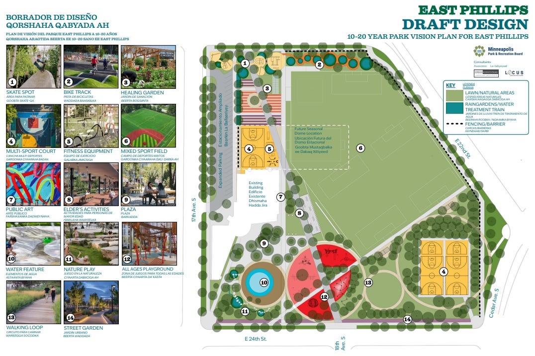
Let’s look at this site plan and renderings as a real-world example. This is a proposed design for East Phillips Park in Minneapolis, Minnesota, and has not yet been built. Here’s a rundown of the problems that stood out to us when reviewing this:
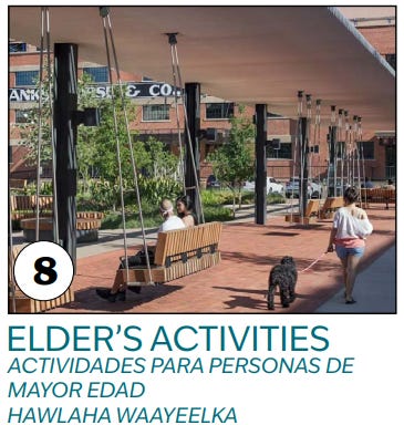
The first thing that caught our attention was this space set aside for “elder’s [sic] activities.” What exactly are elders’ activities? Is this space meant to contain physical objects tailored to older people? Of course, you should consider the needs of older adults when designing a space. But what would make a space good for “elders” but not others? Why would this be something we should even attempt?
In a different type of site, having special seating or other accommodations set aside for older adults or people with disabilities makes sense, but in a park setting, this seems meaningless at best and distorting and exclusionary at worst. What elders want is a space that is inviting, interesting and safe for all kinds of people.
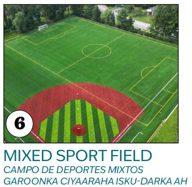
The mixed sports field is a perfect demonstration of how the American conception of sports is overly focused on hyper-organized formats. In other parts of the world, urban recreation happens at a micro scale due to space constraints. Functionally, that creates a richer experience because it’s easier to spontaneously create a game with six people for a micro field versus 22 people for a full-sized soccer field. When you have large fields that only accommodate organized games, it’s so much harder for serendipitous play to happen, especially for kids of younger ages.
Not to mention, it’s so hot playing on a full-sized field in warmer weather, because it’s harder to provide shade!
Moreover, there’s seemingly no barrier wall between the soccer field and the elders’ zone. It’s true that people enjoy watching sports, so it makes sense to set up a place where spectators can watch games, but imagine older adults sitting in close proximity of kids kicking soccer balls around everywhere, with no barrier in between to protect them. That’s a recipe for discomfort and disaster.
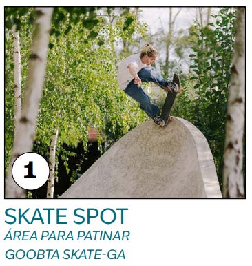
Speaking of safety, you may notice that the skate spot is situated in the uppermost left-hand corner of the park. People familiar with this area will know that there are a lot of safety concerns in this neighborhood: in fact, MNDOT has gone as far as blocking off sidewalk access of some nearby streets because of this.
Therefore, putting young people way out on the edge of the park closest to the least safe areas of the surrounding neighborhood isn’t a great idea. You would need active management of that space to make this work, or, better yet, just concentrate the social activity in the same areas of the park, where youth can be monitored by more “eyes on the street.” (Or in this case, eyes on the space.)
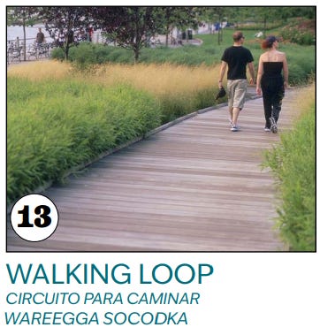
This walking loop is another feature that, frankly, doesn’t make a lot of sense. Why would anyone walk this loop? It’s small and takes you nowhere, and, as we’ve noted in previous posts, the preschool geometry shapes that form this loop are a red flag. It totally contradicts how people actually want to walk.
And what looks like a desire-line path that connects a mid-block intersection to the northwest skatepark is also chopping up the (red circle) play area. Kids will be running around creating conflict with those walking through. Walking around a playground is enjoyable, whereas being forced to bob and weave around kids justifiably not thinking about grown-ups in the way is a recipe for stress and injury.
To get an idea of what we mean, let’s compare this example to Frederick Law Olmsted’s Prospect Park design in Brooklyn. Check out the organic, wiggly, winding design of the park’s paths. It’s all soft shapes and no harsh angles. Not a single straight line in sight.
It follows not only the geography of the land, but also the natural way that people like to walk and interact with a space when changing directions. As the paths curve, you’re getting constantly evolving views of the landscape as you go, whereas on a straight path, your view never changes. That’s fine for a streetscape where there are adjacent buildings and other points of visual interest, but for a park? Yawn. A view that never changes = boring.
The fact of the matter is, people’s behavior is not going to change: you can design a path using angular, unnatural shapes, but they’re still going to walk on whatever path feels most natural and convenient and interesting to them. And that means they’re going to trample all over your greenery and kill it.
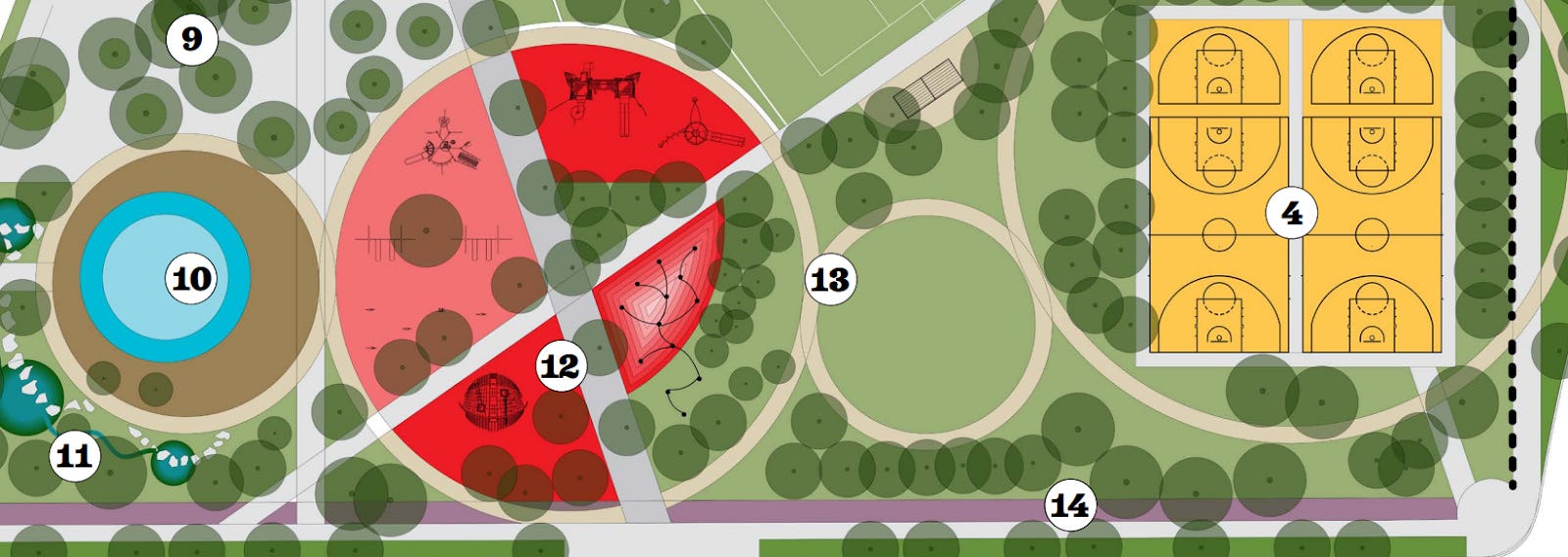
All those little triangular corners of grass between the walking path loops? Dead. Dead. Dead. People will cut across that grass; it’s done for. A good design would take that into account and accommodate the things that people will want to do, instead of fighting human nature (especially since walking is a positive activity that should be encouraged).
While we’re on the topic of greenery that’s not long for this world: this chunk of the walking loop that’s arbitrarily split off by the fencing/barrier?
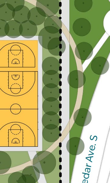
Yeah, that’s also going to become a dirt patch. Because it makes no sense for the fence to bisect the circle around the multi-sport court like this. The circle only exists because it was easy to draw from an aerial perspective, but in reality this inorganic bisected shape doesn’t support what human beings actually want, and thus is not likely going to be used. A cow path will quickly develop on both the court side of the fence and within the eastern arc-ed strip.
We’ve now given you a host of frameworks, questions, and models to translate your desires and intuition into critiques that can demonstrably improve spaces and designs.
So don’t be shy or let the jargon get you down: we end users are counting on you!
If you found this critique of East Phillips Park interesting, then send in a design for us to evaluate in a future blog post. We’ll be taking submissions and will choose one to include as the fourth and final installment of this series. You can submit designs via email to max@musicantgroup.com.
Comments
Nothing yet. Say the first thing.
Sign in to join the conversation.