
This is Part 4 of our series on how to evaluate the designs of public spaces. If you missed Part 3, you can check it out here.
A few weeks back, we put out a call: send us your site plans.
One of you did. And it’s a good one.
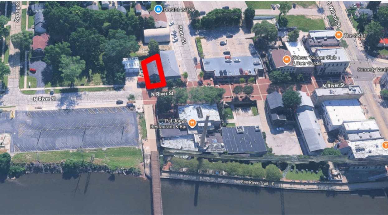
The submission comes from a reader involved with the River Street Plaza - a new public gathering space under development in Batavia, Illinois, on the former site of a former building along their walkable main street. The reader’s note captured the spirit of the place well:
“It started when we wanted to add public bathrooms along a local Woonerf-style street used for public events — our weekly Saturday Farmer’s Market and a popular Thursday night trivia event, among other things. The space is replacing an old shed that’s been demolished, leaving room for a small courtyard plaza.”
Some further context can be found below, with the plaza site in red. The site is the visual gateway for those walking and biking across the Fox River Bridge, and is the northern nexus of district parking and the two main commercial streets.
So let’s get into it.
Before we look at a single design element, let’s ask the foundational question: What are the experiences people actually want to have here?
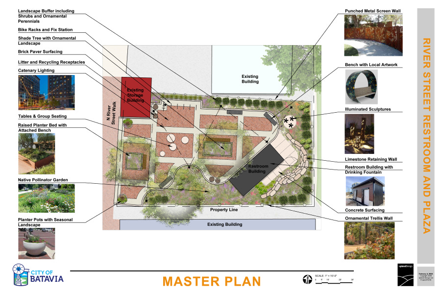
The city’s project website states:
“The plaza design emphasizes accessibility, comfort, and placemaking. Improvements will include accessible paving, landscaped areas, lighting, and site furnishings, along with ample seating to encourage people to linger before and after downtown events.”
So, their defined experiences for the plaza are: linger before and after events and going to the bathroom
I think this plaza can and should do more, let’s expand the desired experiences to include:
A reason to linger in downtown Batavia
Access to a public restroom
A place to sit, eat, and enjoy the outdoors
A venue for small events, or activities nested within larger events
Intergenerational play
That’s a rich and reasonable set of desires. Now let’s ask which ones the current design actually delivers.
A place to sit, eat, enjoy - ✅ Yes. The design includes seating, shade, and string lighting. This is the plaza’s strongest suit.
Access to a restroom - ✅ Yes. The project includes a prefabricated, self-cleaning public restroom with an exterior bottle filler and water fountain.
Small events and activities — ❌ No. As we’ll get into, the design leaves little room for this.
Intergenerational play — ❌ No. There’s nothing here for kids, adults or seniors to do together beyond sitting.
A reason to linger — ⚠️ Partially. You might sit and stay awhile, but you’ll run out of reasons to return unless a large event is happening.
Three of the five desired experiences are either undelivered or only partially met. That gap is what this analysis is about.
Before we get to the red flags, it’s worth naming what we love about this project:
Public bathrooms! We genuinely can’t overstate how important this is. Clean, accessible, self-maintaining public restrooms are a civic amenity that far too many American downtowns lack. This alone makes the plaza a meaningful improvement.
Tree canopy. Shade trees are one of the most powerful tools in the placemaker’s toolkit. It anchors the space, provides relief in hot weather, and creates the kind of natural overhead enclosure that makes people feel psychologically comfortable.
String lighting. Overhead catenary lights do something that very few design elements can: they define a space without over enclosing it. They signal that the space is meant to be used in the evening, which dramatically extends the plaza’s useful hours.
Lush vegetation. The commitment to landscaping, native pollinator plantings, a limestone feature wall, and a decorative trellis reflects genuine care for the place - though we’ll explore how this may not be the best location for the good intentions.
There’s a lot to like here. Which makes the red flags more important to name clearly, because the bones are good.
In our last issue, we introduced three common warning signs to look for in site plans. Let’s run this plaza through them.
The site plan looks orderly and complete from above. But when you lower yourself to eye level and walk through it mentally, a few things become less clear.
The most significant: the restroom’s visibility and approach. The current bathroom placement makes it hard to see from someone arriving from the south - the most natural direction of foot traffic, coming from the main commercial streets - and they navigate around a substantial amount of fixed furniture and plantings before the restroom is even visible. For a returning regular, this is a minor inconvenience. For a first-time visitor who just needs to find a bathroom? It’s a frustrating and confusing experience.
The good news: paths in this plaza aren’t full of harsh angles or awkward turns. Movement through the space feels natural. But the destination most people will be seeking - the bathroom - is underserved by its current orientation.
This is where the plaza genuinely shines.
The combination of a small footprint, a central shade tree, overhead string lights, limestone wall, trellis, and perimeter plantings creates what we’ve called the “Goldilocks Zone” - a space that feels contained without feeling closed off. You have something to put your back against. You’re not exposed in the middle of an empty plaza. The scale is right.
Ding. Ding. Ding.
This is where we found the core problem.
Given the plaza’s delightfully small size, the design dedicates a substantial portion of its surface area to two large, immovable planter/seating boxes positioned at the entrance and in the middle of the space. Add with the size of the border pollinator gardens, and the angled bathroom access zone there is almost no open, flexible floor area remaining.
The result: a plaza that can only be a sitting-and-bathroom destination, and essentially unusable as anything else.
You couldn’t set up a small stage for a concert night. You couldn’t lay out a few yard games for kids during the Farmer’s Market. You couldn’t accommodate a vendor booth, a food cart, or a pop-up activity. The immovable furniture and border planting zones have made these uses impossible, before the community even had a chance to try them.
This is the classic trap of inflexible design, and it’s especially acute here because the site is small. Every square foot counts. Right now, too many of them are spoken for by permanent objects.
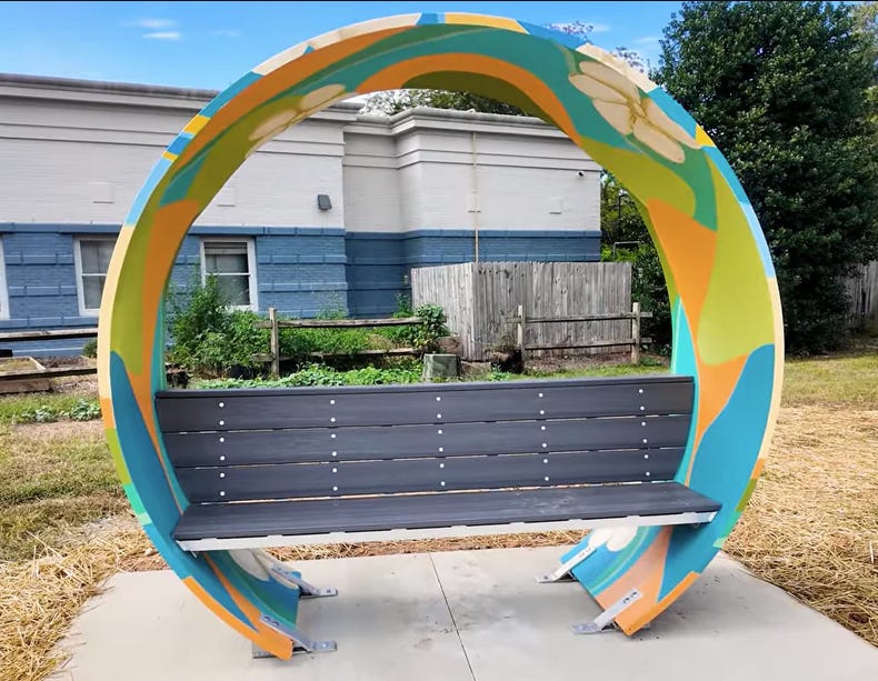
A note on the art bench: We love the idea of public art in this plaza. But when sculptural elements are merged with seating, they almost always compromise both. The art becomes hard to appreciate and the seating becomes uncomfortable or awkward.
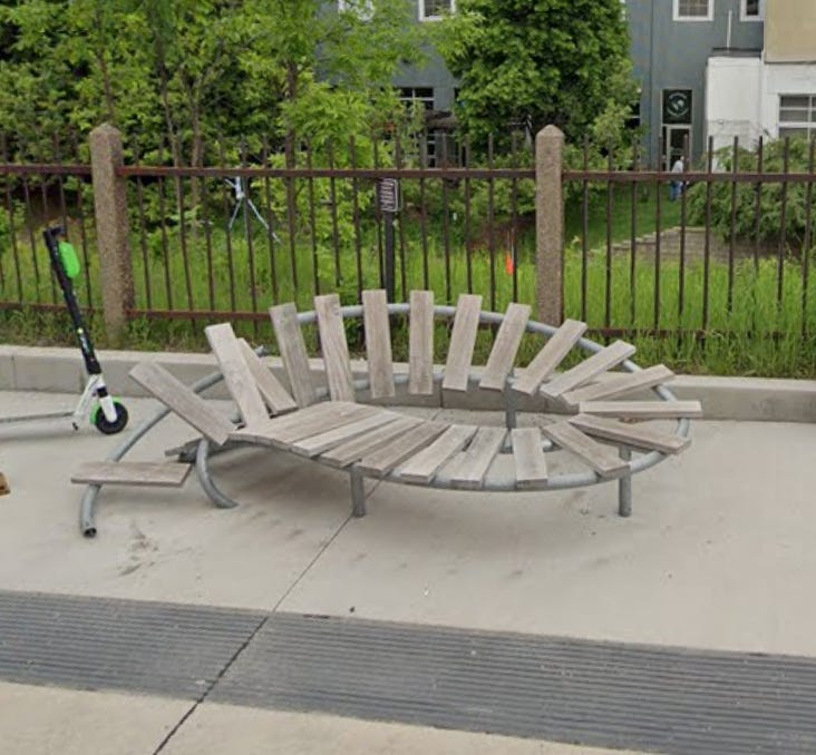
Without having personally tried these benches - though they look great - our recommendation is to separate them and reimagine the arch as a threshold - a gateway that people pass through to enter the plaza. People have a primal love of crossing a threshold. Make the art a passage, not a perch.
When offering design feedback, we always try to anchor suggestions back to the experiences the community has already agreed it wants. This keeps the conversation on shared ground. No one has to feel like they “lost” - we’re all just trying to get to the experiences we said we wanted.
Here are five specific moves that would dramatically improve this plaza:
1. Relocate the restroom to the northeast corner. The current location consumes almost half the plaza’s usable area through its access zone, angled orientation, and surrounding buffer plantings. Moving it to the northeast corner makes it more visible from the south approach, uses the northern edge (where landscaping was already planned) as a natural backdrop, and opens the rest of the plaza for active use. This is the single highest-leverage change.
Update: after sharing the draft of this article with city staff - we heard that the bathroom location was chosen because of where the utility access is. I agree locating the bathroom in the SE corner is the right call given budget tradeoffs and constraints. But, consider moving the facility more into the corner though, to open up more plaza space.
2. Replace the fixed planter boxes with movable furniture. We’ve said in past posts that large, empty central spaces in plazas are a problem. But this plaza is the exception, because it is small. Preserving open floor area here is more valuable than filling it with permanent objects. Swap the fixed planter/seating boxes for movable tables, chairs, and picnic benches that can be reconfigured for events or cleared entirely when something bigger is happening.
3. Right-size the pollinator gardens. This may sound like heresy, but hear me out. Pollinator gardens are wonderful - and there are plenty of locations in Batavia’s downtown where they could be sited in spaces that aren’t as critical to support social use. At the plaza, reducing their footprint (and edging whatever remains with a seating-height ledge) creates more usable space on the south and east sides of the plaza while giving people a place to sit and look into the plantings.
4. Bring in things to do. This is what separates a plaza people visit once from one they return to. Durable, manageable activities like bag toss, a book cart, a toy bin for kids, board games, a ping pong table give people a reason to stay longer and come back. Some of these require a small amount of operations to manage (storing, setting out, putting away). Don’t treat that as an afterthought. Budget for it and assign someone to do it. An un-activated space quickly reverts to a mere passage.
5. Wire it for the future. Install sufficient electrical outlets and water access to support not just the events you’ve planned, but the ones you haven’t imagined yet. A vendor who wants to plug in a heat lamp. A musician with an amplifier. A projector for outdoor movies. The cost of adding outlets now is trivial. The cost of retrofitting them later is not.
Update: city staff shared that the bathroom was fully wired for high amp electrical - nicely done!
Batavia has done something genuinely admirable here. They listened to the community, responded to a long-standing need (bathrooms!), and committed real resources to creating a welcoming gathering place in their downtown. The design shows care: good bones, good atmosphere, a commitment to beauty and nature.
The gap between what this plaza could be and what it’s currently designed to be isn’t large. The biggest change would come from adjusting their vision and goals, from:
Seeing the plaza primarily as a support for large events, to
A place for daily activity and life (in addition to supporting large events)
Small changes can make a big difference.
The experiences Batavia residents and businesses would most benefit from - lingering, playing, gathering, staging small events - are still within reach. The design just needs a few adjustments to amplfy its impact.
Have a site plan you’d like us to evaluate? Send it to max@musicantgroup.com - we’re always looking for real-world examples to dig into.
If you found this useful, share it with someone working on a public space project in your community. The more eyes we have looking for these patterns, the better our places will be.
Comments
Nothing yet. Say the first thing.
Sign in to join the conversation.