RSS Amplifier

Practical Lettering · May 1, 2026

Five New Sign Painter Alphabets

0
Sign in to vote or save

Noah Johnson · Practical Lettering

Earlier this month we wrote about Alf R. Becker, the St. Louis sign painter who spent 27 years producing a hand-lettered alphabet every single month for Signs of the Times magazine. 320 alphabets in total. Five of them are now available as hand-vectorized downloads at PracticalLettering.com.

We vectorized them by hand, pulling each letter from the original Signs of the Times pages and redrawing clean vector paths that hold up at any size. We made minor adjustments to keep scale and strokes consistent. Each letter is drawn separately so you can place and scale freely in your layouts.

No. 210 — Modern Egyptian Bold A carefree brush style with lots of swing, designed for window signs and special sales cards. Upper and lowercase, drawn by Becker in 1949. “By all means, swing that brush!”
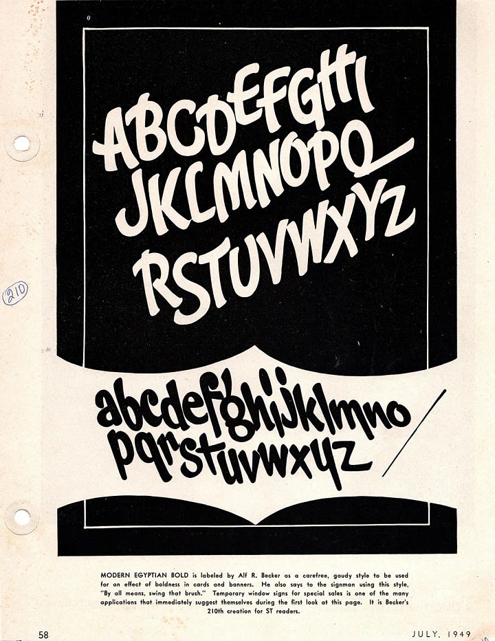
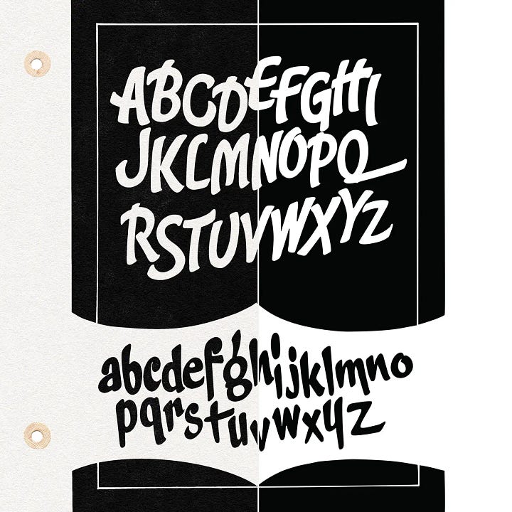
Scanned page from Signs of the Times, July 1949 — Alf R. Becker's Alphabet No. 210, Modern Egyptian Bold, a bold brush-lettered uppercase and lowercase with loose, swinging strokes and rounded forms, printed white on black. Scanned page from Signs of the Times, July 1949 — Alf R. Becker's Alphabet No. 210, Modern Egyptian Bold, a bold brush-lettered uppercase and lowercase with loose, swinging strokes and rounded forms, printed white on black.

No. 55 — Bold Frolic Becker’s own name for it. Designed for theater, attractions, dances, anywhere you need bold, playful letterforms with personality.
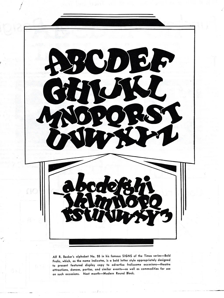
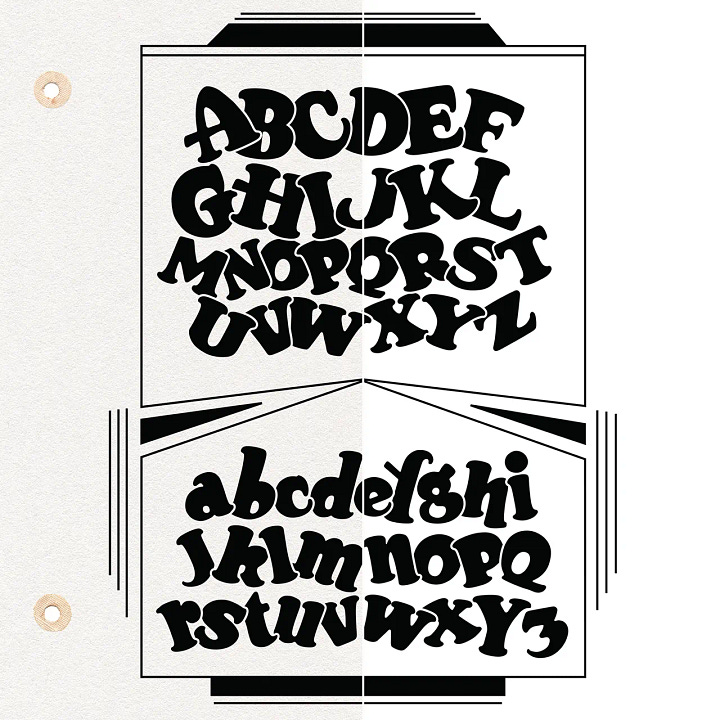
Scanned page from Signs of the Times — Alf R. Becker's Alphabet No. 55, Bold Frolic, a chunky, exuberant uppercase and lowercase with rounded, tumbling letterforms and playful, irregular weight distribution. Scanned page from Signs of the Times — Alf R. Becker's Alphabet No. 55, Bold Frolic, a chunky, exuberant uppercase and lowercase with rounded, tumbling letterforms and playful, irregular weight distribution.

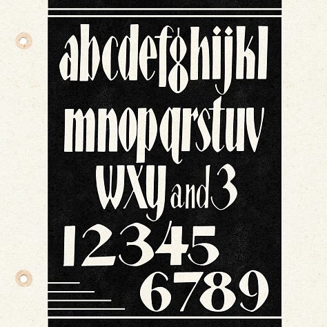
No. 41 — Extreme Modern Sans Serif Becker described this as an “Extreme Modern Sans Serif”, a thin-stroke Art Deco alphabet suited for delicate display work.
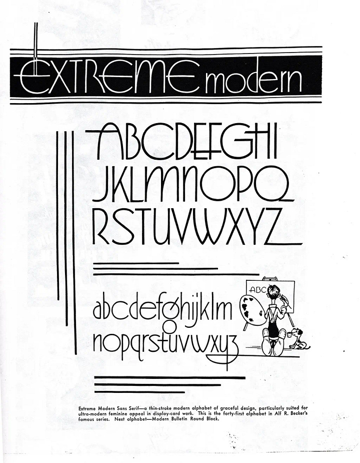
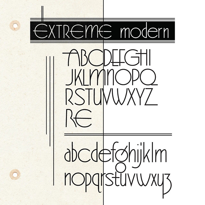
Scanned page from Signs of the Times — Alf R. Becker's Alphabet No. 41, Extreme Modern Sans Serif, a tall, thin-stroke Art Deco uppercase and lowercase with geometric proportions and refined, minimal detailing. Scanned page from Signs of the Times — Alf R. Becker's Alphabet No. 41, Extreme Modern Sans Serif, a tall, thin-stroke Art Deco uppercase and lowercase with geometric proportions and refined, minimal detailing.

No. 37 — Modern Egyptian Thick & Thin A modern thick-and-thin drawn for poster and display-card lettering. The contrast between strokes gives it a formality that works across a wide range of applications.
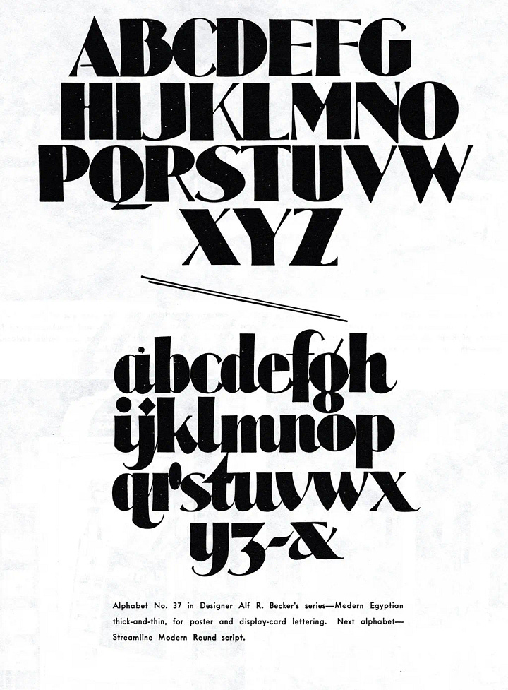
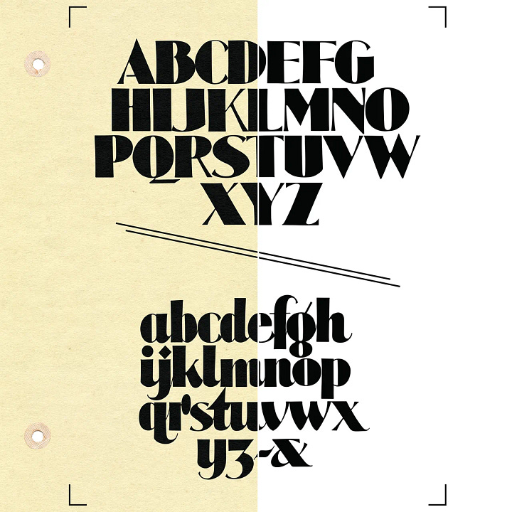
Scanned page from Signs of the Times — Alf R. Becker's Alphabet No. 37, a modern thick-and-thin uppercase and lowercase with strong stroke contrast, drawn for poster and display-card lettering. Scanned page from Signs of the Times — Alf R. Becker's Alphabet No. 37, a modern thick-and-thin uppercase and lowercase with strong stroke contrast, drawn for poster and display-card lettering.

No. 137 An Art Deco style upper and lowercase drawn by Becker in 1943, suited for posters and display work. Decorative, confident, and unmistakably of its era. This one is making its debut here, it didn't appear in our Becker retrospective.
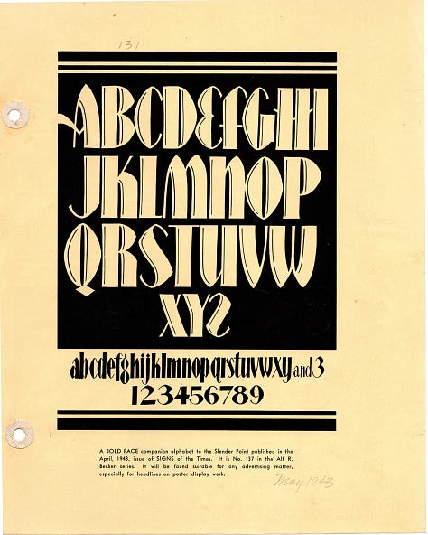
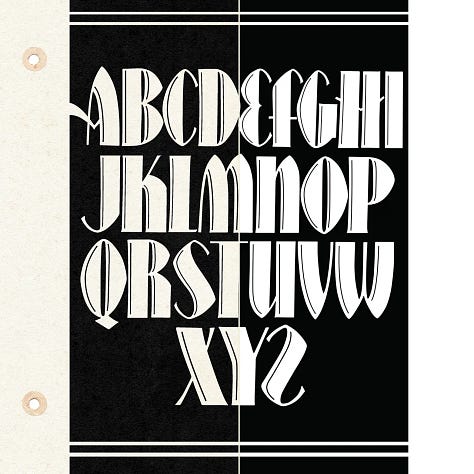
Scanned page from Signs of the Times, 1943 — Alf R. Becker's Alphabet No. 137, an Art Deco uppercase and lowercase with clean, confident letterforms suited for poster and display work. Scanned page from Signs of the Times, 1943 — Alf R. Becker's Alphabet No. 137, an Art Deco uppercase and lowercase with clean, confident letterforms suited for poster and display work. Scanned page from Signs of the Times, 1943 — Alf R. Becker's Alphabet No. 137, an Art Deco uppercase and lowercase with clean, confident letterforms suited for poster and display work.

Each download includes .ai, .pdf, and .eps files, compatible with Adobe Illustrator, Photoshop, Affinity Designer, and similar software.

These aren’t fonts, they’re vector graphic files, which means you work with individual letters rather than typing them out. It’s a different workflow, but one that gives you more control over spacing, sizing, and composition. You can find them at PracticalLettering.com

As always, paid subscribers get the alphabets for free!

No posts

Read the original on practicallettering.substack.com

Comments

Nothing yet. Say the first thing.

    Sign in to join the conversation.