
Hi. Welcome back.
Or if it’s your first time here, I’m so grateful that you are.
As March wraps up, I realize I’ve been thinking a lot about white space — on slides and in life.
And honestly, it feels like it’s showing up everywhere right now.
On the red carpet.
In design trends.
In the extra daylight.
Out in nature.
And even in my work.
Last year, Pantone named Pantone 11-4201 Cloud Dancer the color of the year — a soft, almost-white.
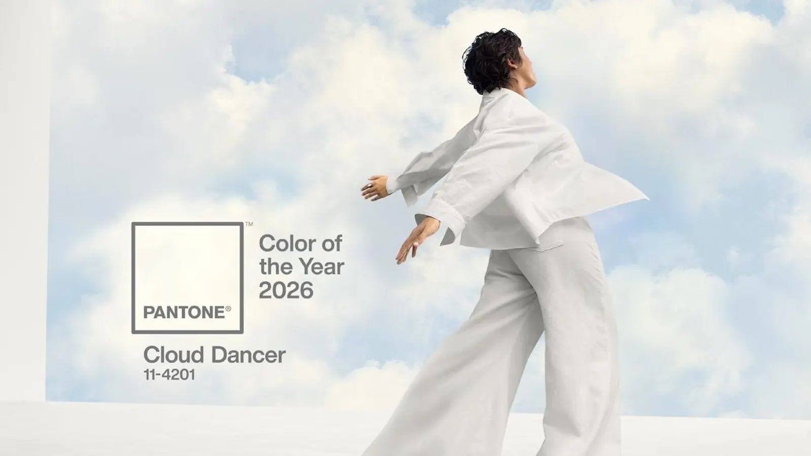
I loved it right away. Still do.
But not everyone felt the same.
Some people saw nothing.
Too safe. Too quiet. Underwhelming.
Like… you had the whole rainbow — and chose this?
I saw possibility.
Softness. Grace. Space. Connection.
A sense of calm. A fresh start.
Of course it was easy to see it show up in my slide design - especially since its one of my favorite ways to bring clarity into a visual story. But lately… it’s felt like something more.
A reminder to make room. To pause.
To breathe.
I had a client reach out recently who knew they didn’t have the bandwidth to tackle their deck — so instead of pushing through, she asked for help.
She created space.
Because white space doesn’t only force clarity — it makes you choose what actually matters, with intention.
And that’s not just true on a slide.
It’s true in how we work … and how we live.
Thats why this month, I’m thinking (& sharing) about how a little less might actually give us a lot more.
I hope this inspires you to think about your own white space — and where you might create a little more of it. ✨
with gratitude,
emily
Tips & Trends

It might sound counterintuitive, but breaking your content into smaller moments makes a big difference.
Instead of layering multiple ideas onto one slide, try focusing each slide on a single visual — or a visual paired with just a few words. It helps your audience stay focused on what you’re saying, rather than trying to read and listen at the same time.
There’s also a natural rhythm that happens when you move between slides. Each new slide acts as a visual cue — signaling a new idea and helping your audience stay with you as the story unfolds.
White space isn’t just about how a slide looks. It’s about how it feels to follow.
And often, a little more space across more slides creates a much clearer, more engaging experience overall. ✨
What’s On My Mind
We talk a lot about creating white space in slides — to help people focus, breathe, and follow the story.
But outside of slide design and work, I’ve been looking for more space too.
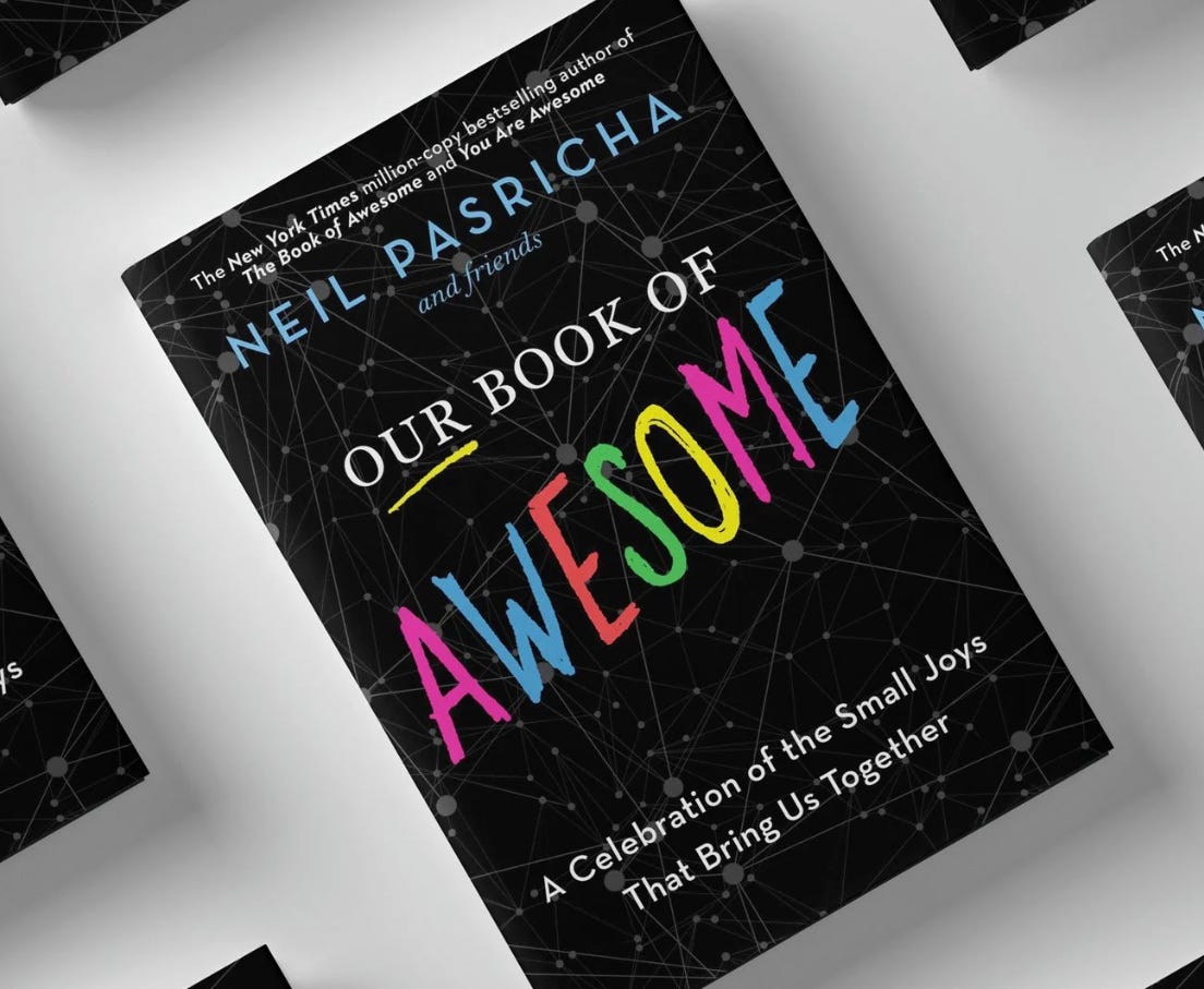
I’m a curious reader, and lately I’ve been picking up Our Book of Awesome by Neil Pasricha — a quick, easy read, even just a page at a time.
It’s full of simple, everyday moments. The kind we all experience but don’t always stop to notice. And it always comes back to this: the best moments aren’t big or planned … they’re the small ones we actually notice.
This week, that’s looked like getting out to dinner.
The car ride.
The music.
The laughter around the table.
Because I realized — I could spend that time cooking…
or I could spend it with them.
And right now, that feels like the best way to find some white space.
Not more time…
just a different choice with the time I have.
Curious… what would it look like to adjust your time just a little to make space for more of those small, awesome moments? ✨
—
And if you’re thinking about how to create more clarity and space in your presentations, too — that’s exactly the work I love to do.
No posts
Comments
Nothing yet. Say the first thing.
Sign in to join the conversation.