
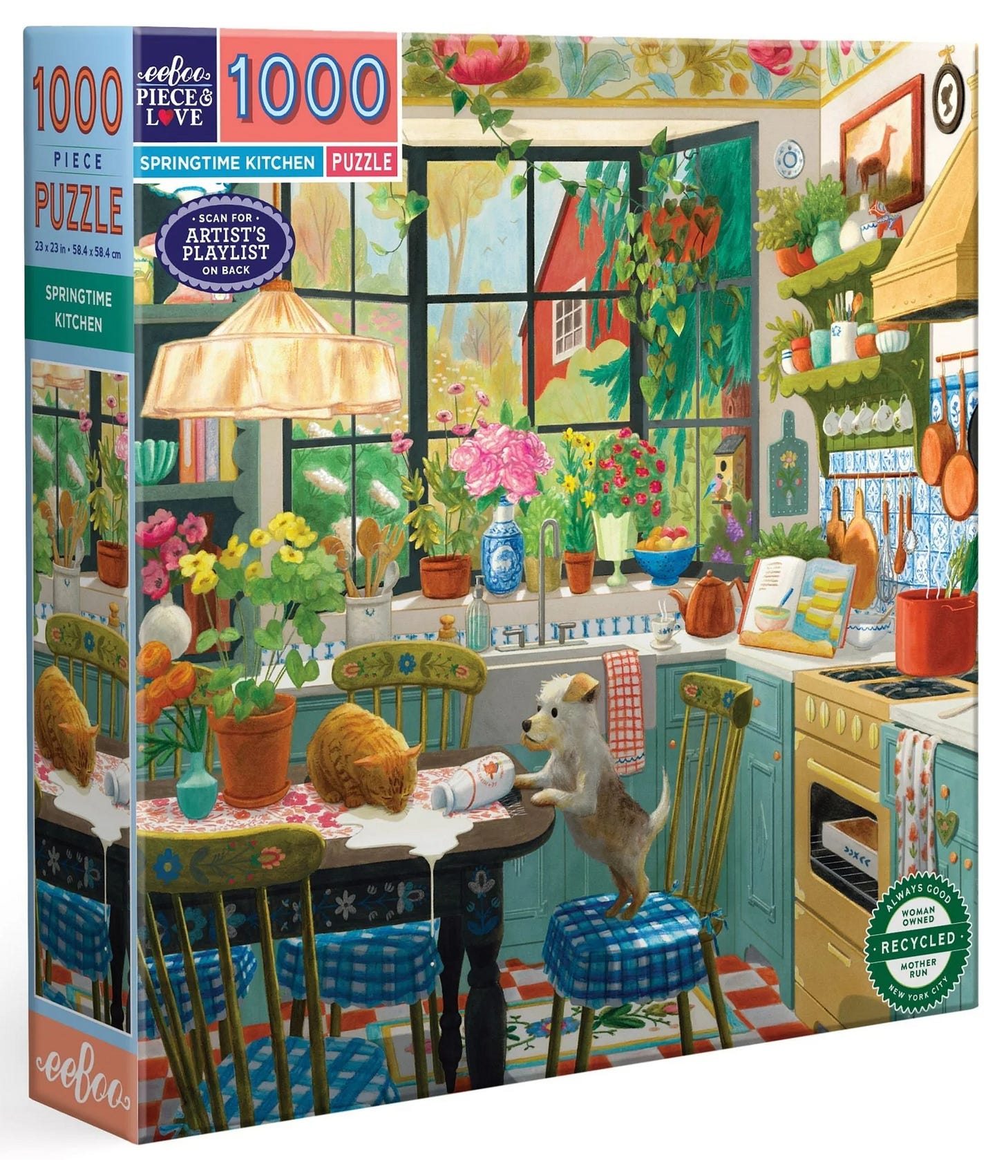
As you can imagine, I was thrilled when eeBoo contacted me back in 2023 about doing a puzzle with them. I see their puzzles everywhere and I’m always drawn to the gorgeous art. I know quite a few illustrators who work with them, so I always look to see if I recognize anyone. And now I might get to find my art right alongside them one day!
eeBoo asked me if I could illustrate a puzzle for their popular Kitchens series. It just came out, so I thought I’d share the process. This wasn’t my first puzzle, but it was the first time I got to work with a team that was so experienced and knowledgeable about designing puzzles, so I learned a lot while working on it.
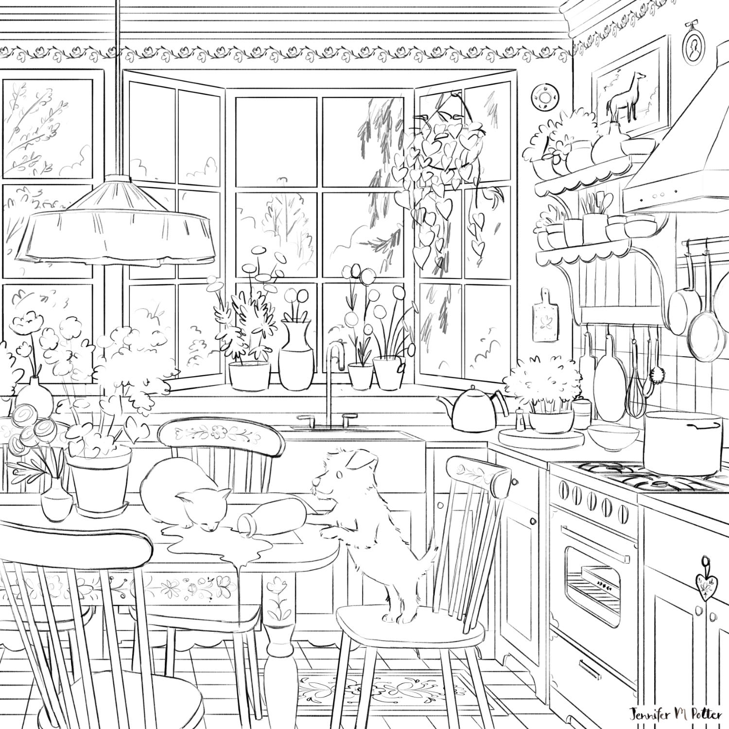
eeBoo gave me some initial direction, and here’s the rough I came back with.
Can you see my mistake?
Anyone who’s done a puzzle before will spot it right off the bat. That top border is a puzzle nightmare!

Y’all know that I do a lot with lighting, and my thought was that the subtle variation in shade would ensure no one mistook one piece for another, but eeBoo encouraged me to think about the customer’s experience when putting the puzzle together. A whole border of similar pieces could come across as tedious. They encouraged me to create something with discrete colors and shapes that connected more obviously. They encouraged me to design in zones.
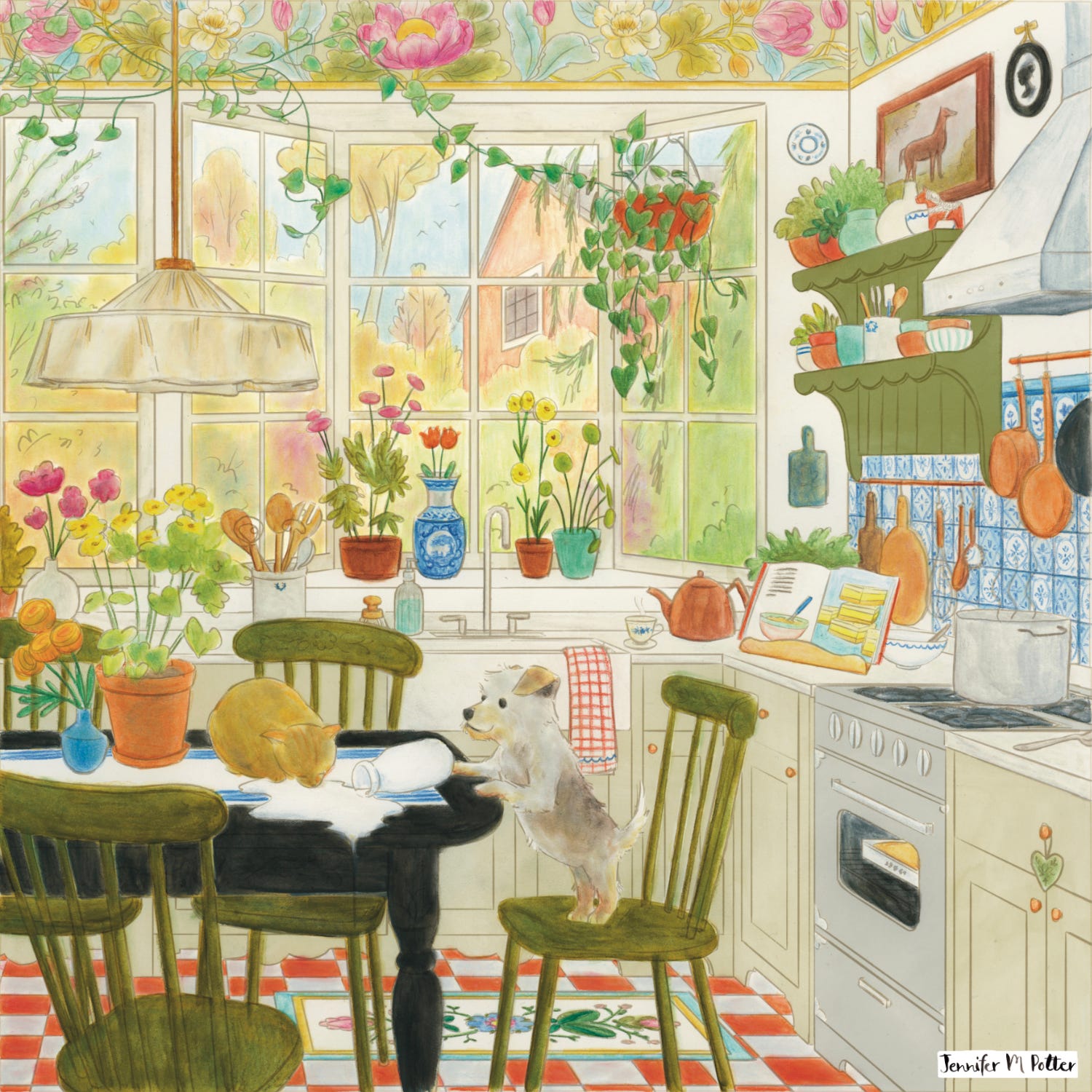
I took out the crown molding and replaced it with a much bigger, more varied border. I also ran the leaves of the hanging plant along the top of the window and left side of the border to create a zone of connected leaves.
I also added in some rough color. Here you can see my natural instinct to distinguish the inside and outside via different exposures. I also kept the cabinetry light to help distinguish the foreground from the midground.
This was a good start, but eeBoo’s style is pretty bright, and they asked me to bump up the saturation, inside and out. There were also a few spots that needed more detail, and they wanted to break up the large picture window with a shelf so we could add another zone and more objects.
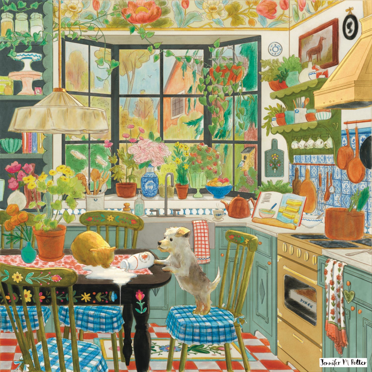
Brighter colors, more detail. eeBoo approved the changes, so it was time to light everything.
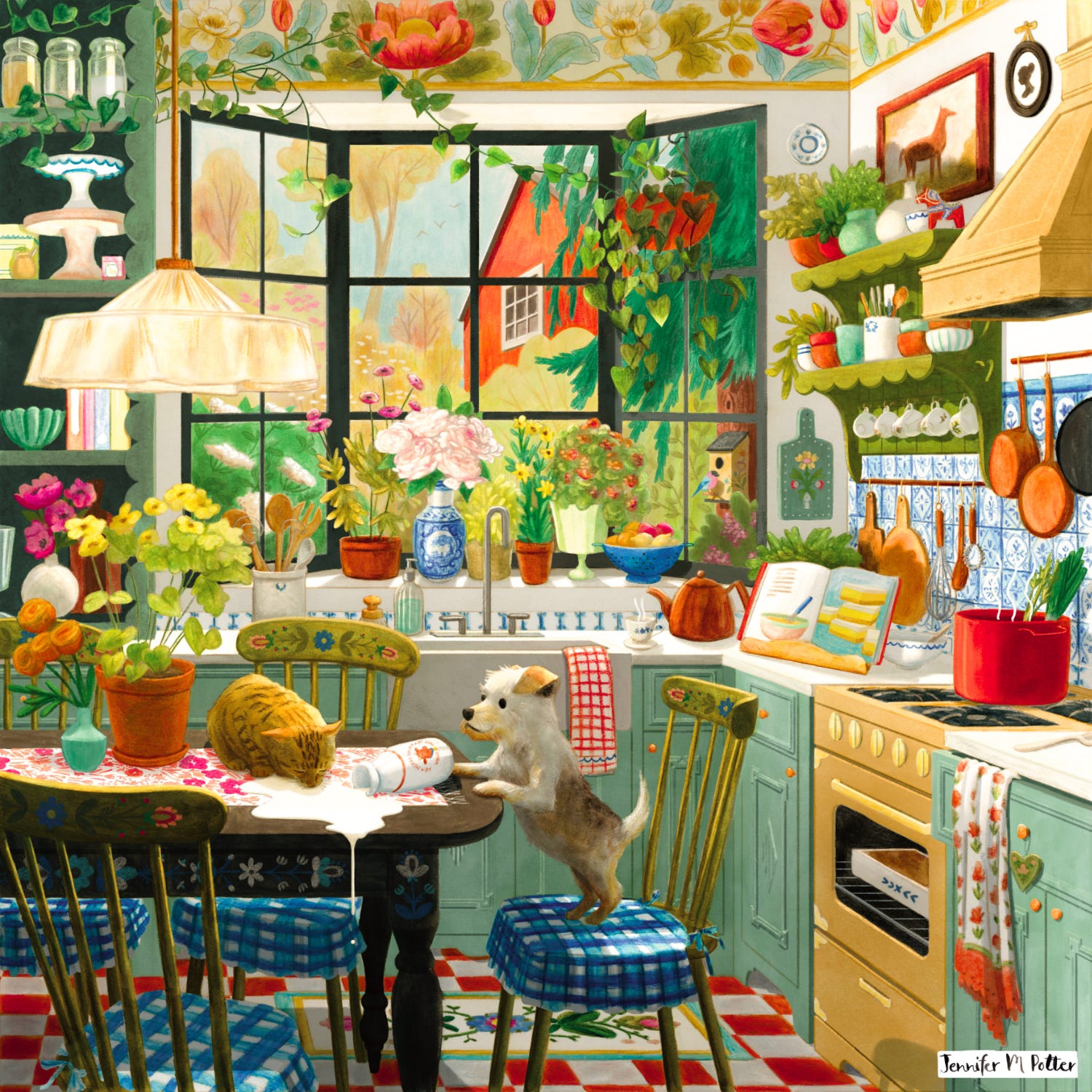
I tightened up the paint and added light and shadow. Only .0000043 people are going to care about (or even notice) this, but it’s a little weird for me to have direct light shining through the window on the surfaces, and not have the window be completely blown out. It’s also strange to include a bright hanging lamp in that situation.
But I know I can be too literal, and sometimes you need to make sacrifices based on what’s right for the product. Would an overexposed background be as striking or as fun to put together as a vibrant, colorful one? Probably not.
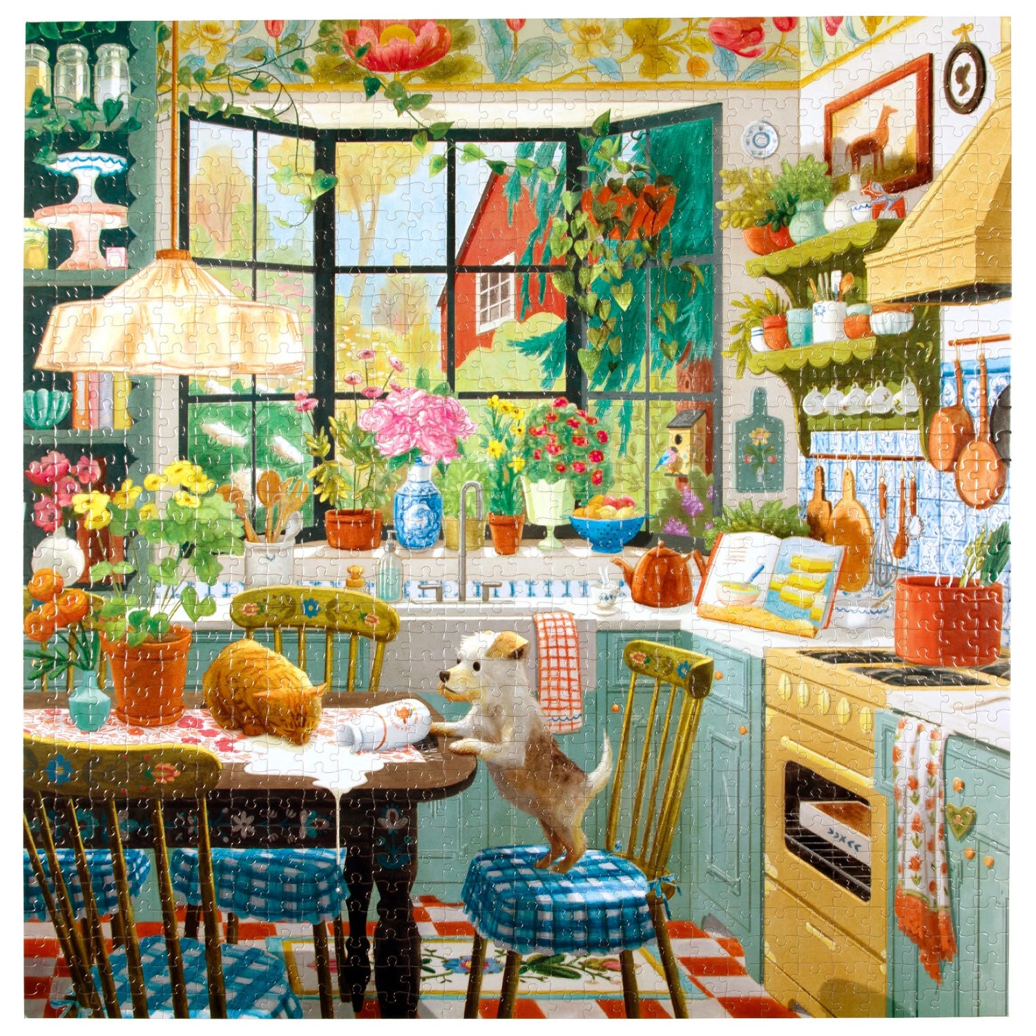
Here’s the mockup eeBoo made for their site. I’m really happy with how it came out! It definitely (appropriately) feels a little more decorative than my typical kidlit style, but I can still imagine how fun it would be to pore over a spread like this, so it doesn’t stray too far. Plus, it looks good in their catalog and sits nicely along with their other products, which is important. I hope they get a lot of orders! Let me know if you see it any shops!
Next week I’ll talk about the actual product and share my key takeaways. See you then!

Last week I shared a post entitled Do it Anyway which was inspired by my friend Louise’s experience choosing the concept of delulu as her word of the year for 2024. Louise has written a post about her experience first-hand and talks about the benefits in depth:

There’s an Instagram-like client for Bluesky currently in development called Flashes. I like the idea, but I’m not sure it will be the answer to all my prayers.
I was an early adopter of Bluesky. I got on the waiting list before it was launched because I like the idea of a decentralized, open-source social media platform. For that reason, I still support it, but I’ve never really been able to get into it. It’s too much like Twitter, meaning there’s too much text.
Which is a silly thing to say as I type over here on this very text-heavy platform, but it’s different. Substack is slower, more meaningful. When it comes to feed full of lots of little things all vying for my attention, I guess I prefer it to be more visual. I can make quicker decisions about what’s worth my attention.
Flashes will repackage Bluesky so it looks more visual, which might be all it takes for me to get into it. Then again, it may be less about the look, and more about the content. People participate on Bluesky (and Twitter) differently than Instagram. The conversation is more active, more fast-paced. Every time I take a peek it feels like I’ve missed the moment. There’s a timeliness to it that seems to require consistent presence, and I just don’t want to be that present on social media these days. I have too much I want to accomplish offline. Give me the digest please.
But if others like me find that a new client allows them to engage in a different way, then maybe it’ll work. Maybe it will actually replace Instagram. I’m certainly open.

No posts
Comments
Nothing yet. Say the first thing.
Sign in to join the conversation.