
I started writing a white paper on the use of different color temperatures on the stage and would have in due course mentioned the Kruithof curve, which I will define later. That curve had become paradigmatic for how those implementing lighting, whether theatrical LDs or architectural installers, choose the color temperature and brightness of their lights. However, recent decades have challenged the claims of the Kruithof curve and particularly the methodology of its construction. While academic and scientific communities have turned their backs on what had been axiomatic for several decades, the assumption of the Kruithof curve in theatrical and architectural communities has not been diminished. Those academic challenges, however, fail to point out that setting a standard for correlating color temperature and intensity was not Kruithof’s original intent. Also, the critics decry the non-scientific and imprecise methodology used to develop the curve without mentioning that Kruithof was not attempting a scientific endeavor in developing the curve. And even if the Kruithof curve can be shown to be inaccurate, or even empirically meaningless, whether in Kruithof’s original intent or how it had been appropriated, perhaps too seriously, by those implementing lighting solutions, such a confutation may be of little value to what is admittedly a subjective experience of synthetic approximations of a natural phenomenon.
I will elsewhere write that fuller discussion of color temperature and its uses in stage lighting, which necessarily refers to the Kruithof curve. Whether that curve should form an empirical bedrock to our decision making regarding color temperature is debated and must here be addressed first. In short, the Kruithof curve is a judgment of the pleasantness of the correlation of the color temperature and intensity of illumination. I say, “Of illumination,” here rather than, “Of a light source,” because we are less concerned with the light coming from a source than with the light that falls on the illuminated area or subject. In a 1941 article in the Philips Technical Review, an internal trade publication of the Philips industrial conglomerate that to this day pushes advancement in many areas of lighting, A. A. Kruithof, one of their engineers, described the advancement in manipulating the spectral output of Philips’ version of what we now know of as fluorescent lighting. Kruithof called them, “Tubular Luminescence Lamps,” with “luminescence” being the term used instead of today’s more familiar “fluorescence.” The product was called the “Gloeilampen,” which is a name I love. Dutch is cute German.
In the midst of writing about that spectral manipulation, Kruithof created a graph that had intensity as its Y axis and color temperature as its X axis. He then plotted points on that graph correlating different color temperatures and intensity combinations, labelling a range of correlations as, “pleasing.”
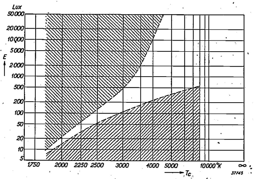
In the above graph, the unshaded area is what Kruithof determined to be pleasing. Relatively dim lighting with high color temperatures–lighting that falls in the lower right shaded portion of the graph–were deemed dim or cold. The upper right shaded portion, representing lighting that was bright relative to its lower color temperature, was deemed unnatural in its color rendering and unpleasant. Although Kruithof himself does not point this out, that area representing “pleasant” lighting follows roughly the natural curve of black body radiation.
The suggestion is that when choosing a lighting source one should account for this correlation and choose a light source that illuminates within the pleasing range. If one wants a brighter room for working spaces, one should choose a higher color temperature source. Conversely, if one wants a warm atmosphere, one should not light it too brightly. This has been the dictum for architectural installs and theatrical design alike since the mid-twentieth century. Note that theatrical and entertainment designers will take on many other considerations, e.g. a moonlight scene that is necessarily both cool and dim.
Perhaps the foremost objection to this curve is that it is not reliable, not having been developed with a repeatable, objective method. Steve Fotios wrote, “The absence of detail is such that the article would be unlikely to pass through peer review. Given that we are unable to determine what was done and how the findings, which are not reported, were used to produce the graph, it is ill advised to place any weight in the alleged relationship between CCT and illuminance.” (2017, 4). Fotios, aptly named, goes on to list similar objections found in the literature. That there is such a number of follow up studies to Kruithof’s conclusion is evidence that this matter has been taken very seriously. However, these studies seem to have taken this effect more seriously than Kruithof would ever have intended.
Firstly, Kruithof’s paper was not primarily, or even secondarily, concerned with proving any correlation between the relative brightness and color temperature of a light to its perceived pleasantness. The article was about how manipulating the phosphors used in the tubular luminescence lamps would affect the color of the light. He gave a range of colors through which the Planckian locus traversed, allowing for color temperatures of 2650 K to 10,000 K. The whole system was not too unlike modern RGB color mixing systems, although with far less saturation. Since Kruithof was primarily concerned with general illumination, the various whites were the focus of the paper.
Knowing that the color or color temperature of the lamps could be manipulated allowed for various applications calling for particular spectral distributions. To make that turn in the paper, Kruithof asked the question, “How can we make the best use of the great freedom in the choice of colour of the luminescence lamps?” (1941, 69) He’s asking for criteria as to why one might choose one phosphor combination and its resultant color over another. This is where he, in slightly more than half a page, half of which is the graph itself, introduces his curve and its methodology. That’s it. It’s part of a bridge that connects the theory to application.
Further, the curve is not the entirety of the bridge. He goes on to say that the further limitation of matching existing lighting must follow the application of the graph. He goes on to say that one must also consider the color rendering provided by staying close to white (again, he is writing of general illumination where colored lighting would be less than ideal) and that a final consideration would be the idea of color temperature loses meaning if one strays too far from the Planckian locus. So, not only is this curve not Kruithof’s purpose in bringing up the topic and it is only a bridge to move from theory to application, it is not even the entirety of that bridge. The paper continues with examples of various applications. So he’s really giving an example of criteria by which one would choose a certain combination of phosphors along with other manipulations, such as Philiphane glass, which was an early version of what we would today call a CTB filter.
Since this curve merely bridges theory to application, like choosing a random number to plug into an equation to make sure the math is correct, Kruithof himself did not expend considerable energy on developing it. He never aspired for a scientific process here. Summarily, his process was he and a lab mate turning on some lights of various brightness and color temperature in their lab and in his living room. Kruithof went so far as to refer to his “pleasant” zone as having “obviously vague limits” (1941, 69). As if to exaggerate the point, his references to “pleasant” and “unnatural” are written in quotation marks, suggesting that readers ought not take seriously these terms, which exist only for the purposes of getting to the real matter at hand.
Add that this article was published in what amounts to a glorified internal technical bulletin for use within Philips among its own researchers and not a public-facing, peer-reviewed journal. That context should cause us to pause before holding it up to the same standards as academic publications in our own day. At the same time, Kruithof’s curve amounts to little more than a throwaway metric by which to spawn examples of his real goal of showing the effectiveness of different phosphor combinations to achieve specific results with his employer’s latest technical advancements. Yet many in the lighting implementation world have taken it seriously–as have academics. It might not have been Kruithof’s intention to define how color temperature would be experienced by millions, but the fact that others used his metric to do precisely that demands that his results be dealt with, even if his name is cleared of any wrong doing.
One of the earliest scientific efforts to address the issue was that of H. W. Bodman, who used similar methodology to Kruithof but used several hundred participants. While the conclusion appeared on the surface to match those of Kruithof, the researchers recognized another dimension to the puzzle. They attributed the experience of the participants with a newly discovered phenomenon, the Hunt effect, that describes how the saturation levels perceived by the eyes changes with intensity similarly to the more narrowly defined Purkinje effect. A more familiar analogue to this would be how our perception of sound is affected by volume. Different weightings for decibel readings depend on the volume range attributable to the Fletcher-Munson curves. Further, Bodman suspected that older non-incandescent lighting sources might vary in their color rendering. It would be no surprise that participants seeing inadequate spectral power distributions at levels less than the physiological ideal would report those combinations as unpleasant.
We have above described the objection of Fotios, who then launched a summary and collation of previous research to arrive at a revised curve. This meta-study revealed that only brightness resulted in pleasantness while color temperature had no effect. This left the graph, somewhat humorously, lacking one of its dimensions. Essentially we’re left with a line plotted needlessly in two dimensions. Under one point in the line it is unpleasant and over that point is pleasant. Graphing this in two dimensions goes only to show that there is no curve.
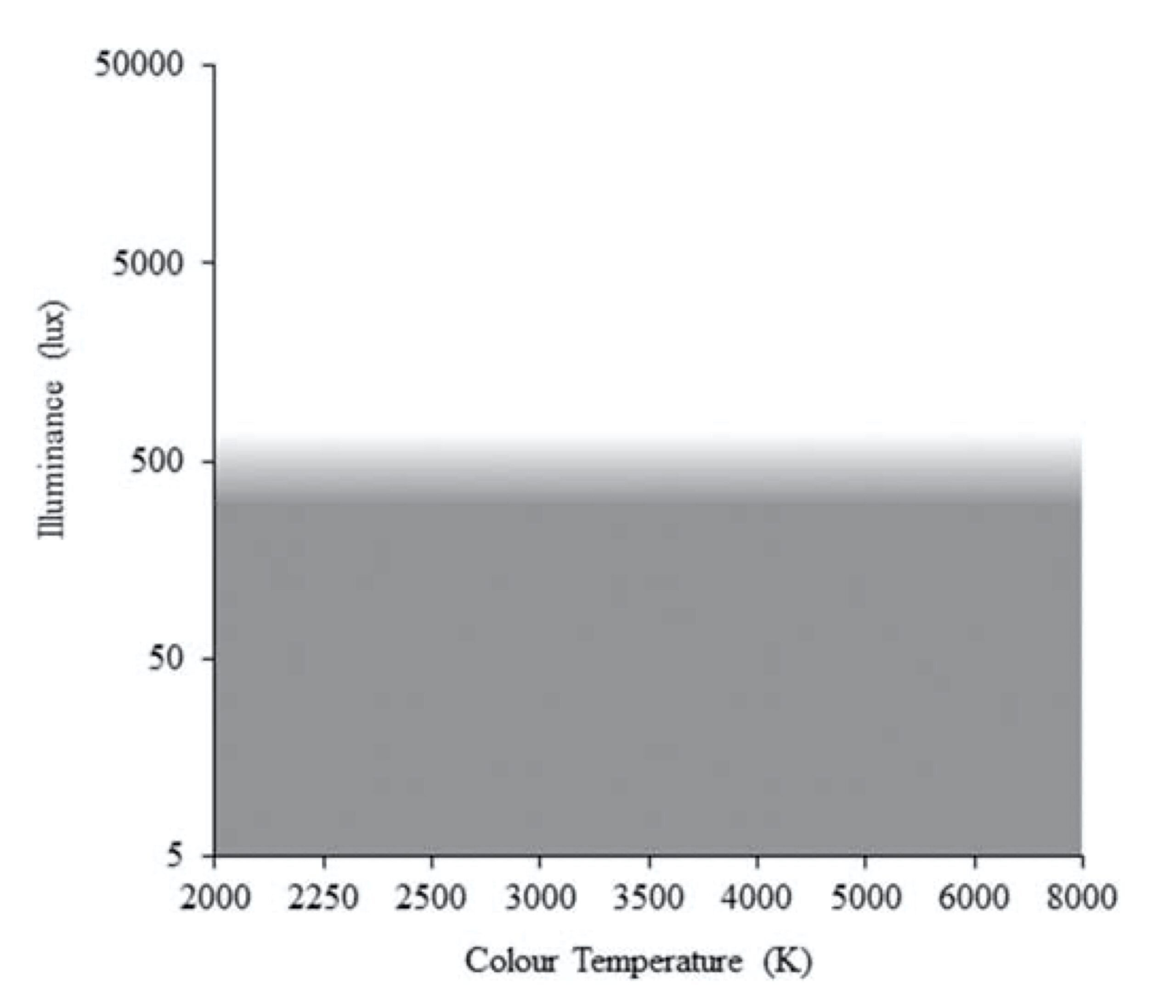
Another industrial researcher, Ian Ashdown, summarized the results, saying, “There is no upper boundary to ‘pleasant’ illumination at any CCT, and the best that can be said about the lower boundary is the obvious: dim lighting can be unpleasant, regardless of the CCT.” (2015, 8). Ashdown concluded that while Kruithof was to be credited for being the first to investigate the matter in his “pilot study,” no appreciable correlation was found and the matter is essentially is at rest.
A first encounter with the graph tends to suggest accuracy and precision. However, the data set is subjective. The lines are fuzzy. At least Fotios in his graph has a nice gradient, which I suppose may have been more difficult to render in Kruithof’s time. Nevertheless, I think the united problem with Kruithof’s critics is that they’ve been attacking the wrong factor. We’re correlating pleasantness, color temperature and intensity and the critics have shown that color temperature has no effect on the other two. However, color temperature should not have been what should have been addressed. Rather, the resultant factor, pleasantness, is what should be addressed.
Originally published as a white paper at phoslites.com
No posts
Comments
Nothing yet. Say the first thing.
Sign in to join the conversation.