
Hello, Chums!
Last time out, I showed the initial creation of our new Sentry 2026 series, taking you from a blank piece of paper to the pitching of an overall story arc. Along the way, I gave a glimpse into how I present an overall theme, and showed you how the first idea is not necessarily the final idea. This week, I want to show you how we get to this:
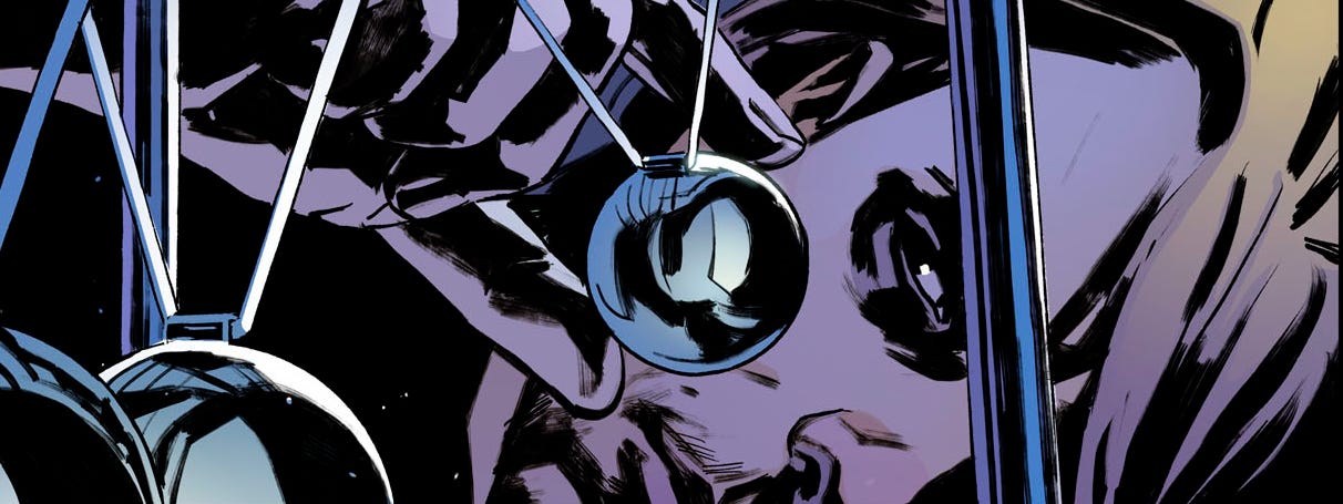
I have a very clear idea of what I want - I write full scripts, and I try to describe things in a “visual” manner. One recurring theme of interactions I have with artists is that they appreciate me for putting myself in their place, trying to understand how they go about their interpretations of my scripts. I have an open line of communication for any artist who wants it, and very often we communicate for the entire duration of the project.
As I begin any issue of a comic, I usually write a preamble - my entire script is a sort of chatty letter to the artist, telling them how I see the themes and the “moments” of each issue. Here’s a section of what I wrote to our artist, Christian Rosado:
“Some of the story will be very “quiet” – there are many moments that move quietly. That’s because our main character, Robert Reynolds, is often overcome by melancholy. Sure, we will have big moments, cool superhero visuals and amazing, fantastical machines. We’ll have the incredible Watchtower, the technology of Reed Richards and Iron Man… all the cool stuff. But we will have many moments that must be allowed to breathe, as a character study. Because this is the story of a person struggling with their mental health, overwhelmed by their depression, dealing with inevitable loss.”
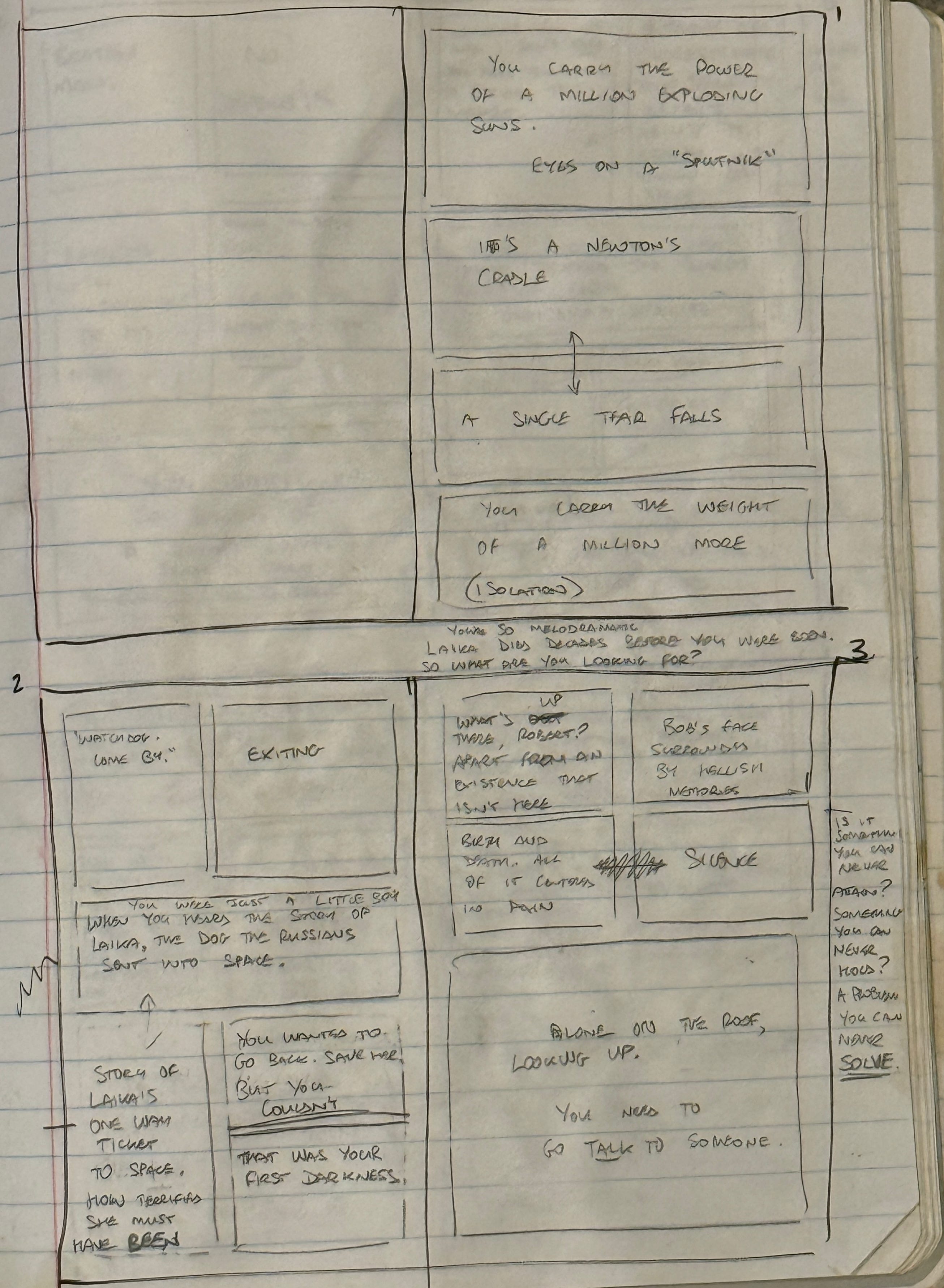
Before we can get to the script, I need to break down my story into scenes, then pages and panels. My notebook for page 1, which you got to see last time, looks like this.
This is going to sound a little daft - perhaps you’ll believe that I overthink my work - but there is a lot of thought that goes into an admittedly ugly layout like this. First of all, I believe that the action of page turning can distance an audience from a scene. Since this will eventually become a collected graphic novel, I know that the monthly ads will be taken out. Therefore, I try to make my scenes end on a right hand side page, if possible. The reader may not know it, but when they turn the page to begin a new scene, that natural break is intentional. Some writers - myself included, on occasion - will create a double-page spread to house information they feel is important to put in the same visual landscape. But since I break my scenes on right-hand pages, it’s not as important for me. Besides, I am not a fan of double page spreads solely to show cool art because the gutter in the middle immediately ruins that art.
You’ll notice there are all sorts of little notes dotted around the page. Not all of them get used. Only the ones that serve the story.
If you have a copy of Sentry #1, you’ll see that yes indeed, scene #1 ends on the right.
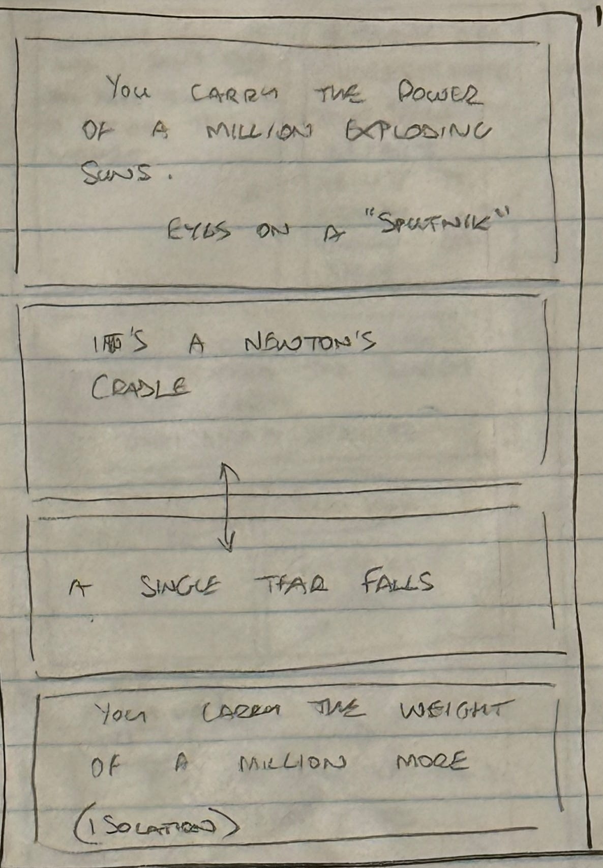
This is the first page. In a moment, we will compare it to the art. But let’s look at what I’m doing here.
First, I believe that every single page should tell its own story. You should be able to look at a page and have it entertain or inform you, minus the context of the entire story. You know where I learned that trick? Well, I was Alan Moore’s editor, after all. Alan once showed me this when we were working on Big Numbers, and I have taken that lesson with me everywhere I go.
For an opening page of a new series, I set myself a couple of tasks:
(1) I want the first line, or the first page, to have immediate impact and to set the tone. I had settled on this: “You carry the power of a million exploding suns. You carry the weight of a million more.” I don’t need to be perfect here, I just need to have an idea for a page that will tell its own story and set the tone. For the printed version, that phrase became, “You are Robert Reynolds, the Sentry. You have the power of a million exploding suns. You carry the weight of a million more.” Why? Because it introduces the name of character to an audience that may now have met him before. Plus, I had a redundancy in there - the word, “carry” was presented twice. This is a much more satisfying line.
(2) You see how I’ve laid out the four panels to be page-wide and of equal size? I believe this simple structure will suggest something cinematic. The aspect ratio of four page-wide panels is similar to what you’d seen in a movie theater. I promise, it’s not meant to be pretentious. It’s meant to be thoughtful. Professional comics artists think like this all the time, and I try to learn from as many of them as I can.
I write myself a few little notes, such as the word ISOLATION at the bottom, to remind me that Robert is alone with his depression. In the first panel, I wanted Robert to be studying a Newton’s Cradle with specific attention paid to the composition and framing. Those little balls, connected to strings, would resemble the Russian Sputnik 1 spacecraft, and this would shout forward to the later scene in which Robert remembers his obsession with space, and with Laika, the space dog.
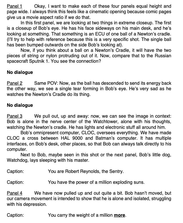
Here’s the actual script to page 1 of Sentry #1. Yup. This is what it looks like, warts and all. I want you to see it in all its glory because this is what Christian sees, and apart from a few emails between us, this is what he must interpret and deliver as a story.
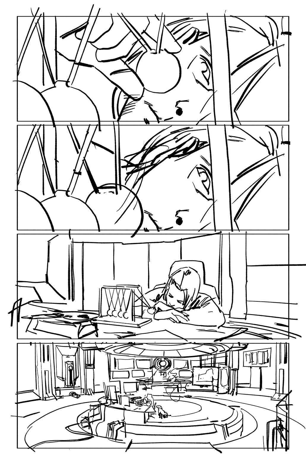
These are the layouts for page 1 of Sentry 2026. This is how Christian sees this page in his mind’s eye, then translates the story and meaning to a page.
First thing I found out about Christian Rosado is that he, like me, prioritizes story as told through his art. His layout was fantastic. The moment is quiet and solemn, and with this, our story would be up and running.
Think of how this works on my end: I am not an artist, but I’m (hopefully) a decent communicator. I try to describe things in a visual manner. So, when the layouts come back I now see the world come to life for the first time. It’s never going to be the series of images, angles and the visual composition I imagined. But this is the trick to doing this professionally. Any director of film will tell you that there are multiple films in one. there’s the one the writer imagined, and the one they wrote. The one the director imagined. The one that was actually shot. The one that morphed and changed because the actors brought their craft to the table. The one that adapted to production issues and new opportunities. The one that was edited. Even the one that was distributed after the studio got their final say.
If I am confident in my work and in my story, I will be able to immediately accept the artist’s contriibution to our story. If I see something that might be a problem - perhaps a misunderstanding about the scene, or a “miss” on the intended emotion of a character - then I can tell Christian at this stage and we can rework it. And remember, it’s not just me looking at this stuff. Mark Paniccia and Lauren Amaro, our editors, may have some notes as well. It takes great communication between us to move things along smoothly. Not for the first time, I want to give our editors props on this. They have a lot to do. Now imagine that they’re dealing with creators who are running late, having to attend a convention or two, internal work stuff, putting in invoices. Trust me, I was an editor for seven years. It is a very difficult job.
But once we have settled on the layouts - hopefully quickly - Christian turns it into something like this:
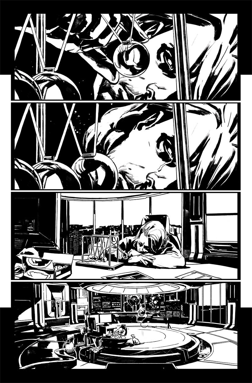
I hope you can appreciate the talent it takes to move from the more storytelling-centric layouts to the gorgeous line art.
Comic artists are like no other. They are co-directors of a story. They must understand not just the composition of an image, but how the eye moves across a page. They must give thought to where our word balloons and captions much be placed. Honestly, so do I throughout the entire process. I care very much about the final output, and I hope this shows on the page. But they not only tell the story, they bring their craft to each and every page.
While Christian is moving onto new pages, a batch of finished black-and-white line art is sent to our colorist, Matt Milla. And after a while, it comes back like this:
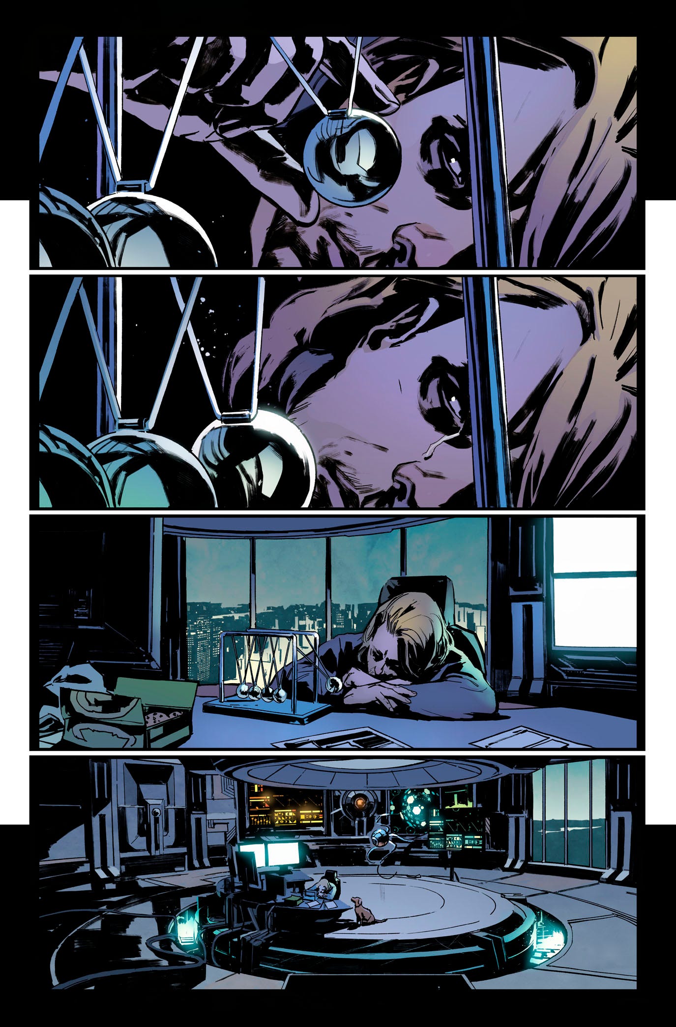
Beautiful limited palette. Moody. Atmospheric. As intended.
Are we finished at this stage? Is the rest of it just a production issue that eventually ends up in a comic store? Nope. Not even close.
Tune in next time, where we will look at how the editorial process - from notes to approvals - is applied. We’ll look at what happens with the lettering, and especially lettering placement.
Until then, I need a nap.
No posts
Comments
Nothing yet. Say the first thing.
Sign in to join the conversation.