

The Outdoor Recreation Archive is the hub for the history of the outdoor industry. We preserve catalogs, magazines, documents, photos, and more from brands, gear innovators, and enthusiasts. This newsletter is a glimpse into our collections and the stories we find. Pull up a chair and flip through the pages of the archive with us.
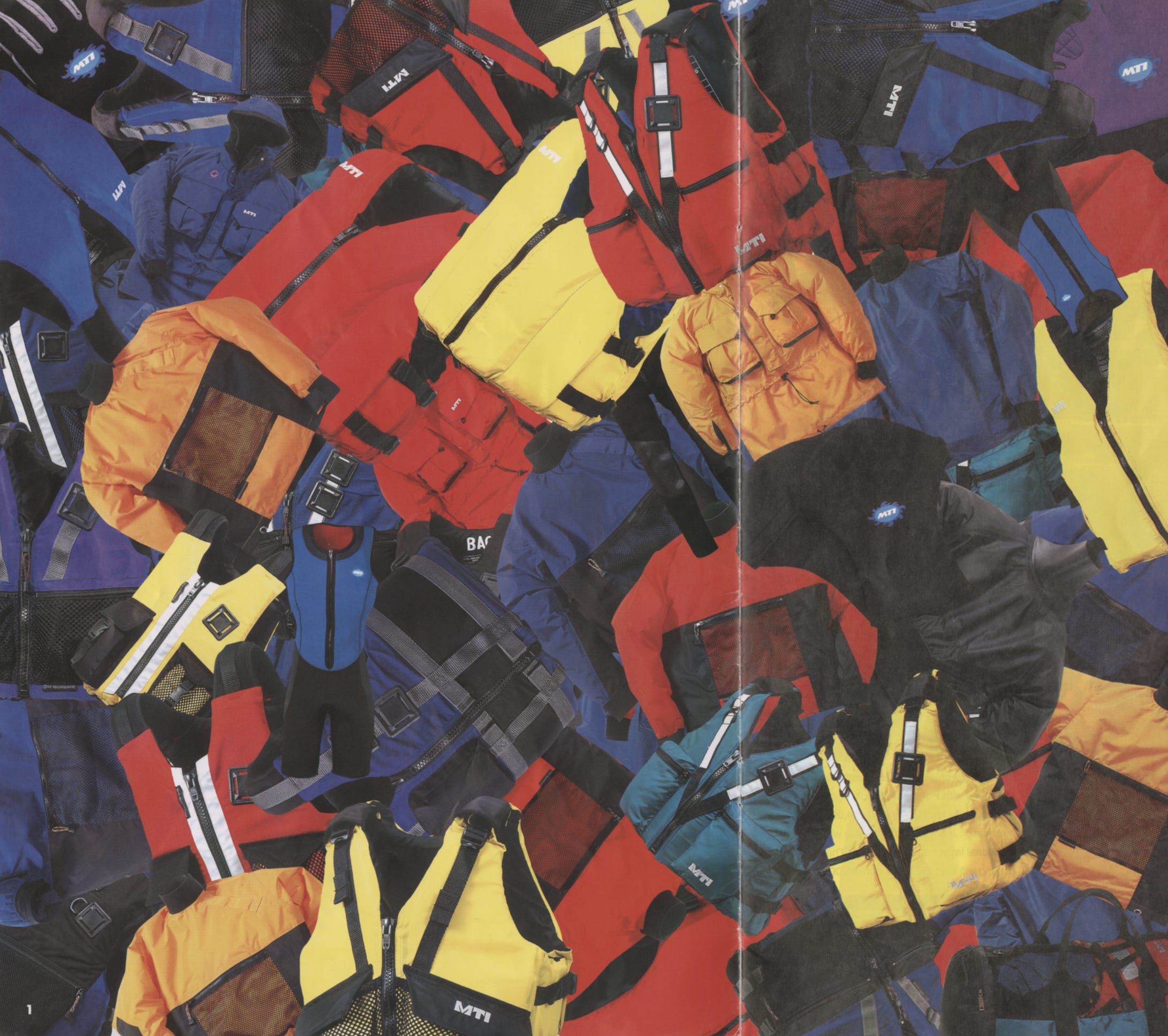
Color in outdoor apparel isn’t just a design choice; it’s a response to risk, culture, and constraint. Color has always played a role in how we experience the outdoors. It provides protection, expresses identity, and results from the realities of production. In the outdoor industry, color consistently appears in three ways: as a tool for safety, an expression of brand and identity, and a reflection of necessity.
Some of the most recognizable colors in outdoor apparel exist for a simple reason: to ensure that people are seen.
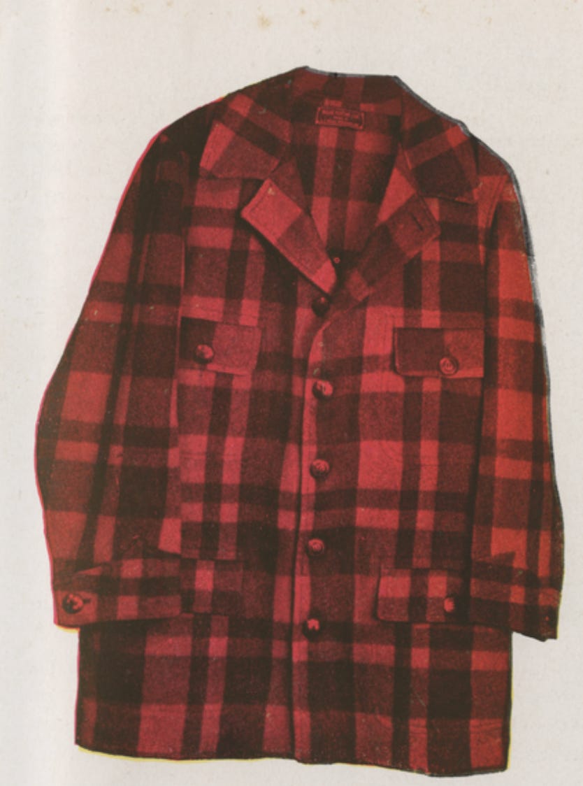
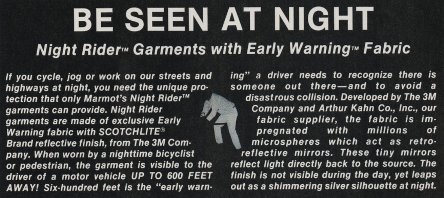
In hunting, manufacturers like LL Bean, Eddie Bauer, and Woolrich introduced what became known as “hunter’s red,” later standardized as “blaze orange”, to reduce accidental shootings by increasing visibility between individuals in the field. What began as a safety intervention became an industry-wide expectation and a shared responsibility.
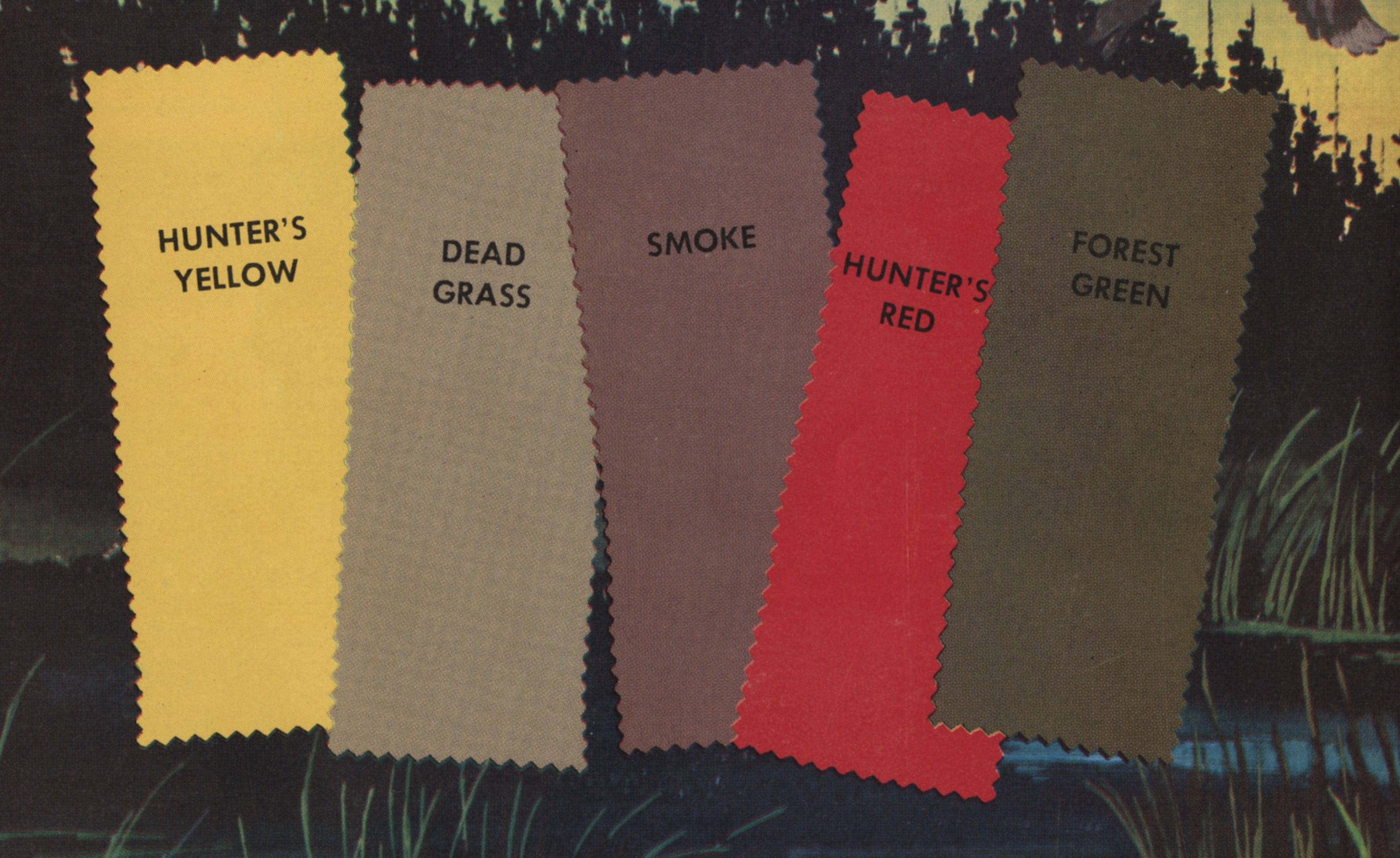
This thinking extended into other outdoor pursuits, where high-visibility colors became common in alpine environments and along roadways. As technology evolved, reflective materials pushed this even further. Products like the Marmot Night Rider integrated reflective materials, including Scotchlite from companies like 3M, directly into garments, allowing wearers to remain visible in low-light and nighttime conditions.
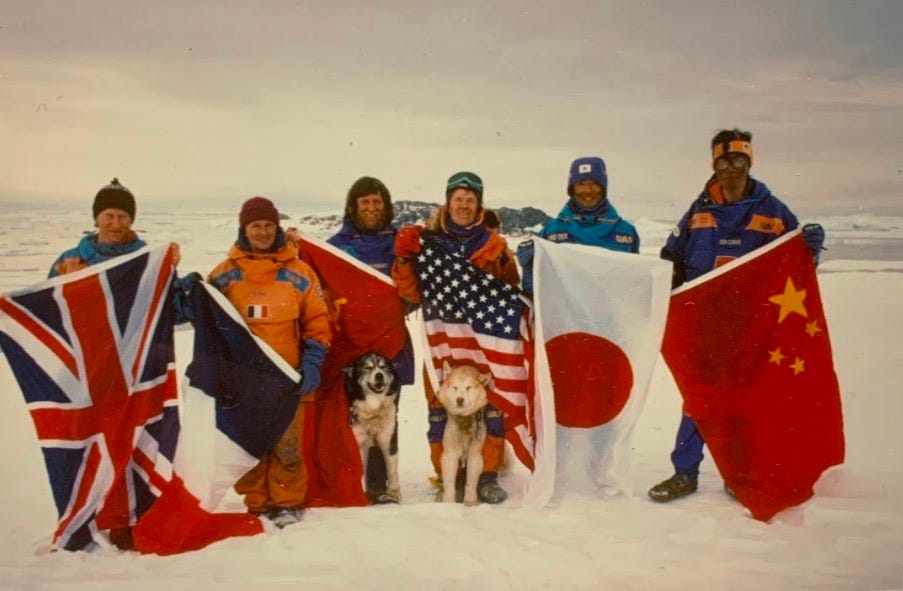
One of the clearest examples of color being used for safety can be seen in the 1990 Trans-Antarctic Expedition. Each team member wore a distinct The North Face Gore-Tex kit in a unique color, allowing individuals to be quickly identified in low-visibility conditions. In an environment defined by whiteout landscapes and extreme exposure, color became a critical tool for maintaining visual connection and ensuring team safety.
Over time, the use of color on the slopes evolved from pure function into a form of expression. Skiers began wearing bold hues, coordinated kits, and graphic designs to stand out against the white backdrop of snow—not just to stay visible, but to be noticed. Bright one-pieces, contrasting jackets and pants, and saturated palettes transformed the mountain into a space for style as much as performance. What once served a practical purpose now communicates identity, confidence, and presence both on the slopes and beyond.
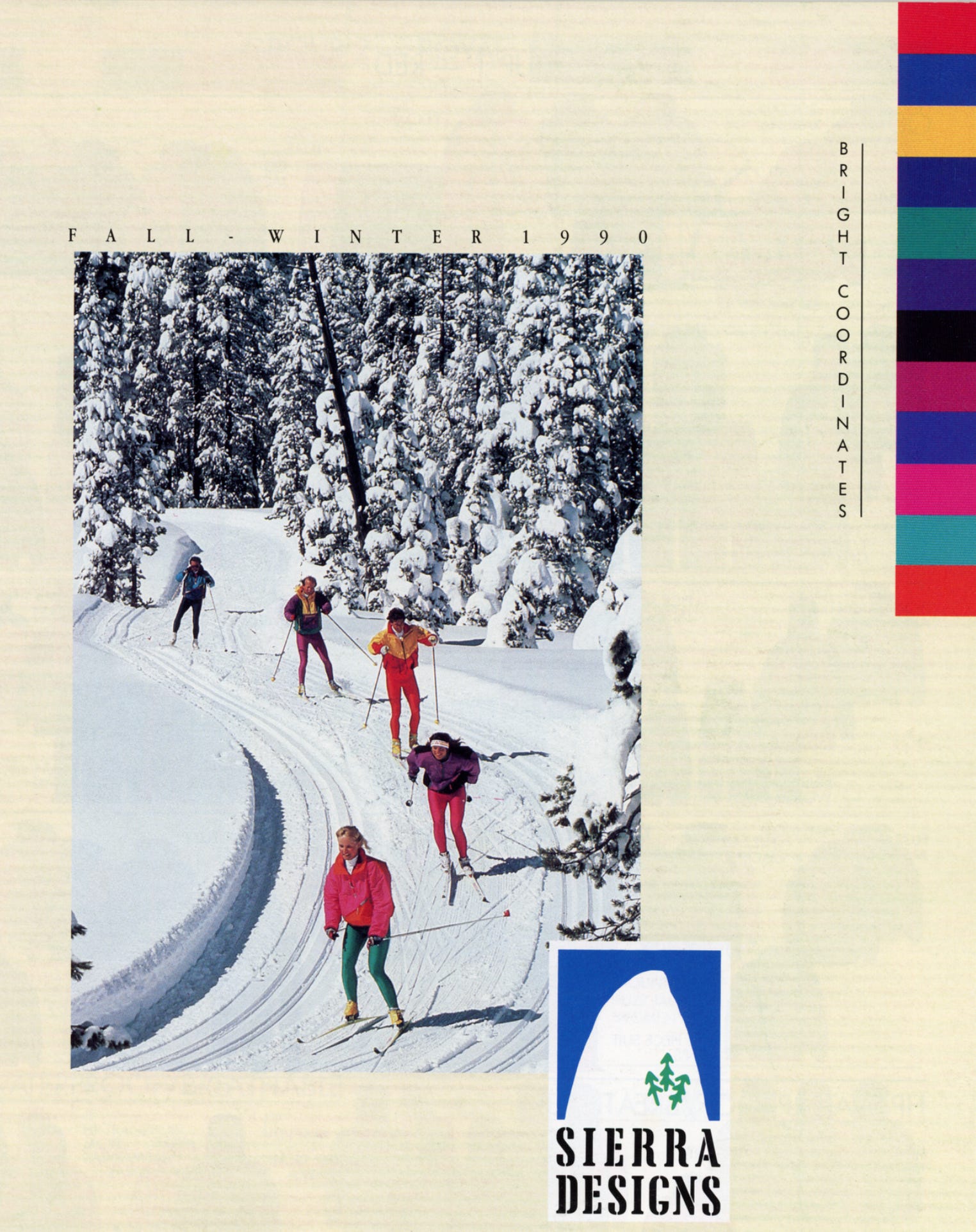
This embrace of color turned ski apparel into a visual culture all its own. From eye-catching race-inspired designs to playful, fashion-forward pieces, skiers and snowboarders began using color to make a statement, signaling personality, skill, and membership in the broader mountain community.
Not all color decisions begin with creative freedom. Many of the most distinctive looks in outdoor apparel are the result of working within constraints.
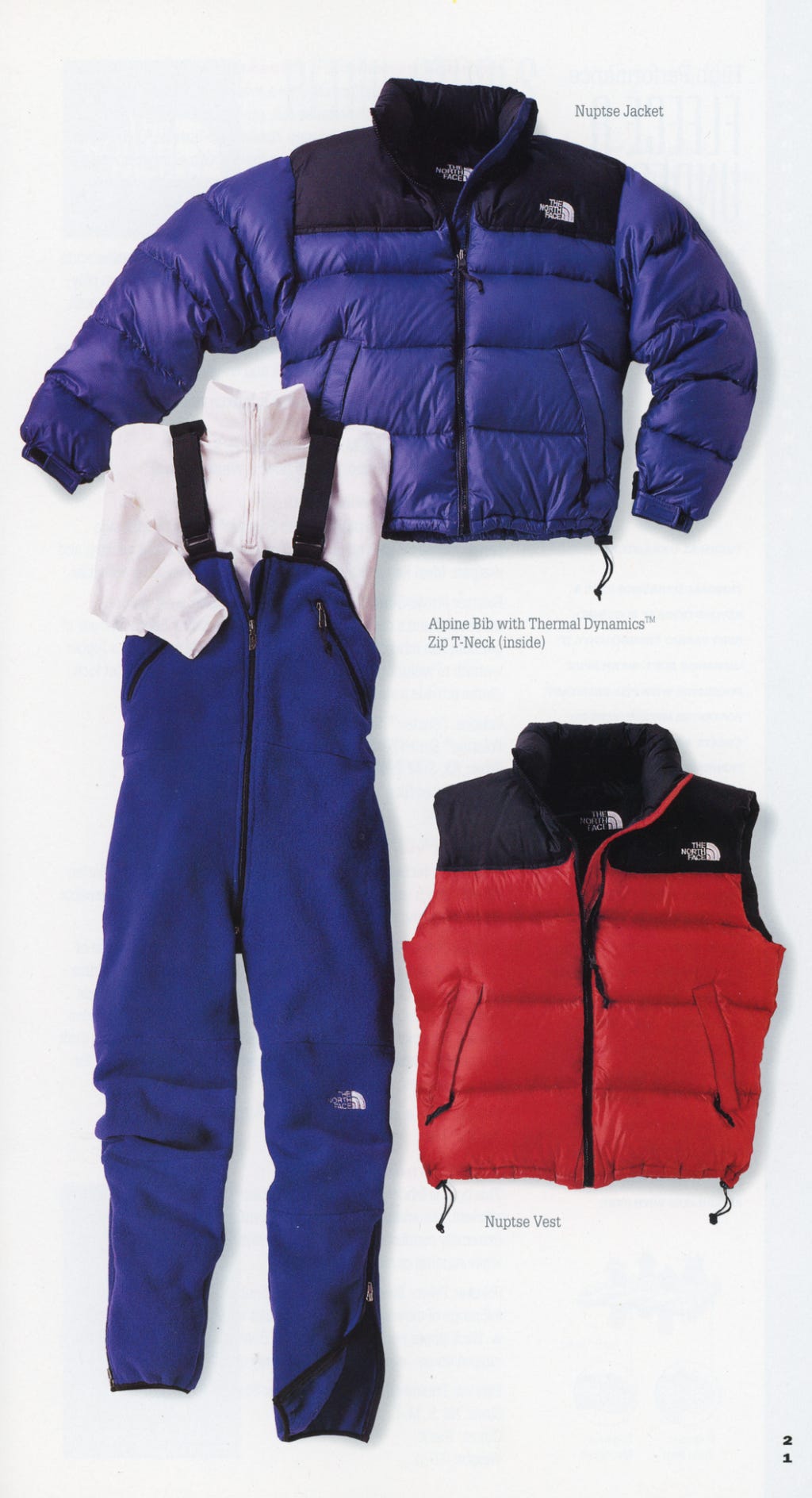
The Cotopaxi Del Día program uses remnant fabrics to construct each product, resulting in one-of-a-kind color combinations shaped entirely by what materials are available. Similarly, early designs from The North Face incorporated bold color blocking in part due to the limitations and availability of fabrics at the time, unintentionally creating an aesthetic that would become iconic.
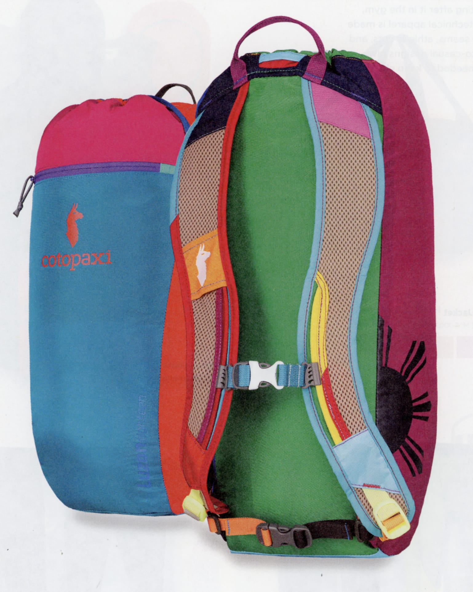
In these cases, constraints helped define these brands rather than hinder them. Some of the most recognizable products in the outdoor industry exist not because designers had unlimited options, but because they responded thoughtfully to the ones they had.
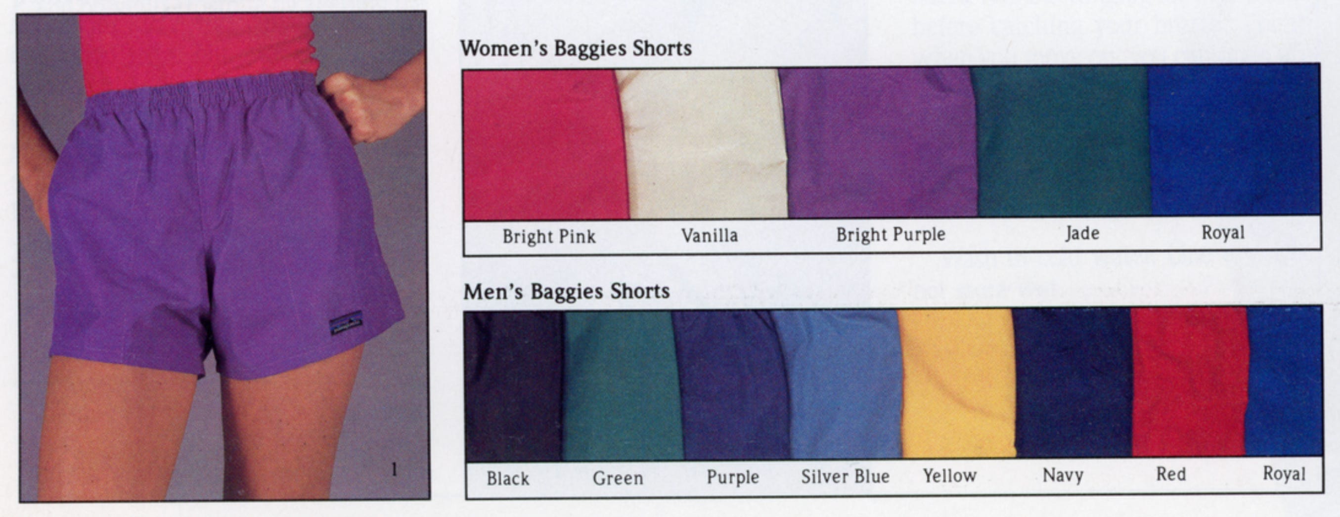
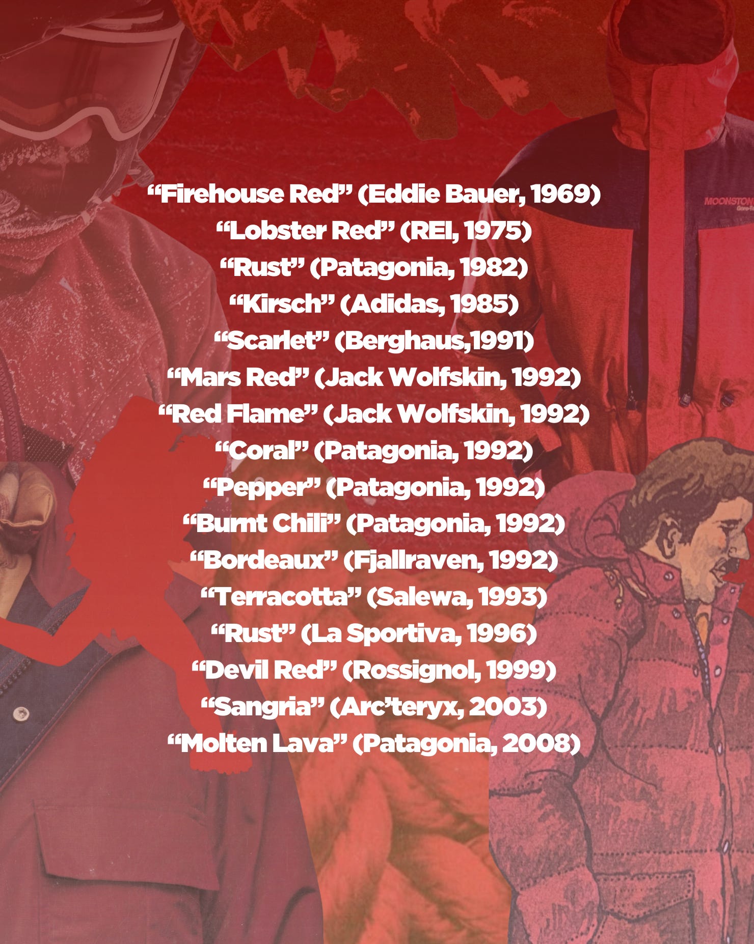
Naming color is its own unique exercise. Each brand gives its shades unique names, turning similar reds into distinct identities. What one company calls “Mars Red” another labels “Pepper,” and yet another dubs “Molten Lava.” These naming conventions do more than differentiate products; they create a sense of personality, story, and connection between the gear and the wearer.
Here are some examples found in the ORA catalogs:
Thanks for reading! The archive is a collaboration between Special Collections & Archives at Utah State University and Outdoor Product Design & Development (@usuoutdoorproduct). It currently houses over 15k catalogs and magazines from 1000 brands with a growing manuscript and photo collection from outdoor brands and gear pioneers.
View an up-to-date list of our catalog, magazine, document collections
🌐 ORA Website 🎧 Interviews with gear pioneers (Apple / Spotify) ✉️ Substack 📍Pinterest 🕺🏼TikTok ❌ Twitter / X 🧵 Threads 📷 Instagram
We love visitors. If you want to visit the archive for research or if your brand / creative team wants to use the collection in person for a research trip or offsite, schedule a visit! ✈️
📖 We also have a book coming out with our friends at Thames & Hudson and Actual Source. Take the book home with you and order below!
US | Canada | International | Amazon
The collection is built by YOU. If you have materials you want to donate, a gear pioneer we should interview to preserve their story, or you’d like to give a monetary donation, please reach out!
No posts
Comments
Nothing yet. Say the first thing.
Sign in to join the conversation.