
This Substack is by David Perrine. I write about architecture, aesthetics, design theory, and philosophy. If you enjoy my work, please consider subscribing.
A few weeks ago, The Architect’s Newspaper published this diagram by the Associate Dean of The Syracuse Architecture School, Kyle Miller.
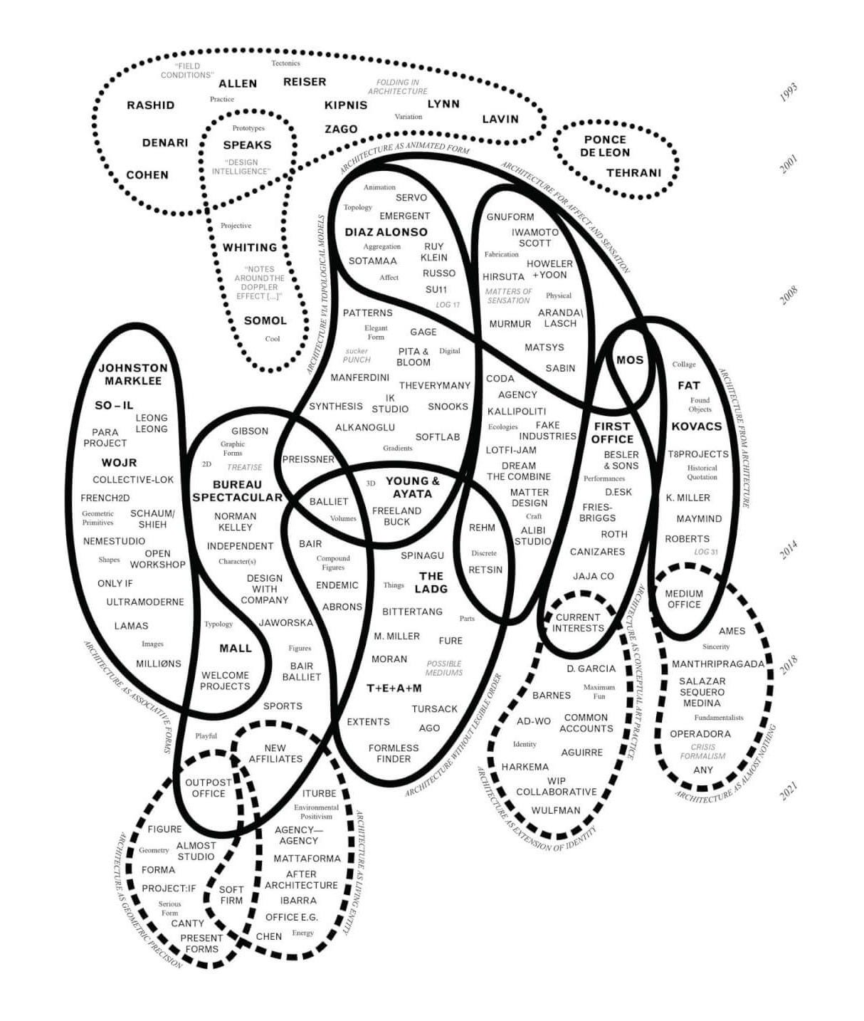
This figure is organized as both a Venn diagram, grouping architectural “projects”, and a timeline which shows the how they have developed overtime. Inside the bubbles are names of firms, exhibitions, and texts differentiated by typeface, font, and size.
At the very least, the diagram serves as a resource to young designers and students looking to identify the major contributors in recent architectural discourse. The text that accompanies the diagram is also accessible and a great read for architecture students.
However useful the diagram may be, it has blown up in an artificial manner.
Many of the firms included in the diagram have large social media followings and the heads of these firms have taken advantage. Being included substantiates a designer as being part of the canon. This proved too tempting not to milk despite the fact that the concept of an articulable canonical narrative in architecture is heavily criticized these days. Nevertheless, many of the included practices have re-shared this diagram to their large social media followings while firms not included have kept mostly quiet.
This critique is by no means saying the included firms are not exceptional or that the diagram itself is undeserving of it’s popularity. I hold much admiration for most of the listed firms. But its instant popularity is undoubtedly misleading.
The explosion of this diagram and lack of nuanced commentary has encouraged me to write about it. I will be go through a few observations about the diagram and it’s surrounding discourse.
Read Kyle Miller’s full piece here.
Enjoy.
Kyle makes a few essential claims in his text.
First is his point on the canon. Miller asserts that there has been a shift in the ‘dominate’ architectural theories in recent years. He claims that for the past three decades, architecture and architecture education have been focused on digital techniques, fueled by advances in computing technology and modeling capabilities. More recently however, architecture has shifted and now solely focuses on its political, social, and environmental roles.
Second is his point on education. Miller states that architectural education has become distracted from it’s core function: to train student’s in “the essential skills that enable architects to create and manipulate form, space, and material with control and intention.” This lack of focus on architecture’s core problem limit’s students’ ability to meaningfully contribute to the field through the creation of ‘projects’. This problem is further exacerbated because schools do not host individual projects anymore as they have chosen to prioritize inclusivity of thought and broad appeal rather than exclusivity and ideological consistency.
Third, is his point on how projects are to emerge today. If universities are not hosting projects, where are they to generate? To Miller, the internet has enabled projects to generate across geographical barriers while others will argue that density of information and it’s continual flow in today’s internet age works contrary to the creation of projects.
Lastly, He hopes that the publishing of this diagram will encourage the members of the diagram to take responsibility for curating and cultivating productive conversations in the field. In other words, the intended audience of the diagram partially is paradoxically the members of the diagram itself.
There is no comments section the article’s main place of publication, but there is one on the Instagram post that promotes the diagram. Unfortunately, the moderator of the @archpaper Instagram account has been quick to delete critical comments. Before it was deleted, one comment read:
Two things architects love to do: elitist gatekeeping and self congratulation; the narcissistic navel-gazing in the diagram is grotesque. It evokes the persistent obsession with delimiting an elite that is often subject to groupthink and tunnel vision, and largely excludes practices from regions that are underrepresented in Western academia and institutions... - Kristopher Thomas Swick
Fortunately, Eric Höweler reshared the diagram and hasn’t curated the comments from what I can tell (I could be wrong). His post hosts similar but more mild critiques.
The bias is academic, formalist, generational, and U.S.-centric — privileging those who frame architecture as a conceptual discipline rather than a civic or material practice. - Mario Madayag
this kind of cool-kids-junior-high tribalism does little service for our profession. and what made monica and nader such outcasts, anyway? - Garrett Martin
A few other places have garnered similar critiques but they all share the flavor of the earlier comments: The diagram is unfairly exclusive and a bit pretentious.
Three RPI faculty members (Christianna Bennett, Caleb White, and Walaid Sehwail) discuss the diagram in the first episode of their Mixed Signal Podcast on September 30th (listen here).
They share the above sentiment but add a few more comments. White adds that the diagram is very useful for figuring out where we came from but is ‘inadequate’ for talking about the future of architecture. Bennett notes that the discipline of architecture has continually held an obsession with clarifying where it is, who belongs to what faction, etc., and that such genealogical projects are no longer needed. Sehwail discusses the lack of utility in the diagram as an educational tool because it’s use requires too much research and is thus, too slow for today’s students (There were a few more comments but I am keeping this brief for now, please listen to their full conversation for more).
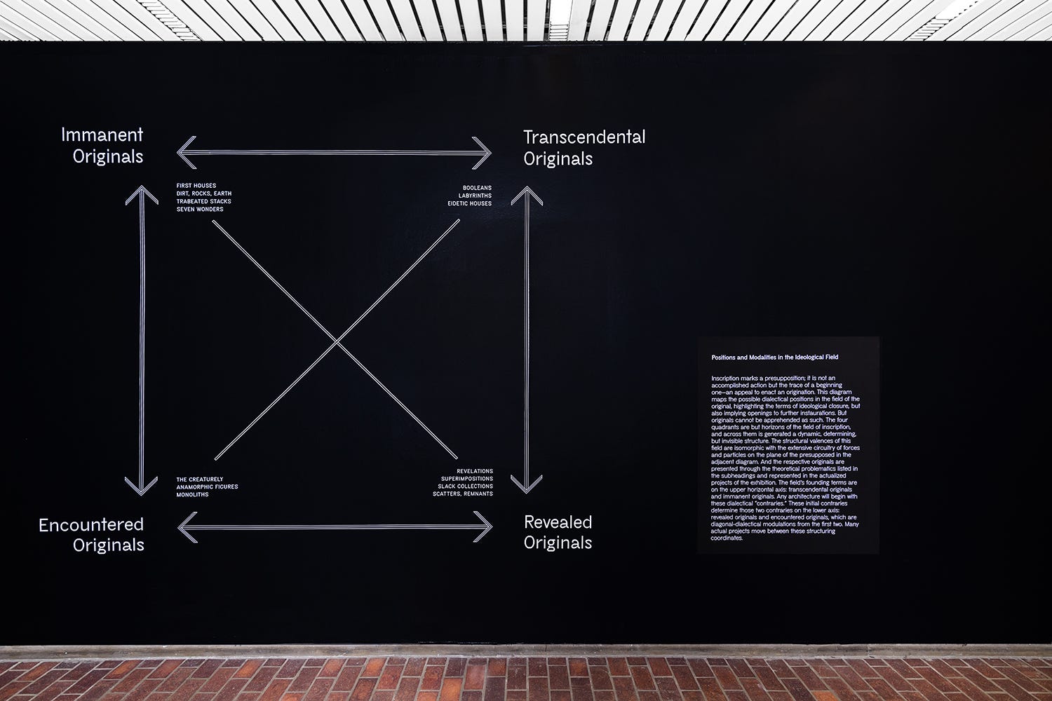
Interestingly, I remember seeing similar critiques of Andrew Holders and Michael Hays’ 2018 exhibition “Inscriptions: Architecture Before Speech”. In this exhibition and book, Hays and Holder attempted to articulate the landscape of contemporary architectural discourse using a series of binaries as fragmented as it was at the time and still is today. Inscriptions was based on a visual connection of various contemporary architecture projects and defines them using a semiotic Greimas square. Find their exhibition lecture here.
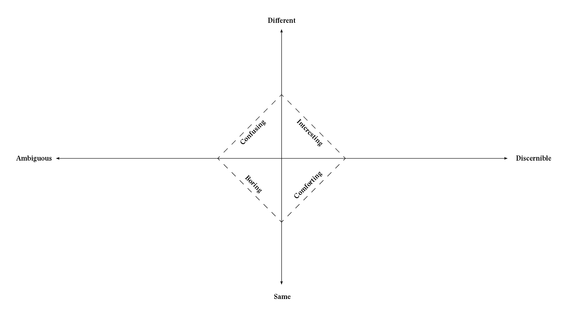
Furthermore, Andrew Atwood’s: “Not Interesting: On the Limits of Criticism in Architecture” published in 2019 presented it’s own landscape of architectural work, this time, in the form of an XY coordinate plane. This text anchors off the fields obsession with the word “interesting” as one quadrant, developing it’s semiotic opposites similar to the Inscriptions exhibition. From what I could tell, Atwood’s diagram did not come under much scrutiny. Because there was no real attempt to assert certain projects or figures as being more relevant than others. This can not be said about the others.
Both the Holder/Hays and the Atwood diagrams lack a timeline. The Holder/Hays is explicitly about contemporary architecture but one could easily apply their map historically. For example, the Revealed Originals category includes the more formally procedural and experimental projects which contradicts found-ness of the top left category. Much of that category plays with techniques of projection and anamorphosis. (Read about anamorphosis here)
I’m sure many members of this camp would argue that the work of Baroque masters Borromini and Guarini fit neatly in this category. Noted, Deleuze did assert that the Baroque transcends it’s epoch so it’s fitting in with contemporary discourse isn’t too odd (I believe this was Deleuze’s first sentence in the first chapter of his seminal work “The Fold: Leibniz and The Baroque”).
Furthermore, other historical figures could be added to the other ends of the graph. The Encountered category which is characterized as bodily, creaturely, or figural could include the work John Hejduk, namely his study of characters. The Transcendental category, defined by, form, structure, and type, has it’s contemporary roots in the work of Eero Saarinen. The Immanent category can be traced back the early brutalism of Allison and Peter Smithson, and as mentioned, the Revealed category, to the Baroque.
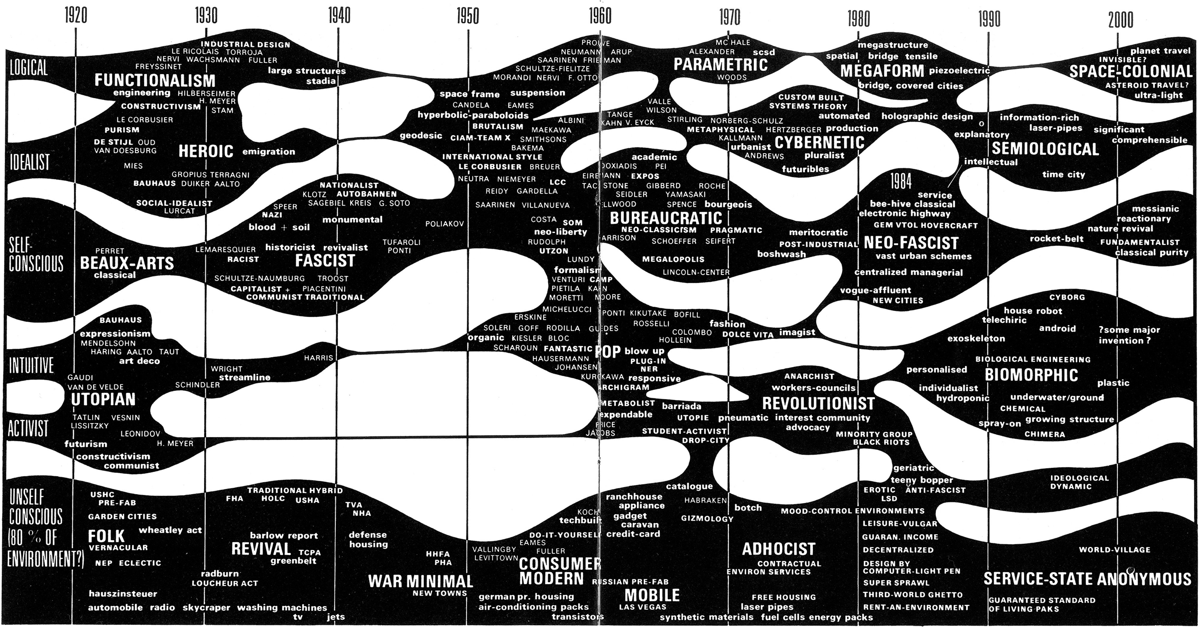
The above diagrams do not begin to scratch the surface of the prevalence of such images. We can find many more looking back. For example, below is Charles Jencks’ “Evolutionary Tree” diagram which reads almost identically in structure to Kyle Miller’s diagram but with different categories. Notably, Jencks’ diagram was published in 1970 so from then onward in the diagram depicts his own speculations. On the left end of the diagram present attributes such as “logical” or “activist” to further specify the various styles. This diagram presents an interesting provocation to White’s assertion that these diagrams are unhelpful in producing new architecture.
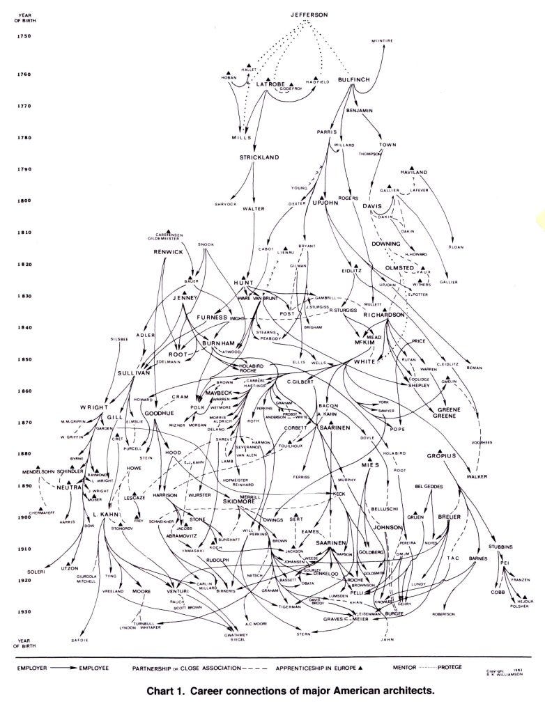
Furthermore, There are other methods to tracking theory. For example, Roxanne Williamson’s 1991 diagram provides a similar map, this time focused on a master-apprentice narrative. Williamson connects architects and designers based on their relationship with other designers whether it be employer, collaborator, or mentor. Here, ‘style’ is completely left out and only a mess of loose potential influences remain.
There are plenty more diagrams to go through and maybe another post will be made documenting these. Now is not the time, I’m afraid.
All of these diagrams with exception to the Atwood and the Williamson are organized based on an abstraction of observed phenomena. The authors observed projects in their field and pulled from it a logic and/or narrative about the practice at large, Thus they always work retroactively and their usefulness in future creation is always questioned. The Atwood is more of a linguistic exercise and could be generated without knowledge of contemporary projects. Furthermore, The Williamson is more so a rigorous documentation as opposed to a deliberate abstraction.
I am not sure that the diagram will succeed in it’s stated mission: to encourage younger names on the diagram to lead conversations and projects to advance the field. I am not even sure it succeeds in it’s other goal of clarifying the field.
To be completely honest, the elite academic universities are small and few in numbers. They don’t represent the American architectural academy. Most universities are not interested in pushing forward an abstract discipline of architecture. They are interested in producing licensed architects. An honest attempt at articulating the academic field would be far less theoretically dense. Only a small handful of schools are interested in projects and I think this is what the diagram misses. The diagram represents the colorful and provocative tip of what is a banal, grey, and massive iceberg.
I currently work at a massive architecture firm with dozens of offices around the world. These firms are the reality for so many young architectural designers who need experience before starting their own practice. I’d bet almost none of my cohort of colleagues has read “Field Conditions” or “Folding in Architecture” or have heard of "Matters of Sensation” or “Possible Mediums”. These works are very obscure for most architectural designers and students, yet they are implied to be seminal works in the diagram.
I think addressing this disconnect between the theoretical machine that exists in a network of a few ‘elite’ universities and the reality of most architecture students is critical. To be completely frank. The most influential book for architecture students is probably “101 things I learned in Architecture School” (which is assigned to every first year for some reason) or one of Francis Ching’s books on representation or construction. It would be comical if these texts were included in the diagram because they clearly don’t belong. The projects of negative/positive space from 101 is still a concept most students grapple with. Almost no one has time for Architecture as precise geometry despite what the diagram would have you believe.
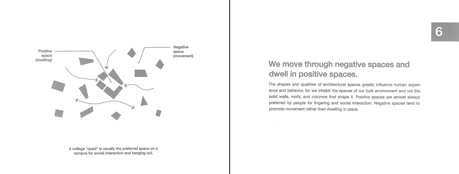
The purpose of this point is not to cast dispersion on my cohort or the ‘elite’ universities, but rather, to note that these diagrams capture an immensely small cross section of the field.
I would argue that the diagram is still very useful for another mission. It is more compelling if you understand it as an argument of what the field ought to be instead of what it is. I would love it if students were given complimentary LOG subscriptions upon enrollment in architecture school. I would love it if students read “Notes Around The Doppler Effect” instead of “Analysing Architecture” by Simon Unwin. I would love it if the name Stan Allen or Kipnis or Greg Lynn, or Sean Canty came up a SINGLE TIME in my undergraduate university. If I ever teach a theory course, I will surely reference the texts and exhibitions in this diagram because they poses ideas that are super interesting yet obscure.
This is how I use the diagram and I hope you do as well. Within it are beautiful buildings and interesting ideas. Exploring the diagram turns your search history into a gallery. Please look through the firms :)
Thank you for reading.
Comments
Nothing yet. Say the first thing.
Sign in to join the conversation.