
Fall is officially upon us, and the end of 2025 is in sight. Even though we are still weeks away from Thanksgiving, Christmas decorations have been moved to the most prominent and visible positions at local hardware stores. Old Navy holiday pajama commercials are in heavy rotation during NFL games. I had frost on the windshield of my truck this morning—most of you know I live in Jacksonville, FL. I couldn’t believe it.
It’s been a season of first-time experiences for me as I’ve been shaping things up for the release of Daddy Set the Church on Fire early next year. Everybody knows that the holiday season has a rhythm all its own, so getting ahead of things feels like the wise thing to do. The publisher and I have finished the edit and are in the proofing and layout stage for the book. I’ve never done either of those things so there’s been a lot to learn. As I type there is a literary publicist working on leads to share news of the books release on podcasts, in periodicals, and on radio broadcasts. I’ve been involved in that sort of thing as a music maker, but never with a book release. All very exciting! My friend Jay Owen helped me build a website to support the book launch with his A.I. wizardry. I think he did most of it from a first-class airplane seat while cruising comfortably at thirty-thousand feet. If you wondered, we are living in the future.
One of the most fun parts of the process has been designing the cover. I know the old axiom would lead us to believe that we shouldn’t judge the content of a book by what’s on the front of it. But as a first-time author, my felt experience is different. It seems that whatever ends up being seen initially will have a tremendous amount of value as far as first impressions are concerned. So, in layman’s terms it can’t suck.
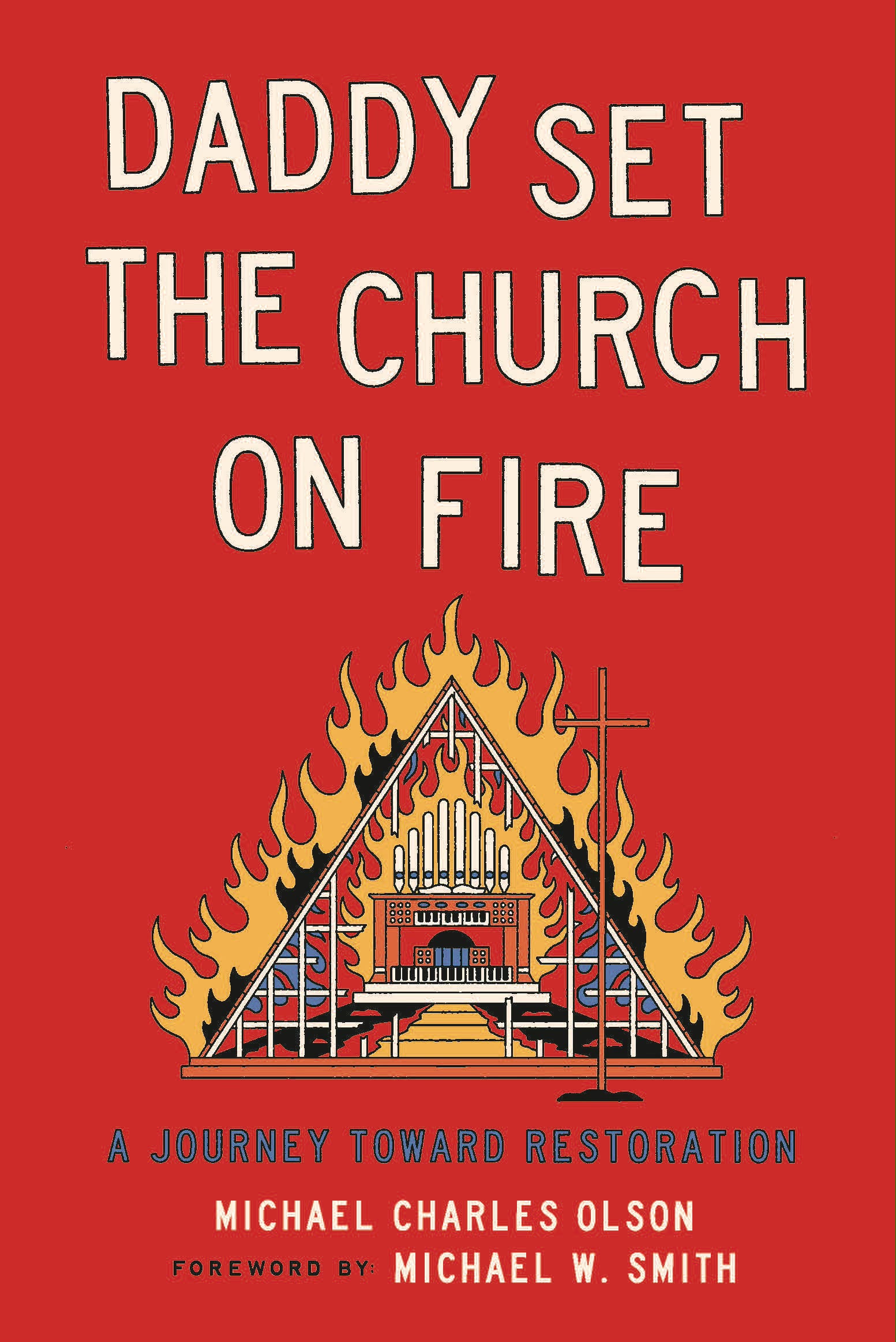
Enter Joshua Noom. I first encountered Josh when he was hired to do some design work for a project at Eleven22 a few years ago. I was immediately drawn to what came out of him, and the more I dug into his work the more interested I became. He’s done some amazing work for artists that I love like Colony House, John Mark McMillan, The Avett Brothers, Tyler Childers and The Fleet Foxes. He’s also done some work on the corporate side for companies like YETI, Old Spice, and The Mellow Mushroom. It’s all great. The way Josh sees the world is unique and evocative. It feels thought about and cared for. I thought he would be the ideal choice to go on the design journey with me as the story being told was created with deep thought and care.
There is a tremendous amount of imagery in Daddy Set the Church on Fire. As a songwriter whose taken on the role of an author, it’s been my hope that one of the great strengths of the book would be its ability to evoke vivid word pictures in which people can fully engage. A great deal of time was spent describing the places, people, and things that are crucial to the story. All of these things have the potential to be both visually and verbally evocative. I need them to be that way to draw readers toward the main point of what I’m trying to communicate. So, I hired Josh to bring some of my words to life…and he did.
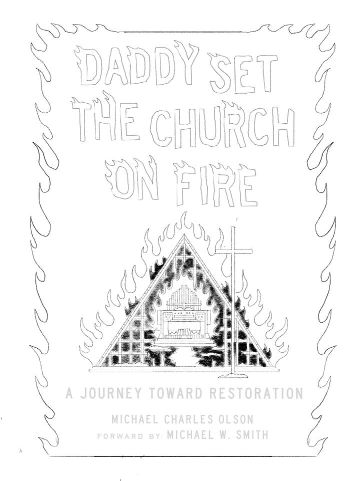
I remember our initial phone call. I told him the story—well, an abbreviated version. I described the eccentric and quirky church in which I was raised and the fire that burnt it down. I described the organ my dad played every week. I used actual phrases from the book to get Josh headed in the desired direction. After a few guiding conversations homing in on the A-frame church for the cover, Josh dove into his process hand drawing some preliminary drafts. It gave me a great deal of confidence to know that his place of initial creation was not in front of a computer screen, but with a pencil and paper which made sense knowing how unique the final images I had seen from him had turned out. After some tweaks on his initial pass, we landed on something that we both felt was distinctive, but brandable. A triangle image with an organ at the center and a cross in the foreground—all on fire. The image was as catchy to the eye as the title itself. From there he moved to a digital medium where he incorporated fonts and color. Bold letters. Bold colors. As the end user it was amazing to see it come to life in real time.
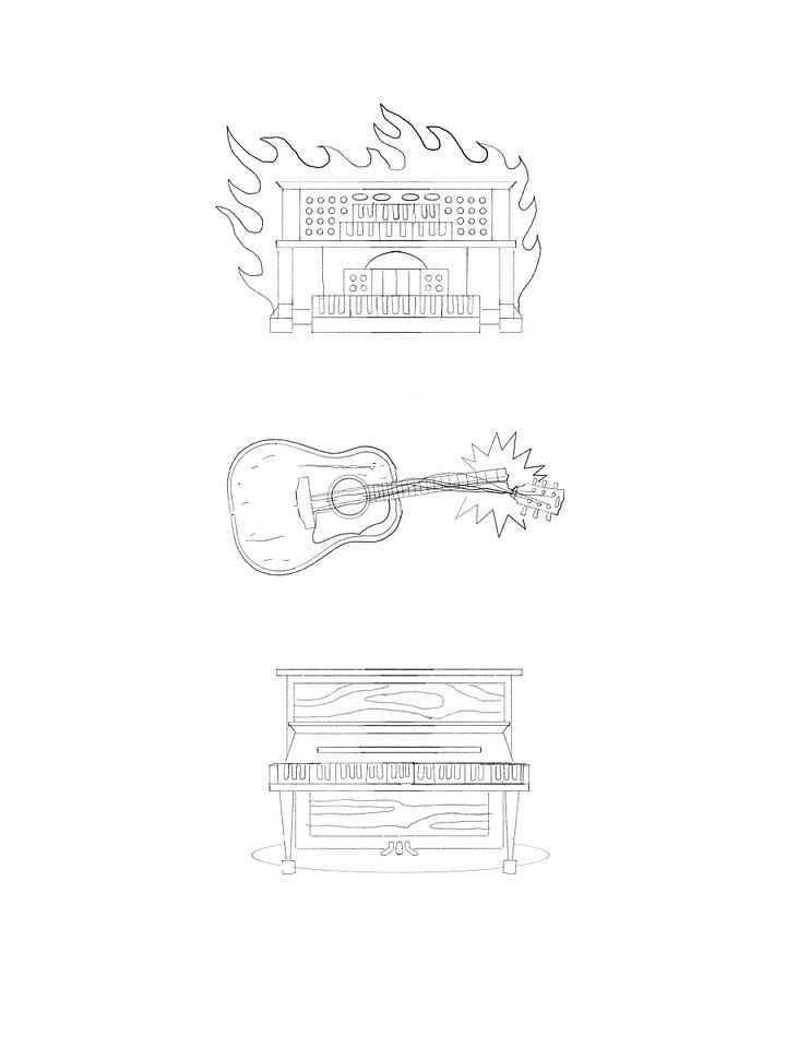
As you’ll discover, the book is laid out in three parts, each one structured around a real instrument that carries allegorical significance in the story: the afore mentioned organ played by my dad, a vintage Gibson acoustic guitar discovered by my best friend, and the old family piano passed down from my wife’s family that’s sitting in my living room. Each of these instruments plays a role in the overall story arch of the book. It only seemed right to ask Josh to go on the journey of creating visuals for each of these three instruments as well to round out the experience for the reader. He jumped at the invitation to do so taking a similar approach to that of the cover, beginning with pencil sketches that evolved into digital images. The result is, what I feel, a distinct and comprehensive visual experience for the reader which is steeped in multilayered meaning. Josh’s images are based on the reality of the story I described to him over the phone at the beginning of the process, yet in a way each one has taken on an evolved character of their own. They aren’t cartoons, but they aren’t literal either. They are symbolic of the redemptive journey the story in which they participate conveys.
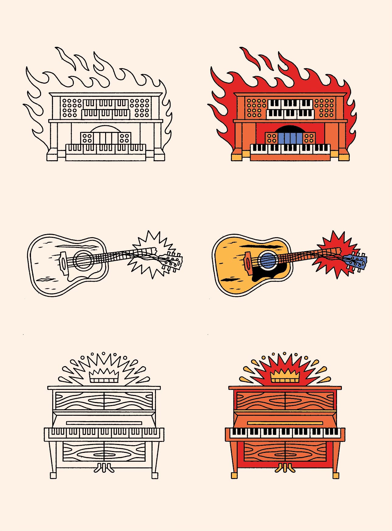
Many thanks to Suzi Wooldridge of Bridge Logos for the permission to pursue the creative direction for the cover design on my own. After all she has to sell it! And of course, major props to Joshua Noom for his uniquely creative mind. Great job man. It gives me great joy to share these images with you.
And, I know what you’re thinking—wow, Michael. Thanks for sharing these with us. We still have no idea what these images mean. To that I say…
I know.
You’ll have to wait until Feb. 17th, 2026 to find out!
Thanks for listening.
Comments
Nothing yet. Say the first thing.
Sign in to join the conversation.