
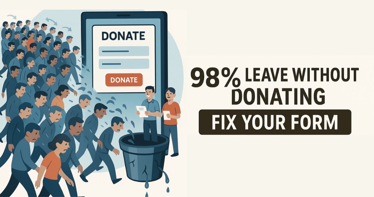
Imagine this: 100 people visit your donation page... and only 2 complete a gift.
What happened to the other 98?
Most nonprofits never find out. They don't test. They don't track conversions. They just assume the form is "fine."
But here's the truth:
Your donation form might be quietly costing you thousands every year.
And unless you're looking closely, you won't even know it.
Let's fix that.
Your donation form is like a leaky bucket — you pour in traffic, but only a trickle turns into donations.
Why?
Most orgs never test their form.
There's no analytics connected to see where people drop off.
Every drop-off = a lost donor you'll never meet.
You wouldn't run an event without knowing who showed up, right? So don't fly blind with your most important donation tool.
Your donation form isn't just another page — it's your highest-impact digital asset.
Here's what I mean:
Fixing a form can 10x your campaign results. (Yes, really.)
Every email, ad, or social post drives people here, so if it's broken or clunky, you're wasting your best efforts.
Even minor tweaks (fewer fields, better CTA, recurring option) can lead to big jumps in giving.
Traffic is expensive. Donors are busy. Let's not make it harder than it has to be.
Here are the usual suspects — how many are lurking on your form?
Too many fields – You don't need their fax number.
Not mobile-friendly – Over half your traffic is on a phone/tablet. Test it!
Confusing or weak CTAs – "Submit"? Try "Give Now to Make a Difference."
No recurring gift prompt – Monthly giving = sustainable revenue.
No follow-up or weak thank-you – Missed opportunity to build trust.
Fixing just one of these could double your donations. Fix all five? Game changer.
Great donation forms are like great fundraisers: fast, friendly, and emotionally engaging.
They're:
Easy to scan and complete
Focused on the donor's impact, not your process
Optimized for mobile
Personal and human (think: "Join us in changing lives" > "Submit Payment")
👀 Mystery Donor insight: In a past audit, one nonprofit's form required 18 fields to complete a donation. (Guess how many people finished it? Not many.)
Sometimes the fix is as simple as asking less and thanking more.
Here's your quick-start checklist:
✅ Run a test donation (or ask me about a Mystery Donor audit)
✅ Remove extra fields — keep it simple
✅ Add a recurring gift option (make it visible!)
✅ Rewrite your CTA to be action-focused and emotional
✅ Improve your thank-you page and follow-up emails (that is, emails, plural)
Don't wait until your next campaign. Do this now.
Future-you (and future donors) will thank you.
Before you launch your next big campaign, fix your form.
👉 Book a quick call and I'll walk through your donation form with you — no jargon, just practical fixes that get more donors across the finish line.
Want to Become a Better Marketer? Go Watch Sesame Street.
Great discussion from Josh Spector over on LinkedIn. He is talking to “marketers”, but all the points are 100% relevant to nonprofits as well (we all should be “marketers” after all).
Always look forward to this report every year. A great way to see how you stack up against other nonprofits. According to M+R, the average conversion rate on donation forms is 11%. If you are below that… fix it now!
Reply or book a call if you need help.
Thanks,
Rich Dietz
Founder, Nonprofit R+D
Comments
Nothing yet. Say the first thing.
Sign in to join the conversation.