
Remember the mood ring?
A metal band and some liquid crystals. A tiny piece of jewellery with the audacity to announce your emotional state to the world. Black meant stressed, blue signified calm and green was somewhere in between. It was ridiculous but also irresistible.
We laughed at the mood ring, but we kept checking it because somewhere beneath the gimmick was an idea we already understood instinctively, that colour tells the truth.
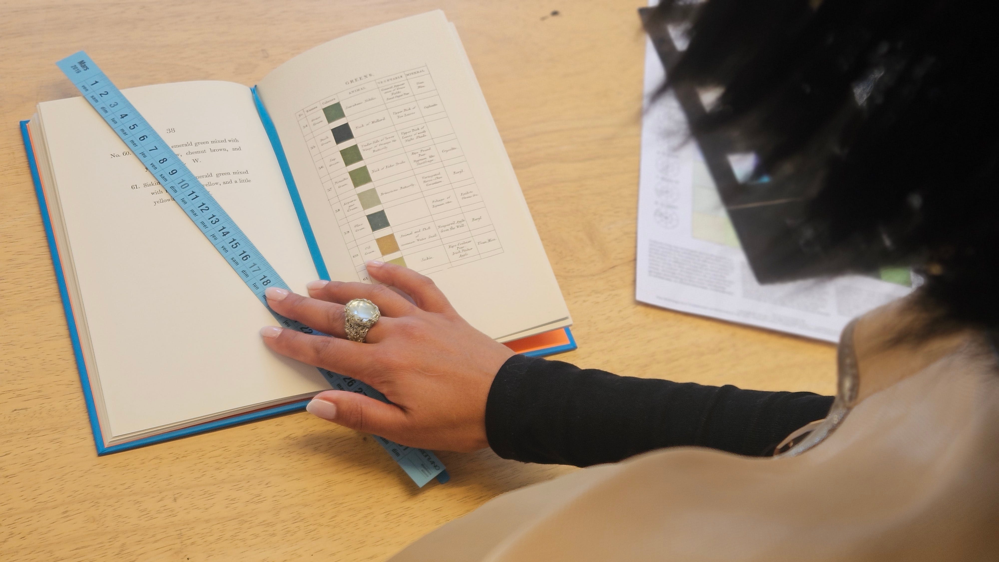
We grew up and stopped wearing it on our fingers, but I’m not sure we ever really left the mood ring behind. We carry it into rooms, the way we choose our clothes, objects and the colours we surround ourselves with. Colour still tells on us!
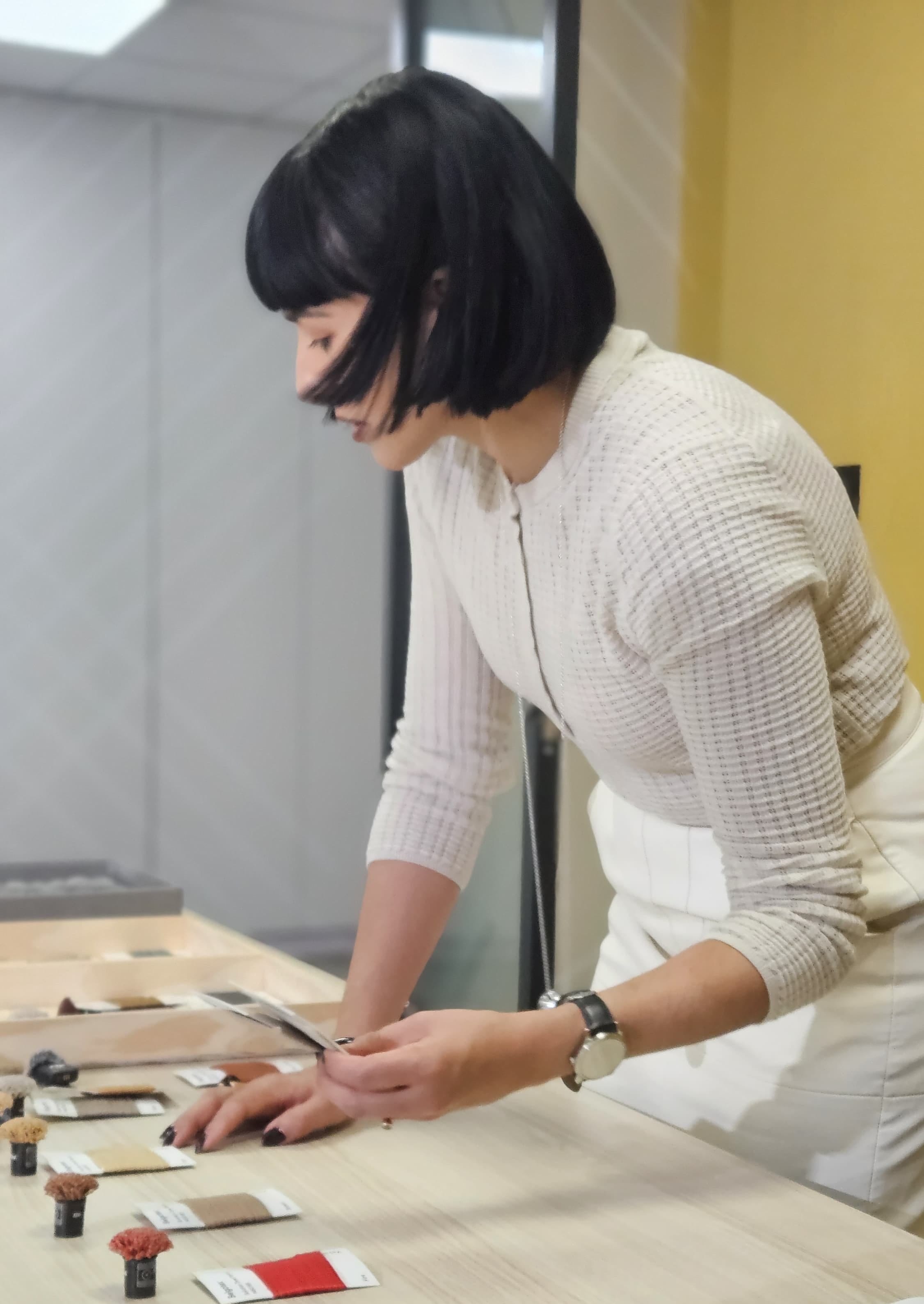
I would like to think that we ‘feel’ colour before we intellectualise it.
There are colours that make you want to move closer and colours that tell you to keep your distance. Colours that seem to shout while others barely whisper. Some feel deliciously wrong together and are all the better for it. A palette is like a cast of characters - if you swap one out suddenly everyone behaves differently.
A muddy green beside chalky limestone feels ancient but put that same green next to electric orange and suddenly it has attitude. A pink can be saccharine, fleshy, dusty or almost mineral depending on what you allow it to sit beside and this is exactly what makes colour so endlessly interesting. The individual shade is only half the story, the relationship is everything.
Which is why certain palettes feel convincing and others don’t. Colour has an internal logic and when the relationships are right, we recognise the truth in them.
One thing I know for sure is that colour doesn’t begin in the studio.
It begins outside. Walking, looking, collecting and getting your shoes dirty.
Some of the richest palettes I’ve encountered were quite literally under my feet.
Travelling through Greece recently made me notice this again: weathered lava stone beside dry grass; the powdery green leaves of an olive tree against an almost indecent blue sky; terracotta fading into dust. Back home there are mine dumps glowing orange at sunset, silver-green veld, blackened earth after a burn, and those final fifteen minutes of light over the Karoo when everything seems to change colour at once.
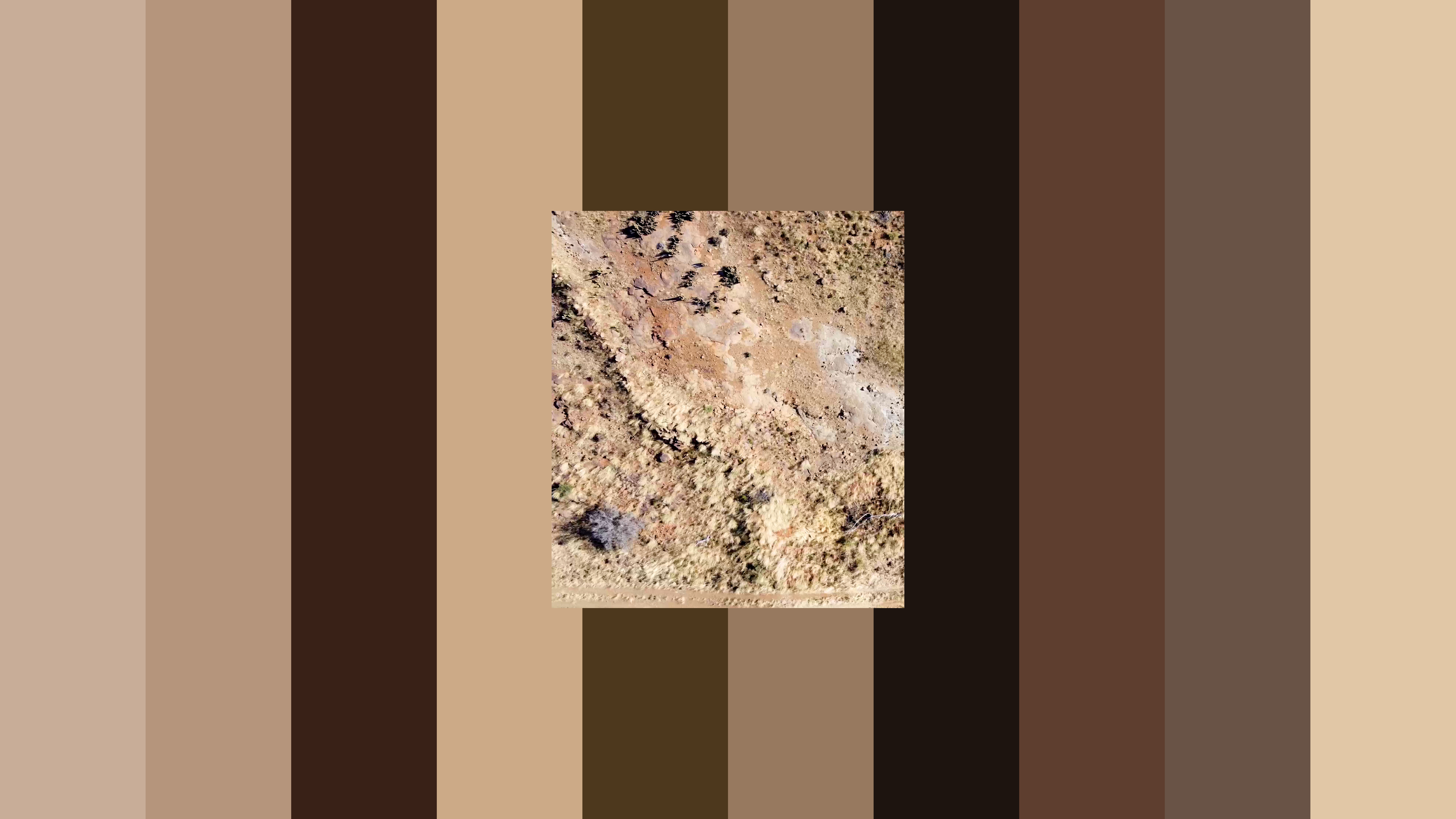
Nature is very good at putting colours together that a moodboard might tell you otherwise. Acid yellow with mud, lilac with rust. Bright pink with brown, blue with almost-black green.
Somehow, they work yet nature has never heard of Pantone. It has no interest in a tasteful tonal palette and that’s why it remains our greatest colourist.
For the past two years, we’ve been looking closely at South Africa’s nine biomes and asking a simple question: What colour is this place?
Not symbolically but actually, creating a colour taxonomy of each biome.
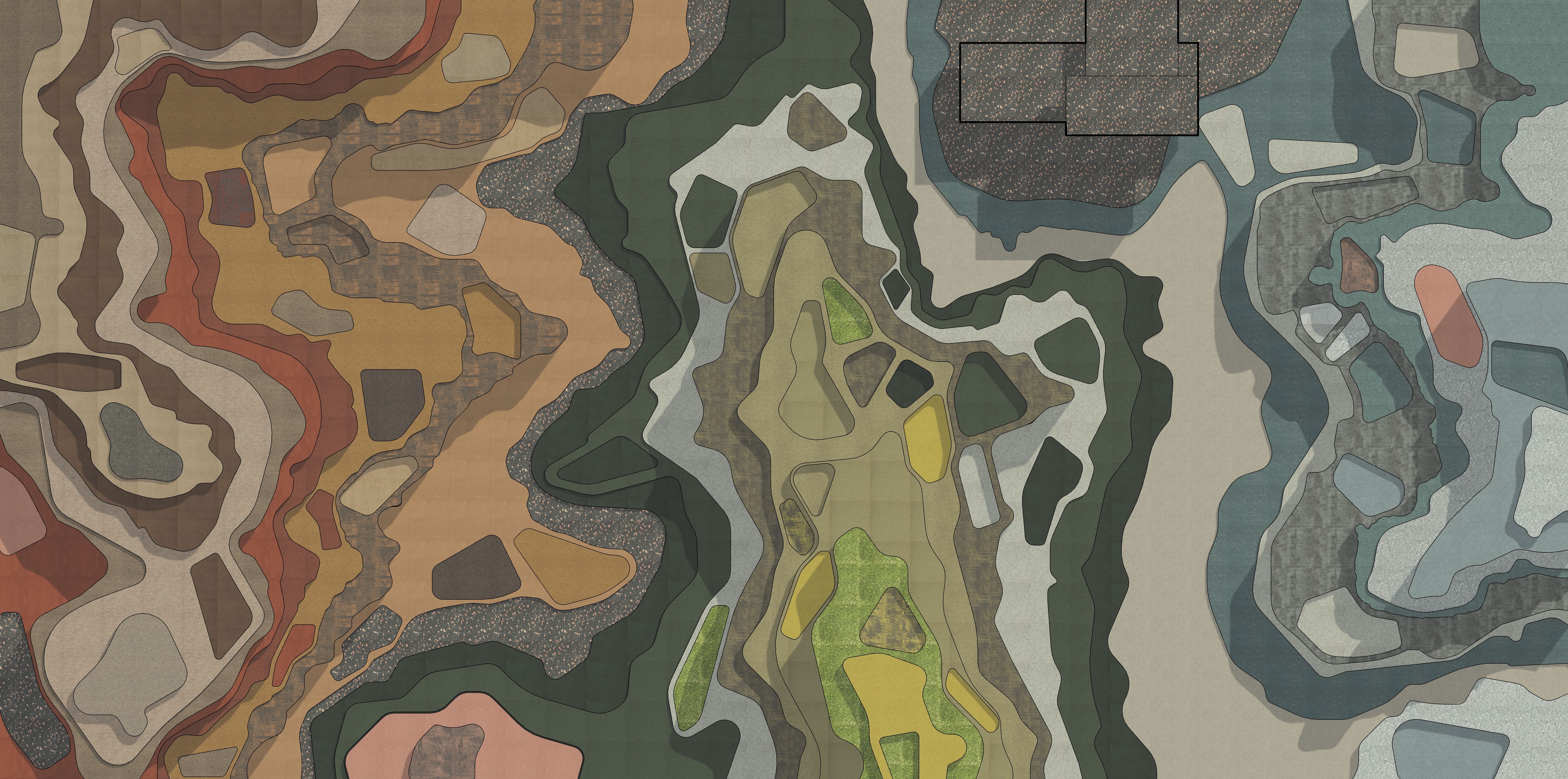
Colour and place now sits at the centre of our collaboration with Belgotex, where we’re translating the landforms and natural pigments of these landscapes into a textile language for a new range of tufted carpets and rugs.
The ambition isn’t to make a green carpet and call it Grassland. The landscape is much stranger and far more complicated than that. Simply put, a grassland is not one green. It is chartreuse from new growth, dry straw, shadow, exposed soil and blackened veld. It changes through grazing and burning, rain and drought. It has dense moments, sparse moments, disturbed moments and places where one condition slowly bleeds into another.


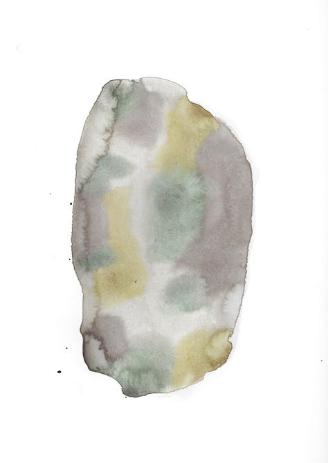
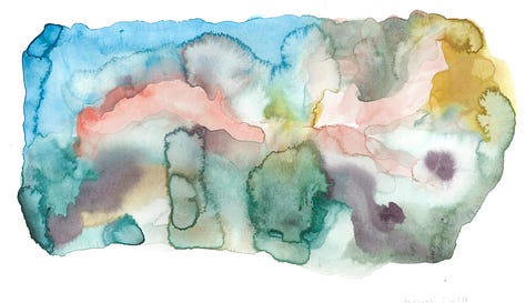
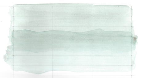


At Hoven we’re interested in the system behind the colour because landscapes don’t really have palettes, they have relationships.
This is where things get wonderfully obsessive.
I take an NCS colour reader into the landscape, walk a lot, scan leaves, flowers, bark, stone, grasses, soil and whatever else catches my eye. A colour that looks completely ordinary from ten metres away becomes strangely specific when you isolate it. Suddenly green isn’t green, it is this green.
A grey has violet hiding inside it and something you were convinced was brown turns out to be almost red. Slowly but surely, the landscape starts revealing its codes. This is where the mood ring wasn’t entirely ridiculous after all. Colour is information and you just need to know how to read it.
We record those colours as NCS references and bring them back into the studio, where another translation begins with the Belgotex team.
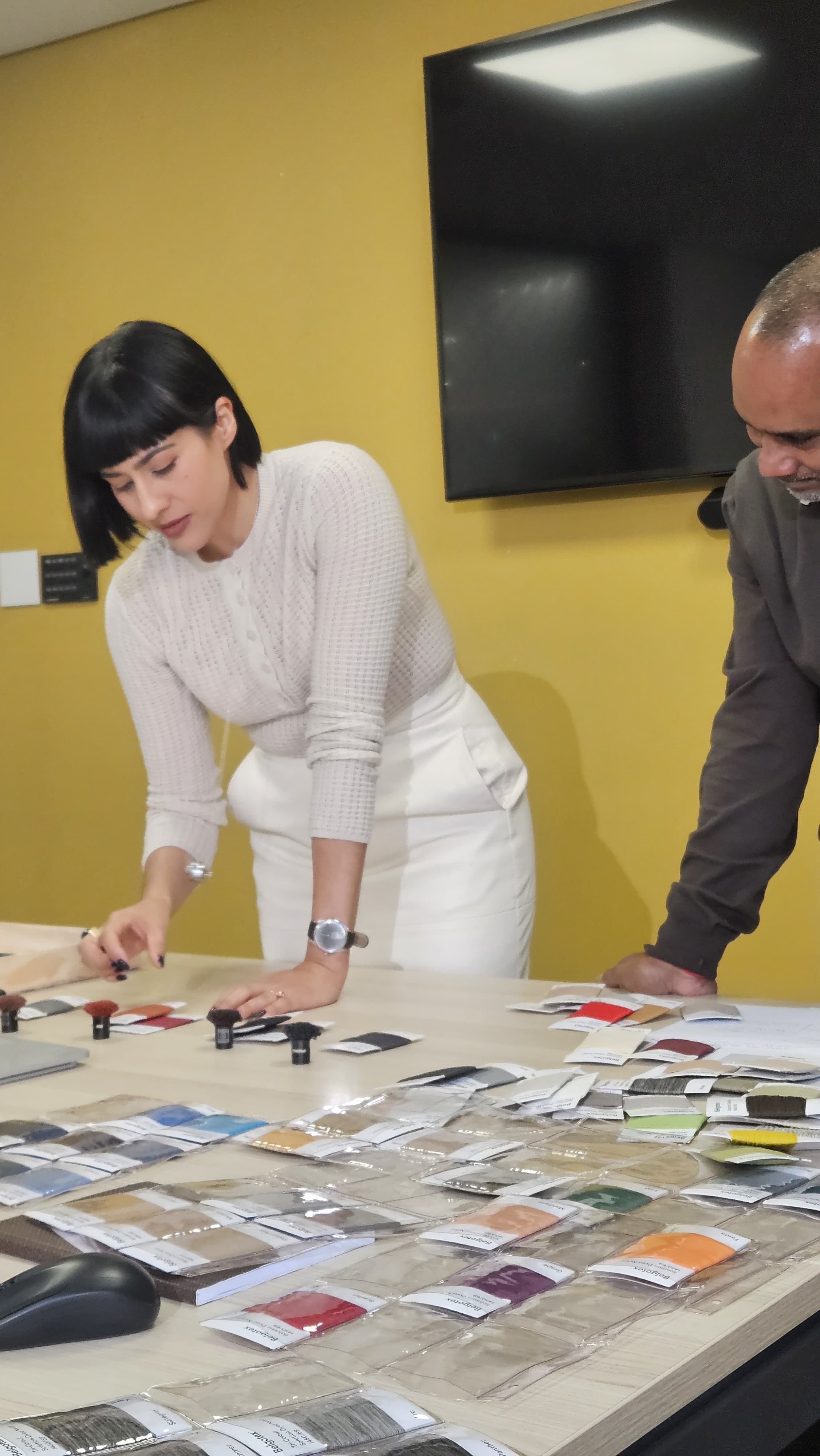
From landscape to colour code to yarn, except it is never quite that neat.
A colour on a leaf is not the same colour spun into fibre. Light behaves differently, texture interferes, fibres mix optically. Two yarns placed beside one another can shift the way you perceive both. So we sample and compare and reject and adjust.
A yarn might need more dirt in it or a green needs to become less polite. An orange needs to lose some sweetness and a neutral needs just enough pink to stop behaving like beige. Then we look again. It is slow, iterative work, and that’s precisely the point because we are trying to preserve the character of the colour we found outside.
Colour is only the beginning.
What has become increasingly interesting through the Belgotex collaboration is the possibility of translating not just how a biome looks, but how it behaves.
Take the Grassland biome for example. Rather than creating a perfect gradient from one green to another, we’ve been looking at the patchiness of the landscape itself - areas of density and scarcity, grazing and regrowth, burning and recovery.
That thinking begins to produce a very different carpet. Colour gathers, disappears and one colour condition interrupts another. Similarly, tiles can rotate and create unexpected adjacencies, so that the floor becomes less like a repeating pattern and more like terrain.


We’re even exploring how environmental information such as rainfall, soil composition and altitude might influence physical parameters including yarn blends and stitch density.
At that point the carpet stops being a picture of the landscape and starts behaving a little more like one.
This process has also made me increasingly suspicious of colours that are too resolved.
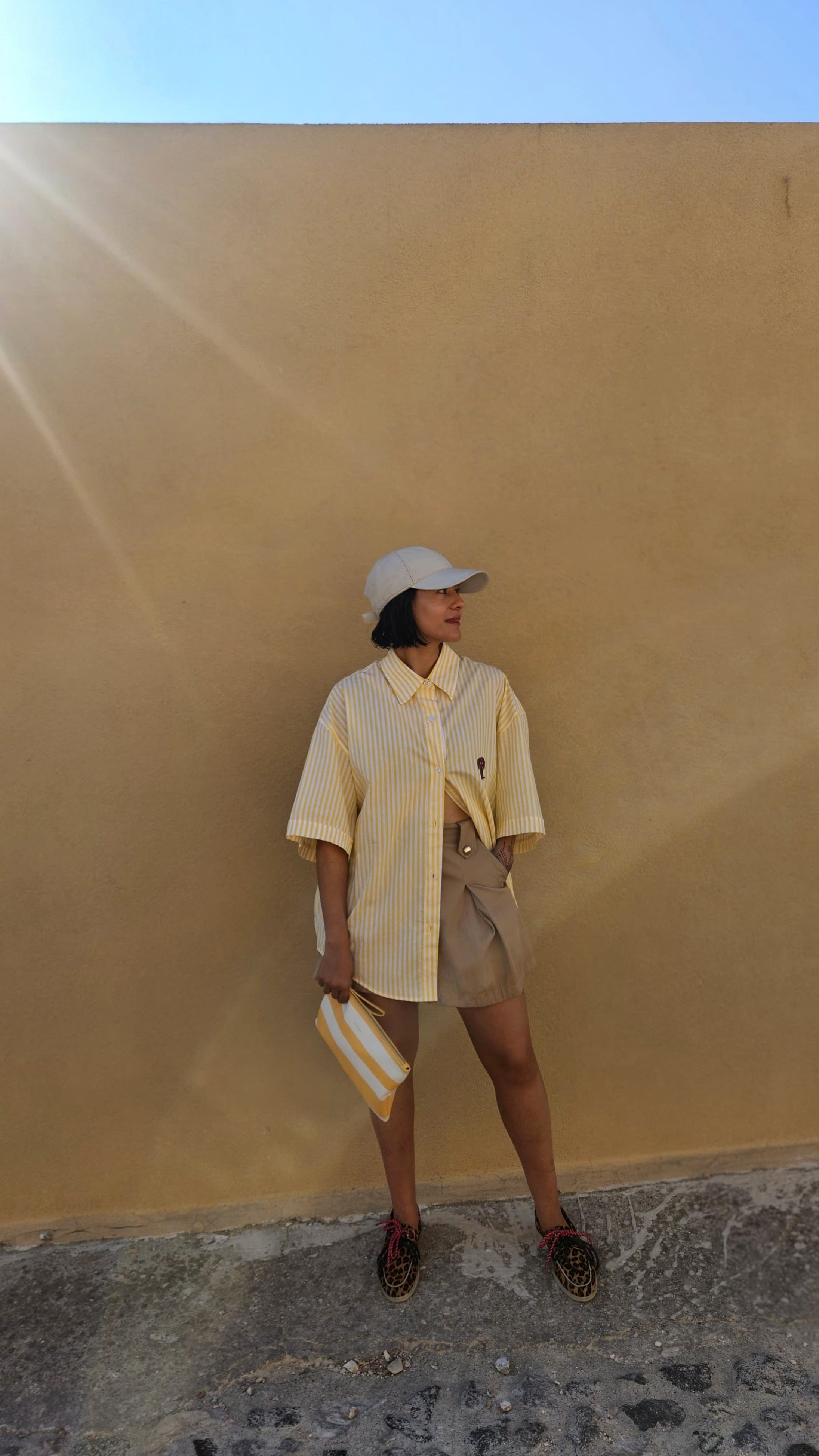
The landscape rarely gives you the perfect sage green, or the perfect terracotta or warm neutral. There is usually something contaminating it, whether it’s dust, ash, salt, sun or decay. Perhaps I’ve been spending too much time in the Santorini sun but it’s that feeling that something is slightly wrong that often makes the colour extraordinary.
The colours we’re developing with Belgotex aren’t intended to be perfect reproductions of nature. That would be impossible and honestly a little boring.
What we’re after is something closer to its colour intelligence. The unexpected relationships, imperfections and the colours that shouldn’t quite work together but somehow do.
Colour in, colour out. Goodbye never-ending neutrals. Hello butter yellow.
At its best, forecasting can be a useful way of reading appetite. What are we hungry for? What are we exhausted by? What does the cultural moment need?
Right now, I’m hungry for things that feel sourced from somewhere real.
We’ve spent years looking at frictionlessly perfect interiors, algorithmically calibrated palettes and images so immaculate they seem to have lost all evidence of the human hand. I’m hoping the pendulum is beginning to swing.
Back towards texture, to embrace irregularity. Towards colours that are nuanced and imperfect and towards objects and materials that carry some evidence of where they came from.
This is why the landscape continues to fascinate me as a colour source. Nature is anything but tasteful. Nature is unruly, contradictory, seasonal and occasionally completely outrageous and yet somehow, in its untamed state, it all holds together.
That’s what excites me and that’s the colourful truth. The best palettes aren’t chosen, they’re discovered and our role as designers is to learn how to read them.
See you next week,
No posts
Comments
Nothing yet. Say the first thing.
Sign in to join the conversation.