
I have built and reviewed a lot of dashboards over the years. Some were simple Excel reports. Others pulled data from several systems and turned it into polished Power BI or Tableau pages. Almost all of them started with the same promise: give leaders a clearer view of the business so they can make better decisions.
The finished product usually looked better than the report it replaced. The charts were cleaner, the filters were faster and the numbers updated with less manual work. But a better-looking report does not always lead to a better decision. Many dashboards simply give the business a faster and more colorful view of something that already went wrong.
Revenue missed the target last month. Expenses ran over budget. Receivables increased. Customer complaints moved in the wrong direction. By the time those numbers turn red, the money may already be spent, the customer may already be frustrated and the deadline may already be missed.
That is not useless information. It is just late.
One of the easiest mistakes in business reporting is confusing access to information with the ability to act on it. A dashboard may show that accounts receivable increased by 18%, but that number alone does not explain which customers are late, whether the problem is getting worse or who should follow up first.
The same problem appears across the business. A sales chart shows that revenue fell in one region, but it does not tell the manager whether the cause was pricing, fewer leads, lost customers or poor follow-up. An expense report shows that spending increased, but it may not separate a real cost problem from a planned investment.
The chart is only the beginning of the conversation. The value comes from connecting the number to a question someone can answer or an action someone can take.
A useful dashboard should help the reader understand what changed, why it may have changed and where to look next. It does not need to solve every problem on the screen, but it should point the user toward the problem instead of making them hunt for it.
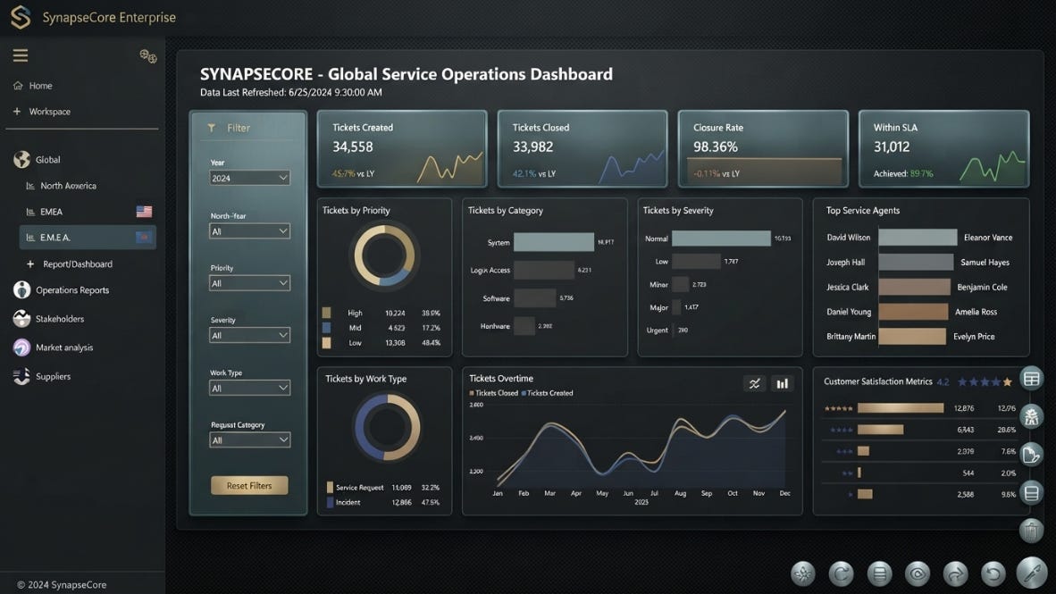
Many dashboard projects start with a simple request: put everything in one place. That sounds helpful until every department adds its own list of metrics, filters and charts.
The final page may contain 25 visuals, a dozen slicers and more colors than anyone can explain. Every number is technically available, but the important story is buried inside the design. The dashboard becomes a digital storage room where nothing was thrown away.
This often happens because the project begins with the data instead of the decision. The team asks what fields are available, which reports already exist and what each department wants to see. Those are fair questions, but they should not be the first questions.
The first question should be: What decision is this dashboard supposed to improve?
A cash flow dashboard should help someone see when cash may become tight, which collections need attention or whether spending needs to slow down. A staffing dashboard should show where work is building up, where people are underused or where more help may be needed. A sales dashboard should make it easier to see which opportunities are moving and which ones are stuck.
Once the decision is clear, the right numbers become easier to choose. Without that decision, every metric feels important and the screen fills up fast.
Numbers rarely explain themselves. A 10% increase in expenses might be bad, or it might come from hiring, buying inventory or investing in a new product. A drop in profit might signal a larger problem, or it may be tied to a one-time expense that will not happen again.
Context changes the meaning of the number.
That is why comparisons matter. A metric becomes more useful when the reader can see how it compares with the budget, the prior month, the same period last year or the normal range for the business. It becomes even more useful when the dashboard shows which department, product, customer or transaction caused the change.
This does not mean every page needs more charts. In many cases, the answer is fewer charts with better detail underneath them. The user should be able to see the issue first, then open the supporting information when needed.
Good dashboard design is not about displaying the most data. It is about removing the time between noticing a problem and understanding it.
The best test for a dashboard is simple: What would someone do differently after seeing it?
A business leader may decide to contact three overdue customers, slow spending in one department or move staff toward a growing backlog. A sales manager may focus the next meeting on opportunities that have stopped moving. A finance team may investigate a cost increase before it becomes the new normal.
Not every chart needs to create an urgent task. Some metrics exist to track long-term performance or provide useful background. But the main purpose of the dashboard should still be easy to explain.
If the answer is only, “It lets us see the numbers,” the business may have built a cleaner report without improving the decision.
There is nothing wrong with reporting the past. Every company needs to understand what happened. The problem comes when the dashboard stops there and everyone assumes the job is finished.
The better dashboard does not just show where the business has been. It helps the reader decide where to look, what to ask and what should happen next.
This is the type of work we focus on at 5Cypress Data Analytics. We provide fractional data analytics support for businesses that need clearer reporting, better dashboards and stronger insight without hiring a full-time analyst.
That may mean rebuilding a report that has become too difficult to manage, connecting data from several systems or creating a Power BI dashboard that helps your team see what needs attention next.
The goal is not to give you more charts. It is to help you get more value from the data you already have.
Learn more at 5Cypress.com.
No posts
Comments
Nothing yet. Say the first thing.
Sign in to join the conversation.