
In 1986, I had an argument with Steve Jobs about trademarks. He showed me his new logo for Apple, a rainbow-striped apple. I said it wasn’t technically a logo. Logo is short for logotype, a brand name created from letterforms. What you have here a symbol, I said, a wordless pictogram. Logo is Greek for word. He said it wasn’t, it was Latin for symbol. He was wrong, but that was Steve.
These days everyone calls any sort of trademark a logo and that’s okay. Language evolves. But for trademark designers, the differences between a logo, a symbol, a pictogram, and a monogram are huge and consequential. You have to match the style of trademark to the brand name and the strategic purpose of the company or product. (In case you’re wondering, the Apple trademark was an inspired choice, no matter what we call it.)
Trademark projects for large organizations generally go to larger design firms who specialize in corporate identity. Some of the giants in the annals of identity design are Paul Rand, Saul Bass, Chermayeff & Geismar, Pentagram, and Lippincott. Here are some of my own trademarks, shown in chronological order. Many were for small organizations or startups.

1975. My first professional trademark, commissioned by a religious organization. I loved the curves of the letter S, which in those days had to be drawn by hand. Turns out that the religious organization was really a cult. I quit when I found out, but the trademark went on to win awards. The group eventually went into hiding in Colorado amid a stockpile of weapons, and I went on to better clients.
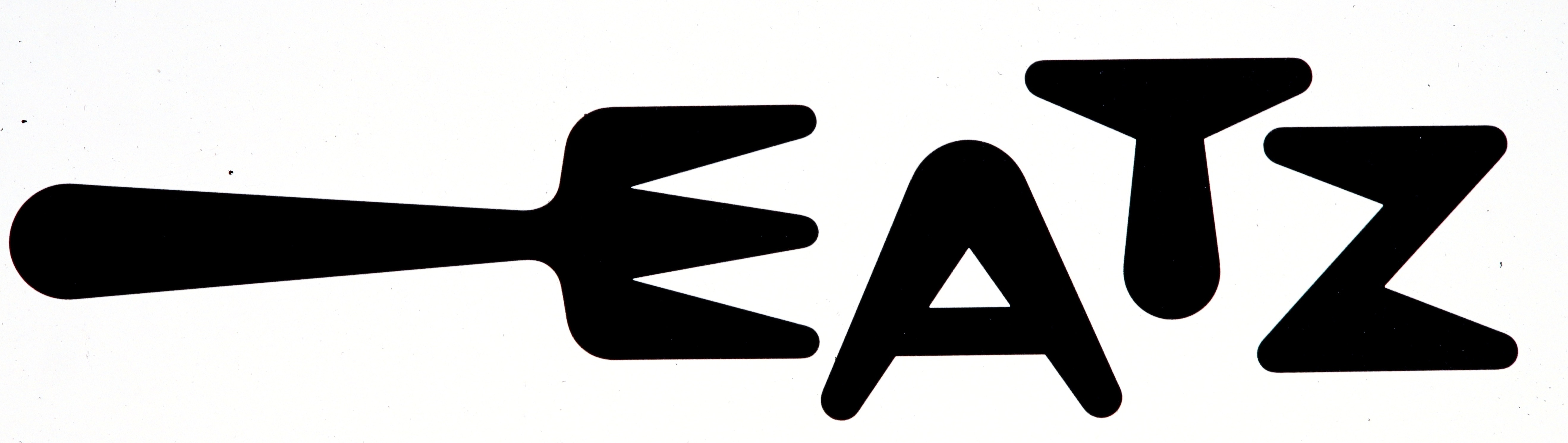
1977. A group of restaurateurs hit upon the idea for a chain of ’50s-style diners on the East Coast. Think checkered linoleum floors, stainless-steel table edges, hot dogs, malts, and salads. They hired me to invent the name and logo. We were all taken with the Jetsons-style letterforms. (This is a true logo, not a symbol.)
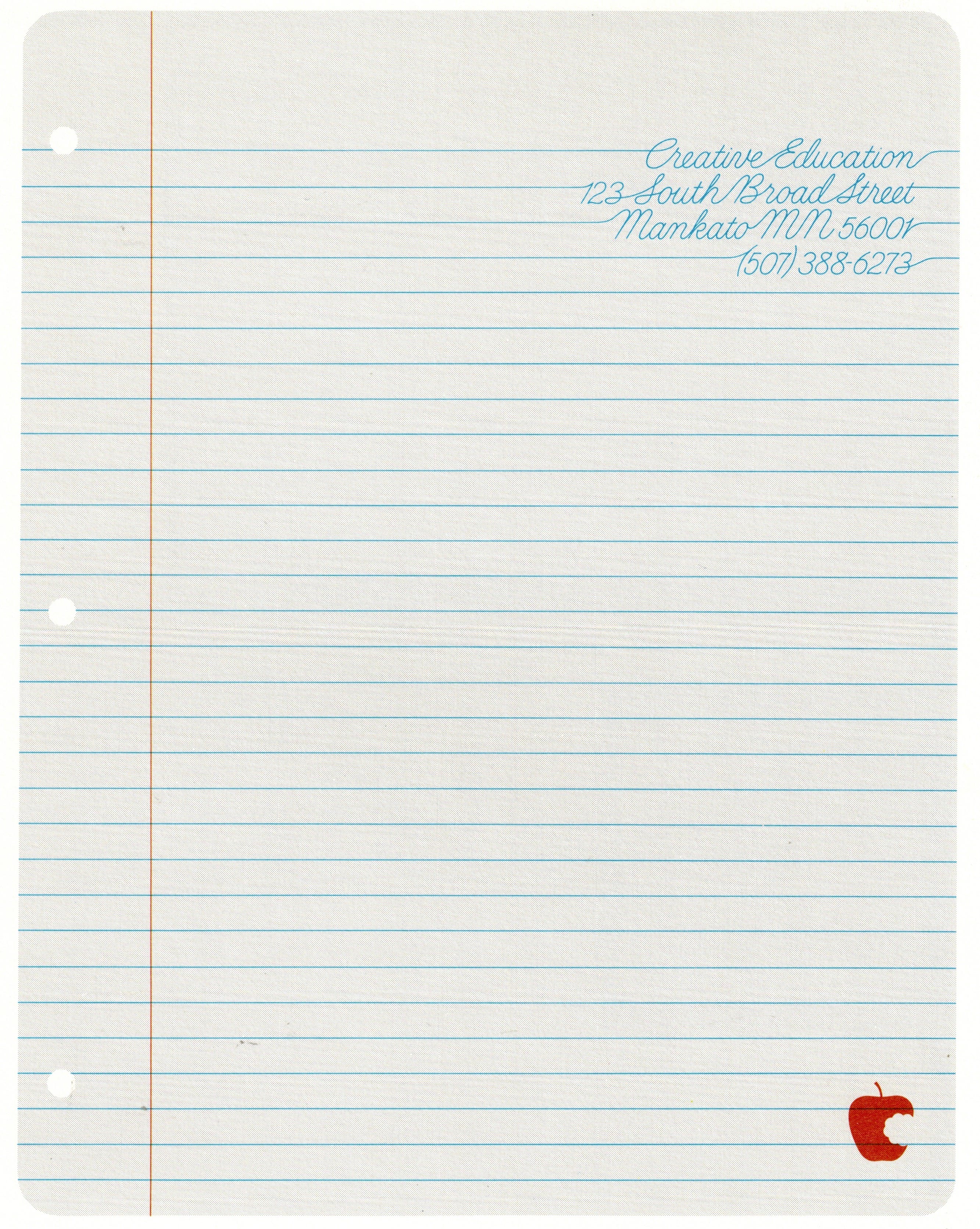
1978. My mentor Bob Overby would pop into the studio once a week to take me out to lunch. He’d alook over my shoulder and say, “Let’s see it,” meaning whatever was taped to my drawing board at the time. He saw this design for a letterhead, and said, “No, no, not like that.” He slapped a piece of tracing paper over my drawing, and where I’d written the address in cursive—between the lines—he wrote it out with the lines. And that’s what you see here. (BTW, the red trademark is not a copy of Apple’s trademark. It came years earlier, and was published in a number of competition annuals by the time Apple designed theirs. Steve Jobs told me that Apple’s—designed by Rob Janoff—was better.)

1978. This symbol for greeting card company Avant Cards seemed pretty good at the time, but to my more mature eye, it didn’t age that well. It’s a bit too corporate, especially as greeting cards have become more casual and cheeky since 1979. I think I would have done it differently today.

1980. Around this time I became intrigued with optical effects. I loved how the apple became more realistic as you moved back from the image or squinted your eyes. I suppose now there’s digital tool to create this effect, but back then my team and I had to figure it out by trial and error. The shape of the TV screen seems quaint, but they looked pretty much like that before flatscreens came along.

1981. The pictogram-style symbol for Greentree, a housing developer in Northern California, combined a redwood with a silhouette of a house. It felt like a Native American symbol, which struck me as appropriate as the architects were among the first to consider conservation as part of their planning.
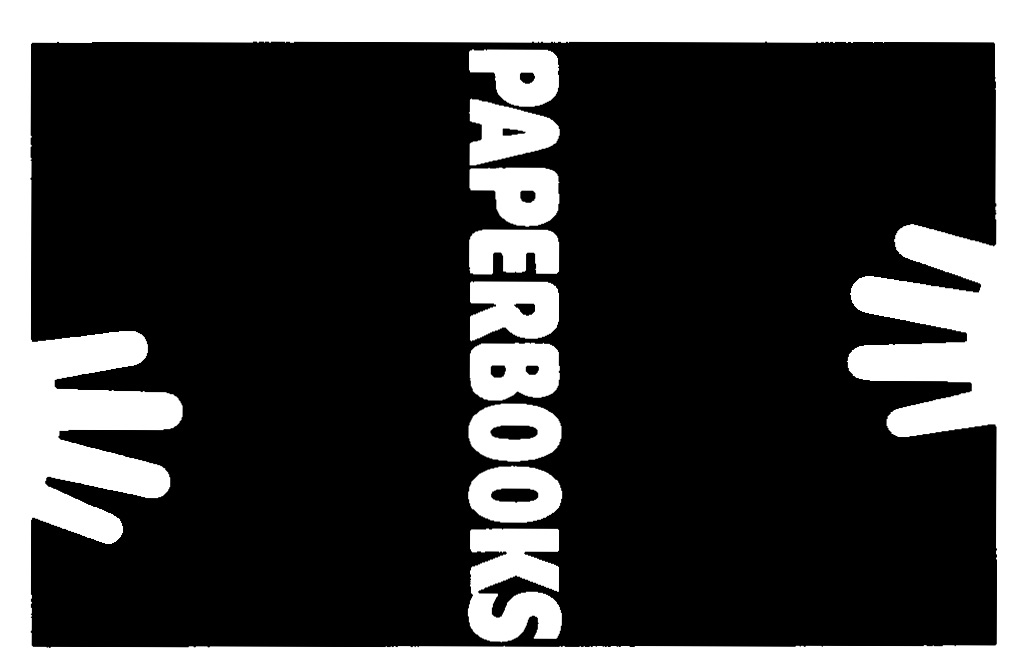
1981. My good client Creative Education had an idea for a line a paperback books as an extension of their flagship hardcover line. Their audience was (and is) elementary-school children, thus the kid-like hans. The rectangular shape is a bit misleading. In actual use, the trademark wraps around the spine of a book so only the word Paperbooks shows on the spine. When you opened the book, the miniature book opened with it.
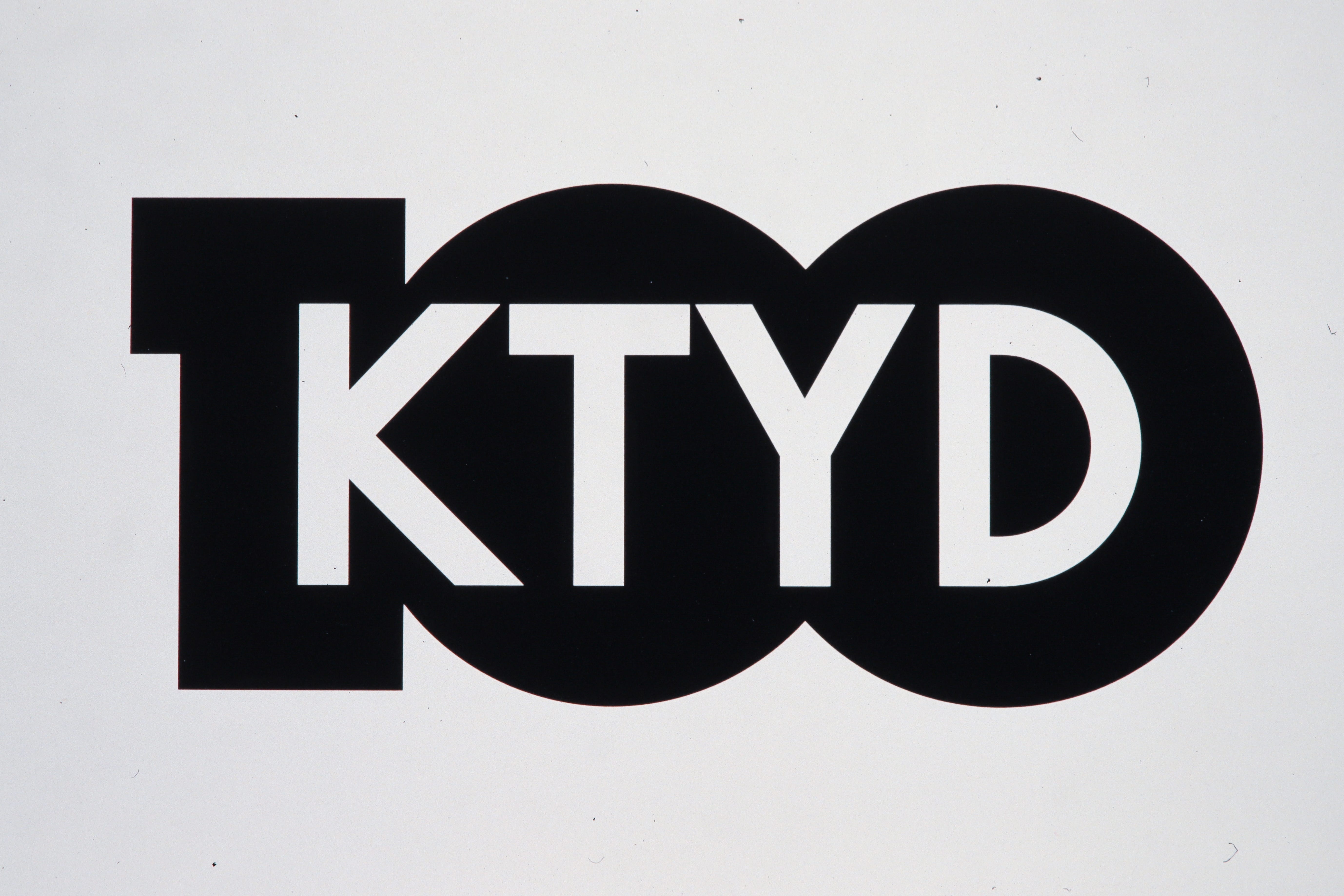
1983. A trademark for radio station KTYD, 100 on the FM dial, I got a kick out of how nicely the call letters and the number fit together. I got to know the DJs in 1977 when I popped in to lend them a brand new album by a guy named Elvis Costello.
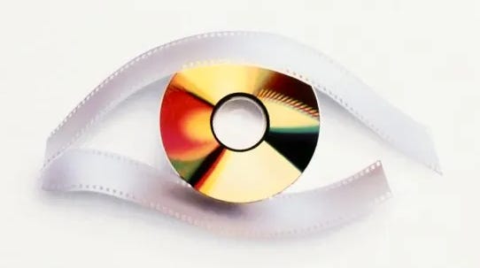
1989. By this time the studio was specializing in technology brands. Kodak had become one of our star clients as we helped them migrate from film to the digital era. In the end, the migration failed. They were forced to compete with the film side of the business for funding, and the film side won. Of course, that meant Kodak lost. Here’s a photographic symbol we designed for their annual developer conference. I scanned this from an old brochure cover, so the image doesn’t quite capture the sheen of the silver film strip, nor the luminescence of the computer disc. Photoshop wasn't a thing yet, so we made a model with a strip of silver film and a disc, then photographed it.
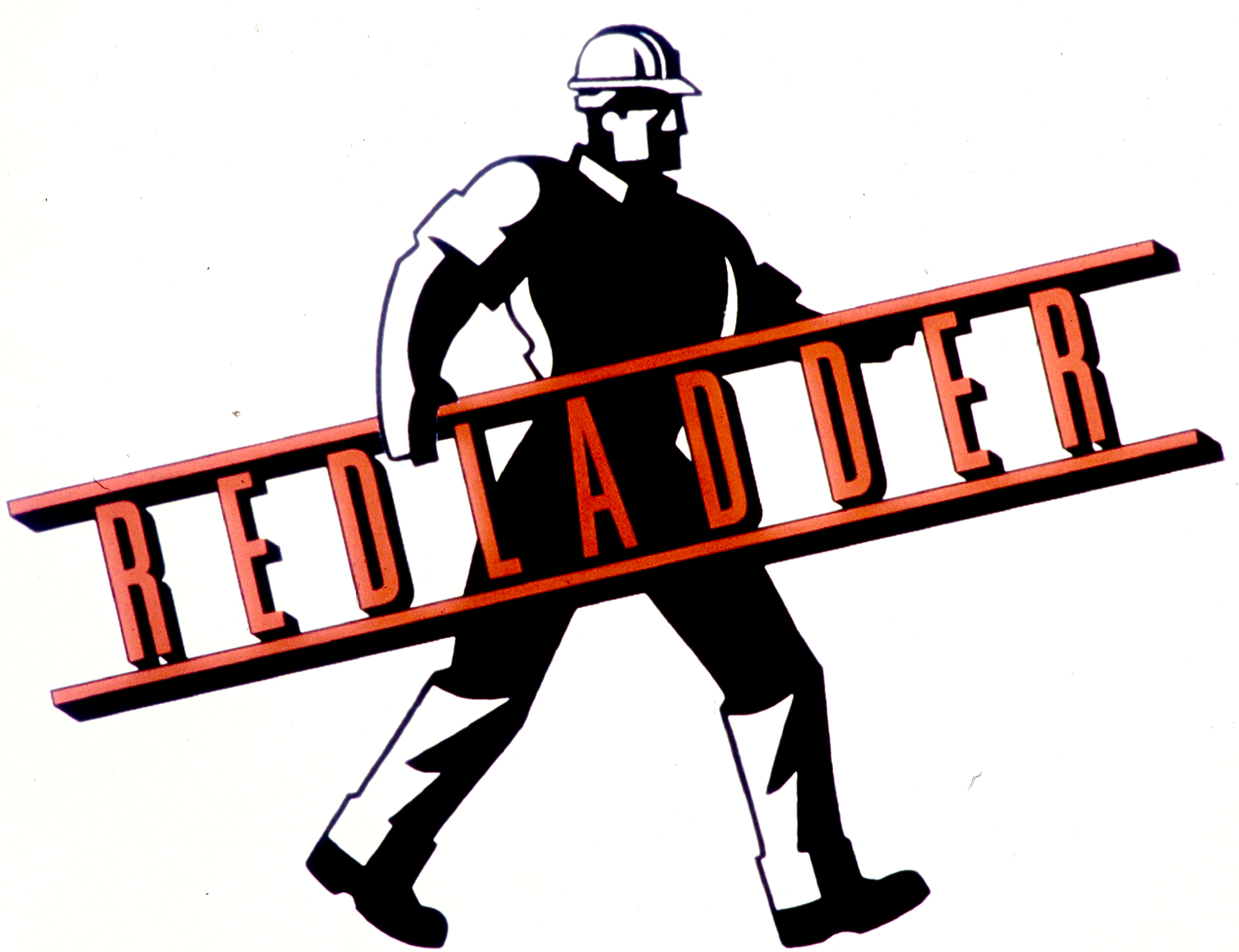
1996. Redladder was one of thousands of startups in the five-year period before 2000, otherwise known as the dotcom boom. The company tried to transform the construction industry with sophisticated production management software. Our research showed that construction managers were still computer-averse, so we designed a friendlier trademark that did well in testing. Unfortunately, Redladder tried to scale too fast and fell to its death in the dot-com bust.
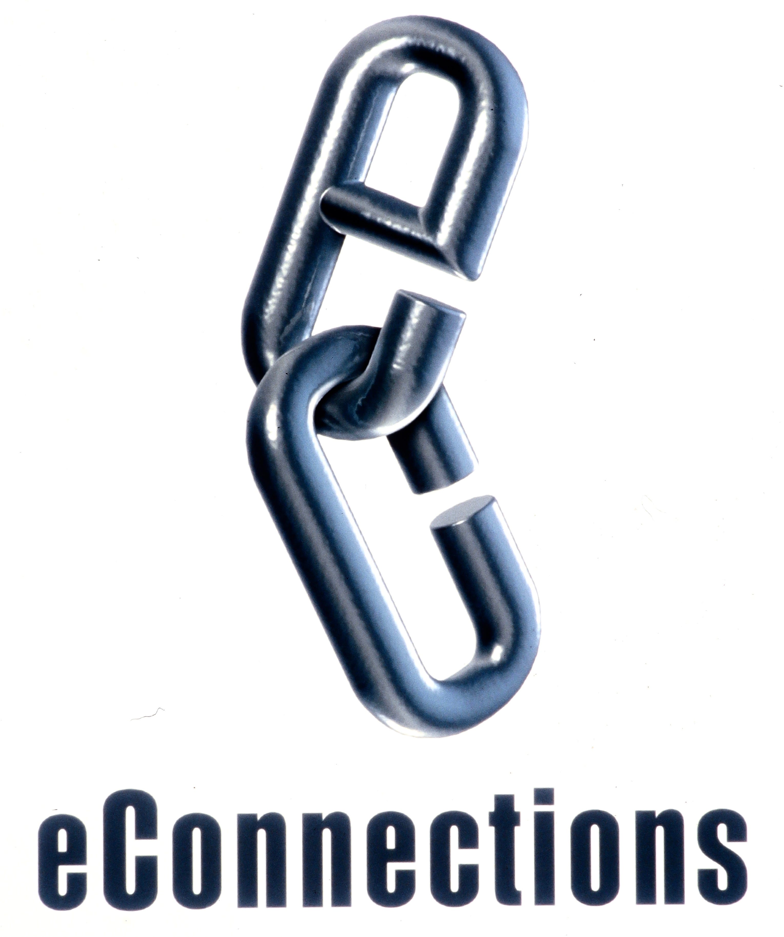
1998. Another dotcom client, eConnections, fared better. Headed by Rob Rodin, the former CEO of a computer parts distributor, eConnections started a trend toward automating supply-chain management. Here we used Photoshop to render the eConnections monogram with realistic detail. Many designers of that era objected to trompe l’oeil logos. Audiences, however, had no such qualms.
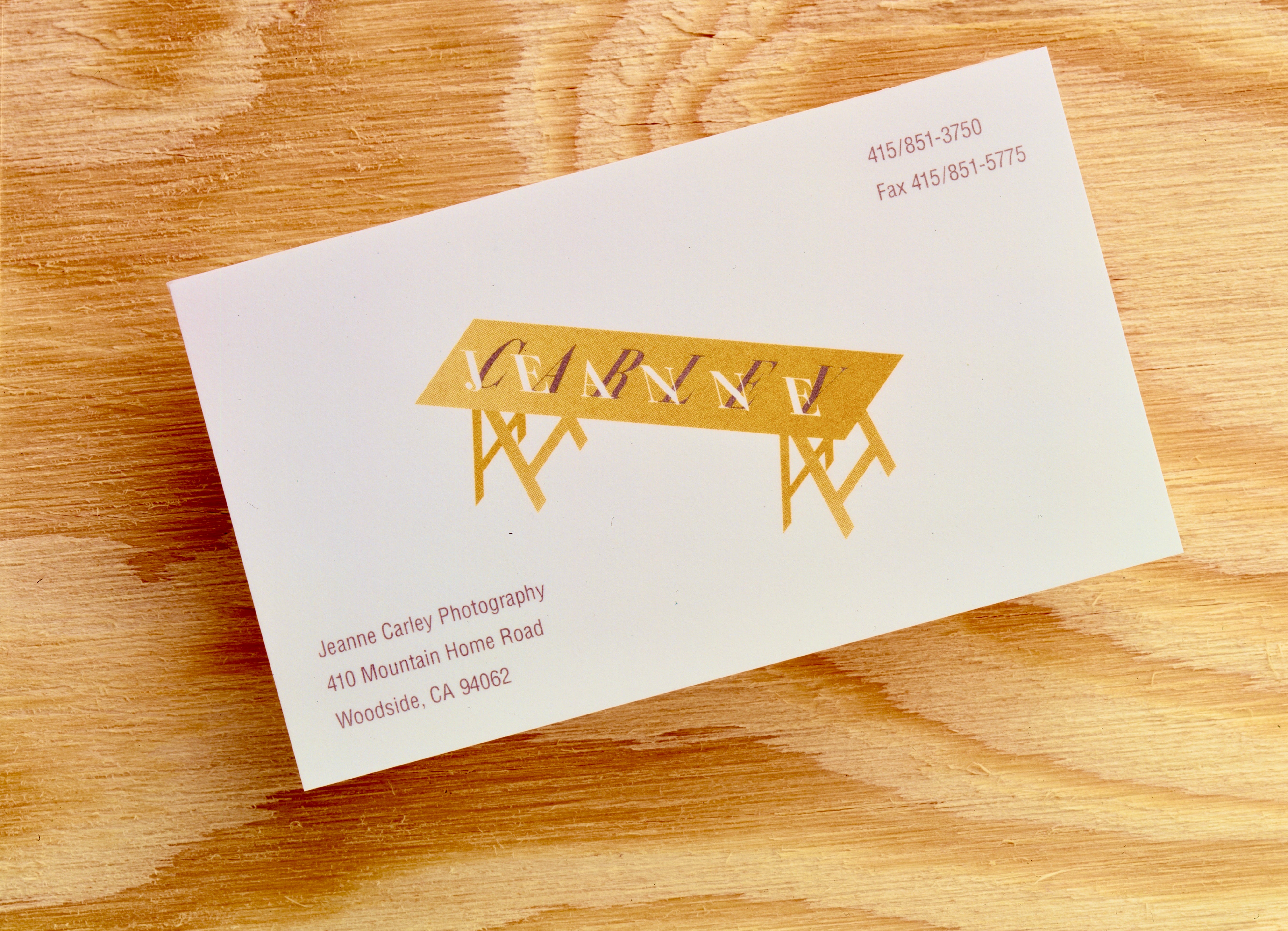
1999. We designed this delicate logo for a commercial photographer named Jeanne Carley, who specialized in tabletop work. Here’s her logo on her business card, shown on her actual tabletop.
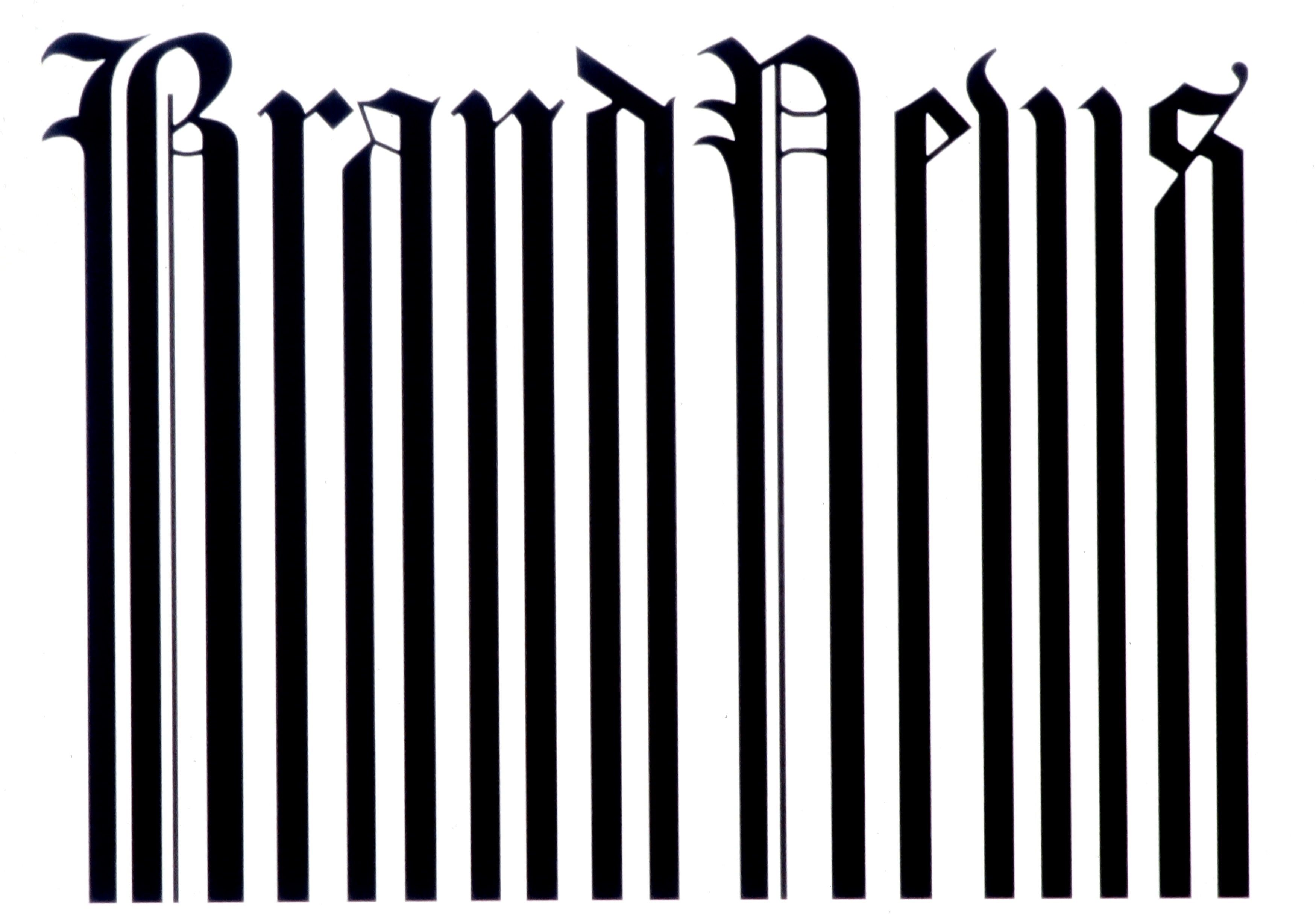
2000. This is the year we found ourselves in a perfect storm: the dotcom bust, the resulting recession, and 9/11. Almost overnight, many of our clients put a hold on their projects; others closed up shop. I had to shut down my own business, putting an end to 25 years of the Neumeier Design Team, as well as to our nascent magazine Critique. But not before we squeezed out one more trademark for a project I hoped might save us. A new journal for the coming era of branding, called Brand News. I never got a chance to test it.
Comments
Nothing yet. Say the first thing.
Sign in to join the conversation.