
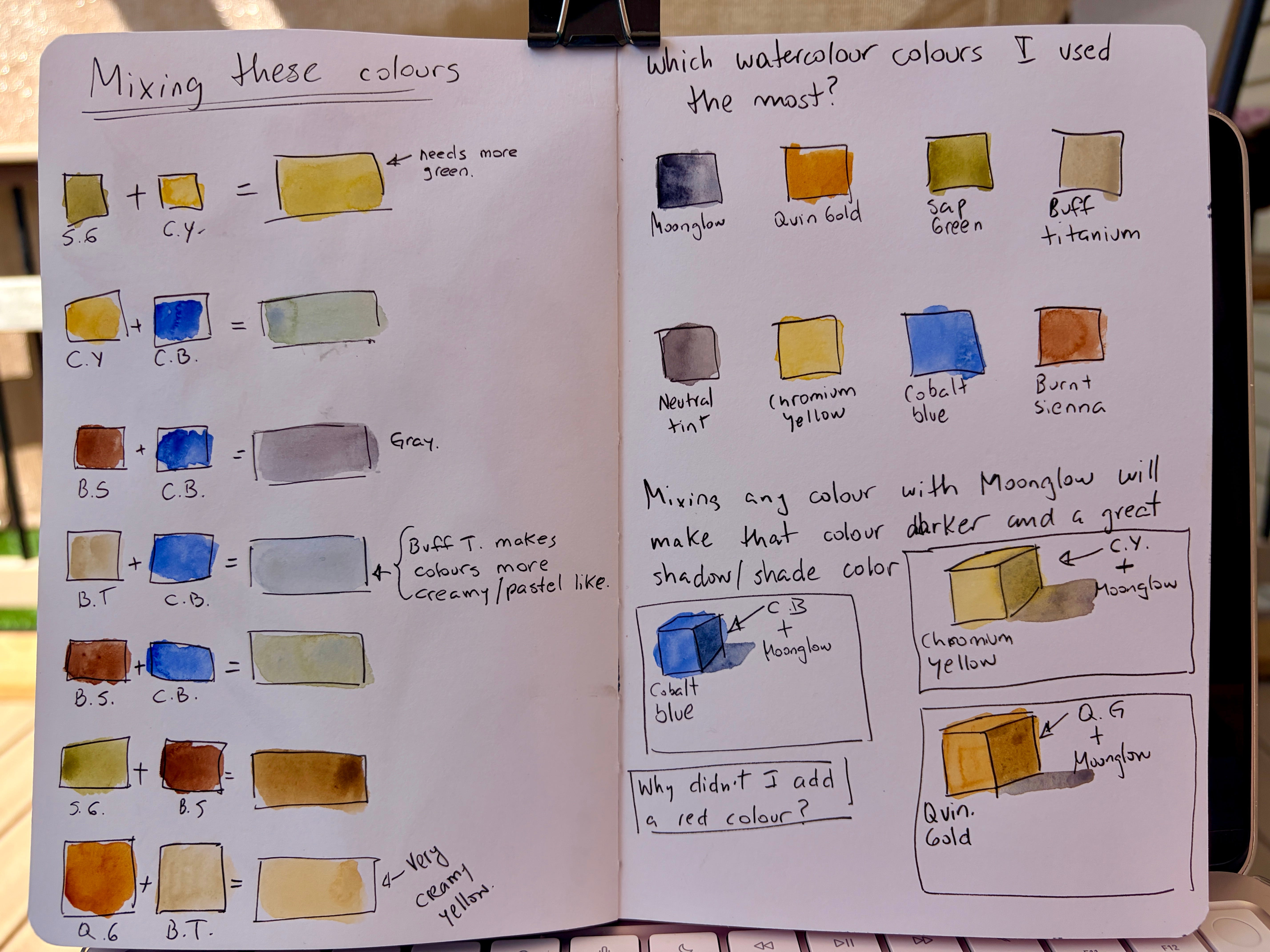
While looking back through my recent paintings, I noticed a small group of colours appeared again and again. My most-used colours were Moonglow, Quinacridone Gold, Sap Green, Buff Titanium, Neutral Tint, Chromium Yellow, Cobalt Blue, and Burnt Sienna.
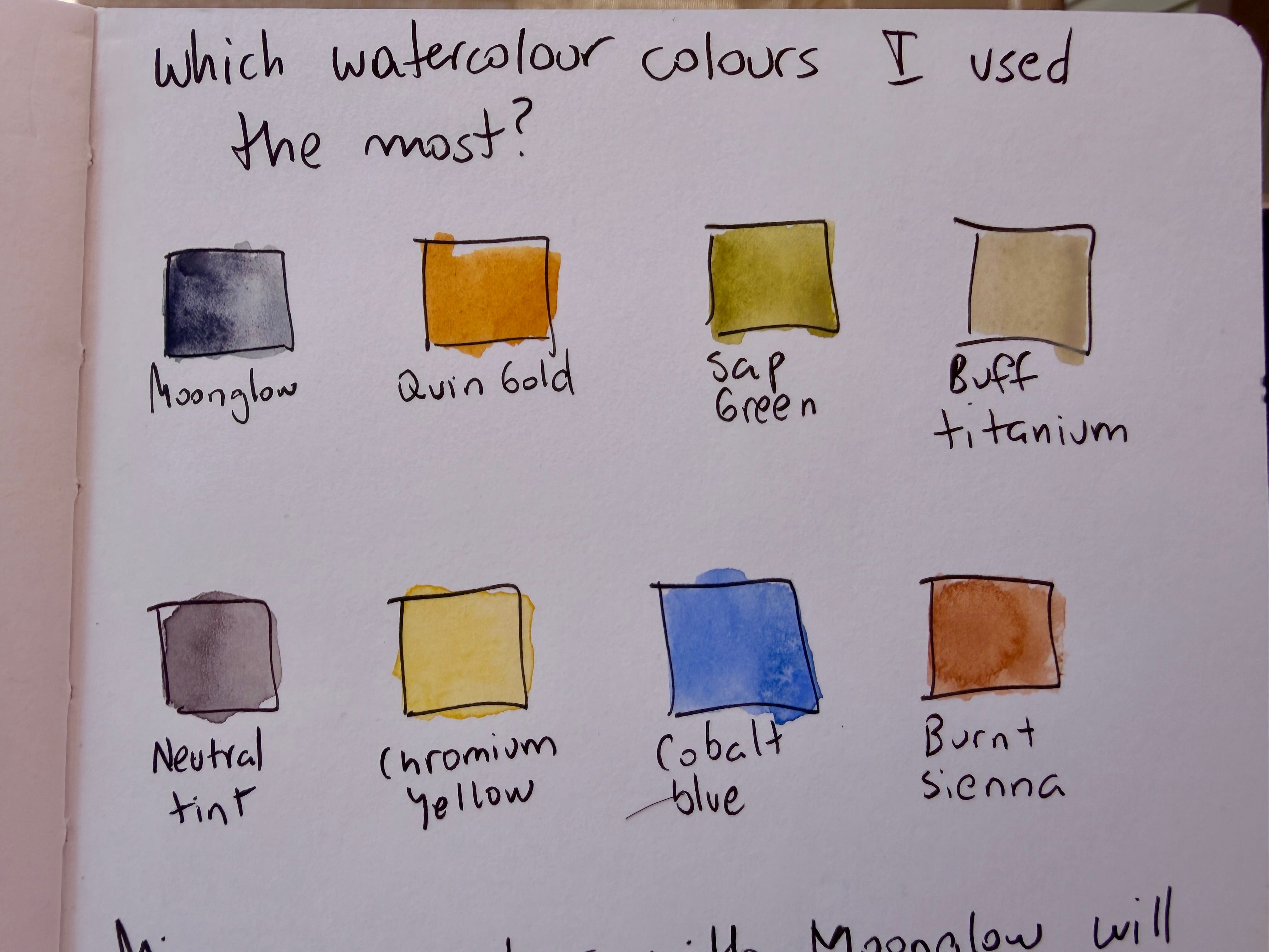
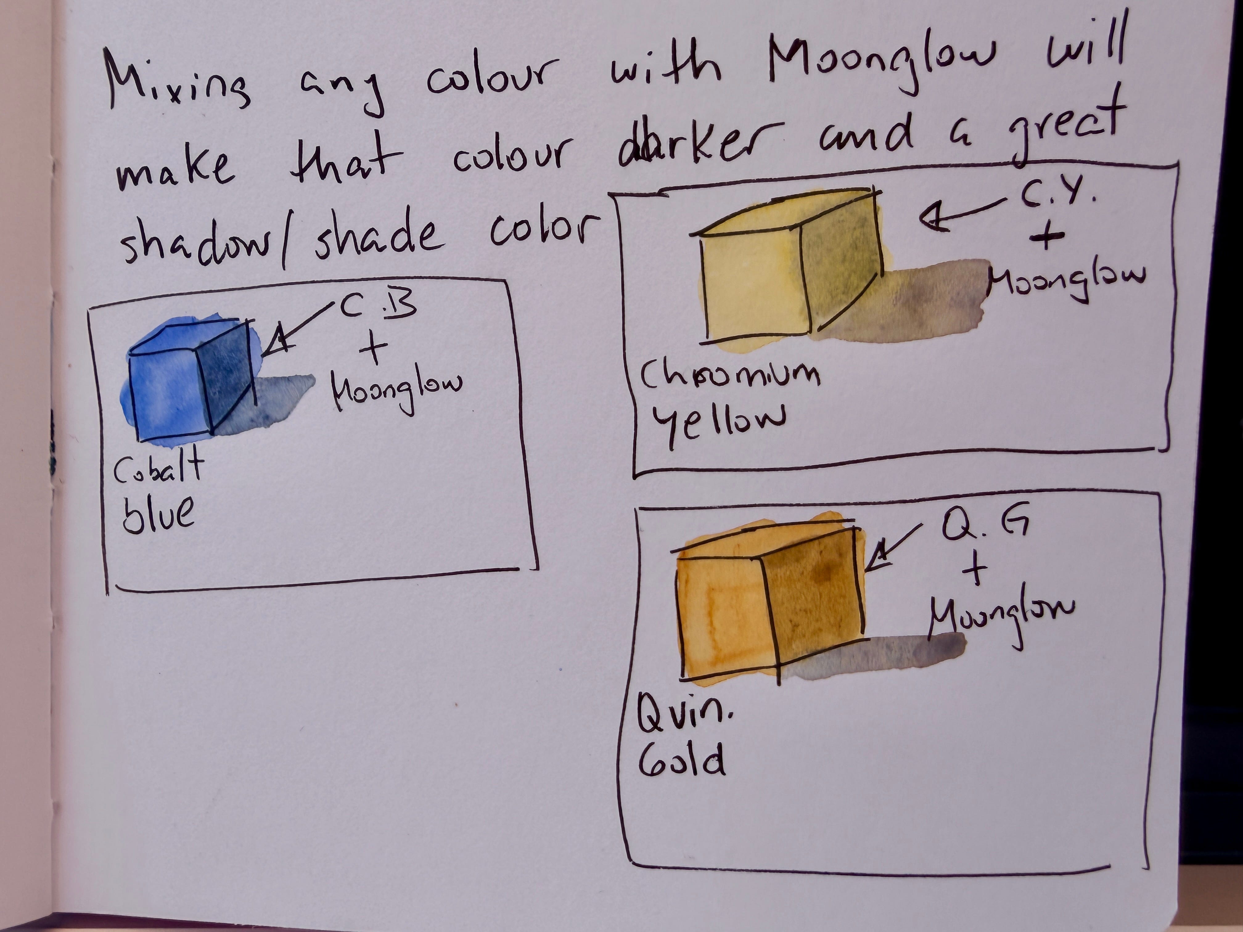
One thing that stood out was Moonglow. Mixing it with another colour creates an easy shadow version of that same colour. I sketched a few simple cubes to remind myself how useful it is. Instead of reaching for black, I can use Moonglow to make natural-looking darker values.
I also spent some time mixing a few colour combinations. I didn’t try every possible mix. I just picked a handful to see what happened and to give myself some future reference.
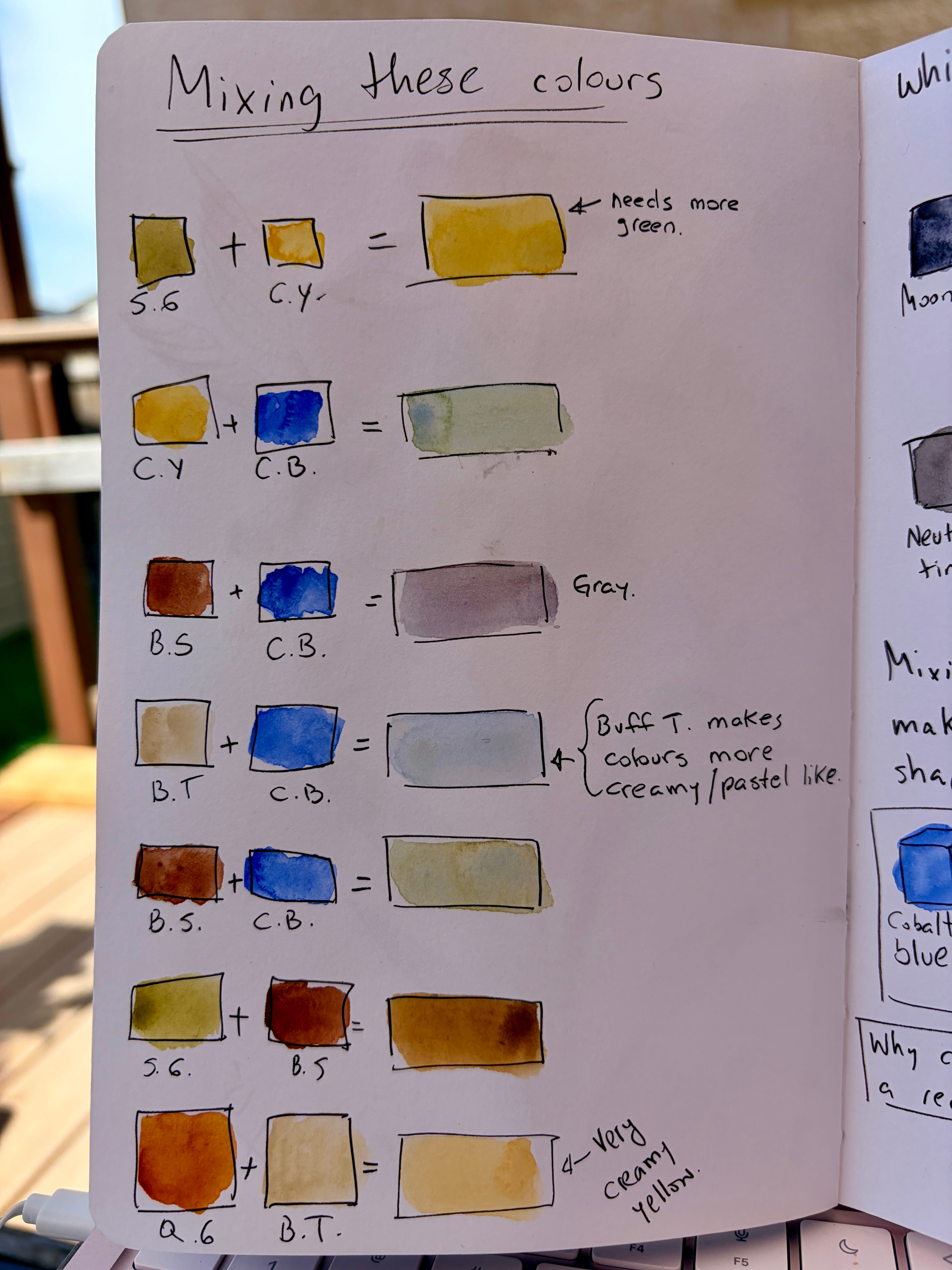
A few things I noticed:
Buff Titanium softens colours and gives them a creamy, pastel look.
Burnt Sienna and Cobalt Blue make a nice grey.
Quinacridone Gold and Buff Titanium create a warm, creamy yellow.
Some mixes surprised me more than others, and a few still need adjusting.
These little pages may look simple, but they’re becoming a helpful reference that I know I’ll come back to while painting.
Have you ever made your own colour mixing pages? I’d love to hear what you’ve discovered. Are there any colours you would add?
Comments
Nothing yet. Say the first thing.
Sign in to join the conversation.