
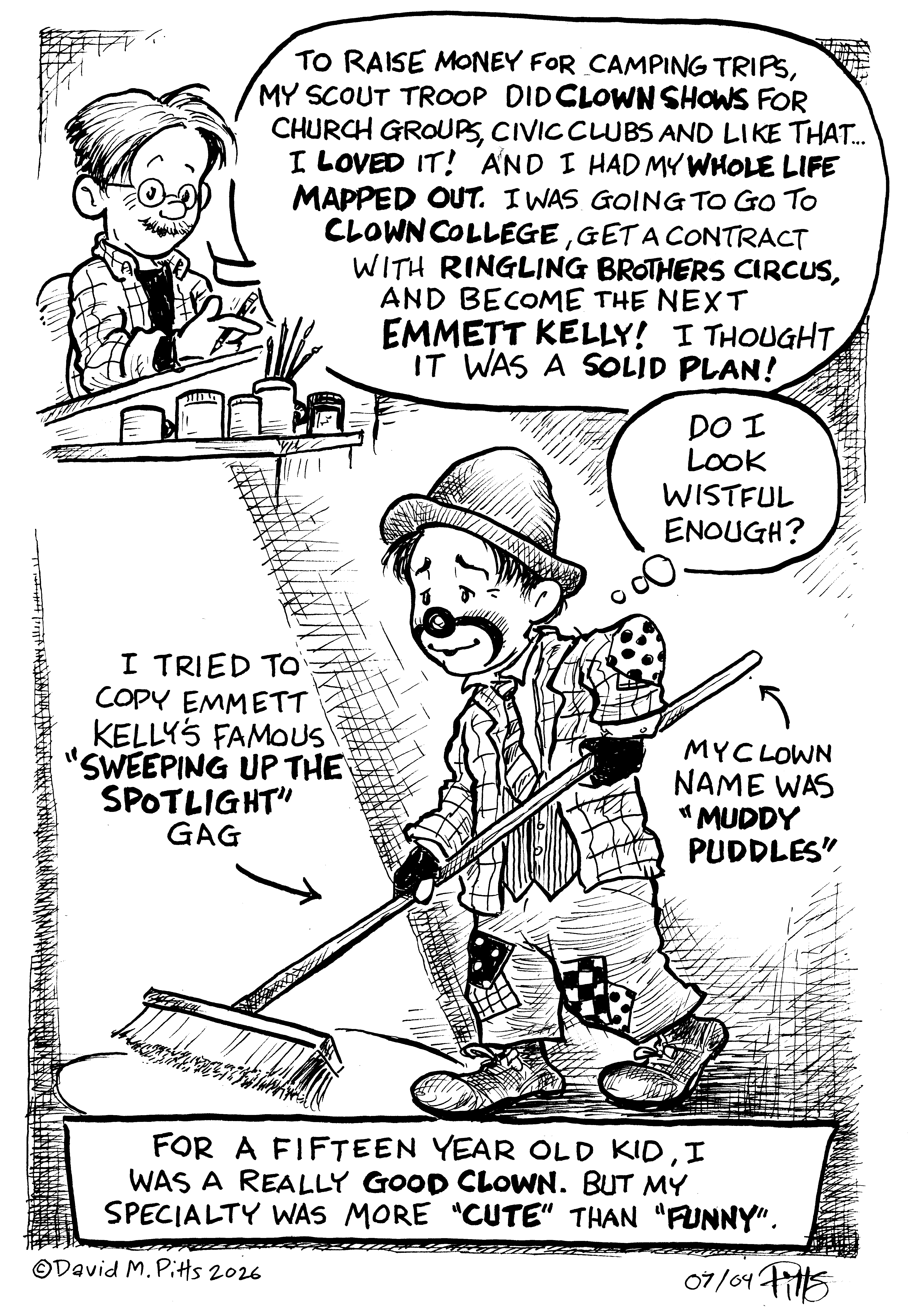
The summer I was fifteen, 1976, was when I was most certain about what I wanted to do with my life. That kind of certainty made me very optimistic about my future.
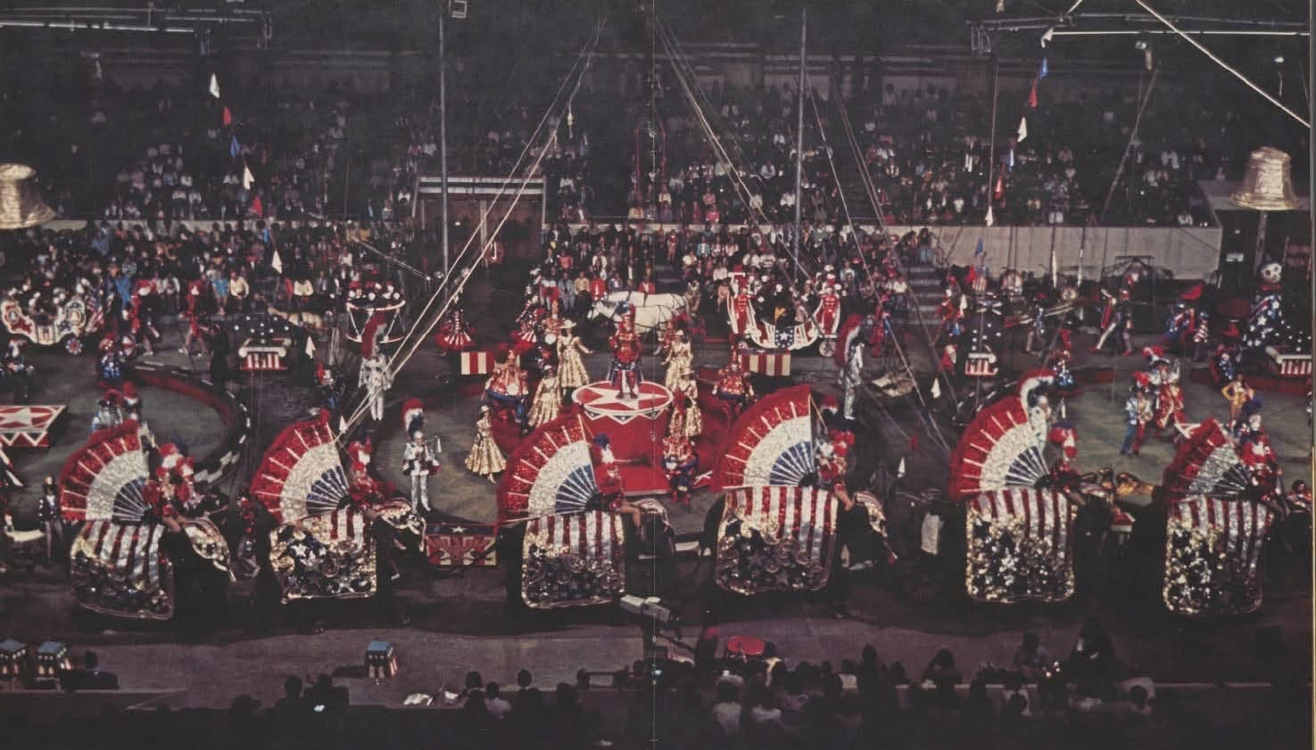
I would be a famous clown and perform in The Greatest Show on Earth: Ringling Brothers and Barnum and Bailey Circus! At the time, it truly was a wonderful big American style circus. Three rings, acrobats and aerialists, beautiful showgirls, brave animal trainers, fierce big cats, elephants, dogs, horses, and of course… CLOWNS.
There were a lot of clowns with the show that year (two shows really, two units, one red, one blue). A group of clowns is called an “alley”, and Ringling at that time carried an alley of around 15 to 20 clowns. Some new, young ones fresh from Ringling’s Clown College and several older, more experienced clowns on each unit.
Ringling Brothers came to my small city, Amarillo, every year back then, in August for a two or three day stand. I went to every performance I could. Tickets were very affordable.
Several circuses came through town that year, and they all had a bicentennial theme, but Ringling really went all out and it was a completely over-the-top spectacle of red, white, and blue sparkles and spangles, costumes, wagons, girls, elephants, clowns, and music. And even with all this showbiz, it somehow managed to feel… sincere. Maybe it was me, maybe it was everybody, but it felt like the circus truly meant it.
I wanted so much to be a part of it.
I changed direction a little later, but that summer I was very certain and I felt happy.
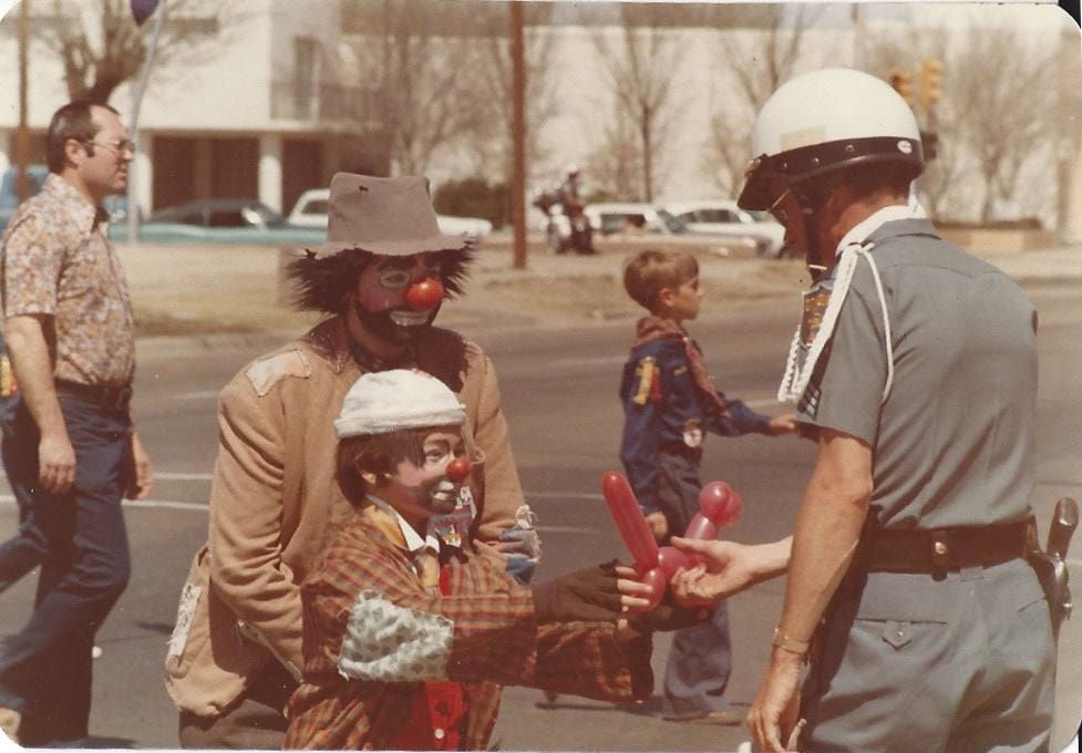
My friend John Szalkowski, “Unca’ Willie” and I, “Muddy Puddles” giving an Amarillo Police Officer a doggie balloon in a parade.
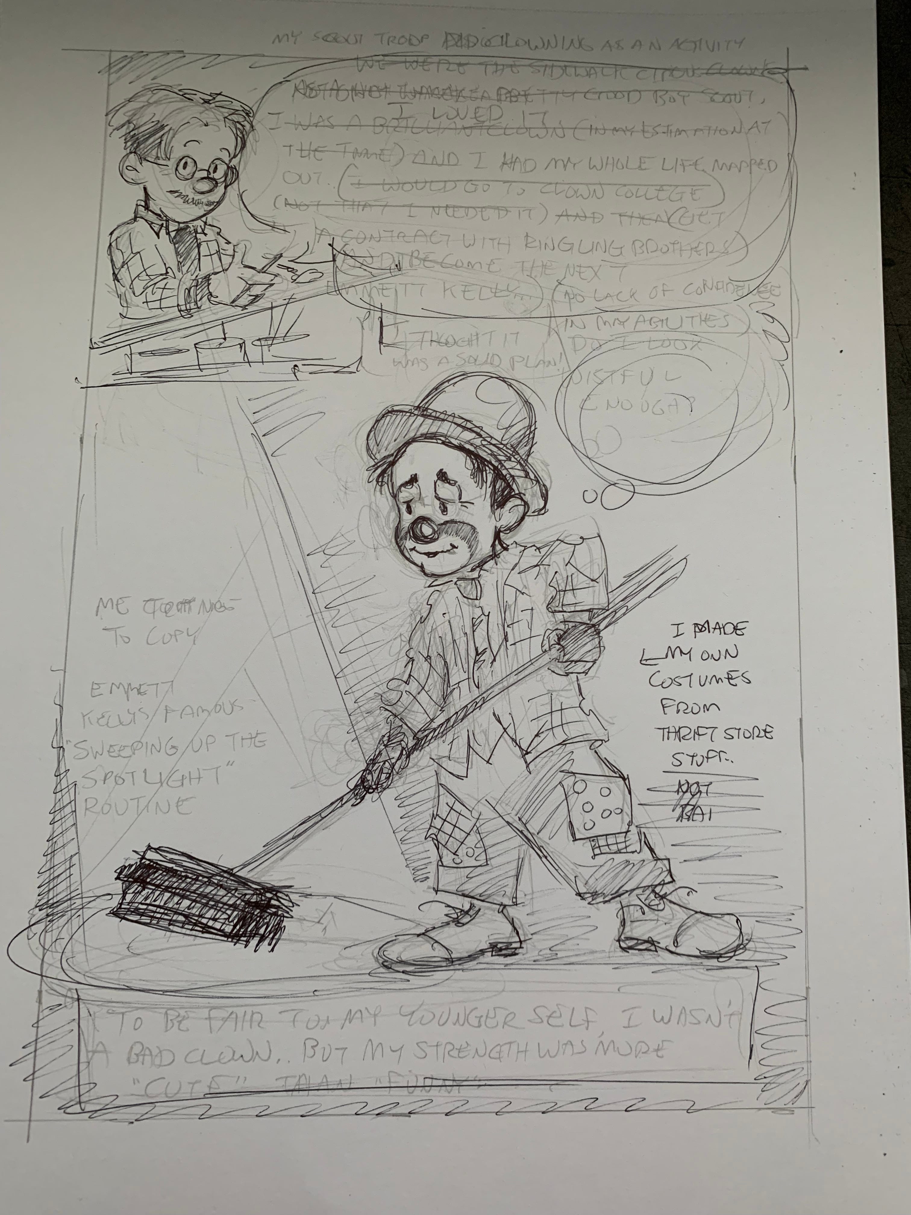
As usual, I did the initial sketch with a mechanical pencil, HB lead, then went over it in ballpoint to make it easier to ‘lightbox’ it.
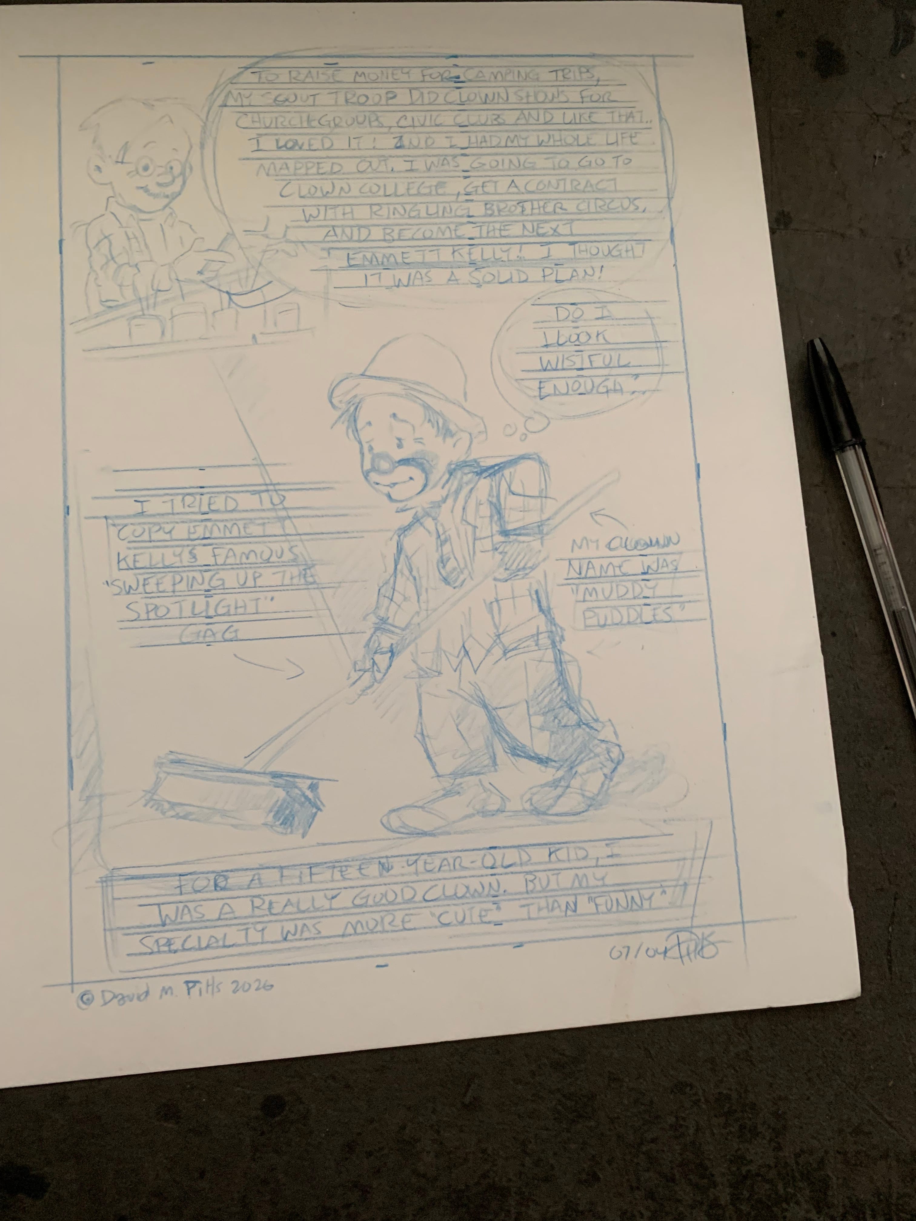
Lightboxed in blue pencil. Notice I changed my stance a little.
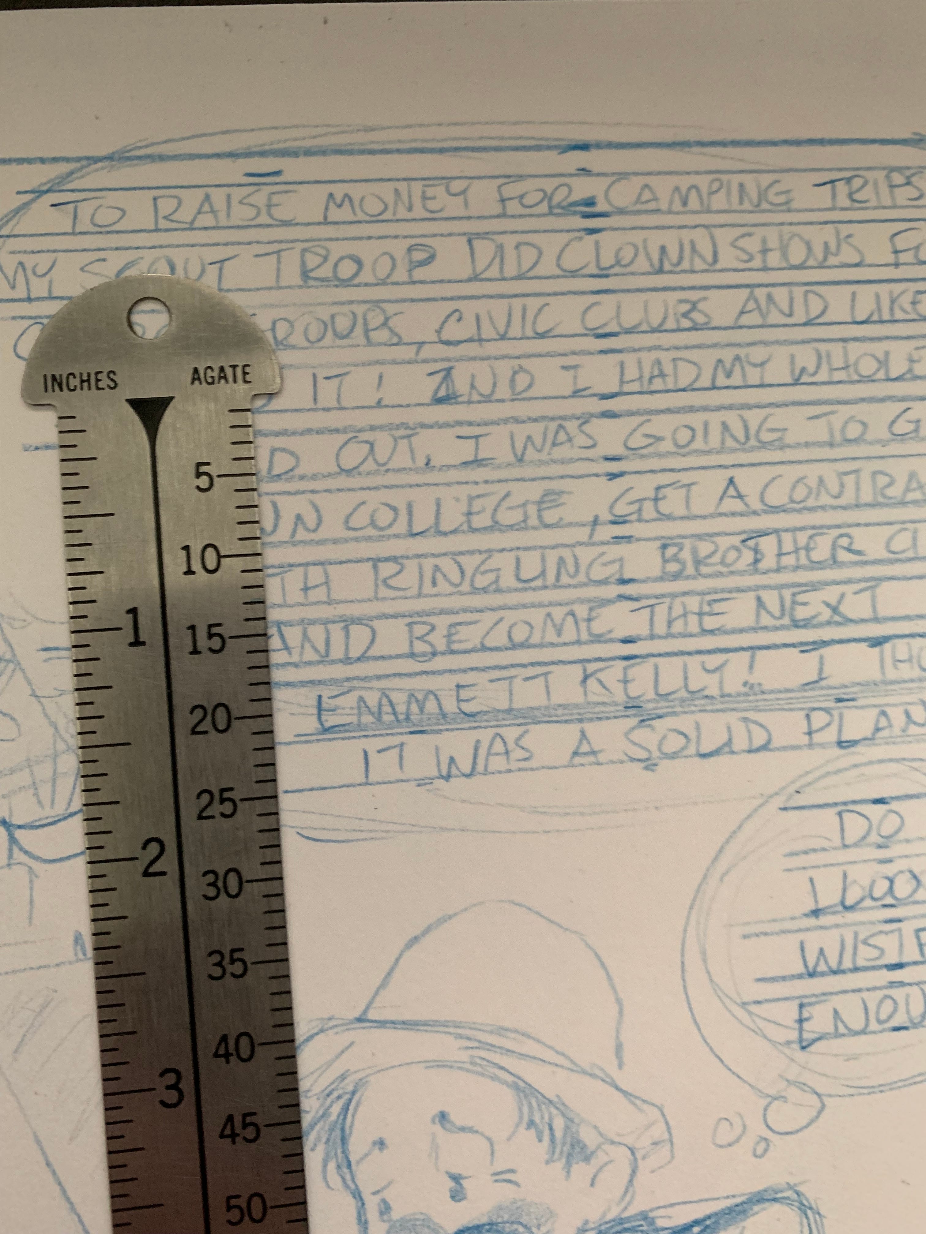
A reader asked me if I use an Ames Lettering Guide. I don’t. I just use a t-square and a ‘pica pole’. I have been experimenting with lettering sizes, and for this comic I made the lines three agates high with a one agate space between.
Last time I went a little bigger on the lettering. As I said, I’m experimenting. Since most people read this on their phone, and since many of my readers are over fifty, I’m trying to make it as readable as possible. Bigger lettering might be easier to read, but it can look a little crowded, so I’m trying for ‘just right’, like Goldilocks.
No posts
Comments
Nothing yet. Say the first thing.
Sign in to join the conversation.