
Time for a rant from Riverton.
Yesterday in my Facebook feed, I saw a video advertisement from Verizon Wireless for their Start the Summer On Us campaign. At first glance of the default image, I had to do a triple take:
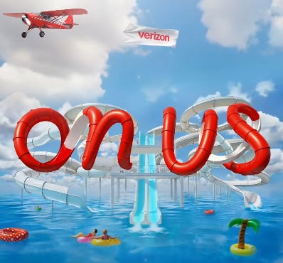
Before hearing the audio from the ad and reading supporting material, I thought Verizon was selling a new product called “Onus”, and that was not until the third of those glances. The first two glances had me seeing something totally different, and very very unfortunate. Something borderline NSFW.
The agency that came up with this campaign should be ashamed of themselves. First impressions matter.
While this specific case does not specifically involve the use of cursive type, this is another reason why I avoid design that involves cursive in presentations as it can be either unreadable from a distance or otherwise misread from a distance or at first glance. Also, spacing matters (the difference between “Onus” and “on us”).
In the case of cursive, I associate its use with targeting an older audience to the exclusion of younger audiences who are less likely to accept cursive writing in their everyday lives.
One of the biggest offenders of this is supermarket chain Food Lion:

Cursive in graphic design is only acceptable if the project requires a nostalgic feel. It has no place in any modern time setting.
Yes, I am part of the anti-cursive crowd where it comes to schools. Students should be judged on the substance of the content being written, not the penmanship used to convey said substance. It is one thing to teach the basics on how to read it, but it should never be a requirement to write in it.
Imagine if road signs were written in a cursive font. Same thing here. It does not make the campaign more “classy” or more “feminine”; it just makes it more out of touch with the times.
Sorry VZW, this campaign was a dud. Think before you green light something.
No posts
Comments
Nothing yet. Say the first thing.
Sign in to join the conversation.