
At work, my colleague Robert Dickson thought it would be fun to do something different this month with our weekly conferences, so we decided in August to feature a “How I Do It” series. Included in this was a talk by my colleague, Dr. Wassim Labaki, on the power of a good figure. It was so good that I wanted to share it here. But to be clear, Dr. Labaki deserves the credit for the content. He began with a story about Florence Nightingale. And for as many years as I’ve been in medicine, I can’t believe I hadn’t heard the story before.
Most know Nightingale as a nurse. You probably don’t know that she was also rigorously trained in mathematics by her father. She ultimately became the first woman elected as a fellow of the Royal Statistical Society. But perhaps more importantly, she not only understood numbers but also the power of how they’re presented. By the time she got to the Crimean War, she already understood that a number, on its own, persuades almost no one. But pair those numbers with the right picture, and numbers can win hearts and minds.
She once lamented, “Whenever I am infuriated, I revenge myself with a new diagram.” I have made hundreds of figures over the course of my career. Not once have I ever thought of it as an act of revenge. All too often, figures are the thing I build last, after the real work of the science is done. But I digress. Back to Nightingale.
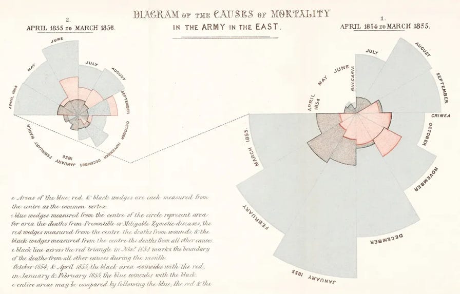
She went to the Crimea in 1854 as a nurse and discovered something horrific. For the most part, soldiers were not dying of battle wounds. They were dying of cholera, typhus, and dysentery due to filthy field hospitals, contaminated water, and wards so overcrowded that infection moved through them like weather. Nightingale kept meticulous mortality records by hand, month by month, cause by cause. She reported the tables, but nobody in London was reading them. So she changed her approach. It became known as the rose diagram or a polar area chart. She created one wedge per month, with each wedge's size determined by the number of soldiers who died and its color by the cause: preventable disease in blue, battle wounds in red, and everything else in black. You didn’t need to know a thing about statistics to look at it and see that the blue wedges swallowed the entire chart. This figure reached the War Office. It even reached Queen Victoria. And it became part of the case for the sanitary reforms that followed, ultimately credited with saving tens of thousands of lives. And this brings us to several key concepts.
But what is it that really makes a figure memorable? How do we create that kind of figure? It turns out that the answer is often not more information, but rather less. In my opinion, the best figures have a point of view. They know what they are trying to show you. Yes, I know that sounds obvious. But we often ask a figure to do too much. We leave it to the reader to decide what matters to them.
So after you look at the data, start with the message. Decide first what you want the reader to see, then decide how to show it. Use color intentionally. Make the important comparison easy to find. And perhaps most importantly, don’t confuse completeness with clarity. A figure doesn’t need to contain everything you learned. It needs to show the thing you want someone else to understand. Yes, in some cases, we simply need to present all the data for completeness and scientific honesty. But in other cases, a good figure really can help the reader focus on the key messages you want to convey.
There is a wonderful simplicity to Nightingale’s diagram when viewed through this lens. She had mountains of data. She could have presented mortality rates, tables, monthly comparisons, denominators, and calculations. Instead, she made one fact visually overwhelming: soldiers were dying from preventable disease.
Which made me realize that making a good figure isn’t really a design problem. It is a framing problem. To make a great figure, you first have to decide what matters. You must find the signal in everything you’ve collected, then decide what deserves the reader’s attention. The figure is simply the final expression of that thinking.
We spend an enormous amount of our professional lives trying to persuade other people of things. But evidence rarely speaks for itself. Nightingale understood that more than 150 years ago. She figured out what people weren’t seeing and found a way to make them see it. The best figures don’t simply show us the data. Rather, they help us understand what the data means.
Thank you to Dr. Wassim Labaki for the talk and the inspiration behind this piece.
Thanks for reading AirWaves with Dr. MeiLan Han! This post is public so feel free to share it.
No posts
Comments
Nothing yet. Say the first thing.
Sign in to join the conversation.