How a feature goes from idea to prototype to shipped
For years, there’s been this really popular Chrome extension for adding a table of contents to your Medium stories. Props to Vinicius De Antoni for writing a popular chrome extension all those years go.
The extension was so popular, we even wrote about it in our Medium Handbook.
How to make a table of contents for your Medium story
The fact that it was so popular was a signal to me. There was a decent size of our user base that wanted this feature. So, at first I set out to just copy it.
The Chrome extension extends the popup menu we have in the editor to add a new option. Just a styled button on the existing list.
const inject = () => {
  const tooltipToggleMenu = document.querySelector(
    "[data-action=inline-menu]",
  );
  const tooltip = document.querySelector(".inlineTooltip");
  const tooltipMenu = document.querySelector(".inlineTooltip-menu");
  const addEmbedButton = document.querySelector(
    ".inlineTooltip-menu [title='Add an embed']",
  );

  if (!tooltip || !tooltipToggleMenu || !tooltipMenu || !addEmbedButton) {
    return;
  }

  tooltip.style.width = "auto";

  const toCButton = document.querySelector("[data-action='inline-menu-toc']");
  if (toCButton) {
    return;
  }

  const handleAddToCClick = (e) => {
    const container = document.querySelector(".is-selected");
    tooltipToggleMenu.click();

    container.innerHTML = generate().join("<br/>");

    setTimeout(() => {
      simulateKeydown(container, 13);
    }, 0);
  };

  const addToCButton = addEmbedButton.cloneNode(true);

  const title = "Add a Table of Contents";
  addToCButton.setAttribute("title", title);
  addToCButton.setAttribute("aria-label", title);
  addToCButton.setAttribute("data-action", "inline-menu-toc");
  addToCButton.setAttribute(
    "data-action-value",
    "Generate a table of contents",
  );
  addToCButton.setAttribute("data-default-value", "Table of contents");
  addToCButton.innerHTML = "⋮";
  addToCButton.style.color = "rgb(26, 137, 23)";
  addToCButton.style.border = "1px solid";
  addToCButton.style.fontWeight = "bold";
  addToCButton.addEventListener("click", handleAddToCClick);

  tooltipMenu.appendChild(addToCButton);
};
(Code taken from the open source Chrome extension)
The button has an event handler that runs some JavaScript to look at the content of the post, find all the headings and creates an unordered list of links for each.
const generate = () => {
  const headingList = [...document.querySelectorAll("h3[name], h4[name]")];

  return headingList
    .filter(
      (headingTag) =>
        !headingTag.classList.contains("graf--title") &&
        !headingTag.classList.contains("graf--subtitle"),
    )
    .map((headingTag) => {
      let bullet;
      switch (headingTag.tagName.toLowerCase()) {
        case "h1":
        case "h2":
        case "h3":
          bullet = `·`;
          break;
        case "h4":
          bullet = `  ∘`;
          break;
      }

      return `${bullet} <a href="#${headingTag.getAttribute(
        "name",
      )}" title="${headingTag.textContent}">${headingTag.textContent}</a>`;
    });
};
(Code taken from the open source Chrome extension)
It inserts that list into the body of the post itself.
For me, this is the first downside. Mutating the post directly feels… not great. It doesn’t play well with our revision model and from writer’s perspective, adding stuff into the post I spent so much time writing can skew the reading experience.
Still, most people don’t mind the look and feel of it. The real issue, however, is that it isn’t dynamic. You click the button and slaps that list in your post. But what if you revise your article later? Add a new section with a new header and suddenly that table of contents isn’t accurate.
Then there was the usability of it. It was always inserted at the top of the post. Which meant that once you used it to jump to the bottom section, you’d have to scroll back to the top to use it again.
The list also just jumped you straight to the section. That’s how anchor links work by default, but it could feel abrupt if you didn’t quite know what was happening.
I thought we could do better. A dynamic solution that writers don’t have to maintain.
The principals are still the same though: the list should be built off of content of the post. That’s our source of truth. If the author revises it, they shouldn’t have to worry about maintaining some index of all their headings.
So, we build the table of contents based on the post’s body at render time. Why at render time? Well, if you didn’t know our post model is… complicated. We don’t store the full, finished post in our backend. We store a series of revisions that we play over one another to land on the final version. The end user doesn’t notice the difference, but it allows authors to step back through different versions of their article.
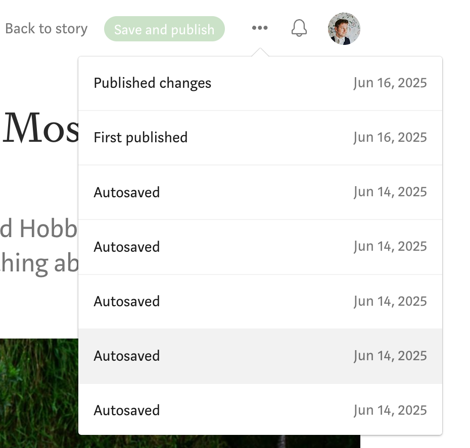
Rather than trying to traverse this complicated model, it was best to just honor the end result of the post and create a table of contents at run time.
Much like that Chrome Extension, we build a list based off the headings.
/**
 * Derives a nested table of contents from a post body model.
 *
 * In Medium's model, in-body H2 and H3 both render as the larger section heading
 * while H4 renders as the smaller sub-heading. So H2/H3 become top-level entries
 * and H4 sub-headings nest beneath the most recent top-level heading. The post's
 * lead title/subtitle/kicker are excluded because getParagraphStyles remaps them
 * to 'Title'/'Subtitle'/'Kicker'. An H4 that appears before any top-level heading
 * is promoted to top level so nothing is dropped.
 */
export function buildTableOfContents(bodyModel: TocBodyModel | null | undefined): TocEntry[] {
  if (!bodyModel) return []
  const styles = getParagraphStyles(bodyModel as Parameters<typeof getParagraphStyles>[0])
  const entries: TocEntry[] = []
  let currentTopLevel: TocEntry | undefined

  bodyModel.paragraphs.forEach((paragraph, index) => {
    const style = styles[index]
    const name = paragraph.name?.trim()
    const text = paragraph.text?.trim()
    if (!name || !text) return

    if (style === ParagraphType.H2 || style === ParagraphType.H3) {
      const entry: TocEntry = {name, text, children: []}
      entries.push(entry)
      currentTopLevel = entry
    } else if (style === ParagraphType.H4) {
      if (currentTopLevel) {
        currentTopLevel.children.push({name, text, children: []})
      } else {
        entries.push({name, text, children: []})
      }
    }
  })

  return entries
}
Then, it’s a matter of how we display it. My first attempt was to just add it to the 3-dot-menu at the top of the post:
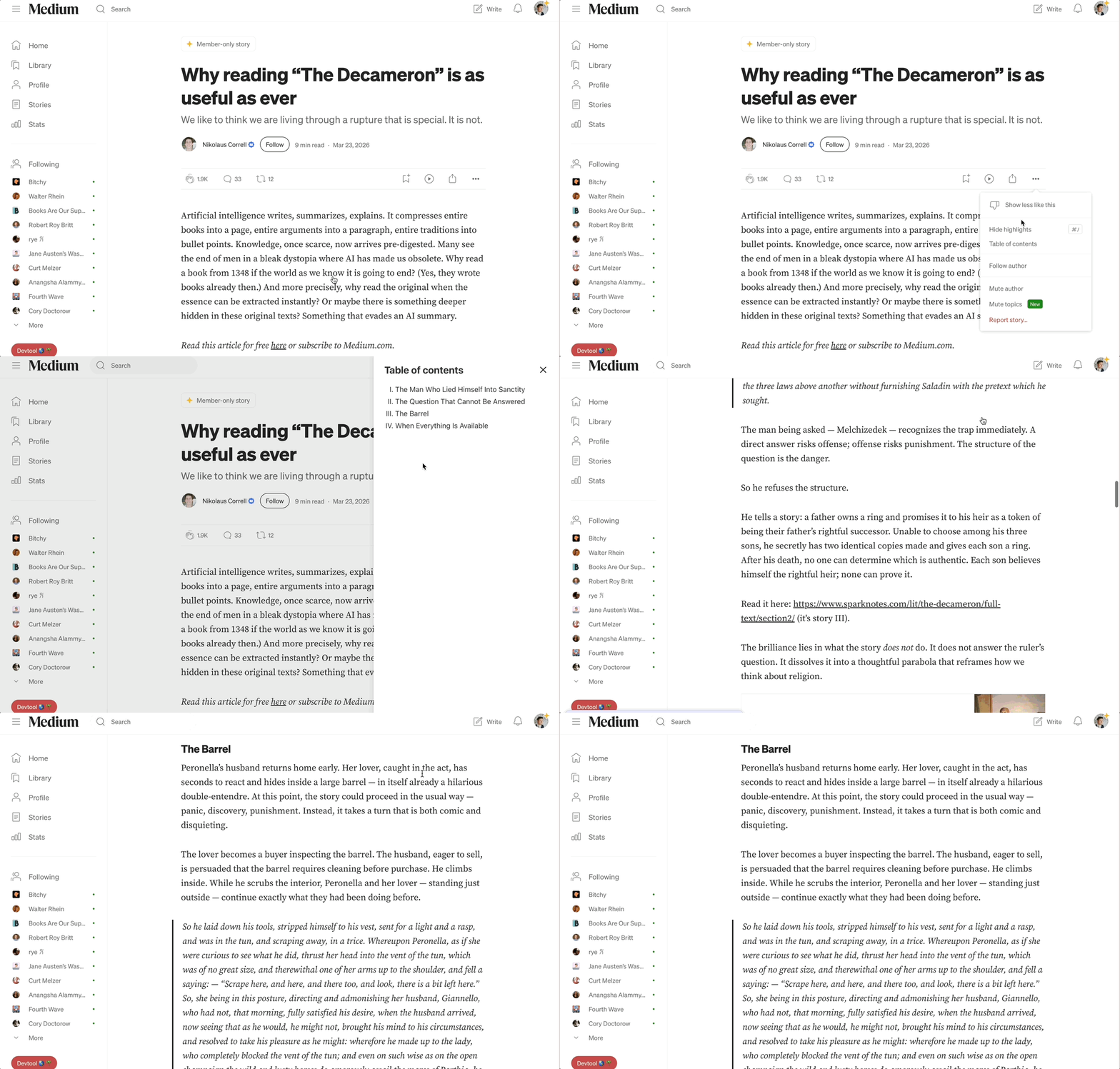
I’m not a designer and I don’t have the best UX sense, but even I could tell this wasn’t quite right. As some people pointed out, the biggest downside was that you couldn’t access the Table of Contents from anywhere. You had to be at the top of the post.
Luckily, I work with some great designers and we were able to noodle out some ideas. There’s a lot of prior art on the internet for breaking up sections on a page. Look at Notion, Codex, Graphite, and many other apps.
Rather than adding another item to that popover menu, what if we had something that lived in the right margin and scrolled with you?
Better yet, what if it could tell you where you were within the body of the text?
Our next solution did just that. Long lines for main headings, short lines for subheadings. The “current” heading would highlight in green and update as you scrolled.
Edge cases
Good enough to ship, right?
Well, almost. The more we played around with it on production, the more edge cases we could see.

We had to account for images that took up the whole width of the page. We did that by adding a translucent background. This way, it’s always visible without being overly abrupt.
What about posts that have only one heading? Well, we just hide it entirely. There’s kind of no point.
What about posts that have one hundred headings? When we tested it, the table of contents went right off the page! Not a typical case, but there are plenty of long papers published on Medium, and they are arguably the ones that could benefit the most from a table of contents.
So we went with a sliding window that only shows a few at a time. Hover over it and you’ll see the full list.
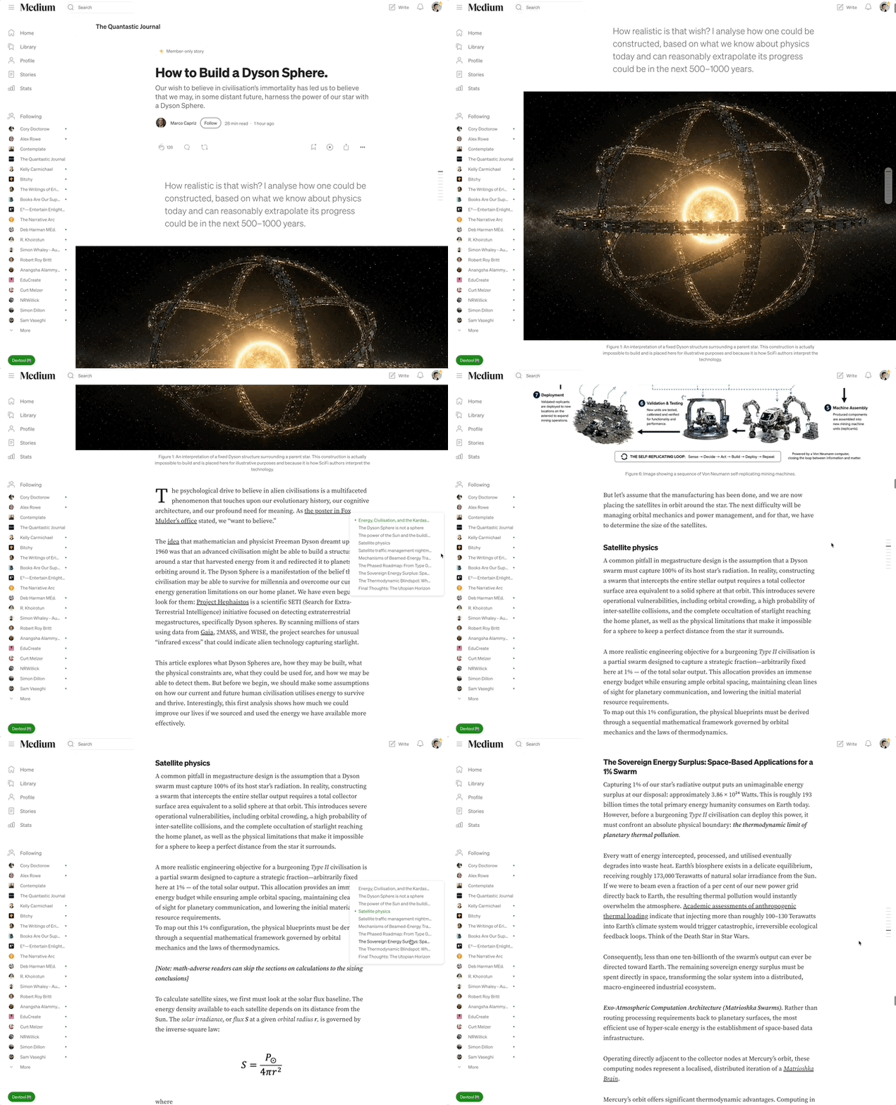
Thanks Marco Capriz for writing this post that was great for testing the table of contents!
At this point, we felt good about the desktop solution. How did it feel on mobile?
Pretty bad…
We have a much smaller right margin on mobile, so the indicators were overlapping with the post content. We could squish them down, but then they were barely visible and the touch box was too small.
How do other apps handle it? Notion completely hides their table of contents on mobile. Most likely, they ran into the same issue.
We decided that mobile table of contents needed to have their own solution. What makes sense for a desktop user doesn’t always work for someone on their phone. More to come on that.
Overall, I think we landed on a great solution.
- Dynamic list users don’t have to maintain
- Clickable from anywhere in the post
- Smooth scrolling
- It doesn’t add any content to the post itself
Unlike the Chrome Extension, we can also add metrics to this, so we here at Medium can see if users are actually using the feature. The old Chrome Extension required writers to create and maintain these lists, but they are ultimately a tool for readers not writers.
Will this hurt my earnings?
Before we shipped, I had the question of “will this hurt scrolling metrics that affect reading time?”
The short answer is: no. We don’t calculate valid reads based on scrolling behavior. We might have in the past, but that was before my time 🤷. Plus, there was nothing stopping a user from quickly scrolling a post before, we just allowed them to do it a more usable way.
So don’t worry about this feature affecting earnings. We weight earnings based on engagement (claps, highlights, reading time). If a user uses the table of contents to quickly scroll your stuff and then bounce, they didn’t actually read anything and they probably wouldn’t have read it without this tool.
Overall, we think quality of life changes like this help with user retention. Which means more readers stick around because they have a more positive experience.
How long did it take to build?
All-in-all, this feature took a couple of days to finish. A lot of that was UX testing and iterating on the design to make it feel right. The code is pretty straightforward once we landed on a solution.
Expect us to ship more quality of life improvements like this in the near future!
How we built the new Table of Contents feature was originally published in Medium Engineering on Medium, where people are continuing the conversation by highlighting and responding to this story.
Comments
Nothing yet. Say the first thing.
Sign in to join the conversation.