
I recently had a great discussion in a Kirby partners call. We talked about how important accessibility is, but also how there’s not always a big enough budget for it in projects. Personally, I don’t want to work on “inaccessible” websites anymore because this topic gives me a lot of purpose in my job. But sometimes, for smaller projects, you have to make compromises.
So I’ve collected some habits that require little to no effort but have a huge impact on accessibility.
I should clarify some things upfront: I’m talking about projects where you don’t (have to) care about meeting specific WCAG levels. True accessibility requires content editors, developers and designers working together, with a big enough budget to make it happen. This article is about making real improvements with little effort.
Use the right elements
One of the easiest accessibility improvements: using the correct HTML elements. The browser does so much work for you when you choose the right element — keyboard navigation, screen reader announcements, focus management — all without writing a single line of extra code.
Buttons
The <button> element is the simply best. It comes with so many built-in features: they’re focusable, they get recognized as interactive elements by screen readers, they can be “clicked” with the space bar or return key, … — all for free. Not using it can make people very sad.
For a long time I felt like the default styles were really hard to override across different browsers. Nowadays the solution is quite simple though. Just use the all property to reset all styles and then restore the focus outline (and optionally box-sizing):
button {
  /* Unset all the styles in one line 🤯 */
  all: unset;
  /* Restore some important stuff */
  box-sizing: border-box;
  &:focus-visible {
    outline: revert;
  }
}
That’s it! Now you can use the button element for pretty much every interactive element on your website (that’s not a link).
Links
I’ve seen so many custom “link” components built from div or span or button elements with JavaScript click handlers. But when you build your own links out of other elements, you need to manually implement so many things yourself: focus states, browser history integration, opening in new tabs (some people even hold ⌘?!), proper semantics for screen readers, …
That’s a lot of work for something the browser gives you for free with <a> tags.
Dialog
The <dialog> element is another gem. It handles (among others):
- Focus management and trapping
- ESC key to close
- Proper modal semantics
- Backdrops
Before <dialog>, we had to implement all of this ourselves with JavaScript. Now it’s built right in. Isn’t this amazing?
Similar to the button element, you might not be happy with the default styles. In this case it’s mostly just the padding and border you can easily override. The ones related to centering the dialog can be kept most of the time.
After you’ve adjusted the styling, you’re not only making your mobile menu or other dialogs more accessible, it even saves you time. Learn more about the dialog element on MDN
Other semantic elements
Elements like <nav>, <header>, <main>, <aside>, and <footer> automatically create landmarks for screen reader users. These landmarks make it much easier to navigate a page for them. I learned a lot about landmarks from Sara Soueidan’s Practical Accessibility course.
Since you now saved some characters by switching from <div class="navigation"> to <nav>, let’s use them for something useful: when you have multiple instances of the same landmark, add an aria-label to differenciate them for screen reader users:
<nav aria-label="Main navigation">...</nav>
<nav aria-label="Footer links">...</nav>
Use ARIA attributes as selectors
For the longest time, I thought ARIA attributes always had to be extra markup I needed to add on top of my classes. I hated the redundancy.
But then it clicked — why not use these attributes instead of classes? Instead of writing this:
.menu-item {
  &.active {
    font-weight: bold;
  }
}
Do this:
.menu-item {
  &[aria-current="page"] {
    font-weight: bold;
  }
}
This approach is quite neat because it connects the visual state directly to its semantic meaning. It doesn’t only apply to CSS of course — the same goes for selecting elements in JavaScript.
There’s an ARIA attribute for almost every UI state you can think of, it’s great! The naming is also surprisingly self-explanatory. Here are my top 3:
aria-currentindicates the active/current item within a set (navigation, pagination, steps)-
aria-pressedshows whether a button is pressed or not (great for filter tags) aria-expandedcommunicates if an expandable element like a dropdown is open or closed
Learn more about ARIA attributes on MDN
Add a lang attribute to html
This is such a no-brainer, but I’m surprised how often it’s missing (on some of my older websites 🙈):
<html lang="en">
Screen readers use this attribute to determine pronunciation rules. Without it, they might read your English content with a pronunciation similar to the German politician Günter Oettinger. It takes two seconds to add and makes a big difference.
If you’re mixing languages on a page, you can also set the lang attribute on individual elements. I’ve written a whole article about the topic of fallback lang attributes.
focus-visible + hover = ❤️
In 99% of cases, :focus-visible and :hover should be treated as inseparable buddies. To stick with my theme of linking to old German YouTube videos, here’s a real classic: Gute Freunde kann niemand trennen (“Good friends can never be separated”).
Anyways, these two simply belong in the same selector:
.button:where(:hover, :focus-visible) {
  background-color: var(--color-secondary);
}
This ensures that keyboard users get the same visual feedback as mouse users. It’s such a simple change but makes a huge difference for keyboard navigation.
Learn more in my article about beautiful focus outlines.
Set aside your mouse
As developers, we’re right at home using a keyboard for everything anyways. Why switch to a mouse for testing then?
You’ll immediately notice if focus indicators are invisible or if important elements can’t be reached. One downside of this approach: you’ll get used to it and realize how frustrating it is when other websites don’t work at all with keyboard navigation.
Separate heading style from heading level
Accessible page structure requires proper heading hierarchy — don’t skip levels, include exactly one <h1> per page, and so on. But this semantic structure doesn’t always match the visual design you get. At least that’s the case for me.
The solution? Separate styling from semantic levels. In my CSS I create .h1, .h2, etc. classes. Here’s a simplified example:
/* Part of my CSS reset */
h1, h2, h3, h4, h5, h6 {
  font-size: inherit;
}

/* Where the magic happens */
.rich-text :where(h1),
.h1 {
  font-size: var(--font-size-xxl);
}
.rich-text :where(h2),
.h2 {
  font-size: var(--font-size-xl);
}
.rich-text :where(h3),
.h3 {
  font-size: var(--font-size-l);
}
.rich-text :where(h4, h5, h6),
.h4, .h5, .h6 {
  font-size: var(--font-size-m);
}
This approach gives me flexibility to maintain proper heading hierarchy while still matching the design. It’s been particularly helpful when working with designers who aren’t familiar with accessibility requirements. I can easily implement their visual hierarchy without compromising the semantic structure.
The .rich-text class in the example above is something I use for any user-generated content areas. It ensures that semantic headings get proper styling without me having to manually add classes to each heading. I might write an article about my .rich-text class in the future, so let me know if you’re interested.
Some users can get physically ill from certain animations on websites. That’s something I didn’t fully appreciate until my wife told me she’s one of them. Nothing like seeing someone you love feel nauseated by your cool animations.
Make it a habit to wrap animations and transitions in a media query. With native CSS nesting, this is easier than ever:
.my-fancy-element {
  @media (prefers-reduced-motion: no-preference) {
    transition: transform 0.5s;
  }
}
Technically, prefers-reduced-motion only needs to affect movement animations, but sometimes when you combine movement with fades or other effects, it makes sense to include those too.
You can also use the inverted way of removing it with prefers-reduced-motion: reduce:
.my-fancy-element {
  transition: transform 0.5s;
  @media (prefers-reduced-motion: reduce) {
    transition: none;
  }
}
Personally, I try to focus on adding stuff, not taking stuff away.
Make sure you’re not using viewport tags that prevent zooming:
<meta name="viewport" content="width=device-width, initial-scale=1.0, maximum-scale=1.0, user-scalable=no">
This is okay:
<meta name="viewport" content="width=device-width, initial-scale=1.0">
I remember why I used that in the past: because Safari would zoom in on form inputs, and I thought it looked unprofessional. In hindsight, that was a terrible idea — I was preventing users from zooming altogether 🤦♂️
Make missing alt text visible
Want to make sure your content editors are adding proper alt text to images? In content management systems like Kirby, you can easily add a warning directly in files fields/sections to remind them:
files:
  info: '{{ file.alt.or("⚠️ No alt text") }}'
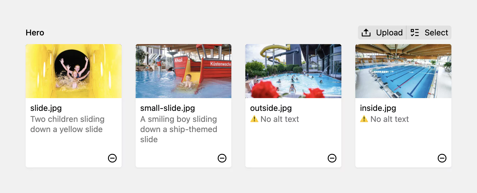
This adds a clear warning in the backend whenever an image is missing alt text, making it impossible for editors to miss. This, plus educating the editors about the importance of alt text, is a great way to keep a website accessible in the long run. The files field with the alt info is now part of my starter kit since quite a long time.
Nils shared a really nice addition to this with me: adding a warning to the file blueprint itself, when the alt text field is empty. Because full-fledged validation is not a good idea here (there are decorative images after all), you can use a simple info field with a when condition set to an empty string (""). I really like this idea and added it to my boilerplate as well.
Final thoughts
As you might have noticed, several of these tips build on having a good CSS reset in place. Other times, simply using the right element or a different attribute can make a huge difference.
Of course there are so many other things you can do to improve accessibility dramatically: labelling interactive elements, implementing skip links, custom focus outlines, and so many more. It was honestly quite hard for me to restrict myself to the actual “no-brainers” that don’t require any or little effort here.
If you are a designer or you’re looking for something to share with your designer friends, check out my wife’s article: 10 essential accessibility questions to ask before calling your design complete.
I’d love to hear about easy wins I’ve missed. Let me know on Mastodon!
Comments
Nothing yet. Say the first thing.
Sign in to join the conversation.