
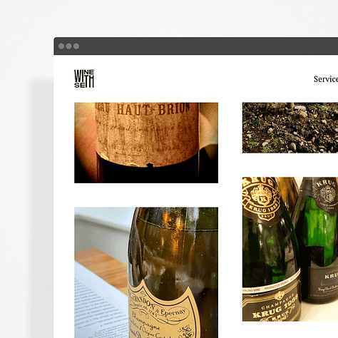
Wine With Seth represents a wine professional establishing his authority in consultation and education. Seth's expertise spans from sensory evaluation to geographical origins and historical context. However, his original brand identity needed a more distinctive visual presence to reflect the personal nature of his expert-driven approach.
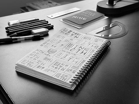
The identity development focused on creating a refined typographic solution that would elevate Seth's professional presence. The design strategy explored restructuring the traditional horizontal layout into an integrated mark that would function effectively across digital platforms and print applications.
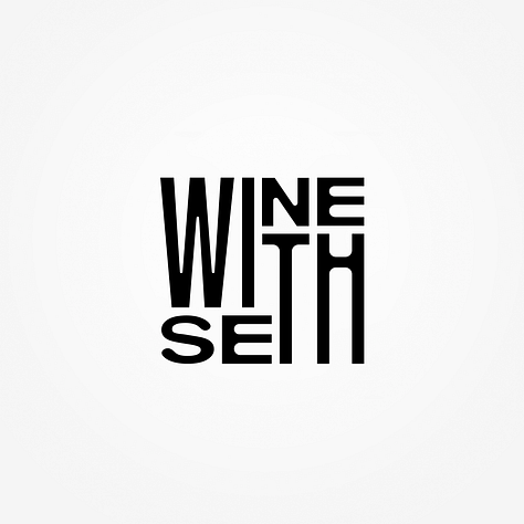
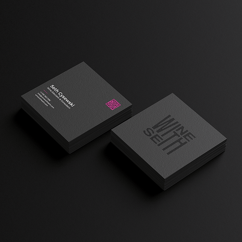
Through typographic exploration, the potential in the shared letter pairs 'WI' and 'TH' across the name was realized. This observation led to transforming the horizontal text into a vertical composition where these letter combinations connect. The elongated treatment of "WITH" emphasizes the personal nature of Seth's services—a critical differentiator in the post-pandemic era where direct expertise has renewed value.
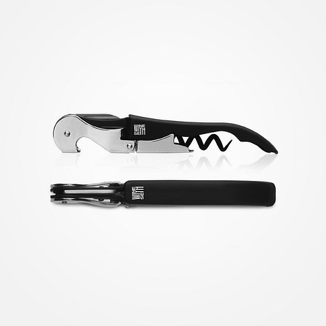
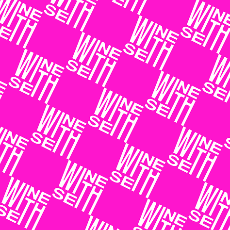
The mark performs exceptionally well in square and circular formats, solving previous avatar limitations while establishing a strong brand presence. The system extends to business cards and web applications, where the emphasized "WITH" reinforces Seth's commitment to personal interaction across all touch points.
No posts
Comments
Nothing yet. Say the first thing.
Sign in to join the conversation.