
In 2019, Hong Kong’s streets filled with people in numbers the city had never seen before. The protests began with opposition to a proposed Extradition Bill that would allow criminal suspects to be sent to mainland China, which, according to the protesters, put democracy activists in danger and undermined Hong Kong’s autonomous status. The protests escalated into massive demonstrations, with up to two million participants in June 2019, and continued in 2020, until around the time of Covid-19 quarantines.
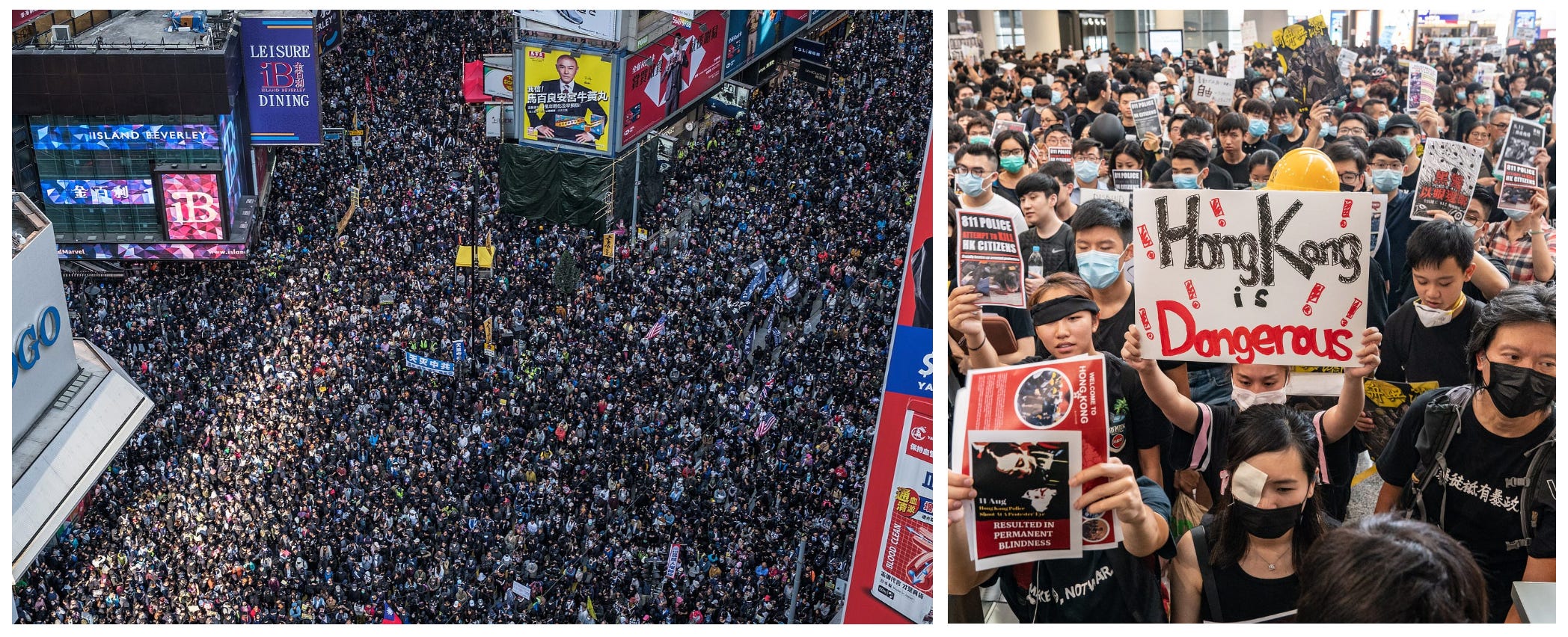
The Hong Kong protests were impressively self-organized. Leaderless and decentralized, they were making collective decisions quickly without any directions by centralized authority. To achieve that, they used digital tools, chat apps (such as Telegram, which while convenient, is actually unsafe for dissenters as it’s not encrypted by default), and one of the most famous services, HKMapLive.
HKMapLive was a crowdsourced map that tracked protest locations, police movements, tear gas, water cannons and other protest-related events in almost real time. The site had been set up on August 4, 2019, drew more than 10,000 unique visitors on the first day, and gained further traction with the release of a mobile app, which briefly became the top free app in Hong Kong’s iOS App Store in October 2019. While its internal details are unknown, the map worked by letting users add information on the publicly accessible map. The inputs were coming from on-the-ground users and also from people watching live and reading different sources, who could then mark those reports on the map. HKMapLive was designed as a relay-and-normalization layer for multiple information streams.
I’ve long been interested in collective decision-making, civic participation, and the ways digital tools enable them. So back in the day, I wrote a simple scraper of HKMapLive and ran it for a while. The data sat on my computer and in the back of my mind, while I moved on to other projects. Only now I had the time to start making sense of it. In this post, I’m sharing an exploration of this dataset.
HKMapLive was a crowdsourced map that let people report events on the ground in real time. Hongkongers could share where a march was moving, where police were gathering, tear gas was employed, or where a roadblock had gone up. Users could almost instantly observe those updates and adjust their movements.
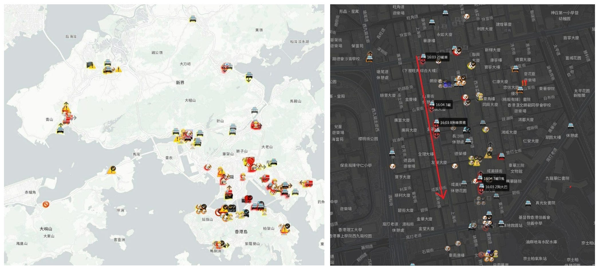
The most useful first-hand descriptions of the system describe people manually dropping map pins, often based on their own observations, livestreams, Telegram groups, news reports, and other public channels. Later developer statements also described the map as consolidating user reports, news, and public social-media posts.
There is no official documentation, public methodology, or audit trail showing exactly how reports were checked before appearing on the map, so the fact-checking process has to be described cautiously. The most likely process was community-based, with reports treated as more credible when they had a match in other sources, when they came from active real-time channels, or when users corrected and updated information as situations changed.
The dataset comes from scraping HKMapLive during two main periods: from November 14, 2019 to February 23, 2020, and from June 10 to July 21, 2020. The scraper saved snapshots of the map every few minutes. Each snapshot recorded the icons visible on the map and their position relative to the map tile they’re in. Applying a simple geo-transformation, I reconstructed their latitude and longitude.
The current dataset contains about 3.8 million marker observations across more than 170,000 snapshots. The chart below (left) shows the map icons from most common to least common. The blue bars count raw map-marker observations.
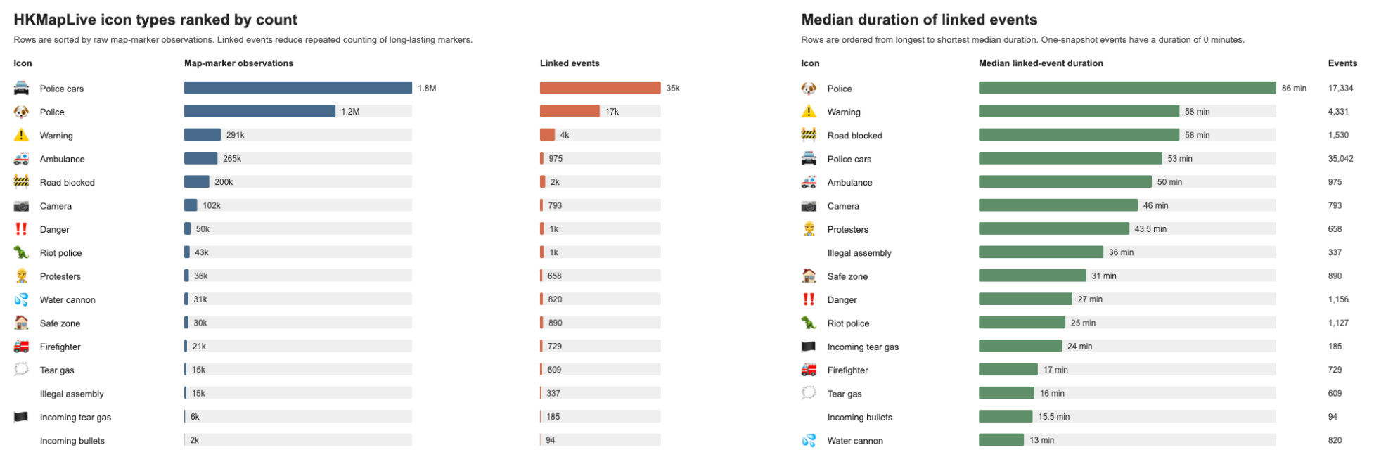
A recorded marker is not the same as an event. A roadblock, for example, might remain on the map for hours and appear in many consecutive snapshots. To handle this, I linked repeated observations that appear to represent the same event over time. The orange bars count linked events, which reduces repeated counting of long-lasting markers.
Like most crowdsourced systems, HKMapLive is incomplete. Some events were never reported, and some places or moments were probably reported more intensely than others. Protester markers also do not tell us how many people were present. A single protest icon could represent a small group or a large crowd. The data should therefore be read as a record of self-reported activity, not as a complete census of protests.
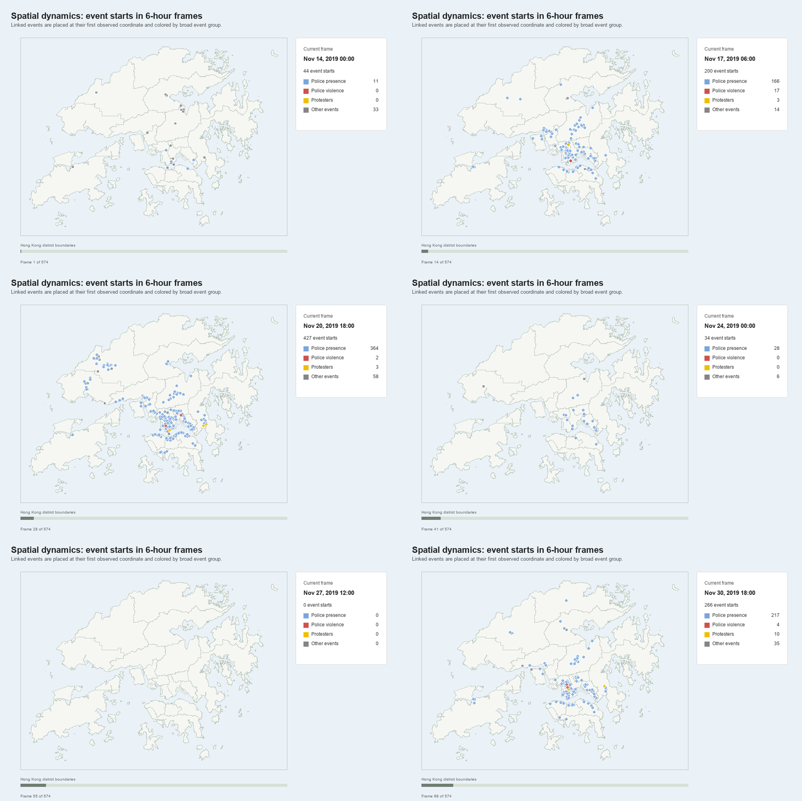
Even with those limits, the data offer an unusually detailed view of how reports of protest activity, police presence, roadblocks, warnings, and escalation moved across Hong Kong in near real time. In the next sections, I trace when activity peaked, in what areas of the city it concentrated, and how reports of protesters and police appeared in relation to one another.
The data covers two windows: November 2019-February 2020 and June-July 2020. The first period includes the citywide disruption around the university sieges and several large mobilizations in January.
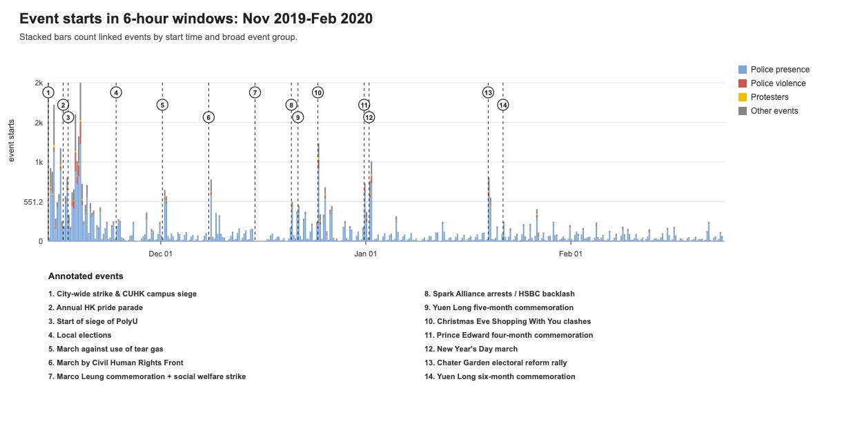
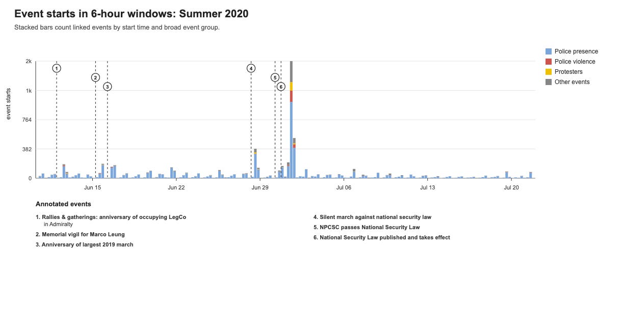
The second window captures the last major flare-ups of the movement before the Covid19-related restrictions and the introduction of the National Security Law. In June, the last large mobilization in the observed period took place around the introduction of the National Security Law, which made protesting in Hong Kong even more dangerous. Water cannons and tear gas were employed once again.
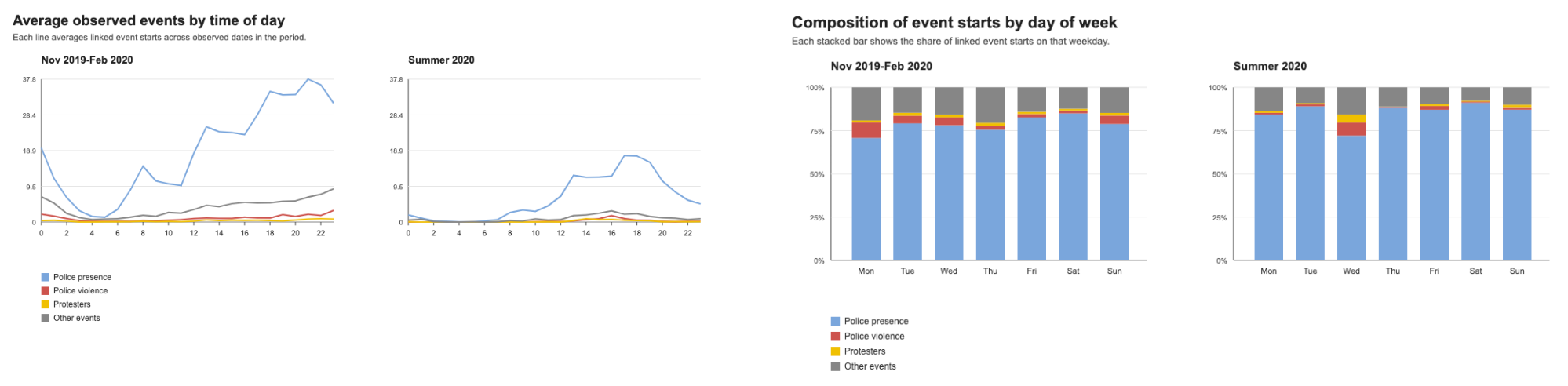
Diving further into temporal patterns, hourly patterns are different in the Fall and Summer sections of the data: in Fall, with more active protests and two campus sieges, police were active throughout the night and with more cases of violence in the evening. In June and July, average police activity reports were concentrated during the day and went down in night hours.
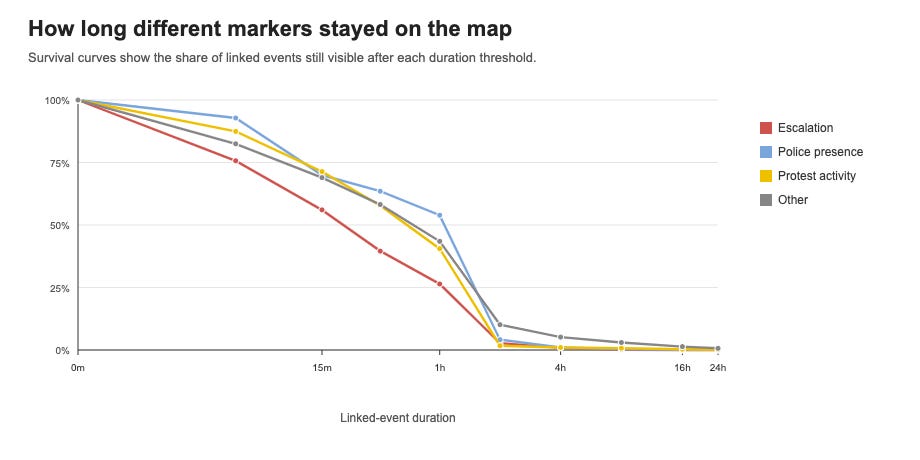
Finally, the markers did not all stay on the map for the same length of time. The linked-event duration curves below compare escalation with police presence, protest activity, and all other markers. Median linked-event duration is 19 minutes for escalation markers, 75 minutes for police presence, and 41 minutes for protest activity.
The spacial affinity graph (right) compresses co-location between icon types. For each six-hour frame, I measure the nearest-neighbor distance from each event start of one icon type to the nearest event start of another, then summarize those distances across frames. The MDS panel is an illustration of that distance matrix, so the axes are arbitrary; look at what labels are closer together.
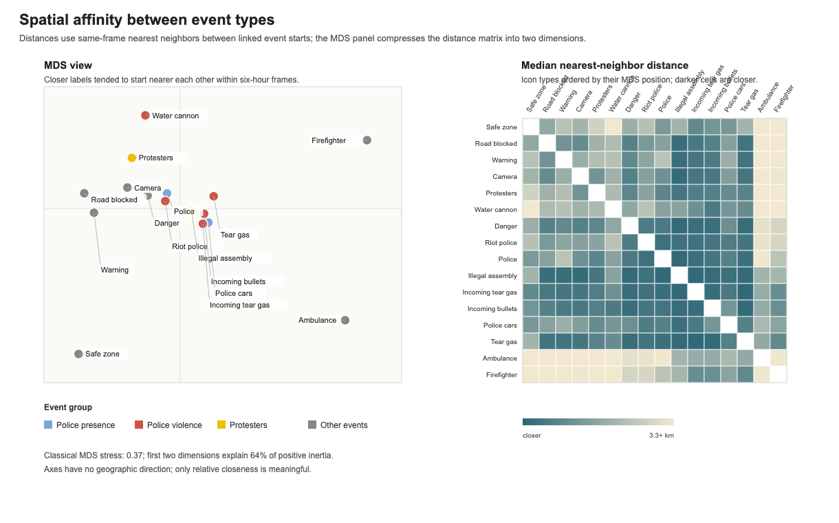
Escalation events, such as tear gas and incoming bullets, are close to illegal assembly, while police, police cars and danger are positioned somewhat closer to the more generic protester marker. Interestingly, water cannons are rather far from police and other violent events; protesters are its closest marker. This suggests that protest markers were indeed underreported on the map, as they should probably be much closer.
Protesters appear close to blocked roads, cameras, and not far from a cluster of police-related events. Emergency events, such as firefighters and ambulances, are far from protesters and tactical signs, but in comparison happen closer to illegal assemblies and escalation events, such as tear gas and incoming bullets.
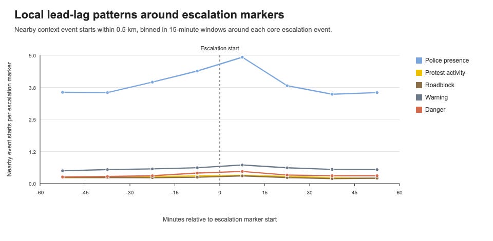
I treat the force-related icons — incoming tear gas, tear gas, water cannon, incoming bullets, and riot police — as (reported) escalation markers. Warning and danger markers are important, but I keep them as risk context rather than counting them as escalation.
These escalation icons account for 2,835 of 66,610 linked events (4.3%). The largest subcategories are Riot police (1,127), Water cannon (820), Tear gas (609), Incoming tear gas (185), Incoming bullets (94). Without making causal claims, we observe higher police presence in the vicinity during the 30 minutes before an escalation and some more danger warnings than usual, but not necessarily more new protest activity starts. After the escalation event, the number of new police events returns to normal within 30 minutes.
When an event family appears, how likely is escalation to appear nearby soon after? The highlighted escalation column is the most relevant part of the matrix below (left). There’s a clear pattern of escalation following escalation, but also of escalation after protest activity, road blocks, and warnings. Again, it is not as proof that one event caused another, as spatial and temporal proximity are not causal evidence. The same incident can produce police, warning, danger, tear gas, and roadblock pins in a tight cluster (think of university sieges), and the most intense moments are also when users are watching and reporting most actively.
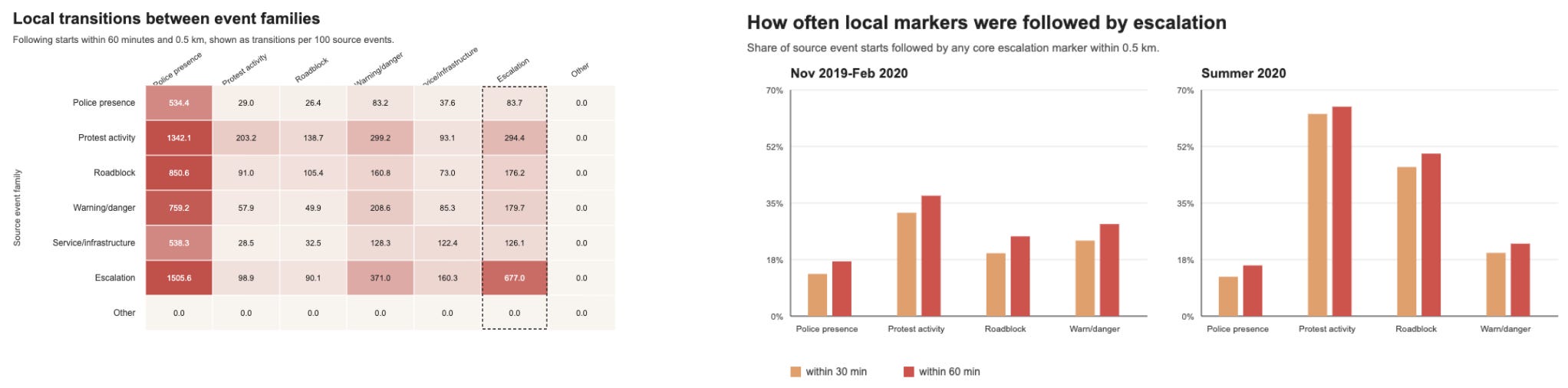
Looking only at whether a local escalation marker followed within 30 or 60 minutes, the highest 60-minute rate is 64.8% for Protest activity in Summer 2020. These rates are conditional on events being reported to HKMapLive, so they combine street dynamics with reporting attention.
Protester markers are thinner in this dataset than others. The absence of a protest icon near a tear gas, police, or warning marker probably means that users were more focused on marking risks and police positions at that moment. There may also be some reluctance to mapping protesters on a publicly available map due to tactical considerations, if the threat of escalation is high.
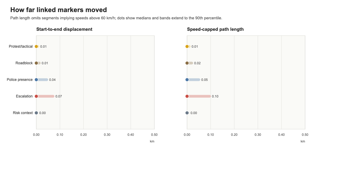
I group protesters, roadblocks, and illegal assemblies as protest/tactical markers, and compare both with police-presence markers. There are 995 protest/tactical linked events and 1,530 roadblock events. The median protest/tactical marker moved less than 5 m from its first to last observed position (so not considering circles or back-and-forth movement), while the 90th percentile of speed-capped path length was 9 m. Police moved around more than observed protesters: their markers had a median speed-capped path length of 5 m. Escalation events moved more. Risk context, predictably, stays in one place.
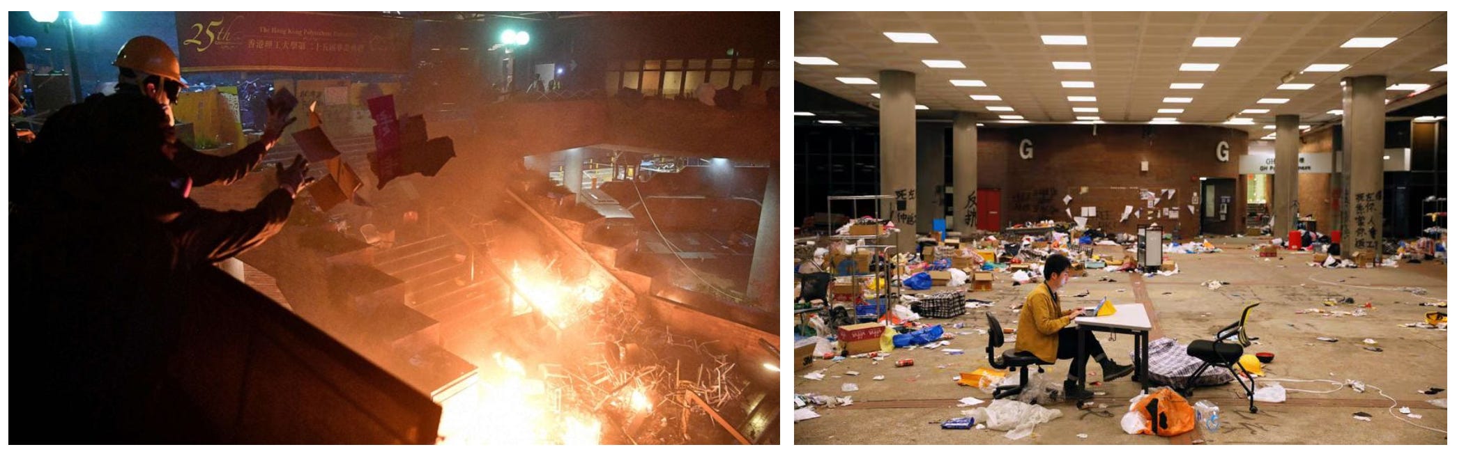
The sieges of the Chinese University of Hong Kong (CUHK) and the Hong Kong Polytechnic University (PolyU) in November 2019 were the most intense confrontations in the dataset. Students and protesters occupied these campuses, leading to prolonged standoffs and mass arrests.
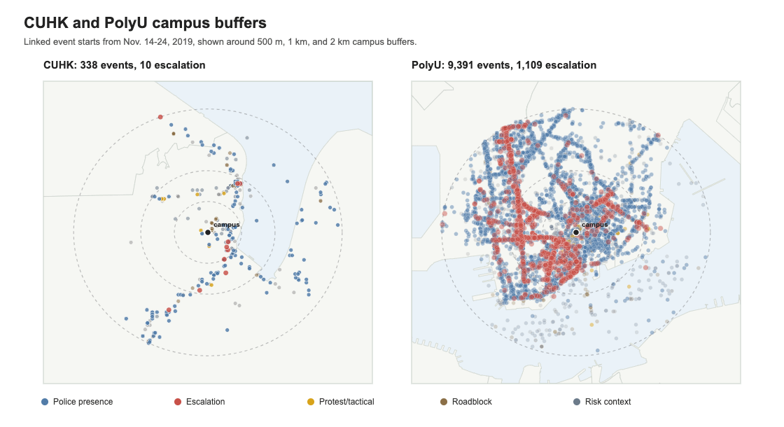
The dataset begins on November 14, 2019 and therefore misses the earliest and most intense CUHK clashes around November 11-12. I treat CUHK as partial coverage and aftermath. In contrast, PolyU is completely observable.
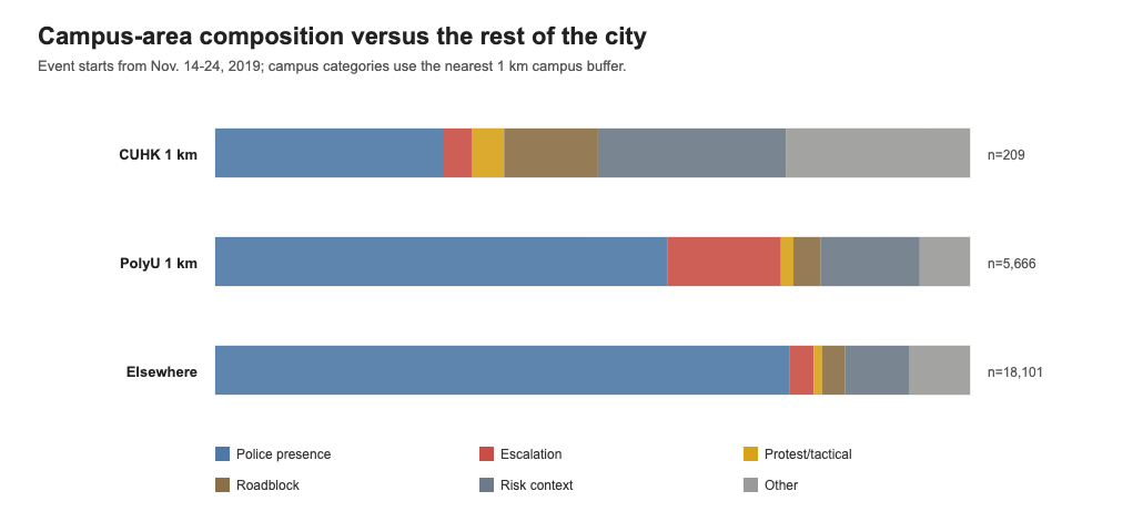
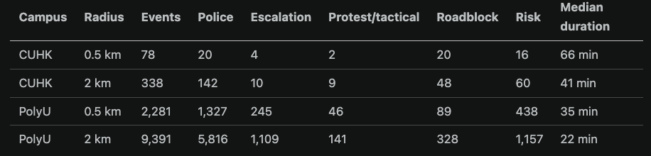
From November 14-24, the CUHK 2 km buffer around campus contains 338 linked event starts, including 10 escalation markers. The PolyU 2 km buffer contains 9,391 linked event starts, including 1,109 escalation markers. For PolyU, only 2,281 of those starts fall inside 500 m, which is a useful reminder that the surrounding street network is part of the observed siege geography. PolyU is situated in a very active area of the city and not all of these events should be attributed to the siege.
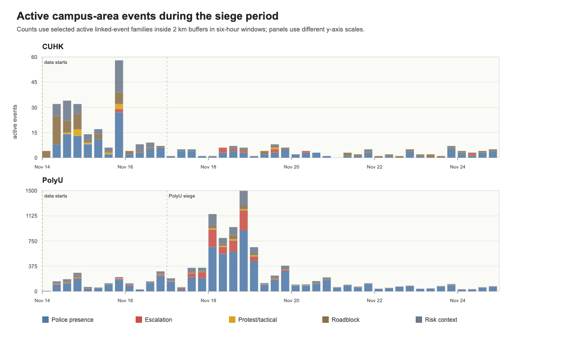
The active-event timelines show the difference between the two campus areas. CUHK data is only available starting November 14, when the largest clashes had already happened. The PolyU event count rises sharply after November 17 and remains visible throughout.
CUHK peaked at 58 active events in the six-hour window starting Nov. 15, 18:00. PolyU peaked at 1,497 active events in the six-hour window starting Nov. 18, 18:00. When protest/tactical and police-presence event starts are both visible in the same six-hour campus window, the median nearest-police distance is CUHK: 534 m, PolyU: 38 m.
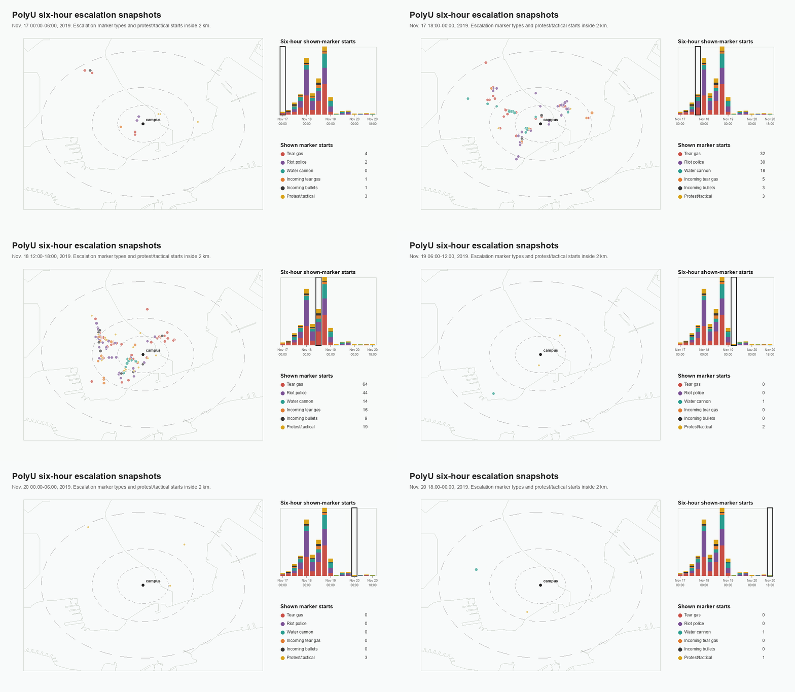
Interestingly, escalation events seem to spill over from PolyU to CUHK during the siege of PolyU, which took place when the CUHK were mostly over. Yet we observe escalation around CUHK during the same hours (the campuses are far away from each other so buffers can’t overlap).
Compared with the rest of the city during the same observed window, the two 2 km campus buffers contain 77.2% of citywide escalation event starts and 34.6% of citywide police-presence event starts.
First of all, the data are observational, so on their own they can’t answer what’s probably the most interesting question: what events cause what, and if there’s been any consequences from exposure to protests on local population. The last type of question was explored by Lee (2021) who asked if the presence of protests caused an effect on municipal elections. However, I’m skeptical that simple controls used in that paper can address such a huge omitted variable problem, and unfortunately the added granularity of my dataset doesn’t help us here.
Embracing the observational nature of the data, we can benchmark protester and police movement speed, directions, behavior patterns and other tactical traits and correlations. We can create empirically-informed benchmarks to be used in behavior models. These would be beneficial to researchers of protest movements and civil disobedience.
An interesting step would be to compare HKMapLive to similar datasets of different nature and look for systematic differences in reporting. What events are present/absent on the map that are reported/omitted in the media or by police officials? That could tease out where the means of data collection and reporting affect what is shown and what is omitted, and uncover structural biases that characterize the sources. That could be a very meaningful finding, as most geo-spacial protest research papers only rely on one data source, and thus inherit these biases.
A few other Hong Kong protest event repertoires were created by scraping media reports and Telegram groups (e.g. by Urman, Ho, Katz 2021, and Teo & Fu 2021). My preliminary test shows a very high correlation between Teo & Fu’s data and HKMapLive, while the map is more granular, which is to be expected. The two sources show an especially high agreement on tear gas events, and some disagreement in sparser parts of the city.
All in all, I hope the dataset will be of interest to researchers and anyone curious about protests and the role of technologies in steering collective action.
No posts
Comments
Nothing yet. Say the first thing.
Sign in to join the conversation.